
25 Song Lyric Tattoo Ideas for Men: Best Lyric Ink (2026)
A song lyric tattoo is a piece of body art that reproduces a line, chorus or hook from a song, usually in a script, serif or blackwork style, chosen because those words mark a moment you did not want to lose. For men, the strongest versions sit on a forearm, bicep, calf or rib rather than the softer waistline placements most galleries default to.
These 25 song lyric tattoo ideas for men are built as designs, not as quote lists. Each one covers the lettering, the placement a man’s skin can actually carry, a realistic size, an honest pain note and one way to make it personal. Bring the description to your artist and let them draw it for your body shape, and book early if you want it finished before autumn.
25 Song Lyric Tattoo Ideas for Men: Quick Guide
| Idea | Style | Best placement | Size | Pain |
|---|---|---|---|---|
| 1. Single-line chorus | Fine-line handwriting | Inner forearm | 2.5–5 in (6.5–13 cm) | Low–medium |
| 2. Two-line bridge panel | Vertical blackwork | Outer forearm | 3–6 in (7.5–15 cm) | Medium |
| 3. Title-track line | Fine-line script | Behind the ear | 1.5–3.5 in (4–9 cm) | Medium |
| 4. Pre-chorus on the rib | Handwritten fine line | Side rib | 3–6 in (7.5–15 cm) | Medium |
| 5. Ribbon banner chorus | Traditional | Upper arm | 4–7 in (10–18 cm) | Medium |
| 6. Hook repeated in a ring | Blackwork | Forearm | 3–5 in (7.5–13 cm) | Medium |
| 7. Watercolour chorus | Watercolour | Shoulder | 4–8 in (10–20 cm) | Medium |
| 8. Micro-text finger line | Minimalist fine line | Side of index finger | 1–2.5 in (2.5–6.5 cm) | Medium–high |
| 9. Chorus split on two arms | Fine-line minimalist | Both inner forearms | 3–5 in each (7.5–13 cm) | Medium |
| 10. Microphone with lyric band | Neo-traditional | Outer forearm | 4–7 in (10–18 cm) | Medium |
| 11. Two lines down the bicep | Fine-line handwriting | Inner bicep | 4–7 in (10–18 cm) | Medium |
| 12. Waveform into a lyric | Fine line | Forearm | 3.5–6 in (9–15 cm) | Medium |
| 13. Line in editorial brackets | Blackwork | Outer forearm | 3–6 in (7.5–15 cm) | Medium |
| 14. Scribbled chorus | Illustrative lettering | Forearm | 3.5–6 in (9–15 cm) | Medium |
| 15. Red ink collarbone line | Red ink lettering | Collarbone | 3.5–6 in (9–15 cm) | Medium–high |
| 16. Lyric inside a cassette | Minimalist line art | Forearm | 3–5 in (7.5–13 cm) | Medium |
| 17. Small script wrist lyric | Fine-line script | Inner wrist | 2–4 in (5–10 cm) | Low–medium |
| 18. Bold sternum chorus | Blackwork | Sternum | 4–6 in (10–15 cm) | Medium–high |
| 19. Watercolour word cloud | Watercolour lettering | Upper arm | 5–9 in (13–23 cm) | Medium |
| 20. One word repeated | Fine line | Forearm | 2.5–4.5 in (6.5–11.5 cm) | Medium |
| 21. Typewriter lyric | Old-western typography | Upper arm | 4–7 in (10–18 cm) | Medium |
| 22. Equaliser bars under a lyric | Minimalist blackwork | Forearm | 3.5–6 in (9–15 cm) | Medium |
| 23. Hook in dotwork | Dotwork lettering | Shoulder | 4–7 in (10–18 cm) | Medium |
| 24. Paper plane with a lyric | Fine line | Forearm | 3.5–6 in (9–15 cm) | Medium |
| 25. Full-width sleeve panel | Blackwork | Upper arm | 7–11 in (18–28 cm) | Medium |
1. Single-Line Chorus in Fine-Line Handwriting
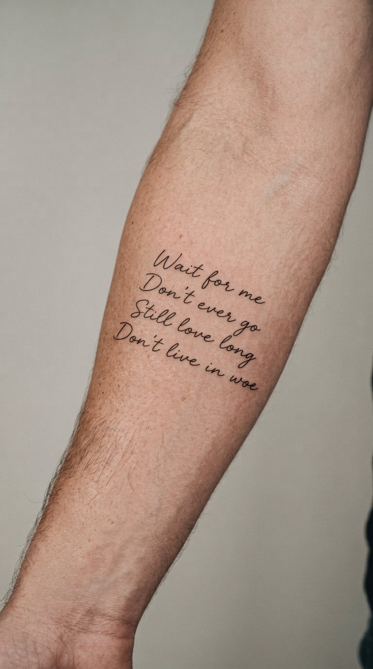
One short chorus line sits on a single uninterrupted baseline in a relaxed handwritten script, done in restrained black ink with no shading and no decorative border. It is the simplest song lyric tattoo for men to get right, and the hardest to do well, because the whole piece depends on even line weight.
People choose a single chorus because it is a complete thought on its own. Pick the line from a song you genuinely connect with rather than one that reads well in a gallery, and the wearer’s connection is the meaning.
Placement: inner forearm, with the upper arm and behind the ear as alternatives. Size: 2.5–5 inches (6.5–13 cm). Style: fine line. Pain: low to medium on the inner arm; the inner forearm is a mobile area, so fine strokes can soften faster than arm placements, and finger versions of this design fade quickest of all.
Make it yours: add a small date in matching hand at the end of the line, or run the words in a single unbroken stroke without a capital at the start.
2. Two-Line Bridge in Vertical Blackwork
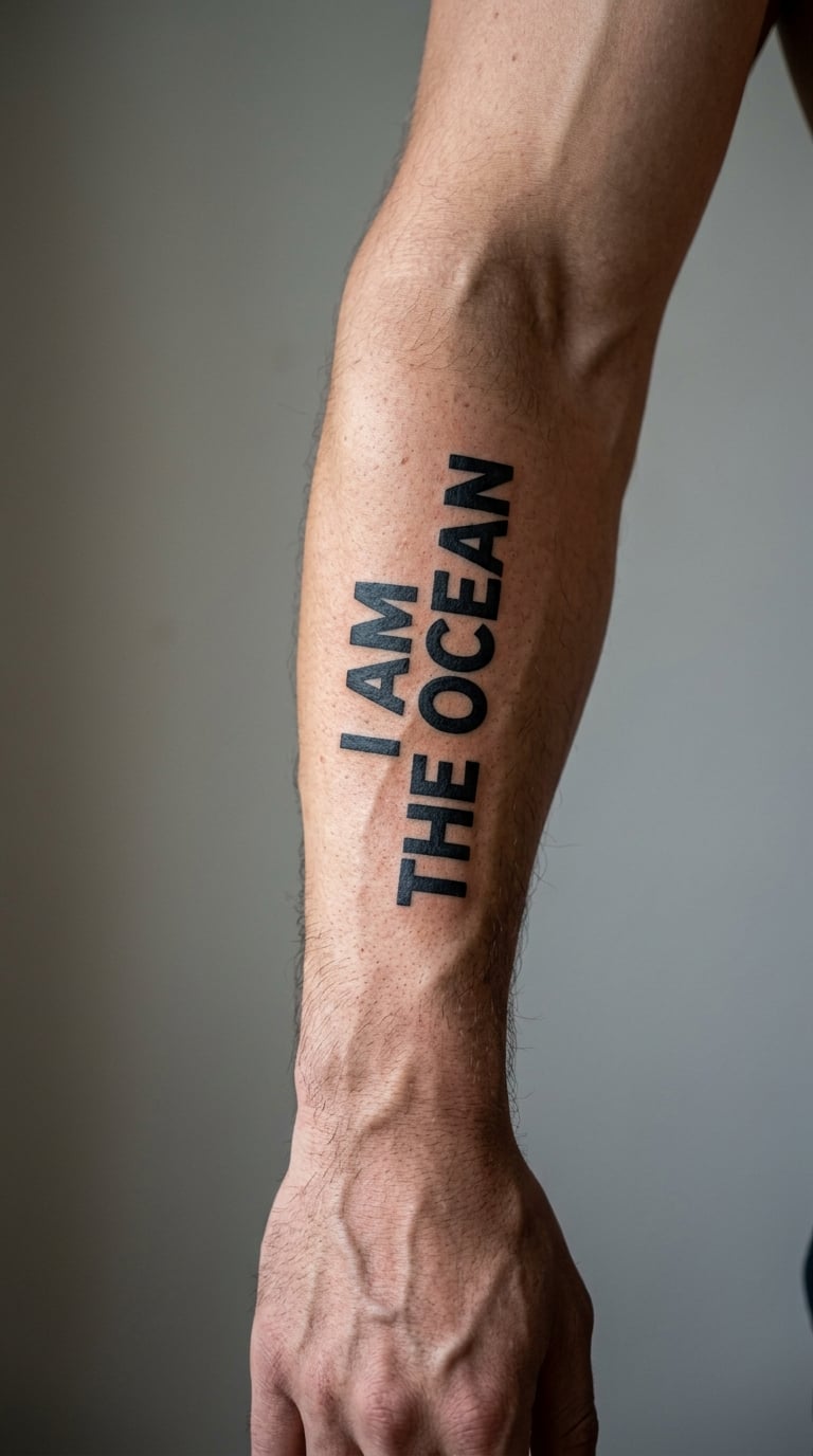
Two short lyric lines are stacked inside a narrow vertical blackwork panel, set in bold sans-serif lettering with a simple bracket or terminal line at the edge instead of ornament. It reads like a graphic statement rather than a handwritten note.
This suits someone who wants a song lyric tattoo that announces itself. The choice here is about weight and contrast, not sentiment, so the line matters less than the way it is set.
Placement: outer forearm, upper arm or calf. Size: 3–6 inches (7.5–15 cm). Style: blackwork. Pain: medium. Broad letters hold their shape well, but line ends and narrow counters in bold type can fill in and age less cleanly than wide lettering.
Make it yours: personalise the panel with a single accent colour inside the brackets, or add a small year beneath the two lines.
3. Tiny Title-Track Line Behind the Ear
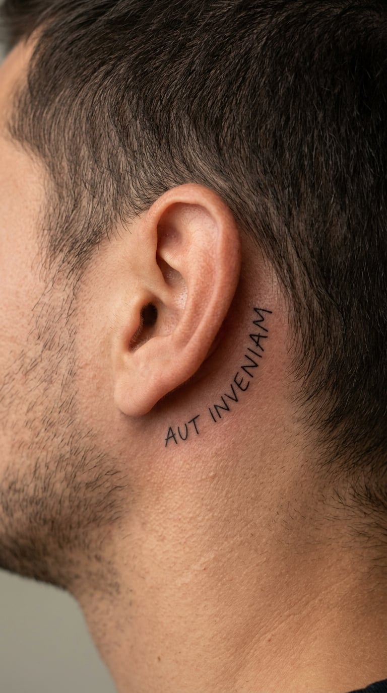
One memorable title-phrase line runs behind the ear in delicate script, following the curve of the ear rather than sitting as a flat rectangle on the neck. The text should be small, exact and almost hidden at first glance.
Discretion is the reason people choose this one. The line usually means a great deal to the person wearing it, and very little to anyone else, which some men prefer.
Placement: behind the ear, side neck or upper shoulder. Size: 1.5–3.5 inches (4–9 cm). Style: fine line. Pain: medium, because the skin there is thin over bone. Hair, sun exposure and constant hand contact all affect how legible the line stays over the years.
Make it yours: let the final word trail toward the jaw, or add a tiny filled dot at the very start of the line.
4. Handwritten Pre-Chorus on the Rib
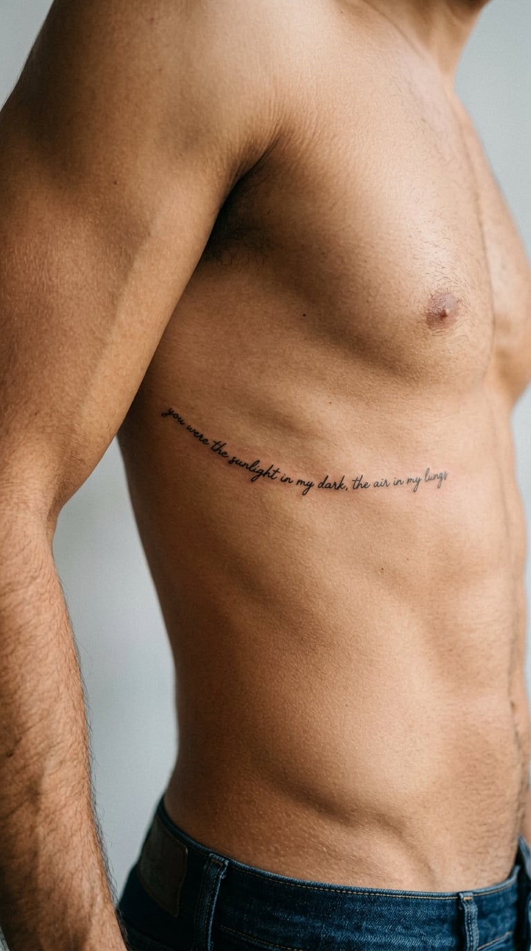
A narrow pre-chorus line follows the rib area in a light, natural hand with generous spacing between words so nothing crowds. It is a body-shaped text piece, quiet rather than declarative, and it changes as the body moves.
Rib text suits a lyric that is private rather than public. Because the line is partially hidden and only fully readable in a mirror, it carries meaning without performance.
Placement: side rib, upper inner arm or flank. Size: 3–6 inches (7.5–15 cm). Style: fine line. Pain: medium; the ribs and flank are sensitive areas and most wearers describe this as more uncomfortable than a forearm piece. Movement and skin stretching can subtly shift thin strokes, and weight changes can alter deep lines.
Make it yours: follow a hidden lyric, or add one small symbol at the front of the line to mark who it is for.
5. Chorus in a Traditional Banner Scroll
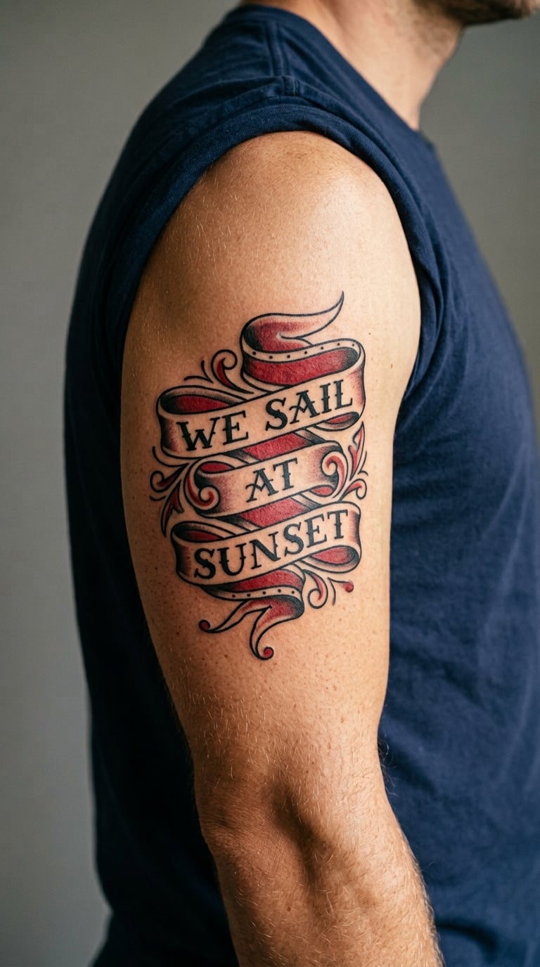
A short lyric is set inside a traditional ribbon banner with clean black outlines, light red shading and a soft drop shadow, kept far simpler than a full traditional piece. No album art, no faces, no borrowed graphics.
Men who like the look of flash but want their own words usually land here. The banner gives the text a frame, which makes a short line look finished rather than unfinished.
Placement: upper arm, forearm or calf. Size: 4–7 inches (10–18 cm). Style: traditional. Pain: medium. Shading on the hand or fingers will wear much faster than the same ink on a protected torso or upper-arm placement, so keep the banner off the hands.
Make it yours: use a second banner colour that matches a shirt or a watch strap, or add a small date in a plain hand below the scroll.
6. Blackwork Repeated Hook in a Circle
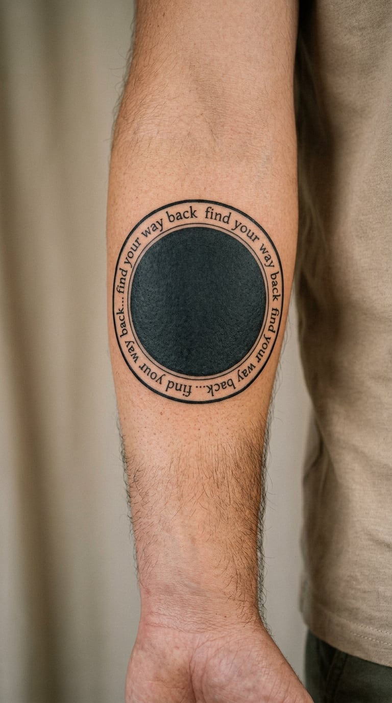
A brief hook phrase repeats around a simple circular blackwork line in consistent lowercase lettering, with nothing else in the frame. The ring is a closed loop and the text follows it all the way round.
Repetition here is a treatment, not a claim. A line wrapped in a circle has no fixed meaning, which is exactly why men who dislike explaining tattoos choose it.
Placement: forearm, upper arm or shoulder. Size: 3–5 inches (7.5–13 cm). Style: blackwork. Pain: medium. Curved text makes small letters feel crowded, so ask the artist to size the circle generously rather than forcing more words in.
Make it yours: mark one point on the circle with a small star or dot, or count the repetitions around a meaningful number.
7. Watercolour Chorus on the Shoulder
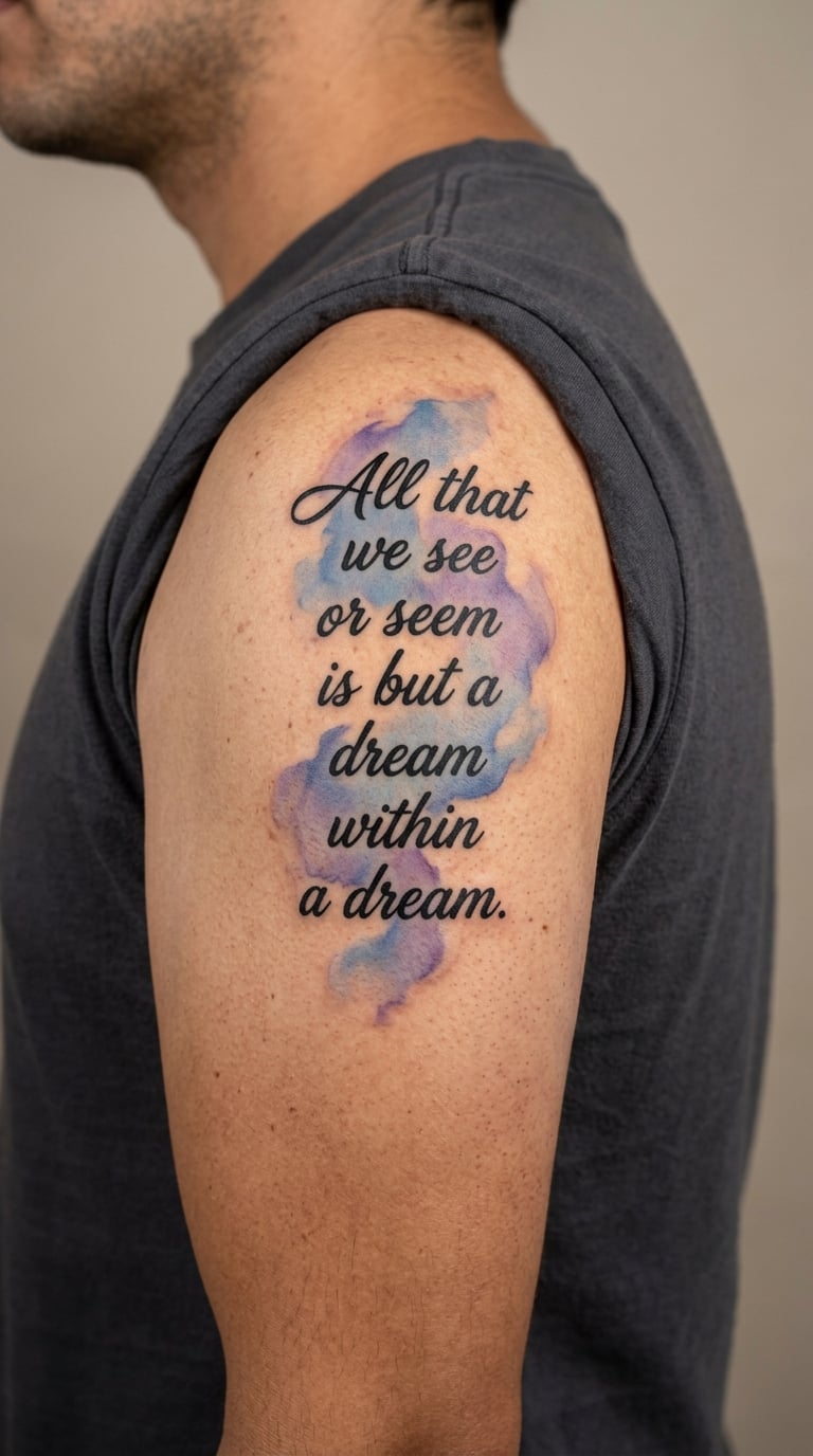
A short, clearly readable lyric sits in the centre of the design with a controlled wash of one or two watercolour colours bleeding softly past the lettering. The text stays sharp; the colour does the work around it.
Colour is what makes this piece feel softer than a blackwork panel, and it works well with a lyric tied to a particular person or season. The wash should stay behind the words rather than crossing them.
Placement: shoulder, upper arm or upper back. Size: 4–8 inches (10–20 cm). Style: watercolour. Pain: medium. Colour saturation shifts over time and exposed shoulders need consistent sun protection or the wash dulls long before the black line does.
Make it yours: tie the colour to a memory, or bring a photo of a place that matters and match the wash to it.
8. Minimal Micro-Text on the Side of a Finger
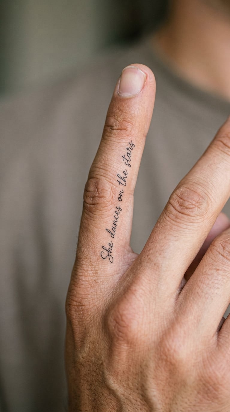
A single ultra-short lyric line runs vertically along the side of one finger in 8 to 12 point lettering, with clean spacing and black ink only. Nothing else goes on the finger.
This is the boldest commitment in the list, and not because of the design. Hand tattoos are the first thing most artists warn men about, and you should be honest with yourself about accepting that.
Placement: outer or inner side of the index, middle or ring finger. Size: 1–2.5 inches (2.5–6.5 cm). Style: minimalist fine line. Pain: medium to high, since the fingers hold a lot of nerve endings and the bone sits right under the skin. Washing, sun and constant movement all speed the fading.
Make it yours: use the shortest phrase the song offers rather than forcing a full line into the space.
9. Chorus Split Across Both Forearms
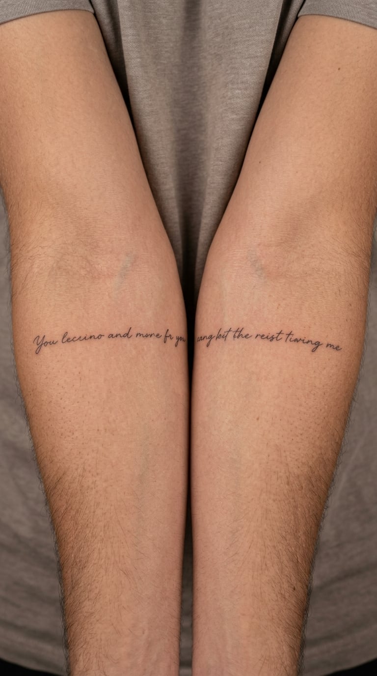
One short phrase is divided between the two inner forearms, with the words reading naturally when the arms hang relaxed side by side. Line lengths stay balanced and the hand-lettering matches exactly across both pieces.
Men who like coordinated ink usually start with two pieces rather than one large design. It also gives you a natural reason to return for a matching second half later.
Placement: both inner forearms. Size: 3–5 inches (7.5–13 cm) per arm. Style: fine line or minimalist. Pain: medium, doubled up. Inner forearms catch more sun and water than upper-arm work, so plan on a touch-up check in a couple of years.
Make it yours: split the phrase at the point where the song pauses, so each half stands on its own.
10. Neo-Traditional Microphone with a Lyric Line
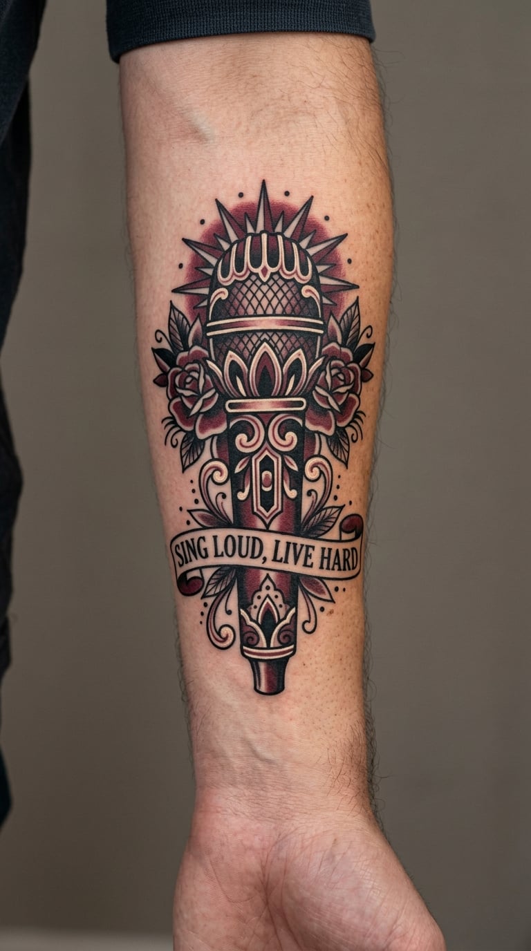
A vintage-style microphone is drawn with bold black outlines, deep red shading and one cream highlight, with a narrow band of readable lyric text wrapped around the stand. The lyric stays secondary so the image holds together as one piece.
The microphone points straight at why the lyric matters, without showing a face or a logo. It is the safest way to add music imagery to a text tattoo.
Placement: outer forearm, upper arm or calf. Size: 4–7 inches (10–18 cm). Style: neo-traditional. Pain: medium. High-contrast outlines age better than fine detail, but the lyric band still needs enough height to stay readable, so ask for a band at least half an inch tall.
Make it yours: list the song title under the mic in a plain sans-serif hand, or pick the red shade first and letter the words in that colour.
11. Two Handwritten Lines Running Down the Bicep
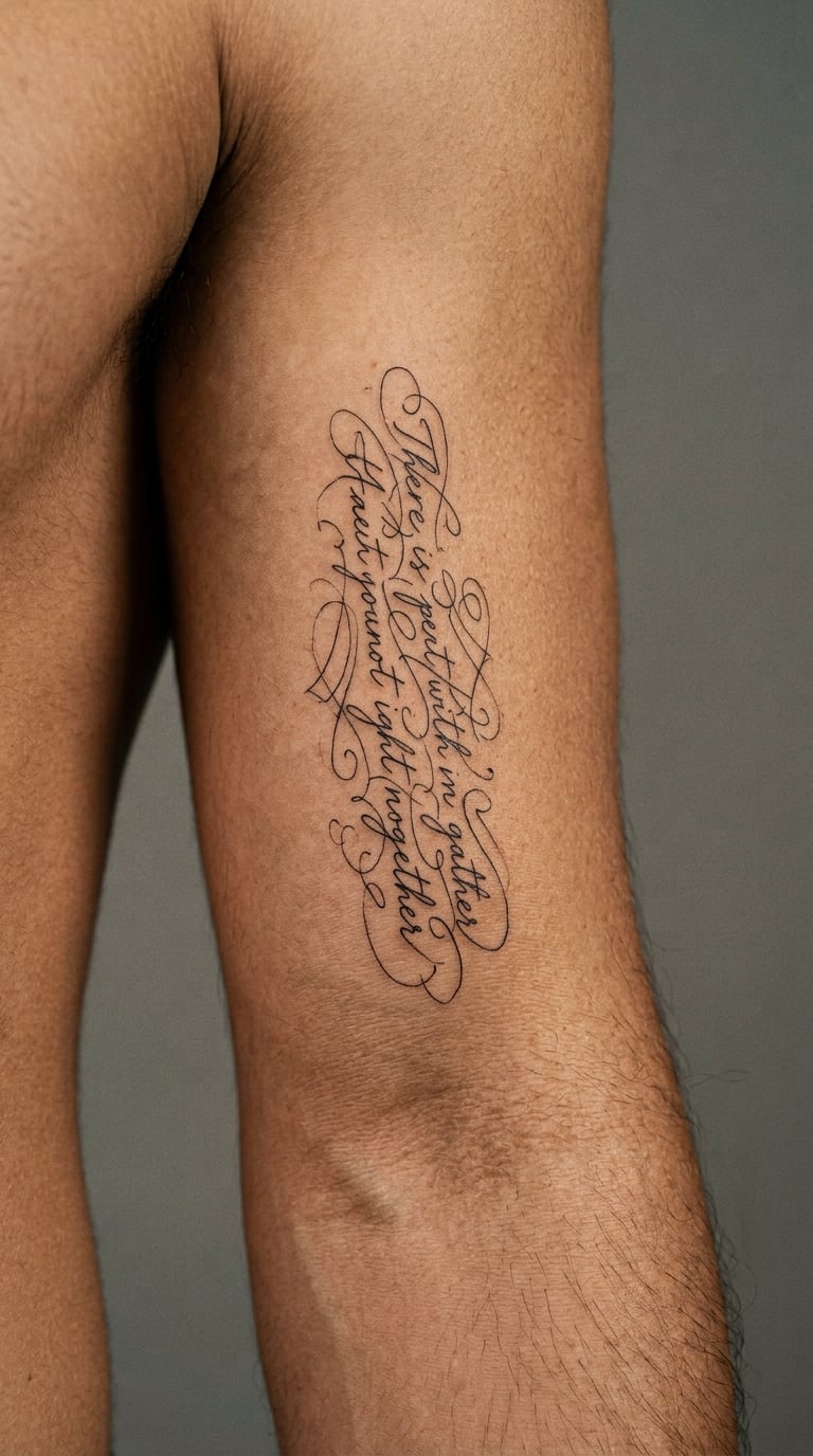
Two short lyric lines run vertically down the inner bicep in a clean, slightly condensed hand with generous spacing between them. The open placement is what makes longer text feel calm instead of crowded.
Vertical text on the arm works well for a verse rather than a hook, since the eye can follow it downward the way it would on a page. Bicep placement also stays out of the way in most work settings.
Placement: inner bicep, upper arm or side torso. Size: 4–7 inches (10–18 cm). Style: fine line. Pain: medium. Repeated flexing, sun and sleeve friction thin out strokes over time, especially close to the elbow, so keep the lower line clear of the crease.
Make it yours: add a small date at the bottom in the same hand, or use one restrained colour accent on the second line.
12. Waveform Line with a Microphone-Pick Lyric
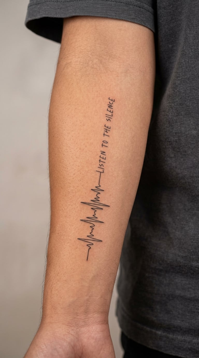
A single audio waveform runs across the design and resolves into one compact lyric line, done in black fine-line work. A simple guitar-pick silhouette is optional, and only worth including if the words need a visual anchor.
The waveform can represent a particular recording that matters to the wearer, such as a live version or a song someone played often in a specific year. It does not have a fixed interpretation beyond that.
Placement: forearm or upper arm. Size: 3.5–6 inches (9–15 cm). Style: fine line. Pain: medium. Very thin waveform peaks blur together within a few years, so ask for a wave with fewer, taller spikes rather than a dense realistic one.
Make it yours: use the waveform from a live recording of the song, or lengthen it to match the length of the track.
13. Blackwork Quoted Line Framed by Brackets
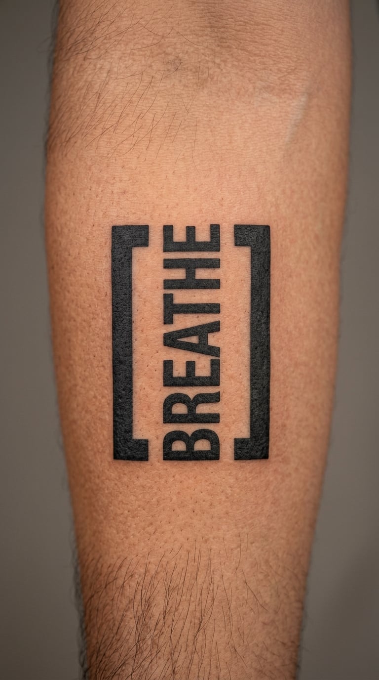
A short lyric is set in bold black sans-serif type between oversized editorial-style brackets, with no music imagery at all. The result reads clearly from several feet away, which is unusual for a text tattoo.
The editorial framing makes the piece feel current rather than nostalgic. Men who dislike the softness of script often end up here because the line is a design element, not a note.
Placement: outer forearm, calf or upper arm. Size: 3–6 inches (7.5–15 cm). Style: blackwork. Pain: medium. Straight, even lines are easier to maintain than ornate scripts, particularly over moving or frequently washed areas.
Make it yours: place one meaningful colour inside a single bracket, or set a date beneath the line in the same weight.
14. Scribbled Chorus as a Handwritten Portrait
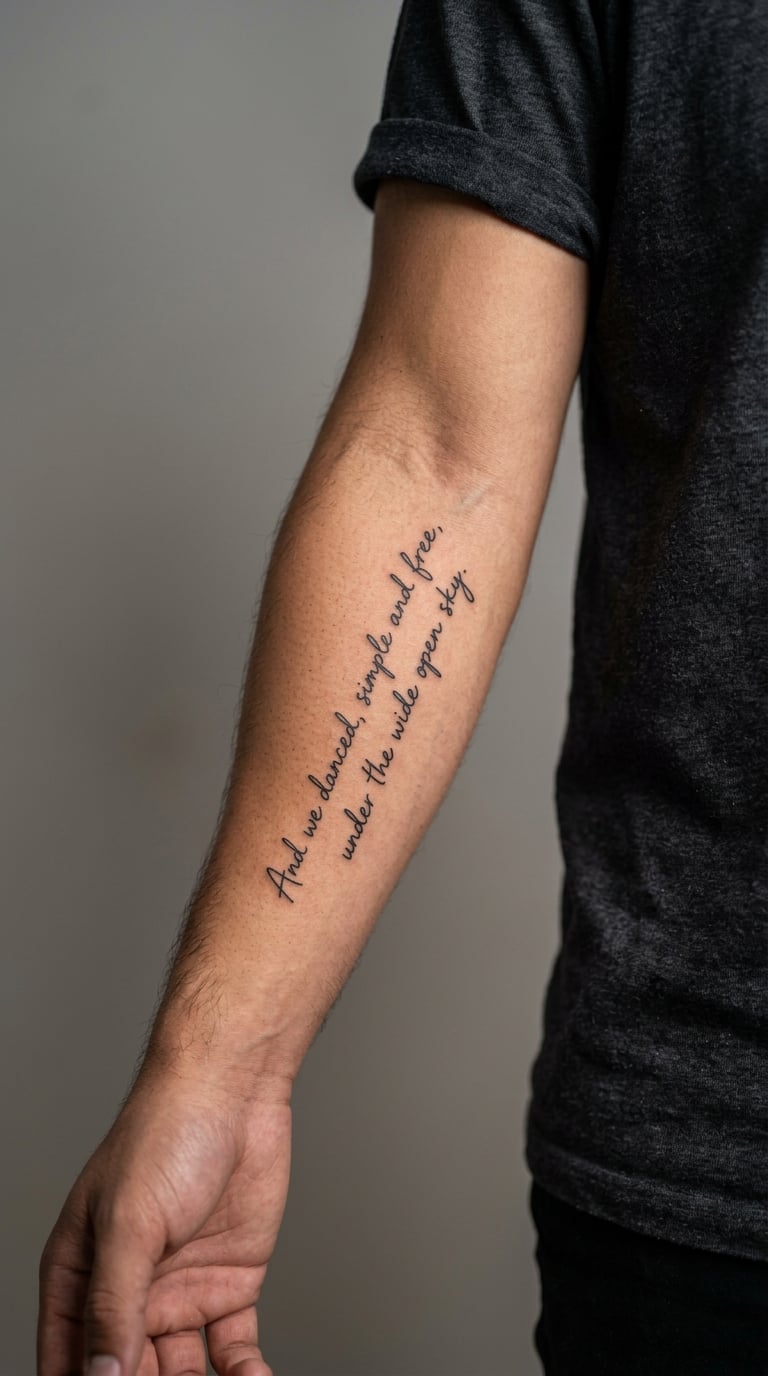
A short chorus is written in loose, energetic handwriting that follows the implied rhythm of the song, with varied line lengths and enough spacing to stay readable. The hand is deliberately informal rather than a copy of any printed album artwork or band logo.
It looks like the way someone actually writes when a song gets to them, which is a different feeling from a clean typed line. Diagonal placement gives the piece movement.
Placement: forearm, upper arm or calf. Size: 3.5–6 inches (9–15 cm). Style: illustrative lettering or fine line. Pain: medium. Hurried-looking strokes lose clarity fast if the piece is tattooed too small, so agree on the size before the stencil is placed.
Make it yours: write the line at the tempo of the chorus, letting the spacing follow the rhythm, or add a small ink-blot dot where the song breaks.
15. Red Ink Lyric Running Along the Collarbone
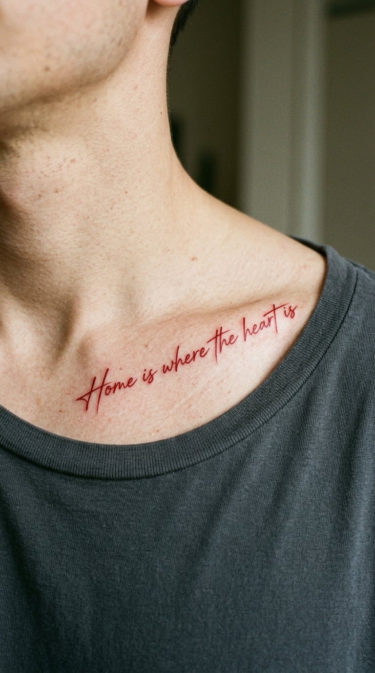
A restrained red-ink line in an elegant thin hand follows one collarbone, kept horizontal and close to the bone. The words are the only element, and the red does the rest.
Colour in a lyric tattoo is a bigger statement than most men expect, so this works best for someone comfortable with visible ink in a short-sleeve shirt. Red holds its shape well in fine lettering.
Placement: collarbone, upper chest or shoulder. Size: 3.5–6 inches (9–15 cm). Style: red ink lettering. Pain: medium to high, since bone sits close under the skin here. Text can shift with chest and shoulder movement, and colour contrast softens faster than black under sun exposure.
Make it yours: add thin black outlines for definition, or repeat the phrase on the opposite collarbone in a smaller scale.
16. Chorus Written Inside a Minimal Cassette Tape
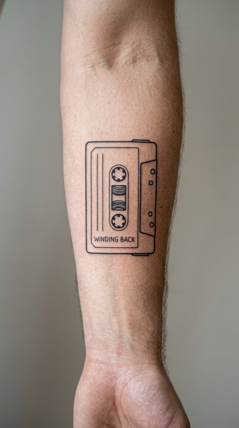
A simple cassette is drawn in black linework with its lower label reserved for one short lyric line. The reels and outer casing stay recognisable but uncluttered, and nothing on the tape identifies a release.
It connects to the act of listening rather than to any album cover, which keeps the design original and avoids borrowed artwork. It also carries a nostalgic weight for anyone who taped songs off the radio.
Placement: forearm, upper arm or thigh. Size: 3–5 inches (7.5–13 cm). Style: minimalist line art. Pain: medium. Small label lettering blurs easily, so use a simple hand with no hairline strokes and keep the label at least half an inch tall.
Make it yours: add a small A or B side marker, or put the song title where the track list would normally sit.
17. Small Script Lyric on the Wrist
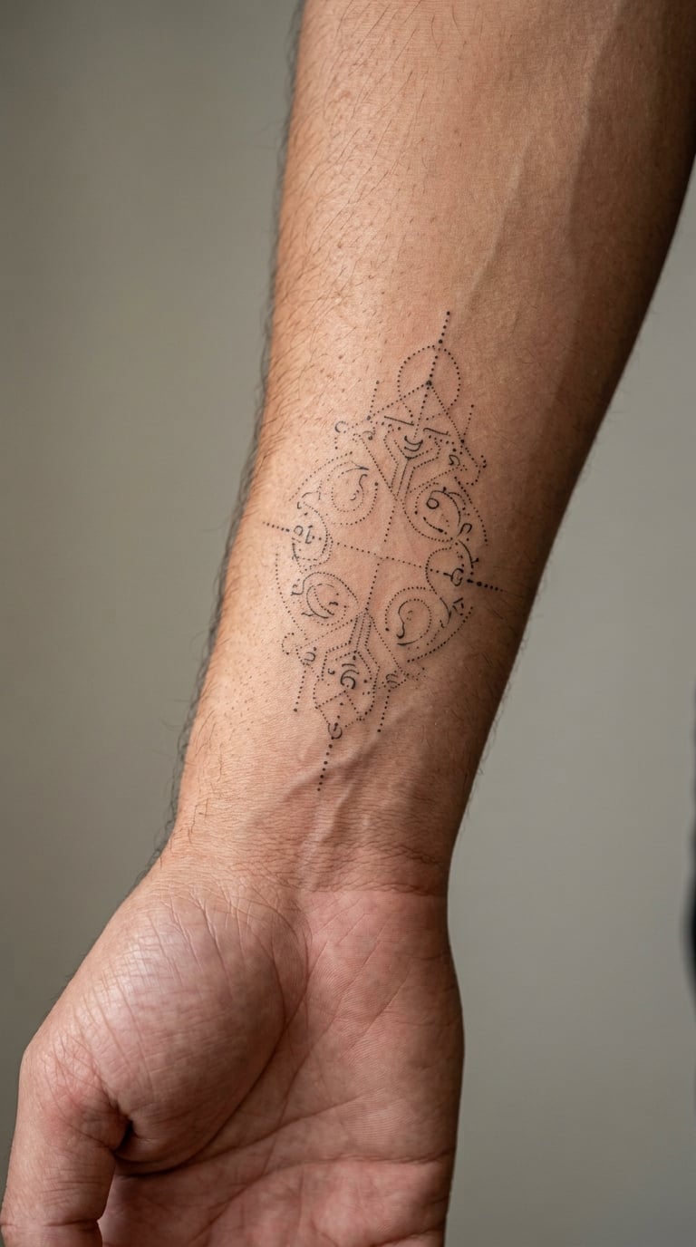
A compact, highly legible lyric sits in a restrained script on the inner wrist, limited to one or two short lines with plenty of open skin around it. The whole design should feel like a quiet everyday piece with a direct personal connection to the song.
Wrist text is one of the most requested lyric tattoo placements for men because it is easy to cover and easy to see. The trade-off is wear, not style.
Placement: inner wrist, outer wrist or ankle. Size: 2–4 inches (5–10 cm). Style: fine line. Pain: low to medium, though the wrist has plenty of nerve endings and the inner side can sting more than expected. Washing, sun and frequent movement mean fine lines here fade faster than the same work on an upper arm.
Make it yours: choose a bolder hand or add a small solid dot to anchor the line, and ask about a free touch-up check after healing.
18. Bold Blackwork Chorus on the Sternum
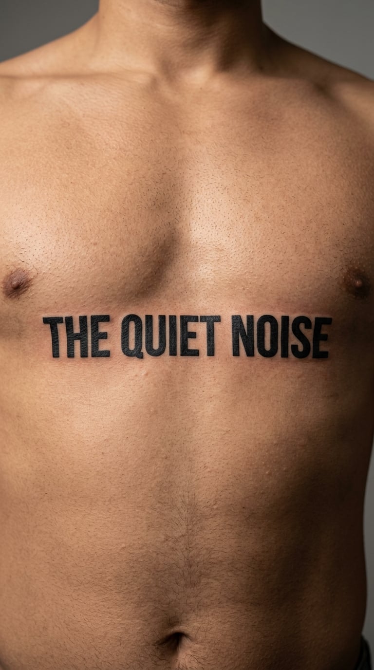
A short lyric line sits centred beneath the sternum in heavy black lettering, kept straight and no wider than the chest comfortably allows. The type follows the curve of the chest rather than fighting it.
This is the most exposed placement in the list, and it changes how people read you at a bar, a meeting or the beach. Men who want a lyric tattoo that plainly announces something usually end up here.
Placement: sternum, upper chest or ribs. Size: 4–6 inches (10–15 cm). Style: blackwork. Pain: medium to high, because the chest and sternum are sensitive and the session position limits movement. Chest movement and skin texture affect fine detail, so broad letters are the right call.
Make it yours: add a small date, a single red underline, or a thin border that follows the sternal line.
19. Watercolour Word Cloud Built from a Chorus
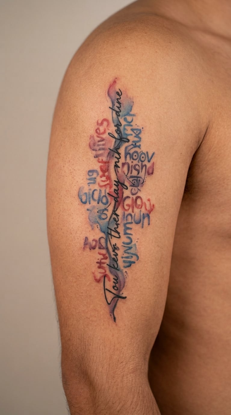
The strongest words from one chorus are arranged as a loose, asymmetric word cloud, with the main line darkest and the surrounding words progressively softer. Three colours maximum, with readable spacing throughout.
It works when the chorus has one obvious anchor line, because that line carries the reading order and everything else supports it. Loose clusters of words with no anchor turn into grey over time.
Placement: upper arm, back or thigh. Size: 5–9 inches (13–23 cm). Style: watercolour lettering. Pain: medium. Dense small words blur and colour edges migrate, so the piece needs real scale. More space between words means a more legible tattoo later.
Make it yours: pick a favourite word to enlarge, add a date, or fix the palette to the colours of a concert poster.
20. Fine-Line Music Note and One Repeated Word
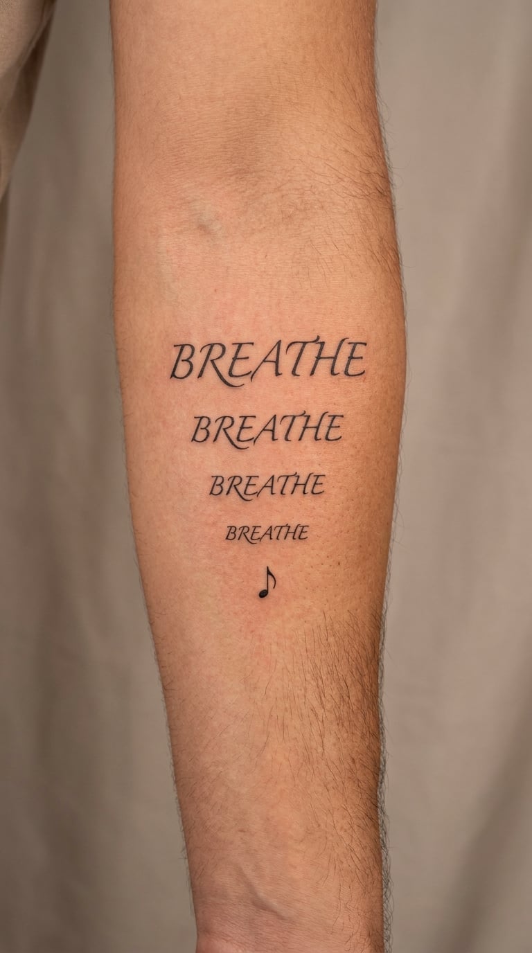
One meaningful word from the song repeats three or four times in a descending arrangement, anchored by a single small clean music note. The treatment is typographic, and no extra decorative symbols are added.
Repeating a single word rather than a whole line is a good option when the chorus is long and only one word is doing the work for you. It is also the least text-heavy idea here.
Placement: forearm, upper arm or shoulder. Size: 2.5–4.5 inches (6.5–11.5 cm). Style: fine line. Pain: medium. The note’s thin stem softens first, and repeated small letters need careful spacing so they do not merge during healing.
Make it yours: vary the word size descending, or add one colour wash behind the final repetition.
21. Old-West Typewriter Lyric on the Upper Arm
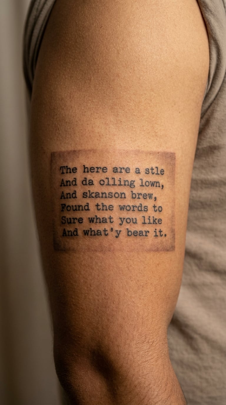
A short lyric is set in a sturdy vintage serif or typewriter-inspired face, with a small paper-shadow rectangle behind it that stops short of becoming a novelty illustration. Black ink carries the piece, with one muted brown accent.
Typewriter faces have a working-man, road-worn quality that reads well on men who want text rather than script. The serifs are also the main risk to plan around.
Placement: upper arm, forearm or thigh. Size: 4–7 inches (10–18 cm). Style: old-western typography or blackwork. Pain: medium. Small serifs soften noticeably within a few years, so the lettering must be scaled up rather than shrunk to fit a long line.
Make it yours: put the song title beneath the lyric, add a meaningful underline, or use the brown accent for a date.
22. Minimal Equaliser Bars Under a Lyric
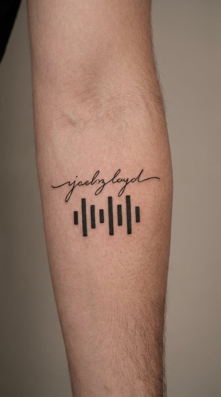
One readable lyric in a clean sans-serif line sits above a row of minimal equaliser bars of varied heights, with no colour and no realistic waveform detail. The bars suggest sound and stay out of the way.
Matching the bar heights to a specific song gives the design a private reference that nobody else can read, without relying on an album cover or a band logo.
Placement: forearm, upper arm or calf. Size: 3.5–6 inches (9–15 cm). Style: minimalist blackwork. Pain: medium. Very narrow bars fade or blur, so keep each bar at least an eighth of an inch wide and avoid a bar count high enough to look busy.
Make it yours: vary the bars to match a favourite track, or fill one bar in red to mark the chorus.
23. Two-Lined Hook in Dotwork on the Shoulder
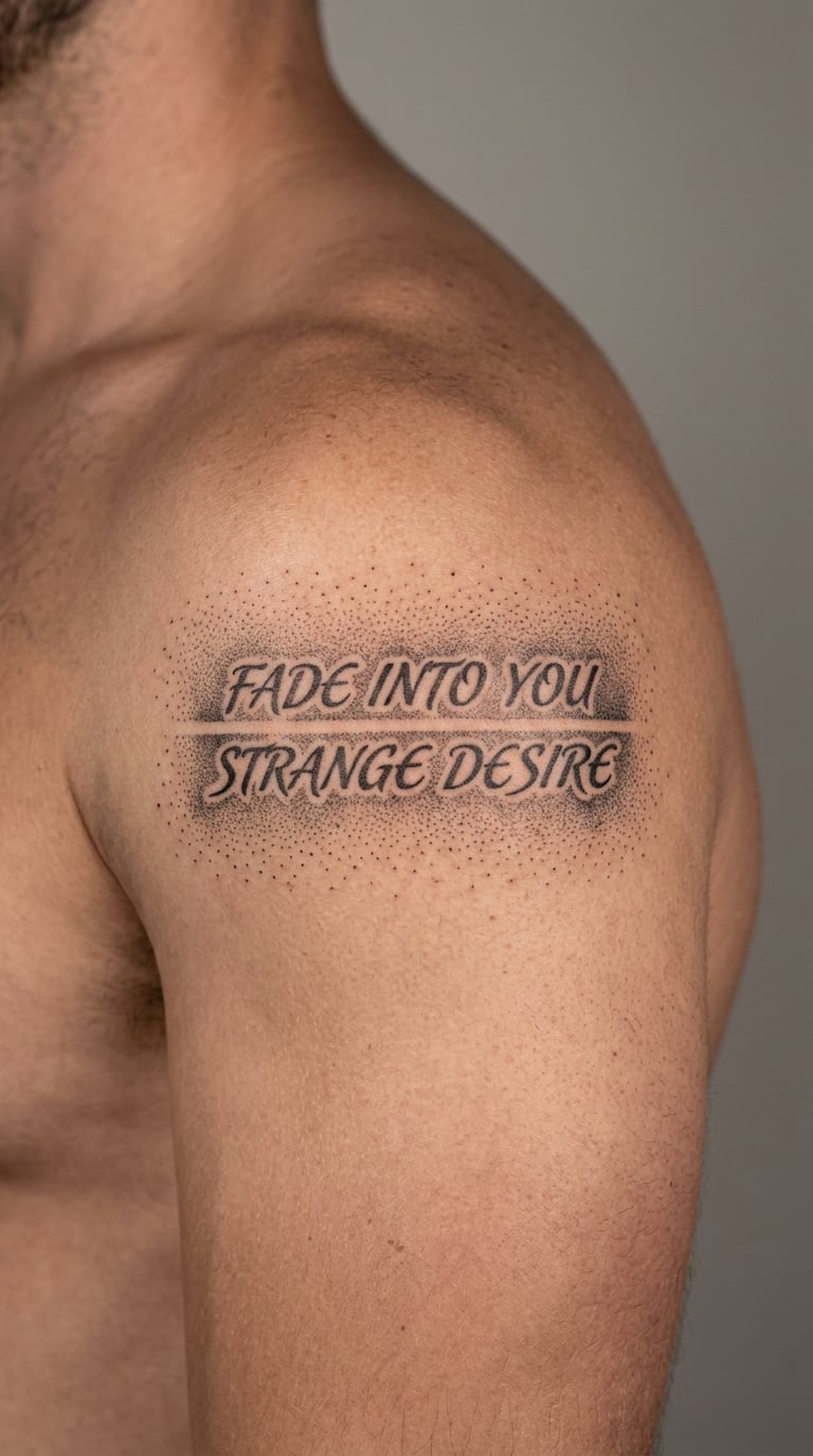
A short two-line lyric is surrounded by sparse, evenly spaced dotwork that fades away at the edges, using black and grey only. The lettering stays readable and the frame never becomes a dense ornamental border.
Dotwork softens the edges of a text piece without adding colour, and the gradient is what makes it feel less like a quotation and more like a finished composition.
Placement: shoulder, upper arm or upper back. Size: 4–7 inches (10–18 cm). Style: dotwork lettering. Pain: medium, and more time-consuming than solid black because the needle passes over the same skin repeatedly. Small dots and fine letters soften in high-wear or sun-exposed placements.
Make it yours: use a number of dots from a meaningful year, add one muted colour to a single word, or place the piece on the shoulder cap for a curved read.
24. Paper-Plane Ending with a One-Line Lyric
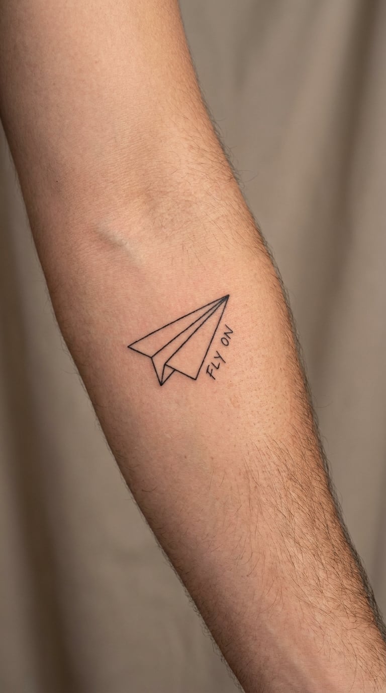
One short final lyric is paired with a simple black fine-line paper plane, with the words kept as the visual focal point and the illustration unbranded. The plane stays small and simple rather than detailed.
A paper plane suggests departure, distance or the end of a story without locking the design into one reading. It is a restrained way to close out a song lyric tattoo.
Placement: forearm, upper arm or calf. Size: 3.5–6 inches (9–15 cm). Style: fine line. Pain: medium. The plane’s thin edges need generous size to age well, so resist shrinking the whole design to fit a narrow area.
Make it yours: add a small route line trailing behind it, a date beneath the lyric, or leave a second plane for a later session.
25. Full-Width Blackwork Chorus for a Sleeve
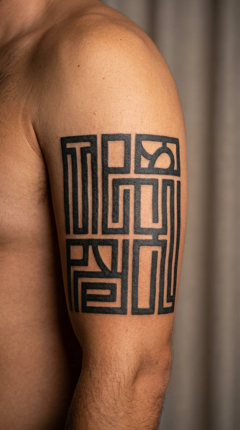
A larger single-panel chorus in bold black lettering is designed to anchor a future text-heavy sleeve, with consistent type, strong contrast and breathing room around the words. It does not copy an existing album layout.
This is the version to choose if you already know you want a text sleeve and are building towards it. Starting with the anchor line saves you from a sleeve that is later made up of filler imagery.
Placement: upper arm or outer thigh. Size: 7–11 inches (18–28 cm). Style: blackwork. Pain: medium over a longer session, and you will need breaks. Larger letters hold their shape far better than micro-text, but the full piece takes more time and costs more than a small script line. See our 25 Construction Tattoo Ideas for Men: Best Bold Designs for the heavy graphic work that pairs well with a text panel.
Make it yours: leave a lower-arm or inner-arm area deliberately open, and add one small meaningful mark inside the panel’s empty space.
How to Choose the Right Design
Five things decide whether a lyric tattoo still works in ten years, and all five come up before the first line is drawn.
- Check the wording yourself. Confirm the exact words, capitalisation and punctuation against the released track before the appointment. Bring the text written out, and tell your artist whether you want the words hand-lettered or traced from a typed font. Hand-lettered work usually ages more gracefully.
- Match type to tone. A heavy serif reads as solid and permanent, a clean sans-serif reads as modern and graphic, and a fine script reads as personal and quiet. Pick the one that matches how you want the piece to feel, not the one that looks best on someone else.
- Size for legibility, not for delicacy. Ask the artist to draw the lettering larger than your reference photo. If you want a comparable open layout, our 20 North Star Tattoo Ideas: Best Designs shows how much negative space changes how a small piece reads at a distance.
- Treat hands and fingers as temporary. Fine-line text on fingers, thumbs and the hand softens fastest of any placement. Unless you are comfortable with a touch-up or eventual re-lettering, choose the forearm, bicep, calf or upper arm instead.
- Test how it moves. Ask to see the design at the size it will be tattooed, on paper, held against the placement while you stand, sit and lift your arm. A line that looks level on paper will sit differently across a shoulder or a rib.
One practical note on length. A short excerpt is the right approach for a body tattoo; long passages turn into a wall of text that is hard to read and hard to live with. If you are reproducing a full verse anywhere, check what applies for that text before printing it at scale, and keep the tattoo to an excerpt you have the right to use.
Cost and Session Time
In the US, expect roughly $100 to $250 for a small single-line lyric, $250 to $600 for a medium composition with several lines or a colour element, and $600 to $1,500 or more for a full-width panel or sleeve-oriented work. Those are the ranges most US studios sit in, and an experienced lettering artist sits at the top of each one.
Cost follows size, and size follows lettering. A small single-line lyric on the inner forearm is usually a short appointment, often under an hour. A two-line bicep piece or a lyric inside a cassette sits somewhere in the middle, commonly an hour to an hour and a half. A full-width panel like idea 25 is a half-day job with breaks, and fine-line script regularly runs longer than expected because slow, steady needle work takes time.
What moves the number: how many hours the design needs, how much hand-lettering detail is involved, whether you are adding colour, where on the body it sits, the artist’s hourly rate, and the shop minimum. Most studios set a floor that a small piece still has to meet, so a tiny finger line and a simple forearm line can cost surprisingly similar amounts.
Ask for a two-part approach. Book a first session to lay down the text cleanly, then return for any softening or a second line once the first has healed. Fine-line work in particular often needs a free or paid touch-up check a few weeks later, and the healed result is the honest measure of how legible the piece will stay.
Aftercare Basics
- Follow your artist’s aftercare instructions first, since they know exactly how they worked your skin.
- Wash gently with clean water and unscented soap while the tattoo is fresh, and pat it dry rather than rubbing.
- Keep the new lyric tattoo out of soaking water, swimming pools and baths, and cover it in the shower for the first couple of weeks.
- Protect it from direct sun and friction. Clothing over a fresh forearm or rib tattoo rubs at exactly the places the new line is still settling.
- Keep the area and anything touching it clean, and change bedding and shirts more often than you would normally.
- Contact your artist, or a qualified clinician, if you notice anything unexpected such as spreading redness, heat, swelling or a line that suddenly feels raised weeks into healing.
Frequently Asked Questions
What is the best size for a song lyric tattoo?
For most song lyric tattoos for men, aim for a line roughly 3 to 5 inches wide with letter height around a quarter inch. Anything smaller stops being readable at arm’s length within a few years. Placement matters as much as measurement, because the inner forearm and wrist take more washing and movement than the upper arm. If your lyric is long, go bigger rather than squeezing the words in smaller.
Do fine-line lyric tattoos fade faster than other styles?
Yes, thin single-needle lines generally soften faster than bold lettering or solid blackwork, especially on hands, fingers and the inner arm. Grey, thicker lines in a heavier hand hold their shape noticeably longer. The fix is scale and line weight rather than placement alone: ask your artist to draw the text larger and heavier than the reference photo, and book a touch-up check once the piece has healed.
Are song lyric tattoos suitable on the hand or fingers?
They can be tattooed there, and plenty of men have them, but hand and finger text fades and fills in faster than almost any other placement because of washing, sun, shaving and constant movement. Expect a micro line on the side of a finger to need more than one touch-up over the years. If you are not comfortable with periodic re-lettering, choose the forearm, bicep, calf or upper arm instead.
How do I choose a font for a lyric tattoo?
Choose the font that matches the tone you want, then check its weight at tattoo size. Heavy serif and clean sans-serif letterings are the most durable, while fine script and typewriter faces with small serifs soften fastest. A good rule is that every letter should have at least one visible line width of ink. Bring a typed sample to the appointment and let the artist hand-letter it rather than tracing a font exactly.
Do I need permission to tattoo a full song lyric?
Song lyrics are copyrighted, and how much can be reproduced varies by country. A short excerpt is the usual approach for a body tattoo, and reproducing an entire verse is where questions start. This is general information rather than legal advice, so if you want a long passage, check what applies where you are before getting it done at scale.
How much does a small lyric tattoo cost in the US?
Cost depends far more on session length and artist rate than on how small the design looks in a photo. A single-line lyric on the inner forearm is usually the quickest option, while anything with several lines, colour or a placement on the ribs or chest takes longer. Most studios have a shop minimum that small pieces still have to meet, so ask for the artist’s hourly rate and the expected hours at your consultation.
Conclusion: Where to Start
For a first song lyric tattoo, a single fine-line line on the inner forearm, upper arm or behind the ear is the easiest place to start. It is quick, it heals simply and it gives you a live demonstration of how your skin takes lettering before you commit to anything larger.
If you are already building a text-focused collection, the bold chorus panel or the bracketed blackwork line is the stronger second move. Either way, finalise the exact words, compare artists’ lettering portfolios, and ask for a design drawn for your specific placement before you book.