
20 Best Tattoo Ideas for Coffee Lovers: Small & Bold (2026)
A coffee lover lives a small daily ritual: kettle on, grinder turning, first cup before anything else happens. Tattoo ideas for coffee lovers turn that ritual into ink, and the best ones are the designs an artist can read cleanly at two inches across rather than the glossy realistic cup photos that blur into a smudge within a year.
Below are 20 coffee tattoo designs, each with a realistic size in inches, the placement that flatters it most, an honest pain note and one way to make it personal. A few of these are quiet enough to hide under a sleeve, a couple are detailed enough to anchor a growing collection. If you already have one small ink, cat silhouette tattoo ideas for minimalists show the same small-scale approach with a different motif.
Tattoo Ideas for Coffee Lovers: Quick Guide
Every design below is listed in the same order it appears, with the practical details in one place so you can compare them before you talk to an artist.
| Idea | Style | Best placement | Size | Pain |
|---|---|---|---|---|
| 1. Fine-line espresso cup with a splash | Fine line, single needle | Inner forearm | 2.5-3 inch | Low to medium |
| 2. Latte-art rosettone in a saucer cup | Clean black linework | Upper back of the hand | 2-2.5 inch | Medium to high |
| 3. Minimal pour-over cone and slow drip | Fine line, single needle | Outer forearm | 3 inch | Medium |
| 4. Vintage moka pot with warm accent | Blackwork with sepia | Calf | 4 inch | Medium |
| 5. French press surrounded by steam | Black and grey | Inner upper arm | 4 inch | Medium |
| 6. Coffee cherry and bean mosaic | Dotwork with colour | Behind the ear | 1.5 inch | Medium |
| 7. Coffee plant branch with red cherries | Botanical realism | Outer forearm | 5 inch | Medium to high |
| 8. Twisted beans in a geometric spiral | Blackwork geometry | Shoulder blade | 5 inch | Medium to high |
| 9. Tulip latte cup with delicate steam | Fine line, single needle | Inner wrist | 2 inch | Low to medium |
| 10. Takeaway cup with a blank sleeve band | Illustrative blackwork | Calf | 3 inch | Medium |
| 11. Hand grinder with scattered beans | Fine line with grey shading | Outer upper arm | 4 inch | Medium |
| 12. Minimal portafilter cross section | Precise blackwork | Rib area | 4 inch | High |
| 13. Blue-grey steam spiralling from a cup | Black with muted colour | Wrist | 2.5 inch | Low to medium |
| 14. Coffee splash wreath with two cherries | Brush-stroke blackwork | Ankle | 3 inch | Medium |
| 15. Cinnamon stick and star anise pairing | Brown and black still life | Inner arm | 3 inch | Medium |
| 16. Whipped cream swirl in a small cup | Bold blackwork | Outer forearm | 2 inch | Medium |
| 17. Coffee-stain ring with a tiny bean | Soft stipple | Wrist | 2 inch | Low to medium |
| 18. Drip carafe with a bean-shaped handle | Fine line with transparency | Calf | 5 inch | Medium |
| 19. Coffee cherry bouquet in a teacup | Fine line with colour accent | Inner forearm | 3 inch | Medium |
| 20. Espresso machine with a bean ribbon | Blackwork with colour | Upper back | 6 inch | High |
1. Fine-Line Espresso Cup With a Splash
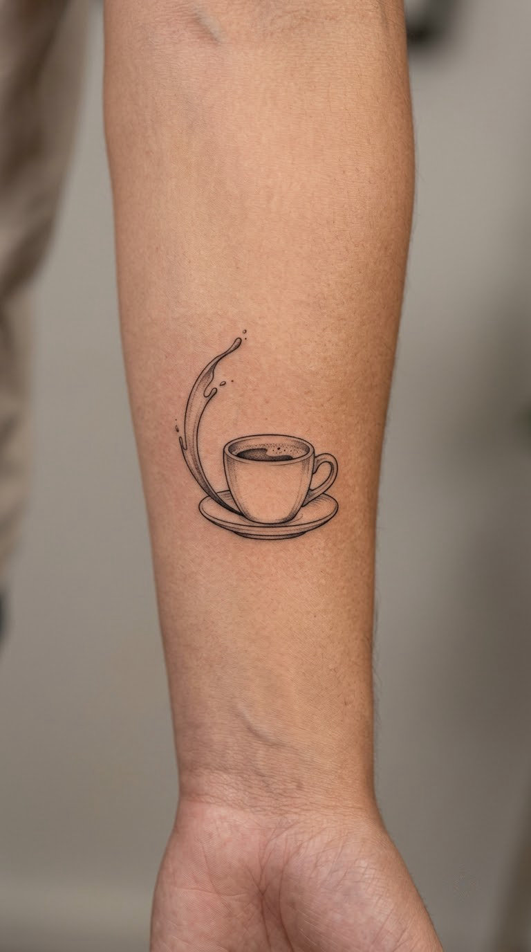
A side-view demitasse drawn with one consistent needle weight, a small crown of crema drawn as three tight curves, and a single splash arcing away from the rim. One restrained shading accent under the handle is all the depth it needs.
Most people choose it because espresso, not coffee in general, is their drink. It reads as a considered choice rather than a joke.
Placement: inner forearm, or the soft area just above the ankle bone. Size: 2.5 to 3 inches (6-7.5 cm) across. Style: fine line, single needle.
Pain: low to medium on the inner forearm, a brief sting with each pass. The fine line is the ageing risk here. Single-needle work on a soft inner surface softens visibly over five to seven years, and the splash is the first element to go.
Make it yours: swap the splash for a small crescent or a thin band of steam shaped like a date.
2. Latte-Art Rosettone in a Saucer Cup
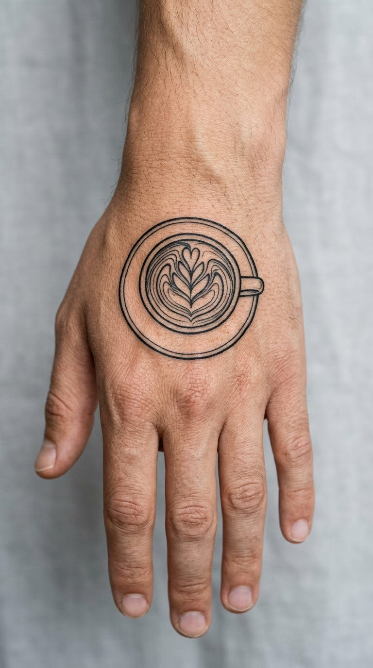
Seen from directly above: a circular cup, a thin saucer ring, and a rosettone of seven or nine leaves pulled into a heart at one edge. The linework is even and unfilled, which is what makes it look drawn rather than shaded.
Baristas pick this because it is the one coffee image that proves they know what the foam actually does. A long-time customer usually ends up with something less technical.
Placement: upper back of the hand, or a shoulder blade where the circle can sit flat. Size: 2 to 2.5 inches (5-6 cm) including the saucer. Style: clean black linework.
Pain: medium to high. Hands are bony, the skin between the knuckles is thin, and nine separate leaf shapes mean nine passes over the same patch. Expect the session to be uncomfortable and a little slow.
Make it yours: reduce the rosettone to five leaves and add a single line of text under the saucer, or change the heart into a bean shape.
3. Minimal Pour-Over Cone and Slow Drip
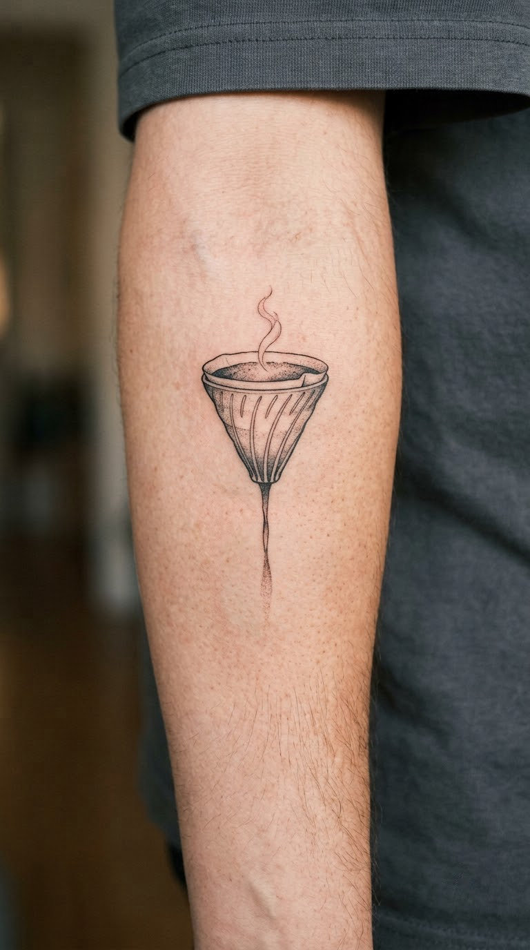
A tall cone drawn in outline, a narrow stream of coffee falling into it, and one steam curl that breaks away from the drip. No shadow, no filter texture. The whole design depends on the gap between the stream and the cone being even.
It suits people who brew at home rather than people who work in coffee. The shape says method, not shift.
Placement: outer forearm, where the cone gets a flat vertical run of skin. Size: 3 inches (7.5 cm) tall. Style: fine line, single needle.
Pain: medium. The outer forearm has more give than the inner arm, and the steam curl is the part that will blur first if the artist rushes the line weight.
Make it yours: add a small numeral for the brew ratio you always use, or run the steam curl into a letter from a name.
4. Vintage Moka Pot With a Coffee-Coloured Accent
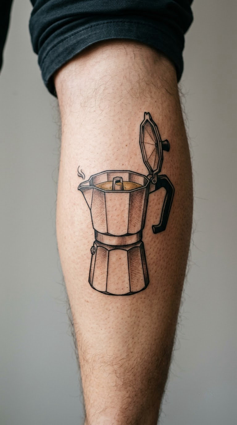
The octagonal moka pot drawn with hard black edges and flat shading blocks, with a restrained sepia or warm brown filling the open top chamber. Keep the colour to one or two small areas. A fully coloured pot goes muddy as the brown breaks down.
The nostalgia angle is real. A lot of people grew up hearing that stovetop rattle, and the moka pot is the machine that carries it.
Placement: calf, or the outer upper arm. Size: 4 inches (10 cm) tall. Style: blackwork with a sepia accent.
Pain: medium. The calf is fleshy and forgiving, but the pot’s facet lines need reworking as the skin stretches over the calf muscle. Brown ink also fades first, so expect the accent to pale within a few years.
Make it yours: have the handle wrapped with a thin ivy stem, or engrave a family initial into the base.
5. French Press Surrounded by Steam
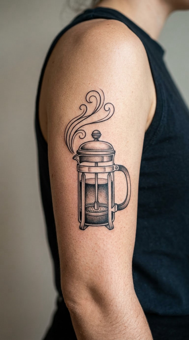
A glass press drawn in outline with the plunger rod visible through it, the coffee level marked as one soft grey band, and three steam lines flowing upward and outward. The transparency is the whole trick, so the artist leaves the glass mostly empty.
People who slow their mornings down tend to choose this. It is a weekend-drink image, not a grab-and-go one.
Placement: inner upper arm, where there is room for the steam to travel. Size: 4 inches (10 cm) tall including the steam. Style: black and grey.
Pain: medium, with a noticeable sting on the rib-adjacent part of the upper arm. The three steam lines are the ageing concern: at this size they hold, but scale below three inches and they merge.
Make it yours: change the coffee level to a thin line and add a small date underneath, marking the year you started buying beans properly.
6. Coffee Cherry and Bean Mosaic
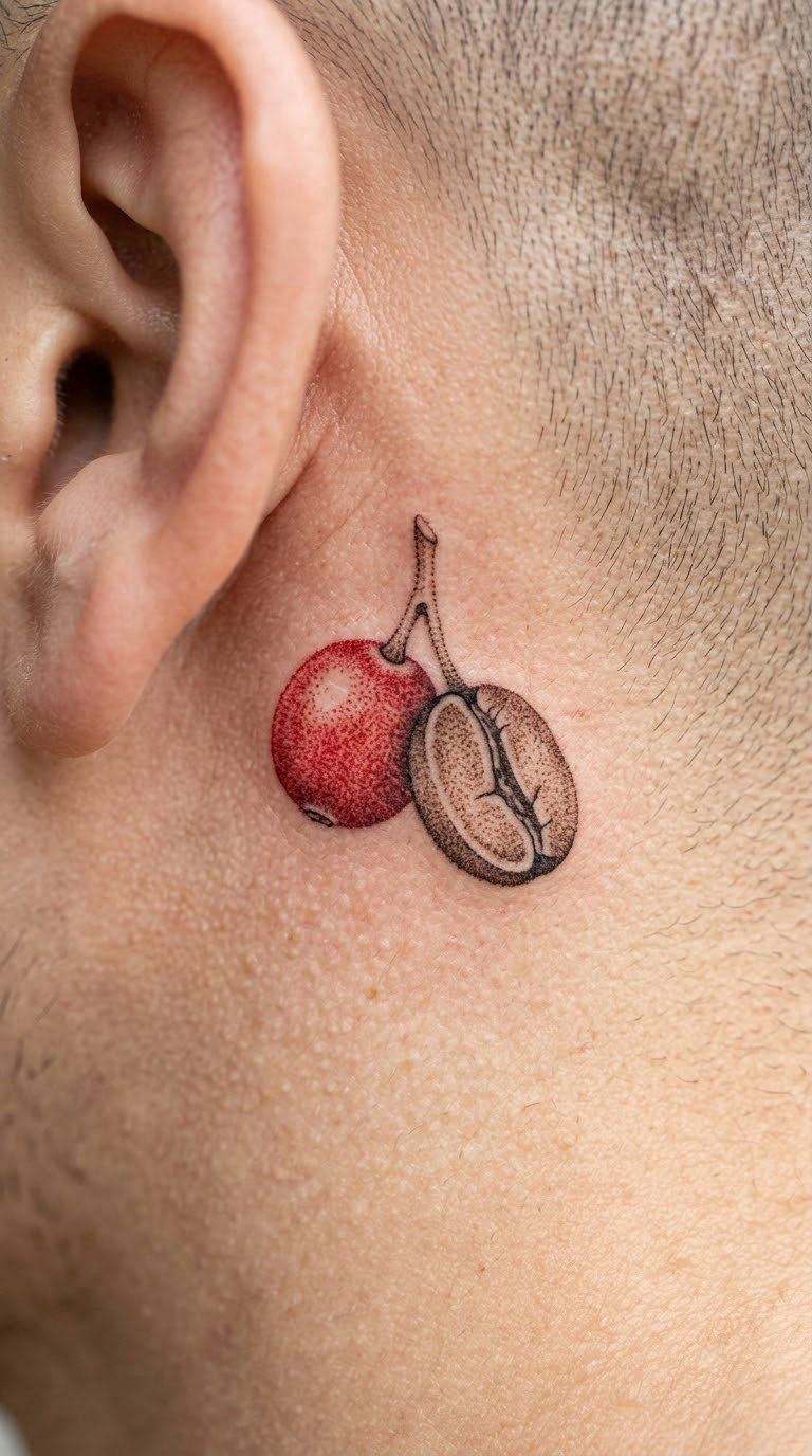
One coffee cherry with its stem, joined to a single coffee bean split down the centre to show the pale inner crease. Both are built from tight dotwork, with red used only on the cherry skin and brown only inside the split.
It is a botanical choice disguised as a small one. That pairing is why it reads more considered than the usual lone bean.
Placement: behind the ear, or the inner ankle. Size: 1.5 inches (4 cm). Style: dotwork with a colour accent.
Pain: medium. Behind the ear is fleshy and awkward to reach, and the session takes longer than the size suggests. At 1.5 inches, ask the artist to keep the dot rows chunky, because fine dots grey out over time.
Make it yours: make it a matching pair, one behind each ear, with the cherries facing away from each other.
7. Coffee Plant Branch With Red Cherries
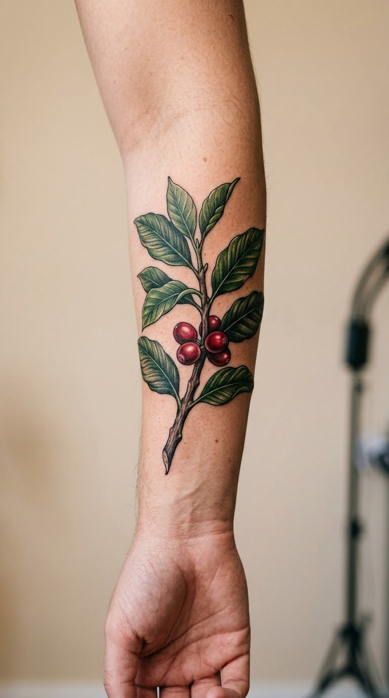
A single branch with waxy pointed leaves, veins drawn individually rather than suggested, and a few cherries in deep red at different ripeness stages. This is the design that rewards a patient artist and a long session.
It marks where coffee comes from, which is the part most cup tattoos leave out. People who care about sourcing usually land here. There is more to explore in 70+ coffee plant tattoo ideas if you want more botanical references before you book.
Placement: outer forearm along the radius, or the calf. Size: 5 inches (13 cm) long. Style: botanical realism in colour.
Pain: medium to high, and the longest sitting of the twenty. Vein detail means many small passes, and the forearm is a moving surface. Green and red soften noticeably in the first two years, so a touch-up in year one is normal.
Make it yours: add the height or region where your favourite beans come from in tiny script along the branch.
8. Twisted Coffee Beans in a Geometric Spiral
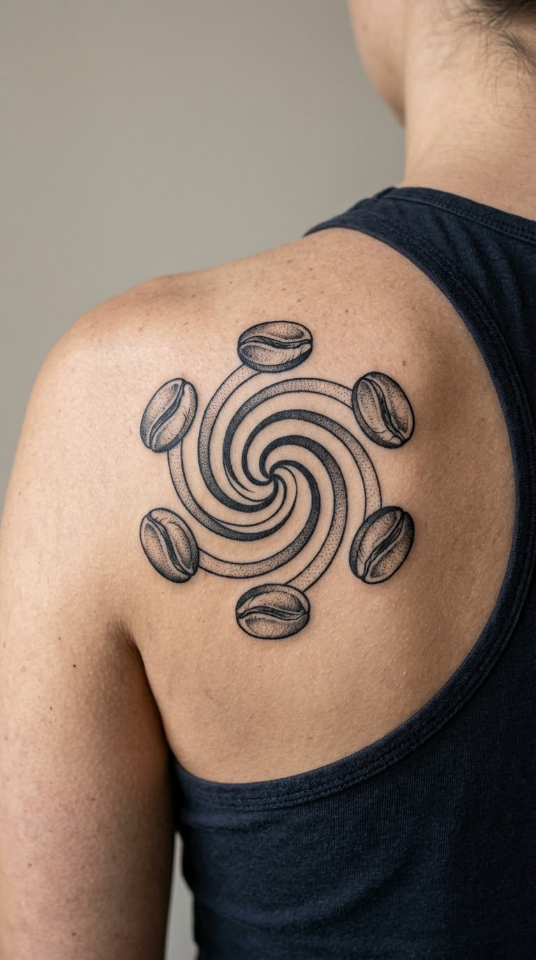
Six or eight coffee beans rotating around a circle, each one drawn with a strong contour line and one central crease. Dotwork shading between them keeps the rotation readable without adding grey blocks.
The symmetry appeals to people who like order. It is the most graphic coffee design here, and the one that sits best next to geometric work you already own.
Placement: shoulder blade, or the outer thigh. Size: 5 inches (13 cm) across. Style: blackwork geometry.
Pain: medium to high. The shoulder blade moves constantly, so the artist works in short sections and the design is finished across two or three sessions on some bodies. Bold contour lines age better than anything else on this list.
Make it yours: alternate the bean rotation so every other bean faces the other way, or set the circle inside a thin ring of text.
9. Tulip Latte Cup With Delicate Steam
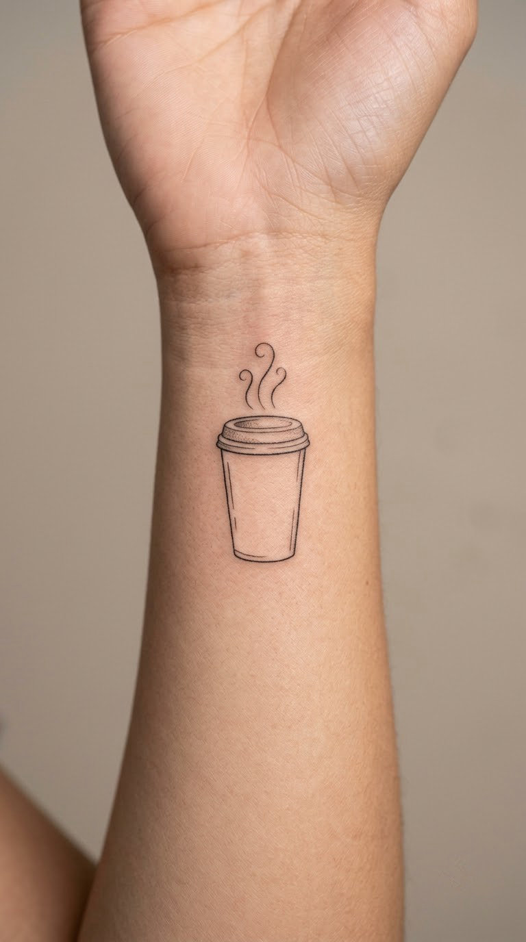
A tapered cup in outline, layers of foam suggested by two or three wavy lines inside the rim, and three thin steam strokes lifting from the top. Nothing else. The restraint is the point.
It reads as a coffee order rather than a piece of kitchen equipment, which makes it the easiest design here to give someone who is not deep into brewing.
Placement: inner wrist. Size: 2 inches (5 cm) tall. Style: fine line, single needle.
Pain: low to medium. The inner wrist is a thin area, so it stings more than the forearm but the sitting is short. Inner wrist skin creases with movement, so the steam strokes and the foam lines soften fastest on this placement. If you want it to stay sharp, the outer forearm holds better. Small pieces on the wrist work well alongside minimalist wrist band tattoo ideas if you already collect ink there.
Make it yours: add a tiny dot for each year you have drunk the same order, stacked under the cup.
10. Takeaway Cup With a Blank Sleeve Band
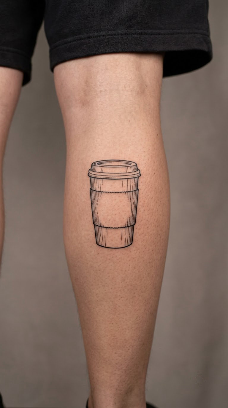
A paper cup drawn with light texture lines to suggest corrugation, and a sleeve band left completely blank. The blank band is the design decision that makes it yours rather than a copy of a café logo.
It is the one people ask about most, because the sleeve is where branding usually lives. Keeping it empty means the cup is a shape, not an advertisement.
Placement: calf, or the outer arm. Size: 3 inches (7.5 cm) tall. Style: illustrative blackwork.
Pain: medium, and calm, since the calf is an easy surface. The texture lines are the ageing point: at three inches they hold, but push for four inches or the corrugation turns to grey fuzz.
Make it yours: have your initials or a short word put inside the sleeve band in the same weight as the cup outline.
11. Hand Coffee Grinder With Coffee Beans
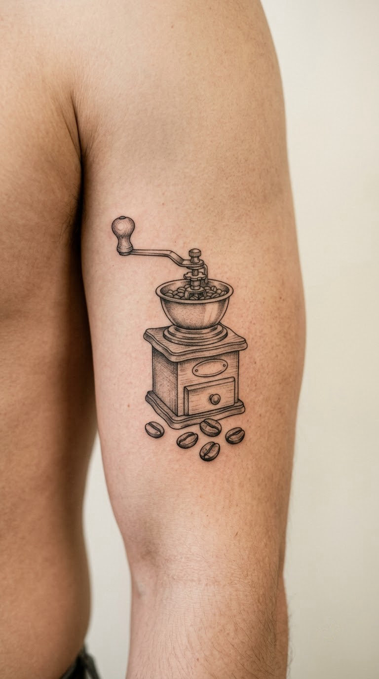
A crank grinder drawn in linework: the body, the crank handle at an angle, the draw knob, and a small scatter of beans at the base. A little grey in the metal keeps it from looking like a stencil.
It is a slower, quieter object than a cup, which suits people who like the preparation as much as the drink.
Placement: outer upper arm, or the outer thigh. Size: 4 inches (10 cm) tall. Style: fine line with grey shading.
Pain: medium. The beans give the artist a natural break, so the sitting splits into two comfortable stretches. Keep the crank handle one line weight or it dominates the whole design.
Make it yours: have the beans at the base show your usual brew method, or replace the crank with a small hand-drawn arrow.
12. Minimal Espresso Portafilter Cross Section
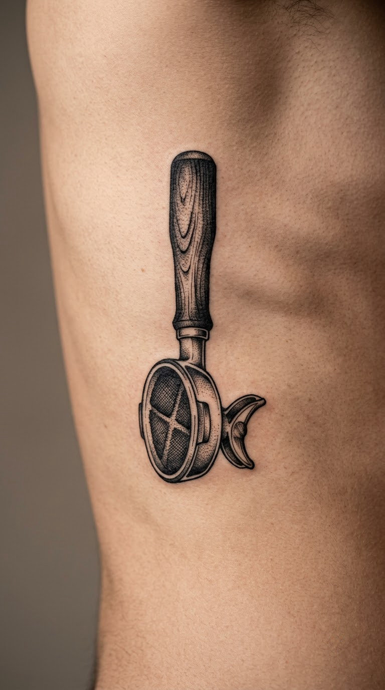
A side-view portafilter with the basket cut open so the divisions are visible, and one area of crosshatched grounds where the coffee sits. No lettering, no brand marks, no gauge on the handle.
This is the barista’s choice. It rewards someone who knows what the machine part actually does.
Placement: rib area, or the inner forearm for a less painful version. Size: 4 inches (10 cm) wide. Style: precise blackwork.
Pain: high on the ribs, one of the more uncomfortable spots on this list. The skin is thin and the skin stretches as you breathe, so the artist may ask you to hold still in sections. The forearm version hurts noticeably less and looks nearly as good.
Make it yours: add the diameter of your basket as a small numeral inside the handle, or leave the grounds area empty for a negative-space piece.
13. Blue-Grey Steam Spiralling From a Cup
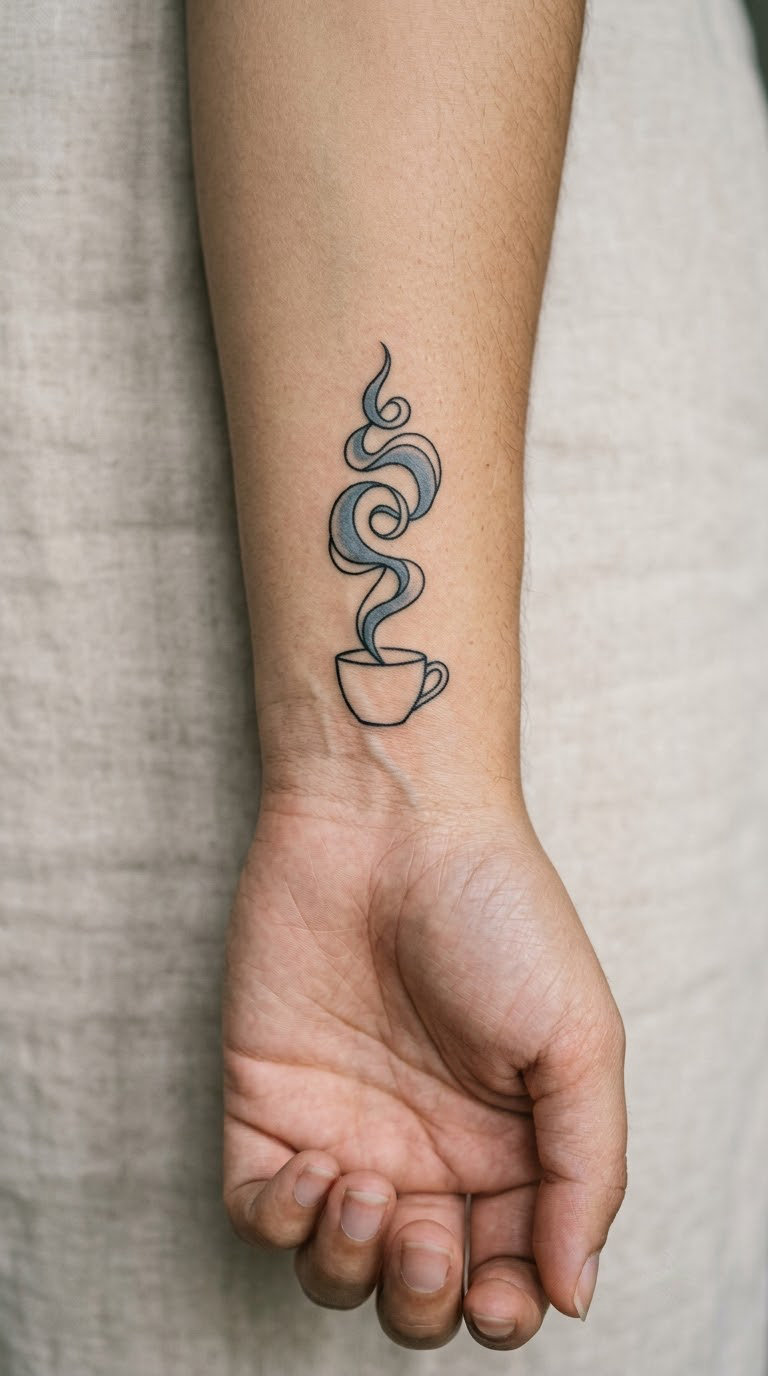
A simple cup in black outline, with one spiralling plume above it filled in a muted slate blue rather than a literal steam colour. The blue is the whole idea, and it needs to stay grey-toned so it does not turn bright or cold on skin.
It is a common request from people who like cool-toned palettes and do not want a full-colour piece. One colour accent keeps it wearable.
Placement: wrist, inner forearm or behind the ear. Size: 2.5 inches (6 cm) tall. Style: black line with one muted colour.
Pain: low to medium. The spiral is filled, not lined, so the needle runs continuously and it feels smooth rather than scratchy. The blue is the first thing to fade, and pale blue on pale skin needs a patch test before you commit.
Make it yours: change the blue to a single colour from another tattoo you already have, so the piece reads as part of the same set.
14. Coffee Splash Wreath With Two Cherries
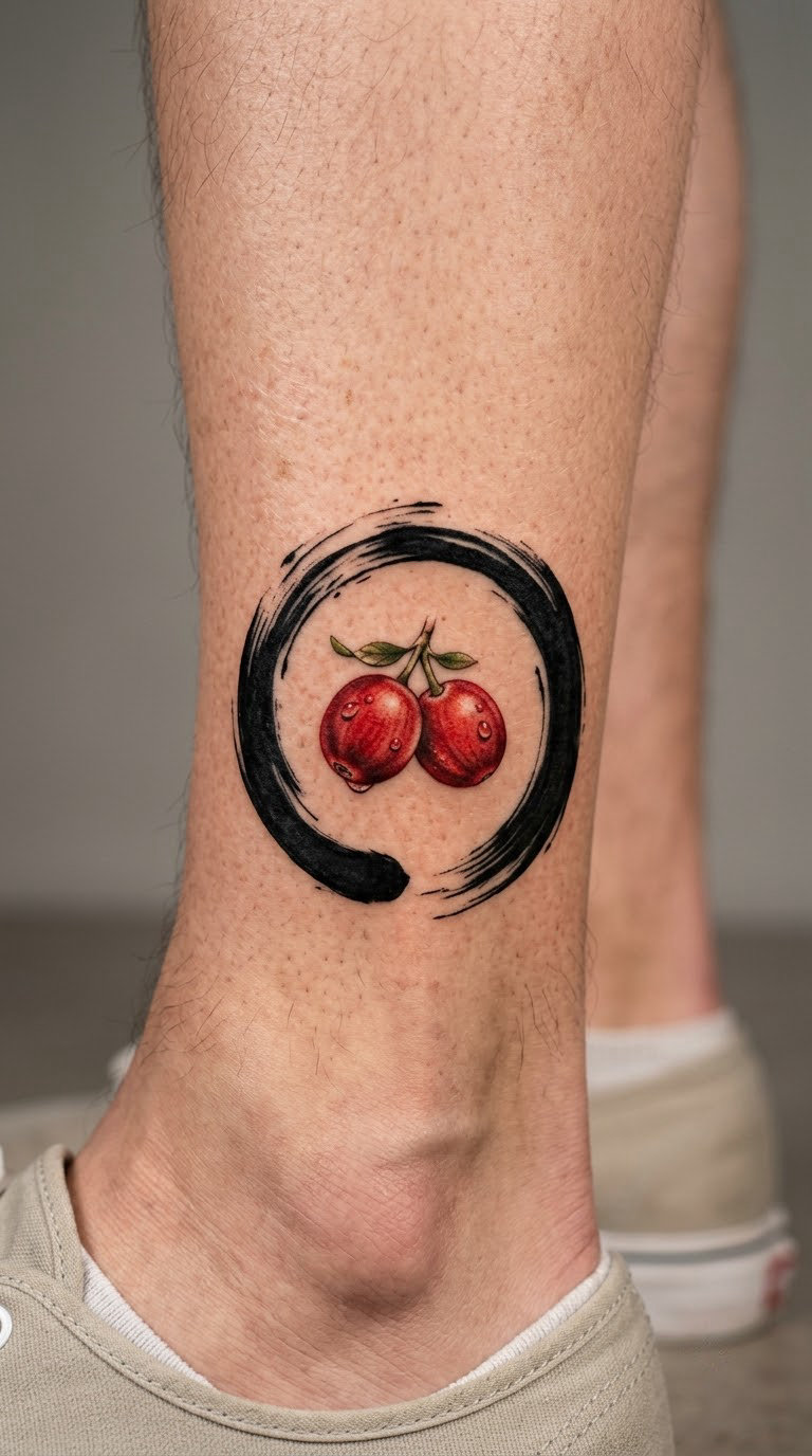
A circle made from loose brush strokes rather than a clean outline, holding two red coffee cherries and three or four tiny droplets escaping the edge. The irregular line is the point, so it suits a piece that is meant to look hand-drawn.
Unlike the tight geometry of the bean spiral, this one has movement in it. People who describe their coffee habit as chaotic usually pick it.
Placement: ankle, outer arm or hip. Size: 3 inches (7.5 cm) across. Style: brush-stroke blackwork with a colour accent.
Pain: medium. The ankle bone is the tender part, so sit with the foot propped up. Brush strokes are forgiving as they heal, which makes this a good choice for a first attempt at a larger piece.
Make it yours: have the droplets land outside the circle in a pattern that only makes sense to you, or add your initials where the circle closes.
15. Cinnamon Stick and Star Anise Pairing
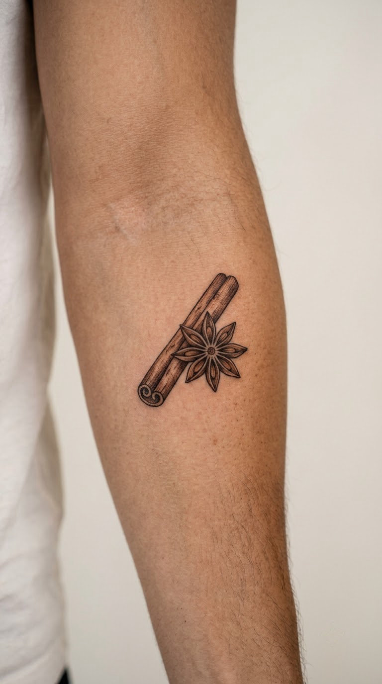
One cinnamon stick crossed diagonally with a star anise, bark drawn with short directional strokes and the anise’s eight points kept clearly separated. Warm brown does most of the work, with black holding the outlines.
Most coffee tattoos skip the cup entirely. This one is about the smell of the kitchen, not the drink, and it reads well next to a plain line piece.
Placement: inner arm, or the back of the hand. Size: 3 inches (7.5 cm) across. Style: brown and black still life.
Pain: medium. The inner arm is sensitive but the session is short. Two colours mean the artist works in passes rather than continuously, so you will be repositioned often. Warm browns fade to a soft tan within a few years, and the bark texture is the first detail to go.
Make it yours: add a third spice such as a clove or a cardamom pod, or wrap the whole pairing in a thin band of a larger piece.
16. Whipped Cream Swirl in a Small Cup
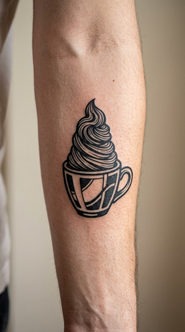
A small cup with a high whipped-cream swirl towering above the rim, the spiral drawn in bold black texture. The exaggerated height is what makes it playful, and it works best with heavier line weight than the rest of this list.
It is the least serious design here, which is exactly why people choose it. It also has the most forgiving healing, since heavy black lines are the last thing to soften.
Placement: outer forearm, or the calf. Size: 2 inches (5 cm) tall, though the cream needs most of that. Style: bold blackwork.
Pain: medium. The spiral means repeated passes over a small area, so it feels more intense per square inch than the size suggests. The cream texture is where the artist earns their time, and it is the part worth paying for.
Make it yours: swap the whipped cream for a latte-art heart, or add a small cherry resting on top of the spiral.
17. Coffee-Stain Ring With a Tiny Bean
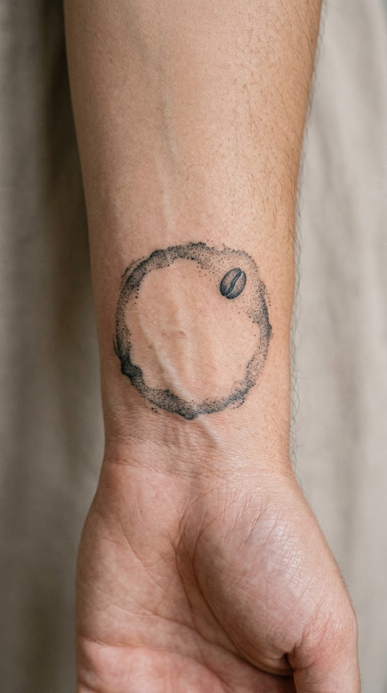
An imperfect ring with a soft, uneven edge, drawn as if the coffee is almost gone from the cup, with one solid coffee bean sitting slightly off centre. The asymmetry is deliberate, and an artist who tries to make it a perfect circle misses the point.
It is the most abstract design in the list, which gives it room. A lot of people use it to mark something that has gone quiet rather than something that happened.
Placement: wrist, or the inner forearm. Size: 2 inches (5 cm) across. Style: soft stipple.
Pain: low to medium, and a short sitting. Because the ring is stipple rather than line, it is far more forgiving over time than a fine-line cup in the same spot. That makes it a sensible first piece on a wrist.
Make it yours: have the bean sit at a specific angle that matches something in your life, or scale the ring to the size of an actual cup you own.
18. Drip-Brew Carafe With a Bean-Shaped Handle
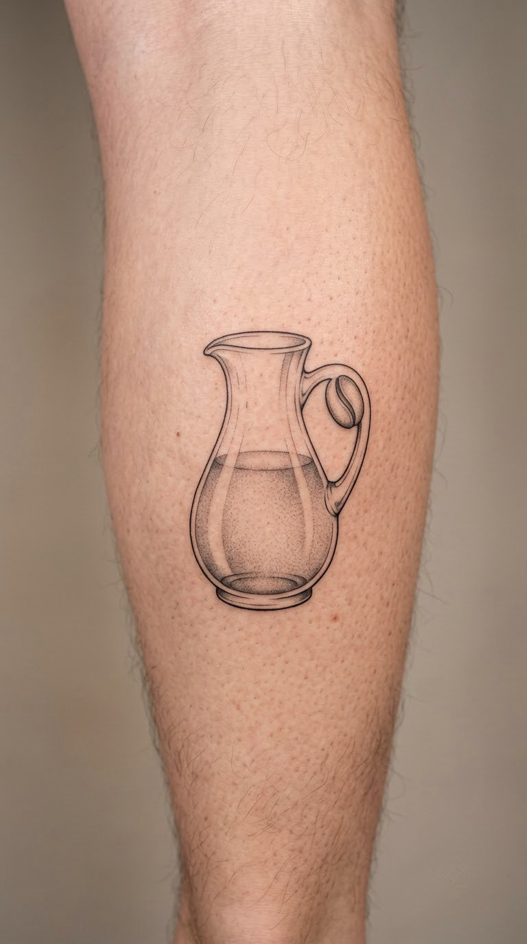
A clear brewing carafe drawn almost entirely in outline, with the handle shaped like a coffee bean and left open in the middle. A light grey wash in the bottom third suggests coffee without filling the shape.
The bean handle is the twist, and it works because it is a real visual pun rather than a gimmick bolted onto a drawing. It suits people who like clever object design.
Placement: calf, or the outer forearm. Size: 5 inches (13 cm) tall. Style: fine line with grey wash.
Pain: medium over a long sitting. The handle outline is thin, and a thin outline that curves tightly is exactly the work that softens first. Ask for a slightly heavier line here than you think you need.
Make it yours: mirror the handle on a second carafe so the two bean shapes face each other, or add a small steam wisp that ties it to the cup designs.
19. Coffee Cherry Bouquet in a Tiny Teacup
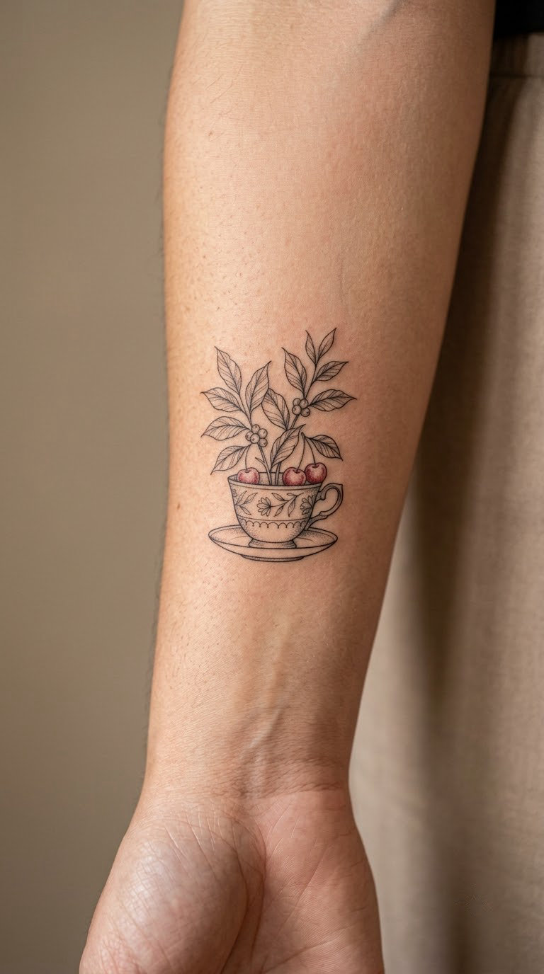
A small teacup used as a vase, holding two leafy coffee stems and three cherries rather than a bouquet. The stems lean out of the cup at different angles so it does not read as symmetrical.
It combines two of the strongest motifs in this guide, the cup and the plant, without turning into a cluttered piece. That balance is why it is worth the extra session time.
Placement: inner forearm, or the collarbone area. Size: 3 inches (7.5 cm) tall. Style: fine line with a red colour accent.
Pain: medium. The stems cross over the cup rim, so a few areas get worked twice. Red on a cherry is small enough that it does not dominate, and it fades much more slowly than a pale blue would.
Make it yours: add a fourth cherry at a different stage of ripeness, or match it with a single cherry behind the ear later.
20. Espresso Machine With Flowing Bean Pattern
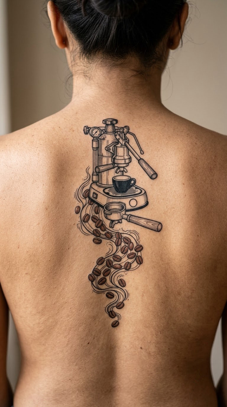
A compact generic machine silhouette with a portafilter attached, unbranded, and a ribbon of brown beans flowing out beneath it as though the machine were pouring them. The bean ribbon softens an otherwise hard mechanical shape.
This is the piece to pick when you are adding to an existing collection rather than starting one. It is the most ambitious design here and it needs an artist who draws machinery well.
Placement: upper back, or the outer thigh. Size: 6 inches (15 cm) wide. Style: blackwork with a brown accent.
Pain: high, and long. The upper back is awkward to reach, so budget for a break-heavy sitting or two sessions. The good news is that bold machine edges age well, and the brown beans are the only part likely to need a later touch-up.
Make it yours: have the bean ribbon curve toward an existing piece so the two read as one composition, or have the portafilter turned slightly as though in use.
How to Choose the Right Design
Most coffee tattoos disappoint for one reason: the detail was drawn at a size that cannot hold it. Work through these six checks before you settle on a reference.
Choose by what stays readable at your size
Look at your design at actual size on a phone, not zoomed in. If the steam, the crema or the crosshatched grounds disappear at that scale, ask the artist to simplify rather than to keep the detail. Fine-line work under two inches softens faster than most people expect, and the outer forearm and upper arm hold line better than the inner wrist, fingers or hands.
Decide on colour or black before you pick the reference
Black and grey holds its shape for decades. Brown, cream, caramel and any pale blue will fade, and warm browns on pale skin can look muddy within a couple of years. If a reference is mostly warm brown, ask to see the design in black first. You may prefer it. If you want colour, keep it to one or two small areas rather than a full wash.
Match the piece to the rest of your ink
Count what you already have and look at the line weight across it. A single-needle cup next to heavy blackwork looks like two different people, and a bold piece next to nothing reads as a first tattoo no matter how large it is. If your existing work is all fine line, the espresso cup, tulip latte or pour-over cone will sit with it. If you have bold pieces, the moka pot, portafilter or machine composition will match better.
Pick the placement before the design
Inner forearm, inner wrist, calf and behind the ear suit small pieces and stay out of sight in most workplaces. Hands, fingers, neck and full forearm draw attention and read as visible in a conservative office. Ribs and collarbone hurt noticeably more for very little extra design space. Decide where it goes first, then find a design that fits that flat area of skin.
Check the design still means something without a caption
Ask yourself what the piece says to someone who does not know you. A rosettone says barista, a hand grinder says home brewer, a moka pot says nostalgia, and a splash wreath says nothing in particular, which is a perfectly good reason to want it. Just be clear about which of those you are after before the stencil goes on.
Have the artist redraw your reference for your body
Plenty of the coffee tattoo photos online are generated images rather than real healed tattoos, and even real ones were drawn for a different body. Bring the reference, but expect the artist to reshape it around your proportions. A cup that looks 3 inches wide on a flat image may need to be 2.5 inches on a wrist to hold the same proportion.
Cost and Session Time
Most US studios charge a flat hourly rate or a shop minimum rather than a price per design, so size and detail drive the bill more than the motif does. A micro piece under half an inch usually costs the shop minimum and takes 20 to 40 minutes. A small design of one to two inches generally runs 45 minutes to an hour and a half. Medium pieces from three to five inches need two to three hours, and a larger colour or blackwork composition like the machine-and-bean piece can take four hours or a second session.
Rates vary a great deal by city and by artist, and shop minimums can be higher than the work itself costs. Portrait and realism specialists usually charge more than generalists, which is worth paying for on the botanical branch and the moka pot. Ask for the total before you start, and ask whether the artist charges by the hour or by the piece.
Aftercare Basics
- Follow your artist’s aftercare instructions first. They know what they did in your session, and general advice can contradict their technique.
- Wash the area gently with lukewarm water and unscented soap, then pat it dry with a clean towel or paper towel rather than rubbing it.
- Protect the fresh tattoo from friction and heat for the first few days. Loose clothing over the area beats a tight sleeve.
- Avoid swimming, soaking and long hot showers until the skin has fully healed, and keep it out of direct sun while it settles.
- Keep the ink clean and let any scabbing run its course. Picking at flakes is the most common cause of patchy healing.
- Watch for unusual changes such as spreading redness, warmth or a tattoo that stays raised after several weeks, and go back to the studio that did the work if you notice them.
Frequently Asked Questions
What is the best small tattoo for someone who loves coffee?
The fine-line espresso cup at two to three inches is the safest first choice. It has a clear silhouette, needs only one shading accent, and reads well even if some detail softens. A coffee-stain ring with a tiny bean is quieter still. Avoid steam curls and rosettone leaves below two inches, since both fill in as they heal.
Do fine-line coffee tattoos fade faster on the wrist or fingers?
Yes, both fade faster than the forearm or calf. The inner wrist creases constantly and fingers wash, stretch and rub through clothing all day, so single-needle work there loses definition within a few years. The outer forearm and upper arm hold fine lines best. If you want the smallest possible design, choose a spot based on placement rather than size.
Should a coffee cup tattoo be done in black ink or colour?
Black holds its shape far longer, so it is the safer choice for a cup that has to last decades. Colour gives you crema, foam layers and red cherries, but warm browns and pale blues fade within a few years and can look muddy on lighter skin. A good compromise is a black linework design with one small red or warm-brown accent.
Where can I place a small latte-art tattoo?
The upper back of the hand works because the rosettone is a flat circle and the skin is already a flat surface. The shoulder blade and outer forearm are the easier options, since they barely move. Hands and fingers carry the most fine detail but fade fastest and hurt more. Ask the artist to keep the leaf lines chunky if the design is under two inches.
Can a tattoo artist design a custom coffee setup without copying a logo?
Yes, and they should. Bring a reference for the shape and proportion you like, then describe what to remove, and a good artist will redraw it for your body. Cafe names, branded sleeve designs and machine logos all belong to their owners. Describe a generic takeaway cup with a blank sleeve band and you will get an original design in the same spirit.
How can a new coffee tattoo match one I already have?
Match the line weight, not just the motif. Take a photo of your existing work at arm’s length and show it at your consultation, then ask the artist to use the same needle and line depth. Staying in one palette helps too, so if your old piece has a colour accent, use that same colour somewhere in the new design. Add the new piece where the old line weight would naturally continue.
Conclusion
If this is your first tattoo, go with the fine-line espresso cup or the tulip latte. Both are small, both hold their shape, and both sit quietly under a sleeve. If you are adding to a collection you already have, the coffee-plant branch or the machine-and-bean composition gives you the detail and the scale to anchor the rest. In either case, bring your reference to the consultation and expect the artist to redraw it for your body.