
20 Short Quote Tattoo Ideas for Women: Best October 2026
A short quote tattoo is a small piece of lettering, usually one to five words, inked in fine-line script or clean type on a woman’s wrist, forearm, collarbone, ribs, chest or ankle. The words carry the meaning an image usually would, which makes them discreet, personal and easy to cover up when you want them hidden.
What makes a phrase work as a tattoo is not the quote itself. It is whether the letterforms stay readable at the size you choose, whether the body space suits the number of letters, and whether you will still mean it in ten years. The twenty designs below are sorted from the smallest and quietest to the bolder pieces, and each one comes with a real size range, an honest pain note and one way to make it personal. If you are still building a visual shortlist, our fine line tattoo ideas for women gallery pairs well with this list.
Short Quote Tattoo Ideas for Women: Quick Guide
The table below puts all twenty phrases side by side so you can compare them before you talk to an artist. Sizes are working ranges for the healed result, not the stencil, and the pain column assumes the placement listed in the third column.
| Idea | Style | Best placement | Size | Pain |
|---|---|---|---|---|
| 1. Be Still | Fine-line handwritten | Right collarbone | 1.5-2 in (4-5 cm) | Low to medium |
| 2. Begin Again | Curved handwritten script | Inner forearm | 2-3 in (5-7.5 cm) | Medium |
| 3. Present | Tiny lowercase line work | Inner wrist | Under 1 in (2.5 cm) | Low |
| 4. Rise | Small blackwork caps | Outer shoulder | 1-1.5 in (2.5-4 cm) | Medium |
| 5. Own Your Power | Flowing script | Upper chest, collarbone | 3-3.5 in (7.5-9 cm) | Medium |
| 6. Light Remains | Delicate serif | Outer upper arm | 2-2.5 in (5-6 cm) | Medium |
| 7. Choose Joy | Simple thin-line font | Inner forearm | 1.5-2 in (4-5 cm) | Medium |
| 8. In Her Season | Fine line plus one leaf | Ribcage, side rib | 2.5-3 in (6-7.5 cm) | High |
| 9. One Day at a Time | Vertical stacked type | Side forearm | 3 in tall (7.5 cm) | Medium |
| 10. Enough | Small italic type | Behind the ear | 0.75-1 in (2-2.5 cm) | Low |
| 11. This Too Shall Pass | Restrained thin line | Inner upper arm | 2.5-3 in (6-7.5 cm) | Low |
| 12. New Beginnings | Fine lettering plus grey sunrise | Calf, outer arm | 2-2.5 in (5-6 cm) | Medium |
| 13. Stay Soft | Fine lettering plus one heart | Ankle, inner wrist | 1.5-2 in (4-5 cm) | Low |
| 14. Keep Going | Bold condensed sans | Outer upper arm | 2.5-3 in (6-7.5 cm) | Medium |
| 15. No Rain, No Rainbow | Airy fine line | Inner wrist | 2-2.5 in (5-6 cm) | Low to medium |
| 16. Almost Home | Fine type plus mountain line | Ankle, hip | 2-2.5 in (5-6 cm) | Low |
| 17. Quiet Mind | Widely spaced uppercase | Upper back, shoulder blade | 4-5 in (10-12.5 cm) | Medium |
| 18. Home Is Within | Soft solid black lettering | Sternum, chest | 3-3.5 in (7.5-9 cm) | Medium to high |
| 19. Soft Life, Strong Roots | Watercolour botanical base | Outer forearm | 3-4 in (7.5-10 cm) | Medium |
| 20. In Bloom | Script framed by two stems | Side rib, hip | 3-3.5 in (7.5-9 cm) | High |
How to Compare Short Quote Tattoo Ideas for Women
Most people pick a phrase from emotion and then discover the practical problems afterwards. Four checks narrow the field fast.
Readable letterforms. Ask whether you could still read the words from arm’s length on a moving body. Cursive with tight connections and very thin hairlines lose definition first.
Space that fits the letters. A flat area like the outer upper arm holds a straight line of text cleanly. Curved or constantly moving areas need the artist to bend the baseline, which stretches letters.
Detail size you can actually get. Print your phrase at its intended physical size, hold it against the placement and look at it from a step back. If you cannot read it there, the tattoo will not read it either.
Long-term wear. Fingers, knuckles and palms wear down fastest. Fine-line text there needs a touch-up schedule, and many people choose text precisely because they want something quieter than a symbol.
1. Fine-Line Be Still on the Collarbone
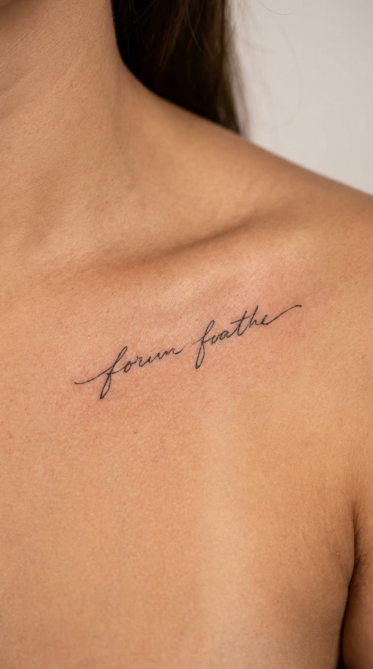
Be Still is two words in loose handwritten linework, no shading, no colour, the kind of piece that reads as a whisper rather than a statement. Most women choose it during a period of noise in their life. It asks for rest instead of another round of pushing, which is why it keeps resurfacing years after the calm arrives.
Placement: Right or left collarbone, centred between the clavicle and the hollow at the base of the throat, or along the inner forearm in a straight line.
Size: 1.5-2 inches (4-5 cm) across for the collarbone, a little taller if the artist curves it with the bone.
Style: Fine line, hand-lettered, single unbroken line weight.
Pain: Low to medium. The collarbone aches because the bone is close to the surface, not because the skin is thin. Hairline strokes blur over the years, so ask for a slightly heavier line than the reference photo shows.
Make it yours: Add the year you needed the reminder, set small under the second word.
2. Begin Again in Curved Handwritten Script
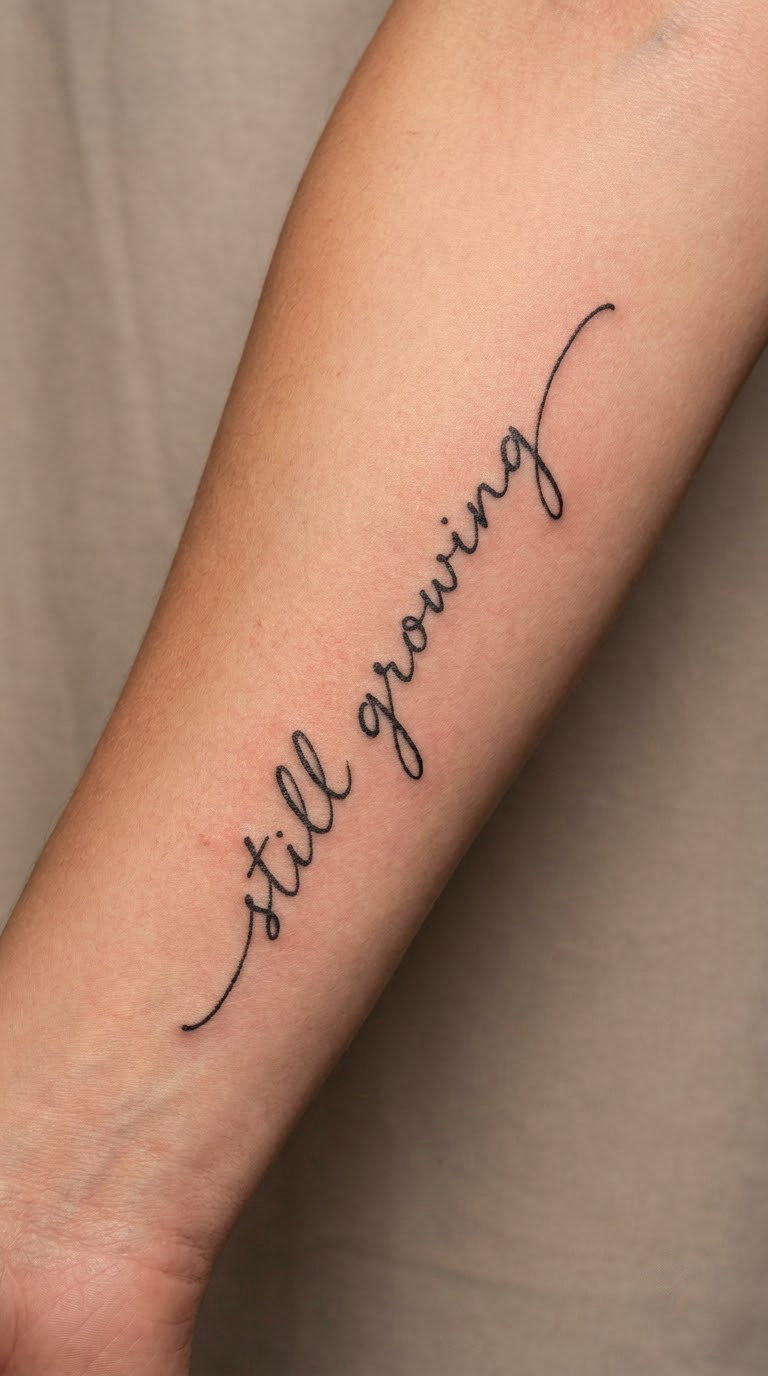
Begin Again gets written as a single unbroken line, the words joined and slightly arched so the letters follow the forearm’s curve instead of fighting it. It is one of the most requested phrases in this whole list, usually by people starting something new after a breakup, a move or a career change.
Placement: Inner forearm between wrist and elbow, or along the outer forearm edge where skin is flatter.
Size: 2-3 inches (5-7.5 cm) long. Longer than one word and it needs a flatter surface to stay straight.
Style: Hand-lettered script, moderate line weight, no shading.
Pain: Medium. Inner forearms are among the more sensitive spots, and the wrist end of that line stings more than the elbow end.
Make it yours: Date the start, either a single small mark under the phrase or the year written as numerals beside it.
3. Present in Tiny Lowercase on the Wrist
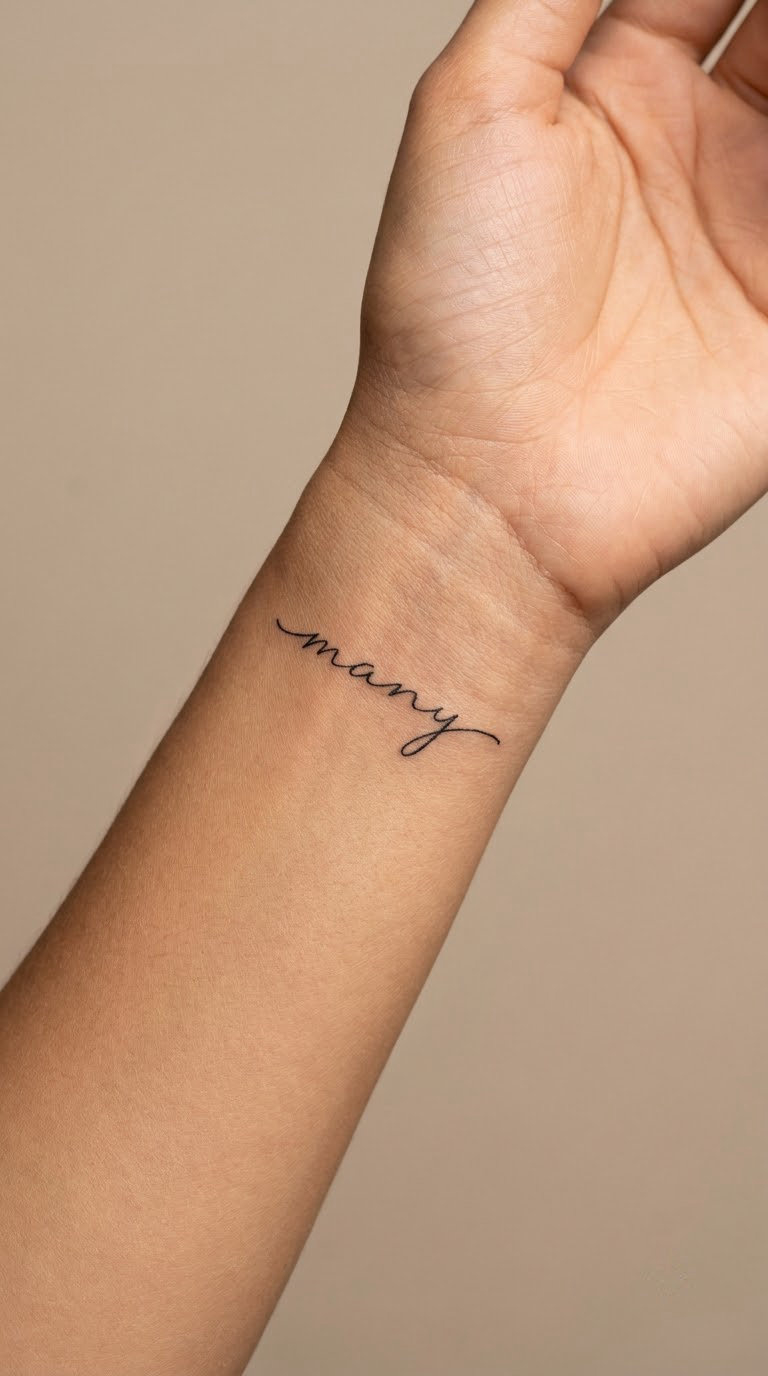
Present is one word in plain lowercase, thin black line, about as small as a decent tattoo can stay readable. The meaning is simple: attention belongs to the moment you are actually in. People pick it as a counterweight to phones and notifications, and it works as a private reminder rather than a message to other people.
Placement: Inner wrist a few fingers above the hand, or the outer wrist where the skin is less creased.
Size: Under 1 inch (2.5 cm) wide. At this scale the artist needs a steady hand and a magnifier.
Style: Lowercase fine-line sans or handwritten print, no flourishes.
Pain: Low, but the wrist bone catches the needle and the area gets used all day, so expect a dull ache that lingers.
Make it yours: Tuck a tiny asterisk or a single dot above the final letter as a private marker. My small hand tattoo ideas that age well roundup has more micro-scale options if this is your first piece.
4. Rise in Small Blackwork on the Shoulder
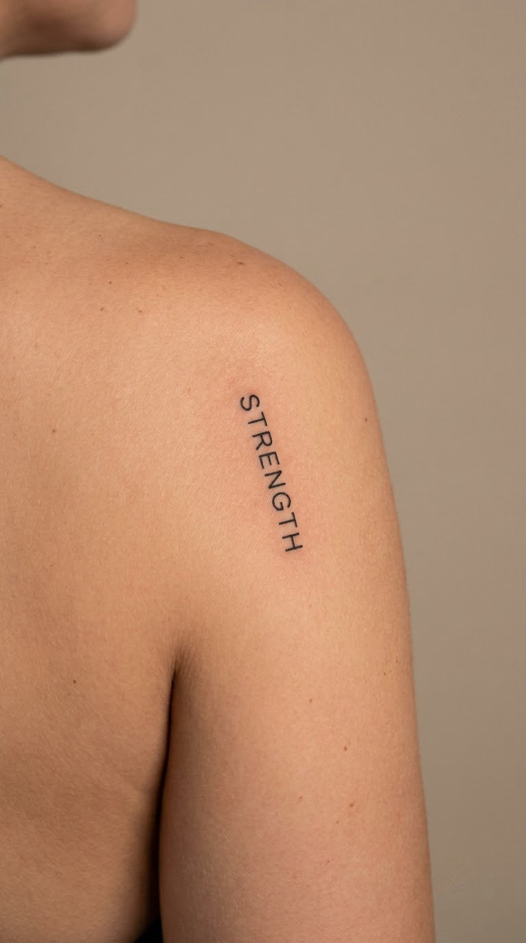
Rise is set in solid black capitals, compact and centred, with the letters sitting level rather than arched. Unlike the flowing pieces in this list, the design trades softness for presence. It suits women who want a short quote tattoo that reads as quiet confidence and does not need context to explain itself.
Placement: Outer shoulder near the deltoid, or centred on the upper back between the shoulder blades where a cap sleeve would frame it.
Size: 1-1.5 inches (2.5-4 cm) wide. Solid black fills can go smaller than line work without losing legibility.
Style: Small blackwork, geometric sans-serif, even stroke weight.
Pain: Medium. The shoulder is fleshy and forgiving, and the discomfort builds the longer you sit through it.
Make it yours: Add a small upward arrow or a mountain ridge under the word, kept to one clean line so the piece stays graphic.
5. Own Your Power in Flowing Script
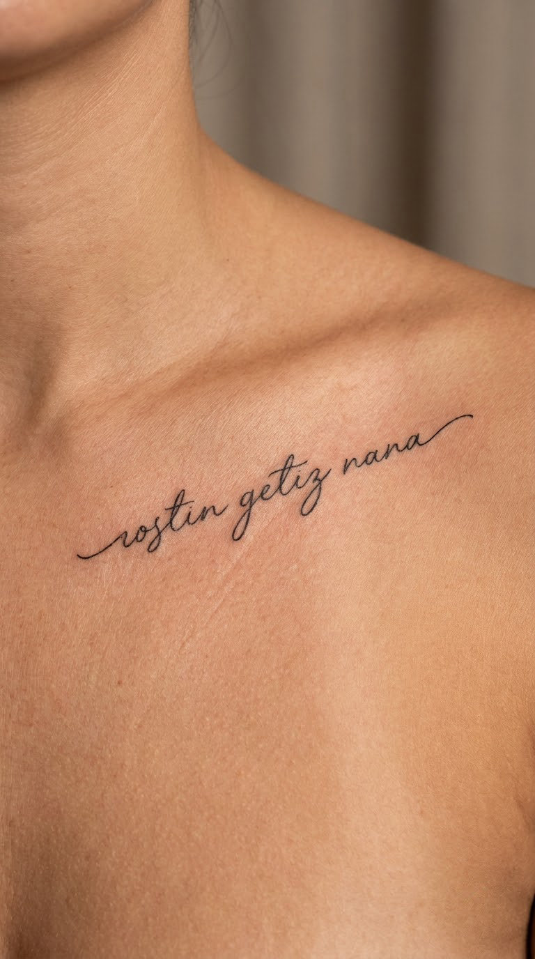
Three words, connected lettering, generous spacing between the letters so the script stays open rather than clotted. This is the longest phrase in my set that still reads as a script tattoo, and it is the one I would pick for someone adding a statement to an otherwise minimal body.
Placement: Across the upper chest just above the collarbone, or along the inner forearm in a single line.
Size: 3-3.5 inches (7.5-9 cm) across the chest, which needs the flatter area between the collarbones rather than the dip of the throat.
Style: Flowing script, fine to medium line weight, slight hand-lettered variation between letters.
Pain: Medium. Chest skin is sensitive and the client usually lies back, which makes the session longer but easier to get through.
Make it yours: Add a birthstone colour to one letter, or a matching piece in the same script on the opposite forearm.
6. Light Remains in Delicate Serif Type
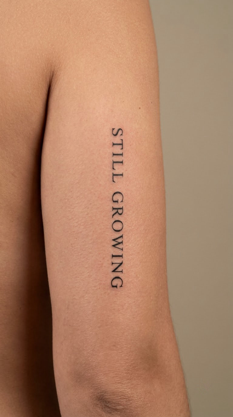
Light Remains is a phrase you will not find on the standard affirmation lists, and that is part of its appeal. Set in a clean serif with thin horizontal strokes, it reads as something kept rather than something shouted. People choose it after a hard year, when the point is not a new beginning but continuity through one.
Placement: Outer upper arm, laid straight across the muscle, or the flat area of the outer forearm.
Size: 2-2.5 inches (5-6 cm) long. Serif lettering needs at least that length for the little feet on the letters to survive healing.
Style: Serif typography, fine line, high contrast between thick and thin strokes.
Pain: Medium on the upper arm, and the arm moves constantly so the artist will pause to let swelling settle.
Make it yours: Underline one word only, or set the two words on separate lines with a wide gap so the phrase breathes.
7. Choose Joy in a Simple Line Font
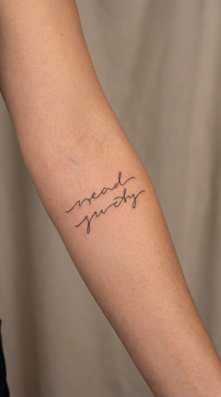
Choose Joy is thin, unadorned and a little blunt, which is exactly the point. In a simple line font it looks like a note somebody wrote themselves rather than a design pulled from a gallery. It is a good everyday phrase to read on your own arm several times a day.
Placement: Inner forearm, or the inside of the upper arm in a straight line where there is room for two words plus a space.
Size: 1.5-2 inches (4-5 cm) long.
Style: Thin-line sans-serif, consistent stroke weight, generous letter spacing.
Pain: Medium. Inner arms bruise visibly for a few days, so plan around events where sleeves will be on show.
Make it yours: Colour the two words a single muted tone instead of black, or put a small date at the end to mark when you started choosing it.
8. In Her Season with a Small Floral Accent
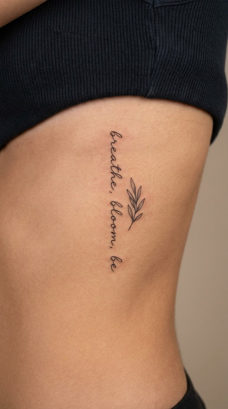
In Her Season is lettering with one small leaf set beside the final word, deliberately restrained so the piece still reads as a quote tattoo. The phrase is about timing, doing the right thing at the right moment rather than rushing someone else’s schedule. Floral versions of this are easy to overdo, so the accent stays tiny.
Placement: Side ribcage between two ribs, following the curve, or the outer hip where the surface is flatter.
Size: 2.5-3 inches (6-7.5 cm), with the leaf no larger than a fingertip.
Style: Fine line lettering with light botanical line work, no shading or colour.
Pain: High. Ribs are the sharpest common lettering placement, and breathing makes the skin move under the needle. Short sessions with breaks are the usual approach.
Make it yours: Use a plant that means something to you, a specific flower or herb, instead of a generic leaf.
9. One Day at a Time in Vertical Type
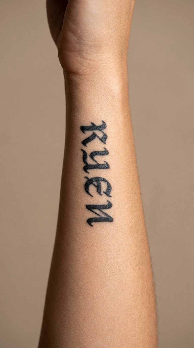
Stacked vertically, this phrase stops looking cramped and starts looking designed. Each word sits on its own line, letters centred, and the whole block runs down the body of the forearm in a narrow column. It is the practical answer to a longer saying that will not fit across a curved area.
Placement: Side forearm, or the inner arm, or a narrow strip of the sternum for a centre column.
Size: About 3 inches (7.5 cm) tall and under 1 inch wide.
Style: Vertical stacked type, thin or medium line weight, centred alignment.
Pain: Medium. A column of small words takes longer than one long line because each word restarts the outline, so expect a longer sitting.
Make it yours: Put your own four short words in the stack, a mantra rather than the standard version.
10. Enough in Small Italic Type
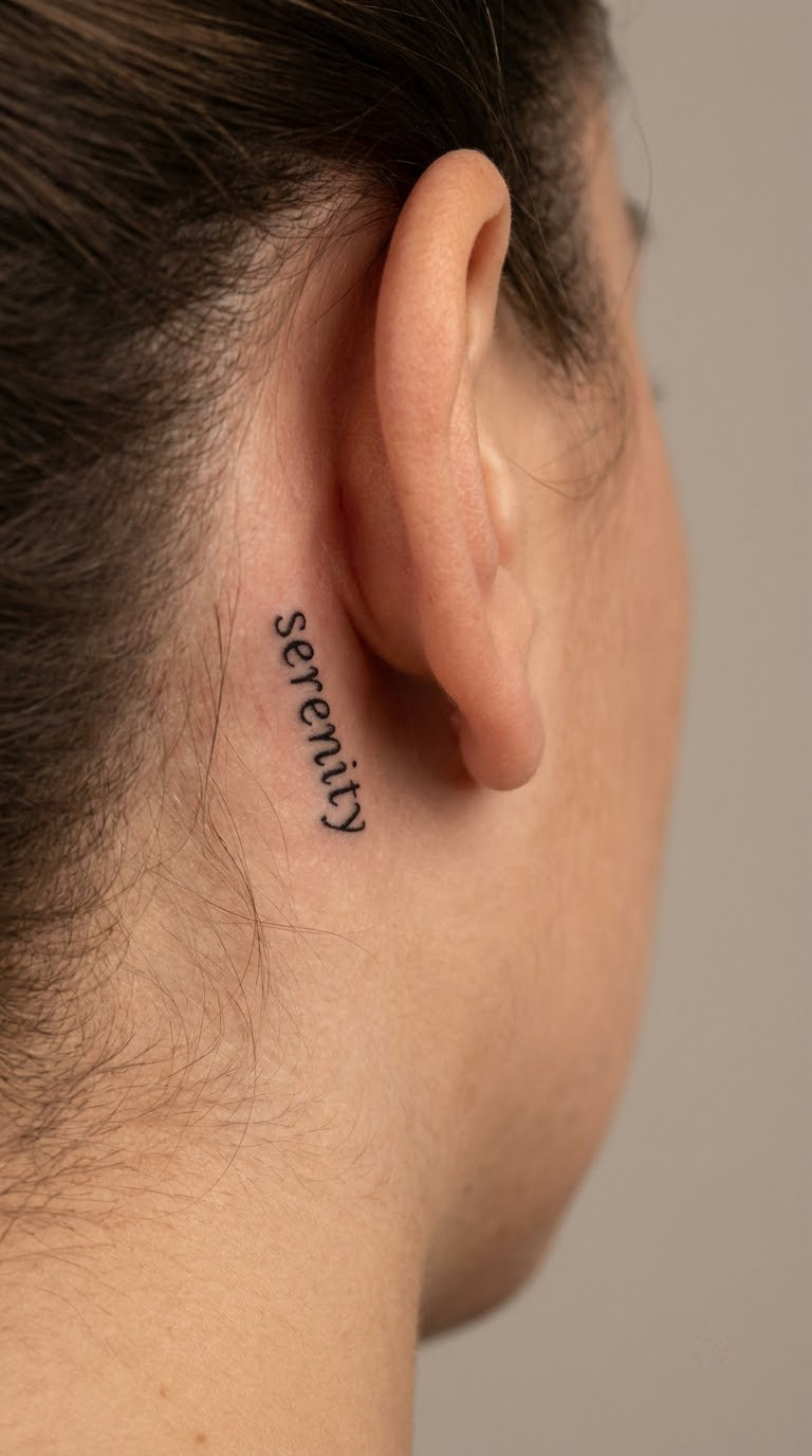
One word, set in small italics, no icon attached. It is a harder piece to explain and an easier one to wear, because most people read it as a quiet note to themselves rather than a message. Behind the ear suits it well since the skin there is soft, hairless and rarely creased.
Placement: Behind the ear at the top of the neck, or on the inner wrist, or the ankle bone.
Size: 0.75-1 inch (2-2.5 cm) wide. One word is the only place a single word can stay legible this small.
Style: Italic serif or italic sans, fine line, slight slant for movement.
Pain: Low. The area is thin and takes ink readily, and the session is short.
Make it yours: Follow it with a second word later, months or years down the line, so the piece grows with you.
11. This Too Shall Pass in a Timeless Line Style
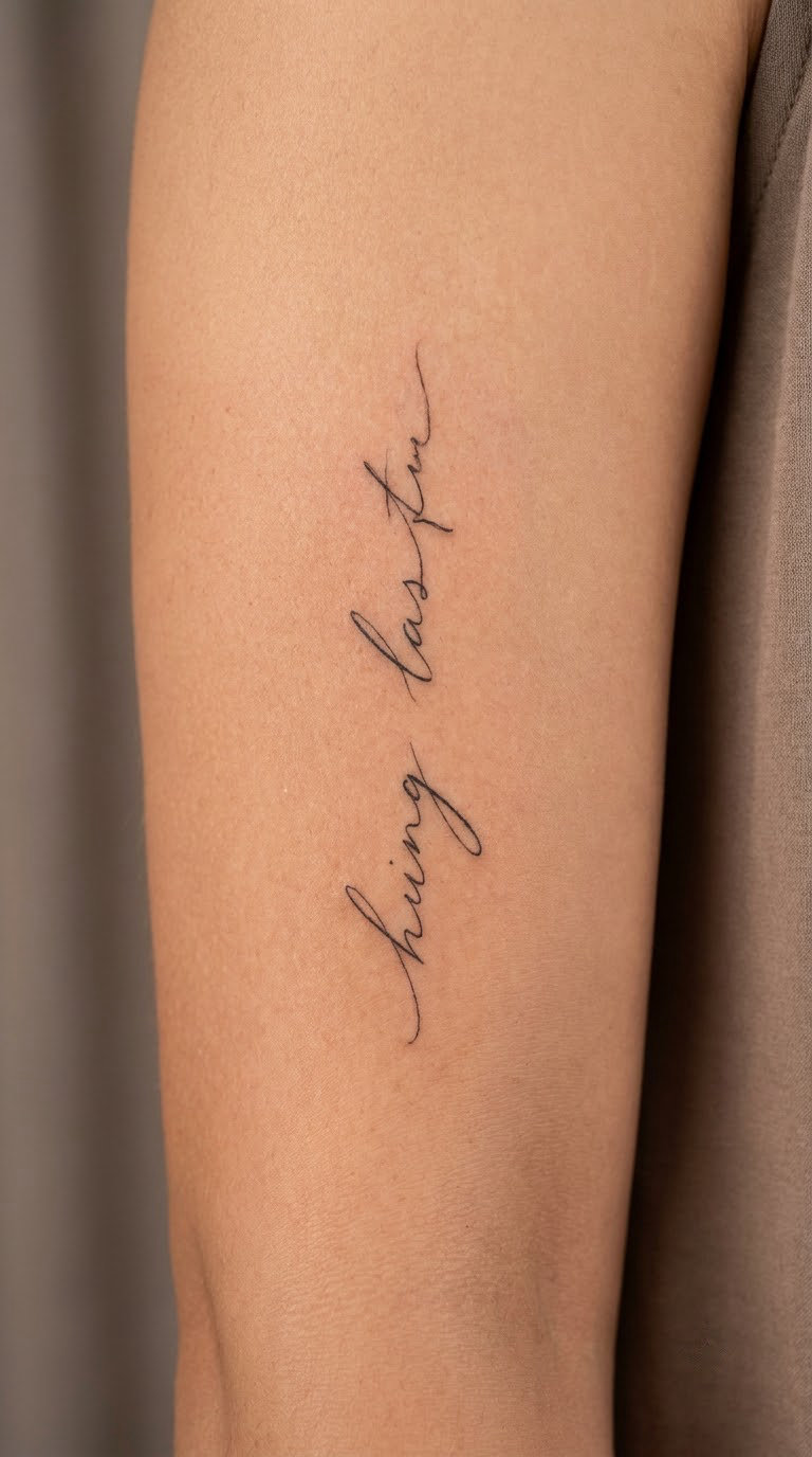
The old saying, kept in clean restrained line work with no styling at all. It has been tattooed for a long time, which cuts both ways: you will not stand out, and the design is a known quantity for any decent lettering artist. People usually get it during a period they would rather not describe.
Placement: Inner upper arm, which gives a long flat-ish stretch for a four-word line, or the outer forearm.
Size: 2.5-3 inches (6-7.5 cm) long. This is close to the limit for a single line of small text.
Style: Plain thin-line lettering, no flourishes, slightly spaced letters for clarity.
Pain: Low. Inner arms are fleshy and the sensation is more of a steady scratch than a sharp sting.
Make it yours: Put a small mark at the start of the line, the beginning of the period the phrase refers to, and let the rest stay anonymous.
12. New Beginnings with a Sunrise Detail
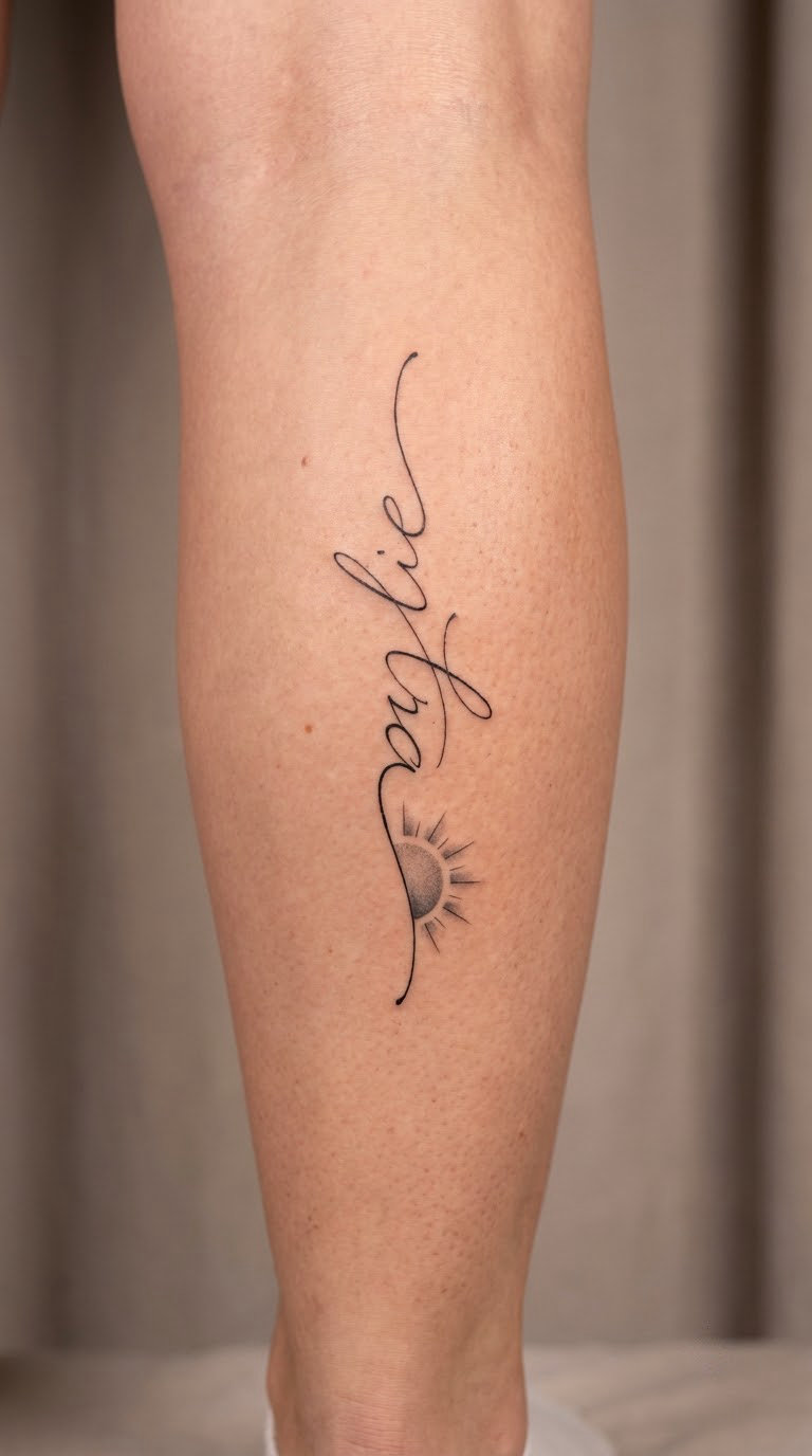
New Beginnings in fine black lettering with one small sunrise underneath, worked in soft grey rather than a full colour fill. The sunrise is a horizon line with short rays, small enough that the composition stays typographic. It suits someone marking a real shift, a new city, a new job, a new chapter.
Placement: Outer calf, where there is room below the words, or the outer arm above the elbow.
Size: 2-2.5 inches (5-6 cm) for the words, plus roughly half an inch for the sunrise.
Style: Fine line lettering with light black and grey shading in the rays.
Pain: Medium. The calf is fleshy and relatively forgiving, though the shin bone nearby is not.
Make it yours: Use a real horizon from somewhere that matters, a coastline or a skyline, instead of a generic half-circle.
13. Stay Soft with a Single Line Heart
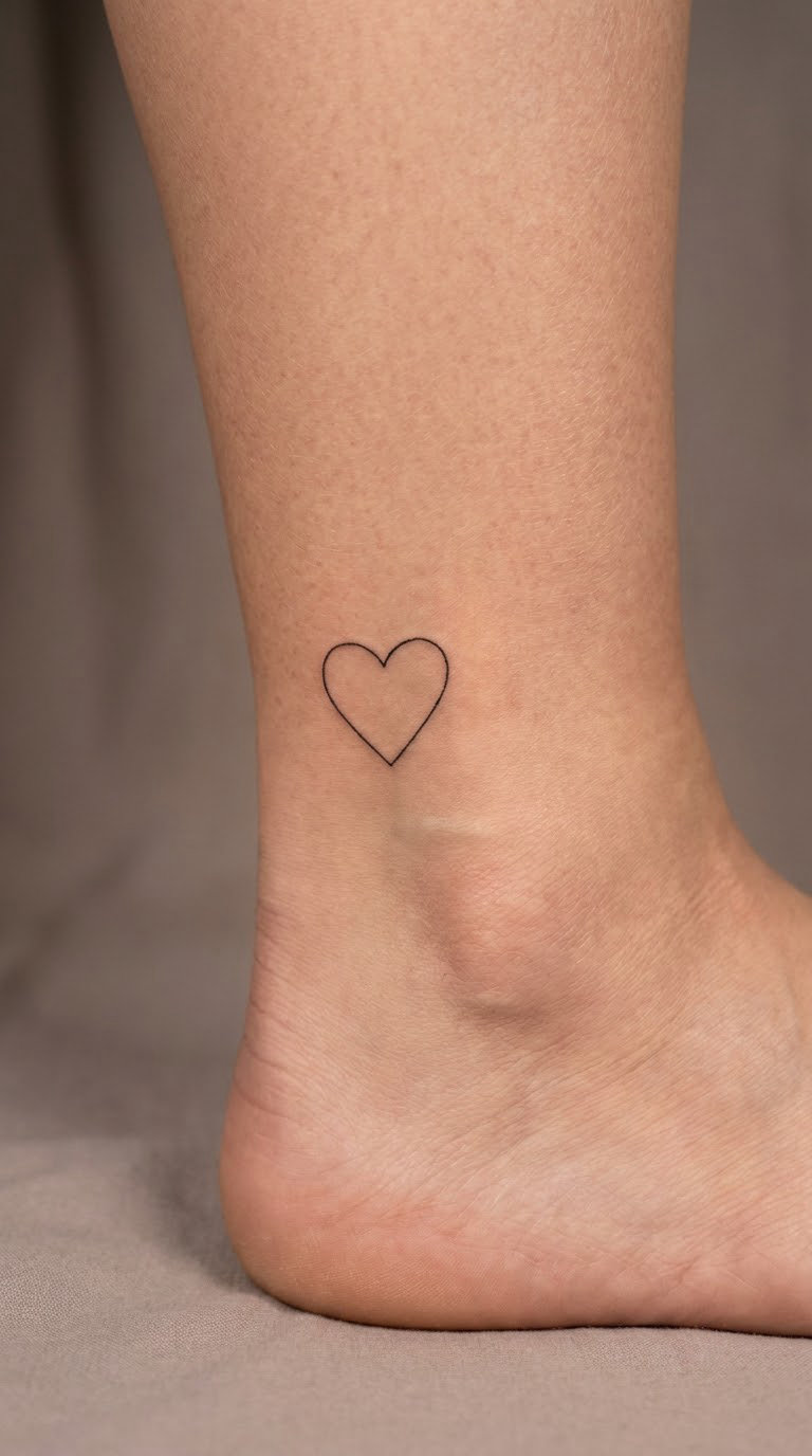
Stay Soft gets one small outline heart, drawn with a single line, no fill and no shine. Kept that small it reads as a punctuation mark rather than a traditional heart tattoo, which matters if you like the message but not the icon. The pairing is the whole idea: the words set the tone and the heart confirms it.
Placement: Ankle bone, inner wrist, or behind the ear, anywhere the words can sit on one line.
Size: 1.5-2 inches (4-5 cm) for the words, heart no bigger than a small nail.
Style: Fine line lettering with a one-stroke outline heart.
Pain: Low. Ankle and inner wrist are both thin, and the ankle is easy to keep still.
Make it yours: Skip the heart entirely and use a small asterisk or a single leaf, so the softness comes from the words only.
14. Keep Going in a Bold Condensed Font
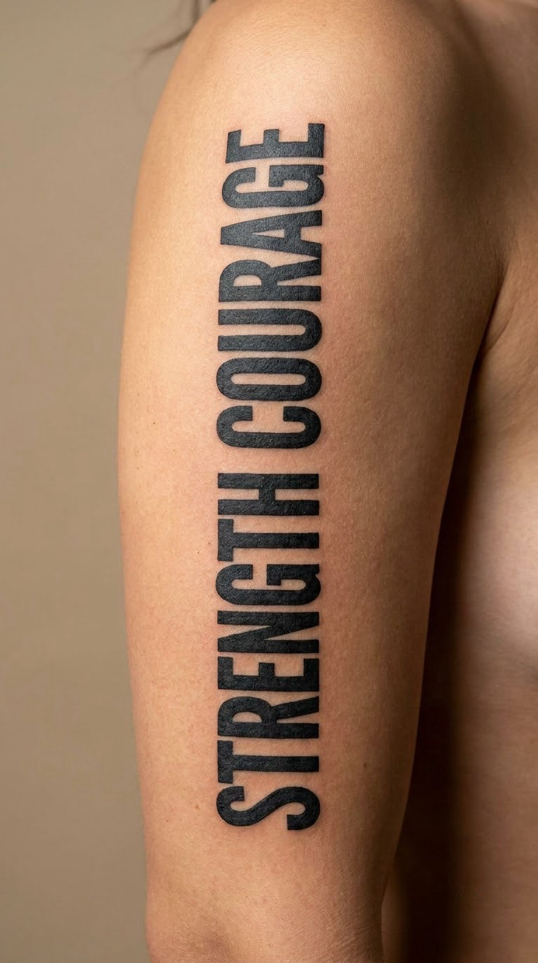
Keep Going set in bold condensed capitals, tall and narrow, sitting on one line with wide gaps between letters. It is the loudest purely typographic option here and the one that reads clearly from across a room. For a short quote tattoo with no imagery, this is the choice that carries the most presence.
Placement: Outer upper arm laid across the muscle, or the upper back between the shoulder blades.
Size: 2.5-3 inches (6-7.5 cm) long, roughly half an inch tall per letter.
Style: Bold condensed sans-serif, solid black fill, wide tracking.
Pain: Medium. Solid fill takes more passes, so the sitting runs longer than a line-work piece of the same size.
Make it yours: Stack the two words on separate lines and let each one take the full width, which makes the design taller and heavier.
15. No Rain, No Rainbow in Fine-Line Type
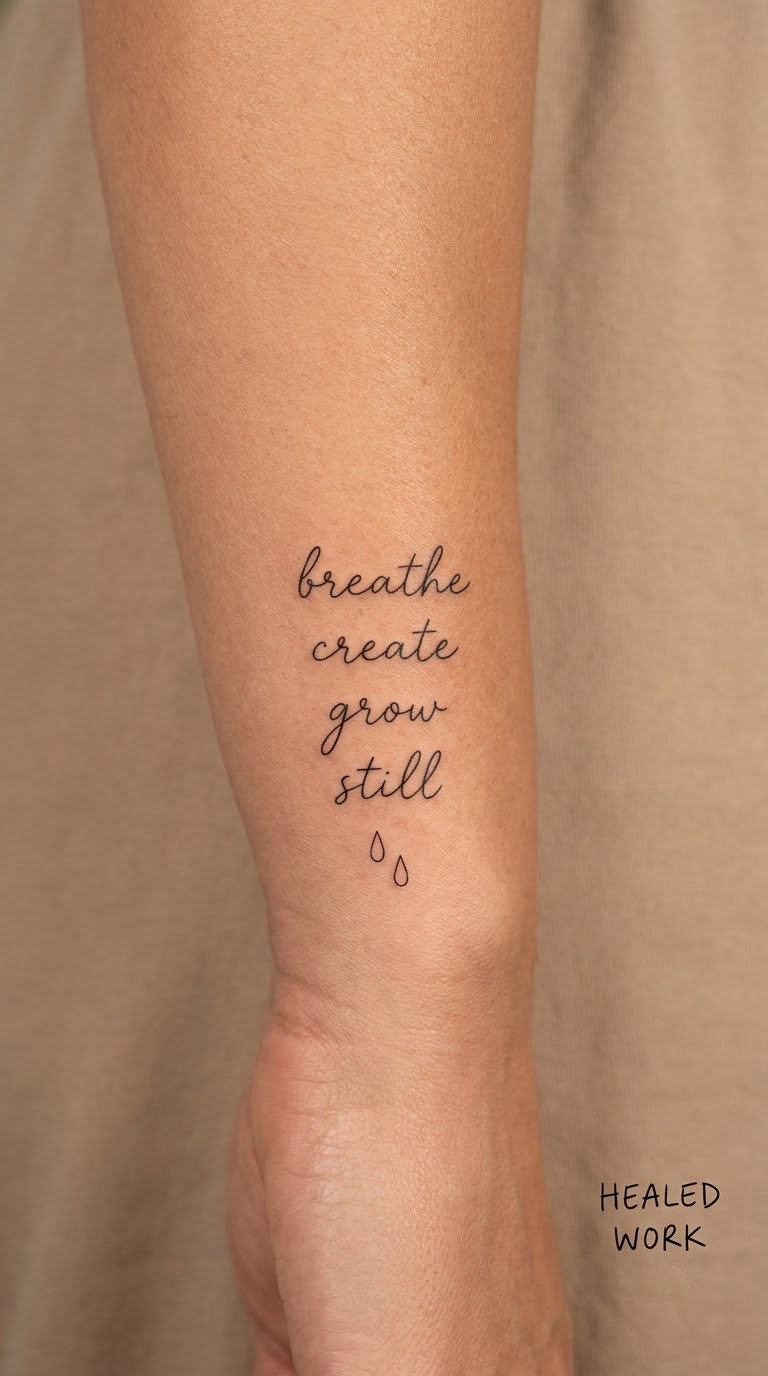
No Rain, No Rainbow is a familiar saying given airy fine-line lettering, with two tiny raindrops or a single restrained colour arc underneath. The lettering does the heavy lifting, so the illustration stays minimal. It is usually chosen by people who like the sentiment but want a small, quiet version of it.
Placement: Inner wrist set straight, or the outer forearm where two words plus a comma have more room to breathe.
Size: 2-2.5 inches (5-6 cm). The comma counts as a letterform, so leave space for it.
Style: Fine line lettering, with an optional two-drop or single-arc detail below.
Pain: Low to medium. Wrists move constantly, so the artist will work around your natural resting position rather than pinning the arm awkwardly.
Make it yours: Add a faint colour arc in the rainbow of your choice, one thin band, so the rainbow only appears when you look closely.
16. Almost Home in a Minimal Mountain Line
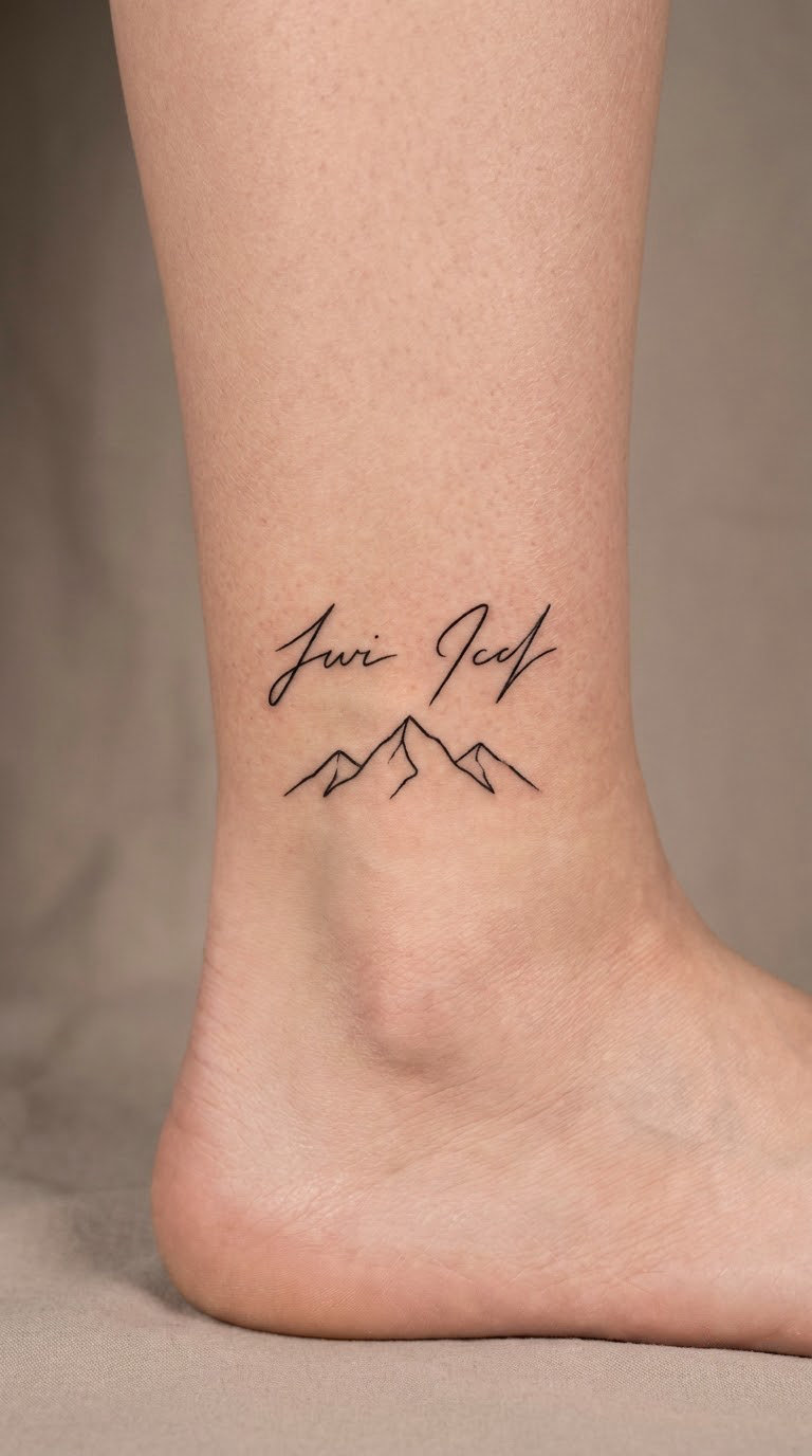
Almost Home in fine type, set above one minimal mountain outline drawn in a single line. The mountain is a peak, not a range, and it sits under the words rather than behind them, so the piece still reads as a quote tattoo first. The meaning is return: to a place, a person, or a version of yourself.
Placement: Ankle above the bone, outer hip, or the flat of the outer forearm with the mountain beneath the line of text.
Size: 2-2.5 inches (5-6 cm) wide, stacked so the mountain fits under the words.
Style: Fine line typography with minimal geometric line work, black only.
Pain: Low. The ankle is thin-skinned and easy to keep still, and this is an easy piece to sit through.
Make it yours: Have the peak drawn after a real mountain, a hike or a place that feels like home, and keep the outline to one line.
17. Quiet Mind in Spaced Uppercase
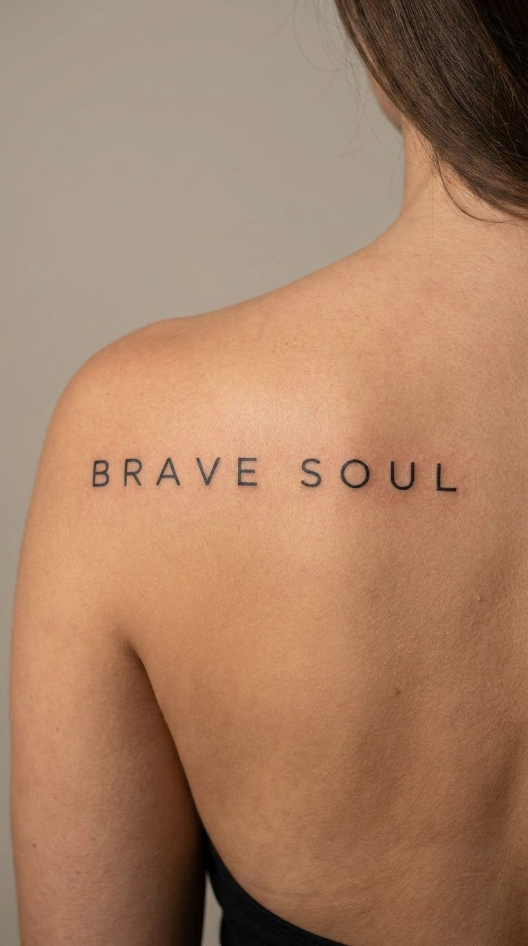
Quiet Mind in wide-spaced uppercase, each letter separated by roughly the width of a letter. The spacing does the work here: it slows the reading down and makes the phrase feel unhurried. It is the widest design in this list because spaced capitals need horizontal room to stay legible.
Placement: Across the upper back between the shoulder blades, or along the collarbone, or centred on the chest below the sternum.
Size: 4-5 inches (10-12.5 cm) wide for two spaced words. Compress it below 3 inches and the spacing collapses.
Style: Uppercase sans-serif, thin to medium line weight, wide tracking.
Pain: Medium. Upper back skin is sensitive and you will feel every pass, but the client position is comfortable and the piece is one continuous line.
Make it yours: Space the letters to match a real rhythm, a music tempo or the number of years something took, so the tracking itself carries meaning.
18. Home Is Within in Soft Blackwork
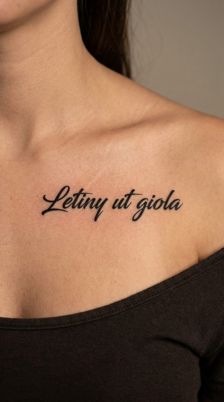
Three words in smooth solid black lettering, slightly thickened stroke weight so the shapes feel confident rather than tentative. The reassuring part of this phrase is that it points inward instead of at a place you might need to find. It suits anyone who has moved cities and found the settling took longer than expected.
Placement: Centred on the chest below the sternum, or across the upper chest above the collarbone, or on the outer upper arm.
Size: 3-3.5 inches (7.5-9 cm) across.
Style: Soft blackwork lettering, medium line weight, clean and modern rather than hand-lettered.
Pain: Medium to high near the sternum, where bone and thin skin meet. Many people take pain medication for this placement; discuss it with your artist first.
Make it yours: Choose a word that means home to you and replace the third word, keeping the same letterforms and spacing.
19. Soft Life, Strong Roots in Watercolor Style
Soft Life, Strong Roots pairs hand-lettered script with a small translucent botanical base in washed grey and green. It is a two-part composition: the words on top, a short stem and a few leaves below, loose edges where the colour fades out. What separates it from a floral-only piece is the lettering doing half the work.
Placement: Outer forearm, with the stem below the text and enough flat surface for both elements.
Size: 3-4 inches (7.5-10 cm) tall for the whole composition, the plant included.
Style: Watercolour botanical with hand-lettered script, muted palette.
Pain: Medium. Watercolour shading means more passes over the same skin, so the session runs longer and the area stays tender for a few days.
Make it yours: Use a plant from your own garden or a place you grew up, drawn loosely enough that it reads as a memory rather than a diagram.
20. In Bloom in a Delicate Botanical Frame
In Bloom set in fine black script, with two thin stems curving up on either side of the words, a few small leaves between them, and no flowers. Leaving the blooms off is the interesting part. The open stems say growth is still happening, which is a different message from a finished bouquet.
Placement: Side ribcage following the natural curve, outer hip, or the back of the shoulder.
Size: 3-3.5 inches (7.5-9 cm), the stems included.
Style: Fine line script with delicate botanical line work, black only, no shading inside the leaves.
Pain: High. The ribcage is the most demanding lettering placement on the body, and the session is usually split into shorter visits.
Make it yours: Add a single small bloom on one stem only, the side that represents the part of you that has opened up already.
How to Choose the Right Design
Five checks narrow twenty ideas down to one that suits you. None of them are about fashion, and all of them save you from a piece you have to explain or cover.
Start with the phrase you would still say in ten years. Trending lines age worst on skin. Test it: would you want it on a birthday card, or does it only work as a tattoo because it is on a gallery page right now?
Test readability at actual size. Print or write the phrase in your chosen font at its true physical size, hold it against the placement and look from a step back. A phrase that reads at a glance will still read after healing; one that needs squinting will not.
Pick a placement that fits daily life. Ask where you wear sleeves, where you sleep on your side, and whether you need the piece covered at work. The best placement is usually the one you can live with for years, not the most flattering photograph.
Budget for ageing. Fine-line script softens over time, and hands, fingers and palms wear down fastest. If long-term sharpness matters more than delicacy, ask for solid line weight or a serif face. Browsing our small hand tattoo ideas for women that age well is worth ten minutes if you are considering text on the hand or wrist.
Bring a real reference and a printed phrase. A screenshot of someone else’s healed work plus your phrase typed out on paper avoids most spelling and layout regrets. Also verify where the quote came from if you are borrowing it, and check the wording in the original language rather than a reposted caption.
Cost and Session Time
Cost for a short quote tattoo tracks the hours at the chair, not the number of words. Two short words in one line are quick; three words in flowing script, or a phrase with a plant beneath it, are not, because each letter is outlined and filled separately.
Typical US lettering rates run somewhere around $80 to $200 an hour depending on the artist, so a single small word often lands in the lower few hundred dollars once the shop minimum is applied, while a two-hour script phrase with a botanical detail underneath pushes well past that. A custom hand-lettered design sits at the top of the range, and setting an existing typeface usually costs less.
Expect your session to run somewhere between half an hour for a single small word and a couple of hours for a full phrase with a detail underneath. Rib and sternum work is often booked in shorter visits, which adds appointments rather than adding time.
What moves the price: the size on paper, the font style, whether the piece needs custom hand-lettering rather than a typed font, how many colours are in the design, and how much detail sits under the words. Custom lettering costs more than setting a chosen typeface.
Studio minimums matter for small pieces. A wrist word can be tattooed in twenty minutes, but the room has a floor on the booking, so tiny work often costs close to the minimum anyway. Ask about the minimum when you book, and ask whether artists charge by the piece or by the hour.
Local rates vary widely by city and by how experienced the lettering artist is. Travel costs add up too, so a session booked in one trip is cheaper than three short appointments to a shop two hours away.
Aftercare Basics
Start with your artist’s aftercare instructions, since they know how your particular session went. The general guidance for fine-line lettering is straightforward.
Wash gently, twice a day, with plain lukewarm water and unscented soap. Pat dry with clean paper towel or air dry, and keep the area away from anything fragranced while it heals.
Protect it for the first weeks. Loose clothing over the area, no shaving across it, and nothing scratched or picked. Ink flaking off in the first fortnight is normal and is not a sign the tattoo is failing.
Keep it lightly moisturised. A thin layer of a plain ointment or tattoo balm supports the skin without trapping heat. Do not layer it on thick.
Skip swimming, baths and saunas until the skin has closed over. Chlorine, salt and heat all pull colour out of fresh ink and irritate an open tattoo.
Use sunscreen once healed. Once the skin is fully closed, daily SPF on exposed placements is the single best defence against a lettering tattoo fading unevenly, especially on arms and chest that see real sun.
Frequently Asked Questions
What size should a short quote tattoo be?
Aim for a phrase you can read at arm’s length. For an inner forearm or collarbone piece, most short quotes land between 1.5 and 3 inches (4 to 7.5 cm) long. Below about 1 inch, only one short word stays readable once healed. Print your phrase at true size, hold it to the placement, and check it from a step back before you book.
Do small quote tattoos on fingers or wrists fade quickly?
Faster than anywhere else on the body. Fingers, knuckles and palms are high-friction areas, and wrists flex through the day. If you want text there, ask for medium line weight rather than hairline fine line, avoid the palm-side joint, and plan on a touch-up every few years. Inner upper arm, chest and back hold lettering far better.
Which font is easiest to read after a quote tattoo heals?
A clean serif or a simple sans-serif in medium weight. Cursive with tight connections, hairlines and long letter swashes lose definition first, and the differences between letters become harder to see. Give the artist a typed font sample or print the phrase in the typeface so they can match stroke weight accurately.
Are two-word quote tattoos better than longer sayings?
Usually, for a first piece. Two words need less space, heal more predictably and stay readable at a smaller size, which means fewer compromises on placement. Longer sayings work when you can give them a flat, sheltered area and accept a longer session. Test the long version at actual size before committing to it.
What is the least painful placement for a lettering tattoo?
The inner upper arm, the outer upper arm and the ankle are usually the most forgiving spots for small text, all sitting over soft tissue rather than bone. Wrists, ribs and the sternum are the common painful ones. Bite into a stress ball, keep sessions short and break if you need to; the lettering is not worth forcing through.
How do I choose a quote tattoo that feels personally meaningful?
Pick something that would still make sense on an ordinary birthday, not just a line from a song or film in your teens. Many people use an original personal phrase rather than a borrowed quote, which keeps the meaning unique. Say the phrase out loud, write it in your own handwriting, and if it still works, it is probably right.
For a first tattoo, start small and quiet. Be Still on the collarbone or Present on the inner wrist are the two in this list that are easiest to place well, easiest to live with and easiest to add to later. Tiny design is a skill, not a shortcut, so going small first is not settling.
For someone already building a collection, go bigger and take a placement risk instead. Soft Life, Strong Roots on the outer forearm or In Bloom on the side rib gives you a piece with a real composition, and it sits well next to older, simpler work. Pick the one whose phrase you would say out loud, and bring a printed reference to the consultation. That is the whole decision, really.
If you are still comparing, these twenty short quote tattoo ideas for women cover everything from a single word behind the ear to a spaced line across the upper back, so there is a starting point for any placement you have in mind.