
20 One Word Tattoo Ideas for Men: Minimalist Style (October 2026)
A one word tattoo for a man is a single word rendered in lettering and placed on the body to carry one idea, one memory or one promise. There is no imagery to hide behind, so the font, the spacing and the size do all the work, and the word has to be one you will still recognise as yours in twenty years.
That is why the twenty one word tattoo ideas for men below are not random picks. Each one pairs a word with a lettering style, a placement that suits the letter count, a realistic size and an honest note on how it ages. If you are booking for autumn or winter, allow 30 to 45 days of lead time for a consultation, a design and a session.
One Word Tattoo Ideas for Men: Quick Guide
| Word tattoo | Lettering style | Best placement | Realistic size | Pain |
|---|---|---|---|---|
| Resilience | Bold blackwork script | Outer forearm | 5 in (13 cm) | Medium |
| Freedom | Vintage serif lettering | Inner bicep | 4 in (10 cm) | Low |
| Grateful | Fine-line script | Inner forearm | 3 in (7.5 cm) | Medium |
| Steadfast | Bold sans-serif capitals | Upper chest | 6 in (15 cm) | High |
| Wanderlust | Western-style type | Calf | 5 in (13 cm) | Medium |
| Courage | Brush script | Upper arm | 4.5 in (11 cm) | Medium |
| Discipline | Gothic blackletter | Outer forearm, vertical | 5 in (13 cm) tall | Medium |
| Family | Elegant italic serif | Inner forearm | 3 in (7.5 cm) | Medium |
| Integrity | Minimal serif capitals | Lower ribs | 4 in (10 cm) | High |
| Patience | Engraved-style capitals | Outer forearm | 5 in (13 cm) | Medium |
| Ambition | Heavy slab serif | Upper back | 6 in (15 cm) | Medium |
| Rebirth | Watercolour script | Forearm | 4 in (10 cm) | Medium |
| Loyalty | Traditional script | Outer arm | 5 in (13 cm) | Medium |
| Respect | Old-English type | Upper arm | 4.5 in (11 cm) | Medium |
| Gratitude | Blackwork handwriting | Inner forearm | 4 in (10 cm) | Medium |
| Adventure | Condensed block capitals | Outer calf, vertical | 6 in (15 cm) tall | Medium |
| Confidence | Modern calligraphy | Forearm | 5 in (13 cm) | Medium |
| Mindfulness | Fine-line Roman capitals | Inner forearm, vertical | 4 in (10 cm) tall | Medium |
| Strength | Blackwork Roman capitals | Upper back | 7 in (18 cm) | Medium |
| Stillness | Micro-realist script | Outer wrist | 2.5 in (6 cm) | High |
1. Resilience in Bold Blackwork Script
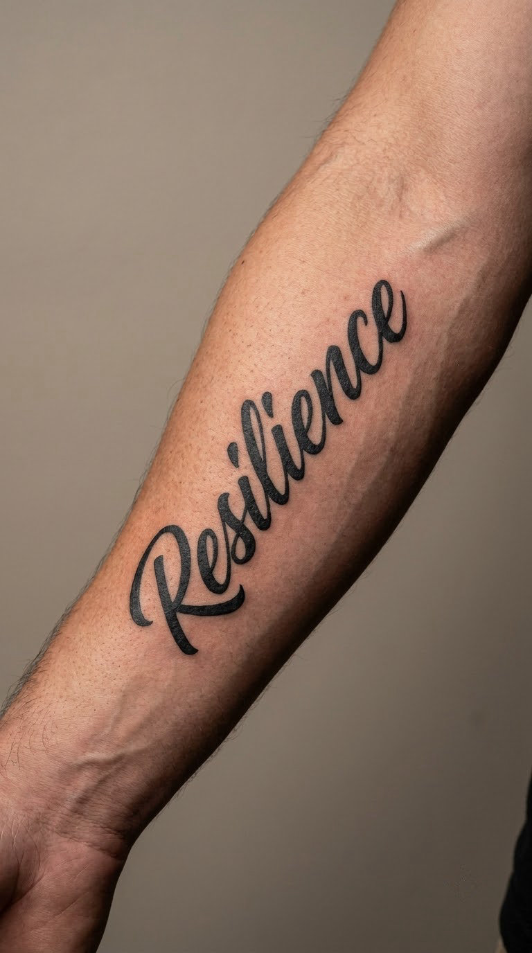
Resilience in bold blackwork script sits somewhere between handwriting and a signature. The artist thickens the downstrokes, keeps the entry strokes soft, and lets a few letters break the baseline just enough to feel written rather than printed.
Men usually choose it for the personal meaning they attach to bouncing back, not for any agreed-upon symbolism. What the style adds is visual weight: a heavy script reads as settled and confident at a distance.
Placement: Outer forearm running lengthways, or the flat of the upper arm. Size: 4.5 to 5.5 in (11 to 14 cm) across. Style: blackwork script. Pain: medium on the outer forearm; the forearm bone is not far under the skin, so expect a scratchy, persistent sensation rather than sharp pain.
Make it yours: Extend the final letter into a single underline that runs the width of the word, which is easier to keep legible than adding extra symbols.
2. Freedom in Vintage Lettering
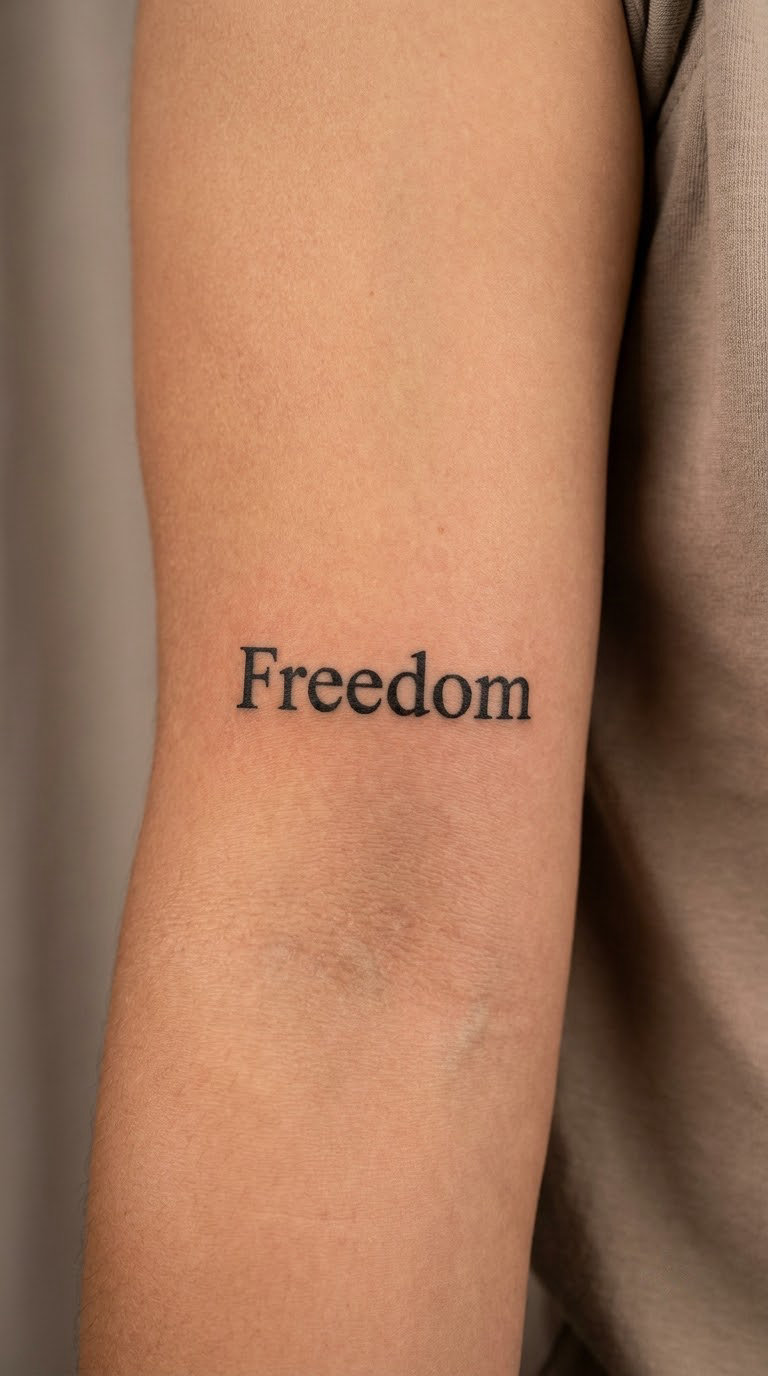
Vintage lettering for Freedom is compact, symmetrical and slightly stiff, the way type looked on old posters and shop signs. The artist works with even stroke weight, small bracketed serifs and generous but tight letter spacing so the six big letters fit a narrow band.
The word suits travel, independence or simply a man who does not like being boxed in. Aged serif shapes also age well, because the strokes are even rather than hairline-thin.
Placement: Inner bicep, inner arm or the side of the chest. Size: 3.5 to 4.5 in (9 to 11 cm) wide. Style: vintage serif or traditional lettering. Pain: low on the inner bicep, which is fleshy and moves little while you sit.
Make it yours: Ask for slightly irregular serifs, hand-cut rather than machine-perfect, so it reads as vintage rather than as a computer font printed on skin.
3. Grateful in Fine-Line Script
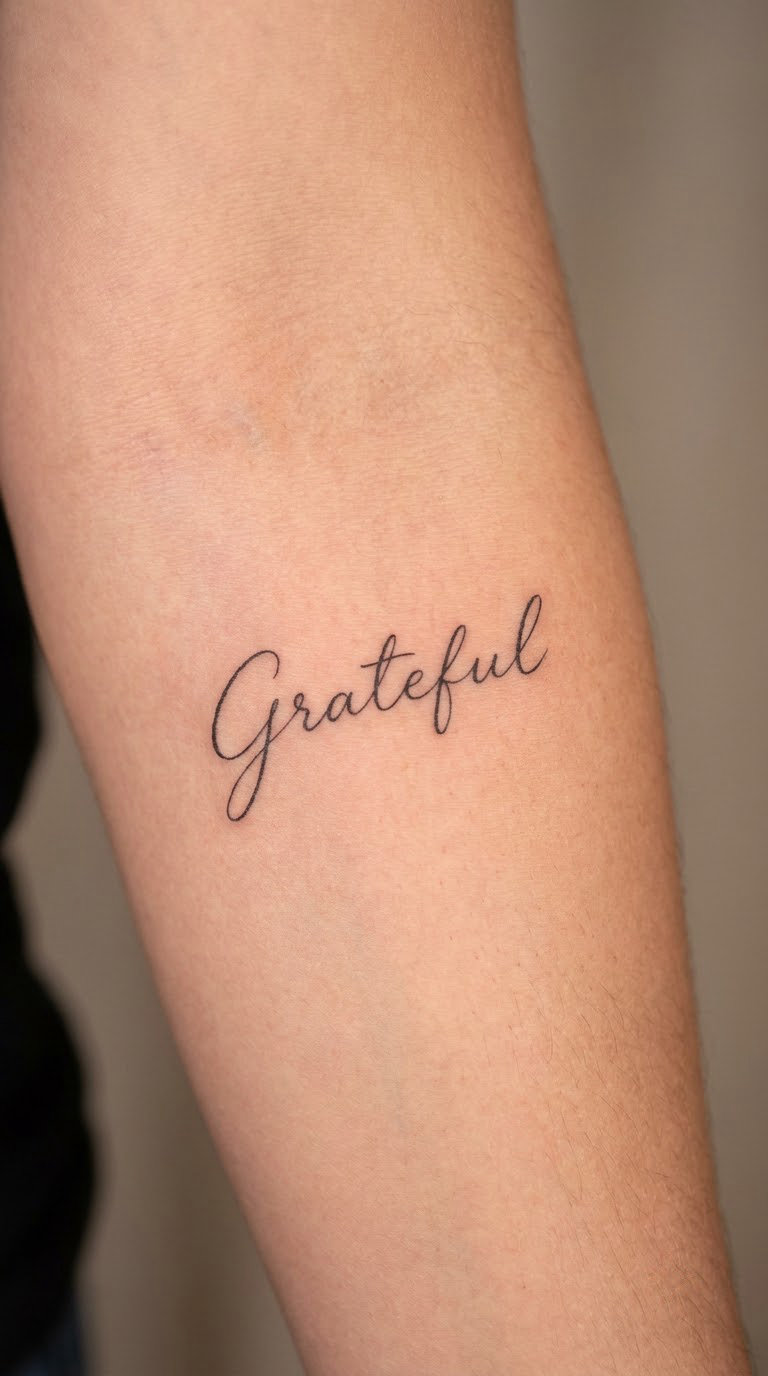
Grateful in fine-line script is a light, restrained piece: a single black line of consistent weight, letter spacing opened up so each letter breathes, and no shading at all. The whole design is about restraint.
Men pick it when gratitude is the thing they want to read on themselves rather than say out loud. There is no universal meaning attached to the word, which is part of why it wears so quietly.
Placement: Inner forearm along the wrist crease gap, or the inner upper arm. Size: 2.5 to 3.5 in (6.5 to 9 cm) wide. Style: fine line. Pain: medium on the inner forearm, and this placement is a tough one for ageing because a single hairline stroke spreads into its neighbour over the years.
Make it yours: Choose a script with open loops and few thin joins, then ask the artist to keep every line at least a shade thicker than the reference image.
4. Steadfast in Bold Sans Serif
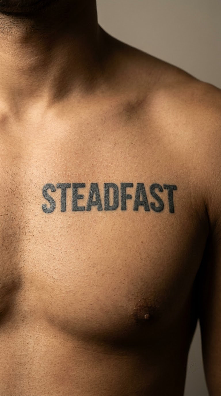
Steadfast in bold sans-serif capitals has no curves to soften it. Flat terminals, even stroke weight, generous counters, one baseline running dead straight across the sternum. Nine letters means the artist has to widen the word or condense the face to make it fit.
The word is chosen for reliability, resolve or staying grounded, usually as a private reminder rather than a message for anyone reading it. A clean geometric sans is the most legible lettering style in this entire list.
Placement: Upper chest, sternum or across the collarbone. Size: 5 to 6.5 in (13 to 16 cm) across. Style: bold sans-serif, block capitals. Pain: high on the chest, and the sternum is the least forgiving surface on the body for a first sitting.
Make it yours: Split the word across two lines, Stead over fast, which halves the width and keeps the letterforms large enough to age cleanly.
5. Wanderlust in Western Type
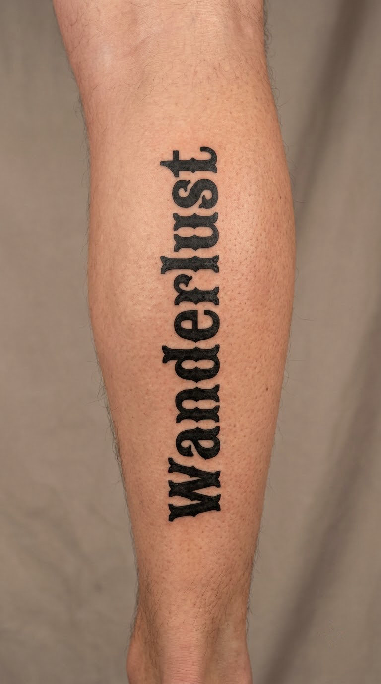
Wanderlust in Western-style type leans on sturdy, slabby forms with flared stems and a slight forward lean, the look of a wanted poster or a saloon sign. The letterforms are wide, so this word wants a long, straight canvas.
Travel is the obvious reason people choose it. What separates a Western type treatment from a novelty version is the spacing and the stem weight: hand-drawn Western lettering has irregular flare and breathing room, while novelty type is too even and too jokey.
Placement: Lengthwise down the outer calf, or across the outer forearm. Size: 4.5 to 5.5 in (11 to 14 cm) long. Style: Western lettering, solid black. Pain: medium on the calf, which has thin skin over firm muscle and gets warm quickly.
Make it yours: Ask for hand-flared stems rather than a font swash, and let the W run slightly wider than the rest of the word so the baseline feels earned.
6. Courage in Brush Script
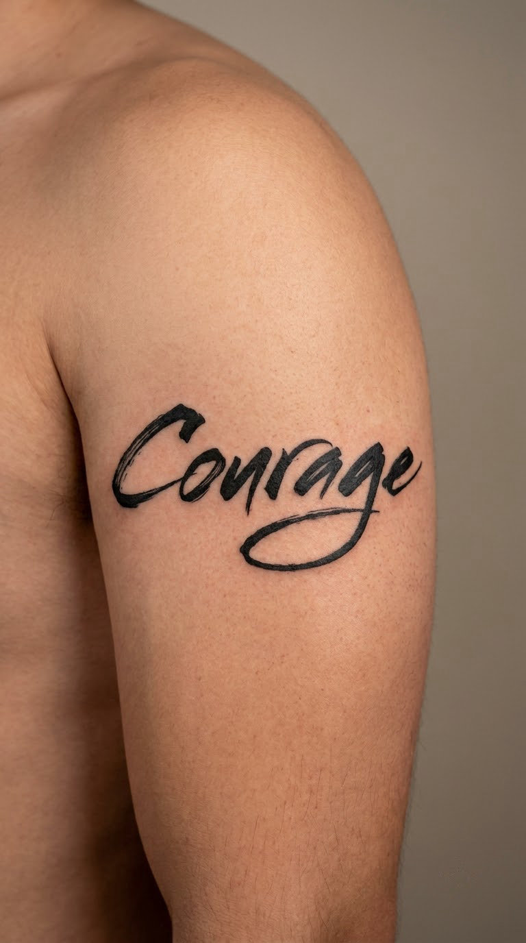
Brush script gives Courage thick downstrokes that taper to nothing and a few deliberate dry-brush skips where the bristles separate. The result is expressive and slightly imperfect, closer to painting than to printing.
Men who choose Courage usually connect it to a specific moment rather than a general virtue, a hard conversation or a decision that took years to make. The brushwork suits a word that sounds like a verb.
Placement: Upper arm across the deltoid, or the outer forearm. Size: 4 to 5 in (10 to 13 cm) across. Style: brush script, blackwork. Pain: medium on the deltoid, one of the easier first-tattoo spots because the muscle does most of the work.
Make it yours: Let the C open into a long entry stroke that wraps under the word, and keep the final e flicking outward rather than tucking back in.
7. Discipline in Gothic Lettering
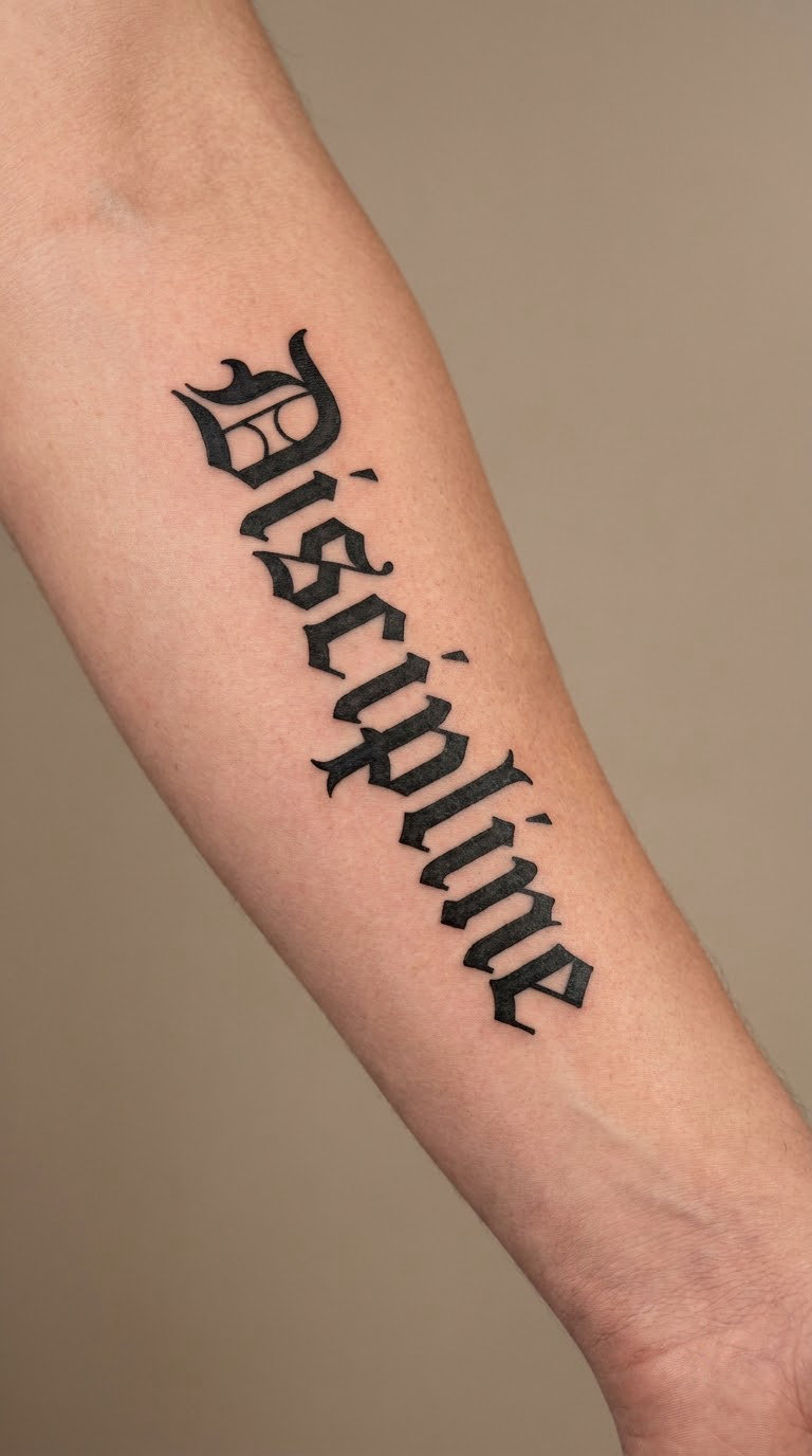
Gothic blackletter for Discipline is all sharp angles: broken strokes, diamond serifs, tight joins. Ten letters stacked vertically give each one room to be as tall as it needs to be without the word becoming a cramped bar.
Discipline is chosen for routine, self-control and the long game. The gothic look is the whole point, and it should come from the letterforms themselves rather than from bolts, chains or other decoration bolted on the side.
Placement: Vertical on the outer forearm, or along the side of the calf. Size: 4.5 to 5.5 in (11 to 14 cm) tall. Style: blackletter. Pain: medium on the outer forearm, with brief sharper spots where the wrist bone sits near the surface.
Make it yours: Ask the artist to open the counters on the a, c and e, because closed counters in blackletter are the first thing that fills in as the piece ages.
8. Family in Elegant Italic Type
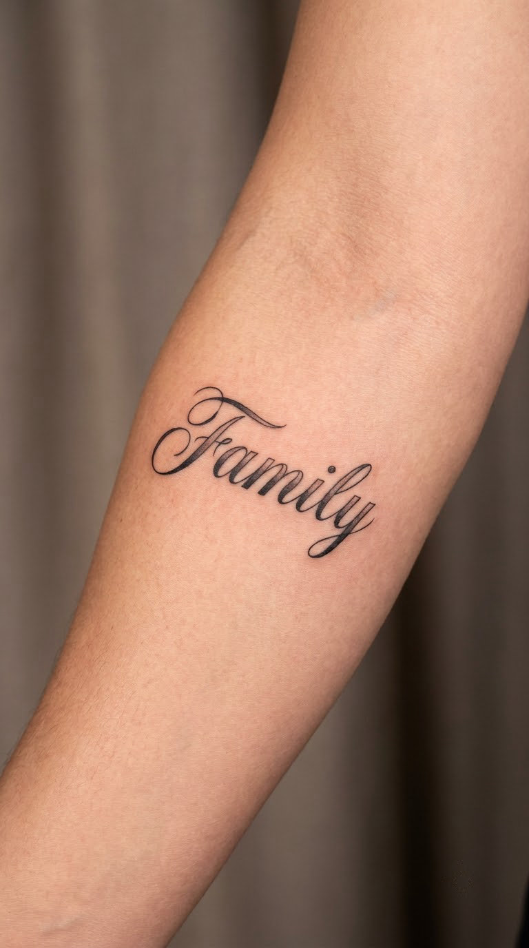
Family in elegant italic serif leans forward, with high contrast between thick and thin strokes and a few long graceful exits. Six letters at three inches gives the artist room to keep the italic angle without crowding.
This one is usually personal or memorial. If it is memorial, settle the exact form of the word before anyone draws anything, including whether you want a name following it, and put that request in writing at the consultation.
Placement: Inner forearm, inner upper arm or across the chest beneath the collarbone. Size: 3 to 3.5 in (7.5 to 9 cm) wide. Style: italic serif with light shading. Pain: medium on the inner forearm, and the skin there stretches and folds as you move your wrist.
Make it yours: Have the artist trace the lettering of a handwritten note rather than a printed specimen, which is the honest way to keep a personal word personal.
9. Integrity in Minimal Serif Type
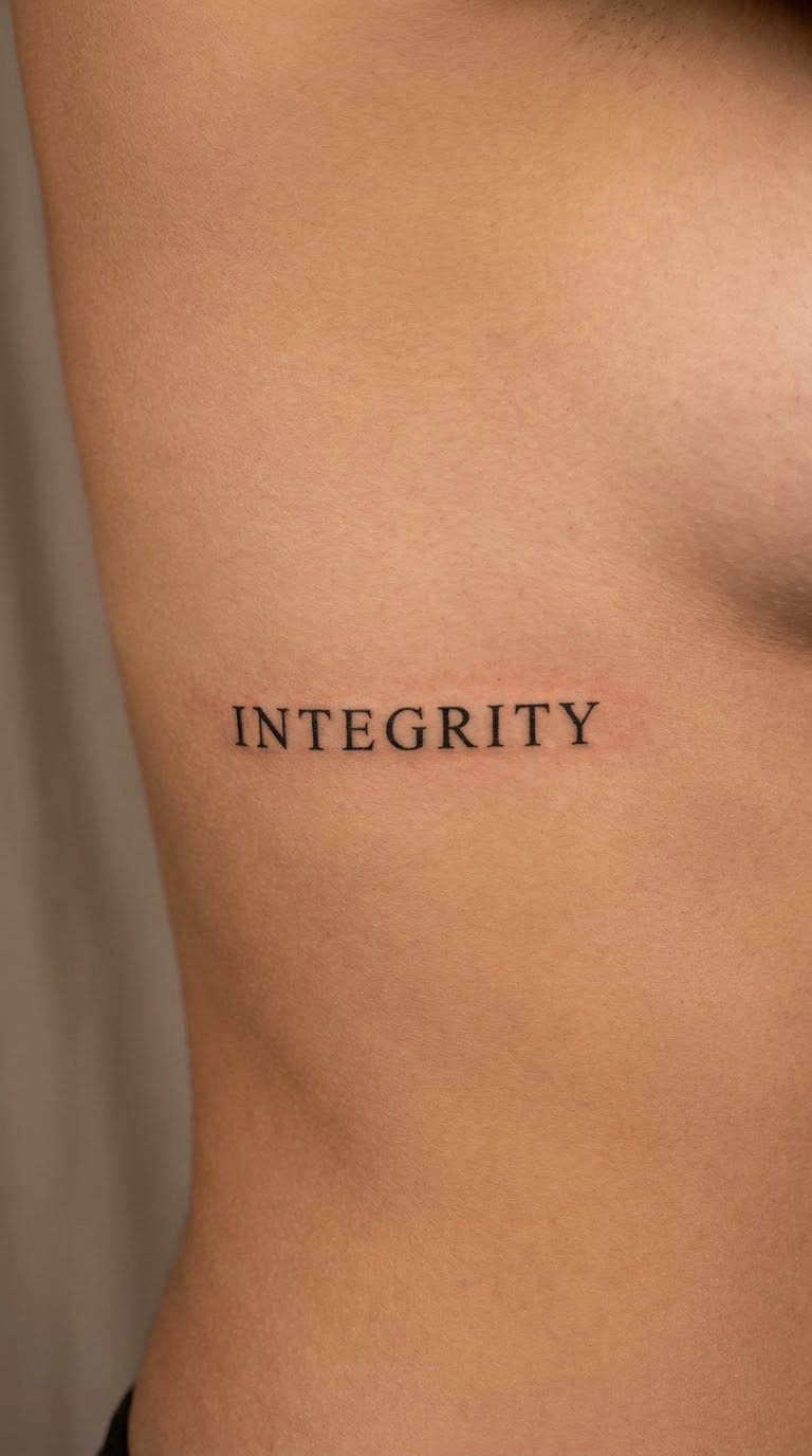
Integrity in minimal serif capitals is the quietest structured option here: nine letters, small bracketed serifs, an even horizontal baseline and no flourish anywhere. The restraint is the design.
People choose it for honesty and consistency, usually as something they want to read as a private standard rather than announce. Nothing about the word fixes a single meaning, so it stays as open as the person wearing it.
Placement: Lower ribs, side of the abdomen, or the inner forearm. Size: 3.5 to 4.5 in (9 to 11 cm) wide. Style: minimal serif capitals. Pain: high on the ribs, which are bony and thin-skinned, and a long sitting there is genuinely uncomfortable.
Make it yours: Ask the artist to pull the letterspacing a touch wider than feels right, and remember that thin serifs on sun-exposed ribs will need protection over the years.
10. Patience in Engraved-Style Lettering
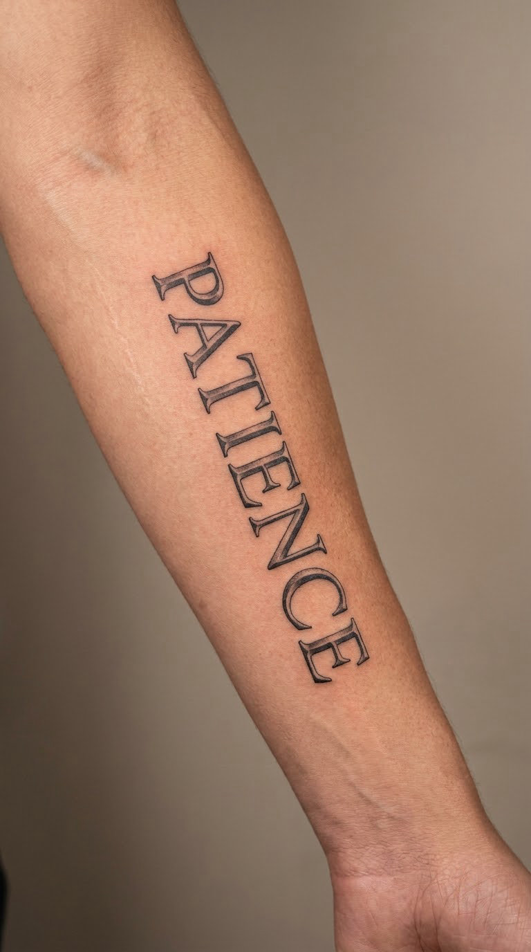
Engraved-style lettering borrows from banknotes and old print: capitals with fine hairline serifs, an engraved line texture and careful even spacing. It rewards patience as a subject in its own visual manner.
Collectors of classic typography gravitate here. The word also gets chosen by people working toward a slow goal, a qualification, a craft or a long save, where the reminder matters more than the statement.
Placement: Outer forearm lengthwise, or the upper arm. Size: 4.5 to 5.5 in (11 to 14 cm) long. Style: engraved-style capitals. Pain: medium on the outer forearm, with slightly higher sensitivity on the wrist end of the word.
Make it yours: Keep the hairline serifs above about half the body stroke thickness, because hairline detail is what softens first once the ink settles.
11. Ambition in Heavy Slab Serif
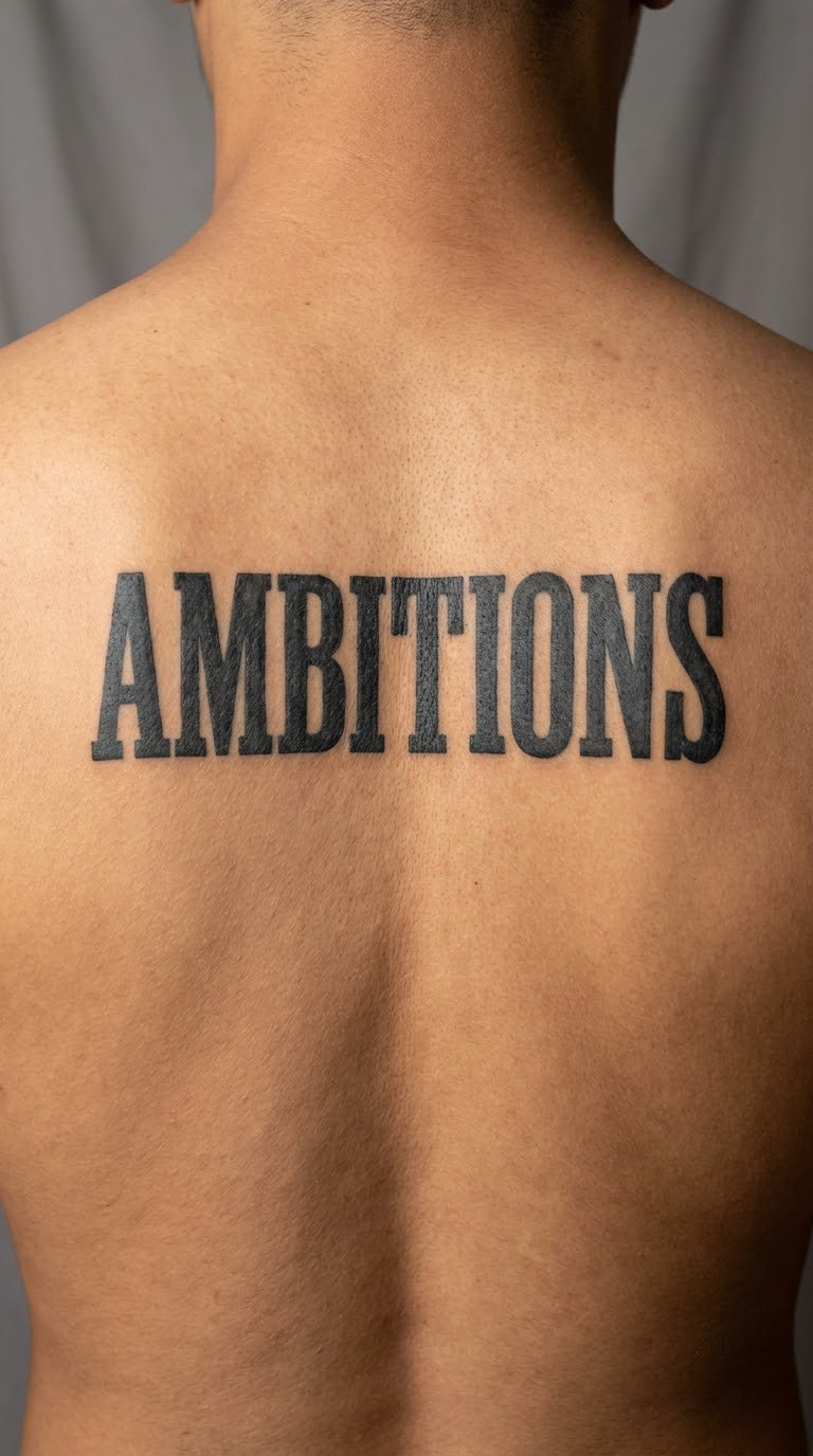
Ambition in heavy slab serif is built from blunt, rectangular serifs that look like they were cut with a chisel. Eight letters at a substantial weight need real width, and this is one of the few words here that rewards going bigger.
The meaning people attach is drive, long-term goals and forward motion rather than a fixed symbolic reading. Slab serif suits that because the letterforms look heavy enough to carry the weight of the word.
Placement: Upper back between the shoulder blades, or across the chest. Size: 5.5 to 6.5 in (14 to 16 cm) wide. Style: slab serif, solid black. Pain: medium on the upper back, and you get a strange tickling sensation that is generally easier to sit through than the ribs or the sternum.
Make it yours: Splay the serifs slightly by hand rather than keeping every terminal perfectly parallel, which softens the blockiness without losing the weight.
12. Rebirth in Restrained Watercolour Script
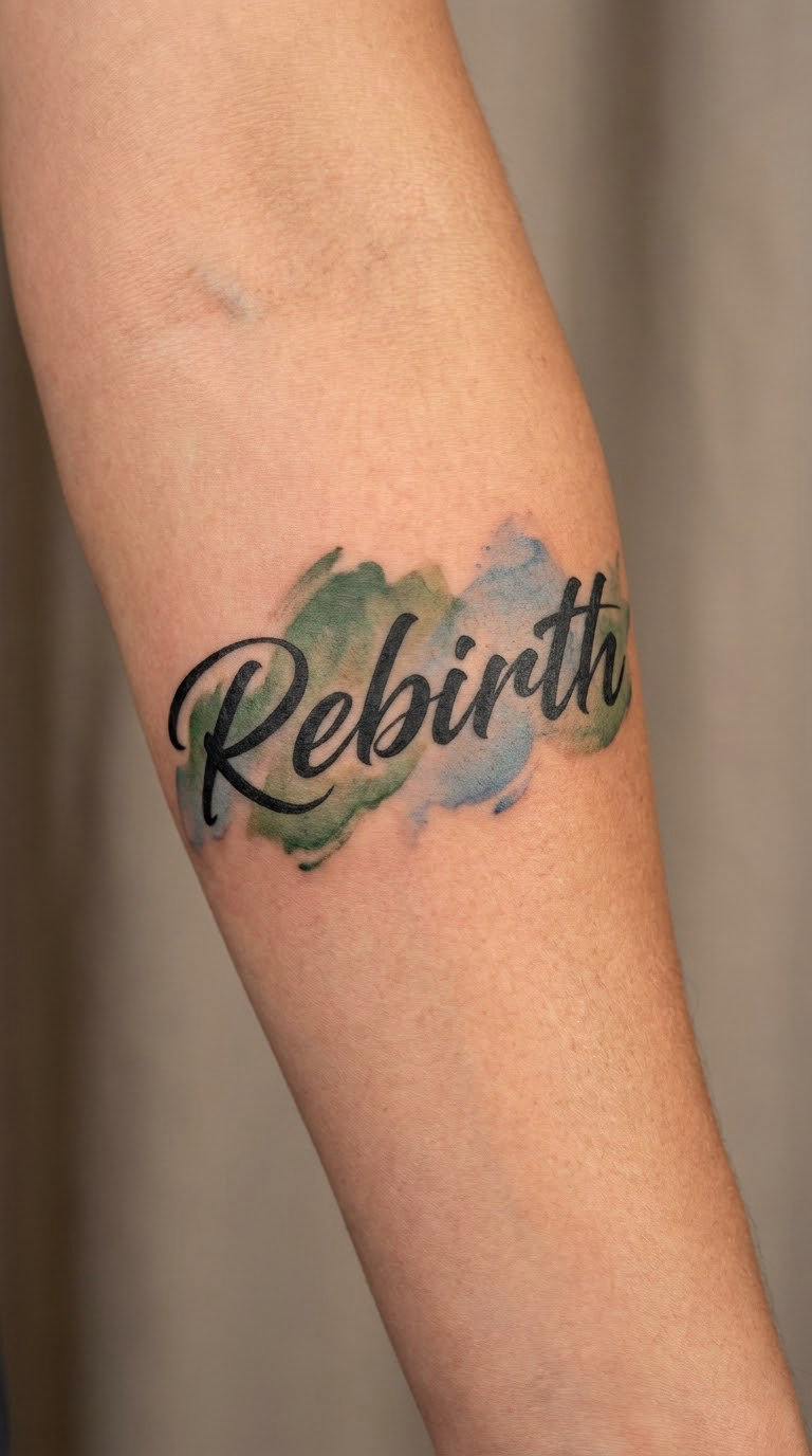
Rebirth in restrained watercolour keeps the word itself in solid black script and surrounds it with transparent washes bleeding past the letter edges. Muted green, dusty blue and a little ochre work; three or more saturated colours fight the lettering.
The word reads as a change of chapter, often after a move, a recovery or a new direction. Choose the colours deliberately and check them against any sleeve or tattoos you already have, because colour is the part that ages fastest and shows mismatches first.
Placement: Forearm, upper arm or the back of the shoulder where the skin is flat. Size: 3.5 to 4.5 in (9 to 11 cm) wide. Style: watercolour with black linework. Pain: medium on the forearm, lower on the shoulder.
Make it yours: Keep the wash to one colour and let it bleed in a single direction, so the piece still reads as a word tattoo rather than a painting with a word in it.
13. Loyalty in Traditional Lettering
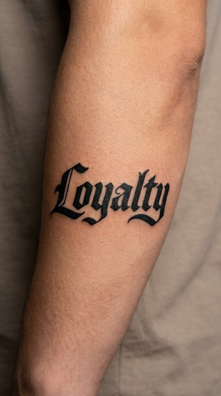
Traditional lettering wraps thick outlines around each letter and leaves the interiors solid black, the way old school flash lettering does. The result is heavy, graphic and readable from across a room without adding a single symbol.
Men choose Loyalty for partners, for a crew, for a unit or for themselves, and the traditional style keeps it from tipping into sentimental. It stays a word rather than a greeting card.
Placement: Outer arm, upper back or the shoulder. Size: 4.5 to 5.5 in (11 to 14 cm) wide. Style: traditional script, bold and outlined. Pain: medium on the outer arm, and solid fills need more passes so expect a longer sitting than the linework suggests.
Make it yours: Ask for a slight inner highlight in the thickest strokes, which keeps a heavy piece from reading as a flat block after a few years.
14. Respect in Old-English Type
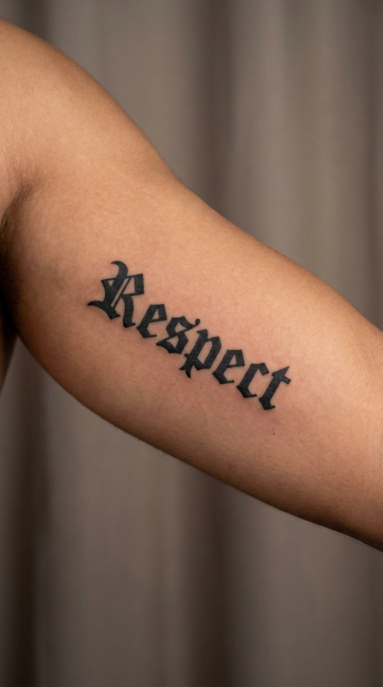
Old-English type has angular letterforms built from thick and thin strokes with split serifs, and it is a cousin of blackletter rather than a separate system. Seven letters give each one decent width, which matters more here than in most styles.
Respect is usually chosen for a parent, a mentor, an employer or an older brother. The lettering carries weight without a literal translation, so it suits a word people say out loud far more than they read.
Placement: Upper arm, outer forearm or the shoulder. Size: 4 to 5 in (10 to 13 cm) long. Style: Old-English, black ink. Pain: medium on the upper arm.
Make it yours: Request a simplified version with fewer internal hairline breaks, because the fine interior detail in traditional Old-English blurs noticeably over the years.
15. Gratitude in Blackwork Handwriting
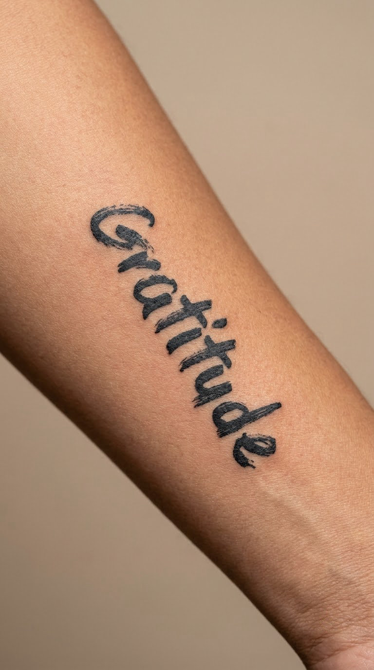
Gratitude in blackwork handwriting looks drawn rather than typed, with brush-like variation in stroke weight and a baseline that gently rises. Nine letters make it one of the longer words in this list, so the artist has to condense the letterforms to keep them readable.
It gets chosen as an everyday reminder, something you catch yourself glancing at, and handwriting is the right register for that. Grateful and gratitude both work here; gratitude simply needs more width.
Placement: Inner forearm running towards the elbow, or the outer calf. Size: 3.5 to 4.5 in (9 to 11 cm) long. Style: blackwork handwriting. Pain: medium on the inner forearm.
Make it yours: Give the artist a sample of your own handwriting to adapt, and ask them to simplify the tall letters, where handwriting loops tend to clog first.
16. Adventure in Condensed Block Type
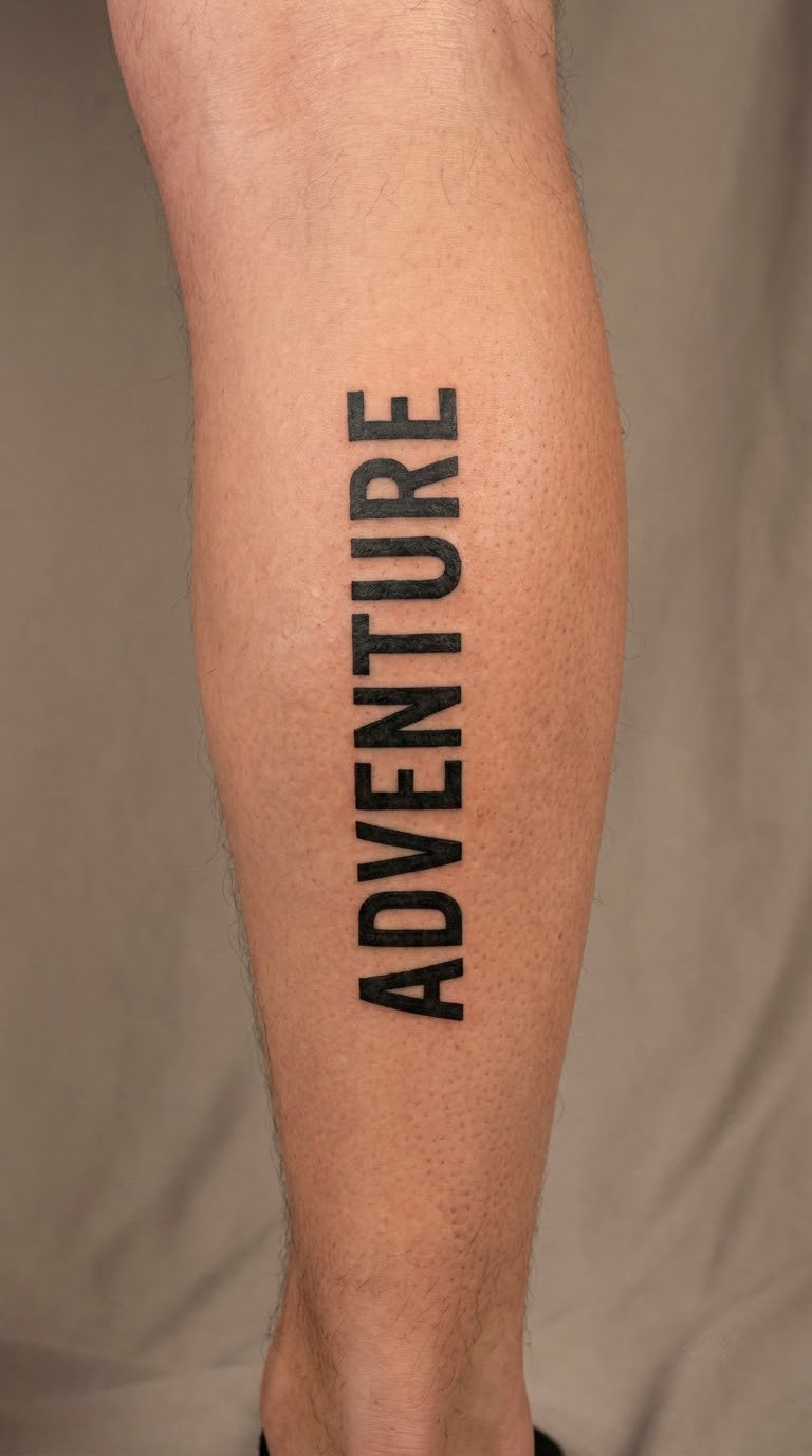
Adventure in condensed block capitals is nine letters squeezed into a narrow face with strong verticals and a hard, closed silhouette. Condensing is the trick that makes a long word work on a small canvas without shrinking the letterforms.
The word is picked for novelty-seeking and for a reluctance to settle, and the condensed block treatment keeps it confident rather than giddy. Turned vertically it uses the length of the leg, which most word tattoos waste.
Placement: Outer calf, vertically, or the inner forearm vertically. Size: 5.5 to 6.5 in (14 to 16 cm) tall. Style: condensed block capitals. Pain: medium on the calf, edging higher on the shin area.
Make it yours: Run it vertically and let the A break the outer edge of the column, which gives the long word a stronger shape than a centred horizontal line.
17. Confidence in Modern Calligraphy
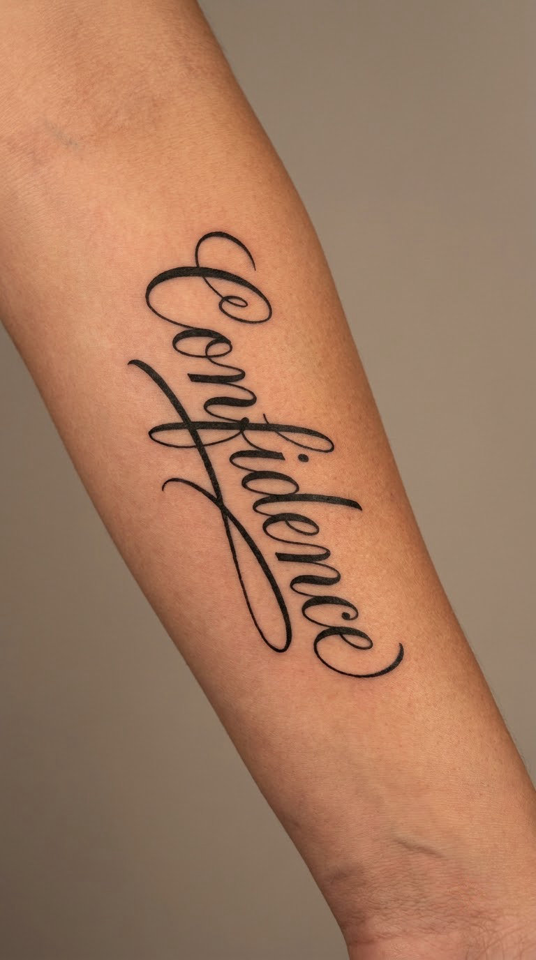
Modern calligraphy uses a broad nib held at a fixed angle, so the thick and thin strokes are mirror images of each other. Confidence gets a long entry stroke and an underline flourish that carries most of the visual weight.
People choose the word for self-belief, usually after a period of not having much of it, and the sweeping strokes give it momentum. The risk is the flourish: it only works if the word underneath is still perfectly readable.
Placement: Forearm, the flat of the bicep or the chest beneath the collarbone. Size: 4.5 to 5.5 in (11 to 14 cm) wide including the flourish. Style: modern calligraphy. Pain: medium on the forearm, low on the bicep.
Make it yours: Keep the underline separate from the letters with a small gap, so a faded flourish never turns into a smudge under the word.
18. Mindfulness in Fine-Line Roman Type
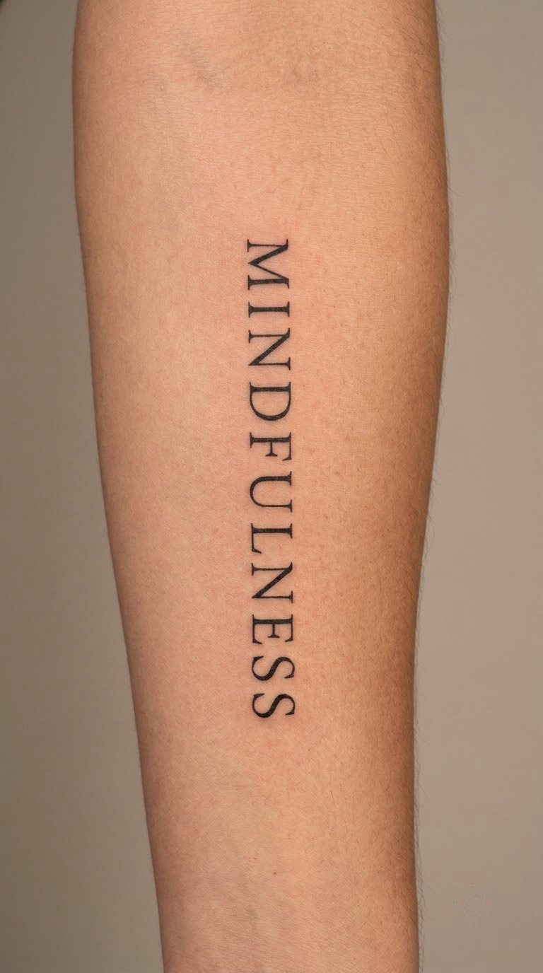
Mindfulness in fine-line Roman capitals is a quiet vertical column of thin strokes, evenly spaced, with no flourishes. Eleven letters is a lot to fit small, so the artist works letter by letter rather than compressing the whole word into a shape.
It suits someone who wants a reflective, understated statement rather than a loud one. Fine line suits the register, with the usual caveat about hairline strokes on skin that moves and flexes.
Placement: Inner forearm vertically, or the side of the calf. Size: 3.5 to 4.5 in (9 to 11 cm) tall. Style: fine-line Roman capitals. Pain: medium on the inner forearm, higher on the wrist end where the skin is thinner.
Make it yours: Ask the artist to cap the thinnest strokes at a single line weight with no variation, and to space the letters generously so each one can be read separately.
19. Strength in Blackwork Roman Capitals
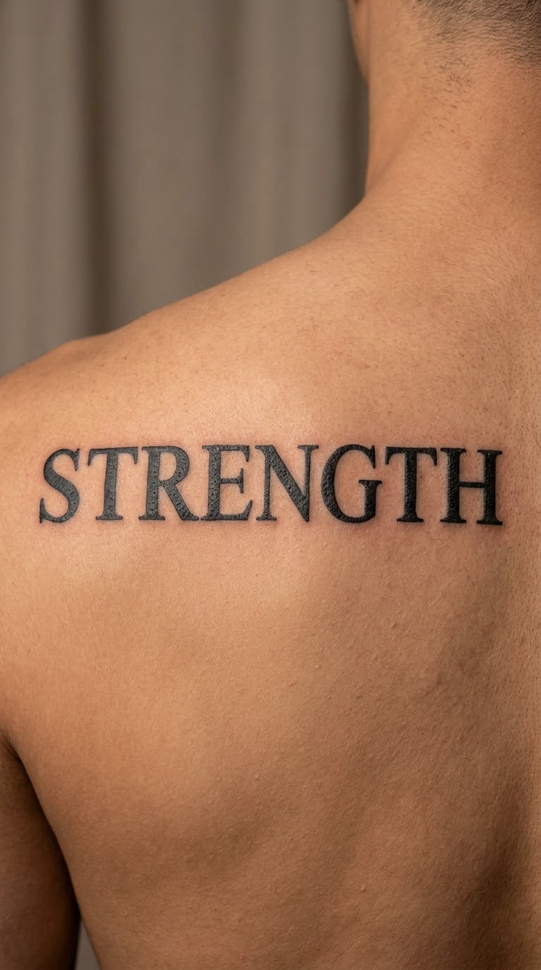
Strength in blackwork Roman capitals is the heaviest piece in this list. Serif capitals, wide proportions, solid black fill and enough space around the word that it sits on the back like a stamped panel rather than a line of text.
Men read it two ways, physical or emotional, and both are personal rather than fixed. At seven inches it is genuinely bold, and it works well as an anchor when a word tattoo is the first element of a wider typography collection.
Placement: Upper back across the shoulder blades, or the chest. Size: 6.5 to 7.5 in (16.5 to 19 cm) across. Style: blackwork Roman capitals. Pain: medium on the upper back, and a piece this size runs past an hour, so plan a break.
Make it yours: Ask for the letters to be drawn slightly wider than the reference and the inner corners of the serifs kept sharp, so the fill stays black as it ages.
20. Stillness in Micro-Realist Script
Stillness in micro-realist script is compact script with controlled hairline detail: a small word drawn at a small scale, where every stroke has to be exactly the right weight because there is very little of it. Eight letters in two and a half inches is the practical limit for this approach.
It is a quiet closing choice, chosen for calm and for the idea of pausing. Be honest about the trade-off: hands and fingers take the most friction and the most sun, so micro lettering blurs and fades faster than anything else in this list.
Placement: Outer wrist, inner wrist, or the side of a hand. Size: 2 to 3 in (5 to 7.5 cm) wide. Style: micro-realist script. Pain: high on the wrist, where the skin is thin and the bones sit right under it.
Make it yours: Look at healed photographs of the artist lettering work, not just fresh examples, and consider moving it from the wrist to the inner forearm if you want it to hold up longer.
How to Choose the Right Design
Most regret in word tattoos is not regret about the word. It is regret about the size, the placement or the spelling, all of which are decided in a ten minute conversation before anyone turns a machine on.
The real problem is rarely the pain. It is the thought of possibly regretting a tattoo in the first place, and that is a decision problem, which means it has a process.
Match the lettering to the style you already have
If you already have a sleeve or a defined style, bring healed photos to the consultation. A gothic or blackwork collection usually takes blackletter or a heavy traditional outline, a fine line collection takes fine line, and a colour piece needs the word to share its palette. Search terms help less than you think; healed photos of the artist lettering other people are more useful.
Size from the letter count, not the drawing
Ten letters need roughly twice the width of five at the same letter height, which is why Adventure and Mindfulness need a longer canvas than Loyalty or Steadfast. Long words on a small area force condensed faces, condensed faces close up, and closed letters stop being readable. If the word is long, change the placement before you shrink the letters.
Leave more letter spacing than looks right
Ink spreads slightly into the surrounding skin as a tattoo settles, and the gaps between letters close up over the years. What looks like sloppy spacing on a stencil is usually correct. If you have a full size printout, read it at arm’s length rather than from six inches away.
Match the weight of the type to the weight of the word
A heavy word in hairline script and a quiet word in thick block capitals both fight their meaning. Community consensus is the same on this point across lettering forums: hand-drawn lettering beats a font chosen at the counter every time, so bring references, not screenshots.
Check spelling three times before the stencil goes down
Once the stencil is on the skin, the error is permanent and expensive to fix. Have the artist write the word in front of you, read it back letter by letter, and check any foreign language, Latin or runic version with a fluent speaker rather than a translation app. If you want a word in another script, confirm the script and the reading order too.
Think about sun, friction and what already covers it
Sun-exposed areas fade first, and the outer wrist and hands wear fastest because of movement and friction. If there is a wedding band, a watch strap or a work shirt cuff, look at where the word sits before you commit, and check that it will not clash with a piece you are planning. More men planning a word tattoo in 2026 are matching an existing piece, and that conversation is much easier before the design is finished.
For placement ideas that work alongside a single word, our guides to 20 best wrist band tattoo ideas for minimalist looks, 20 best knuckle tattoo ideas for men and 20 best inner bicep tattoo ideas for men cover the canvas around the word itself.
Cost and Session Time
Almost every studio prices lettering by the hour rather than by the word, and most have a minimum charge that a small two inch script will not drop below. Expect a simple single word in one line to take 45 to 90 minutes, a wide or condensed word with a flourish to take an hour and a half to two and a half, and something like a seven inch blackwork block to run past two hours.
Treat these as US ballpark figures rather than quotes, because hourly rates swing hard by city and by shop tier:
- Under 2 in (5 cm): about $120 to $200, and often billed at the shop minimum instead of by size.
- 2 to 4 in (5 to 10 cm): about $180 to $300 for a single line of lettering.
- 4 to 6 in (10 to 15 cm): about $250 to $450, and higher if the lettering is custom drawn rather than traced from a reference.
- 6 in (15 cm) and up, or any colour work: about $400 to $800, usually split across two sittings.
What moves the number: the size of the word, whether the lettering is custom drawn or copied from a reference, whether it is one solid black fill or a colour piece, the shop minimum, the artist hourly rate and where you are. Guest spot and walk-in rates are usually lower per hour and come with a longer wait.
Two practical notes. Shop minimums are the reason a small word tattoo costs about the same as a much larger one, so ask about the minimum when you book rather than after the stencil is placed. And ask whether the fee covers a touch-up: most artists include one, but the studio policy is the one that counts, so get the answer in writing.
Aftercare Basics
Start with your artist’s aftercare instructions, because they know the depth and the style they used.
- Wash gently. Clean with lukewarm water and a mild unscented soap, then rinse thoroughly, using your hand rather than a cloth.
- Pat dry and leave it alone. Pat the area with clean paper or a fresh soft towel. Let it air dry and do not scrape flakes or pick at scabs.
- Cover it loosely. A clean, breathable layer helps with clothing friction. Keep it covered while you sleep for the first few nights if the area is on a shoulder or thigh.
- Keep it out of water. Avoid swimming, hot tubs and lakes until the piece has healed, and keep showers short with the ink kept out of the direct spray.
- Hold off on everything else. Skip sunbathing and tanning for a couple of weeks, and hold off on gym work that heavily sweats or rubs the area until your artist clears it.
- Watch the healing, then forget it. Follow whatever your artist tells you to look for during healing, and once it has settled, stop poking at it. Set a calendar reminder for a yearly check on sun-exposed lettering.
Frequently Asked Questions
What is the best font for a one word tattoo?
The best font is the one with even stroke weight and open counters, hand drawn by your artist rather than picked off a printed sheet. Block sans-serif capitals age best because the strokes are uniform. Fine-line script looks the most elegant and ages the worst on moving skin. If you are choosing a one word tattoo idea for men and want it to last, a clean serif or a bold sans-serif is the safest bet.
Should a one word tattoo be in cursive or print?
Use print lettering for shorter, heavier words like Loyalty, Steadfast or Adventure, where the silhouette holds up at a distance. Use script for longer or softer words like Grateful, Gratitude or Confidence, where the connected strokes carry the movement. Match the style to the register of the word, and let the letter count decide the size, not the other way around.
How large should a one word tattoo be?
Letter count drives width, and width drives placement. A five or six letter word fits comfortably at 3 to 4 inches (7.5 to 10 cm), a nine or ten letter word needs 5 to 6 inches (13 to 15 cm), and eleven letters want a long canvas such as a calf or upper back. Going smaller to fit a small spot is a frequent reason a word tattoo becomes unreadable, so choose the placement that suits the word instead.
Do wrist and hand word tattoos fade quickly?
Faster than most. The outer wrist, inner wrist, hands and fingers take constant movement, friction and sun, and fine hairline strokes there soften and blur within a few years. Bold, even-weight lettering holds up much better than micro script on those areas. If long-term legibility matters to you, move the word to the inner forearm or the upper arm, and protect sun-exposed lettering with sunscreen once it has healed.
Can a one word tattoo be made smaller without losing legibility?
Only so far. Legibility depends on the height of the lower case letters, and hairline strokes that go too thin spread into their neighbours as the ink settles. Condensed faces help with long words by narrowing the width rather than shrinking the height, which is why a condensed block word can sit at six inches tall on a calf. Below roughly 2.5 inches (6 cm) of overall width, a nine letter word starts closing up, so keep it larger or pick a shorter word.
Conclusion
If this is your first tattoo and you want it quiet, go with Grateful in fine-line script at around three inches on the inner forearm. It reads cleanly, it suits any existing work, and it is the easiest of the twenty to live with.
If you want the piece to carry a room, go with Strength in blackwork Roman capitals at seven inches across the upper back. It also works as the first element of a typography collection, since a bold block word leaves space for more lettering later.
Whichever you pick, bring healed photos of the artist’s lettering to the consultation, read the stencil before it goes down, and settle the size around the word rather than the spot you had in mind.