
20 Best Inner Bicep Tattoo Ideas for Men (September 2026)
An inner bicep tattoo is permanent ink placed on the inner surface of the upper arm, in the strip of skin between the armpit and the elbow. It is one of the few arm placements that disappears completely at rest and shows in full the moment you lift a hand, reach for something, or flex. That is why inner bicep tattoo ideas for men keep coming up: the placement holds a design that is personal rather than public, and it fills the one gap an outer arm sleeve always leaves.
What follows is twenty of them, grouped by how they sit on that curved, constantly moving surface. Every entry notes the zone it works best in, a realistic size, the pain you should expect there, and one honest note about how it ages. The designs lean toward what actually holds up: bold shapes over hairlines, drawings that follow the arm’s curve rather than fighting it, and pieces that still make sense when the muscle underneath them changes.
One practical thing first. If you are booking this, autumn and winter are easier than summer. Short sleeves mean less sun on fresh ink, and less sweat in a warm session. Spring and early summer work too, just plan a couple of weeks of loose shirts and no heavy lifting while it settles.
Quick Guide: Every Idea at a Glance
| Idea | Style | Best placement | Size | Pain |
|---|---|---|---|---|
| Blackwork serpent | Blackwork | Mid bicep, wrapping | 8-12 in (20-30 cm) | Medium-high |
| Thorned traditional rose | Traditional American | Lower inner bicep | 4-6 in (10-15 cm) | Medium |
| Japanese dragon scale | Irezumi | Upper inner bicep near armpit | 6-10 in (15-25 cm) | High |
| Sacred geometry lattice | Geometric blackwork | Mid to lower bicep | 5-8 in (13-20 cm) | Medium |
| Flying bird in fine line | Fine line | Lower inner bicep | 2-4 in (5-10 cm) | Low |
| Koi in a water ripple | Irezumi | Mid bicep to elbow | 7-11 in (18-28 cm) | Medium-high |
| Wolf in profile | Black and grey realism | Mid bicep | 5-7 in (13-18 cm) | Medium |
| Compass rose | Minimal blackwork | Upper inner bicep | 3-5 in (8-13 cm) | Medium-high |
| Coordinates in script | Fine line script | Lower inner bicep toward elbow | 2-3 in (5-8 cm) | Low |
| Moon phase column | Minimal line work | Mid to lower bicep | 4-6 in (10-15 cm) | Low |
| Tribal band | Tribal | Bicep to elbow wrap | 10-14 in (25-35 cm) | Medium |
| Blackwork lion head | Blackwork realism | Upper inner bicep | 4-6 in (10-15 cm) | High |
| Pocket watch clock face | Traditional illustrative | Mid bicep | 3-4 in (8-10 cm) | Medium |
| Soundwave line | Minimal single line | Lower inner bicep | 3-5 in (8-13 cm) | Low |
| Dotwork mandala | Dotwork and ornamental | Mid bicep | 4-6 in (10-15 cm) | Medium |
| Skull in black and grey | Realism | Mid to lower bicep | 4-6 in (10-15 cm) | Medium |
| Samurai mask | Traditional Japanese | Upper inner bicep near armpit | 5-8 in (13-20 cm) | High |
| Olive branch in fine line | Botanical fine line | Lower inner bicep | 3-5 in (8-13 cm) | Low |
| Peacock feather in colour | Colour realism | Mid bicep | 5-7 in (13-18 cm) | Medium-high |
| Mountain range in grey wash | Illustrative landscape | Bicep to elbow wrap | 8-12 in (20-30 cm) | Medium |
1. Blackwork Serpent Wrapping the Mid Bicep
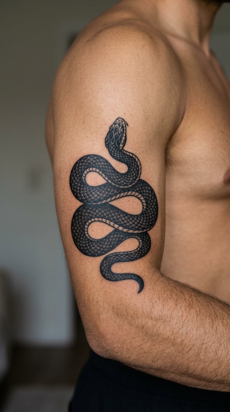
The design is one continuous snake, drawn in solid black with a hard edge between the scales and the background, coiling two or three times so the body disappears behind itself and reappears further down the arm. Artists who work this style usually leave the background skin alone rather than filling it black, so the piece reads as a band of dark shape on pale skin rather than a solid panel.
It is the most flexible option on this list for shape. A snake can be re-proportioned to fit almost any zone, which matters if you do not yet know where on the arm you want it to sit.
Placement: Mid bicep, the sweet spot between the armpit and the elbow crease. Size: 8-12 in (20-30 cm) for two full coils, or 5-6 in for a single loop. Style: blackwork. Pain: medium-high, roughly a 6 out of 10, and the solid black fills are where you feel it most, because the needle works the same area repeatedly. Make it yours: have the head face down the arm toward your hand, so it reads as movement rather than a static shape.
2. Thorned Traditional Rose in Red and Green
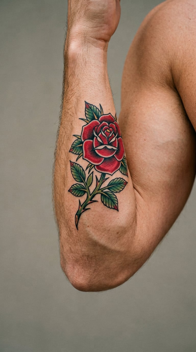
Heavy black outline, red petals built from flat washes of two or three values, and a green stem that trails off and turns into two or three thorns. The traditional rose is old enough that a good version never looks dated, and the bold saturation survives years of sun far better than pale colour work does.
It gets chosen as a memorial piece more often than anything else on this list. A rose can mark a person, a date, or simply a decade you wanted on your skin.
Placement: Lower inner bicep, below the muscle belly, where the skin is flatter and the curve gives way to a straighter run. Size: 4-6 in (10-15 cm) across the bloom. Style: traditional American. Pain: medium, nearer a 5 out of 10, since most of the work is outline and flat colour rather than deep shading. Make it yours: have one thorn drawn without a leaf, which in the old story reads as grief carried quietly rather than stated.
3. Japanese Dragon Scale Segment Near the Armpit
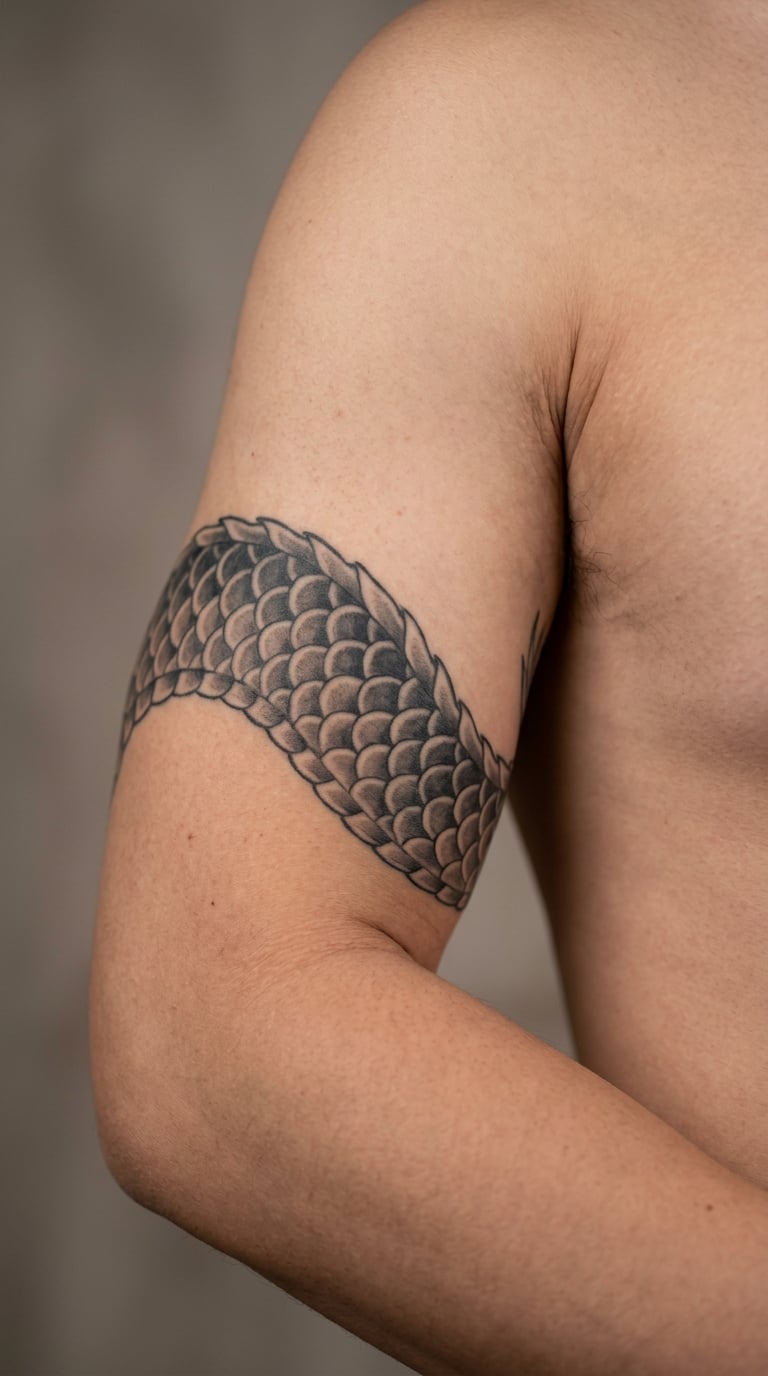
A section of dragon hide rather than a whole dragon: overlapping scales in grey washes, some areas pushed to near-solid black, with the pattern curving away around the arm. Irezumi is usually built as a piece of a larger body, so this works beautifully as a panel that a sleeve can be built around later, either before or after.
Dragon work is one of the few motifs that reads as traditional rather than decorative at almost any size.
Placement: Upper inner bicep, close to the armpit. Size: 6-10 in (15-25 cm). Style: irezumi, meaning the Japanese style. Pain: high, closer to a 7 out of 10, because the skin near the armpit is thin and very mobile. One poster on r/tattooadvice described the inside of the bicep as the point where it gets noticeably worse the closer you go to the armpit. Make it yours: ask for the scales to fade out toward the elbow so the piece can quietly grow into a larger panel.
4. Sacred Geometry Lattice in Solid Black
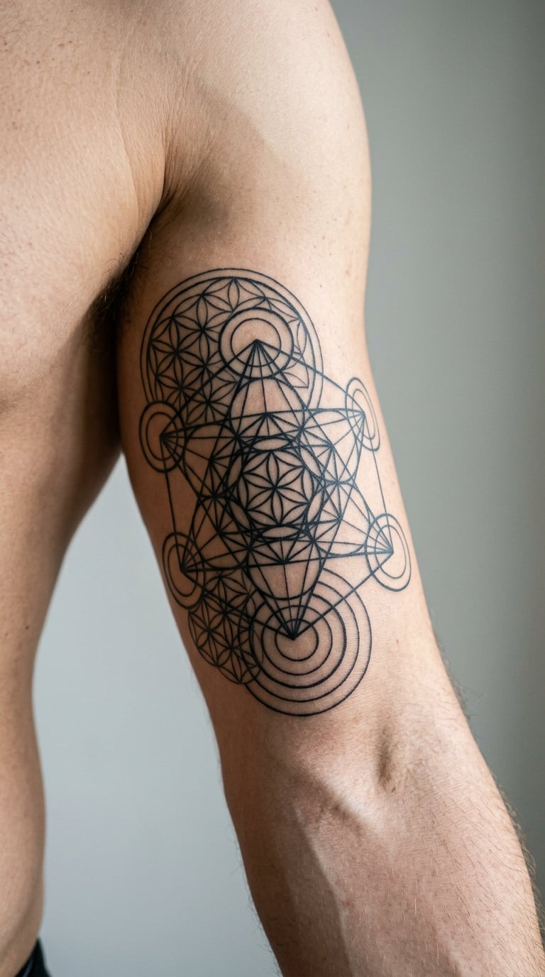
Overlapping circles, triangles and hexagon grids drawn as even-weight black lines that cross and merge into a continuous lattice. There is no shading and no colour, which is exactly the point: the whole design is line weight, so an artist with clean geometry can build something intricate out of nothing but patience.
It carries no fixed meaning, which some people prefer. It reads as order and structure rather than as a symbol pointing at something in your past.
Placement: Mid to lower inner bicep, where there is a broad enough flat area to keep the grid even. Size: 5-8 in (13-20 cm). Style: geometric blackwork. Pain: medium, about a 5 out of 10, since it is all single-pass line work. Make it yours: build one repeating figure from something personal, a set of initials or a date reduced to geometry, and let the rest of the lattice be ordinary.
5. Fine-Line Bird in Flight
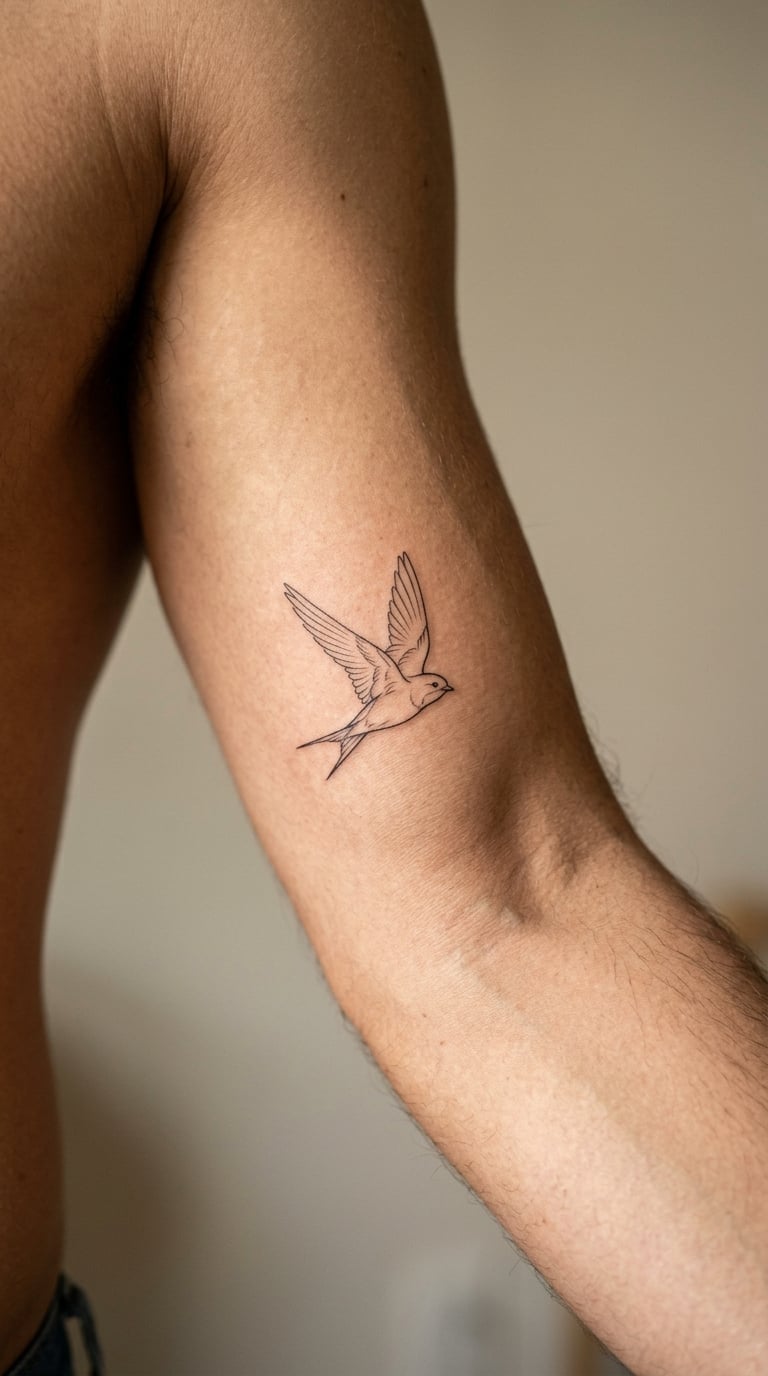
One or two birds in flight, drawn in hairline weight with a few deliberate thicker strokes for the wing edge. Nothing is shaded and no background is added. The whole effect depends on restraint: two birds the size of your palm sit on the lower inner arm and read as deliberate rather than empty.
It is often chosen for what it suggests rather than for a memorial: freedom, travel, or the person who taught you to fly.
Placement: Lower inner bicep, close to the elbow crease. Size: 2-4 in (5-10 cm). Style: fine line. Pain: low, around a 4 out of 10, and fine line is generally the least painful approach on this placement, a point several people made on r/tattooadvice when comparing it with shaded and coloured options. One honest note: fine line on the hands fades fast, and on the lower arm it can soften noticeably within a few years, so plan on a touch-up. Make it yours: have the birds face away from your body so they appear to fly up the arm.
6. Koi Fish in a Water Ripple
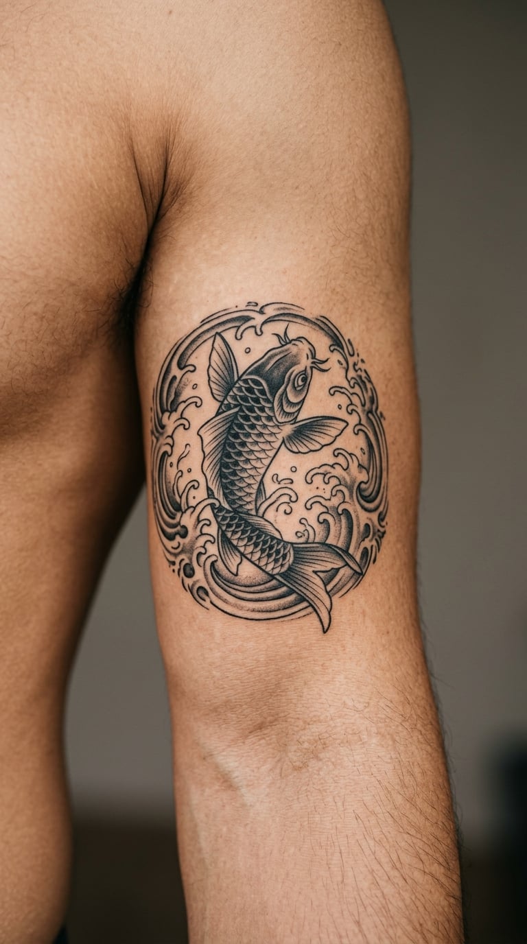
A koi curved into a near-circle, scales drawn in fine stippled shading with the belly left pale, set inside a ring of broken water lines and a few floating petals. The circle is the reason this design works on a bicep: it gives the artist a shape that already accounts for the arm’s curve instead of ignoring it.
Koi carry a long association with perseverance, since they are supposed to swim upstream, and plenty of men pick them after a hard year.
Placement: Mid bicep running toward the elbow. Size: 7-11 in (18-28 cm). Style: irezumi. Pain: medium-high, around a 6 out of 10, and the shaded scale work is the part that hurts most, since shading means going over the same skin repeatedly. Make it yours: have the water lines break at the front of the arm and pick up on the other side, so the flow continues around the whole bicep.
7. Wolf in Profile in Black and Grey
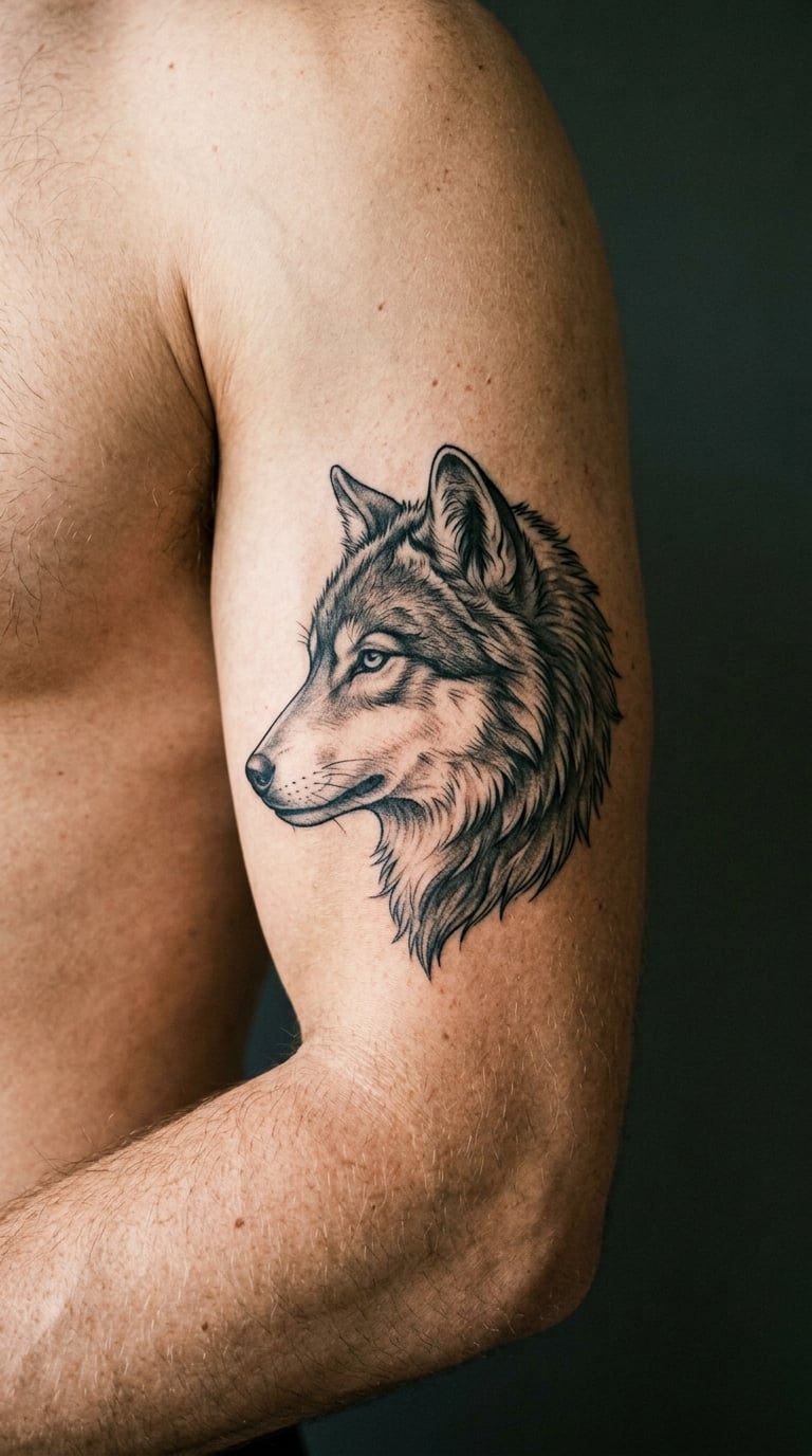
A wolf’s head at a three-quarter angle, with the fur built from soft grey shading rather than hard line work, the eye left clear and pale, and no background behind it. Realistic black and grey portraits sit well here because the inner bicep gives the artist a flat enough plane to work in and a soft enough light to judge the gradient against.
It is the most personal animal on this list, and it usually arrives with a story attached: a nickname, a pack, a difficult year.
Placement: Mid bicep. Size: 5-7 in (13-18 cm). Style: black and grey realism. Pain: medium, a 5 to 6 out of 10, mostly from the gradient shading. Make it yours: have the wolf looking back over the shoulder toward your face, so the two of you make eye contact when you look down at it.
8. Compass Rose in Minimal Blackwork
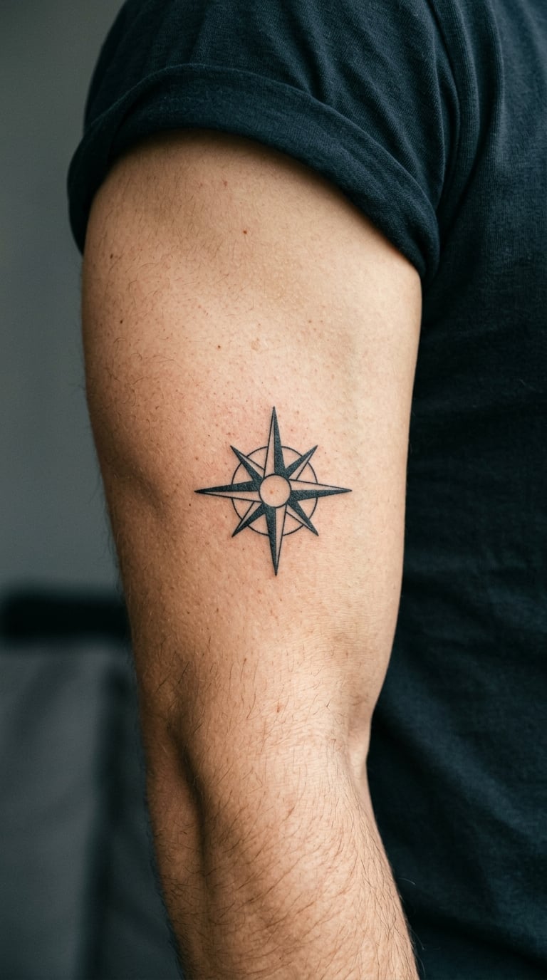
Eight points, each one a triangle, radiating from a small circle, with a single line marking north. It is about as simple as a design can get and still look deliberate, and that simplicity is the point: nothing on the arm competes with it and the shape stays readable from across a room.
Compasses get chosen for direction, for travel, or for a person who was the bearing that got someone somewhere.
Placement: Upper inner bicep, though the design is flat enough to work anywhere on the arm. Size: 3-5 in (8-13 cm). Style: minimal blackwork. Pain: medium-high, a 6 out of 10, and the reason is the placement rather than the design. Low ink volume does not mean low sensation. Make it yours: have the north point replaced with a small solid star, or add the four initials of somewhere you have never been to yet.
9. Coordinates in Fine Line Script
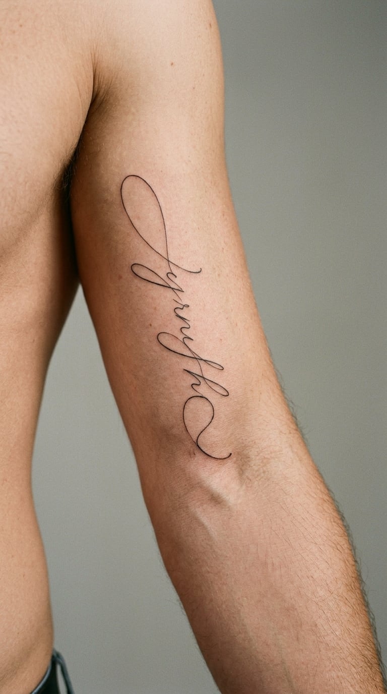
A line of flowing cursive, usually a latitude and longitude pair, set along the arm so the script runs lengthwise rather than across it. Set it vertically and you turn the numbers into a design; set it across the arm and it is a note to yourself that only reads from one angle.
These are almost always a place. A beach, a stadium, a trailhead, or the coordinates of a house that no longer exists.
Placement: Lower inner bicep, running toward the elbow so the script follows the length of the arm. Size: 2-3 in (5-8 cm). Style: fine line script. Pain: low, roughly a 4 out of 10. The skin here is forgiving, and small lettering needs very few passes. One ageing note that matters: thin cursive is the first thing to blur on an inner arm, so a heavier line weight is worth asking for. Make it yours: pair the coordinates with a tiny landmark outline, a mountain or a bridge, at the end of the line.
10. Moon Phase Column
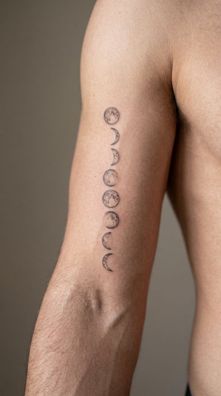
Eight circles stacked in a column, alternating between new moon, crescent, half and full, each one drawn in simple outline. It is a purely graphic design, no shading anywhere, and it suits the arm unusually well because a straight column of circles can be laid out on a curved surface and still read as a straight line.
Men pick the moon phases to mark a specific stretch of time, a season, or a year that mattered, without having to write the dates down.
Placement: Mid to lower inner bicep, which gives you room for a clean vertical stack. Size: 4-6 in (10-15 cm) for the full column. Style: minimal line work. Pain: low, a 4 out of 10, as it is nothing but repeated outline. Make it yours: have the matching full moon filled solid and the new moon left as an empty outline, so the design has a visual centre instead of eight equal marks.
11. Tribal Band Running From Bicep to Elbow
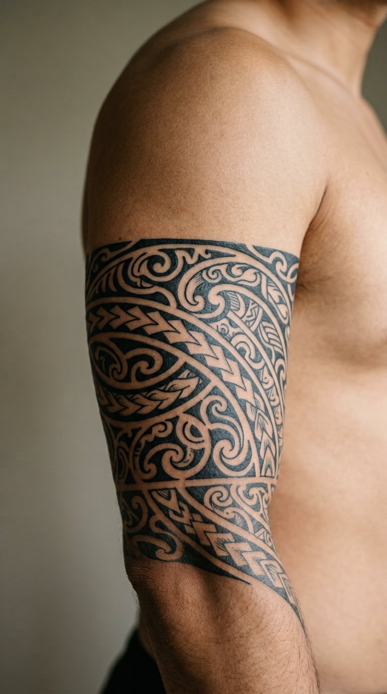
A wrap of heavy black shapes with curved spines and repeating negative space, designed to read as a band circling the arm rather than as a picture on it. Tribal work takes advantage of the fact that the inner arm is one continuous surface, so the pattern can travel around the limb without hitting an edge.
It is the one design on this list that is really about shape language, not about an image, which is why it sits so comfortably with a full sleeve.
Placement: Bicep to elbow, as a wrap. Size: 10-14 in (25-35 cm) of band. Style: tribal. Pain: medium, a 5 to 6 out of 10, and the black fills are the demanding part. Make it yours: give the band a single repeating motif drawn from something specific to you, so it stops being a stock shape set and starts being yours.
12. Blackwork Lion Head
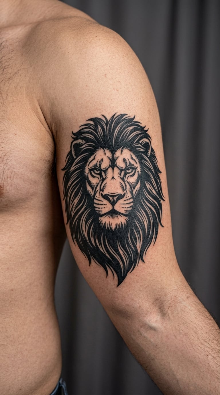
A lion’s face straight on, mane built from large solid black shapes that flare outward in clumps, eyes and muzzle left as negative space. The technique is called blackwork because the design is mostly ink with the highlights carved out of it, which makes it one of the few animal designs that reads clearly at a distance and holds its edges for years.
Strength, nerve, or a family name. All three turn up regularly.
Placement: Upper inner bicep, the zone with the least flat surface, so the mane is angled to follow the muscle rather than sit square on it. Size: 4-6 in (10-15 cm). Style: blackwork realism. Pain: high, a 7 out of 10. Large solid blacks on mobile skin near the armpit are the two hardest things in this placement combined, and the inner bicep is already described on r/tattooadvice as the spot that gets worse the closer it sits to the armpit. Make it yours: have the mane shape shift into an ornamental pattern at the edges, which softens the transition into an existing sleeve.
13. Pocket Watch Clock Face
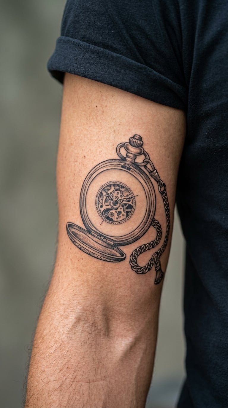
A round watch face in fine illustrative line work, a winding crown at the top, and a short chain trailing off one side. It is small, detailed and a little old-fashioned, and it reads as an heirloom object rather than as an illustration, which is why it does not need any background work.
Time is the obvious reading. It is also the most common choice for a family piece, a grandfather’s watch, or a date with a specific hour attached to it.
Placement: Mid bicep. Size: 3-4 in (8-10 cm) including the chain. Style: traditional illustrative. Pain: medium, a 5 out of 10, mostly from the small markings on the dial, which need a steady hand and a lot of tiny passes. Make it yours: have the hands stopped at a specific time rather than left at ten past ten, which is what most stock versions use.
14. Soundwave Line
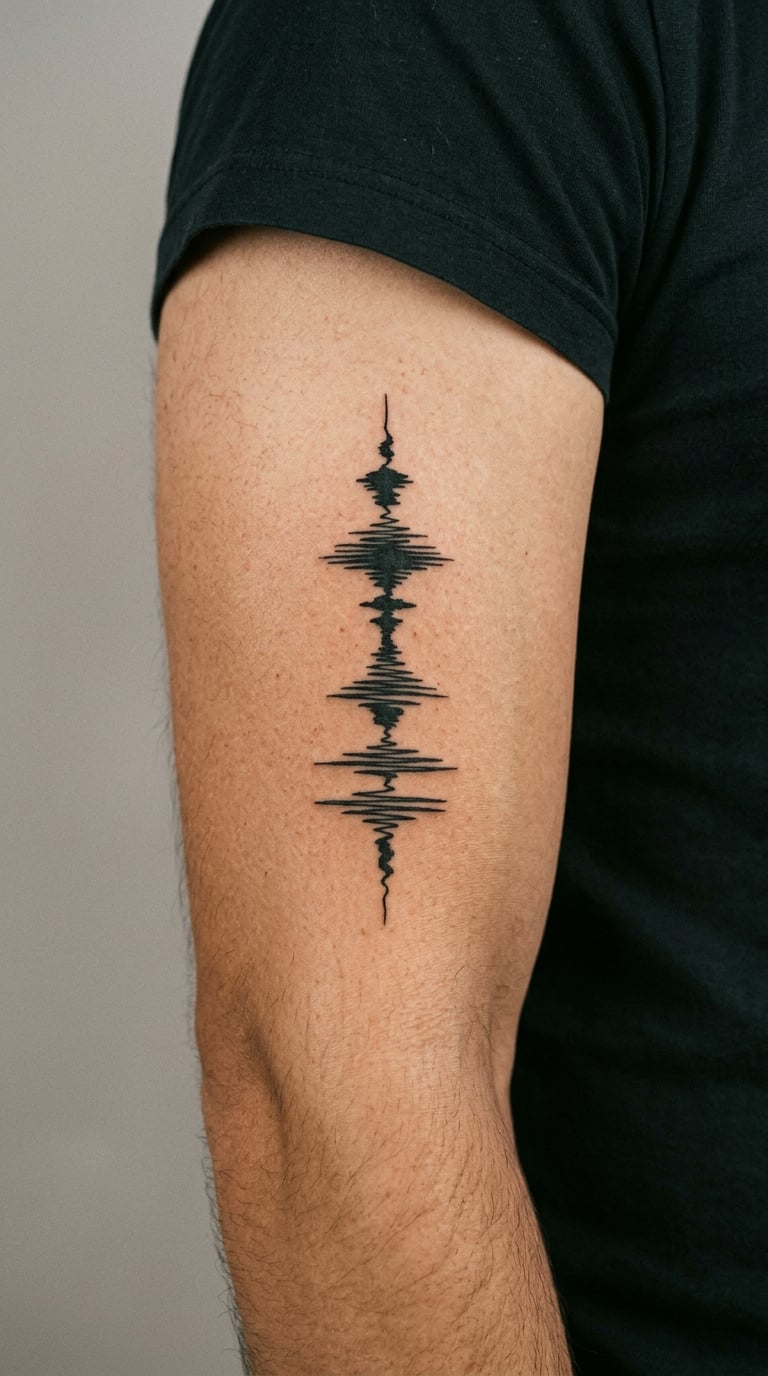
A waveform running along the arm, tall peaks and flat valleys, drawn in one solid line whose thickness changes with the amplitude. It is the simplest design on this list to describe and one of the few that can be generated from something real rather than drawn freehand, which means it can be exactly accurate to a song or a voice.
Most people get one for a song, a podcast line, or a single sentence from someone who mattered.
Placement: Lower inner bicep. Size: 3-5 in (8-13 cm). Style: minimal single line. Pain: low, a 4 out of 10. Make it yours: name the exact moment in the audio before the appointment, in seconds, so the artist can work from the right segment rather than picking one for you.
15. Dotwork Mandala
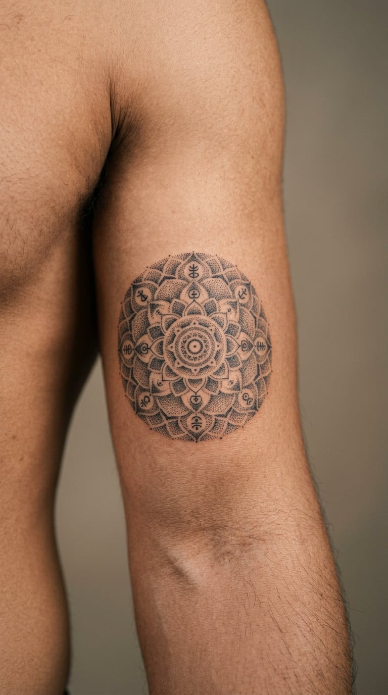
A circular mandala built entirely from dots, shaded in bands of density to create the pattern, with no solid lines anywhere except the outer ring. Dotwork suits a rounded surface particularly well because the texture absorbs small irregularities: on a curved, moving area the dot gradient hides small shifts that a hard outline would exaggerate.
It is decorative rather than symbolic, and the radius of the mandala can be set to match the circumference of the arm so the outer ring sits flush.
Placement: Mid bicep, which is the widest part of the inner arm and gives you the cleanest circle. Size: 4-6 in (10-15 cm) across. Style: dotwork and ornamental. Pain: medium, a 5 out of 10, and the dot shading is the slow part, since each pass covers very little skin. Make it yours: have the centre replaced with a small solid shape, so the design has a focal point instead of fading from the middle out.
16. Skull in Black and Grey
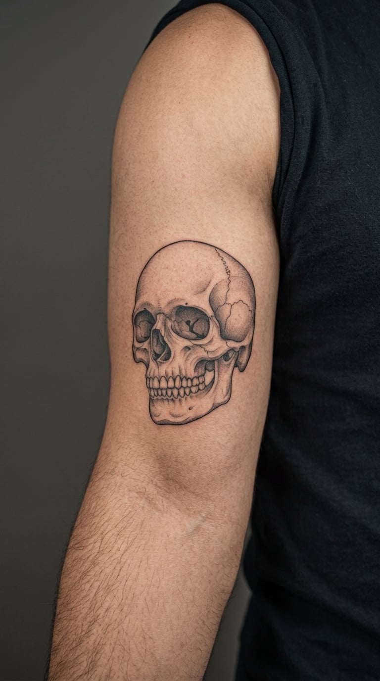
A skull rendered with tonal shading rather than outlines: the eye sockets as deep black, the cheekbone built from a smooth grey gradient, teeth picked out with fine line. Realistic skulls need no background, because the form carries itself, and a shaded version ages far better than a black outline of the same image.
It is chosen for mortality, for a job in a risky line of work, for a parent or grandparent, or sometimes simply because it is a good drawing.
Placement: Mid to lower inner bicep. Size: 4-6 in (10-15 cm). Style: realism. Pain: medium, a 5 to 6 out of 10, with the gradient work in the cheekbone and jaw being the sharpest part of the session. Make it yours: have the jaw angle toward the elbow so the skull is looking down your own arm, and add a very small bloom of leaves at the base of the cranium.
17. Samurai Mask in Traditional Japanese Style
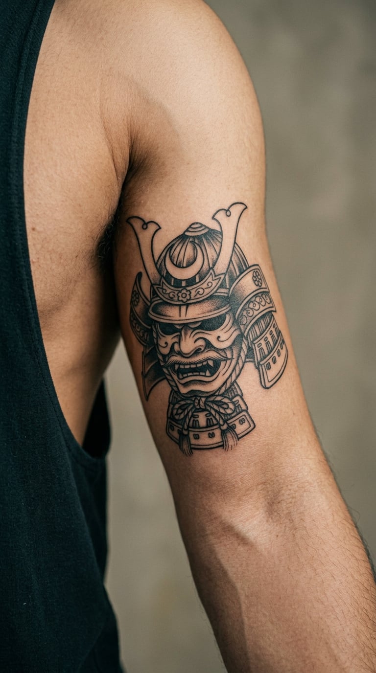
A kabuto helmet in bold traditional Japanese style: hard flat colours, a fierce expression, strong black contours and a crest rising above the brow. Traditional work like this is built in flat colour fields rather than gradients, so it holds its shape and its edges for a very long time on skin that flexes.
Discipline, a code you live by, or an ancestor you carry with you.
Placement: Upper inner bicep near the armpit. Size: 5-8 in (13-20 cm). Style: traditional Japanese. Pain: high, around a 7 out of 10, for the same reason as the other upper-zone designs: thin, mobile skin close to the body. Make it yours: put the crest or horns at the top of the design where they follow the natural rise of the muscle toward the shoulder, so the piece looks like it is sitting in the anatomy rather than pasted on.
18. Olive Branch in Fine Line
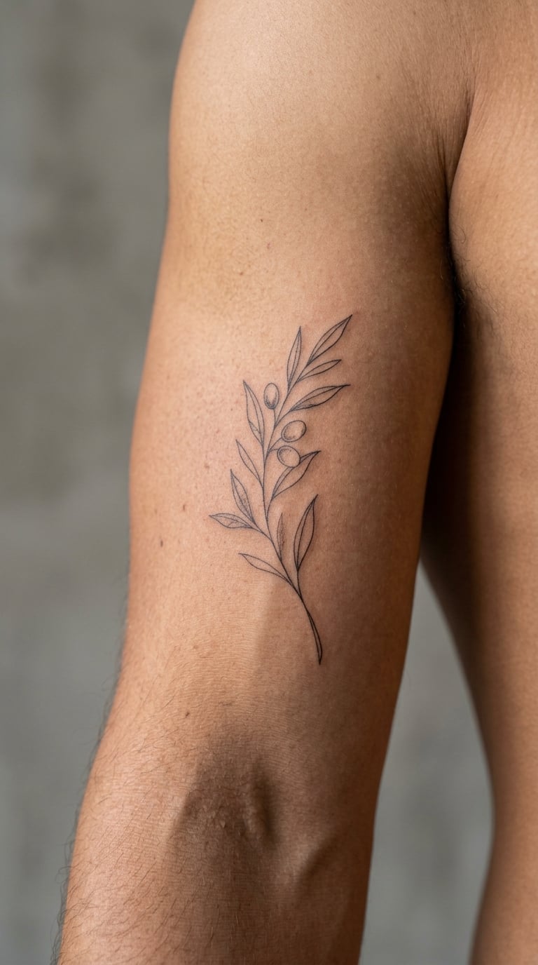
A single stem curving along the arm with narrow leaves alternating down its length, drawn in one continuous line where possible, sometimes with a few olive fruits picked out in solid black. Botanical fine line suits the inner bicep because the branch shape is already a curve, and a curve is what the arm gives you.
Peace, a family name that is also a plant, a homeland, or nothing more than a quiet green thing.
Placement: Lower inner bicep. Size: 3-5 in (8-13 cm). Style: botanical fine line. Pain: low, a 4 out of 10. Ageing note: the leaves on a fine line branch are small closed shapes, and small closed shapes are the first to fill in and blob together, so a slightly heavier line here pays off over time. Make it yours: use a plant native to somewhere you have actually been rather than a generic sprig.
19. Peacock Feather in Colour
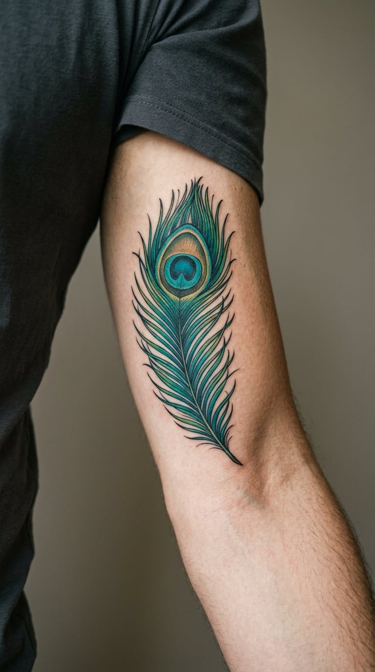
A single feather in full colour, with the eye at the top, the barbs drawn as fine radiating lines, and the shaft in a pale gold. It is the most colour-dependent design on this list and the one that will fade fastest in sun, so it belongs on an arm that mostly stays out of the light or gets looked after.
Colour is the whole point here, so this is a design to choose for how it looks now rather than how it will look in fifteen years.
Placement: Mid bicep, where the eye lands under the muscle belly and stays visible when the arm is raised. Size: 5-7 in (13-18 cm). Style: colour realism. Pain: medium-high, a 6 out of 10, because colour means more passes and more blending than blackwork, and reviewers regularly note that shaded and coloured work is the painful end of this placement. Make it yours: keep the eye in a saturated teal and let the barbs drop back to muted green and grey, which fades much more gracefully than an even wash of colour.
20. Mountain Range in Grey Wash
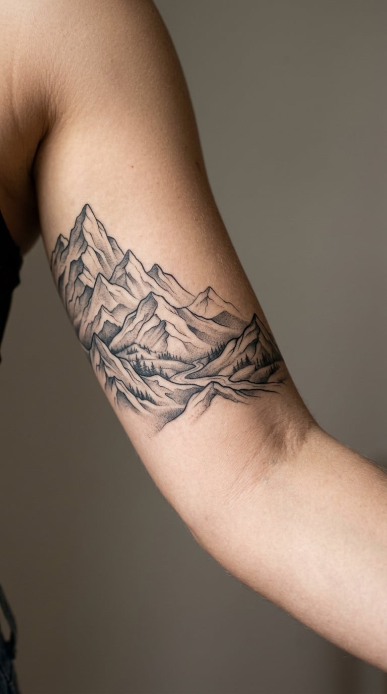
Three or four overlapping ridgelines in graduated grey, darkest at the front and fading toward the back, with no line work except a few broken tree marks on the nearest slope. The atmospheric fade is what makes it work, and it also does the practical job of blending the piece around the arm so the far edge disappears.
It is nearly always a place, and often a hike that mattered, or a view from a childhood home.
Placement: Bicep to elbow, as a wrap. Size: 8-12 in (20-30 cm). Style: illustrative landscape. Pain: medium, a 5 to 6 out of 10. The wash means going over the same areas several times, but soft grey shading is gentler than heavy black fill. Make it yours: give the artist the actual ridgeline of a place you have stood on, and ask for the farthest range to be no more than twenty percent ink so the fade does the work.
How to Choose Among 20 Inner Bicep Tattoo Ideas for Men
Most men who regret an inner bicep tattoo did not pick a bad design. They picked a good design in the wrong zone, at the wrong size, without thinking about how much the arm moves. Work through these four questions in order and the choice makes itself.
How painful is an inner bicep tattoo?
It is not one number. The inside of the bicep sits on a gradient, and pain climbs as you move up the arm toward the armpit. People with the placement describe the mid bicep as a moderate, bearable session, and describe the upper inner bicep near the armpit as the point where it gets noticeably worse.
Use a rough scale of 4 to 7 out of 10 for this placement, and treat it as a range rather than a verdict. Mid bicep with outline work sits near the bottom of that. Solid black, heavy shading or colour sits near the top, because those need repeated passes over the same skin. A person on r/tattooadvice who has had both the inside forearm and the inside bicep put it plainly: inside forearm is tolerable, inside of the bicep hurts pretty bad, and the closer to the armpit the worse it gets.
It is worth correcting one common assumption. Plenty of men with the placement consider the upper bicep among the least painful spots they have been tattooed, so do not talk yourself out of it on the internet. Lower and mid placements are genuinely manageable, and the style matters more to the discomfort than the zone does.
Which inner bicep tattoo ideas suit which part of the arm?
Match the line weight to the movement. A soft, shaded or fine line design is easiest lower down, where the arm is a little longer and the skin a little firmer. Solid blackwork, tribal and anything with a hard geometric edge belongs higher or on the wrap, where the flat planes of the design can sit across muscle and bone rather than being forced around a bend.
On the same principle, avoid a wide horizontal design across the mid bicep. The arm shortens visibly when it bends, and a wide design across it compresses. Vertical designs and circular designs handle the change well, which is why the koi, the mandala and the rose all sit better here than a long banner would.
What size should you ask for?
Ask in inches, not in vague terms, and ask what the artist can fit in one sitting. A small inner bicep tattoo reads as 2-4 in (5-10 cm) and works well on the lower arm. A medium piece is 5-8 in (13-20 cm) and needs a much flatter patch of skin. Anything above 10 in (25 cm) is a project, and usually more than one session, with the artist mapping the design across the arm first.
Bring a reference image to the consultation and mention two placement options on the arm, the mid and the upper. A good artist will tell you honestly which one your chosen design suits, and that conversation is worth more than any gallery photo.
Will an inner bicep tattoo show?
At rest, the inner arm hangs against the torso and the tattoo is largely hidden. It shows fully when you raise your arm, reach overhead, gesture, lift something, or flex. In photographs it depends entirely on what your arm is doing, which means most photos of you will not show it unless you are actively lifting.
That is the appeal for plenty of people and a deal breaker for others. If you want something that reads in every photo, put it on the outer arm. If you want a piece that appears when you choose, the inner bicep is close to ideal.
How to sit and position for the session
Positioning decides how cleanly the design comes out, because a stretched surface and a slack one produce different lines. These are the things worth saying out loud in the session:
- Say where on the arm you want it, and point to the spot relative to your armpit and elbow rather than saying mid bicep, which means something different to everyone.
- Ask the artist to stretch the skin before starting and to tell you when they are about to change position, so the line weight stays consistent across the whole design.
- Keep the arm supported so your shoulder is not doing the work. An unsupported arm drifts, and drift shows up in a line.
- Ask what you can do about movement. Every artist has a preferred posture, and a few extra minutes of setup usually prevents a wobble halfway through.
- Take the break when offered. This placement needs more repositioning than most, and the breaks are part of getting a clean result, not a delay.
Blow-out, where the ink spreads under the skin and a line turns soft and blurry, is a real consideration here because the skin is thin and always moving. It is not an argument against the placement, but it is a reason to pick an artist whose line work you have actually seen finished: healed work rather than fresh work in a portfolio.
What happens to the design as you get stronger or change weight?
This comes up constantly in tattoo communities and almost never gets answered, so here is the honest version. The inner bicep is muscle. A design laid over a soft bicep looks different on a developed one, because the contour changes and the skin stretches across a fuller shape. Letters and straight geometry distort first, followed by circular elements.
Some wearers find that a piece looks emptier than they expected once the muscle has changed, and some find it looks better. Neither is wrong, but it is predictable, and the fix is design choice rather than luck. Choose something that was drawn for a curved surface, ask the artist to map the design around the arm rather than onto it, and expect a free touch-up in a year or two if lines soften. One thing nobody can control is large swings in body weight in the first months, which is worth delaying a session for if one is coming.
Session Time and What Drives the Cost
Nobody prices an inner bicep tattoo by the design alone. The four things that move a quote are size, how much shading or colour is in it, how many sessions it takes, and the artist’s hourly rate and shop minimum. Small outline work and detailed colour portraits can cost the same, because the first is quick and the second is not.
| Rough size | What fits | Typical session time | Sessions |
|---|---|---|---|
| 2-3 in (5-8 cm) | Small script, one symbol, minimal line work | Under an hour | One |
| 3-5 in (8-13 cm) | One detailed motif with light shading | 1-2 hours | One |
| 5-8 in (13-20 cm) | A full subject, or a small wrap | 2-4 hours | One or two |
| 8-12 in (20-30 cm) | A large motif or a full bicep panel | 3-5 hours | Two, usually |
| 12 in and up (30 cm and up) | A sleeve segment or a full wrap | Several sessions planned out | Four or more |
Shop minimums and artist rates vary widely by city, so treat these as planning ranges for how long you will be in the chair rather than as quotes. If you have a modest fixed budget, the most useful thing you can do is pick a small outline design in the lower and mid arm, get a single session finished, and save the bigger piece for later. A partly healed half-finished design is the worst outcome on this placement, because of the friction described below.
Aftercare Basics for the Inner Arm
Follow your artist’s own aftercare instructions first, since they will know what they put in your skin and what the area looked like at the end of the session. Everything below is general guidance for a high-friction placement, not a replacement for that.
- Expect more friction than other placements. The inner arm rubs against the torso in ordinary movement, and that rubbing is the most common thing to irritate a healing inner bicep tattoo. People who have had it report exactly this worry in advance, and it is worth planning for. Wear loose shirts and sleep on the other side for the first fortnight.
- Wash it often and gently early on. The advice that comes up most often is washing with antibacterial for the first few days, a couple of times a day, and patting dry rather than rubbing.
- Moisturise, but do not oversaturate. A thin layer keeps the area from drying out and cracking. A thick one traps heat and slows things down.
- Skip the gym for the first week or two. Not because the muscle will be damaged, but because sweat, heat and repeated movement in the area all work against a fresh tattoo that is trying to peel.
- Let the peel do its job. Do not pick flakes off. Anything that gets removed early takes pigment with it and leaves a patch that then needs a touch-up.
- Know when to call the artist. Spreading redness after the first few days, heat coming off the area, yellow or green discharge, a fever, or a smell that is not simply fresh ink are all reasons to get the artist or a doctor involved rather than waiting it out.
Expect the surface to settle in two to four weeks in most placements. On the inner bicep it usually takes a little longer, partly because of the rubbing and partly because nobody can stop moving that arm. The full depth of the ink takes a couple of months to show properly, so judge the healed result in person, not from a photo taken in week two.
Frequently Asked Questions
How painful is an inner bicep tattoo?
Pain on the inside of the bicep runs on a gradient rather than a single number. Most people put the mid bicep around a 5 out of 10 and the area near the armpit closer to 7, mainly because the skin there is thinner and more mobile. Style pushes the number as much as placement does: fine line sits at the low end, while solid black, heavy shading and colour all need repeated passes over the same skin.
Is the inner bicep a good place for a tattoo?
Yes, with three caveats worth knowing in advance. It is discreet at rest and fully visible when you raise your arm, and it fills the gap an outer arm sleeve always leaves. The trade-offs are that pain rises sharply toward the armpit, the inner arm rubs against the torso during normal movement, which complicates healing, and the design will change as the muscle underneath it changes. Inside the bicep is also reported as more painful than the inside forearm.
Are inner bicep tattoos noticeable?
At rest, mostly not. The inner arm hangs against the body and covers the design. It becomes fully visible when you raise your arm overhead, gesture, lift something, or flex, and in photos it appears only when your arm is doing something. Plenty of men choose it precisely for that behaviour. If you want a tattoo that reads in every photograph, the outer upper arm is the better placement.
How long does an inner bicep tattoo take to heal?
The surface usually settles in two to four weeks, but the inner bicep commonly takes a little longer because the arm rubs against the torso in normal movement and nobody can stop moving that arm. Full healing, meaning the ink settling into its final shade, takes a couple of months. Loose clothing, sleeping on the other side and skipping the gym for the first fortnight all make that timeline easier.
How big should a first inner bicep tattoo be?
For a first tattoo, 3 to 5 in (8 to 13 cm) is the sweet spot on the lower or mid inner bicep. It is small enough to finish in one session, quick enough to sit through, and detailed enough that the design does not look thin. Below 3 in you lose room for detail. Above 8 in you are looking at a multi-session project, which is a much bigger commitment for a placement that rubs while it heals.
How do you position for an inner bicep tattoo?
Point to the exact spot relative to your armpit and elbow, since mid bicep means something different to everyone. Ask the artist to stretch the skin before starting and to tell you when they are changing position, keep the arm supported so your shoulder is not doing the work, and take the breaks they offer. Repositioning is routine here and protects the line weight across the whole design.
Where to Start With Inner Bicep Tattoo Ideas for Men
If this is your first arm tattoo, start with the compass rose or the moon phase column. Both are small, both are single-session, and both hold their edges on a surface that bends.
If you already have an outer arm piece and you are filling it in, the blackwork serpent or the tribal band is the better call, because both are designed to read as part of a larger composition rather than as a picture sitting on top of one.
Whichever you pick, bring two placement options to the consultation and ask the artist to tell you which one your design actually suits. That single question does more for the finished result than any hour of scrolling through galleries.