
20 Best Anniversary Tattoo Ideas for Couples (September 2026)
Anniversary tattoo ideas for couples usually come down to one detail that nobody else has: a real date, a real place, a piece of handwriting. A generic heart says very little, while your wedding date in fine black numerals says everything to the two of you and almost nothing to the rest of the room. If you are planning around a milestone, book the artist 30 to 45 days out and expect to spend that first sitting on the design, not the tattoo.
Below are 20 concepts, each described closely enough that an artist can sketch it from the text. For every one I have noted the style, the placement that suits it, a size you can actually read, and how it ages. If you are still hunting for base inspiration, these sweet tattoo ideas that couples will love are a good warm-up.
Anniversary Tattoo Ideas for Couples: Quick Guide
Here is the whole list in one view. Sizes are the finished height or width on skin, not the size of the drawing. Pain ratings assume the placement listed, and your mileage depends on the spot and the day.
| Idea | Style | Best placement | Size | Pain |
|---|---|---|---|---|
| 1. Matching date | Fine line | Inner forearm | 1.5-2 in wide | Low to medium |
| 2. Split date, half moons | Fine line | Inner forearm, opposite arms | 2-3 in wide | Low to medium |
| 3. Wedding coordinates | Minimalist blackwork | Outer forearm | 2 in wide | Low |
| 4. Date and fingerprint | Micro-realism | Inner bicep | 3 in tall | Medium |
| 5. Interlocking bands | One-line blackwork | Inner wrist | 2.5 in wide | Medium |
| 6. Date inside a snake | Neo-traditional | Outer forearm | 4 in long | Medium |
| 7. Wedding bouquet | Botanical, black and grey | Outer upper arm | 4 in tall | Medium |
| 8. Wedding-day skyline | Micro-realism | Collarbone | 3 in wide | Medium |
| 9. First-dance song title | Fine-line lettering | Inner wrist, vertical | 2 in tall | Medium |
| 10. Latitude and longitude | Fine line with red accent | Inner forearm | 2 in wide | Low |
| 11. Ring engraving detail | Blackwork line drawing | Outer wrist | 2 in wide | Low to medium |
| 12. Compass points | Minimal fine line | Outer upper arm | 2.5 in across | Low |
| 13. First home address | Monoline lettering | Inner forearm, horizontal | 2.5 in wide | Low to medium |
| 14. Constellations | Dotwork | Forearm or shoulder | 3 in wide | Low to medium |
| 15. Venue outline | Architectural linework | Outer forearm | 4 in wide | Low to medium |
| 16. Vow line | Micro-lettering | Inner forearm, vertical | 3 in long | Medium |
| 17. Location map with plants | Fine line, muted green | Outer upper arm | 3.5 in wide | Medium |
| 18. Mirrored helix hearts | Fine line | Inner upper arms, matching | 2 in wide | Low to medium |
| 19. Initials arched over a date | Blackwork lettering | Outer forearm | 2.5 in wide | Low to medium |
| 20. Split watercolor mountains | Watercolour | Matching forearms | 3 in wide each | Medium |
1. Matching Anniversary Date in Fine-Line Numerals
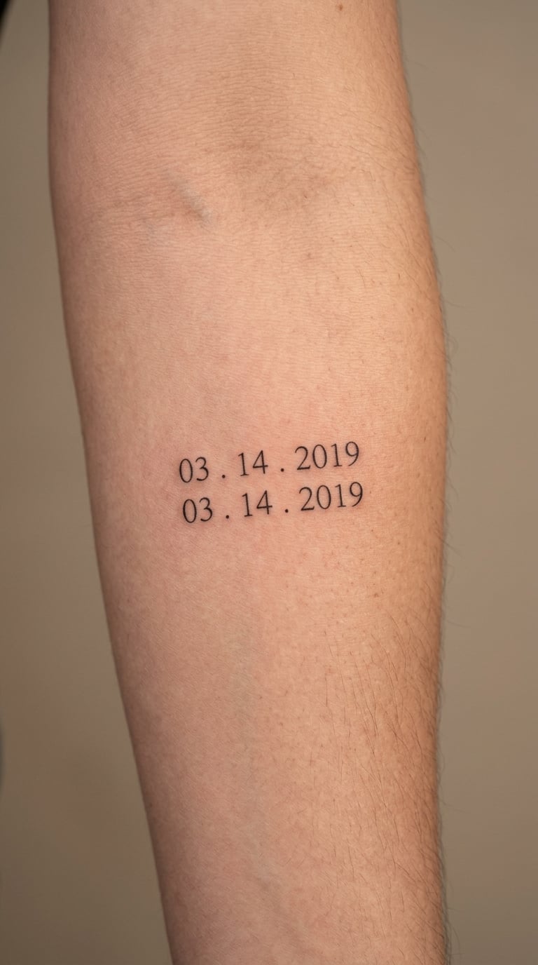
This is the discreet option and the one I would pick for a first matching tattoo: a single-line date, hairline weight, no banner, no hearts. Use your wedding date, your commitment date, or the day you moved in together, and agree on the format before anyone sits down. Slashes and periods read best at small scale because they break the numbers up for the eye.
Placement: inner forearm, or the soft area just below the collarbone. Size: 1.5 to 2 inches wide, roughly the width of an adult thumb. Style: fine line with condensed numerals.
Pain: low to medium on the inner forearm, and the forearm takes ink well. One honest note: single hairline strokes soften and lighten over the years, and finger placements fade fastest of all. Make it yours: put the same date in the same format on both bodies, then check the height matches when you stand side by side. More numeral and script pairings like this in our birth date tattoo ideas in Roman numerals guide.
How to Personalize Anniversary Tattoo Ideas for Couples
Start with the detail only the two of you know: a date, a coordinate, an initial set, a house number, one line from a card. Then check it against the placement you have chosen, because the same string of characters needs more room on a forearm than it does on a wrist.
Send both partners the same reference folder and compare notes before the consultation. Agree on three things and stop arguing: the content, the exact format, and the finished height in inches. Anything beyond that is a style decision one artist can settle.
Ask your artist to print the design at actual size and hold it against the site before the stencil goes on. That single check prevents the most common disappointment, a design that looked right on a screen and too cramped on skin.
2. Split Date with Complementary Fine-Line Half-Moon Shapes
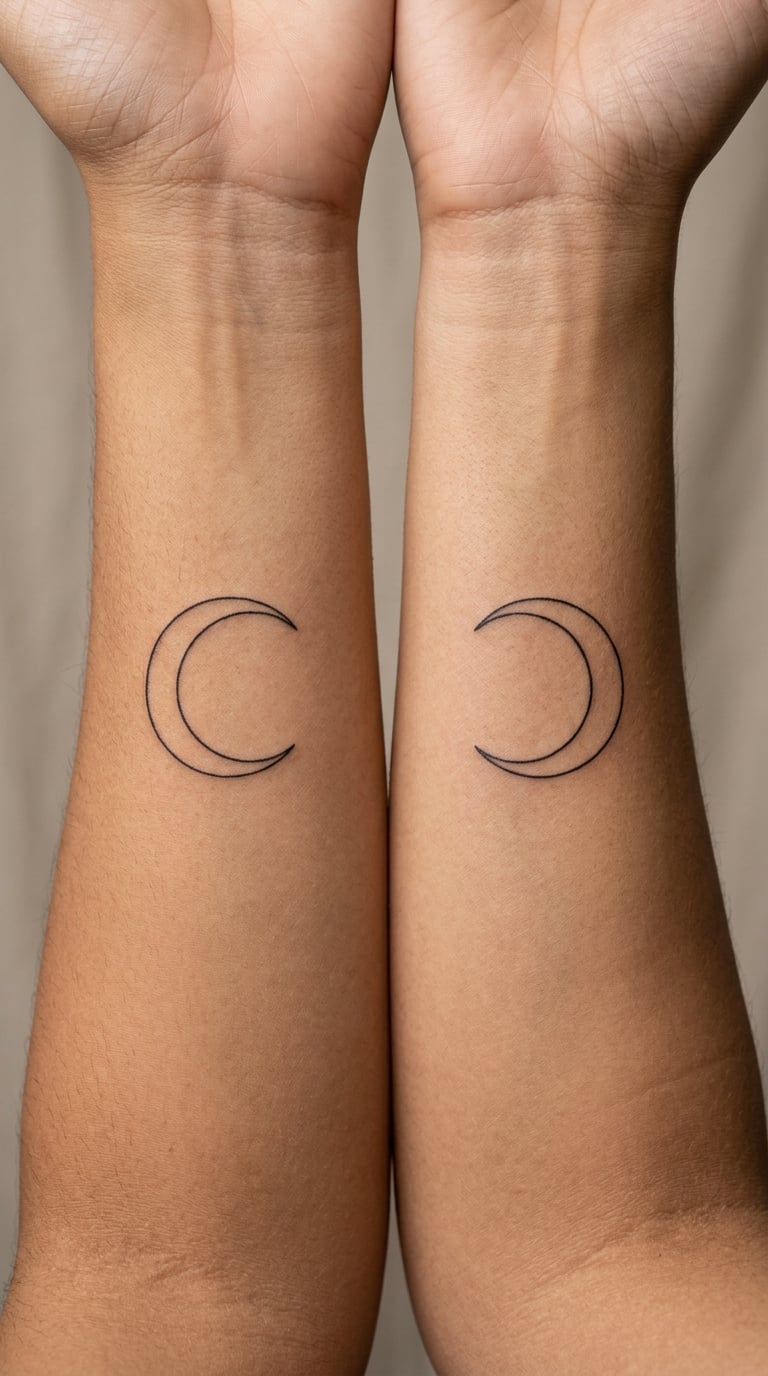
Instead of copying the same date twice, you split it. One person gets the full date, the other gets a crescent that shares the same line weight and style, and the pair reads as a set without looking stamped. Couples who dislike identical work tend to land here, and it holds up better when one of you adds to an existing sleeve later.
Placement: inner forearms on opposite arms, or one inner wrist and one inner forearm. Size: 2 to 3 inches wide. Style: fine line crescent, black ink only.
Pain: low to medium, same as any inner forearm work. Crescents drawn as one clean curve hold their shape far better than shaded ones. Make it yours: match the crescent opening direction to the date’s slant so the two pieces visually point at each other.
3. Wedding Coordinates in Minimalist Blackwork
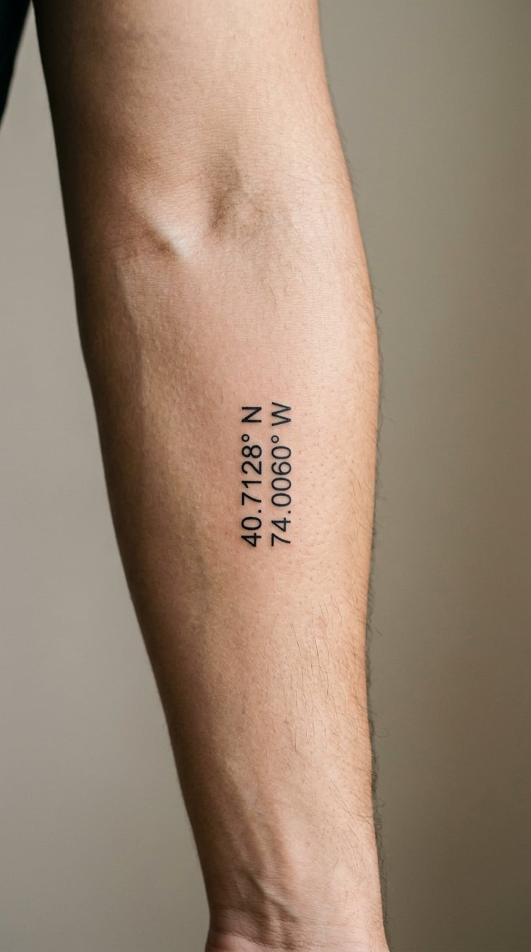
Coordinates say where you married without spelling anything out, which makes them the most private date tattoo there is. Latitude above, longitude below, condensed numerals, equal line weight, no map pin and no map fragment. The whole thing reads as a tidy block of numbers to strangers and as a full address to everyone who has been there.
Placement: outer forearm, or the inside of the upper arm where nothing pushes it out of shape. Size: 2 inches wide, 1 inch tall. Style: minimalist blackwork.
Pain: low on the outer forearm. Numerals are the part that softens over time, so ask for slightly heavier weight than looks right in a drawing. Make it yours: use the exact venue coordinates, or the coordinates of the spot where you first met if that matters more to you.
4. Matching Wedding Date and Ring-Sized Fingerprint
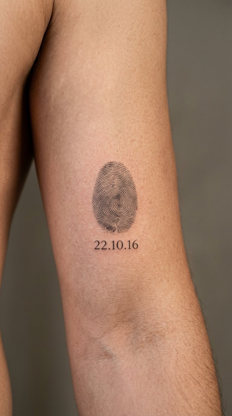
This one is a portrait, not a symbol. One partner’s ring finger print, reproduced small enough to sit beside a date, with the loops and ridge endings actually followed rather than suggested. It suits people who find generic love imagery embarrassing and would rather wear something only their partner can identify.
Placement: inner bicep or inner upper arm, where there is flat skin for the print. Size: 2 to 3 inches overall, with the print itself ring-sized. Style: micro-realism in black and grey.
Pain: medium, mostly the repeated passes over the same small area. Ridge detail is the first thing to blur, so a slightly larger print ages better than a perfectly detailed one. Make it yours: bring a clean scan or a high-contrast photo, not a phone snap, or the artist is guessing at the ridges.
5. Interlocking Wedding Bands in One-Line Blackwork
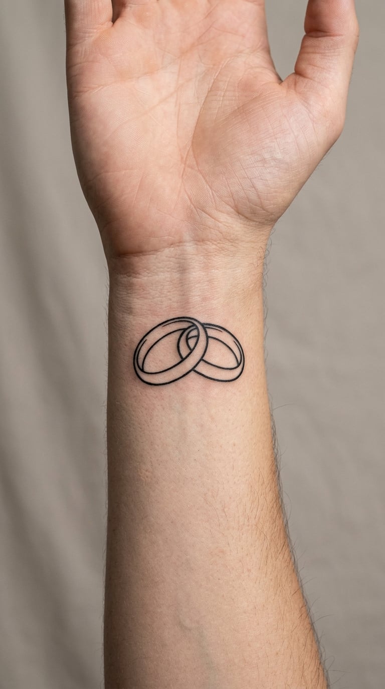
Two rings drawn as a single unbroken line, one loop passing through the other. It works as a ring alternative for couples who do not want metal, and as a plain anniversary piece on its own. Most people add the wedding date in small numerals underneath the loops, which keeps the design meaningful without turning it into a paragraph.
Placement: inner wrist, inner forearm, or the ring finger itself if you want a band alternative. Size: 2.5 inches wide, or 0.4 inch tall for a finger band. Style: one-line blackwork.
Pain: medium on the inner wrist, since the wrist has veins and bone right under the skin. Continuous lines lose their evenness when skin is stretched unevenly, so keep the curves simple. Make it yours: leave the date out entirely if the loops are enough, or add a single year for people who want one number and not two.
6. Wedding Date Wrapped Around a Fine-Line Snake
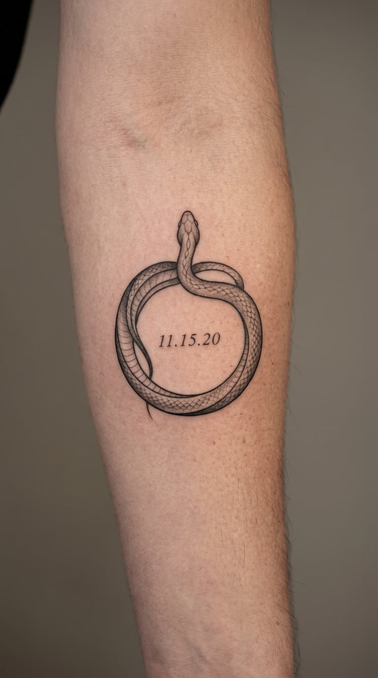
A slender neo-traditional snake curled into a ring, body wrapping around the outside of the date rather than the date sitting on top of the coil. Snakes carry a long association with renewal and transformation, which suits an anniversary better than most people expect, and the circular frame solves the problem of where to put text on an animal piece.
Placement: outer forearm, upper arm or the calf. Size: 4 inches long, about 1 inch tall for the body. Style: neo-traditional with a thin outline and a little black-and-grey shading on the head.
Pain: medium, and the scale work in the middle is where it bites. Keep the date at the same height as the diameter of the coil, and if the digits start to crowd, move the date to the centre on its own. Make it yours: skip the standard dagger and banner entirely and let the snake do all the work.
7. Matching Botanical Anniversary Bouquet
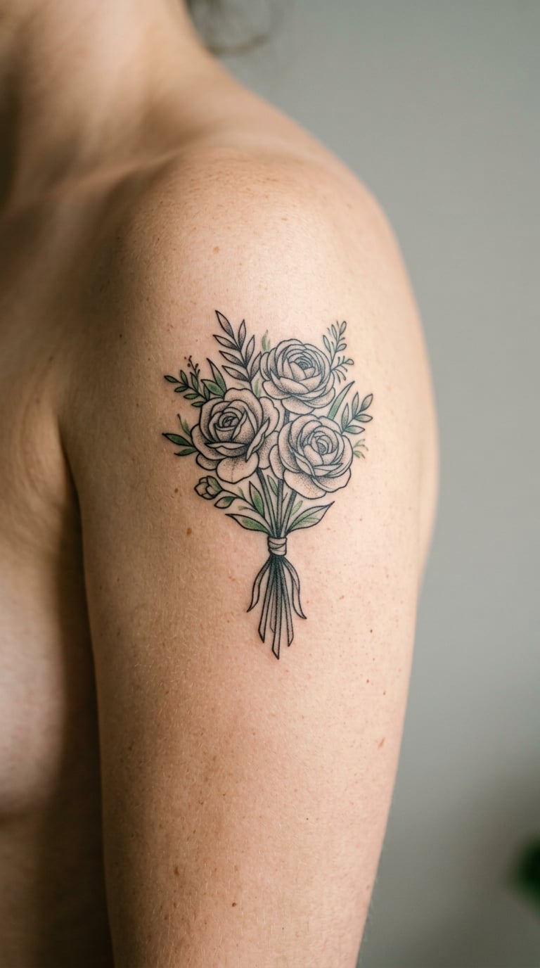
A tattooed version of the actual bouquet, drawn with fewer petals and simplified stems so it holds together at body scale. Botanical work punishes over-detailing, so three recognisable blooms usually read better than eight. The green is optional and often the reason a couple chooses this over a pure black-and-grey piece.
Placement: outer upper arm, thigh, or along the back of the shoulder. Size: 4 inches tall, 3 inches wide. Style: botanical realism in black and grey with one muted green accent.
Pain: medium, and the green requires a second pass, so give the artist time in the session. Colour in a soft shade fades toward grey first, and an arm in the sun ages faster than a thigh. Make it yours: substitute your birth flowers or the blooms you actually carried, and keep the count matching on both tattoos.
8. Wedding-Day Sky Line in Miniature Micro-Realism
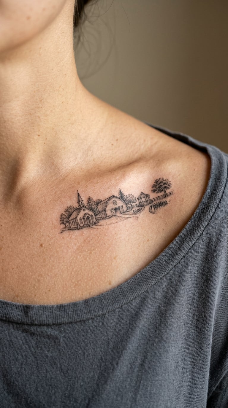
The building, the hall or the view from the venue, reduced to a horizon you can recognise. A window count that matches, a roofline at the right angle, maybe one doorway that means something to you. Keep the scene to a single structure rather than a whole town, because a small skyline turns into visual noise very fast.
Placement: collarbone, inner forearm, or the side of the ribcage. Size: 3 inches wide, 1 inch tall for a horizon piece. Style: micro-realism in black and grey.
Pain: medium on the collarbone, which is bony and unforgiving. Tiny architectural edges soften within a few years, so a slightly heavier outline buys you decades instead of a few. Make it yours: sketch the building from a photograph taken from the same angle you will see it from for the rest of your life.
9. First-Dance Song Title in Fine-Line Lettering
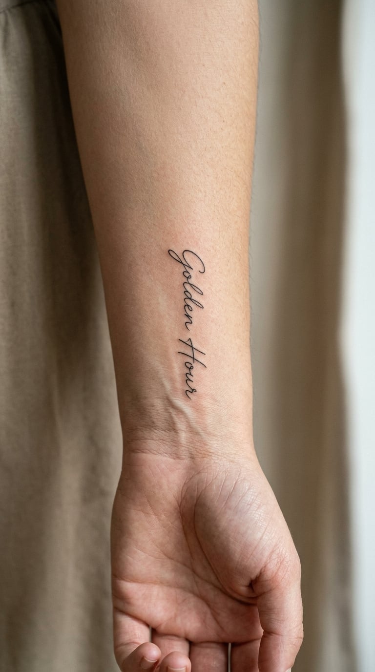
Just the title of your first-dance song, in the script style that suits your handwriting. No notes, no album art, no chorus lines, which keeps it readable at a size that stays legible. Song titles are personal in a way that dates are not, because a hundred couples can share a wedding day and almost nobody shares that track.
Placement: inner wrist running vertically, or the ribcage for a longer title. Size: 2 inches tall for a short title, 4 inches for a long one. Style: fine-line cursive or neat print lettering.
Pain: medium on the inner wrist, and lettering means the needle returns to the same spot repeatedly. Cursive loops fill in as the years pass, so print lettering is the safer long-term choice. Make it yours: bring a typed sample of the exact capital and lowercase forms you want, and keep the title under five words.
10. Matching Latitude and Longitude with Tiny Heart
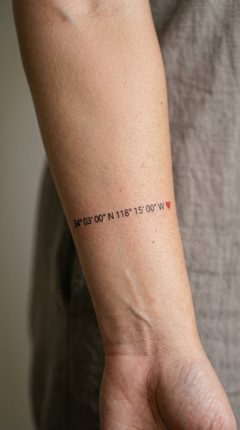
The same idea as a bare coordinate block, with a single small heart tucked into the negative space to hold the composition together. It is the one place a heart earns its place, because on its own the numbers leave a hole in the layout. The heart is usually a quarter of an inch, which keeps it as punctuation rather than decoration.
Placement: inner forearm, below the elbow where the skin is flat. Size: 2 inches wide. Style: fine line with a single red accent.
Pain: low, since nothing here needs a deep pass. One red detail in a mostly black piece is easy to touch up if it drops out, which is a good reason to keep it. Make it yours: put the heart in the gap between the two lines rather than after the longitude, so it reads as part of the design.
11. Engraved Wedding Ring Detail in Blackwork
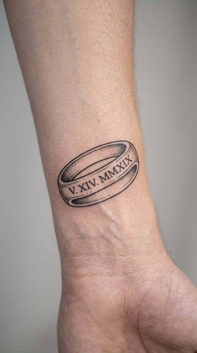
A cropped, unbranded line drawing of the engraving inside your ring, or of the band profile itself. No logos, no maker’s mark, just the part that means something. Couples with inherited or heirloom rings tend to pick this one, because the engraving is often the only text on the metal that nobody else can read.
Placement: outer wrist, inner forearm, or behind the ear. Size: 2 inches wide. Style: blackwork line drawing with a single hairline shadow.
Pain: low to medium. Engraved text is small, so plan a touch-up visit in about three weeks to bring the strokes back to full strength. Make it yours: photograph the ring flat on plain paper under even light, straight on, with no fingers in shot, and the tracing will be accurate.
12. Matching Compass Points for Shared Directions
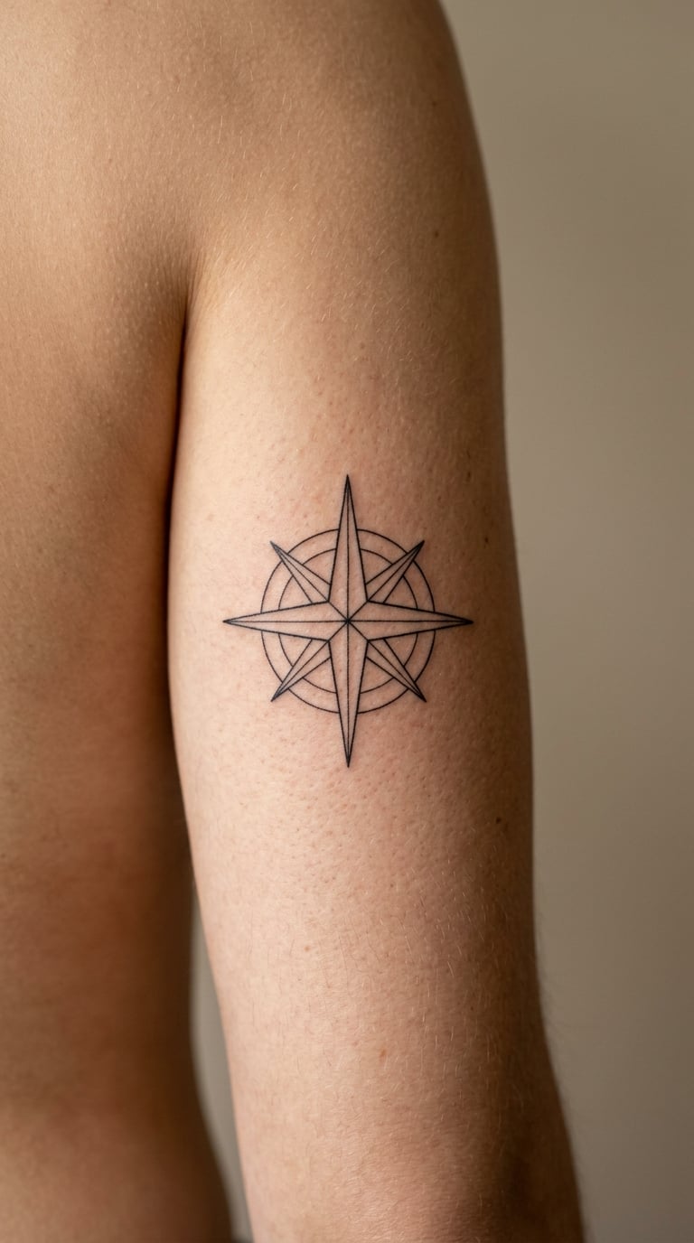
A small compass rose pointing toward a place that matters: a first home, a meeting spot, a destination you keep returning to. Without cardinal letters it stays quiet, and the single emphasized point does the storytelling. It reads as travel and direction, which is a different emotional note from a date or a flower.
Placement: outer upper arm, upper back, or the back of the calf. Size: 2.5 inches across. Style: minimal fine line in solid black.
Pain: low, and the symmetry makes the session short. Fine radial lines blur at the tips over time, so give the outer points a hair more weight than the inner ones. Make it yours: swap the emphasized point for any bearing you like, including the direction of a home you have not lived in yet.
13. First Home Address in Simple Black Ink
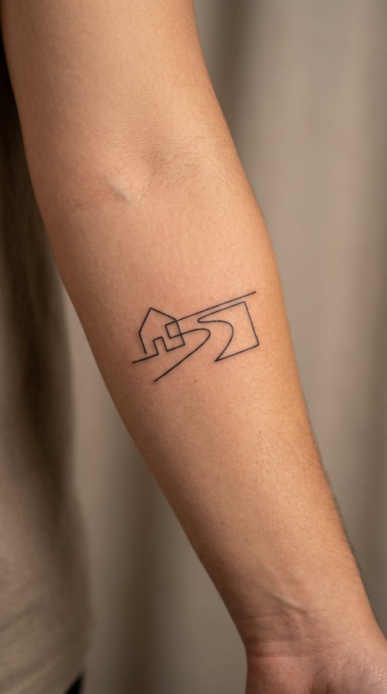
The address of the first place you lived together, in clean monoline lettering, sometimes with a small porch lamp or the house number repeated underneath. Addresses are quietly sentimental and nobody else in your life carries that one, which makes them hard to copy.
Placement: inner forearm, horizontal, or the outer upper arm in a single vertical line. Size: 2.5 inches wide for a short address, 4 inches if the street name is long. Style: simple black monoline lettering.
Pain: low to medium, and the forearm fills and holds colour predictably. Thin monoline type loses definition in roughly a decade, so ask for a slightly heavier stroke than the reference sketch. Make it yours: check with your partner first whether the address is one you both want permanently visible to a stranger who reads it.
14. Matching Milky Way Constellations
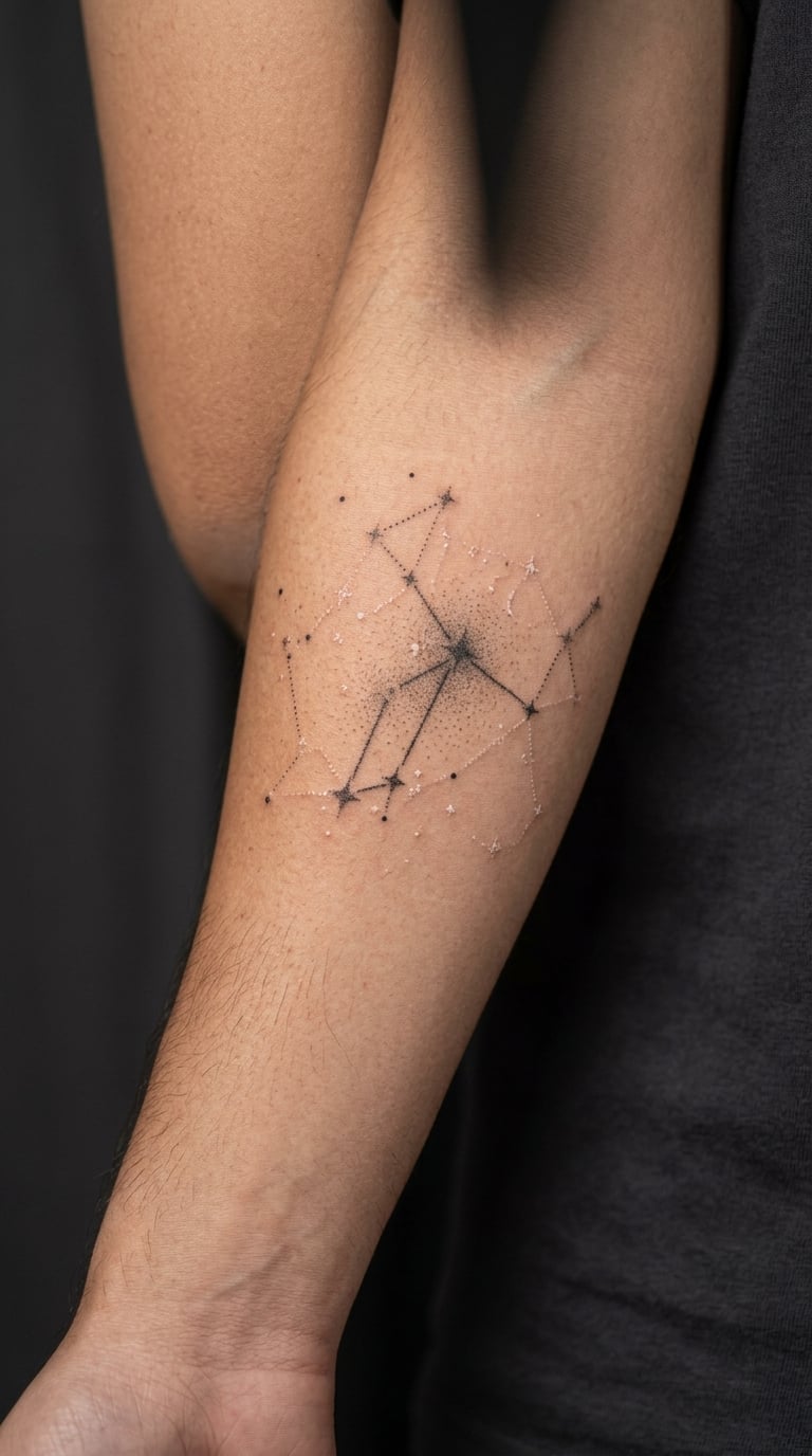
A dotwork star map of the sky on the night of your wedding, or of a constellation that means something to you. Two people can get the same patch of sky and it will still be a private reference, because almost nobody else knows which night you looked up. Constellation line work over dotwork gives the design some structure to hold onto.
Placement: forearm, shoulder, or the upper back. Size: 3 inches wide for a single constellation, 5 inches for a full sky strip. Style: dotwork with fine accent lines.
Pain: low to medium; dotwork is repetitive and slow, which is why it wears on most people. Individual dots soften into a grey haze over the years, and white ink on skin fades faster than black, so keep the star count reasonable. Make it yours: use the real chart for your date and location, and mark one star more brightly than the rest.
15. Wedding Venue Outline in Architectural Linework
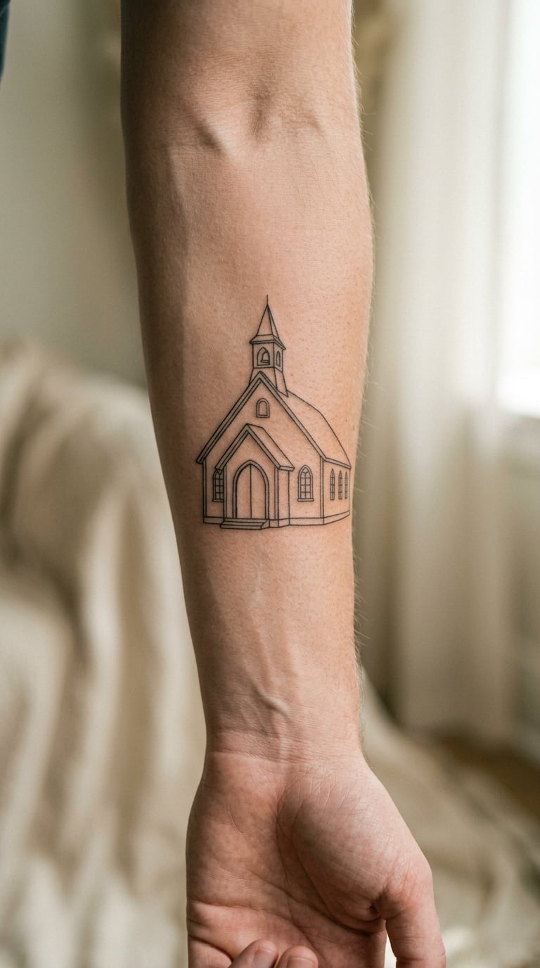
An elevation of the ceremony building drawn as a measured elevation rather than a copied photograph. Straight verticals, a believable roofline, maybe a doorway at human scale, and nothing around it. Architectural linework is forgiving because buildings are mostly straight lines, which means the piece stays crisp where flowers and faces would not.
Placement: outer forearm, upper arm, or along the ribcage. Size: 4 inches wide, 2 to 3 inches tall. Style: architectural fine line in solid black.
Pain: low to medium, and the long straight runs are the quick parts. Window details are the first to disappear, so simplify them to single panes rather than glazing bars. Make it yours: set the date in small numerals under the base line, which balances the composition and keeps the building the subject.
16. Matching Vows Written as Tiny Micro-Lettering
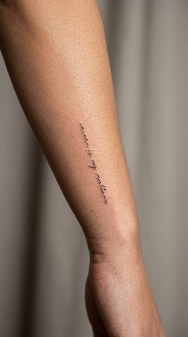
One line of your vows, reduced to the only words that survive the cut. Take four to eight words, set them in a consistent script or print hand, and leave everything else out. This is the most intimate option in the list and the one most likely to blur, so choose it for the meaning and accept the ageing.
Placement: inner forearm running vertically, or along the side of the ribs. Size: 3 inches long for a short line. Style: micro-lettering, one weight throughout.
Pain: medium, because the needle works the same strip of skin again and again. Vertical placement on a forearm is a poor long-term bet for legibility, so a flatter site like the ribcage or upper arm gives the letters more protection. Make it yours: handwrite your shortlist in a straight line on paper and photograph it flat, so the artist copies your actual hand rather than a generic script.
17. Wedding Location Botanical Map in Fine Line
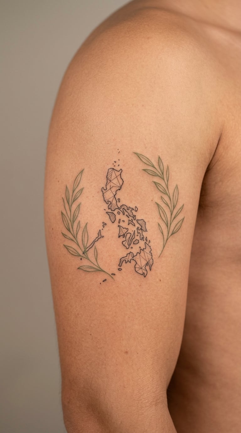
An abstract outline of the region where you married, marked with a single point, framed by two plants that grow there. The map does not need to be geographically accurate, only recognisable to you, so a simplified coastline or border shape is enough. The two sprigs stop the composition from being all hard edges.
Placement: outer upper arm, thigh, or the back of the calf. Size: 3.5 inches wide. Style: fine line with muted green foliage.
Pain: medium, and the two colours mean a longer session. Muted green is a low-saturation pigment, so it reads soft from day one and quietly fades toward grey over the years. Make it yours: draw the point of the map in solid black or a single red dot so the eye finds the venue immediately.
18. Matching Hearts with Shared DNA Helix Fragment
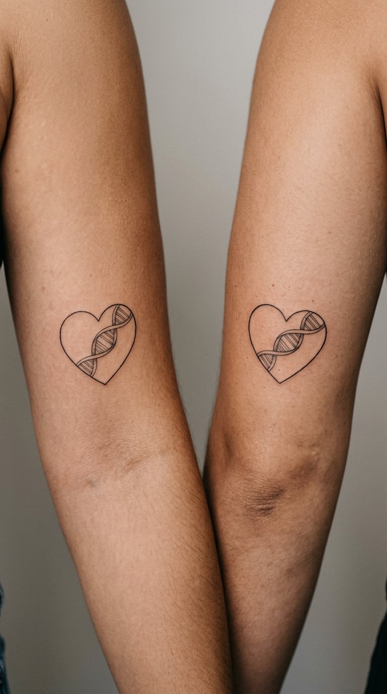
A heart outline built from two mirrored curling lines that read as a helix without going full science-textbook. The result is a heart that looks like a heart and carries a shared-connection idea underneath, which suits couples who find a plain heart too generic and a helix alone too clinical.
Placement: inner upper arms, so the two pieces face each other. Size: 2 inches wide. Style: fine line, black only.
Pain: low to medium, and a symmetrical design is quick work. Fine interior details on the inner arm are the part that fades first, so keep the helix suggestion simple rather than anatomically tidy. Make it yours: make one partner’s version mirror the other, so the two inner curves point toward the space between you.
If you want the shared-connection idea stated in a way that reads to a stranger too, our guide to heartbeat tattoo ideas with meaning works through several versions of exactly that.
19. Initials Wrapped Around a Wedding Date
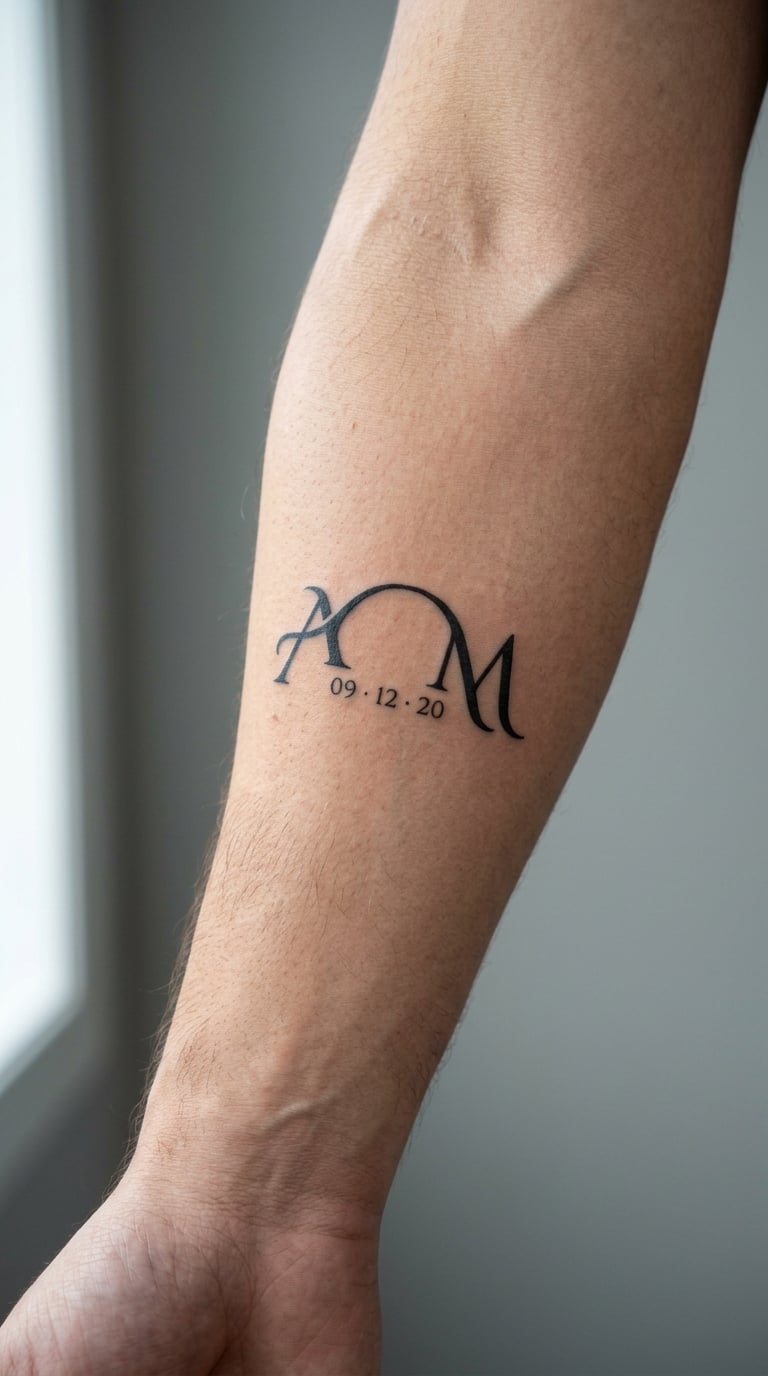
Two initials, one from each of you, arched around a small date. Done properly it is a monogram rather than a logo: matched letterforms, consistent stroke weight, the date tucked into the negative space under the arch. This is the design most often botched by tattooing lettering first and adding space for the date afterwards, so plan the date in from the start.
Placement: outer forearm, chest, or the back of the shoulder. Size: 2.5 inches wide. Style: blackwork lettering.
Pain: low to medium, and thicker letterforms hurt more than thin ones. Bold initials hold their shape for decades, which makes this a better long-term option than micro-lettering in the same spot. Make it yours: bring a font sample of the exact letterforms you like, and let the artist redraw them by hand rather than tracing a font directly.
20. Two Halves of an Abstract Watercolor Mountain

One scene divided down the middle, each partner taking a side, coloured loosely in watercolor washes rather than hard outlines. Nobody else wears the same pair, and the two pieces only resolve into a single scene when you put your arms together. It is the strongest option here for couples whose styles are too different for a matching design.
Placement: matching forearms or calves, same height on both bodies. Size: 3 inches wide per half. Style: watercolor with a light black structural line.
Pain: medium, since the washes go on and come off several times to build depth. Watercolour on skin is the first thing to fade in this whole list, so expect a touch-up and choose soft, low-saturation tones that lose less contrast. Make it yours: use a real landscape from a trip, a wedding venue you can see from a window, or a mountain range you both know the name of.
How to Choose the Right Design
Five checks will settle most decisions before you get to a studio, and they take about ten minutes between the two of you.
- Read it at real size. Print or draw the design at its finished height and view it from arm’s length. If the date or the coordinates are not legible, the artist will not make them legible either.
- Match the style to the site, not the reference. A design that works on a flat upper arm can collapse around a wrist. Have the artist redraw the composition to the body site rather than scaling the same file down.
- Decide matching or complementary. Identical pieces suit couples who want the same statement twice. Complementary pieces, like the split date in idea 2 or the divided mountains in idea 20, keep each design personal and read as a set to anyone who looks closely.
- Audit for unintended meaning. A Reddit user in r/tattooadvice got a matching anniversary tattoo with his wife and then worried outsiders were reading something into it that he never intended. Show the design to three people who are not in the relationship and ask them what they think it means. If their answer is not the one you want, change it now rather than in ten years.
- Plan for ageing. Single hairline strokes, tiny lettering and pale colour are the first casualties. If a design is entirely fine line and micro-detail, decide now whether you value the delicacy enough to book touch-ups every few years.
One more practical point for pairs with very different tattoo styles. Give both designs the same line weight, the same finished height and the same colour palette, and let the subject matter differ completely. That shared structure is what makes a mismatched pair look deliberate.
Cost and Session Time
Most studios bill by the hour rather than by the design, and they set a shop minimum that covers the setup, the stencil and the aftercare. That minimum is often what a small fine-line date actually costs, because the session is short. A four-inch neo-traditional snake or a two-person set of watercolour landscapes runs two to four hours and lands well above it, since the artist bills for the extra passes rather than the drawing alone.
For US pricing, treat these as realistic starting ranges rather than quotes. A small fine-line design such as a date or coordinate pair generally lands between $150 and $300, and a medium piece with colour or shading runs $400 to $900. Micro-lettering, architectural elevations and micro-realism sit at the expensive end because of the hours involved, and a four-inch neo-traditional or watercolour piece can pass $1,000. Hourly rates across the country commonly run $80 to $200, with high-demand artists booking further out.
Variables worth asking about at the consultation: how many hours the design needs at your chosen size, whether colour adds a second pass, and whether a stencil or a custom drawing fee applies. Custom lettering and architectural work are drawn by hand, so those designs carry a drawing charge on top of the session. Rates move by region and by artist, and a well-reviewed artist with a full book books out weeks ahead. Ask for a total estimate for the finished piece, not just an hourly figure, and get it in writing before the first sitting.
Booking both partners for the same day works well if neither of you is fainting at the sight of a needle. Sit in adjacent chairs, stagger the start times, and expect the second person to be steadier after watching the first one finish. If one of you needs a long rest, split the pair into two sessions instead of rushing both.
Aftercare Basics
- Follow your artist’s aftercare instructions first. They know what they did, and their advice overrides anything general you read online.
- Wash gently with lukewarm water and unscented soap, then pat dry with something clean and soft rather than rubbing.
- Keep any loose covering on for as long as your artist says, usually a few hours, and change it if it gets dirty or damp.
- Keep fresh ink out of direct sun, swimming pools and hot tubs, and do not soak it in the shower while it is still healing.
- Do not scratch or pick flaking skin. It comes off on its own schedule, and pulling it takes pigment with it.
- Contact the studio if the tattoo stays swollen, weeps or feels hot well after the first few days, or if you notice a line that has faded more than the rest.
Frequently Asked Questions
Should couples get identical anniversary tattoos or matching designs?
Identical designs suit couples who want the same statement made twice, and they are the simplest option to plan. Complementary designs, like one partner taking a full date and the other a crescent, look like a set while leaving room for individual style. Many couples pick identical lettering but complementary imagery. Whatever you choose, agree on line weight, finished height and palette so the pair reads as deliberate.
What is the best size for a small anniversary tattoo?
Two to three inches is the sweet spot for a small anniversary tattoo. Anything under an inch forces tiny linework that softens within a few years, especially on hands and forearms. Bigger is not always better, though: a four-inch piece of micro-lettering ages worse than a three-inch piece of bold initials. Print the design at actual size and read it from arm’s length before committing.
Do anniversary date tattoos fade quickly on fingers and hands?
Faster than anywhere else on the body. Hands and fingers are exposed to sun, washing, weather and constant movement, and fine-line strokes lose definition there within roughly five years. If a date must go on a hand, ask for heavier line weight, avoid fingers entirely, and plan on a touch-up every few years. Forearms and upper arms hold small date work far longer with much less maintenance.
What is a meaningful anniversary symbol for couples?
The most meaningful symbols are the ones tied to a specific memory: a coordinate, a first home address, a line from your vows, the shape of a building, a piece of handwriting. Generic symbols like hearts and infinity marks carry a shared cultural meaning rather than a shared history. Ask what the two of you would recognise instantly and an outsider would not. That gap is where the personal meaning lives.
How should I bring a date or coordinate to a tattoo consultation?
Write it out exactly as you want it tattooed, in the format you have chosen, and bring it as text on a phone or a clean printed page. For coordinates, confirm the latitude and longitude values and decide whether you want a dot, a comma or a line break between them. For a ring engraving or building, photograph it flat on plain paper under even light. Never rely on a screenshot of someone else’s tattoo as the only reference.
Which Anniversary Tattoo Idea Is Right for You?
For a first matching tattoo, start with idea 1, a fine-line date on the inner forearm. It is small, it sits well under a sleeve, it costs one short session, and it ages more gracefully than almost anything else in this list.
If you both already have tattoos and want a piece that adds something rather than starting a set, go for a coordinated concept with more structure: the bouquet in idea 7, the venue outline in idea 15, or the divided mountains in idea 20. Those have enough visual weight to hold a space in an existing collection, and the mountain pair also solves the problem of two very different tattoo styles.
One last thing. Photograph both finished tattoos on the same day, in the same light, before either has healed. That is the only record you will have of what the fresh line looked like, and it makes a good five-year comparison later.