
24 Best Watercolor Tattoo Ideas for Women (September 2026)
These watercolor tattoo ideas for women cover everything from a single loose stem on the inner forearm to a misty forest across the calf. Each one comes with the placement it suits best, a realistic size in inches, and an honest note on how the color settles over the years.
Watercolor sits somewhere between a painting and a tattoo: layered washes of pigment, soft bleeding edges, and usually no hard black outline holding the whole thing together. That looseness is the appeal, and it is also the reason a watercolor piece needs an artist who works this way every week rather than once a year.
Most of the designs here sit in the small-to-medium range, because that is where watercolor actually reads well on skin. If you are planning a first piece this autumn or winter, allow six to eight weeks of healing before you judge the final color, and book a consultation early, since good watercolor artists fill up fast.
Looking for the stripped-back version instead? Our fine line tattoo ideas for women guide covers the single-needle approach, which pairs nicely with the looser pieces below.
Watercolor Tattoo Ideas for Women: Quick Guide
The table below compares all 24 designs by style, best placement, realistic size and expected pain, in the same order the ideas appear. Use it to shortlist two or three before you sit down with an artist.
| Idea | Style | Best placement | Size | Pain |
|---|---|---|---|---|
| Loose Botanical Stem | Botanical, painterly | Inner forearm | 3-4 in long | Low to medium |
| Watercolor Peony Cluster | Floral, painterly | Outer forearm | 3 in wide | Medium |
| Wildflower Meadow | Floral, loose spray | Collarbone | 5 in wide | Medium |
| Lotus in a Color Wash | Floral, symmetrical | Upper back | 5 in across | Medium |
| Olive Branch | Botanical, fine line | Outer forearm | 5-6 in long | Low to medium |
| Monstera Leaf | Tropical, layered | Side thigh | 4 in long | Medium |
| Hummingbird in Flight | Animal, painterly | Shoulder blade | 3.5 in long | Medium to high |
| Abstract Crane | Fine line with wash | Calf | 6 in tall | Medium to high |
| Swallow and Blossom | Black and grey with color | Upper chest | 4 in wide | Medium |
| Watercolor Butterfly | Animal, translucent | Back of ankle | 3 in wide | Medium |
| Luna Moth | Animal, detailed | Upper back | 4 in tall | Medium |
| Painted Dragonfly | Animal, airy | Wrist | 3 in wide | Low to medium |
| Mountain Sunset | Landscape, layered | Forearm | 5 in wide | Medium |
| Ocean Wave | Landscape, bold color | Calf | 4 in wide | Medium |
| Misty Forest | Landscape, atmospheric | Forearm | 6 in tall | Medium |
| Rose Stem | Floral, minimal | Inner wrist | 3 in tall | Medium |
| Poppy Field | Floral, movement | Side rib | 5 in tall | High |
| Lavender Stems | Floral, relaxed | Back of forearm | 3.5 in tall | Low to medium |
| Peacock Feather | Animal, jewel tone | Hip along spine line | 6 in long | Medium to high |
| Flowing Ribbon | Abstract, color | Forearm | 5 in long | Medium |
| Abstract Color Splash | Abstract, graphic | Upper chest | 4 in across | Low to medium |
| Crescent Moon and Stars | Celestial, fine stars | Behind the ear | 3 in tall | Medium |
| Sunlit Window | Geometric, warm wash | Inner forearm | 3.5 in tall | Low to medium |
| Floral Name in Watercolor | Script with accent | Wrist | 3 in wide | Medium |
Watercolor Tattoo Ideas for Women at a Glance
Read the table across rather than down. The Style column tells you how much control you are signing up for: a fine-line crane behaves like a line tattoo that happens to have color behind it, while a color splash is almost entirely blending and no outline at all.
Size is the column people underestimate. A motif that looks delicate at 3 inches turns into a soft blur below 2 inches, and watercolor detail is harder to keep crisp the smaller you go. If your shortlist contains a piece under 3 inches, ask to see healed examples of the same size before you commit.
Pain here tracks placement, not style. The collarbone, ribs, side thigh and calf all sit on bone or over muscle that moves, and the mild watercolor work on the upper chest is on the gentler end. Use the table to pick a design that suits the pain tolerance you actually have, not the one you wish you had.
1. Loose Botanical Stem
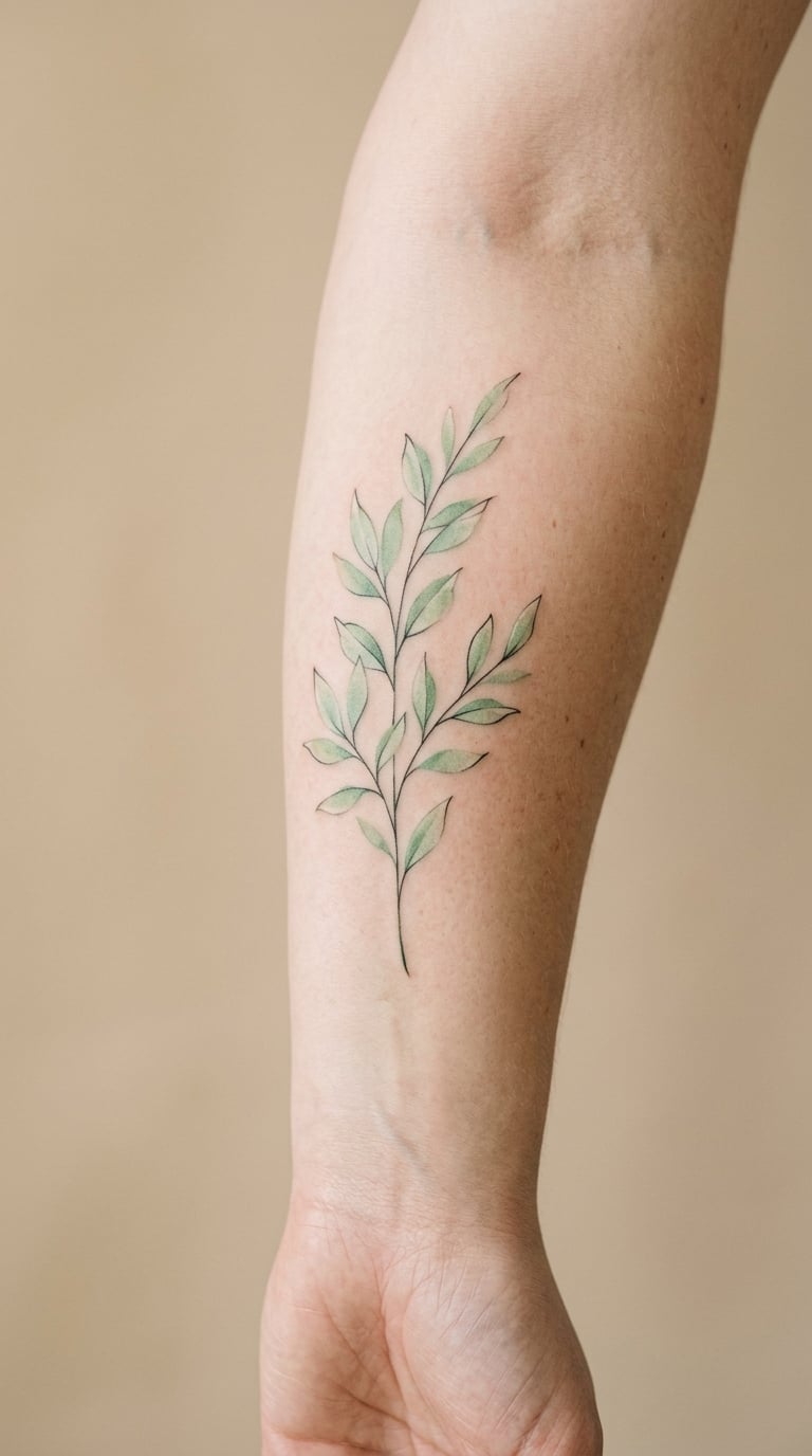
This watercolor botanical stem is one stem, not a bouquet: a fine central line with translucent leaves and a few pale green and yellow washes bleeding past the edges. A little pigment drift is the point, and it is also what makes the piece look relaxed rather than printed.
People usually pick a stem because it is a first-tattoo shape that still looks considered. It carries whatever meaning you attach to it, which is a good reason to keep the species meaningful to you rather than picking whatever looked prettiest on a screen.
Placement: inner forearm, vertical along the inner bicep, or the wrist-to-elbow line on the outer arm. Size: 3 to 4 inches long, 1 to 1.5 inches wide. Style: botanical watercolor with fine line structure.
Pain: low to medium, since the inner forearm is fleshy and the forearm bone is nowhere near the surface. The ageing note matters here: the pale washes drop out first, so expect the leaves to mellow to soft green-grey rather than stay vivid.
Make it yours: name the plant that means something to you and let the artist sketch that species, or add one thin band of deep color at the base so the stem has a visual anchor.
2. Watercolor Peony Cluster
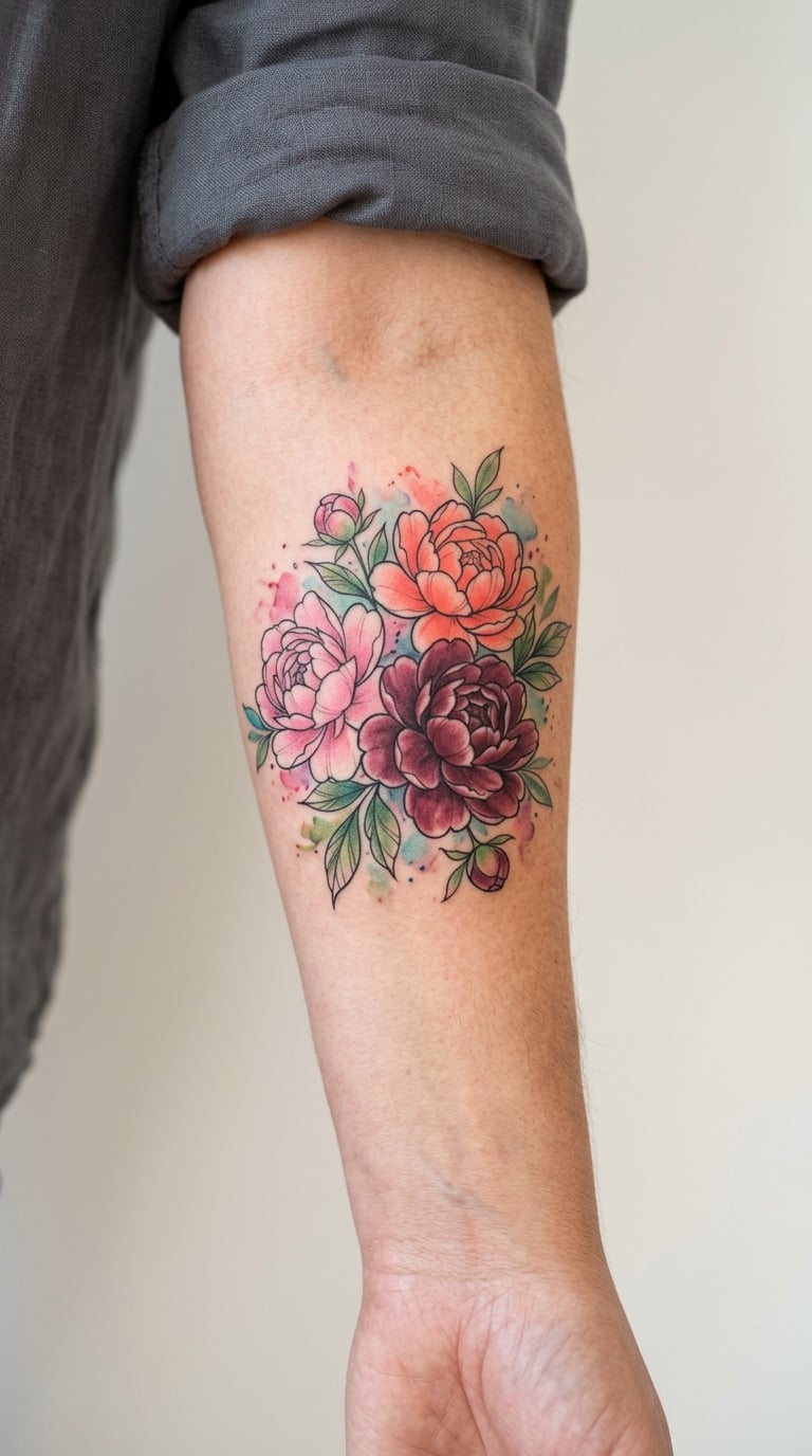
A tight cluster of two or three peonies, worked in soft pink with coral and burgundy pushed into the shadow areas and edges that dissolve into the skin. Peonies hold layered color well, which makes them one of the more forgiving watercolor flowers to tattoo.
This is the romantic end of the list. It suits a design that leans feminine and color-loving, and it works well as the centrepiece of a forearm group if you plan to add smaller pieces later.
Placement: outer forearm, or the upper chest near the collarbone if you want it higher. Size: 3 inches wide, 2 to 3 inches tall. Style: painterly floral with layered washes.
Pain: medium on the forearm, and a clustered bloom means more passes over the same skin in one sitting, so expect a longish session rather than a sharp one. Burgundy and deep pink hold better than pale pink, which is the first thing to soften.
Make it yours: choose the two or three colors that match something you already own, and skip the leaves entirely for a tighter, more graphic cluster.
3. Wildflower Meadow
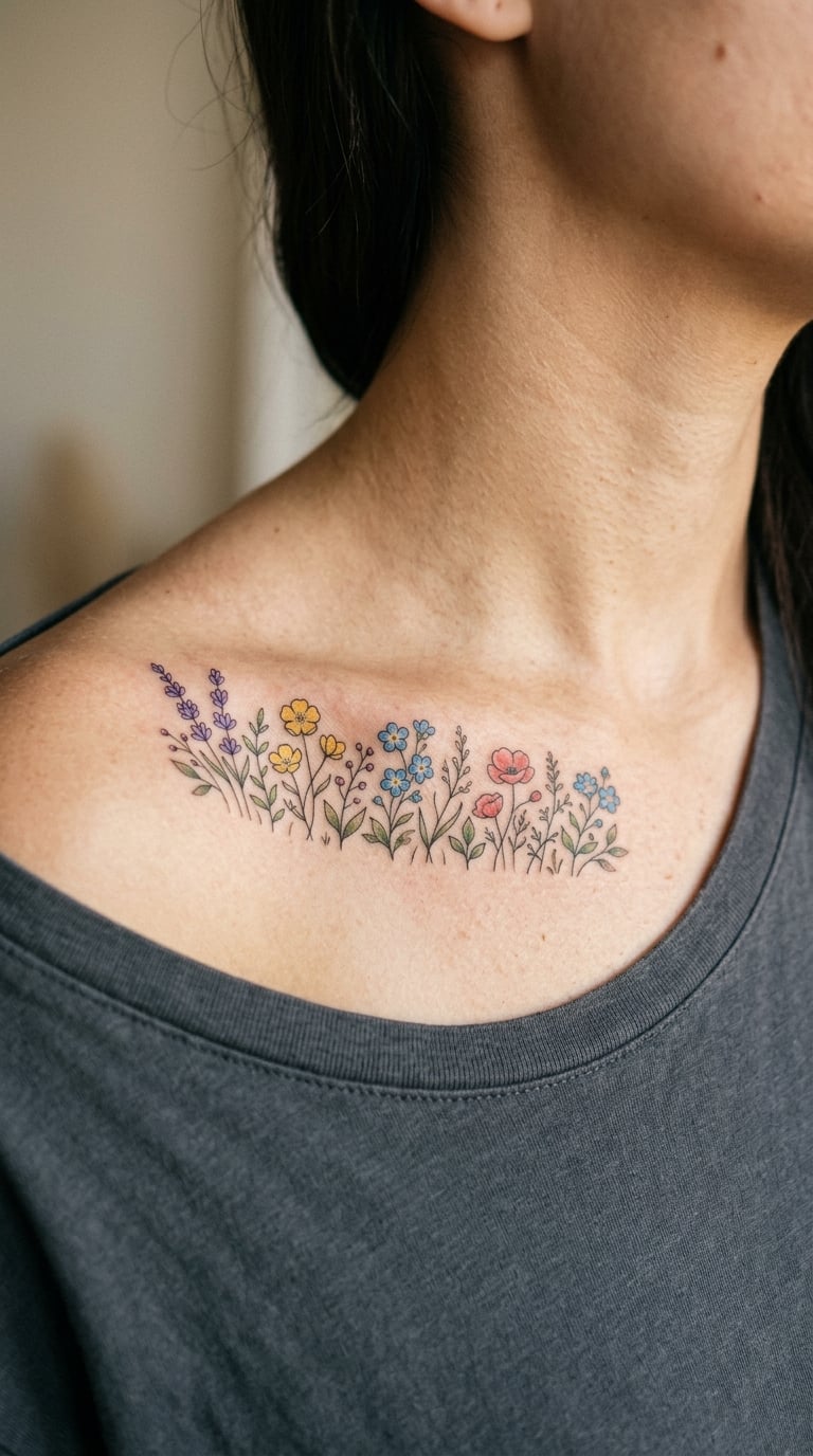
A horizontal spray of varied wildflowers, each stem a different length, with a few loose petals drifting free and just enough pigment bleed to keep it soft. Violet, soft yellow, pale blue and one muted red give you variety without turning it into a rainbow.
It reads as a small field, which is why people choose it when they want a piece with a bit of landscape in it but not a full scene. The balance is the hard part: an uneven spray looks accidental, and a careful artist spends time spacing the stems.
Placement: collarbone, following the bone from shoulder toward sternum, or the side of the thigh. Size: 4 to 5 inches wide, 2 inches tall. Style: loose floral watercolor spray.
Pain: medium. The collarbone is right over bone, and the skin there moves constantly, so the sensation is more of a constant scratch than a sharp hit. Soft washes on a curved bone also have a habit of settling into the collar hollow, so ask your artist to keep the color out of that dip.
Make it yours: use the actual species from a wedding bouquet or a garden you grew up around, so the meadow carries a private reference.
4. Lotus in a Color Wash
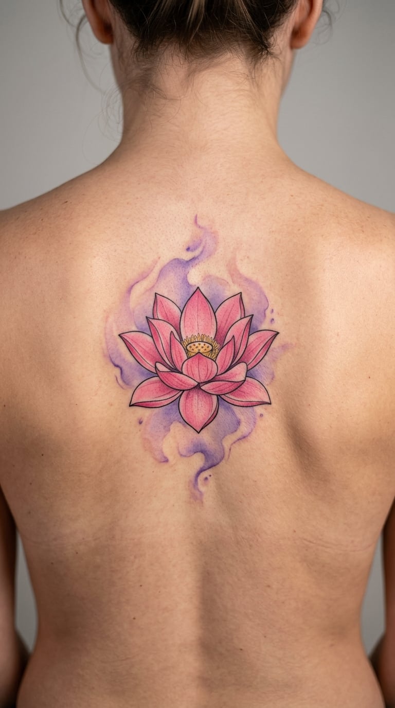
A symmetrical lotus, petals defined by layered pink washes rather than outlines, sitting inside a controlled lavender or teal field with soft edges. Symmetry is what sells it: a lotus drawn off-centre immediately reads as a mistake instead of a design.
Lotus tattoos carry a lot of inherited symbolism, so treat any meaning as yours to claim rather than assumed. What draws most people here is the shape and the calm of the composition, not a specific doctrine.
Placement: upper back between the shoulder blades, or centred on the sternum. Size: 4 to 5 inches across. Style: symmetrical floral with a controlled background wash.
Pain: medium, rising toward the higher end on the sternum because the breastbone is thin and the skin is mobile. The back is a longer session, so plan a break and a snack. The lavender wash is the fragile part; it fades first and leaves the lotus looking sharper than the background, which many wearers actually like.
Make it yours: have the wash match a specific year, a birth flower season, or a color that dominates a room you spend time in.
5. Olive Branch
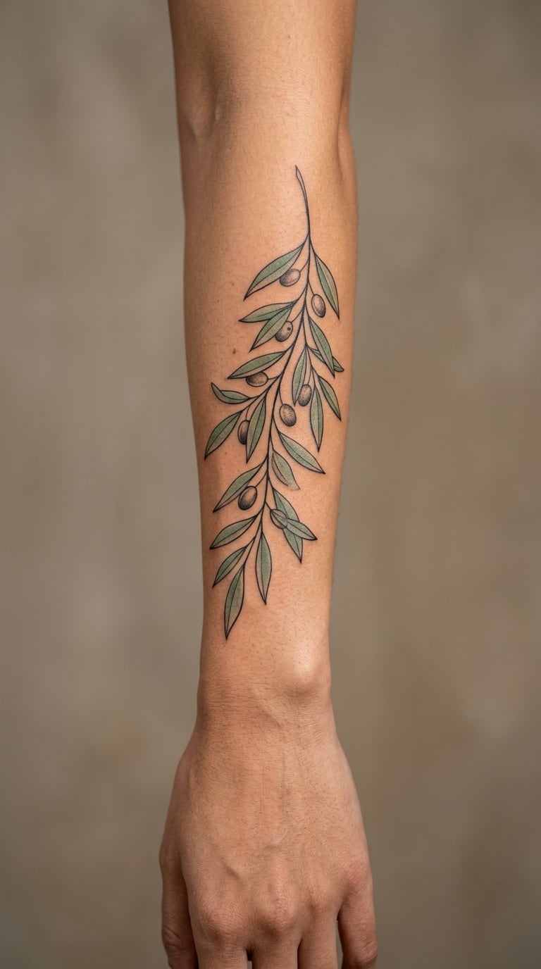
A slender branch with narrow sage-green leaves, laid over thin black linework that defines the stem and leaf edges without enclosing the whole shape. The line is a support, not a border, and that distinction is the whole technique.
Olive is a restrained botanical, so it suits people who want a green piece that does not shout. It also photographs well, which matters more than most people expect.
Placement: outer forearm along the muscle, or the side of the calf. Size: 5 to 6 inches long. Style: fine line with translucent watercolor wash.
Pain: low to medium on the arm, since the outer forearm is well padded. Leaf edges drawn in one-needle line soften noticeably over about five years, and the sage green follows the same path, so the two fade toward each other rather than one bailing out first.
Make it yours: have one leaf left as an outline only, unpainted, as a quiet reference to someone who has passed.
6. Monstera Leaf
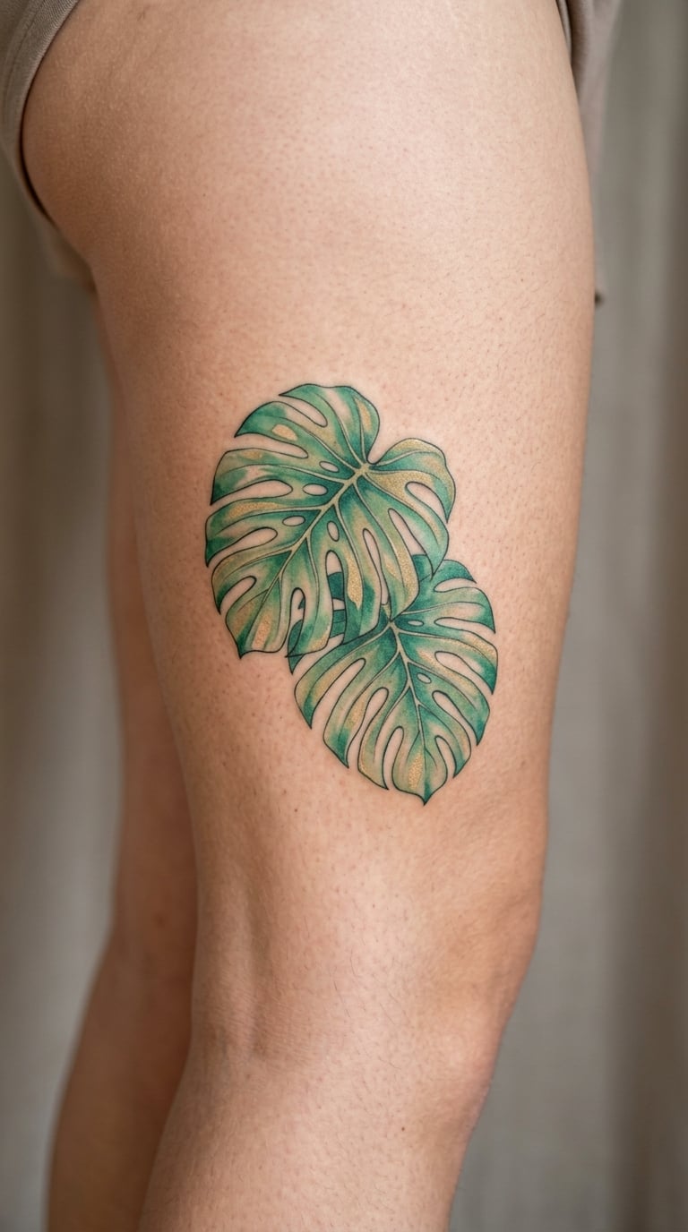
Two overlapping monstera leaves, layered in translucent green with a muted gold pigment drifting through the background. Overlap is what gives it depth, because the second leaf reads as being in front without any shadow being drawn.
It is a modern, slightly tropical design that suits a larger flat area, and the split leaves give the artist plenty of negative space to work with. Those gaps also make it forgiving, because a small error in one gap does not undo the whole leaf.
Placement: side thigh, outer thigh, or across the hip. Size: 3 to 4 inches per leaf, 5 to 6 inches combined. Style: tropical botanical with layered transparency.
Pain: medium on the thigh, and thigh work is a long session because the muscle gets restless under long sessions. The gold is the element to watch: metallic-style pigments are decorative and can sit closer to the surface, so ask your artist what they plan to use and how they will reinforce it.
Make it yours: have the gold leaf shapes fall in a pattern that means something to you, like initials hidden in the negative space, so the detail is yours rather than decorative.
7. Hummingbird in Flight
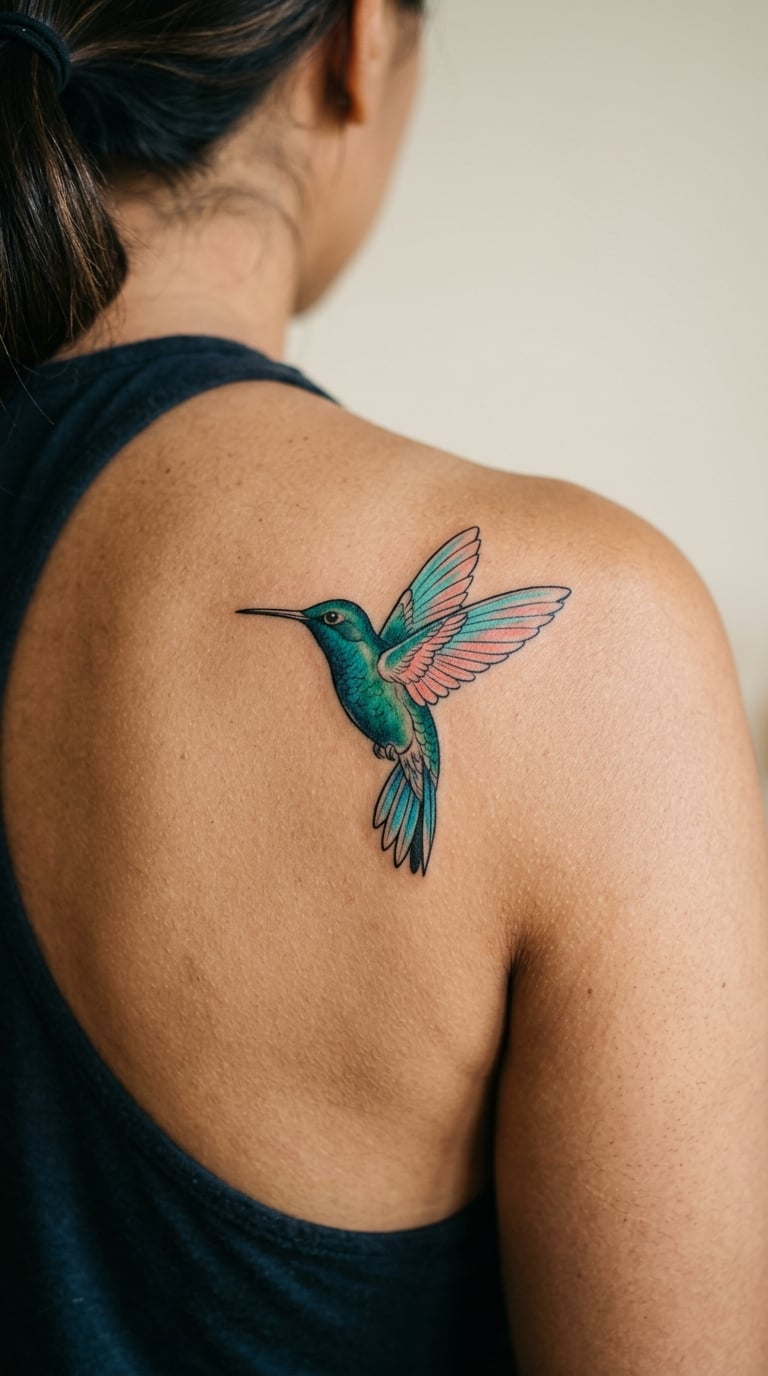
A hovering hummingbird with wings suggested by turquoise and coral washes rather than drawn feathers, body in a dark warm grey, beak in a fine point. The whole effect depends on movement, and on leaving the wing edges deliberately unfinished.
People choose it for the sense of a frozen second rather than for symbolism, which is refreshing in a motif list where most birds arrive carrying a story. The motion is the reason to get it.
Placement: shoulder blade, or the side of the upper arm. Size: 3 to 3.5 inches long. Style: painterly animal with loose edges.
Pain: medium to high. The shoulder blade is over a bony area and the skin moves with every breath and reach, and shoulder blade placements sit in the middle of the awkward family of spots that make long sessions tiring. Wash work also means repeated passes over the same pigment, which extends chair time.
Make it yours: aim the beak toward a specific part of the body, a wrist or a collarbone, so the piece visibly points at something that matters to you.
8. Abstract Crane
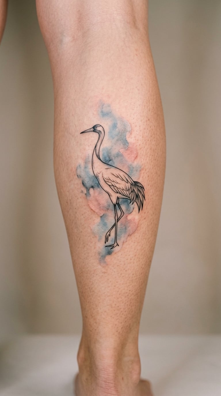
A fine-line crane with long neck and legs, standing inside a misty field of blue, grey and blush that has no defined edge anywhere. The line is precise and the color is not, and the tension between the two is the whole design.
It has an elegance to it that photographs well and it suits anyone who wants a statement piece without heavy black. The crane itself is easy to draw badly, so pick an artist whose healed line work holds up, not just whose fresh line work looks crisp.
Placement: calf, vertical, or the outer arm from elbow to wrist. Size: 5 to 6 inches tall. Style: fine line with a soft painterly background.
Pain: medium to high, because the calf is sensitive and the shin area sits right over bone. Fine legs and neck take a single needle and a lot of passes, so the session will be slow. Ageing note: thin single-needle lines on the lower leg blur first, since that area sees a lot of sun and friction from shoes and leggings.
Make it yours: have the mist colour matched to a season rather than a birthday, so the piece looks considered in winter and still right years later.
9. Swallow and Blossom
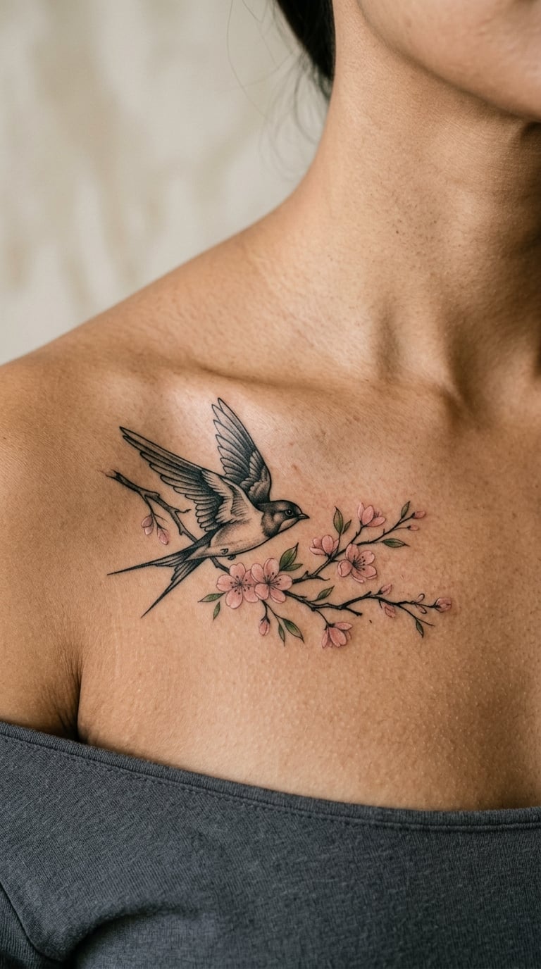
A swallow rendered in black and grey, wings defined by solid dark shapes, crossing a branch of blush blossom built from soft pink washes. The contrast between the two techniques is the point: hard shape, then soft colour, side by side.
Swallows are one of the most tattooed birds in history, so if you want something that is clearly yours rather than a very good version of a very common thing, this pair is a better bet than a swallow on its own. Our fine line ideas for women guide has other approaches if you want to go further from tradition.
Placement: upper chest near the collarbone, or the back of the shoulder. Size: 3 to 4 inches wide. Style: black and grey with a watercolor floral accent.
Pain: medium. Solid black areas on the chest are more uncomfortable than soft washes, and the collarbone edge adds sting without adding much time. The pink is the fragile element: pale pinks are among the first to fade, and this piece will lose its blush long before the black wing.
Make it yours: angle the swallow upward rather than level, and put the blossom branch on the side the swallow appears to be leaving.
10. Watercolor Butterfly
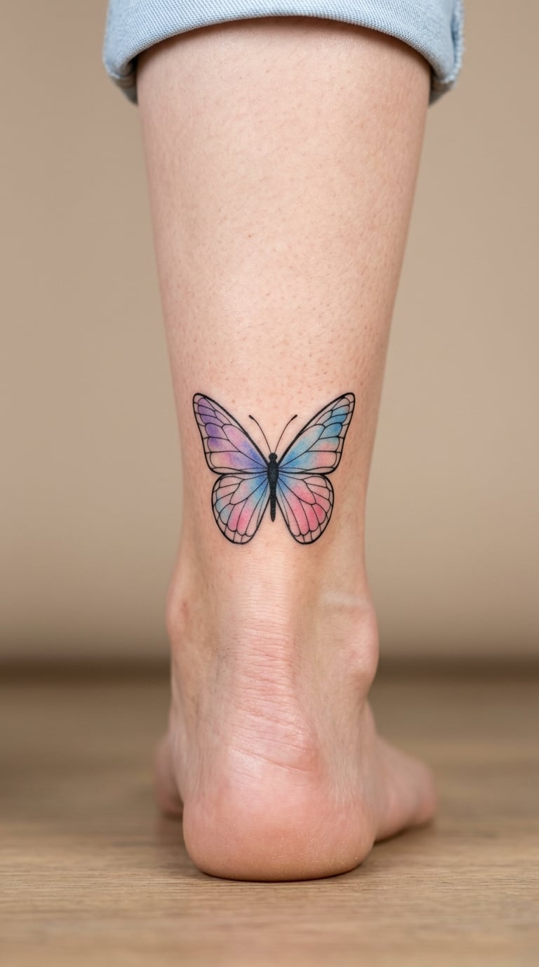
A single butterfly, wings built from translucent pink, blue and violet that overlaps where the layers cross, body in a fine dark line with two short antennae. The overlap is the detail that makes it look painted rather than printed.
It is a small, flexible piece that people add to a growing collection as often as they start with. Butterflies suit almost any colour story, so this is a good one to match to whatever you already own.
Placement: back of the ankle, inner wrist, or behind the ear for the smallest version. Size: 2.5 to 3 inches wide. Style: painterly animal with translucent layering.
Pain: medium. The ankle bones make the first few passes feel sharp, then it eases. Ageing note: the ankle is exposed in most footwear, and sun plus shoe friction is the fastest route to a faded butterfly, so this placement needs the most disciplined sun protection of anything in the list.
Make it yours: place it beside a fine-line piece of a different size so the collection reads as layered rather than repetitive, or use a butterfly from a book you love as the shape reference.
11. Luna Moth
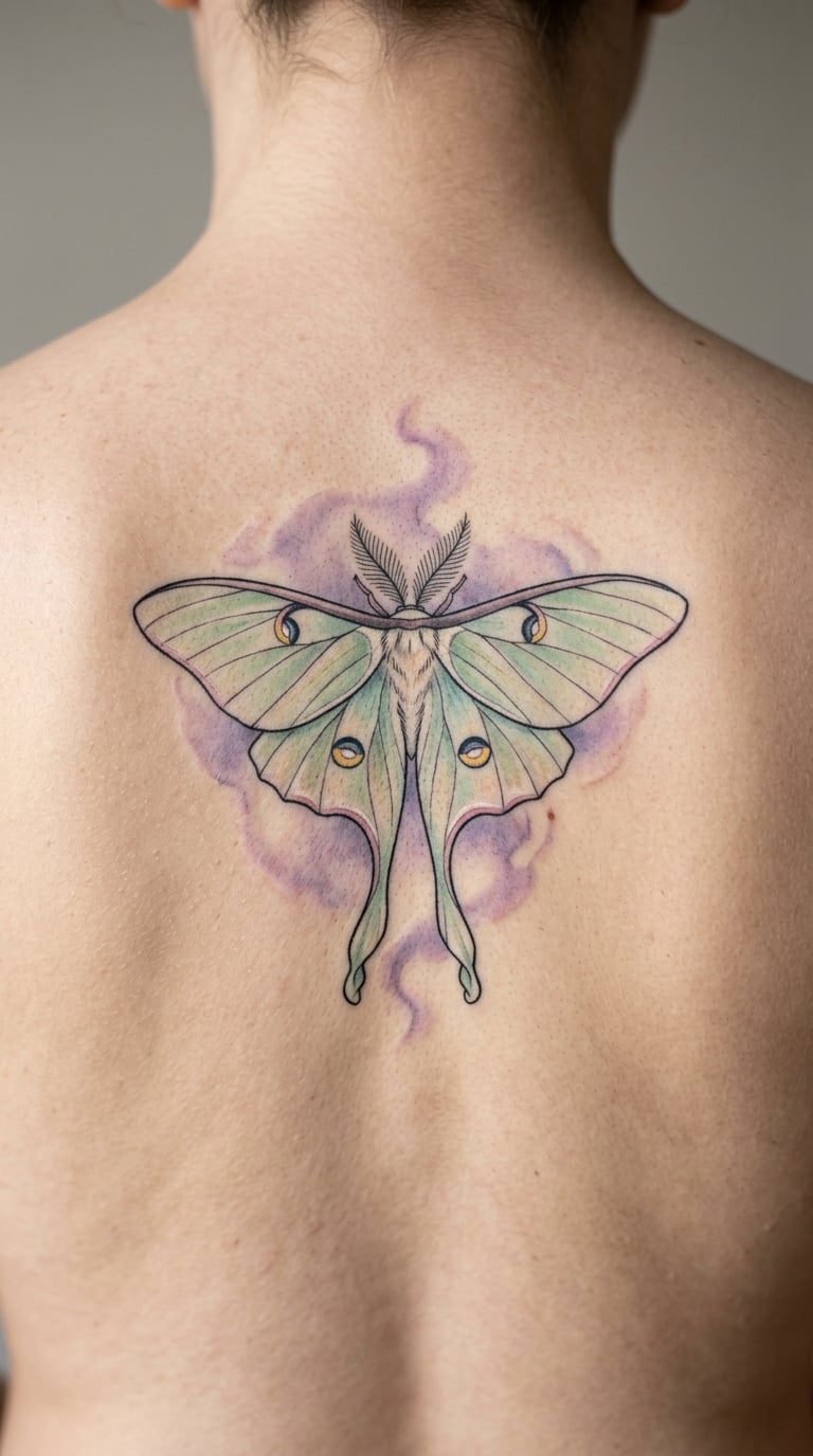
A pale green luna moth with a smoky lavender wash behind it, its feathery antennae drawn in enough fine detail to be the hardest part of the piece. The wings carry soft patterning rather than hard stripes, which keeps the whole thing painterly.
Moths got popular well past their moment, and the appeal is less about trend than about the fact that the delicate anatomy rewards a good artist. If your local artists are competing on moths, that is a good sign about their line work.
Placement: upper back, or the outer arm. Size: 3.5 to 4 inches tall. Style: detailed animal with a soft background wash.
Pain: medium, and the back means a long session with an awkward posture for part of it. Fine antennae on the upper back are hard to keep crisp because the skin there stretches when you reach across your chest. They will soften over time; ask your artist to build them slightly heavier than looks right fresh.
Make it yours: have the lavender wash placed to sit behind one wing only, so the moth appears to be half in light and half in shadow.
12. Painted Dragonfly
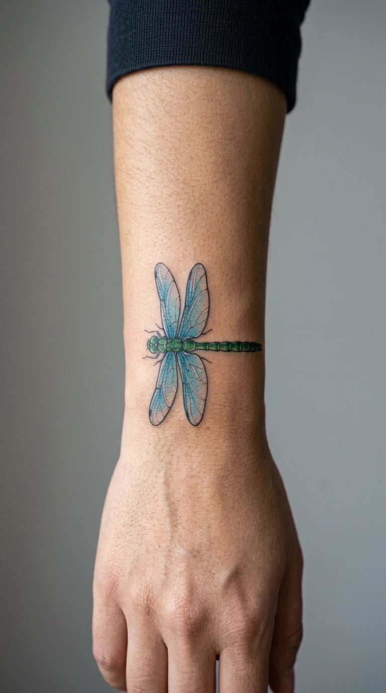
A horizontal dragonfly laid across the wrist, four wings in transparent blue that overlap slightly, a restrained green body with a darker thorax. Horizontal and low-contrast is exactly right for a wrist, where most designs are too tall to fit.
Dragonflies get chosen for the delicacy rather than any story attached to them. This is a good under-rated option if you find most floral watercolors too soft for your taste.
Placement: wrist, inner forearm, or behind the ear. Size: 2.5 to 3 inches wide, 1 inch or less tall. Style: airy painterly animal, minimal palette.
Pain: low to medium, and the wrist is one of the more forgiving inner-arm spots. Small is the risk here: at under 3 inches the four wings have to stay separated or they merge into one blue shape, and merged wings cannot be un-blurred later. See more small-scale layouts in our small rose tattoo ideas for women guide.
Make it yours: have the wings angled to follow the wrist’s curve rather than sitting flat, which makes the piece look built for that spot instead of copied onto it.
13. Mountain Sunset
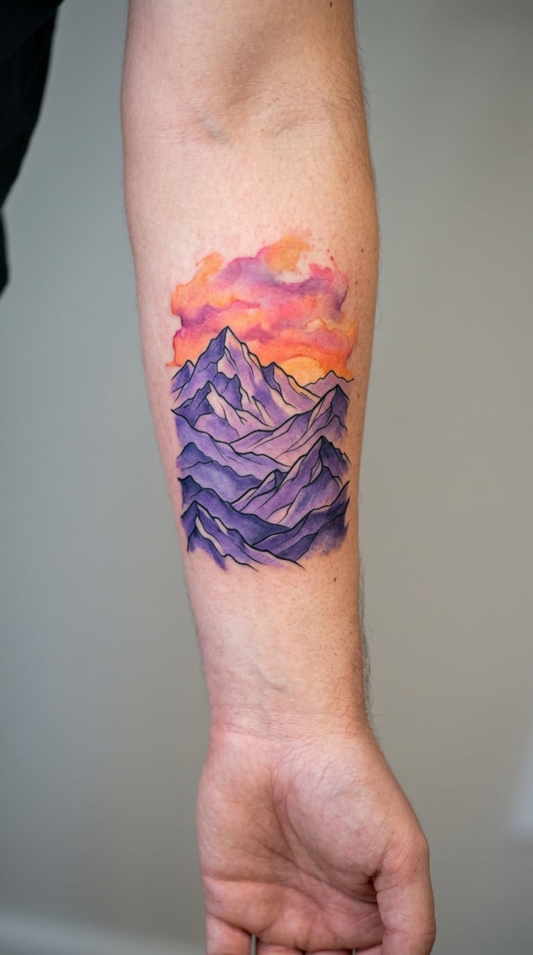
Layered violet mountains under an orange-pink sky, with the horizon line softened into a gradient so no hard edge cuts the composition in half. The colour separation is the whole technical challenge here, and it is one worth asking about.
It is a small landscape rather than a big scene, which makes it workable at arm scale. People tend to choose it because it marks a place, a trip or a stretch of years that mattered.
Placement: forearm, or across the upper back for a wider version. Size: 4 to 5 inches wide. Style: layered landscape with gradient sky.
Pain: medium, and large areas of blended colour take time rather than sting, so this is a long-chair-time design. Ask your artist how they will keep the orange from bleeding into the violet; a clean separation that survives a year is the real test of skill here. Sunsets warm and yellows fade fastest, so expect the orange to quiet down first.
Make it yours: have the mountain layers reduced to two or three and let the sky carry the detail, so the piece stays readable at a smaller scale if you ever need to rework it.
14. Ocean Wave
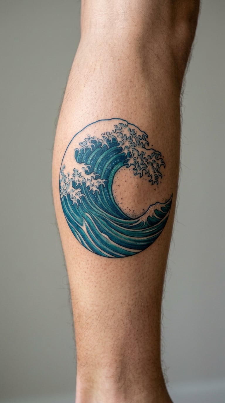
A curling wave in teal and deep blue, with the foam built from uninked skin rather than white pigment. Using negative space for the white is the mark of someone who understands how watercolour works, because it keeps the lightest areas light and crisp.
It is a confident, graphic option in a list full of soft florals, and it suits people who want colour without romance. The curl gives the composition its direction, so ask for the crest to face inward toward your body.
Placement: calf, ankle, or lower leg. Size: 3.5 to 4 inches wide. Style: graphic landscape with negative space.
Pain: medium on the calf, which is a sensitive area even though it is well padded. Blue pigments are generally durable, so this is one of the pieces here that ages better than most. The lower leg gets more sun than the arm, and shade from leggings and boots is where colour gets chewed up, so cover it or clear it out long before it matters.
Make it yours: have the wave break in a direction that follows the bone of your leg, which usually reads more natural than the same orientation on both legs.
15. Misty Forest
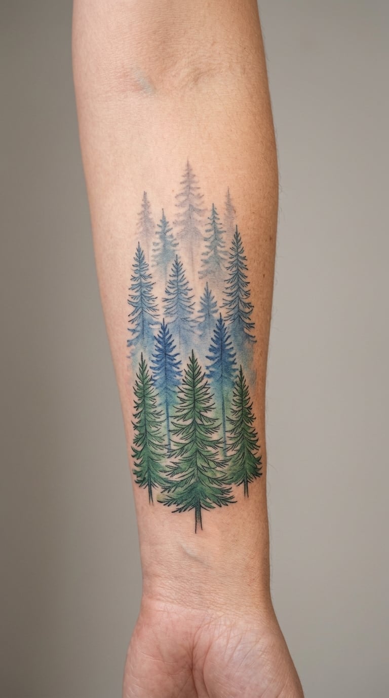
Layered pine trees receding through green, blue and grey, each row lighter and less defined than the one in front. Atmospheric depth comes from contrast control rather than realism, and the nearest trees can stay loose and dark.
It is a landscape that suits someone who wants depth and a bit of quiet without a full scene. Forests also have a good track record of being tattooed in groups, so it works as the anchor piece for a forearm project.
Placement: forearm, vertical from wrist toward elbow. Size: 5 to 6 inches tall, 2.5 inches wide. Style: atmospheric landscape, tonal layering.
Pain: medium, mostly chair time. The middle distance is where the palette turns to grey, and grey is the pigment that muddies fastest, so the middle rows may look flatter in a few years while the dark foreground holds. Ask to see the piece healed before you commit to a very light palette on a large scale.
Make it yours: give your artist a reference photo of the exact light you want, since mist is a lighting effect and not a colour, and a word like “misty” alone gets interpreted very differently.
16. Rose Stem
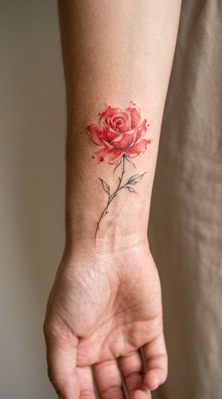
A single loosely painted rose, red blooming off a fine black stem, with a bit of pigment drifting free of the bloom as if the brush kept moving. Compact, vertical and instantly readable at arm’s length.
It is the piece people pick when they want a flower that is not a peony and not a botanical study. If you want more variations on this specific flower, our small rose tattoo ideas for women guide goes deeper into rose layouts and sizes.
Placement: inner wrist, or the outer arm. Size: 2.5 to 3 inches tall. Style: minimal painterly floral with fine line stem.
Pain: medium on the inner wrist, where veins run close to the surface and you will feel every pass. Ageing note: reds hold better than pinks and yellows, so a red rose keeps its shape longer than a soft pink one. The free-floating pigment is the most fragile part, since dilute pigment has less pigment in it to begin with.
Make it yours: have the stem wrap slightly around the wrist instead of sitting flat, which turns a small flat image into a piece with dimension.
17. Poppy Field
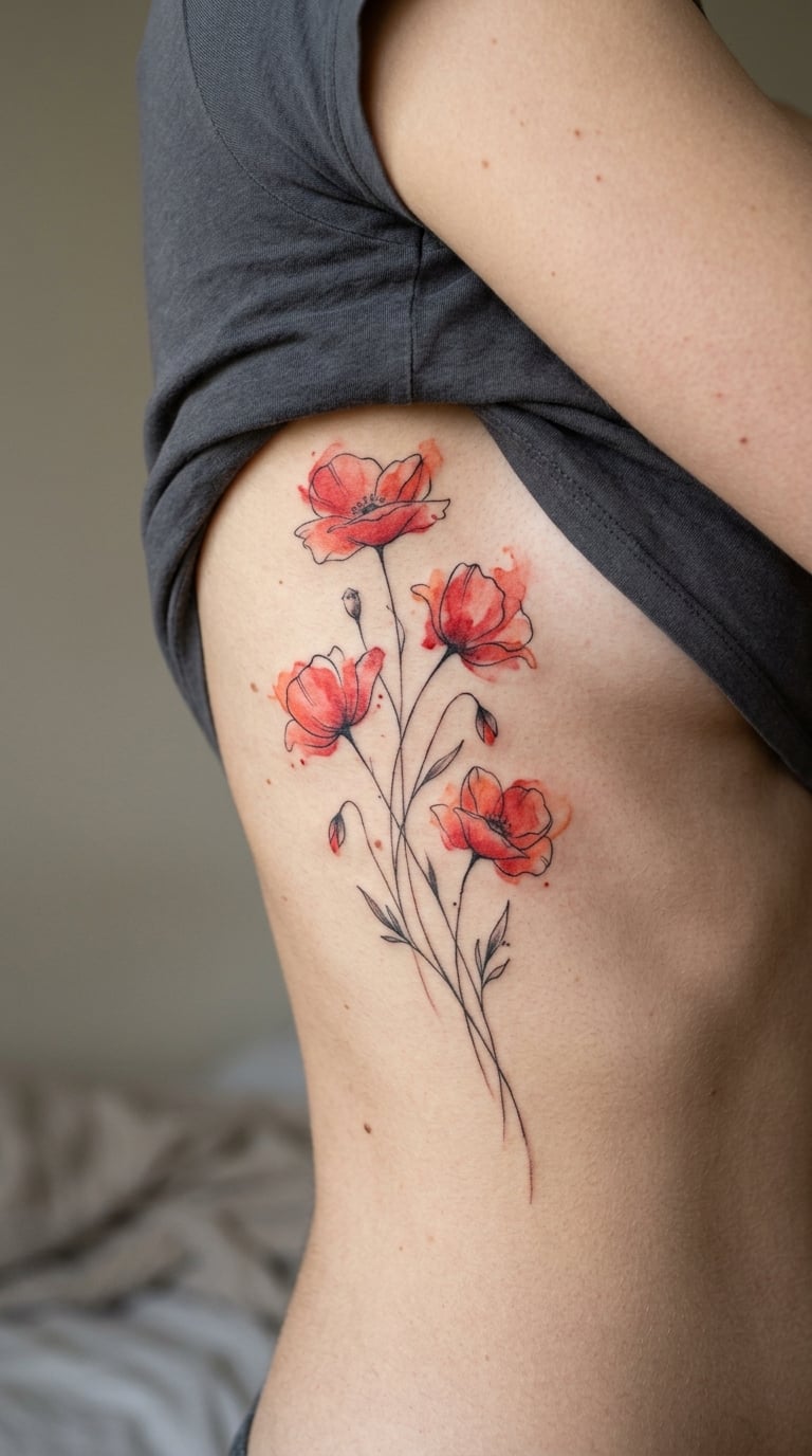
Several poppies on thin stems, in red, coral and a pale pink, with the petals allowed to bleed past their own edges. Loose colour movement is what makes it feel like wind rather than arrangement.
Poppies carry inherited meanings about remembrance and the transient, and they get chosen for that. Whatever the reason, it is a strong design to live with and a hard one to keep looking exactly as it did on day one.
Placement: side rib, or the outer thigh. Size: 4 to 5 inches tall. Style: loose floral with movement and bleed.
Pain: high, and the rib is the honest answer here. The skin is thin over bone, the ribs shift when you breathe, and a tall design means a long session in a position you cannot adjust. Our side rib tattoo ideas for women guide covers placements around this area if you want the look with an easier spot.
Make it yours: have one poppy partially open and the rest in bud, which gives the field a timeline rather than repeating the same shape five times.
18. Lavender Stems
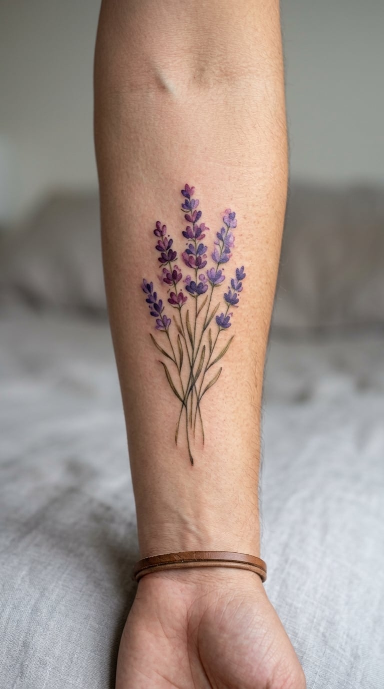
A relaxed fan of lavender stems, drawn in diluted violet with deeper plum accents pushed into a few flower heads and the shadow side of the fan. The stems are thin and slightly uneven, which is what stops it looking printed.
It is a small, soft piece that works almost anywhere, and a good one to book as a first tattoo if you want colour but not commitment to a large area. The palette suits most undertones because it stays in the purple family.
Placement: back of the forearm, inner wrist, or behind the ear. Size: 3 to 3.5 inches tall. Style: painterly botanical, muted palette.
Pain: low to medium, and a 3-inch piece on the back of the arm is one of the easier appointments to sit through. Ageing note: purples and violets sit between the durable blues and the fragile pinks, so expect a slow loss of saturation rather than a sudden fade. If you want the colour to hold longer, the artist can deepen the plum rather than relying on pale violet.
Make it yours: have the fan built with a specific count that means something, or add a single lavender stem at a different angle in a future session as a matching piece.
19. Peacock Feather
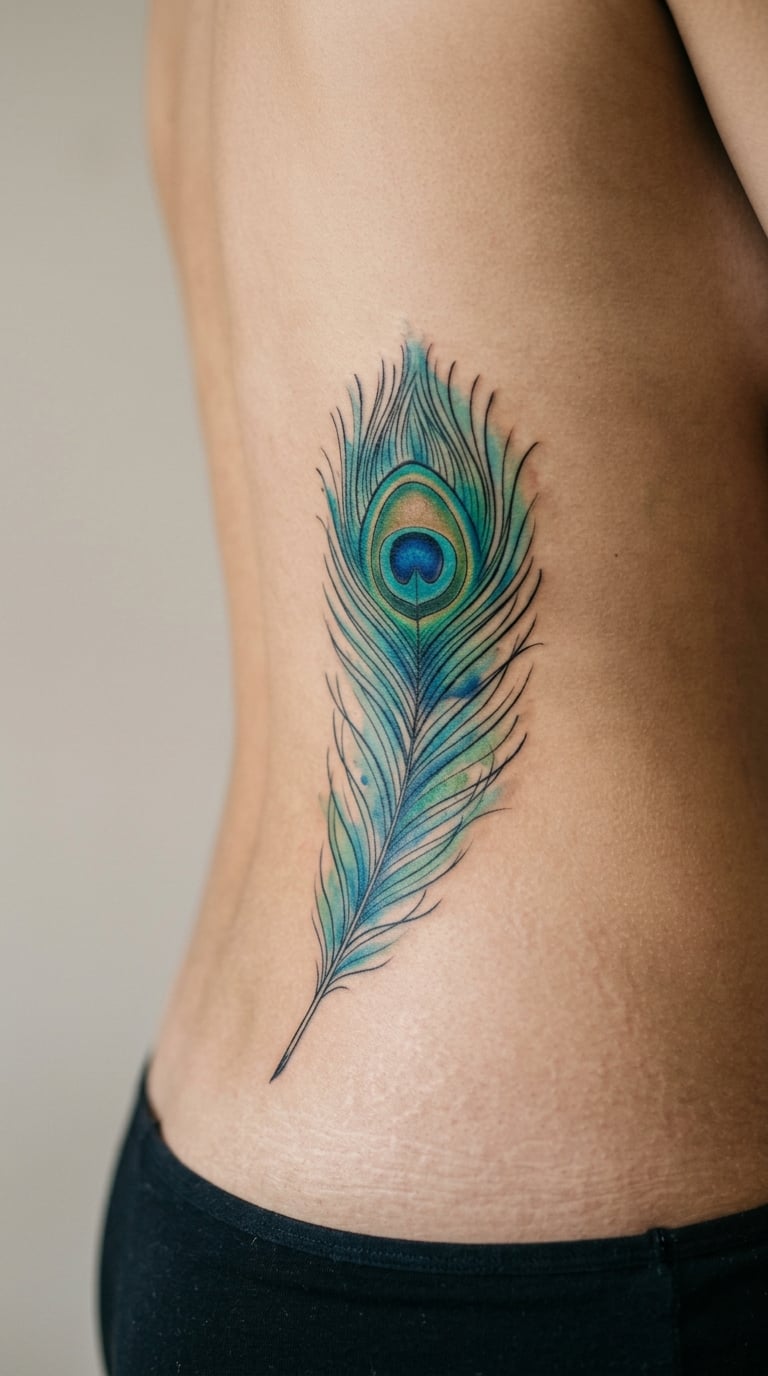
A peacock feather with the eye rendered in fine detail, set in washes of teal, blue and green that shift along the barbs. The eye is the anchor; the colour does the work around it, which is why this one survives a fade better than most.
It is a bold, directional design that suits a long line on the body and reads well from a distance. People tend to choose it for the colour, and they should know the colour is the part that changes most over time.
Placement: along the hip on the spine side, the outer thigh, or the back of the upper arm. Size: 5 to 6 inches long. Style: detailed animal with jewel-tone washes.
Pain: medium to high. The spine-side hip is close to the pelvic bone and sensitive, and the thigh beside it is not. Blue and green are durable pigments, so the washes will hold reasonably well, but the soft edges of the barbs lose definition where there is no line to hold them. The eye is the part you should pay attention to in the healed examples.
Make it yours: have the eye colour shifted to the exact shade of your birthstone or a specific gem, since it is the one part of the piece that gets looked at closely.
20. Flowing Ribbon
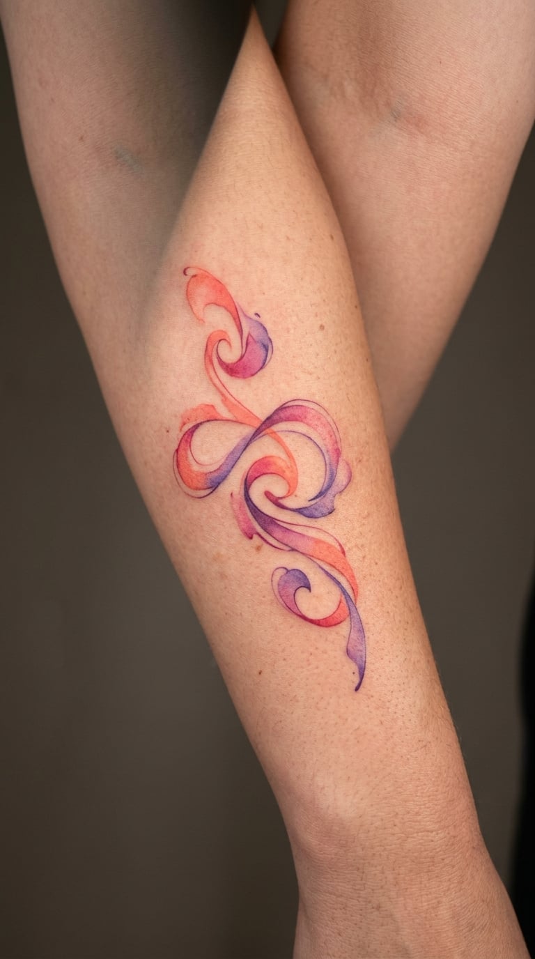
An abstract ribbon curling in coral, magenta and violet, with real open skin between the twists so the shape reads as it turns. Abstract, but controlled, which is the difficult balance in a design with no subject.
It suits bodies with long, flowing lines and it pairs easily with a botanical piece placed somewhere else. If you like the idea but not the saturation, an artist can do the same ribbon in a three-tone muted palette.
Placement: forearm, ribs, or along the back of the calf. Size: 4 to 5 inches long. Style: abstract color, layered washes.
Pain: medium on the arm, higher on the ribs. Magenta and coral are among the colours that lose intensity first, so this is a design to expect to mellow. Ask your artist to build the darker magenta tones with more pigment depth rather than thin dilution, since depth holds better than transparency over time.
Make it yours: have the ribbon follow an existing scar or an old favourite tattoo’s curve, which turns a new piece into a deliberate continuation rather than a separate addition.
21. Abstract Color Splash
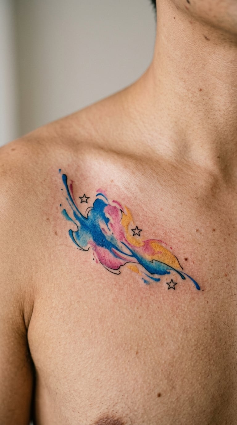
A controlled splash of blue, pink and yellow with three tiny stars caught inside it, edges soft and bleeding rather than splattered. Splashes look accidental unless the artist plans them, and this one is planned: the shape has a direction and a boundary.
It is the most flexible piece in the list because it carries no motif and no placement requirement, which makes it a good match for someone who likes the technique and not the subject. The stars give it somewhere for the eye to land.
Placement: upper chest, forearm, or upper back. Size: 3.5 to 4 inches across. Style: abstract color splash with graphic accents.
Pain: low to medium, and because it is a single mass of blended colour with no line work, it is a shorter session than most designs here. Ageing note: yellow is the first pigment to go in any tattoo, so the splash will read cooler and slightly duller over time, and the three stars will hold their shape longest because they have defined edges.
Make it yours: pick your three colours from a palette rather than at random, and have the stars placed asymmetrically so the piece does not sit like a logo.
22. Crescent Moon and Stars
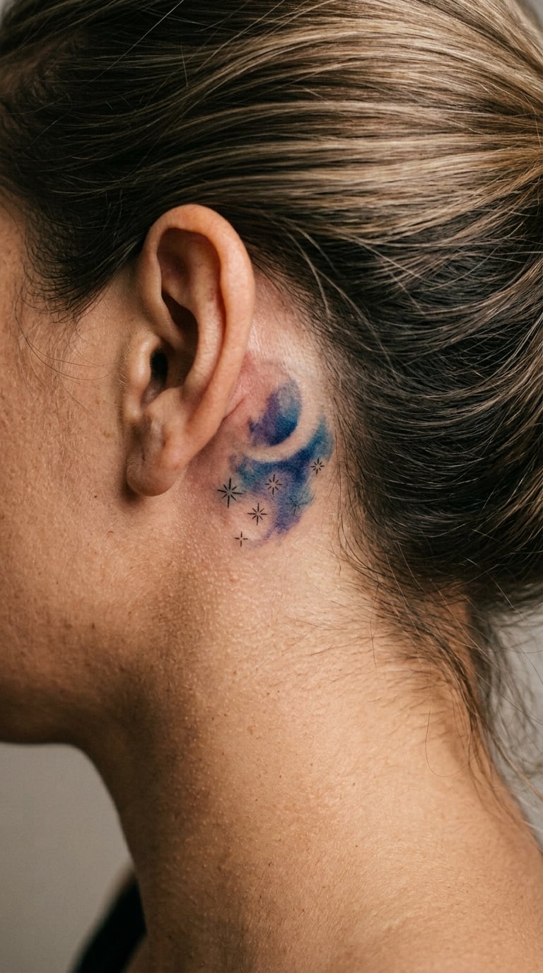
A crescent moon with five fine stars over a wash that runs from deep blue into violet, darkest at the bottom of the crescent and fading out above. The gradient is doing the atmospheric work, and the stars are almost an afterthought, which is how it should be.
Celestial tattoos rarely come with a fixed meaning; people tend to describe them in terms of a person or a period of their life. It works well as a small piece that stays under clothes most of the year.
Placement: behind the ear, the inner arm near the elbow, or the ankle. Size: 3 to 4 inches tall. Style: celestial fine line with gradient wash.
Pain: medium, and behind the ear is a nerve-rich spot, so the first few passes can be genuinely uncomfortable even on a small design. The stars are single-needle line and will blur first; ask for them slightly heavier than the reference image suggests. The blue and violet wash holds better than most, and the background gradient will soften into a softer version of itself rather than disappearing.
Make it yours: use the five stars for a date in Roman numerals beside them, or place the crescent to face a specific direction so the piece reads as pointing somewhere.
23. Sunlit Window
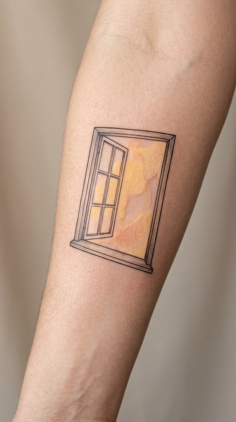
A simple window frame standing open, with a yellow and peach wash falling across two or three panes and fading out where the light would end. It is contemporary and geometric, and it is the one design here that is about a space rather than a subject.
It suits people who like the softness of watercolor but do not want a flower. The hard edges of the frame give the pigment something to sit against, which makes it one of the easier watercolor styles to keep reading clearly.
Placement: inner forearm, outer arm, or the upper back. Size: 3 to 3.5 inches tall. Style: geometric with warm watercolor wash.
Pain: low to medium, and a frame-and-wash design like this is a shorter sitting than a dense floral. The wash is warm, and warm colours soften visibly over time, so the peach in particular will drift toward a duller tone while the yellow drops out fastest. If you want the warmth to survive, ask the artist to build it in deeper layers at the start.
Make it yours: have the shape of the window drawn from a real building you know, so the piece has a place in it that nobody else would guess.
24. Floral Name in Watercolor
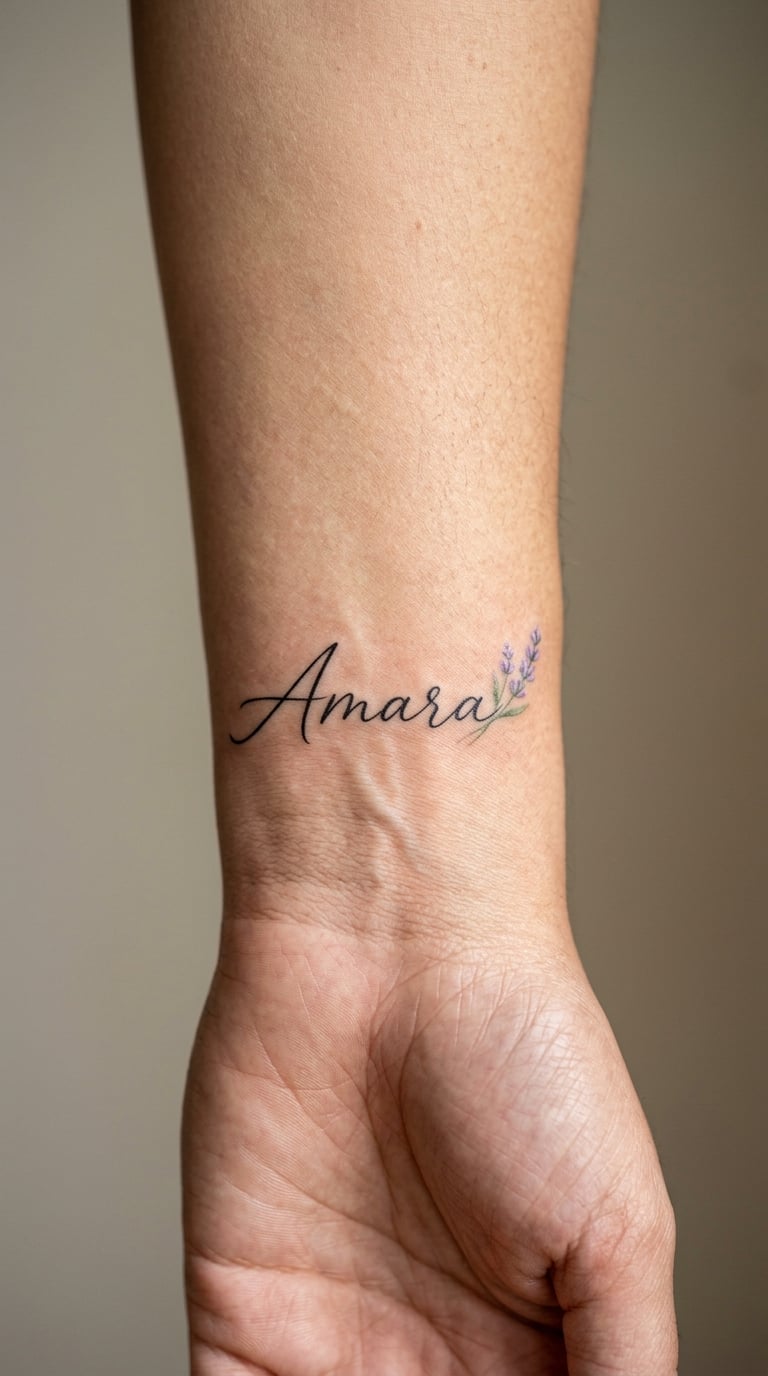
A short name in restrained fine-line script, black and slightly uneven so it looks written rather than printed, with one small lavender sprig or a single rose tucked into the space above the last letter. The colour is an accent, not a feature.
Script names are the most common choice in this list and the most frequently regretted one, usually because the name was too long for the spot. A short name, a small size and a good wrist position solve most of it.
Placement: wrist, inner arm, or behind the ear for a first name only. Size: 2.5 to 3 inches wide, one to two words. Style: fine line script with a small watercolor accent.
Pain: medium on the wrist, and thin script over the wrist bone is where people feel the needle most. The lettering is the ageing risk: single-needle script softens within a few years and loses its crisp edges first, so ask to see healed examples of that artist’s script at 6 to 12 months rather than judging fresh work.
Make it yours: have the accent flower painted in a colour pulled from the person’s handwriting or a piece of jewellery they wear, which makes the addition feel connected rather than decorative.
How to Choose the Right Design
- Match the style to the artist, not the other way round. If you want a painterly piece, look for a portfolio full of painterly pieces. An artist whose work is mostly bold line and blackwork will add outlines, and outlines are the one thing a watercolor design cannot absorb gracefully.
- Check contrast before colour. Ask to see healed work, not fresh work. The pieces that have aged badly show it in the washed-out areas and the muddy greys, and a good artist will show you those without being asked.
- Choose a placement the design can grow into. Forearm, upper back and thigh all have room for a larger piece later. Wrist, ankle and ribs are more committed choices, so if you are young and undecided, start somewhere with space around it.
- Set the size before the detail. Anything under 2 inches loses blending detail first, and fine elements blur together. If you want a small piece, pick a small design rather than a small version of a big one.
- Think about ageing honestly. Friction from clothing, shoes and bags, plus sun exposure, will affect a piece long before the style changes. A watercolor on the shin or the ankle needs more sun discipline than the same design on an upper arm.
Cost and Session Time
Watercolor costs more than comparable linework for one reason: chair time. Blending takes passes over the same skin, and a 4-inch piece with a wash behind it can take two to three hours where a solid black equivalent takes forty minutes. Most artists price by the hour, so the design’s complexity feeds straight into the number.
A useful rule is to think in sessions rather than in a single total. Small pieces of 2 to 3 inches in simple designs are often a one-session job of roughly an hour. Mid-size pieces in the 4 to 6 inch range with layered colour commonly run two to four hours, and those may be split across two appointments.
Larger work, such as a misty forest or a peacock feather at 6 inches, can run four to six hours and is usually scheduled in stages. Ask whether your artist charges for the whole project or per session, because it changes the decision about how much detail to add in one go.
Rates vary far more than people expect. An hourly rate, a shop minimum, a deposit, and a cancellation policy all come into play, and the minimum matters most for small pieces, since a 2-inch design at an hourly rate can still be billed at the shop minimum. Get the full figure, the session estimate and the deposit terms in writing before you commit, and if a quote arrives without a session length attached, treat that as a sign to keep asking questions.
Aftercare Basics
- Follow your artist’s aftercare instructions first. They know the needle depth and ink they used, and their instructions come before anything on this list.
- Keep it clean. Wash gently with unscented soap and water as directed, pat dry rather than rubbing, and let the tattoo breathe rather than covering it for long stretches.
- Protect it from sun. Fresh watercolor is at its most saturated for the first weeks, and direct sun in that period is the fastest way to lose the colour you booked for. Cover it, and keep using sunscreen on the area once it has healed.
- Moisturize with something simple. A plain, unscented lotion is enough. Anything heavily fragranced or containing alcohol is a poor fit for healing skin.
- Choose loose clothing. Tight waistbands, bra straps, collars and shoe tongues rub at exactly the moment the skin should not be disturbed, and collars and waistbands are also where a healed watercolor piece fades fastest.
- Watch it, then stop worrying. Some redness and a light flush in the first days is normal. Anything that spreads, stays hot, or starts to ooze is a reason to contact the studio or a doctor rather than to keep refreshing the photo.
Frequently Asked Questions
Do watercolor tattoos fade faster than other styles?
Yes, and the honest answer is that they do. Watercolor works through diluted, layered pigment with soft edges, and diluted pigment has less colour in it to begin with, so it loses intensity with less sun exposure than solid black or fully packed colour. Most wearers describe the change as mellowing rather than falling apart, and many prefer the aged look. Light pigments such as yellow, pale pink and coral go first, while blues, greens and reds tend to hold longest.
What is the best placement for a small watercolor tattoo?
The inner forearm, the back of the forearm and the outer arm are the easiest places to keep a small piece clean, because the skin is relatively flat, well padded and easy to see while it is being done. The wrist works well too, though the wrist bone makes the first passes sharper. Placements to approach carefully are the ribs, the side thigh and anything on the lower leg, where the skin is thinner or the area rubs against clothing and footwear.
Should I choose a large or small watercolor design for my first tattoo?
Smaller and simpler, as a rule. Watercolor detail is technically harder at small scale, because the blends that make the style work have very little room to breathe below 2 inches, and small pieces blur together first. A first piece in the 2 to 3 inch range with one motif and one clear focal point is a comfortable middle ground. You can always add a larger piece later on the same arm once you know how your skin takes colour.
How many hours does a watercolor tattoo take?
Expect roughly one hour for a simple piece under 3 inches, two to four hours for a mid-size design in the 4 to 6 inch range with layered colour, and four to six hours for larger work such as a landscape or a detailed feather. Blending and layering mean repeated passes over the same area, so the time comes from technique rather than size alone. Longer pieces are often split across two appointments, which is easier on both the client and the artist.
Can a watercolor tattoo be matched with other small pieces?
Yes, and matching is easier with this style because watercolor has no fixed outline to repeat. Keep the palette to two or three colours across all pieces, keep at least two or three inches of clear skin between them, and vary the scale so a 2-inch and a 3-inch piece sit together comfortably. Alternating a soft piece with a fine-line one adds variety without any colour matching to manage. Decide the full set before the first appointment so the spacing works.
Conclusion
Twenty-four designs sit in this guide and they are not variations on one idea. The loose botanical stem is the one I would point a first-tattoo client toward, because it is a small single motif, it sits on a forgiving part of the arm, and it teaches you how your skin takes colour without committing to a large canvas.
The abstract colour splash is the stronger collection piece. It carries no motif to grow tired of, it works at almost any placement, and it plays well beside florals or fine line. Most people end up with one of each, on different parts of the body, on different timelines.
Whichever one you land on, settle the motif, the size and the placement with your artist before the stencil goes on. Bring a reference image, ask to see healed work of a similar size, and take the extra week to think if you are unsure. The style is soft, but the tattoo is permanent, and the best watercolor work starts with a design that was scaled to the body it is going on.