
20 Trash Polka Tattoo Ideas in Bold Blackwork (September 2026)
Trash polka tattoo ideas work because they refuse to sit still. A realistic portrait sits next to a torn paper shape, a typewriter word cuts across a black block, and a red splatter lands wherever it wants. The style came out of the Buena Vista Tattoo Club in Würzburg in 1998, and it has stayed recognisable ever since because the recipe is fixed: realistic subject, abstract chaos around it, and a black-and-red palette that refuses to soften.
That mix suits anyone who wants a piece that reads as personal rather than decorative. Most trash polka tattoo designs want a real canvas, so a first piece works best when you pick one subject and let the surrounding chaos breathe. If you like cleaner subjects, the cat silhouette tattoo ideas for minimalists are a gentler way into blackwork; if symbolism is your driver, the heartbeat tattoos with meaning are worth a look first.
Below are 20 concepts with placement, size, pain and one personalising note each, so you can walk into a consultation with something more useful than a screenshot.
Trash Polka Tattoo Ideas: Quick Guide
| Idea | Style | Best placement | Realistic size | Pain |
|---|---|---|---|---|
| 1. Distressed portrait | Realism with halftone | Outer forearm | 4-6 in (10-15 cm) | Medium |
| 2. Torn newspaper typography | Collage blackwork | Inner bicep | 3-5 in (8-13 cm) | Medium |
| 3. Cracked bust | Distorted realism | Upper arm | 5-7 in (13-18 cm) | Medium |
| 4. Dithered rose | Floral blackwork | Forearm | 3-4 in (8-10 cm) | Low |
| 5. Abstract eye in a torn square | Micro-realism | Upper chest | 2-3 in (5-8 cm) | Medium |
| 6. Skull with collage shading | Blackwork | Calf | 4-5 in (10-13 cm) | Medium |
| 7. Fragmented anatomical heart | Anatomical realism | Inner forearm | 4-6 in (10-15 cm) | Medium |
| 8. Profile with torn negative space | Editorial realism | Outer thigh | 6-8 in (15-20 cm) | Medium |
| 9. Black sun with dripping rays | Abstract blackwork | Shoulder blade | 4-6 in (10-15 cm) | Low |
| 10. Torn map and compass | Illustrative collage | Outer forearm | 5-7 in (13-18 cm) | Medium |
| 11. Hourglass with ink grains | Grunge realism | Forearm | 3-4 in (8-10 cm) | Low |
| 12. Moth with halftone wings | Naturalistic blackwork | Between shoulder blades | 5-7 in (13-18 cm) | Medium |
| 13. Broken chain around a heart | Symbolic blackwork | Forearm | 3-4 in (8-10 cm) | Low |
| 14. Moth and flower hybrid | Botanical collage | Thigh | 5-6 in (13-15 cm) | Medium |
| 15. Smeared portrait | Abstract realism | Upper arm | 4-5 in (10-13 cm) | Medium |
| 16. City skyline in black blocks | Geometric blackwork | Forearm | 7-9 in (18-23 cm) | Medium |
| 17. Raven with torn-paper wing | Graphic blackwork | Upper arm | 4-6 in (10-15 cm) | Medium |
| 18. Candle flame from brush strokes | Abstract brushwork | Inner forearm | 3-5 in (8-13 cm) | Low |
| 19. Torn playing-card symbols | Abstract collage | Calf | 4-5 in (10-13 cm) | Medium |
| 20. Full collage sleeve | Large-scale trash polka | Full arm | 18-24 in (46-61 cm) | High |
1. Distressed portrait with a halftone face
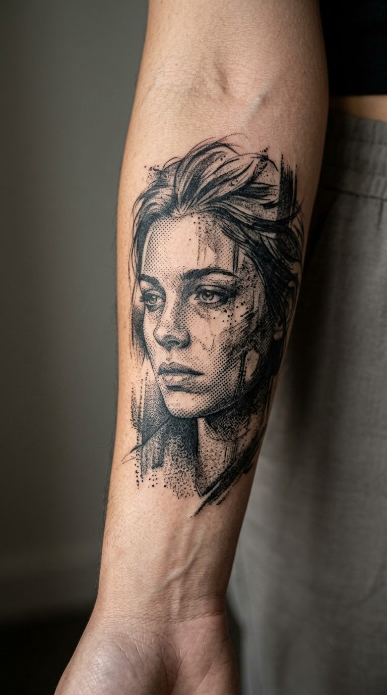
This is the one most people picture when they hear the style. The face is built from deep black shadow shapes, then the highlights dissolve into a grid of dots that thins across the cheek and jaw, with dry brush marks dragged across the edges. Nothing is symmetrical and the outline is deliberately unfinished, so the portrait looks half-printed and half-erased.
People usually choose it because it carries a face without looking like a photograph, which keeps it personal instead of decorative. A second reason shows up constantly: distressed black work hides small imperfections better than clean linework.
Placement: outer forearm, upper arm, or a vertical panel on the calf. Size: 4-6 in (10-15 cm) tall. Style: realism with halftone texture. Pain: medium, higher across the inner elbow crease. Ageing: the halftone dots soften first, so the face keeps its contrast for longer than the texture does.
Make it yours: hand the artist a photo with the lighting you actually want, and ask for the dot pattern to fade out over the collarbone instead of the cheek.
2. Torn newspaper typography panel
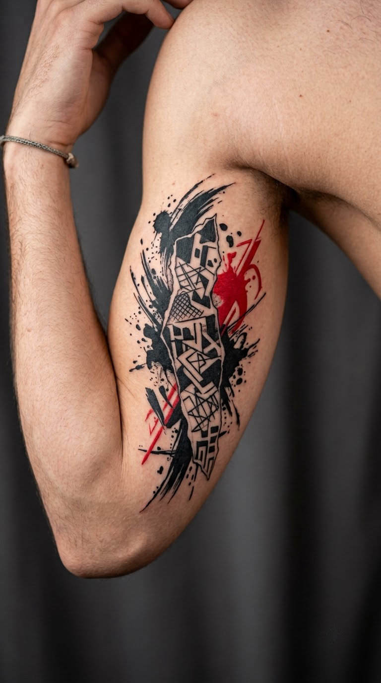
Typography-led trash polka tattoos are built from torn paper rectangles at sharp angles, a few words in a rough typewriter style, and black blocks that cut across the edges as if the sheet was ripped in half. Ink splatter and a single red accent give the panel its weight.
The lettering is usually the reason for the piece, so keep it to a handful of words. Long paragraphs on skin blur and the eye stops reading them after a while.
Placement: inner bicep, sternum, or wrapped around a forearm. Size: 3-5 in (8-13 cm). Style: collage blackwork with brush texture. Pain: medium on the bicep, high over the sternum. Ageing: fine serifs on the inner arm wear down fastest, so expect touch-ups on the lettering sooner than on the black shapes.
Make it yours: bring a date, a surname, or one word in a foreign language you actually read, and ask for it set at an angle rather than straight across.
3. Cracked bust with ink drips
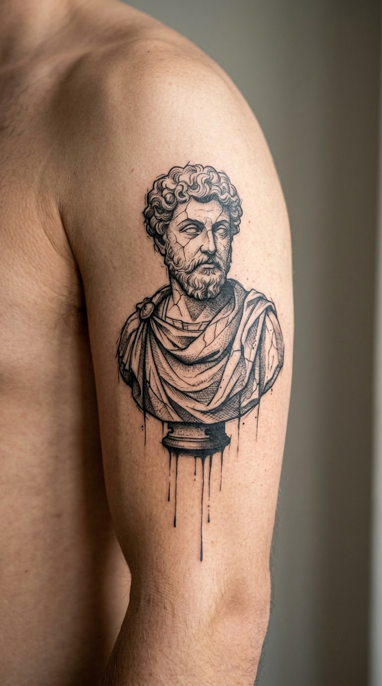
A classical profile bust is the traditional version, all smooth marble shading and calm proportion. Break it with rough contour lines that skip across the cheek and jaw, cross-hatching in the shadow, and thin black drips running down from the chin and shoulder. The classical subject stays readable, the surface stops being polite.
It reads as an old master print that came off a damaged scanner, which is a good look for anyone who likes art history but not nostalgia.
Placement: upper arm, chest, or the back of the shoulder. Size: 5-7 in (13-18 cm) tall. Style: distorted realism with drips. Pain: medium, and the collarbone area adds noticeable sting. Ageing: heavy black fills stay strong; the cross-hatch lines are what soften first.
Make it yours: pick the era of the bust to match something in your life, then ask for the cracks to follow one real fracture line rather than scatter evenly.
4. Dithered rose and thorn spray
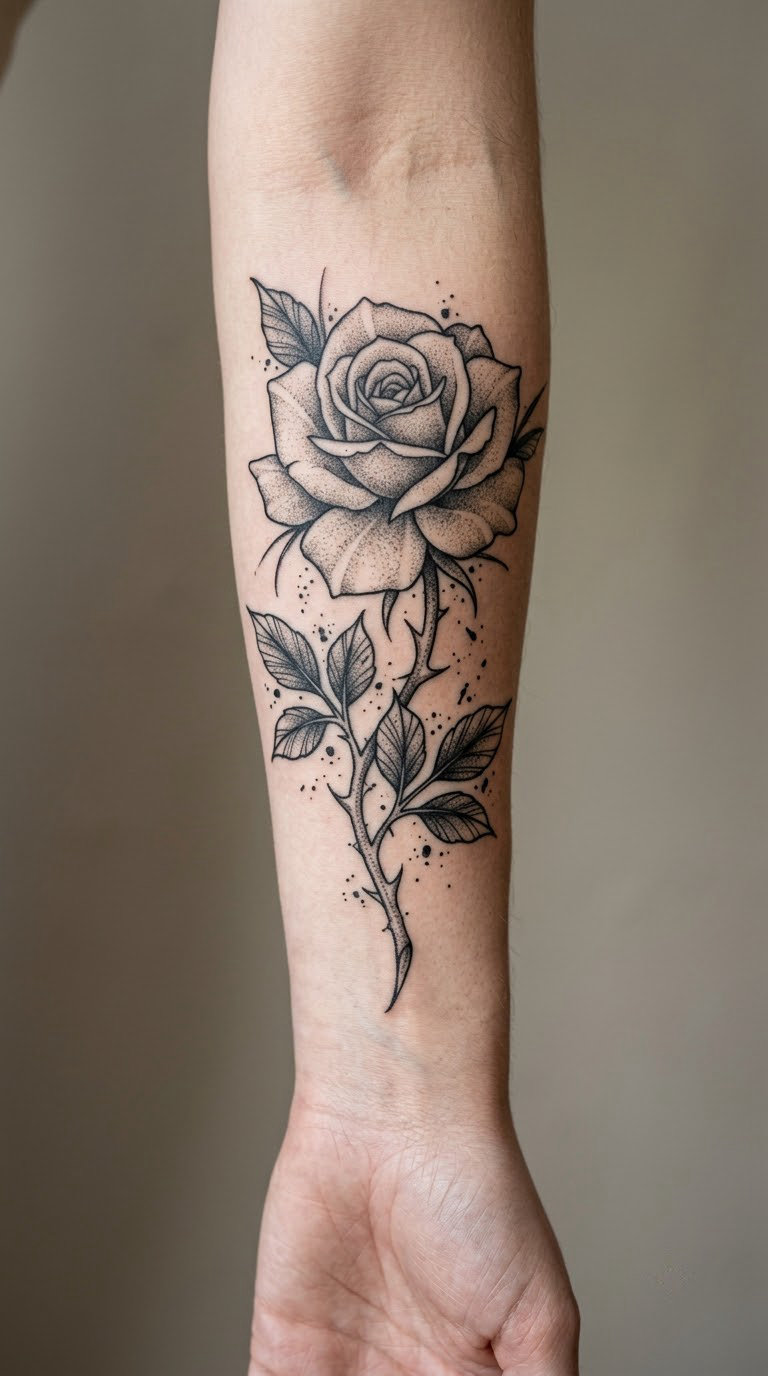
A softer trash polka idea, and one of the few that works small. The rose is drawn realistically in the centre, the outer petals break into a dot gradient, and the leaves are solid black shapes that read as negative space against the skin. Thorns and a light ink speckle field keep it from turning decorative.
Flowers in this style are usually chosen for the person or the event rather than the flower itself, so the meaning sits with you.
Placement: side of the forearm, inner arm, or behind the ear. Size: 3-4 in (8-10 cm). Style: floral blackwork with dot shading. Pain: low to medium. Ageing: dot gradients in grey fade to a soft blur, so keep the centre petals darker than the edges.
Make it yours: add a thorn wrap with a small date inside, or swap the dot gradient for a torn-paper edge if you want more of the trash side.
5. Abstract eye inside a torn square
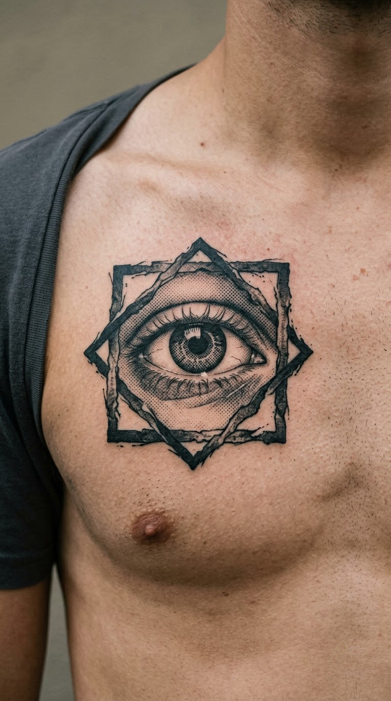
The eye is the only realistic part. It sits inside a rough square whose edges look ripped rather than drawn, with shading that breaks off halfway and a few dots drifting outside the frame. The tension between a precise iris and a chaotic border is the whole idea.
It works as a single statement piece, and it is a common choice when someone wants a subject that feels watchful or protective without a literal symbol.
Placement: upper chest, forearm, or the back of the hand. Size: 2-3 in (5-8 cm). Style: micro-realism with geometric framing. Pain: medium, and the finger or knuckle placements hurt far more than they look. Ageing: hands and fingers fade fastest, so put it on the chest or the arm if you want the iris to stay sharp.
Make it yours: use the colour of your own eyes in the iris, and let the torn square break in one direction so the gaze has somewhere to go.
6. Skull with newspaper collage shading
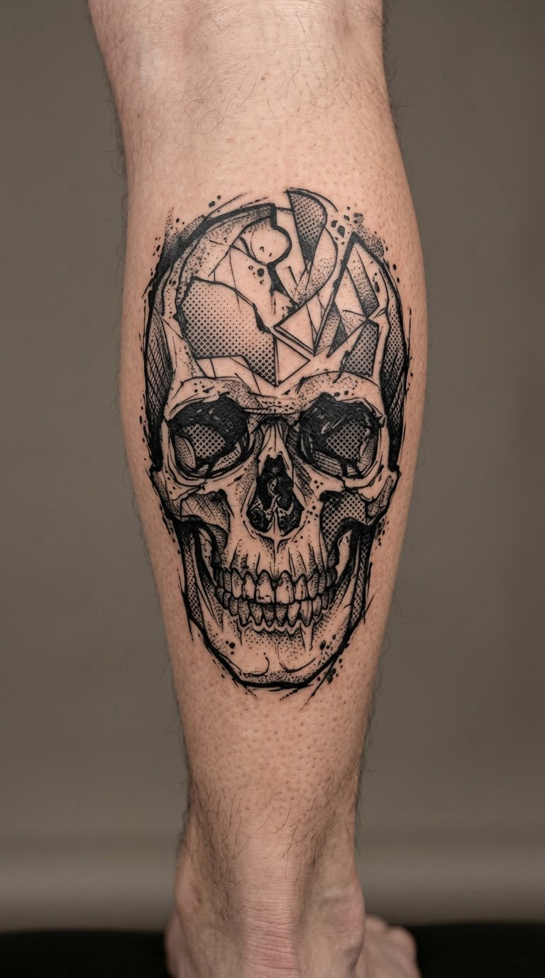
Skulls carry a lot of baggage, so this version stays away from roses, crowns and playing cards. The structure is pure black masses, and the shading is built from overlapping paper fragments, halftone fields and rough stipple that looks like newsprint pressed into wet ink. The jaw and cheekbone stay clean enough to read as a skull.
Most people pick it for the graphic weight rather than a mortality message, though plenty of wearers give it their own story after the fact.
Placement: calf, forearm, or rib area. Size: 4-5 in (10-13 cm). Style: blackwork with collage texture. Pain: medium, higher on the ribs. Ageing: solid black holds colour for years; collage edges go soft, which usually looks intentional by then.
Make it yours: add a torn strip of your own handwriting running under the jaw, small enough to read as texture at a distance.
7. Fragmented anatomical heart
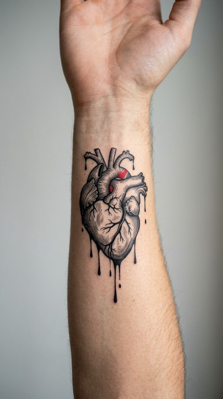
Anatomical linework supplies the realism, then the piece gets broken up: dark drips from the arteries, scratched-out sections that look redrawn by a different hand, and one restrained red mark somewhere near the bottom. The heart is anatomically correct enough to be interesting and abstract enough to be personal.
Hearts in this style are rarely romantic by default. The meaning tends to arrive later, often something about keeping going.
Placement: inner forearm, chest, or the inside of an upper arm. Size: 4-6 in (10-15 cm). Style: anatomical realism with abstract texture. Pain: medium, lower than the chest because the inner forearm is fleshy. Ageing: red ink shifts toward warm brown with sun exposure, so a yearly refresh every few years is normal for this one.
Make it yours: place the red accent where your pulse sits, or add a small anatomical detail from a diagram you have kept for years.
8. Woman’s profile with torn negative space
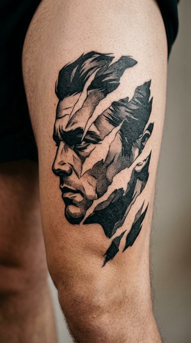
The profile line stays clean from forehead to lips, then the composition breaks into blank paper-like gaps where chunks of the design simply stop. Rough brush shadows and halftone transitions carry the eye along the jaw, and the whole thing reads like a print damaged in three places.
Blank space is doing the work here, so the piece needs a canvas with room around it. That rules out tight placements between existing tattoos.
Placement: outer thigh, rib, or the side of the torso. Size: 6-8 in (15-20 cm) tall. Style: editorial realism with negative space. Pain: medium, and ribs are the sharpest area on the list. Ageing: the untouched skin inside the gaps stays white permanently, so the contrast actually improves as the shading settles.
Make it yours: match the hairstyle in the portrait to a cut you have had, and ask for the gaps to fall along your collarbone line.
9. Black sun with dripping rays
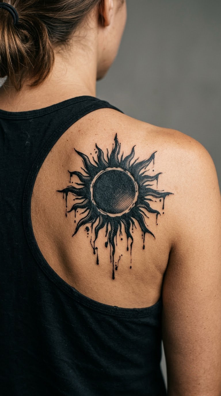
A solid black disc with rays of different lengths, grainy dots between them, and thin drips falling off the lower edge like wet ink. It is simple to draw, so the whole conversation ends up on the ray shape and where the drips land.
Suns get chosen for warmth, energy or a specific place, and almost nobody claims a single fixed reading for one.
Placement: shoulder blade, upper back, forearm, or a sternum piece. Size: 4-6 in (10-15 cm). Style: abstract blackwork. Pain: low to medium, the shoulder blade being one of the more forgiving spots. Ageing: large flat black areas are the most durable ink on the body, so this style ages best of the twenty.
Make it yours: count the rays to match a year that matters, then ask for uneven ray lengths so the piece still looks composed.
10. Torn map and compass lines
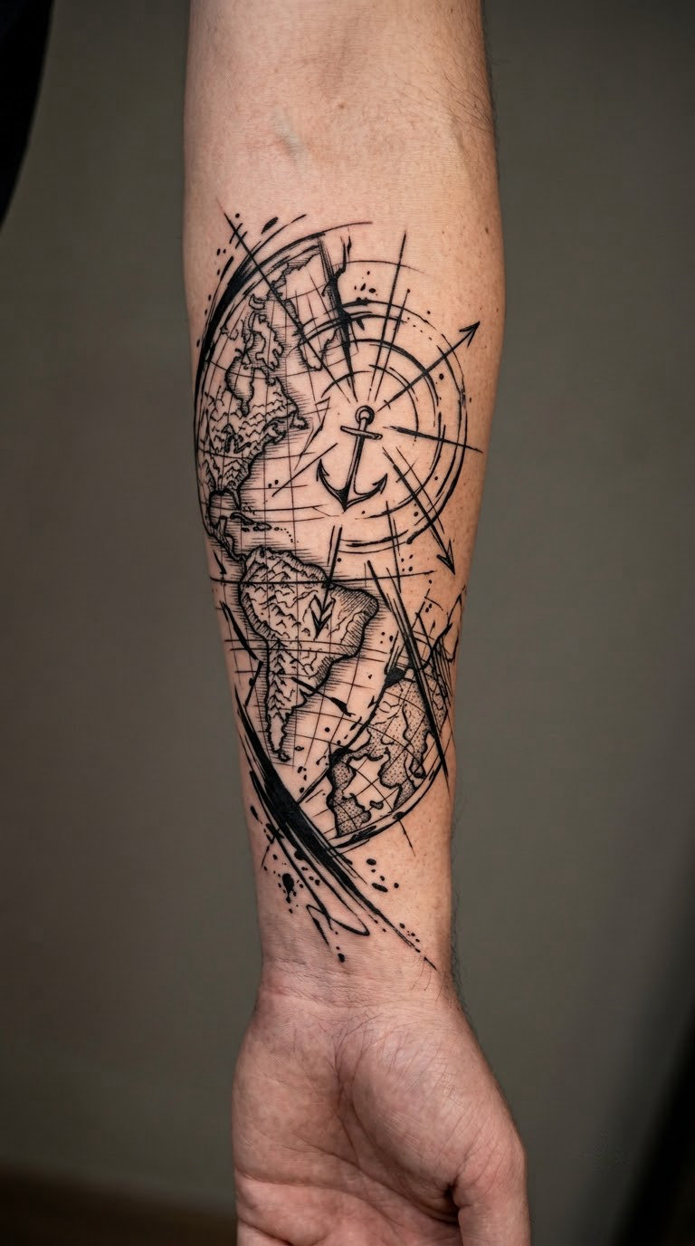
Travel-inspired trash polka uses fragments that suggest a map without reproducing one: hand-drawn compass lines, black blocks where land or sea would sit, scratchy route marks and torn edges. The compass star is usually the only recognisable element, and it is drawn rough rather than technical.
It suits anyone who has a specific memory tied to distance, and it works well as a companion to a smaller piece elsewhere.
Placement: outer forearm, rib, or calf. Size: 5-7 in (13-18 cm). Style: illustrative collage. Pain: medium on the arm, higher on the ribs. Ageing: hairline route marks and small hatch marks blur together, so the artist should keep the map detail at the size it will be, not smaller.
Make it yours: describe a route rather than a location, and ask the artist to invent the coastlines so nothing on the skin is a copy.
11. Hourglass with falling ink grains
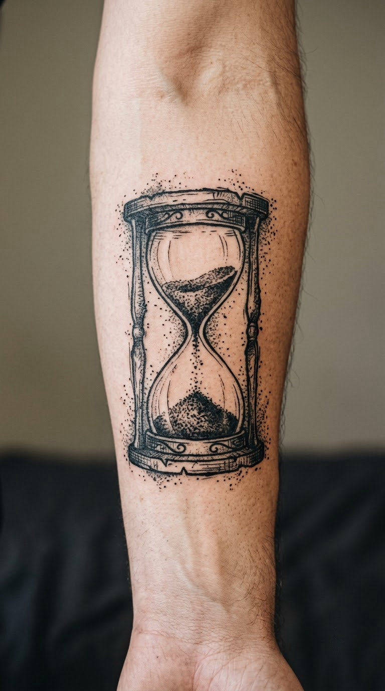
The frame is drawn in rough, uneven black, the sand has become granular ink falling in a slightly scattered stream, and speckles sit around the outside of the glass. The two bulbs are kept nearly identical in shape so the object still reads instantly.
Time motifs show up often in this style, usually for someone marking a stretch of it rather than a date on a calendar.
Placement: forearm, upper arm, or the back of the shoulder. Size: 3-4 in (8-10 cm). Style: grunge realism. Pain: low to medium. Ageing: individual grains disappear within a couple of years, so ask for a solid dark mass at the bottom as a base for the whole composition.
Make it yours: tilt the hourglass slightly, or fill one bulb solid and the other with grain to suggest something unfinished.
12. Moth with halftone wings
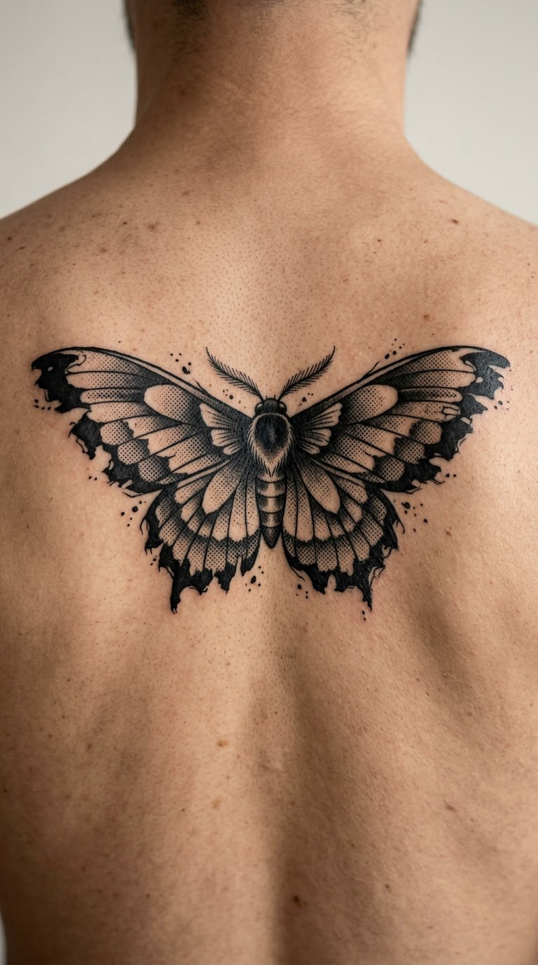
A dark moth drawn with a naturalistic body and antennae, while the wings break into halftone dots and ragged torn edges. Scattered ink flecks around the body keep the symmetry from feeling too neat, which is the main risk with insects.
Moths are popular in this style as the night-side counterpart to a butterfly, and for plenty of wearers the connection to something drawn to light is the point.
Placement: between the shoulder blades, upper back, or the forearm. Size: 5-7 in (13-18 cm) across the wings. Style: naturalistic blackwork. Pain: medium, and the spine area feels more sensitive than the shoulders beside it. Ageing: wing dot patterns blur fastest, so keep the body and antennae fully solid.
Make it yours: specify a real species so the proportions are right, and let the halftone fade out on one wing only for an off-balance finish.
13. Broken chain around a heart
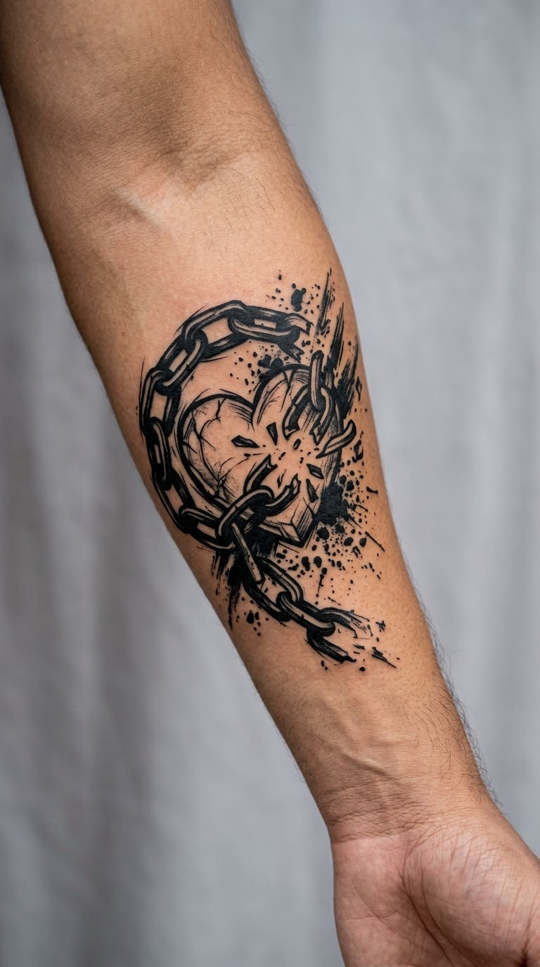
Solid black chain links circle a rough heart, and one section of the chain has come apart into torn fragments with ink splash around the break. Unlike decorative hearts, this one is deliberately not symmetrical, which makes it read less like a logo.
Like most symbols here, the meaning comes from the wearer. What matters is whether it stays meaningful to you in ten years.
Placement: forearm, wrist area, or the chest. Size: 3-4 in (8-10 cm). Style: symbolic blackwork with splatter. Pain: low to medium. Ageing: chain links are solid black and hold well; thin splash dots fade first and are the only part likely to need a refresh.
Make it yours: add a date hidden inside the broken section where only you will see it, or wrap the intact part of the chain around your wrist.
14. Moth and flower hybrid
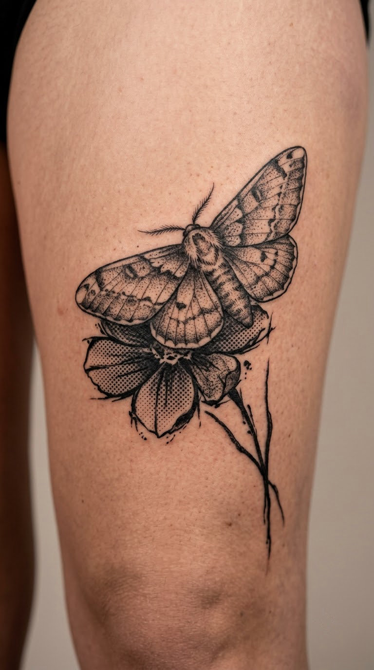
One idea, two subjects, no gap between them. The moth overlaps a dark flower so the wings cover part of the petals, halftone dots carry the transition, and the stems turn into scratchy marks that run off the edge of the composition. The overlap is what stops it looking like two tattoos stacked together.
Hybrid subjects are chosen for a relationship rather than a symbol, which is why this works well for a partner or a family member’s name.
Placement: thigh, rib, or the outer upper arm. Size: 5-6 in (13-15 cm). Style: botanical collage. Pain: medium, and the outer thigh is one of the easier canvases for a piece this size. Ageing: petal dot shading softens with the rest; the solid stem lines keep the structure readable.
Make it yours: use a flower from a specific place and a moth species that lives near it, then ask for the two to share one stem.
15. Smeared portrait in negative space
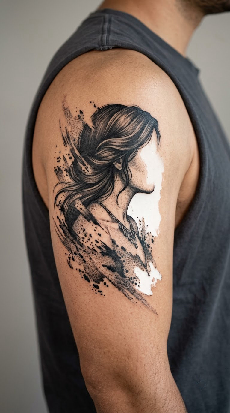
The face is fully rendered on one side and dissolves on the other, where dense black shadow gives way to dry-brush smears and then to bare skin. Contours simply stop, and stippled transitions bridge the gap. It has the look of an editorial photo that was reprinted too many times.
Unlike a full portrait, this one hides which part of the face matters, so people often use it when they want a person in the piece without a specific likeness.
Placement: upper arm, shoulder, or the outer thigh. Size: 4-5 in (10-13 cm). Style: abstract realism. Pain: medium. Ageing: dry-brush texture fades unevenly, so ask the artist to put the strongest contrast along a bone line where skin stays flatter.
Make it yours: turn the face toward wherever the rest of your pieces already sit, so the empty half looks like it points at them.
16. City skyline reduced to black blocks
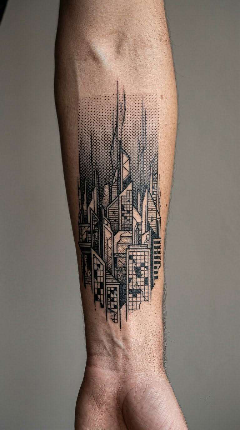
Buildings reduced to black masses with distressed window blocks, a halftone sky and scratchy vertical marks running the full height of the design. The shapes are invented rather than copied, which is what keeps it original, and the halftone band across the top gives the composition a horizon.
Urban designs tend to be about a feeling rather than a landmark, which makes them an easy fit for anyone who moved a lot.
Placement: forearm, calf, or across the upper back. Size: 7-9 in (18-23 cm) for the full skyline, or 4 in for three buildings. Style: geometric blackwork. Pain: medium, and long single-pass line work takes longer than most people expect. Ageing: window blocks and hatch marks lose definition, so big shapes should carry the image.
Make it yours: give the artist the silhouette of your own street rather than a city, and keep the buildings imaginary.
17. Raven with a torn-paper wing
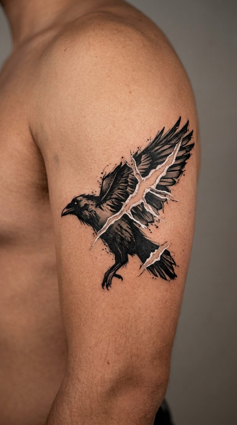
A stark black bird with a clear profile, a wing broken by torn white gaps, halftone feather sections and rough edges where the ink runs out. The beak, head and tail are kept solid so the silhouette stays readable from across a room.
Crows and ravens get chosen for intelligence, memory or plain visual weight. The style does not attach a single reading to either bird.
Placement: upper arm, forearm, or the chest. Size: 4-6 in (10-15 cm). Style: graphic blackwork. Pain: medium. Ageing: the solid body holds its edge for years; the halftone feather panels are the part that softens first.
Make it yours: add a torn strip of lettering as the second wing, or leave one eye as the only clean detail in the whole piece.
18. Candle flame made from brush strokes
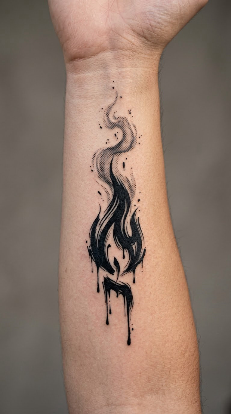
The flame is built from loose black brush strokes with dripping lower edges, halftone smoke rising beside it, and a handful of sparks scattered away from the main shape. The candle body below is only a few strokes, so the flame carries the piece.
Fire imagery usually comes from something personal rather than the element itself, and this abstract version suits people who want the subject without the literal candelabra.
Placement: inner forearm, the side of a calf, or the ribs. Size: 3-5 in (8-13 cm). Style: abstract brushwork. Pain: low on the forearm, high on the ribs. Ageing: thin brush strokes and sparks fade first, so a solid black core keeps the flame readable after a few years.
Make it yours: have the smoke drift toward a small second piece you already have, or keep one spark as the only detail outside the flame.
19. Torn playing-card symbols
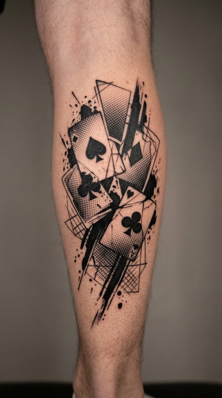
Card-inspired designs work best when the suits are treated as shapes rather than as a deck. Fragmented rectangles, rough ink blocks and dotted shading carry the idea, and at least one element is torn so the arrangement never resolves into an orderly fan.
Cards in this style are often about chance or timing rather than gambling, and plenty of wearers treat the design as an abstract composition rather than a symbol.
Placement: calf, forearm, or the shoulder. Size: 4-5 in (10-13 cm). Style: abstract collage. Pain: medium on the calf, lower on the shoulder. Ageing: halftone shading around the shapes goes soft first, so keep each symbol’s outline heavy.
Make it yours: pick the one suit that means something to you and scatter the rest as background shapes, or use a real date as the only numeral.
20. Full collage sleeve with a single focal image
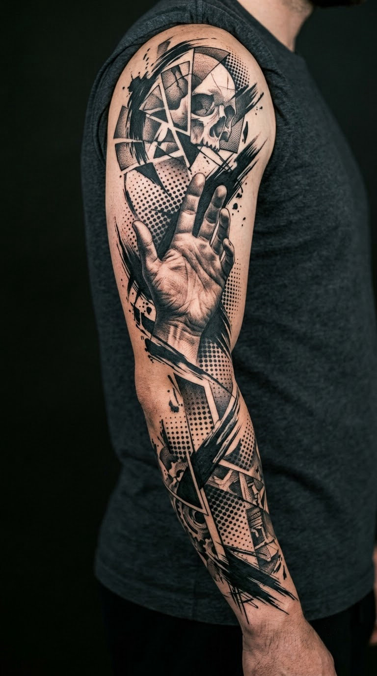
A full sleeve works when one image holds the middle and everything else supports it. Here a realistic hand sits in the centre, torn panels and halftone fields fill the gaps, brush marks run between elements, and a strip of lettering runs along the inner edge. The chaos needs a centre of gravity or it reads as noise.
This is the version most collectors end up with, and it is the one that rewards planning. Working out how much skin is left for later pieces before the first session saves arguments later.
Placement: full arm, with a second session planned. Size: 18-24 in (46-61 cm) of coverage. Style: large-scale trash polka collage. Pain: high, especially over the elbow and inner bicep. Ageing: sleeves take longer to heal and often need one touch-up session once fully healed.
Make it yours: bring a clear hierarchy to the consultation, one focal image first, then supporting elements, and agree how much space stays open.
How to Choose the Right Design
Most disappointing trash polka tattoos fail on scale, not on subject. Use these five checks before you book a consultation.
- Check the canvas against the chaos. Tiny pieces lose dot patterns, collage edges and drips. Below about 2 in (5 cm) the style stops reading and becomes an ordinary blackwork motif.
- Pick one realistic subject, not four. Realism carries the piece. Two or more realistic images in one composition usually fight each other and end up muddy.
- Look at healed work, not fresh work. Fresh ink is glossier and sharper than the same tattoo a year later. Ask the artist for healed photos of pieces at least a year old.
- Leave room around the design. Negative space is part of the style. A piece placed between two existing tattoos rarely has anywhere to breathe.
- Budget for a touch-up. Large black areas on a high-contrast piece often need a refinement session once the skin has fully settled, usually around six months in.
If you want a comparable single-subject approach with a calmer surface, the forearm band tattoo ideas for men are worth comparing side by side before you commit.
Cost and Session Time
Tattoo pricing varies so much by region and artist that a single number would be misleading. What you can plan with is size, detail and how the artist charges.
- Small pieces (under 2 in / 5 cm) are usually a quick single session, though the style needs a minimum size to work at all.
- Medium pieces (3-5 in / 8-13 cm) with a focal image plus texture typically run two to three hours.
- Large panels (6-8 in / 15-20 cm) often need two sessions, because dense black areas take time and the skin gets irritated.
- Sleeve-scale work (18-24 in / 46-61 cm) is a multi-session project with a plan agreed at the start.
Most studios set a shop minimum, and that minimum matters more than a per-hour rate for small work. Ask whether the artist charges by the hour or by the project, and whether a sleeve is quoted as a whole. Regions differ widely, so a quote from a local shop beats any online estimate.
Aftercare Basics
- Follow your artist’s aftercare instructions first, since ink depth and placement change what a piece needs.
- Wash gently with lukewarm water and unscented soap, then pat dry rather than rubbing.
- Keep the protective covering on for as long as you were told, and change it if it becomes damp or dirty.
- Wear loose clothing over fresh work, and avoid bags or straps rubbing the area.
- Keep the tattoo out of direct sun while it heals, and think about sun protection for the life of the piece. UV exposure is the main reason red ink fades toward brown.
- Book the touch-up your artist recommends, usually once the skin has fully settled rather than during healing.
Expect some flaking, redness and tenderness in the first two weeks. If anything looks like an infection rather than normal healing, contact the studio and seek medical advice rather than treating it at home.
Frequently Asked Questions
Do trash polka tattoos age well?
Mostly yes, and better than styles that rely on fine shading. Large solid black areas stay dense for years, and the chaotic texture is forgiving because softening edges blend into the design. Two things fade first: thin brush strokes and small halftone dot fields. Red ink also shifts toward a warmer brown with sun exposure, so protect the piece from direct sun and plan a refresh every few years on the red elements.
What does a trash polka tattoo mean?
There is no fixed meaning attached to the style. The style itself came from the Buena Vista Tattoo Club in Germany in 1998 and was built around realistic imagery colliding with abstract texture. What any individual piece means depends on the subject: a portrait, a skull, a compass or a moth each carry whatever the wearer puts into it. Judge the meaning on your own reading of the design.
Can a trash polka tattoo be small?
Yes, with a caveat. The style relies on dot patterns, torn edges, drips and collage layering, and all of those lose definition below roughly 2 in (5 cm). A small version works best if you keep one realistic subject and simplify the surrounding texture into a few bold black shapes. Ask your artist to show you a healed example of a piece that size before you commit.
Can trash polka tattoos cover up an old tattoo?
Often, yes, because the style relies on dense black areas and busy texture rather than clean open skin. Dense black covers most older linework, and adding realism or collage elements on top gives the artist more control than a simple blackout would. The hardest old pieces to hide are light, low-contrast colours that were never fully removed. Book a consultation where the artist can assess the old tattoo in person.
Where should I place a trash polka tattoo?
Large flat areas work best: the forearm, upper arm, thigh, calf, chest, ribs and the back between the shoulder blades. The style needs space for realistic subjects and surrounding texture, so it suits bigger canvases than a wrist or ankle. Ribs and the sternum hurt more and need steadier sitting, while the outer arm and the thigh are easier sessions. Placement should follow the design, not the other way round.
How do I find a trash polka artist?
Look for a portfolio of healed trash polka pieces rather than a general tattoo gallery. Ask to see work at least a year healed, and check that the artist handles realistic subjects as well as abstract texture, since both are needed. If nobody local works in the style regularly, travelling to a specialist is common and worth it. Be cautious about an artist showing only fresh photos, since fresh ink hides a lot.
Conclusion
If this is your first tattoo, start at number 4, 11 or 13. A dithered rose, an hourglass or a broken chain gives you the texture of the style at a size that heals in one sitting and still reads clearly years later.
If you already have blackwork and want the next piece to carry weight, the distressed portrait, the cracked bust or the full collage sleeve will use the space you have. Either way, the deciding factor is the artist’s healed portfolio, not the subject you pick. Bring one of these ideas to a consultation, ask to see similar work a year old, and let the placement follow the design.