
20 Best Tattoo Ideas for Writers: Literary Picks (September 2026)
If you live with words, a writer’s tattoo has to earn its place on your skin for a very long time. These tattoo ideas for writers run from a quill the size of a grain of rice to a full blackwork scene, and each one is written to be specific enough that an artist can sketch it straight from the description.
Pick the object you actually use rather than the one that looks most literary. Ask almost anyone who reads the book-tattoo threads online and the same lesson comes back: a design tied to one book, one poem or one habit ages far better than a generic typewriter. If you are new to ink, start small and leave room around it. If you already have a sleeve, section 20 is worth your time.
One caveat before the list. I am not a tattoo artist, and these are design briefs rather than stencils. Your artist will translate each description into a line weight that suits your skin and your spot, and that translation is where the good work happens.
Tattoo Ideas for Writers: Quick Guide
| Idea | Style | Best placement | Size | Pain |
|---|---|---|---|---|
| 1. Quill and ink bottle | Fine line | Inner forearm | 2.5 in wide | Low to medium |
| 2. Open book, blank page | Single line | Inner forearm | 2 in wide | Low |
| 3. Single typewriter key | Black and grey | Outer wrist | 0.75 in | Medium |
| 4. Fountain pen nib | Blackwork | Forearm | 3 in long | Medium |
| 5. Handwritten word mark | Fine-line script | Inner wrist | 2 in wide | Medium |
| 6. Stack of three books | Blackwork | Outer forearm | 2.5 in tall | Medium |
| 7. Manuscript with margin notes | Micro-realism | Side of forearm | 2 in tall | Medium |
| 8. Cat curled on a notebook | Black silhouette | Calf | 3 in long | Low to medium |
| 9. Ink drip as bookmark | Minimal with colour accent | Inner wrist | 1.5 in tall | Low |
| 10. Miniature writing desk | Line work with dotwork shade | Forearm | 2.5 in wide | Medium |
| 11. Laurel wreath around a pen | Fine line botanical | Forearm | 3.5 in tall | Medium |
| 12. Torn manuscript paragraph | Fine line | Side rib | 3 in wide | High |
| 13. Comma and period constellation | Dotwork | Behind the ear | 1.5 in wide | Low to medium |
| 14. Feather pen in watercolour | Watercolour | Shoulder | 4 in long | Low |
| 15. Paper stack with folded corner | Minimal line | Forearm | 2 in tall | Low |
| 16. Mechanical pencil and graphite trail | Fine line | Forearm | 3 in long | Low to medium |
| 17. Library key with page bow | Antique line work | Outer upper arm | 2.5 in long | Low |
| 18. Lunar eclipse over a book | Black with red accent | Forearm | 3.5 in wide | Medium |
| 19. Ink bottle constellation | Dotwork | Inner upper arm | 2 in tall | Low to medium |
| 20. Typewriter-spacing scene | Blackwork | Outer forearm | 5 in wide | Medium to high |
1. Fine-Line Quill and Ink Bottle
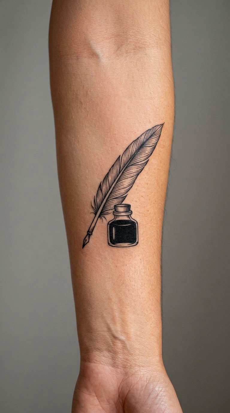
A quill crossing diagonally over a small solid-black ink bottle, drawn in one confident line with almost no shading. The bottle is the only filled shape, so the eye goes to it first and reads the whole piece as two objects rather than a drawing.
Writers pick this because it points at the tool rather than the result. There is no book, no face, no famous name to explain to a stranger at a party.
Placement: inner forearm reads best, where there is flat skin between wrist and elbow. The outer bicep works too, turned slightly inward so the bottle sits upright. Size: 2 to 3 inches wide (5 to 7.5 cm). Style: fine line, single-needle weight. Pain: low to medium on the inner forearm; expect a constant scratch rather than sharp pain. Fine line on the inner arm fades first, so plan on a refresh every few years. Make it yours: have the bottle cap rendered as a small open book shape, or add your initials on the bottle’s label.
2. Open Book with a Blank Page
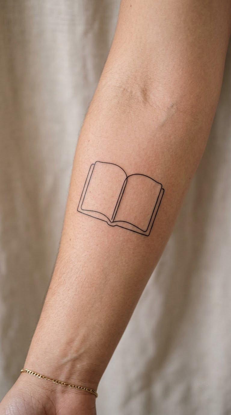
An open book in single-line outline, two pages meeting at a shallow crease, and nothing written on either side. The emptiness is the point. Some versions add four or five short horizontal strokes on one page only, as if the writing is still happening.
A blank page usually means possibility rather than a specific book, which makes it a good first tattoo if you are not ready to fix one title to your forearm forever.
Placement: inner forearm or the flat of the upper inner arm. Size: 1.5 to 2.5 inches wide (4 to 6 cm). Style: single-line minimalism. Pain: low, and a fast session since there is so little to fill. Single-line work softens and spreads over the years, so expect the crease to blur before the outer edges do. Make it yours: leave a real page blank, or hand your artist a first sentence you wrote and have it placed on the right page in a small hand.
3. Typewriter Key Single Letter
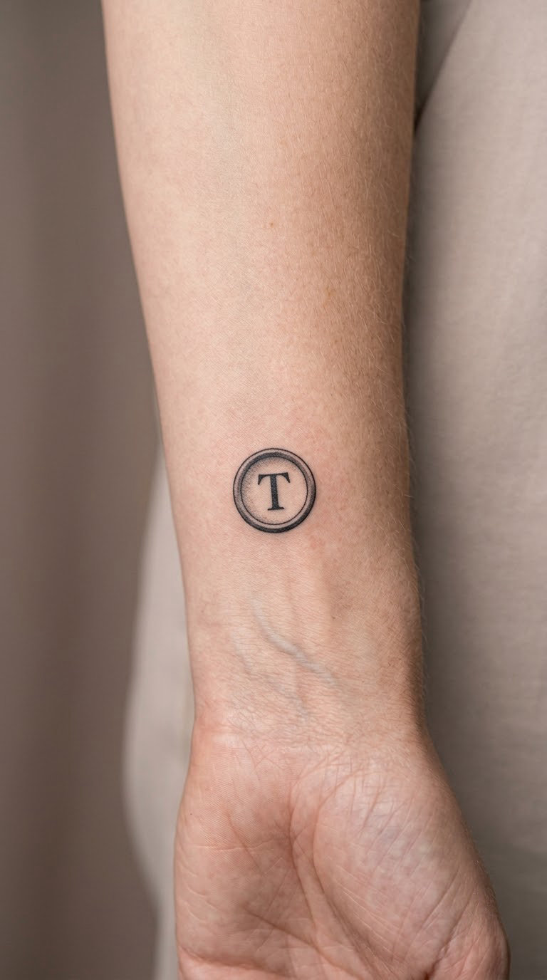
One square typewriter key in black and grey, drawn at a slight three-quarter angle with a raised face, and a single capital letter on the surface. Shading is kept to a soft gradient under the key so it reads as metal rather than as a cartoon icon.
It is the most personal version of the typewriter idea, because a whole machine means writing in general while one key points at a name. A surname initial or a monogram letter is the usual choice.
Placement: outer wrist, just above the bone, or the inside of the forearm. Size: 0.6 to 0.9 inches (1.5 to 2.3 cm). Style: black and grey realism, small scale. Pain: medium, mostly from the wrist bone under the key. Wrist ink in general smudges and fades faster than arm ink, and a single letter at this size is the first thing to go soft. Make it yours: use the first letter of the book you are working on, or a letter from a language you write in that nobody around you reads.
4. Fountain Pen Nib in Blackwork
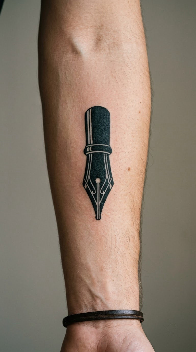
A solid black fountain-pen nib, tapered, with a slit down the centre and a handful of fine white lines carving out the breather hole and the shoulder of the metal. Blackwork gives it weight, so it holds up as a standalone piece rather than a background element for a sleeve.
Nibs sit closer to how most writers actually work today than quills do, and the shape is graphic enough to read across a room without any lettering.
Placement: forearm along the muscle, angled so the point aims toward the elbow. Size: 2.5 to 3.5 inches long (6.5 to 9 cm). Style: blackwork with negative-line detail. Pain: medium, flat and steady. Filled black on the forearm holds its edge for years, though solid areas sometimes develop a faint grey wash as they settle. Make it yours: engrave your own handwriting along the nib’s length in negative white line, or pick the nib style of a pen you actually own.
5. Handwriting-Style Word Mark
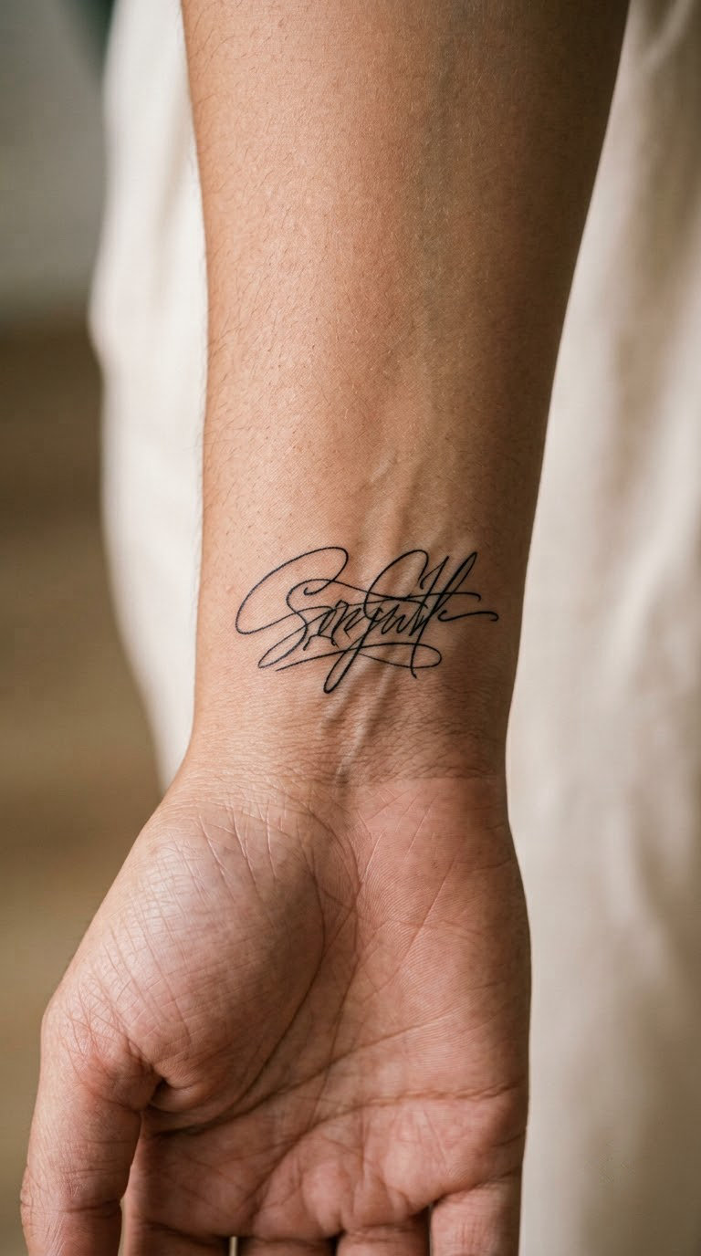
One short word in a clear, legible hand, drawn as if signed rather than as decorative calligraphy. Loops are kept shallow and the baseline is kept flat, which is the difference between a word you can read at arm’s length and a tangle that only makes sense from the artist’s desk.
This is the tattoo that carries a sentence without quoting anyone, so it works for a writer who wants the meaning to stay private.
Placement: inner wrist, or the rib area if you want it seen when you are not moving your arms. Size: 1.5 to 3 inches wide (4 to 7.5 cm); under 1 inch wide, the letters start merging. Style: fine-line script. Pain: medium on the rib, low to medium on the wrist. Script is the first thing to blur, so thicker line weight and a slightly larger size are worth asking for. Make it yours: give your artist a clear photo of your real signature and have them trace the actual letterforms, including any crossed t or long descender.
6. Stack of Three Novel Books
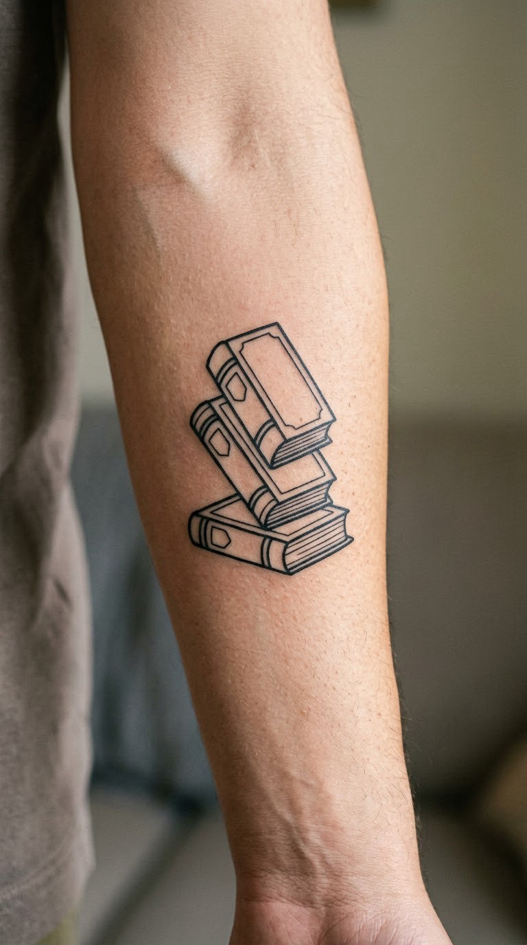
Three books stacked at slight angles, each drawn as a simple blackwork rectangle with a visible spine line and page edge, rotated a few degrees so the stack looks placed rather than diagrammed. Clean negative space between the volumes keeps it readable.
Three is a useful number because it can stand for three finished books, three favourite reads or three decades of a reading habit, and the wearer picks which story they are telling.
Placement: outer forearm, or the outer bicep where there is room for width. Size: 2 to 3 inches tall (5 to 7.5 cm). Style: blackwork, solid spine fills. Pain: medium, mostly from the hard forearm muscle under the stack. Page-edge lines are the detail that fades first, so ask for a slightly heavier line there. Make it yours: have each book tilted at a different angle, or leave one gap in the stack as room for a fourth volume later.
7. Manuscript Page with Margin Notes
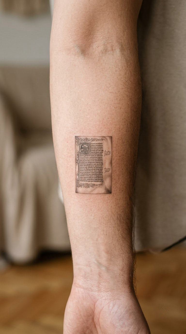
A single sheet of paper in micro-realism, with a couple of lines of near-illegible handwriting across the top and two short marks in the margin that read as edits. Light black-grey shading curls the bottom corner so the page does not look like a flat rectangle.
The margin note is usually the actual story: a place the writer marked, a line they moved, a draft that mattered. It is a design for people whose relationship with editing is as personal as their relationship with drafting.
Placement: side of the forearm, where the sheet can sit at a slight diagonal. Size: 1.5 to 2.5 inches tall (4 to 6 cm). Style: micro-realism with soft shading. Pain: medium, steady and fiddly; expect to sit still for a while. Fine shading and tiny text are the first elements to soften, so the artist should keep the marks deliberately loose. Make it yours: bring a scan of an actual marked-up page and have two or three of your own marks reproduced, leaving the rest as impression.
8. Black Cat Curled Around a Notebook
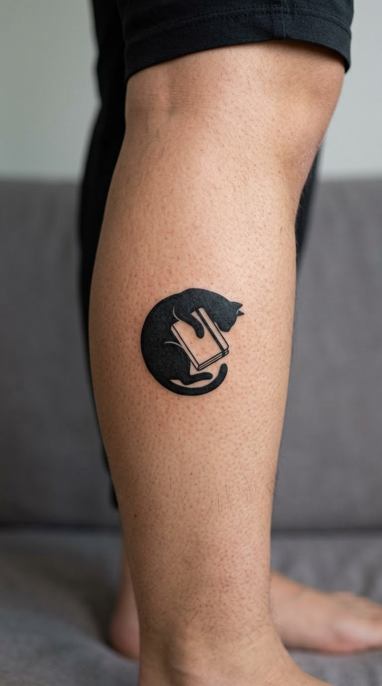
A solid black cat silhouette, curled with its tail wrapped forward, lying on top of a closed notebook drawn in simple outline. One or two thin white lines cut into the black for the ear and the curve of the back, and nothing else in the frame.
Cats are the most tattooed animal in the world, so this one earns its place through the notebook rather than the cat. It reads as a writing object with company, and it suits a writer who works late and would rather not be asked about it.
Placement: calf, outer arm or the back of the thigh. Size: 2.5 to 3.5 inches long (6.5 to 9 cm). Style: solid black silhouette with outline detail. Pain: low to medium on the calf, and the muscle under the calf edge is the sore part. Solid black holds its colour well, but the thin white cut lines are delicate and need a top-up sooner. Make it yours: put the notebook’s cover edge in your own handwriting, or angle the cat’s head so it is looking off the page rather than at the viewer.
9. Ink Drip Shaped Like a Bookmark
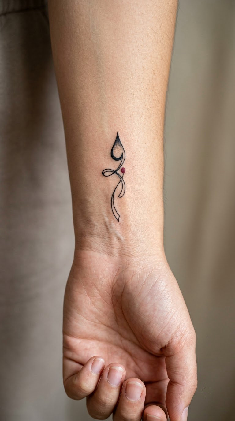
A single ink drop falling into the top of a narrow ribbon bookmark, the drop and the ribbon sharing one outline so the shape reads as both at once. Everything is black except an optional colour accent in the drop itself.
It is a small, quiet design for a writer who wants the gesture of reading rather than the object of it, and it works well as a companion to a larger literary piece.
Placement: inner wrist or the crease where the arm bends. Size: 1.25 to 1.75 inches tall (3 to 4.5 cm). Style: minimal with a single colour accent. Pain: low, one of the quickest sessions on this list. The inner wrist is a high-move area, so the drop’s edge will soften first; ask for a slightly heavier outline than feels right in the drawing. Make it yours: colour the drop in the ink colour of your choice, or have the ribbon’s notch cut at an angle that matches a real bookmark you own.
10. Miniature Desk with Paper and Pen
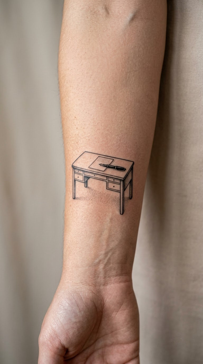
A small writing desk in side profile holding exactly two objects: one sheet of paper and one pen. Legs, a drawer pull and a lamp-less silhouette, with minimal dotwork shading under the desktop to give it weight without filling the frame.
Limiting the scene to one sheet and one pen is what makes it work on skin. Add a lamp, a mug and a stack of books and the same drawing stops being legible at two and a half inches.
Placement: forearm, or the outer arm where the desk sits horizontally. Size: 2 to 3 inches wide (5 to 7.5 cm). Style: illustrative line work with dotwork shading. Pain: medium; the desk legs and drawer pull are the fiddly bits. Dotwork is durable, but very light dotwork fades unevenly if it is placed over a joint. Make it yours: draw the sheet with a few of your own handwritten lines on it, or have the pen angled to match how you actually sit at a desk.
11. Botanical Laurel Wreath Around a Pen
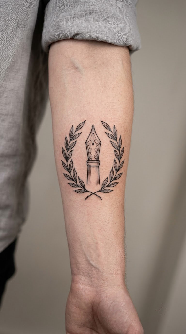
A fountain-pen nib standing upright inside a narrow laurel wreath, drawn in fine black line with each leaf individually outlined rather than filled. The wreath is symmetrical and deliberately spare, with open space at the top and bottom rather than a tied ribbon.
Laurel is a familiar mark of achievement, so a writer wearing one is usually marking a published book, a finished manuscript or a completed degree in literature. The pen keeps it from reading as a purely athletic symbol.
Placement: inner or outer forearm, vertical, or the side of the upper arm. Size: 3 to 4 inches tall (7.5 to 10 cm). Style: fine-line botanical. Pain: medium, and longer than it looks because leaves are all curve and no flat shading. Each leaf outline is a spot where the line can thicken over the years, so the artist should keep the leaves larger rather than more numerous. Make it yours: swap the laurel for a plant you write around, or place your publication date in the open space at the base of the wreath.
12. Torn Manuscript Paragraph
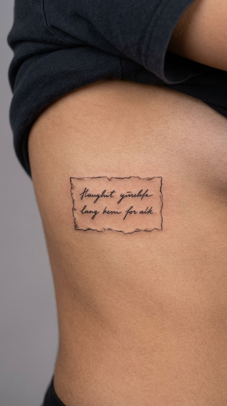
A torn-edged paper shape carrying two lines of neat handwriting, the tear done with a few jagged ink lines rather than a smooth cut. The text is your own words, kept short enough to read at the size it is tattooed.
Two lines is the most that stays readable at three inches wide, and it is enough to carry a sentence that only makes sense to you. This is the design for a writer who wants a piece of their actual work on their skin rather than a line from a favourite book.
Placement: side rib area, or the inner forearm. Size: 2.5 to 3.5 inches wide (6.5 to 9 cm). Style: fine line with light hand-lettering. Pain: high on the ribs, and the rib bone makes the session long even when it is not especially painful. Hand-lettering at this size softens visibly within a few years unless the line weight is generous. Make it yours: type your two lines in a plain font, print them, and hand the artist the print, so the spacing is right and nothing depends on their guesswork.
13. Comma and Period as Constellation
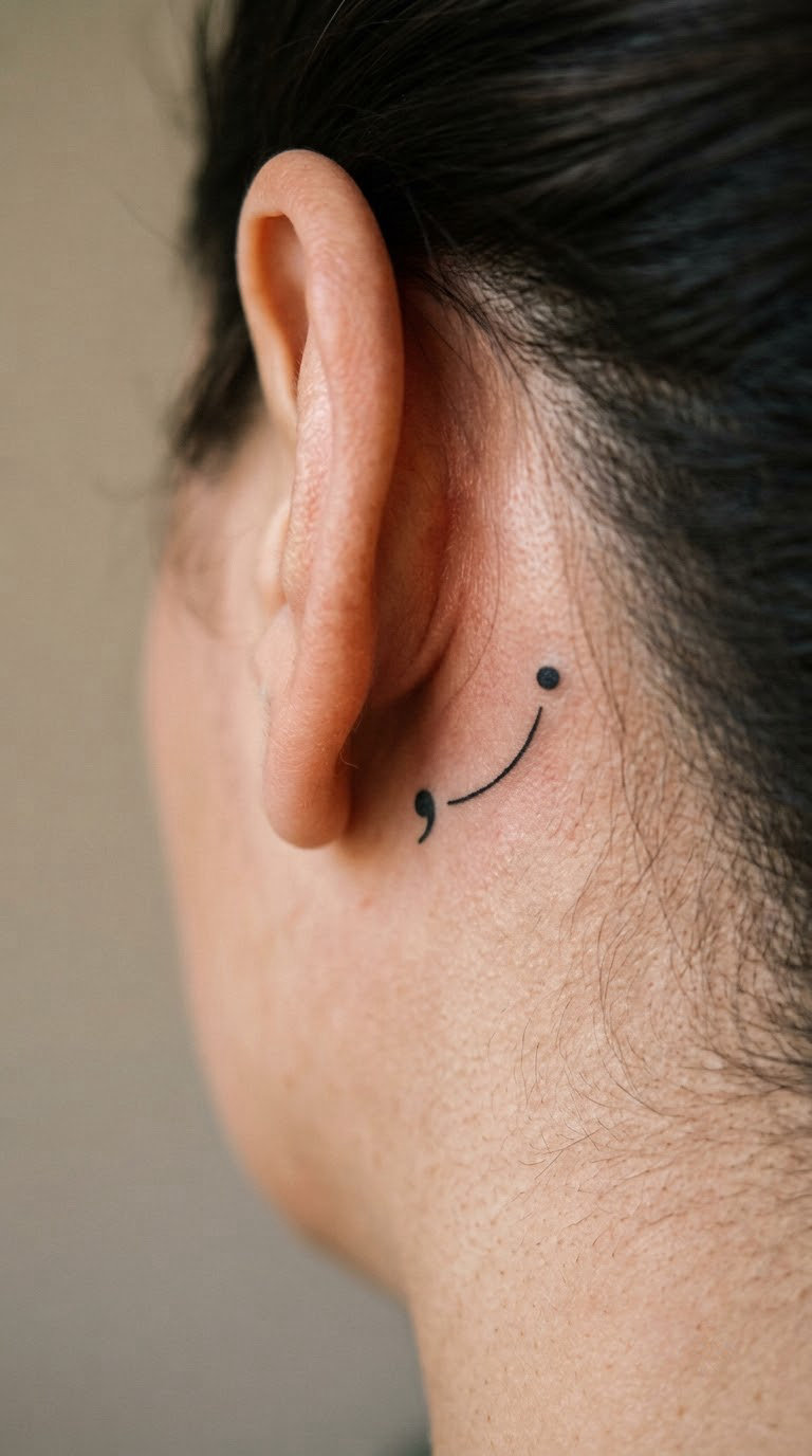
A single comma and a single period, each built from clusters of tiny black dots, joined by one fine curved line. The spacing is accurate: the comma’s tail curves below the baseline of the period, so the punctuation reads correctly to anyone who looks closely.
Punctuation is the quietest insider symbol in writing, which is exactly why it works for people who find a full quill too literal. Almost every quick list of literary tattoo ideas reaches for a quill, and very few get the spacing right, so a correct one stands out.
Placement: behind the ear, the nape of the neck, or the inner wrist. Size: 1 to 1.5 inches wide (2.5 to 4 cm). Style: dotwork with a fine connecting line. Pain: low to medium; behind the ear is a sensitive spot but a small one. Dotwork fades unevenly if the dots are too small, so ask for larger dots at this scale. Make it yours: swap the pair for the two punctuation marks you use most, or add a third mark later as part of a slow series.
14. Feather Pen in Watercolour
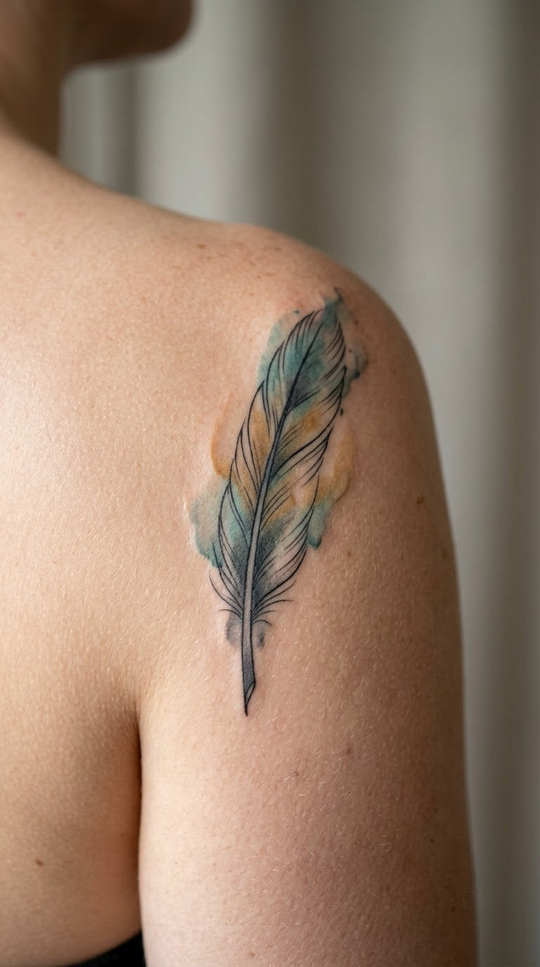
A long feather pen painted in soft watercolour, with translucent pigment bleeding slightly past the line work at the barb edges. Two or three muted colours do all the work, with no hard outline on the outer edge of the feather.
It suits a writer who already has colour in their collection and wants one softer piece to break up blackwork elsewhere. Painted rather than drawn, it also hides small imperfections better than a hard-lined design.
Placement: shoulder, upper arm or the back of the calf, where there is a flat enough area for four inches of feather. Size: 3.5 to 4.5 inches long (9 to 11 cm). Style: watercolour, no hard outlines. Pain: low; the shoulder is one of the least sensitive areas on the body. Watercolour ink is paler than black from the start and fades faster, so expect a refresh in five or six years rather than ten. Make it yours: pick two colours that appear in the cover of your own book, or add a faint ink stain at the nib end in a third colour.
15. Stack of Paper Sheets with Folded Corner
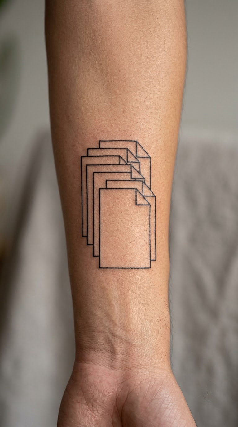
Five sheets of paper stacked with each one offset by a few millimetres, drawn in crisp black outline with a dog-eared corner on the top sheet. No text anywhere, just edges, which is what makes it work at two inches tall.
Drafts and revision are the least romantic part of writing and the most real, so this reads well to anyone who has watched a manuscript move through a dozen versions. It is also the safest way to say working writer without naming a genre.
Placement: forearm, or the inner upper arm. Size: 1.5 to 2.5 inches tall (4 to 6 cm). Style: minimal line work. Pain: low, and a short session. The five thin outlines are the vulnerable part, so the artist should keep the gaps between sheets wide enough to stay separate after healing. Make it yours: count the sheets to a real number, such as the drafts it took to finish a chapter, and let the artist vary the offsets slightly.
16. Mechanical Pencil with Graphite Marks
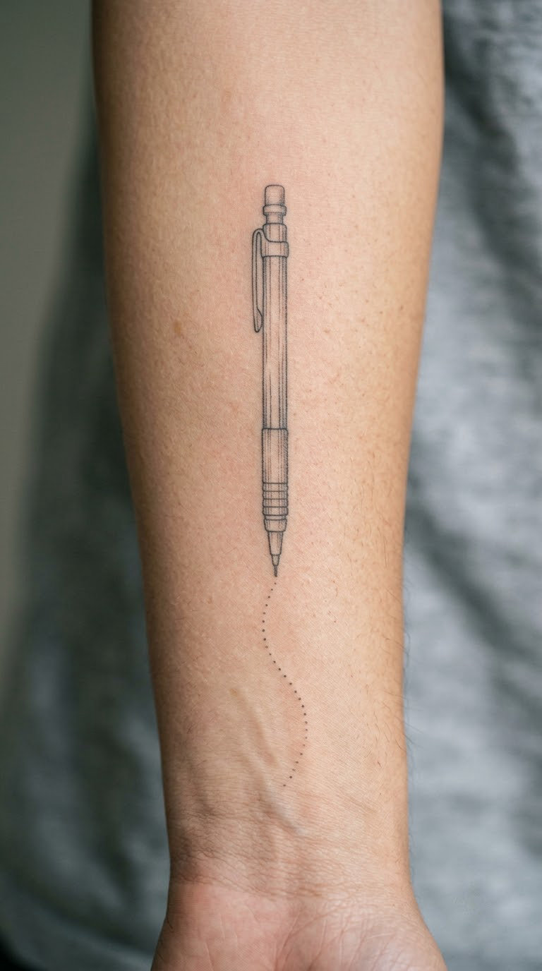
A mechanical pencil in fine line, angled as though it has just been set down, ending in a short trail of tiny grey dots that fade out. The pencil body is simple: barrel, clip, eraser end, no branding and no text.
It is a drafting and editing rather than a composing image, which makes it a good fit for a writer who works in structure, revision or copy work rather than on novels. The graphite trail gives the piece movement without adding clutter.
Placement: forearm, running along the muscle, or along the collarbone. Size: 2.5 to 3.5 inches long (6.5 to 9 cm). Style: fine line with grey wash on the trail. Pain: low to medium; the collarbone is a classic, and the forearm is comfortable for a long session. Grey pigment sits lighter than black and will need topping up sooner. Make it yours: have the graphite trail spell out a short word in dots, or use the pencil you actually edit with as the model for the clip and eraser.
17. Library Key with Paper Tail
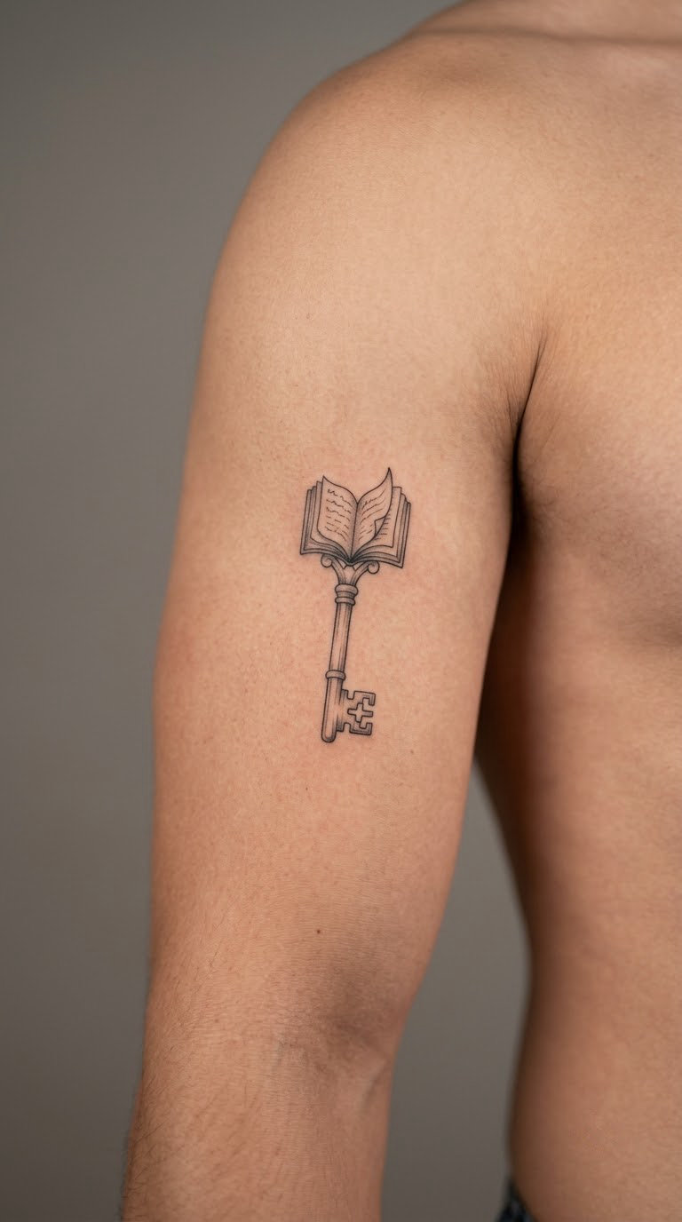
An old-fashioned library key in black-and-grey line work, with the bow of the key formed by a small open page shape instead of a round handle. The teeth are drawn simply and accurately enough to read as a key from across a room.
Access and stories sit comfortably together here, since the key opens something and a book holds what is inside. People who work in libraries, archives or publishing tend to land on this one for obvious reasons, and so do readers who spent years in a particular building.
Placement: outer upper arm, or the back of the forearm. Size: 2 to 3 inches long (5 to 7.5 cm). Style: antique black-and-grey line work with light shading. Pain: low, mostly on the outer arm. Grey shading in the teeth is delicate, so the key should be shaded with wide gradients rather than tight hatching. Make it yours: put a small year in the page-shaped bow, or use the shape of a key from a library you actually used.
18. Lunar Eclipse over an Open Book
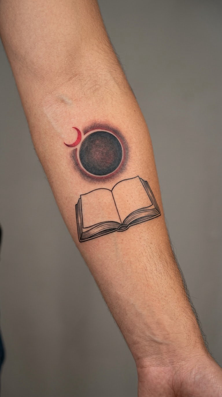
An eclipse, black disc with a single red crescent, set above an open book drawn in the same single-line style as a plain open-book design. The two shapes are balanced rather than stacked, with the disc slightly larger than the book’s width.
It is the one design here that leaves room for an actual date, which is why writers finishing a manuscript or marking a publication year like it. The eclipse shape should be accurate, not a generic circle with rays.
Placement: outer or inner forearm, or the side of the calf. Size: 3 to 4 inches wide (7.5 to 10 cm). Style: black with a single red accent. Pain: medium across the forearm. Red pigment in a thin crescent can look weak against black, so ask for the red to be laid slightly heavier than feels comfortable. Make it yours: use your publication date, or a date the writing started, beneath the book in a small plain hand.
19. Ink Bottle Constellation
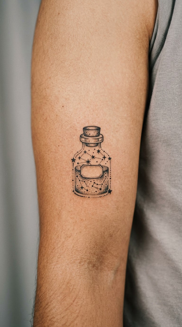
An ink bottle drawn entirely in dotwork, its outline formed by stars of varying size connected by fine straight lines, with a denser cluster of dots where the ink pools at the bottom. The shape still has to read as a bottle at two inches, which is the real design problem here.
Star maps are the most enduring small tattoo in the personal-symbol category, and this one gives a reading habit a shape that is not a literal book. It works as a standalone piece and as a quiet filler between larger literary ink.
Placement: inner upper arm, back of the shoulder, or the calf. Size: 1.5 to 2.5 inches tall (4 to 6 cm). Style: dotwork with fine connecting lines. Pain: low to medium; the inner upper arm is a popular but slightly tender spot. Star dots must stay large enough to survive healing, which usually means fewer, bigger stars at this scale. Make it yours: use the coordinates of somewhere that matters to your writing, a library, a desk, a view, and have the artist place one larger star there.
20. Typewriter-Spacing Literary Scene
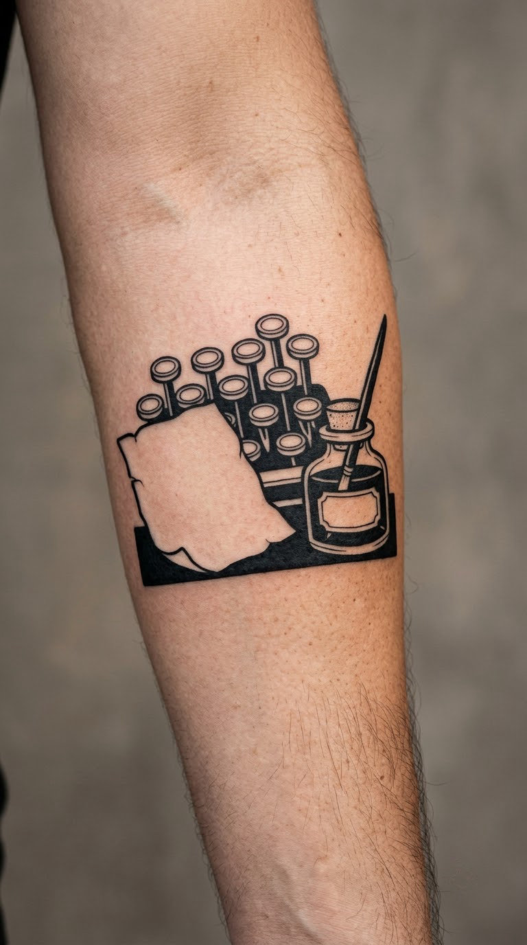
A compact blackwork scene: the left edge of a typewriter keyboard with three or four keys, a loose sheet of paper with a few black lines of text, and an ink bottle at the far side. The keys are solid black, the paper is outline, and the negative space between the three groups does most of the composition work.
This is the version to plan for if you already have writing-related ink or you are building a literary sleeve. A five-inch scene needs a forearm that can hold it without crowding, and an artist comfortable with black fills and clean edges in one sitting.
Placement: outer forearm, or the upper arm for a fuller composition. Size: 4.5 to 6 inches wide (11 to 15 cm). Style: blackwork with heavy negative space. Pain: medium to high, and expect a long session, possibly two if the fills are large. The paper’s text lines are the elements that blur, so keep them short and few. Make it yours: leave a clear gap at one end as reserved space, which is the approach many self-published writers use when they want to add a book each time they publish.
How to Choose the Right Design
Five checks before you commit, in the order that saves the most money if something is wrong.
Read it from arm’s length before you commit to fine detail
Print your design at final size and look at it from a step back. If the letter, the period or the teeth of the key are the only things making the design legible, it is too small. Most of the frustration people report with literary tattoos comes from details that read beautifully on a phone screen and vanish in daylight.
Pick a placement your body can hold
Ribs, collarbones, the inner wrist and the spine all distort straight lines and curves differently once a design is on skin. A circular composition such as a wreath or a constellation suits curved surfaces, while a manuscript sheet wants something flat. If you write every day, an inner wrist tattoo will be under your hand at a keyboard for the rest of your career, and that is a real consideration rather than a small one.
Object design or text design: decide before you book anything
Object designs, meaning quills, nibs, books and keys, need no reading and last longer. Text designs carry your actual words, which is the point, but they blur, they take more planning and they need a clean printed reference. Choosing early saves a consultation spent going back and forth, and it is the single decision that most affects how long a writing tattoo lasts.
Think about where the rest of your collection is going
Fine line and blackwork sit well together. A small piece on the inner forearm leaves the outer arm free for a scene like idea 20 later, and a dark piece near the elbow crowds out a small detailed one next to it. Look at your existing work from a few feet away, not from your seat.
Accept the ageing before the drawing
Fine line on hands, fingers, the inner forearm and the rib softens fastest, and grey pigment fades before black. A design at two inches on the inner arm will look noticeably lighter in five years, and any lettering within it will need a touch-up. Larger sizes and heavier line weight are the only real defences, so this is a decision to make now, not later.
Cost and Session Time
In the United States, most small literary tattoos in this list fall between roughly 120 and 300 USD, with a single letter or a punctuation pair at the low end. Pieces in the 2.5 to 4 inch range usually run from about 200 to 450 USD, and the five-inch blackwork scene in idea 20 can reach 600 USD or more depending on how much solid black goes in.
Session time usually tracks size more than complexity. A single typewriter key is a short sitting of well under an hour. A quill and ink bottle or a torn manuscript paragraph is an hour to an hour and a half. The laurel wreath and the typewriter-spacing scene are two to three hours, and some artists will split a scene like that across two appointments so they are not rushing the fills.
Shop minimums, hourly rates and how artists price small pieces all vary widely, so a studio with a high minimum may simply be the wrong fit for a half-inch design. Ask for the total price of the whole design before you start, including whether a touch-up is included.
Aftercare Basics
Start with your artist’s aftercare instructions, because they know exactly how deep they went and how much pigment they laid down. Everything below is general and comes after that.
- Follow the aftercare your artist gives you, in the order they give it. Generic advice does not override instructions from the person holding the machine.
- Keep the fresh tattoo clean and let your body’s own healing do the work. Wash gently with unscented soap and lukewarm water, then pat dry rather than rubbing.
- Leave the skin alone. Picking flakes or scabs is the most common cause of patchy line work and lost detail, which hurts fine-line lettering more than anything else.
- Skip the sun. Direct sunlight fades fresh ink fastest, and it is the first thing to avoid during healing and the first thing to think about afterwards.
- Do not soak. Pools, hot tubs, baths and swimming are worth skipping until the tattoo has fully closed over, and your artist will tell you how long that is for their work.
- Expect a settling period. Line work looks heavier and sharper for the first couple of weeks, then softens. Judge the result at eight weeks, and contact your artist if a letter or a thin line has faded out.
Frequently Asked Questions
What is the best small tattoo for a writer?
A single typewriter key with one letter, or a comma and period pair, is the strongest small option. Both read instantly at under an inch, cost the least, and do not depend on line weight staying perfect forever. The open book with a blank page is the other reliable small design, at around two inches wide, because its meaning comes from the empty page rather than from detail.
How do I make a handwritten tattoo easy for my artist to read?
Print the words in a plain font rather than sending a phone photo, and hand over the print at the consultation. Ask for the design to be at least two inches wide, since script merges below about an inch. Keep it to two lines maximum, avoid thin hairlines between close letters, and tell the artist if a particular letterform matters to you, such as a long descender or a crossed letter.
Where should I place a pen or quill tattoo?
The inner forearm suits a quill and ink bottle best, since it gives a flat surface between wrist and elbow and reads well when your arm is down. A fountain pen nib works better on the outer forearm, angled toward the elbow. The inner wrist works for small pieces but sits under your hand all day if you write, and the rib area hurts most, so save it for a design worth the discomfort.
Do fine-line literary tattoos age well?
They hold up reasonably well on the upper arm, chest and back, where skin is stable and sun exposure is limited. On the inner forearm, wrist, ribs and especially the fingers, fine line softens fastest and lettering blurs within a few years. Ask for a heavier line weight than the reference image shows, and plan on a refresh every five to eight years in high-fade areas.
Can I combine writing symbols with an existing tattoo?
Yes, and planning it early makes it much easier. Small writing symbols such as a period, a bookmark ribbon or a key work well as fillers in the negative space around existing line work. Tell your artist about the pieces already there before the consultation, bring photos of how they healed, and keep new fine line at least half an inch from older work so the two do not blur into each other.
Conclusion
For a first tattoo, start with the quill and ink bottle from idea 1 or the blank-page book from idea 2. Both are small, both read at a distance, and neither locks you into a specific book or quote you might want to change your mind about in ten years.
If you already have writing-related ink and want a proper literary sleeve, the typewriter-spacing scene in idea 20 is the one to design carefully with an artist, well ahead of time. Whichever you pick from these tattoo ideas for writers, save three or four reference images at the size you actually want, write down the words exactly as they should read, and take those to a consultation. The design is the easy part. The conversation is where the good placement comes from.