
25 Forearm Quote Tattoo Ideas: Best Curated Picks (October 2026)
These 25 forearm quote tattoo ideas cover the whole range: fine line, script, blackwork, calligraphy, one bold word, and a few with a small motif tucked in. Each one lists the exact words, the style, the forearm placement, a realistic size in inches, what it will feel like, and one way to make it yours.
Text is harder to place than imagery. A forearm curves, flexes, catches sun and wears smooth, and a quote that reads perfectly on a flat flash sheet can warp once it’s wrapped around an arm. The designs below are the ones that hold their shape on skin. If you want more placement inspiration before you book, our guide to forearm tattoo ideas for women with meaning and to inner forearm tattoo ideas for men both work well alongside this list.
One note before we start: quote tattoos are permanent text. Getting the spelling, punctuation and line breaks right at the appointment matters more than any style choice, so every idea here is written the way it should be tattooed.
25 Forearm Quote Tattoo Ideas: Quick Guide
The forearm has four working zones: the inner forearm, the outer forearm, the wrist end and the elbow ditch. Each one handles script differently. This table maps every idea below to its style, zone, size and expected pain.
| # | Idea | Style | Best placement | Size | Pain |
|---|---|---|---|---|---|
| 1 | Not Everyone Belongs Here | Fine line | Inner forearm | 4–6 in | Low–medium |
| 2 | Choose Your Own Adventure | Minimal script | Inner forearm | 5–7 in | Low–medium |
| 3 | Be Your Own Hero | Bold block | Outer forearm | 5–7 in | Medium |
| 4 | Let It Go | Watercolor | Inner forearm | 4–6 in | Medium |
| 5 | You Are Enough | Fine line sans | Inner forearm | 3–5 in | Low–medium |
| 6 | Stay True | Traditional ribbon | Outer forearm | 5–7 in | Medium |
| 7 | Resilient | Blackwork | Outer forearm / below elbow | 3–5 in | Medium |
| 8 | Still Becoming | Handwritten | Inner forearm | 4–6 in | Low–medium |
| 9 | Breathe | Stacked type | Wrist end or elbow | 2–4 in | Medium |
| 10 | Create the Life You Want | Modern calligraphy | Outer forearm | 6–8 in | Medium |
| 11 | Start Where You Are + two dates | Fine line | Inner forearm | 4–6 in | Low–medium |
| 12 | No Permission Needed | Serif, red ink | Outer forearm | 5–6 in | Medium |
| 13 | Keep Going | Sans, blue ink | Inner forearm | 3–4 in | Low |
| 14 | Own Your Story | Stacked serif | Inner or outer forearm | 4–6 in | Medium |
| 15 | I Am at Peace | Soft script | Inner forearm | 4–5 in | Low–medium |
| 16 | Grow Through What You Go Through | Blackwork condensed | Outer forearm | 6–8 in | Medium |
| 17 | Be Here Now | Dotwork | Inner forearm | 4–6 in | Low–medium |
| 18 | Rise | Gothic serif | Outer forearm / below elbow | 2–4 in | Medium |
| 19 | Rose + Grow | Micro-realism | Inner forearm | 3–5 in | Medium |
| 20 | Laurel + Begin Again | Fine line botanical | Outer forearm | 4–6 in | Medium |
| 21 | Mountains + Keep Climbing | Line silhouette | Outer forearm | 3–5 in | Medium |
| 22 | Always Home + coordinates | Fine line | Inner forearm | 3–5 in | Low–medium |
| 23 | Staff + Stay in the Tune | Fine line music | Outer forearm | 5–7 in | Medium |
| 24 | Rainbow + Be Kind | Colour linework | Outer forearm | 4–6 in | Medium |
| 25 | This Is My Story | Full-quote fine line | Inner or outer forearm | 5–7 in | Medium |
1. Fine-Line “Not Everyone Belongs Here”
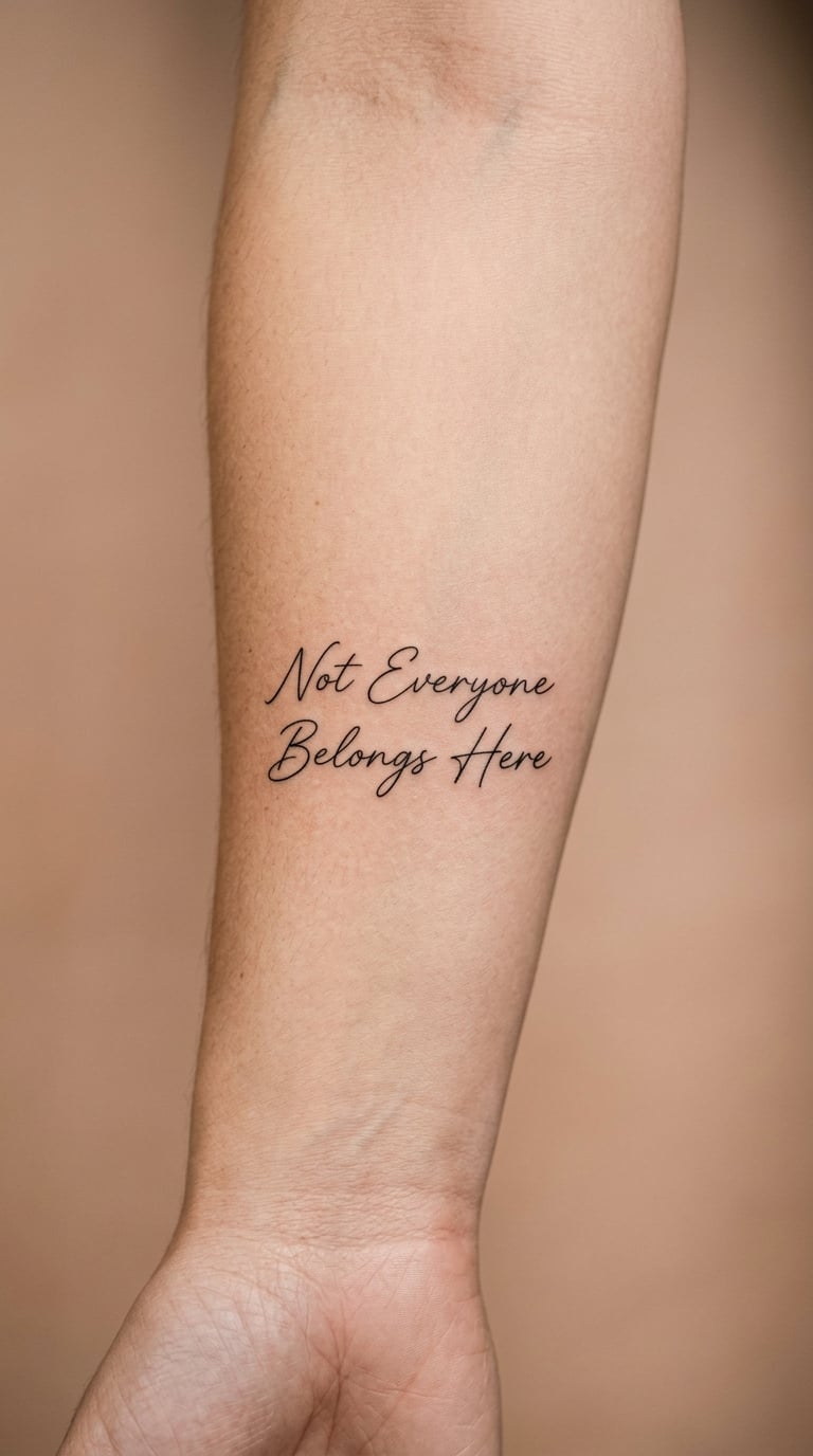
A forearm quote tattoo in airy fine-line lettering works here because the phrase does the heavy lifting. Two thin script lines, generous line spacing, no shadow and no ornament, set across the inner forearm just above the wrist crease.
People usually choose it after a change of circle rather than a change of job. It draws a quiet boundary without being a warning, which is why it reads as personal rather than defensive.
Placement: inner forearm, 2–3 inches above the wrist crease · Size: 4–6 inches wide, roughly 10–15 cm · Style: fine line script
Pain: low to medium on the inner arm. The honest ageing note: single-needle fine line softens noticeably in five or six years, so a touch-up in year one or two is normal, and the outer end of any word nearest the wrist fades first as the skin moves most there.
Make it yours: close the design with one private symbol, such as a tiny open circle or a short date in numerals no one else would read.
2. Minimal Script “Choose Your Own Adventure”
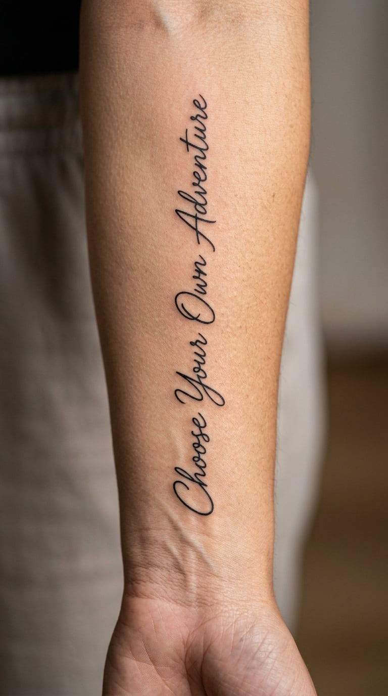
One continuous line of single-weight script, no swashes at the ends, no underline. The whole phrase sits in a single unbroken run so the eye follows the arm instead of stopping at a flourish.
It is the optimistic one, and it is the design most often chosen by people marking a gap year, a new city or a first long trip. Keep the words horizontal across the arm rather than curving them, or the middle letters squeeze as the forearm bends.
Placement: inner forearm, running wrist to elbow · Size: 5–7 inches long, about 13–18 cm · Style: minimal script, single weight
Pain: low to medium along the inner arm, rising slightly near the elbow where skin tightens. Ageing note: a single-weight line with no contrast has less ink to lose, so it stays readable longer than a hairlined piece, but any hand or finger extension of the same quote would blur fast.
Make it yours: add the month and year of the trip underneath in tiny plain numerals, or a single coordinate of the place it started.
3. Bold Block Quote “Be Your Own Hero”
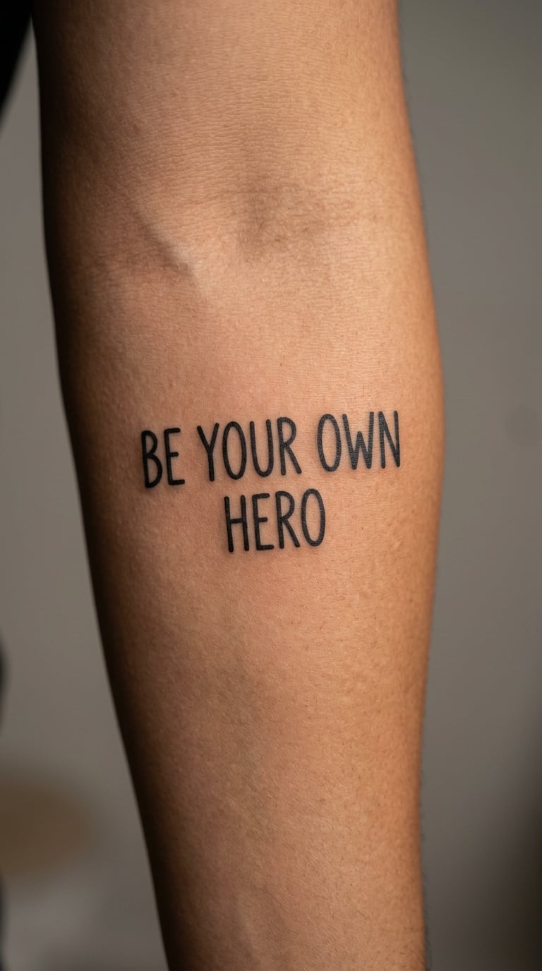
Hand-drawn block capitals, two lines, no fill, thick consistent stroke. The letters are drawn rather than typed, so the corners are slightly imperfect and the whole thing carries more weight than a typed font would.
It is a self-reliance line, chosen most often by people who have just come out of a relationship, a job or a family pattern that needed managing. Scaling it up rather than adding decoration is what makes it land.
Placement: outer forearm, broad flat area between elbow and wrist · Size: 5–7 inches wide, 13–18 cm · Style: hand-drawn block lettering
Pain: medium on the outer forearm, more noticeable along the outer bone. Ageing note: block strokes hold their edges well, but a solid outline across the elbow crease eventually softens where the skin folds.
Make it yours: run a thin grey shadow under one word only, or set a small date beneath the two lines in the same block face.
4. Watercolor “Let It Go”
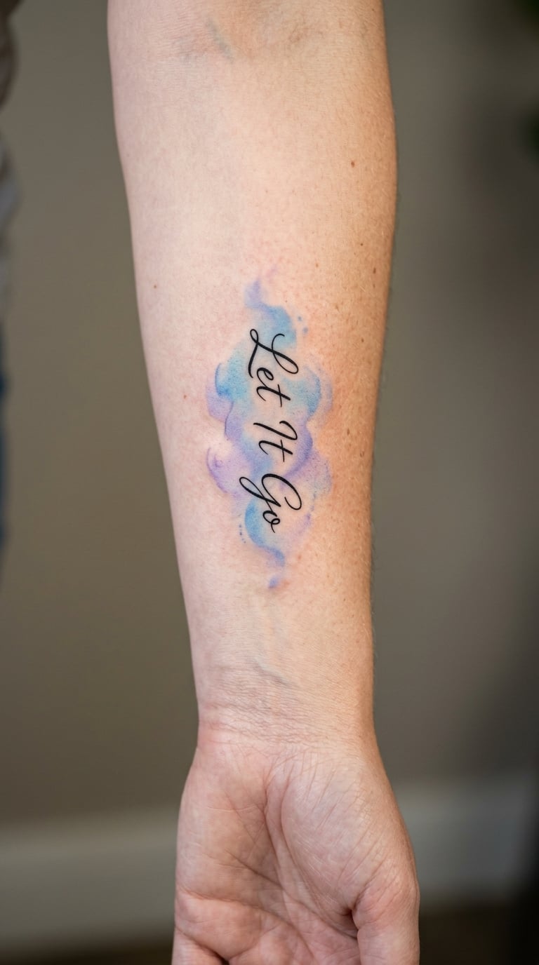
Short handwritten words with a restrained wash of blue and violet behind them, edges feathered so the pigment fades out rather than stopping at a line. No illustration, just colour doing the work.
People reach for a short release line when something has already ended and the tattoo is the closing gesture rather than a plea. The colour is personal — pick a shade that already means something to you instead of the usual blue.
Placement: inner forearm · Size: 4–6 inches wide, 10–15 cm · Style: watercolor lettering with black script
Pain: medium, mostly from the shading passes rather than the linework. Ageing note: pale washes are the first thing to fade, so expect the colour to recede into a soft ghost while the black script stays legible.
Make it yours: use a colour tied to a place, a season or a person, and ask for the wash to stay behind the words rather than across them.
5. Fine-Line “You Are Enough”
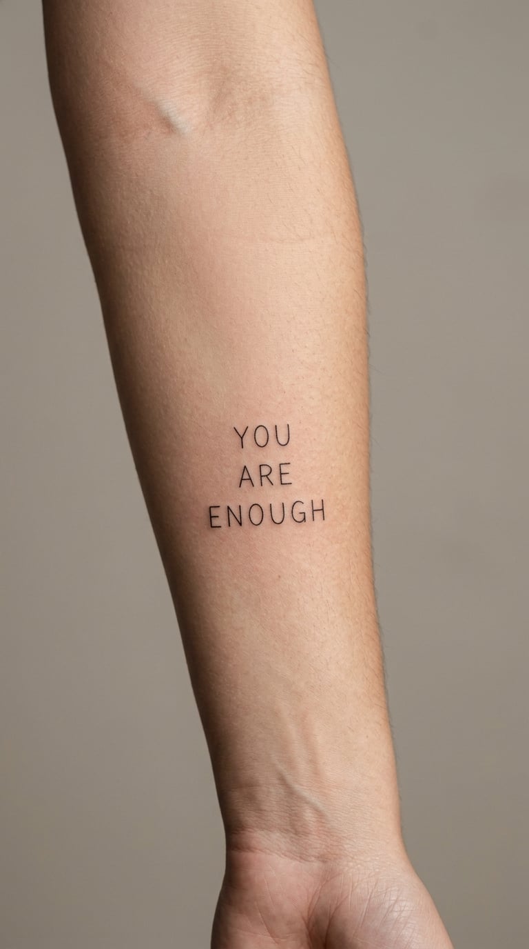
A narrow modern sans serif at small size, letterspaced so each character gets air around it. Three words, centred, done. The restraint is the point — this one reads like a private note rather than a statement.
It suits people who want an affirmation they can read to themselves and nobody else tends to look at. The design works because it is small enough to stay polite in a work setting.
Placement: inner forearm, centred a little above the wrist · Size: 3–5 inches wide, 8–13 cm · Style: fine line sans serif
Pain: low to medium. Ageing note: narrow type has thin verticals, and thin verticals disappear first; ask for slightly heavier stems than the reference image shows, and expect a touch-up sooner than the larger designs below.
Make it yours: set one word in your birthstone colour and leave the other two in black, so the emphasis is obvious to you and quiet to everyone else.
6. Traditional Ribbon “Stay True”
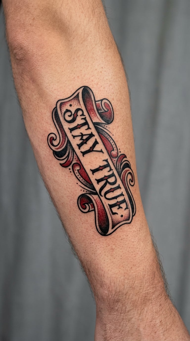
A banner with folded, dimensional ends carrying two words in a plain letterform, with traditional-style shading and a single restrained accent of red. The layout is original rather than a copy of any existing flash piece.
It is a short authenticity line, often chosen alongside a name or a date. Banners give the words a frame, which is useful when the letters themselves are very simple.
Placement: outer forearm, oriented with the ribbon running along the arm · Size: 5–7 inches long, 13–18 cm · Style: traditional
Pain: medium on the outer forearm, with the shading passes counting as more than one. Ageing note: the heavy ribbon outline survives better than fine interior detail, so keep detail inside the banner shallow.
Make it yours: colour the ribbon in your birthstone shade instead of red, or tuck a real date into the fold at one end.
7. One-Word “Resilient” in Blackwork
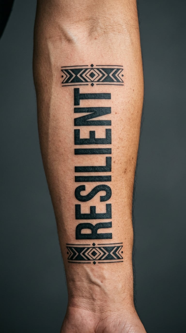
One word set in heavy black geometric capitals, lettered in a single dense block, framed by two narrow bands that stop short of the edges. Solid black throughout, no grey, no colour.
With a single word the meaning is whatever you decided it means. That is the appeal for anyone who finds a full sentence too literal and wants a word instead.
Placement: outer forearm, or just below the elbow on the broad side of the upper arm · Size: 3–5 inches wide, 8–13 cm · Style: blackwork
Pain: medium, since solid black is repeated passes over the same area. Ageing note: heavy blackwork holds tone for years, but the geometric bands will soften at their ends where the arm flexes.
Make it yours: add a private date inside one of the bands, small enough to read only when you look closely.
8. Handwritten “Still Becoming”
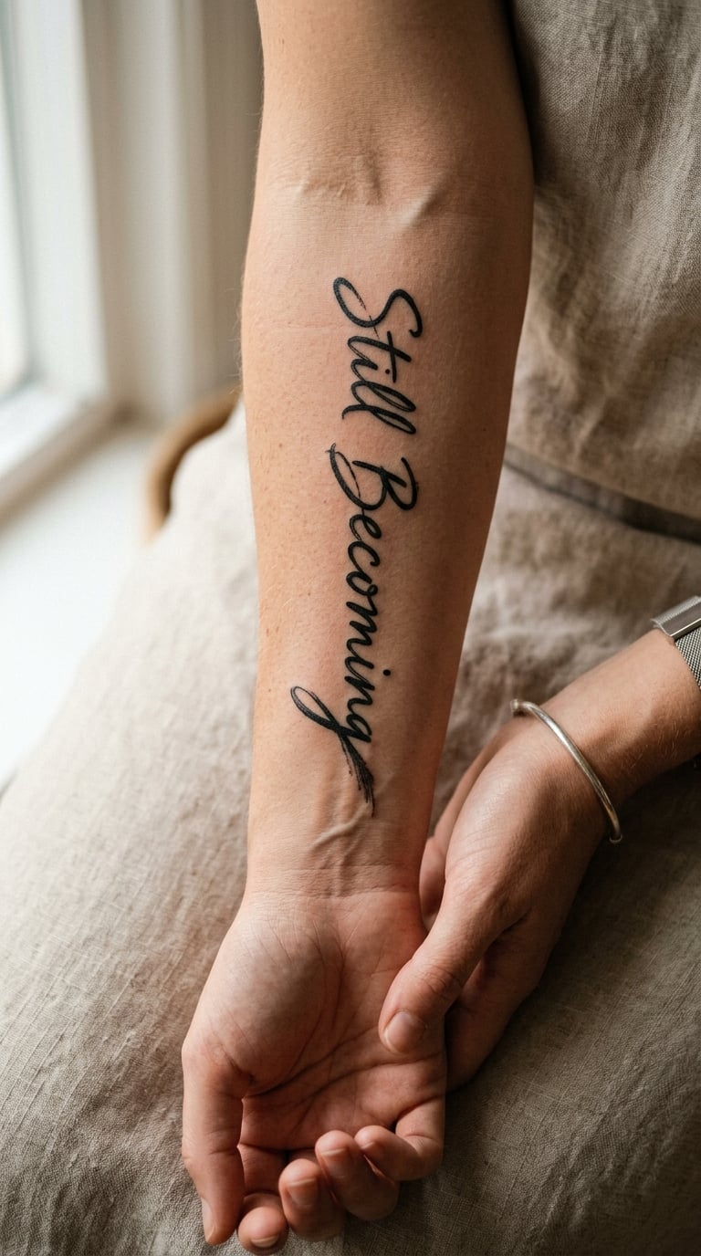
Deliberately loose handwriting with real line variation — thick downstrokes, thin upstrokes, letters that lean and do not line up perfectly. The last letter trails off with a dry brush finish that looks unfinished in a good way.
It is a growth line, and it works because the texture admits the person is not finished yet. A polished script version of the same words would feel like a statement, this one feels like a note.
Placement: inner forearm, tilted slightly to follow the arm’s line · Size: 4–6 inches, 10–15 cm · Style: hand-lettered
Pain: low to medium. Ageing note: thin hairlines in the loose lettering are the first to blur, so ask for the downstrokes to carry a touch more weight than the reference.
Make it yours: have the words written in your own hand — send your artist a clear photo of a note you wrote, and let the letterforms follow it.
9. Stacked Type “Breathe”
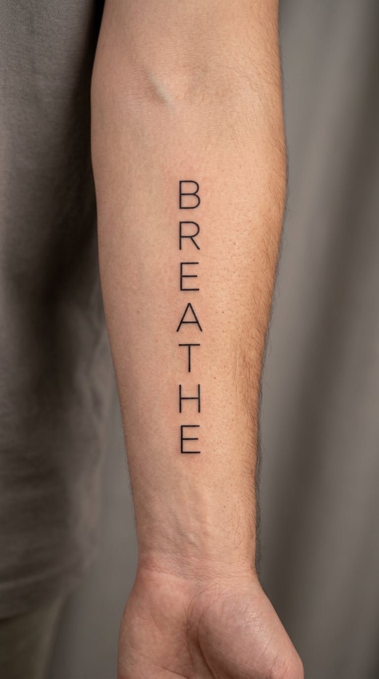
Seven capital letters, each on its own line, stacked vertically down the inner forearm in a narrow geometric sans serif. Wide spacing between letters, no imagery, nothing else in the composition.
It is the smallest and most private design in the list, and the one people most often get as a first tattoo because the commitment feels small. A single word you can say to yourself is easier to live with than a sentence.
Placement: inner forearm from wrist end toward elbow, or vertical just below the elbow · Size: 2–4 inches tall, 5–10 cm · Style: stacked geometric sans
Pain: medium on the inner forearm because seven separate passes add up. Ageing note: letter edges on a stack this small are fragile, so expect one touch-up inside the first couple of years.
Make it yours: add a fine pulse line running behind the stack, or colour the middle letter in a single shade.
10. Calligraphy “Create the Life You Want”
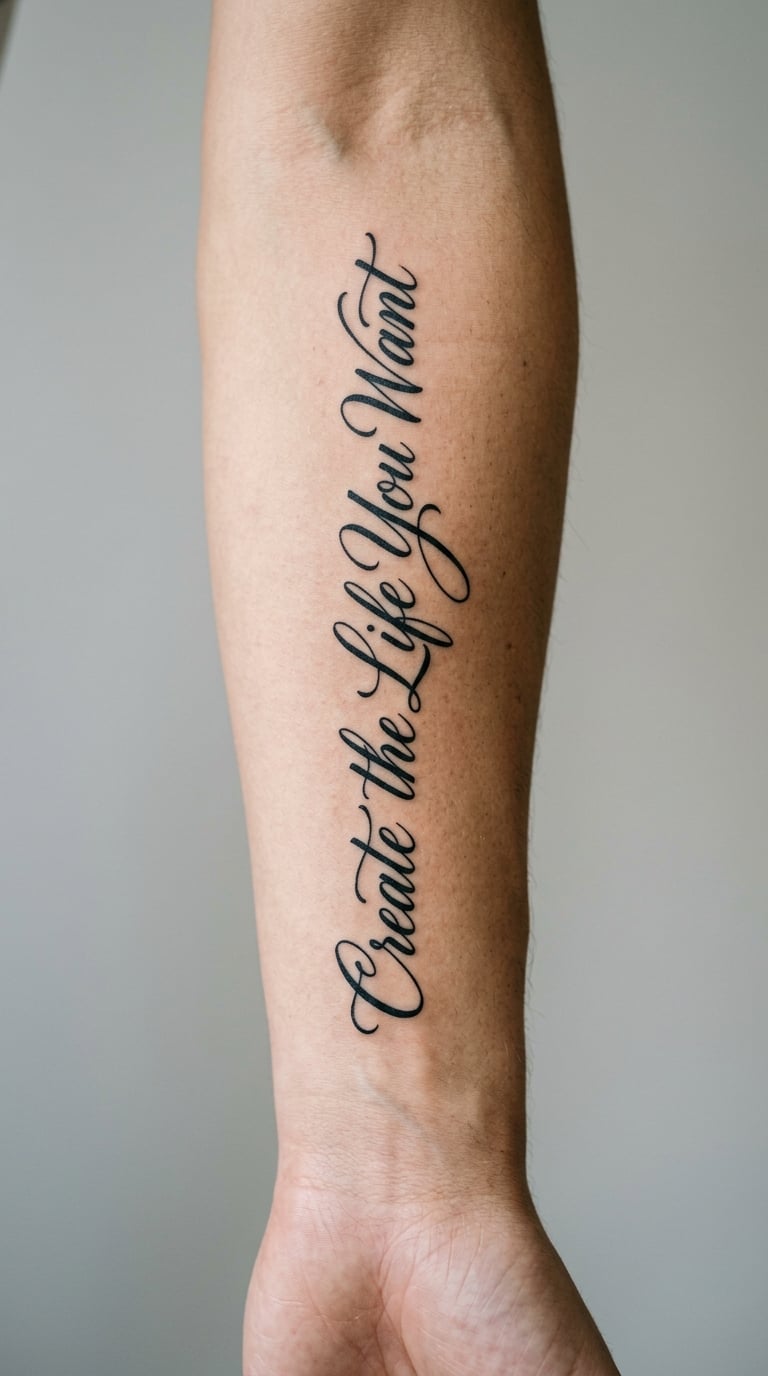
Readable modern calligraphy with a controlled brush rhythm — thick downstrokes, clear thick-to-thin contrast, generous spacing between words so nothing collides on the curve of the arm.
The line is about deliberate choice rather than luck, and it suits people who picked the words carefully. Longer phrases need wider spacing than a flat mock-up suggests, so agree the letter spacing at the consult.
Placement: broad outer forearm · Size: 6–8 inches, 15–20 cm · Style: modern calligraphy
Pain: medium, higher near the elbow end of a long run. Ageing note: high-contrast calligraphy puts its beauty in the thin hairlines, and hairlines are what sun and time remove first, especially on the outer arm.
Make it yours: in a longer custom version, set the place the words refer to directly beneath them in a smaller hand.
11. Two-Date “Start Where You Are”
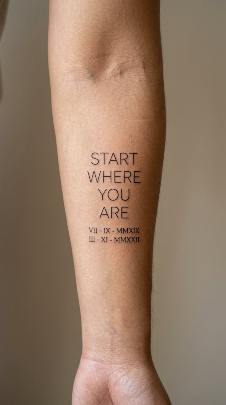
The quote in fine line, with two small Roman numeral dates sitting directly underneath in a plainer face, both clearly legible rather than decorative. The dates are part of the design, not an afterthought.
Two dates under a starting line is a structure people build around a chapter ending and a new one beginning. Pick dates that mean something to you, not dates that merely look like the right number of characters.
Placement: inner forearm · Size: 4–6 inches, 10–15 cm · Style: fine line with numeral sub-line
Pain: low to medium. Ageing note: the numerals are the smallest elements and the first to soften, especially on skin that sees sun — keep them slightly larger than feels necessary at the consult.
Make it yours: use the date you started and the date you changed direction, and add a tiny mark between them if you want the pairing to read as a sequence.
12. Red Ink “No Permission Needed”
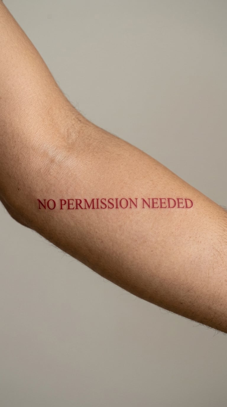
One confident serif phrase, inked entirely in a single muted red with no black anywhere, centred on the outer forearm. The red is dusty rather than bright, which keeps a bold word from looking aggressive.
It is an independence line. People read it their own way — as permission, as a boundary, or just as three words that sound good said out loud. Either way the single-colour treatment is the part people notice.
Placement: outer forearm, centred · Size: 5–6 inches, 13–15 cm · Style: serif in single-colour ink
Pain: medium on the outer arm, with redness lasting a while afterwards. Ageing note: red is more prone to fading than black, so plan on a colour refresh rather than assuming the tone will hold.
Make it yours: put the phrase in red and set a short line of tiny black lettering underneath for contrast.
13. Blue Ink “Keep Going”
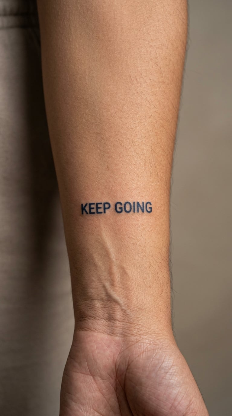
Two short words in a sturdy sans serif, inked in a deep navy blue, set small on the inner forearm. The letters are built for longevity rather than delicacy — wider strokes, plain terminals, nothing decorative.
This is the quiet persistence design, chosen by people who want a reminder that is not a declaration. Navy was picked over black because it softens the look without turning pale.
Placement: inner forearm · Size: 3–4 inches, 8–10 cm · Style: sturdy sans serif in blue
Pain: low on the inner arm for a piece this small. Ageing note: navy is a lighter pigment than black and will fade toward grey sooner, so treat the first-year touch-up as part of the job rather than a flaw.
Make it yours: add a milestone date underneath in black, so the permanence is doing the work and the colour is doing the feeling.
14. Stacked Lines “Own Your Story”
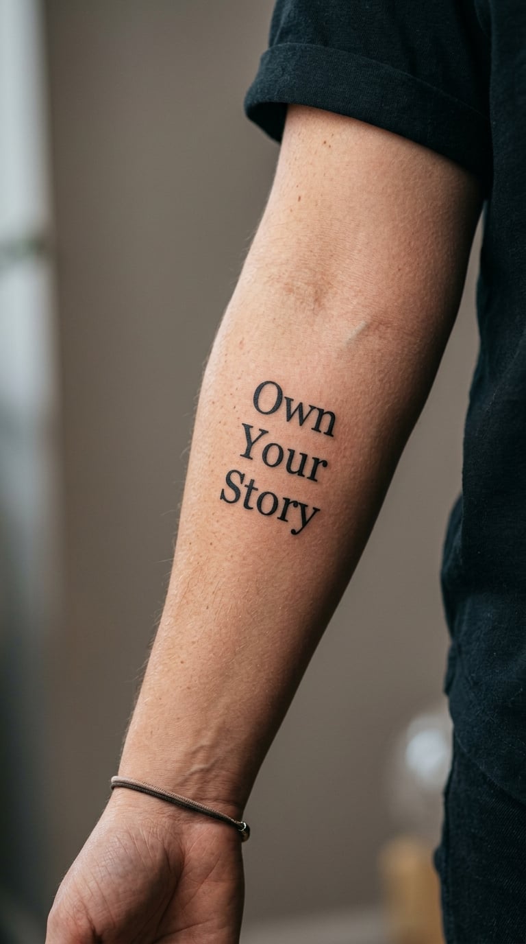
Three lines of compact serif type, balanced so the block reads as a rectangle rather than three separate sentences. Line lengths are matched deliberately, which is what keeps it legible from the side.
It is about authorship — the idea that what happens to you is yours to narrate. Most people who choose it are marking a stretch where they stopped being a passenger.
Placement: inner or outer forearm, wherever the three lines sit square · Size: 4–6 inches, 10–15 cm · Style: stacked serif
Pain: medium, three lines of consistent shading rather than one light pass. Ageing note: stacked blocks distort more than single lines when the arm bends, so ask the artist to lay it out around the curve instead of flat across it.
Make it yours: rewrite one line into a private motto of your own and keep the other two as the public part.
15. Soft Script “I Am at Peace”
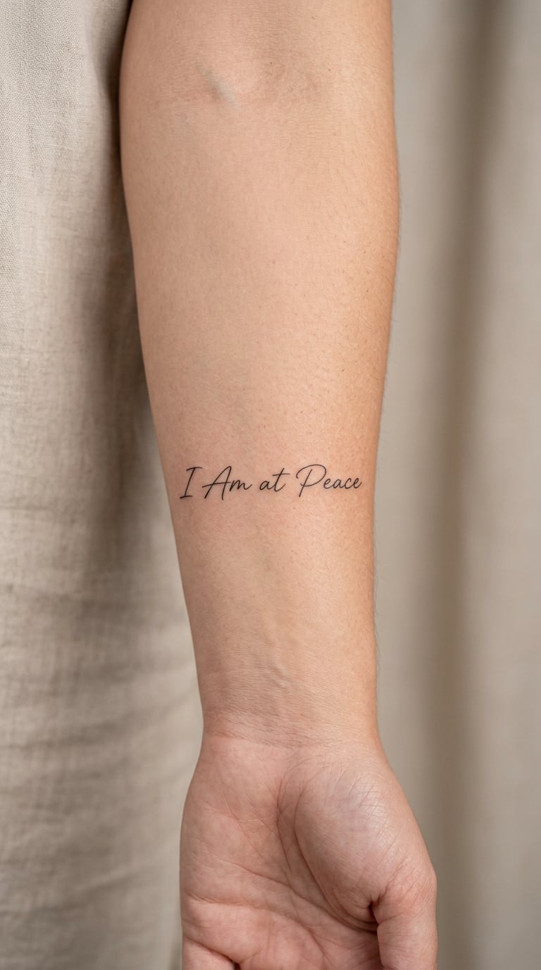
Wide, airy script with generous spacing between letters, minimal flourishing, and only a few soft curves. The whole phrase is set loosely enough to breathe rather than compressed into the available skin.
It is a reflective statement, the kind of line people choose after a hard year rather than before one. The looseness is deliberate; tight script would make the same words feel formal.
Placement: inner forearm · Size: 4–5 inches, 10–13 cm · Style: soft script
Pain: low to medium. Ageing note: fine curves in scripts blur where two lines come close together, so keep the counters of the letters open and expect a maintenance session sooner than a bolder design.
Make it yours: place two tiny dots on either side of the phrase, sized to sit level with the x-height.
16. Blackwork “Grow Through What You Go Through”
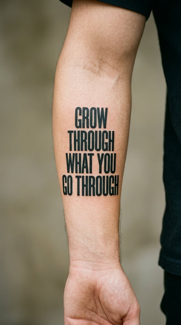
Longer phrase, so the words have to be broken up: four lines of bold condensed blackwork lettering, tightly packed but with open spacing between the lines. Dense black text, no colour, no illustration.
A long resilience line needs a longer run and heavier letterforms than a short affirmation, or the words turn to mush by the last line. Most people who pick this one want the length of the sentence to be visible.
Placement: outer forearm, full length wrist to elbow · Size: 6–8 inches, 15–20 cm · Style: blackwork condensed
Pain: medium, the longest sitting of any design in this list. Ageing note: it is the piece most likely to need planning around a future sleeve, so leave margin at both ends before you commit.
Make it yours: add two restrained leaf marks at one end, small enough that the text still reads first.
17. Dotwork “Be Here Now”
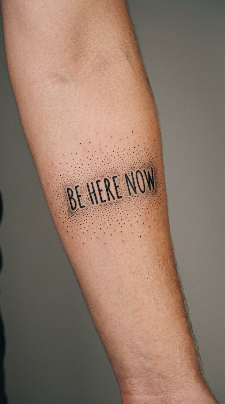
Hand lettering at the centre with a sparse field of small dots around it, the dot density fading toward one edge so the frame dissolves rather than ending. All black, all dots the same size, no colour.
The message is about the present moment. Dotwork does not carry a fixed meaning of its own here — it is used as texture that frames the words without competing with them.
Placement: inner forearm · Size: 4–6 inches, 10–15 cm · Style: dotwork with hand lettering
Pain: low to medium, though many small dots take longer than the time suggests. Ageing note: single-needle dots on the inner arm are durable, but the outer end of the gradient thins out first.
Make it yours: vary the dot density to a shape that means something to you, or add one set of coordinates tucked into the sparse area.
18. Gothic Serif “Rise”
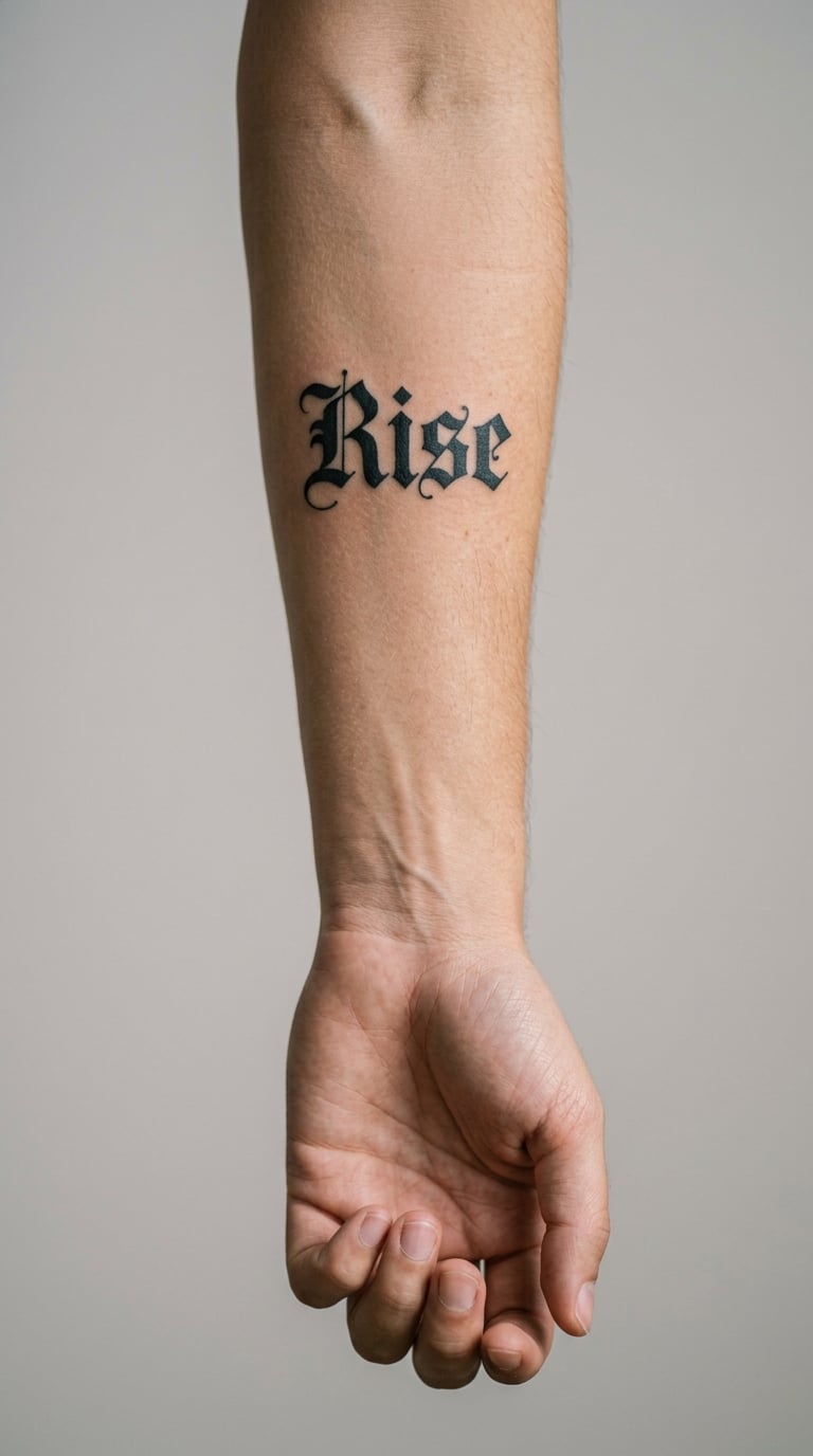
One short word in decorative blackletter-adjacent serif lettering, ornate at the terminals but still readable. Sparse decoration only — a hairline flourish at most, so the word stays the subject.
The whole effect is the contrast: heavy ornamental letterforms carrying a single short word. People choose it when the design should look considered rather than casual.
Placement: outer forearm, or just below the elbow · Size: 2–4 inches, 5–10 cm · Style: gothic serif
Pain: medium, and the tight internal spaces of the letterforms take longer to fill. Ageing note: the enclosed counters fill in over time, which is what turns ornate type into a blur, so keep the counters generous.
Make it yours: add a subdued colour wash behind the word, or set the word in a second language small enough to read only up close.
19. Micro-Realistic Rose + “Grow”
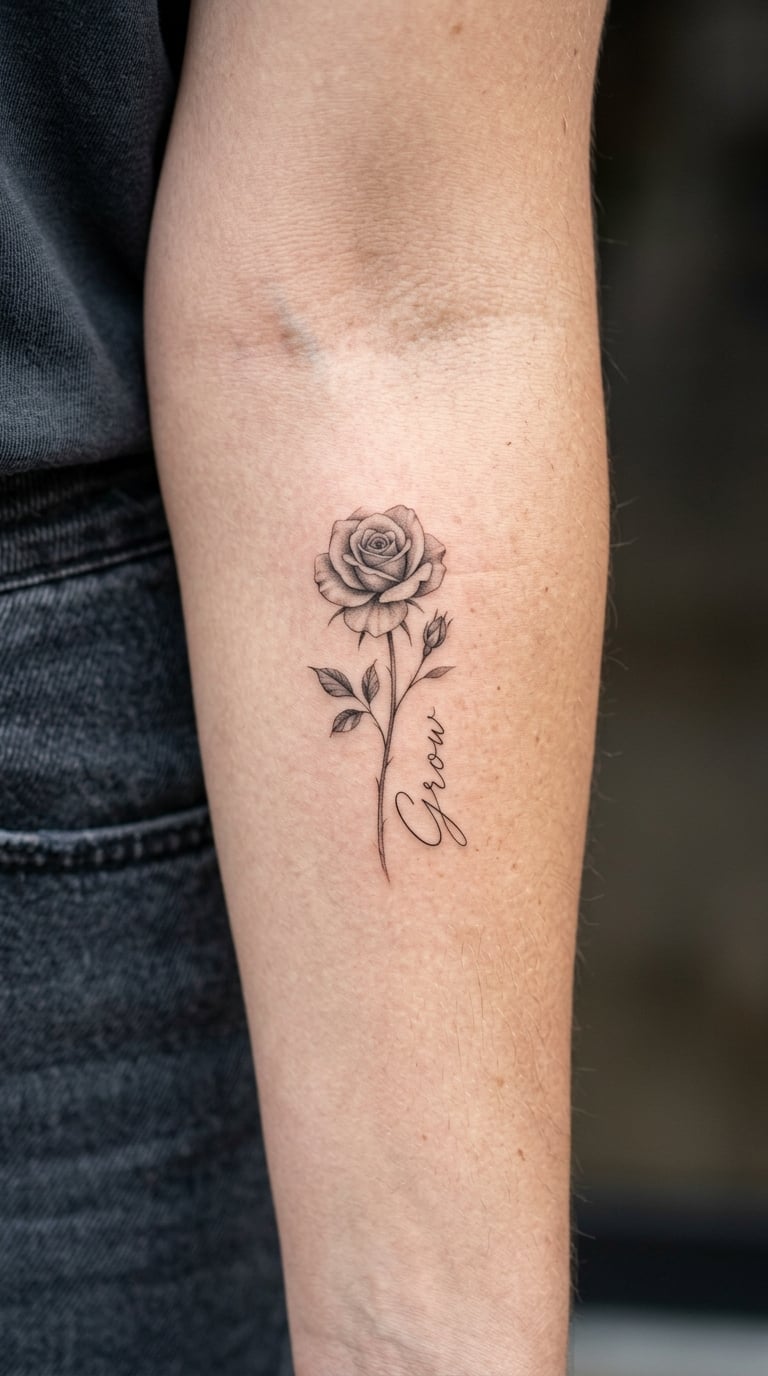
One small rose shaded in black and grey, roughly a centimetre and a half across, with “Grow” in fine script beside it. The flower is the smaller element by design, and there is no background work at all.
Roses are often read as growth and resilience, though that reading comes from the person wearing it rather than from the design. Pairing a bloom with a growth word makes the intent obvious to the wearer and subtle to everyone else.
Placement: inner forearm · Size: 3–5 inches overall, 8–13 cm · Style: micro-realism with fine script
Pain: medium, the grey shading on the bloom taking more passes than the words. Ageing note: the smallest shading on the flower loses detail first, so ask for slightly heavier petal separation than a healed reference photo shows.
Make it yours: match the rose to a real flower that matters to you, right down to the petal count.
20. Laurel + “Begin Again”
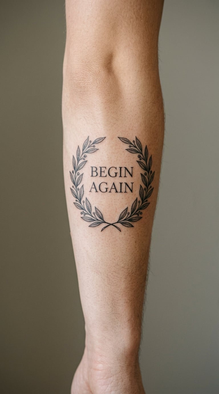
A small symmetrical laurel wreath framing “Begin Again” in fine line, the leaves evenly spaced and thin-stroked, with the words sitting clear in the centre. Balanced rather than loose, so it reads as a finished mark.
The wreath structure gives a celebratory frame to a restart, whether that is a job, a city or a relationship with someone. The meaning is personal; the symmetry is what makes the design hold together.
Placement: outer forearm · Size: 4–6 inches, 10–15 cm · Style: fine line botanical
Pain: medium on the outer arm, more from the leaf work than the words. Ageing note: the thinnest leaf tips soften first on sun-exposed skin, so keep the leaves slightly fuller than the reference.
Make it yours: hide a date inside the wreath at the base, where it reads as part of the stem rather than a caption.
21. Mountain Silhouette + “Keep Climbing”
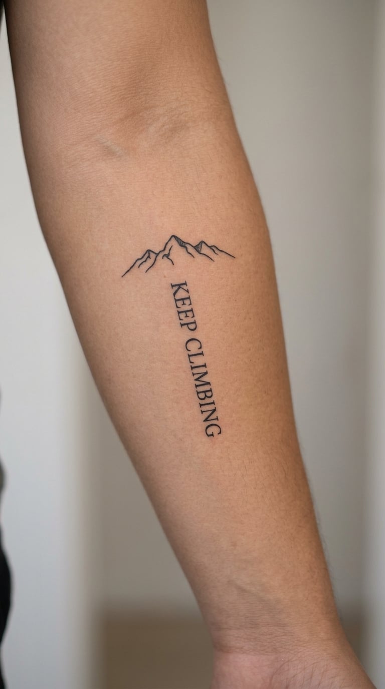
A short run of narrow mountain peaks in solid line silhouette with “Keep Climbing” in compact script underneath. Three or four peaks, no shading inside the triangles, no trees, nothing behind it.
The mountain motif usually tracks a personal goal — a summit, a qualification, a first of something — and the phrase underneath is the reminder. The meaning sits with the wearer, not in the drawing.
Placement: outer forearm · Size: 3–5 inches, 8–13 cm · Style: line silhouette with script
Pain: medium, the filled peaks taking repeated passes. Ageing note: solid black peaks are durable, but the fine script underneath is the part to watch, particularly across the elbow.
Make it yours: outline the real summit you are aiming at, or replace one peak with a date in the same scale.
22. Coordinate + “Always Home”
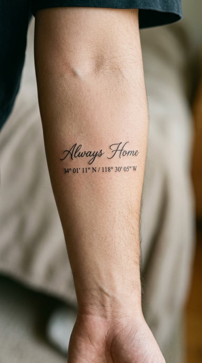
“Always Home” in fine line with a small line of latitude and longitude numbers set underneath in a plain type. Minimalist, black, no map, no pin icon, no border.
The numbers are the personal part. Whether the coordinate is a birthplace, a house or somewhere you once lived, the design only works once those figures are yours, so treat them as required rather than optional.
Placement: inner forearm · Size: 3–5 inches, 8–13 cm · Style: fine line typography
Pain: low to medium. Ageing note: tiny numerals blur over the years more than any other element on this list, so ask for the coordinate line at least twice the size you pictured, and plan on a touch-up.
Make it yours: use the exact coordinates with decimal points, and check them on two devices before the stencil is cut.
23. Musical Staff + “Stay in the Tune”
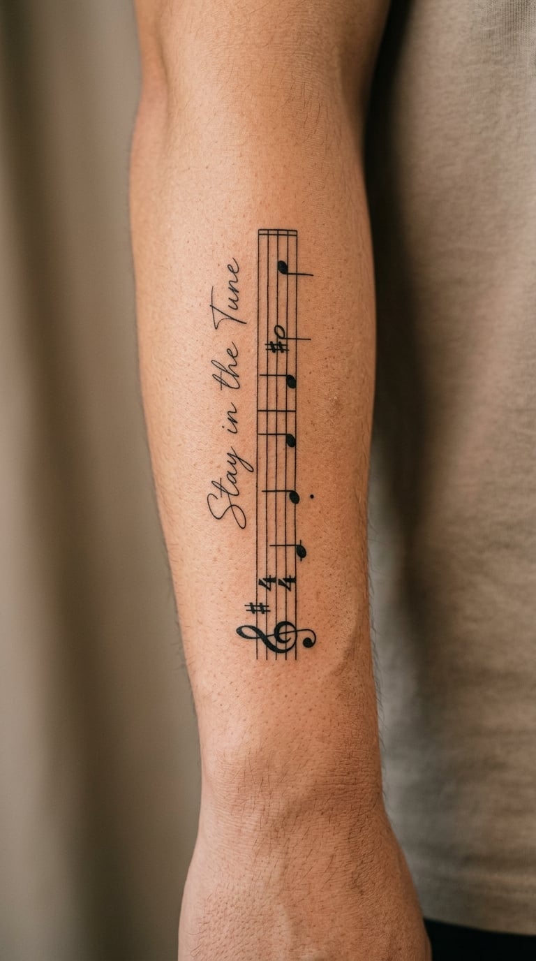
A fine-line staff carrying the opening few notes of a song that means something to you, with “Stay in the Tune” set alongside it. Five lines, about eight notes, black ink, no instrument drawn in.
This one cannot be done from a stock design — the notes have to be the right notes. Bring the reference to the consult and expect a little extra time spent getting the sequence right rather than approximated.
Placement: broad outer forearm · Size: 5–7 inches, 13–18 cm · Style: fine line music notation
Pain: medium, and the staff lines are five extra passes across the same span. Ageing note: staff lines are hairline-thin and will fade out of alignment before the words do, so plan a refresh every few years.
Make it yours: pick a short phrase, four to eight notes, and have the artist redraw it by hand rather than printing it.
24. Multicolor Rainbow + “Be Kind”
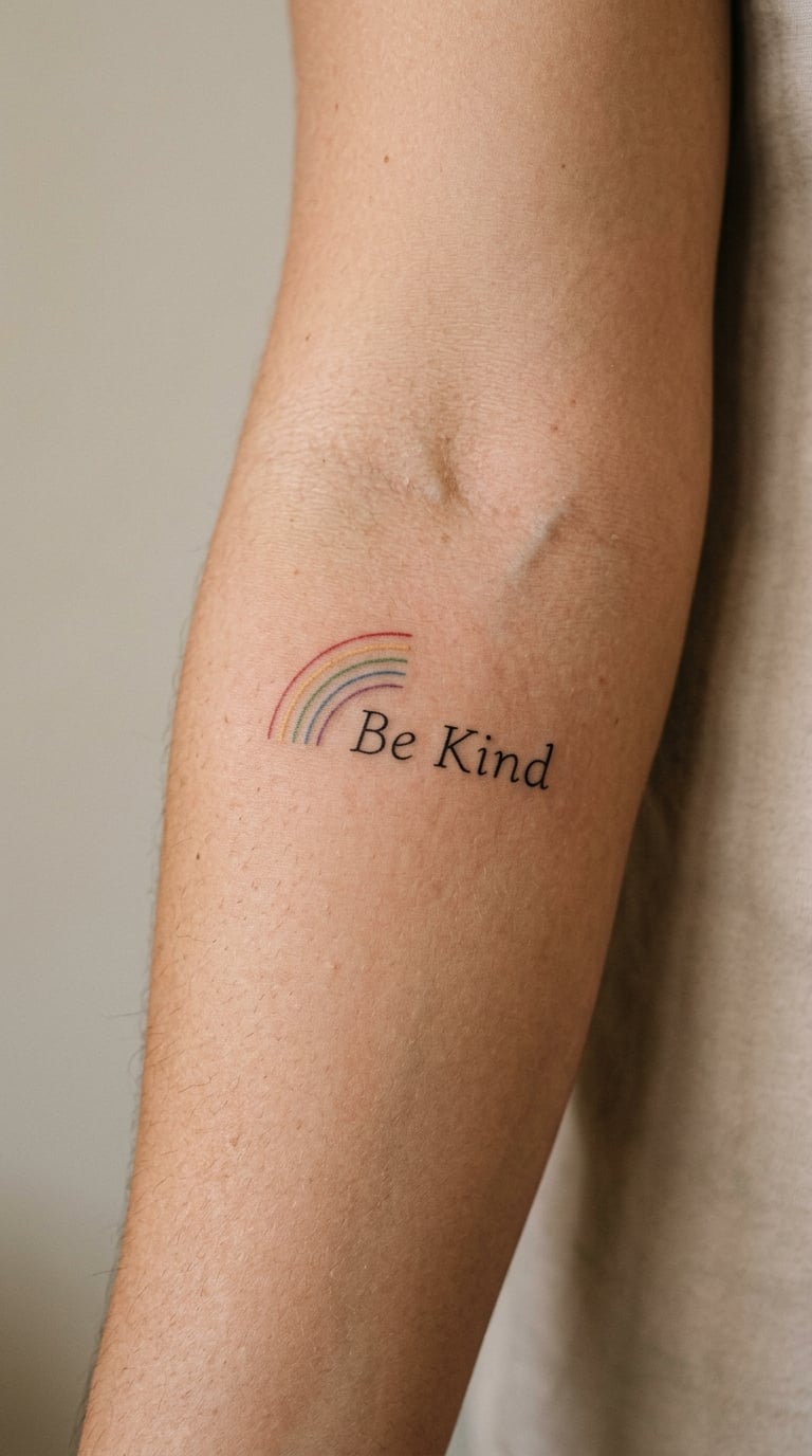
A small tapered rainbow in muted linework — thin red, yellow, green, blue and purple bands — sitting beside “Be Kind” in plain lettering. Tapered, not a novelty arch, and kept narrow so the words stay dominant.
Restrained colour is what keeps this from feeling childish. The bands are narrow and low-saturation so the text reads first and the colour reads as an accent rather than the subject.
Placement: outer forearm · Size: 4–6 inches, 10–15 cm · Style: colour linework with lettering
Pain: medium, since colour work means separate passes per band. Ageing note: the yellow band fades first, and small colour fills on a limb that flexes will soften edges over time, so a colour refresh is normal.
Make it yours: use a sequence that means something specific to you rather than the default order, and keep the same order in a matching piece elsewhere.
25. Full-Quote Fine-Line “This Is My Story”
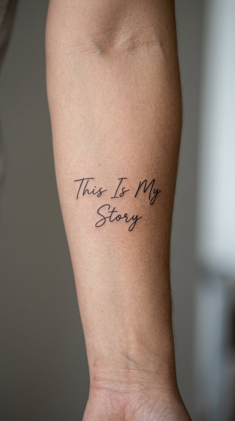
The most ambitious of the fine-line designs here: the phrase split across two balanced lines with generous spacing between them, airy black lettering, no illustration and no border. Two lines, nothing else.
It sits at the boundary between a small affirmation and a full statement, and the difference shows in the size and spacing. Plan the line break at the consult rather than on the day, because the break decides how the words sit on the curve.
Placement: inner or outer forearm · Size: 5–7 inches, 13–18 cm · Style: full-quote fine line
Pain: medium. Ageing note: fine line over this length is a maintenance piece, not a set-and-forget one, and the words nearest the wrist will need attention first.
Make it yours: add a year or a place beneath in the same fine line, and keep the whole design on one side so it reads as a single thought.
How to Choose the Right Design
Most people narrow 25 forearm quote tattoo ideas down to two or three in a single sitting, and the filter is almost always size. Here is what actually decides it.
Match the quote length to the space, not the other way round
Count the words before you pick the lettering. One to three words sit comfortably on the wrist end or the inner forearm. Four to seven words sit across the inner forearm. A full sentence usually has to run vertically or wrap the outer forearm, and it needs heavier linework to stay readable.
Choose the lettering weight to match where it will live
Fine line and single-weight script belong on the inner forearm or in softer body areas. On the sun-exposed outer forearm, ask for heavier strokes and solid black rather than hairlines, because thin lines are the first thing to fade there. Bold block lettering and blackwork age best of everything in this list, which is why three of the 25 forearm quote tattoo ideas here lean that way.
Check how the design sits on a curved arm
Bring or ask to see the design drawn on a real forearm, not just on a flat sheet. A quote that reads cleanly on paper often compresses along the inside of a bent arm, so the line break and the letter spacing should be set while the arm is flexed.
Decide how visible you want it to be
The outer forearm and the top of the forearm read from across a room. The inner forearm is readable to you and to whoever is close. Think about work dress codes and about whether you want colleagues reading it every day.
Budget attention for small or fine-line text
Tiny numerals, hairlines and dot gradients all need a maintenance session. If you want something that stays crisp with the least upkeep, go bolder and larger — a five-inch block word will need less attention than a two-inch fine-line one.
Bring the text exactly as you want it tattooed
Send the wording in writing with the punctuation, capitalisation and line breaks you want, then read it back with your artist before the stencil goes on. The most common regret in this category is not the style; it is a comma in the wrong place or an ampersand written as “and” by accident.
Cost and Session Time
Forearm quote tattoos are usually priced either hourly or as a flat rate for the design, and the number changes a lot with size, colour and how much custom lettering is involved. In the US, a small single-word piece in a small sans serif usually lands somewhere around $150 to $300, a four-to-seven word quote at a realistic $300 to $650, and a full sentence in blackwork or a coloured design with a motif somewhere around $700 up to $1,500. The rose, mountain and musical staff options sit at that upper end because the drawing and the linework add hours. Ask your artist for the figure that fits your actual design, since a single short word in black and a full sentence in colour are not the same job.
Session length follows the same logic. A short phrase on the inner forearm is often a single sitting of an hour or two. A six-to-eight-inch blackwork phrase across the outer forearm, or a coloured design, may need two. Artists differ on whether they price a design flat or by the hour, and shops have a minimum charge that applies even to small pieces, so ask about both at the consult.
Location moves the number more than almost anything else, and so does the artist’s booking list. The honest way to get a figure you can rely on is to bring the design or the wording to a consultation and ask for the total, including whether a second session is expected.
Aftercare Basics
- Follow your artist’s aftercare instructions first. They know what they did in your session, and this list is general guidance only.
- Wash the area gently with clean water and a mild soap, then pat it dry with a clean towel. A lot of people scrub it; don’t.
- Keep it covered from friction and contact for as long as your artist says, and change the covering if it gets damp or dirty.
- Moisturise thinly with whatever product your artist recommends, a few times a day while the skin is still new. Thick layers trap heat.
- Keep it out of direct sun while it heals, and remember the outer forearm gets sun all year. That exposure is what fades fine line fastest, even after healing.
- Do not pick, scratch or flake the healing skin. If anything looks unusual to you, go back to your artist rather than treating it yourself.
Frequently Asked Questions
Do quote tattoos hurt more than other forearm tattoos?
Not because of the words. Text tattoos usually mean a larger surface area and more single-needle passes than a small symbol, and that length of sitting is what people notice rather than the line itself. The inner forearm is generally the easier side. The elbow ditch and the bony outer edge are the two spots worth timing around, and asking your artist to take a break is completely normal.
What size should a quote tattoo be on the forearm?
For one to three words, aim for 2 to 4 inches. For four to seven words running along the inner forearm, 4 to 7 inches works. A full sentence across the outer forearm usually needs 6 to 8 inches and bolder lettering. Size the text so the smallest letters stay readable at arm’s length, and never plan a long quote in a space that only fits a short one.
Will fine-line lettering on my forearm fade?
Yes, sooner than most people expect. Single-needle fine line has less pigment in the skin than solid blackwork, so it softens first, and the outer forearm catches sun all year which speeds that up. Ask for slightly heavier line weight than a healed reference photo shows, keep the piece out of direct sun while it heals, and plan a touch-up within the first year or two.
Should I place a quote tattoo on the inner or outer forearm?
Inner for private text and easier skin, outer for something you want other people to read. The inner forearm curves inward and hides the words from a distance, and it usually takes the ink more kindly. The outer forearm is flat and broad, which suits longer text, but it takes more sun, so bold strokes matter more there. Follow the sun if you can.
Can a tattoo artist design a quote from my own words?
Almost always, and you should bring the wording exactly as you want it tattooed. Send it in writing with your punctuation, capitalisation and line breaks decided, and read it back with the artist before the stencil goes on. A custom phrase is usually quoted the same way as a flash design; expect the artist to redraw it by hand rather than tracing a font, and for musical or unusual wording to take a little extra time.
How many sessions does a long forearm quote take?
A short phrase on the inner forearm is usually one sitting of an hour or two. A full sentence in blackwork, a coloured design, or anything with a motif like a rose or a musical staff may need two sessions, particularly if it runs six to eight inches across the outer forearm. Ask at your consult whether the artist expects a split, since planning for it is much easier than stopping halfway through the line.
Which Idea to Book First
If this is your first text tattoo, start small and start inward. The stacked “Breathe” or the navy “Keep Going” are the two designs that stay polite in every setting and need the least upkeep, and both fit a short inner forearm sitting.
If you are adding to an existing collection, the bold block and blackwork options — “Be Your Own Hero”, “Resilient” or “Grow Through What You Go Through” — take up the space a sleeve would eventually need, so they are worth planning around rather than filling in later. Wherever you land among these 25 forearm quote tattoo ideas, bring the words written down exactly as you want them and read them back with your artist before the stencil goes on. That conversation decides more about how the piece ages than any style on this list.