
What Tattoo Styles Age the Best? 12 Lasting Picks 2026
If you have been staring at a laptop full of reference images for months, the question under all of them is the same one: what tattoo styles age the best? The short answer is that bold, high-contrast designs built on thick black outlines and solid color packing hold their shape for decades, while hairline lines, soft gradients and pale pigments lose their edges first. Nothing is permanent, and skin changes faster than most people expect.
I have watched friends get pieces that still read crisply at 50, and watched others get a tiny wrist tattoo that turned into a smudge inside a decade. The difference was rarely talent. It was ink mass, contrast, placement, and whether anyone protected it from the sun.
This guide breaks down twelve styles on the same variables so you can see which ones hold up and why. We also cover the colors that fade first, the placements that wear a design down, what a healed tattoo actually looks like versus the fresh photo that sold you on it, and what you can realistically do after the ink is in.
What Tattoo Styles Age the Best? Quick Guide
American Traditional ages the best because it is built on thick black outlines and solid color packing that resist blurring as skin changes. Japanese traditional, heavy blackwork, and black and grey realism with strong contrast follow close behind. The winners all share one thing: plenty of ink mass and hard edges.
| Style | Line Weight | Color Approach | How It Ages | Best Placement |
|---|---|---|---|---|
| American Traditional | Thick, even, bold | Saturated color packing | Softens but stays readable | Outer upper arm, forearm, thigh |
| Neo-Traditional | Bold | Rich but softer palette | Holds well, slight lightening | Upper arm, back |
| Japanese Traditional (Irezumi) | Thick outer, fine inner | Deep, restrained palette | Very durable at scale | Back, thigh, sleeve |
| Heavy Blackwork | Solid fill and bold line | Black only | Excellent, ages with skin | Torso, limbs |
| Tribal | Bold, filled | Black only | Very durable | Arm, calf, back |
| Black and Grey Realism | Strong subject line | Greyscale with white accents | Good if contrast was high | Forearm, thigh, ribs |
| Geometric | Medium to bold | Black or flat color | Holds at larger sizes | Forearm, upper arm |
| Ornamental | Fine but dense and repeated | Black, some color | Decent, detail dependent | Thigh, back, chest |
| Dotwork | Extremely fine | Black | Softens noticeably over time | Forearm, calf |
| Lettermark or Script | Thin to medium | Usually black | Letter joins blur first | Avoid fingers and inner wrist |
| Illustrative Realism | Fine and varied | Greyscale or color | Shading merges over time | Larger areas only |
| Minimalist Symbol | Bold, simple | Black only | Very durable at 2 inch plus | Forearm, upper arm, back |
On the other side, the styles that age worst are fine line at small sizes, micro-realism, watercolour without outlines, anything leaning on white ink, and soft pastel work with low contrast. Tattoo owners on r/tattooadvice keep returning to the same pattern: thin detail plus a high-wear placement is a combination that almost never looks good after a decade.
If you want browsable design lists while you think about it, our cat silhouette tattoo ideas for minimalists and small rose tattoo ideas for women both translate well into bolder, more durable versions when you scale the design up.
12 Tattoo Styles and How Well They Age
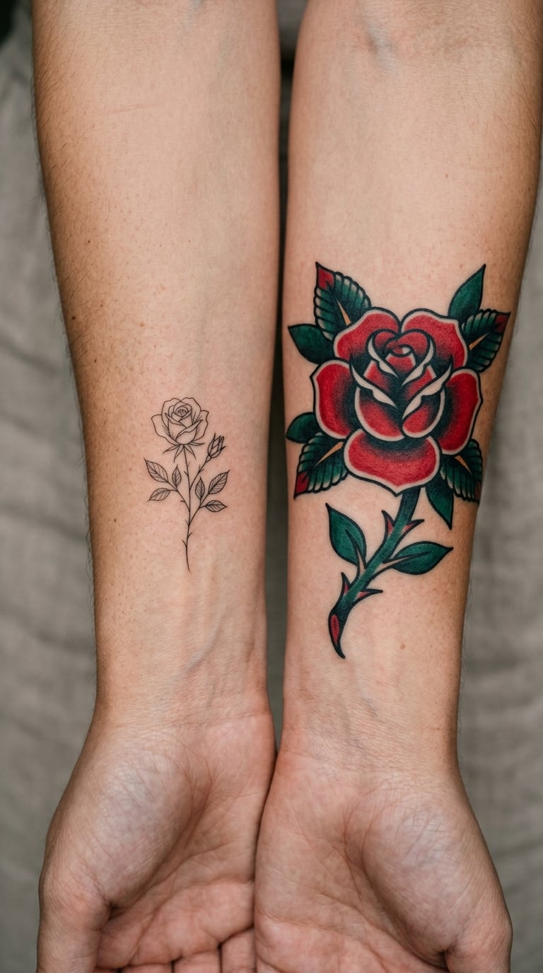
1. American Traditional (Old School)
Every line is heavy, usually two to three times wider than a fine-line stroke, and the color goes down as flat saturated blocks rather than blended transitions. Shading exists, but it is a small supporting element instead of the main event. That means even if the softer tones wash out over twenty years, the design still reads as a rose, a dagger, a swallow.
Because the outlines carry the whole image, most of the aging shows up as a slight thickening and softening of the black. Reviewers with bold traditional work report it still looking crisp decades later, and that pattern holds up in person as much as in photos.
Best placement is the outer upper arm, forearm, or thigh, where skin moves as one surface. Upkeep is minimal, mostly sun protection.
2. Neo-Traditional
Neo-traditional is the descendant of traditional work with softer contrast, more illustrative shading, and a wider color range including muted and pastel-adjacent tones. It still has the bold outline, which is what saves it, but the interior detail is where aging shows.
Expect the line work to hold for decades and the inner shading to lose some definition first. On a large piece that reads as patina. On a small one it reads as a blur, so scale matters more here than in straight traditional work.
Upper arm and back give the piece enough surface for the detail to survive.
3. Japanese Traditional (Irezumi)
Irezumi is designed to cover large areas of the body in a single composition, usually with a thick outer contour, a defined background, and a limited set of strong pigments. The design was historically built to be read from a distance, which is exactly the quality that makes it durable.
Wrapping a body in black can soften over time and lift a little, but the composition survives because it never depended on hairline detail. Plenty of people plan a full back piece across multiple sessions over years, and each session has to blend into the last one without the seam showing.
Back, thigh, and full sleeves are its natural homes.
4. Heavy Blackwork
Solid black fills and confident line work, usually with no color at all. Black pigment is the most stable color in tattooing, and large filled areas have enormous ink mass, so a blackwork piece is the least likely style to look faded at any point in its life.
The tradeoff is different from fading. As skin ages, black fills can soften at the edges and the negative space between elements tightens or loosens depending on the body. A design with generous breathing room ages better than one that packs tiny gaps between shapes.
Torso, limbs, and large panels suit it. This is a good choice if you want something that still looks deliberate in forty years.
5. Tribal
Black, bold, and mostly filled, with shape doing all the work instead of shading. There is very little for the design to lose, which is why this style has survived in some form for centuries in various cultural traditions.
What to look for is line weight in the repeating elements. Thin tribal line work on an inner forearm wears down faster than broad filled bands on an upper arm. For cultural work, go to an artist who works within that specific tradition rather than borrowing the visual language for a generic band.
Arm, calf, and back placements work best. Ask to see healed examples at that size.
6. Black and Grey Realism
Portrait work in greyscale, which removes the color-fade variable entirely and leaves one problem: contrast. A portrait with strong dark values and a clear subject line holds together far longer than one built on soft mid-tones and delicate transitions.
Realism owners worry about exactly this, and the honest answer is that fine shading does blur. Over decades, adjacent grey tones merge and a nose can start to look like a smudge. Bigger pieces with a wider tonal range tolerate the change better than small ones.
Forearm, thigh, and ribs give the piece room. Ask your artist how they plan to protect the lightest values.
7. Geometric
Straight lines, curves, and repeated shapes. Geometry is one of the more durable styles at larger sizes because the shapes are large, the lines are usually medium to bold, and the composition reads as an overall pattern rather than a set of small details.
It is less forgiving at small scale. A geometric mandala done at two inches is mostly line and negative space, and both get harder as the design gets smaller. The intricate dot-and-grid styles get worse because the whole design is made of small repeats.
Forearm and upper arm placements give straight edges to follow the limb.
8. Ornamental
Ornamental work borrows from lace, mandala, filigree, and jewelry forms, and it is usually black line with some color. The line work is fine, but it is dense and repetitive, which helps: many similar elements mean the loss of a few is not obvious.
The risk is scale. Ornamental pieces that are fitted to the body, following ribs or hips, tend to age better because the design has room. A squeezed version on an inner forearm does not. If you like this style, our side rib tattoo ideas for women are a good example of designs that were planned around body shape.
Thigh, back, and chest give the pattern space to breathe.
9. Dotwork
Dense fields of tiny dots forming shading, texture, or images. It looks extraordinary fresh and it is the most vulnerable style on this list. Every mark is a single-needle dot, which means there is no line weight holding a shape together.
Expect visible softening within a decade and real loss of definition over thirty. That is not a failure of the artist; it is the nature of the technique. If you want dotwork, go large. A full forearm of dots is a different proposition from a two-inch piece of dot shading.
Forearm and calf. Skip the hands.
10. Lettermarks and Script
A name, a date, or a word in a flowing hand. Script is thin by nature, and the letter joins are the weak points. A cursive word is really dozens of small connections, and each one is a spot where the design can break.
Wrist placement makes it worse. The inner wrist moves constantly, flexes with the hand, and sees more abrasion from daily life. Plenty of people get a fingerprint or a first name on an inner wrist and regret the placement more than the style. Block lettering at a larger size, placed on the outer forearm, is the durable version of the same idea.
Avoid fingers, hands, and inner arms for anything you want to keep legible.
11. Illustrative Realism
Detailed scenes with a strong concept, usually rendered with fine line and soft shading. The concept is the reason to get it, and that is also the aging risk, because the concept depends on small details reading correctly.
Over time, a shaded cheek, a fold of fabric, or a distant background element loses its edge. Bigger pieces survive this better than small ones, and a strong outline around the main subject buys a lot of extra years. Artists who specialize in this style know it and will tell you at consultation which elements they would simplify for longevity.
Give it a large flat area. Thigh, back, and upper arm are the usual choices.
12. Minimalist Symbol
A single bold shape or mark with no interior detail. It looks like the easy option and it is the most reliable one. One thick outline, optionally with a solid fill, has nothing to blur and nothing to lose.
The only real constraint is size. A minimalist symbol at two inches or larger holds for decades. The same symbol at half an inch is effectively a fine-line tattoo, and fine-line aging rules apply. If your favorite mark is tiny, scale it up before you commit and let the artist redraw the line weight for the larger size.
Forearm, upper arm, chest, or back. Almost anywhere except high-movement spots.
What Makes One Tattoo Style Age Better Than Another?
Understanding the mechanism makes the style list less arbitrary. Four variables do most of the work: line weight, contrast, ink mass, and where the design sits on your body.
Why the top tattoo styles age the best
Line weight is the biggest single factor. Ink settles into the dermis over time and the body gradually pushes it deeper and outward, so every line spreads a little. A line that started thick has somewhere to go. A hairline line spreads into nothing.
Contrast is the second. A design that reads as shape against empty skin stays readable when both the line and the background shift. A design that reads as a difference between two similar greys loses that difference as the greys converge.
What the 1/3 rule actually means
The tattooing guideline of the 1/3 rule says a design should be drawn roughly a third larger than the finished size you want on the body. Line spread takes care of the rest. Artists talk about it constantly because it is the practical answer to a design looking too small or too timid once it is healed.
It applies most when a piece is detailed. A bold symbol needs very little compensation. A reference image copied at exactly the size it appears on a screen will always look small on skin.
What 10, 20 and 30 years does to a design
At around the ten-year mark, healthy tattoos mostly look like themselves. Slight softening of the finest details and some color lightening are normal and mostly invisible day to day.
By twenty years, skin texture starts interacting with the ink. Stretch marks, sun damage, and collagen loss all change the surface the pigment sits in, and the difference between a twenty-year-old forearm and a twenty-year-old upper arm is dramatic.
By thirty years and beyond, the split is obvious. High-contrast pieces in lower-exposure placements still look deliberate. Low-contrast, thin, high-wear pieces have blurred into their background. Color owners report pieces going patchy without any single obvious failure point, just uneven pigment dropout across the design.
Which Placement Helps a Tattoo Keep Its Shape?
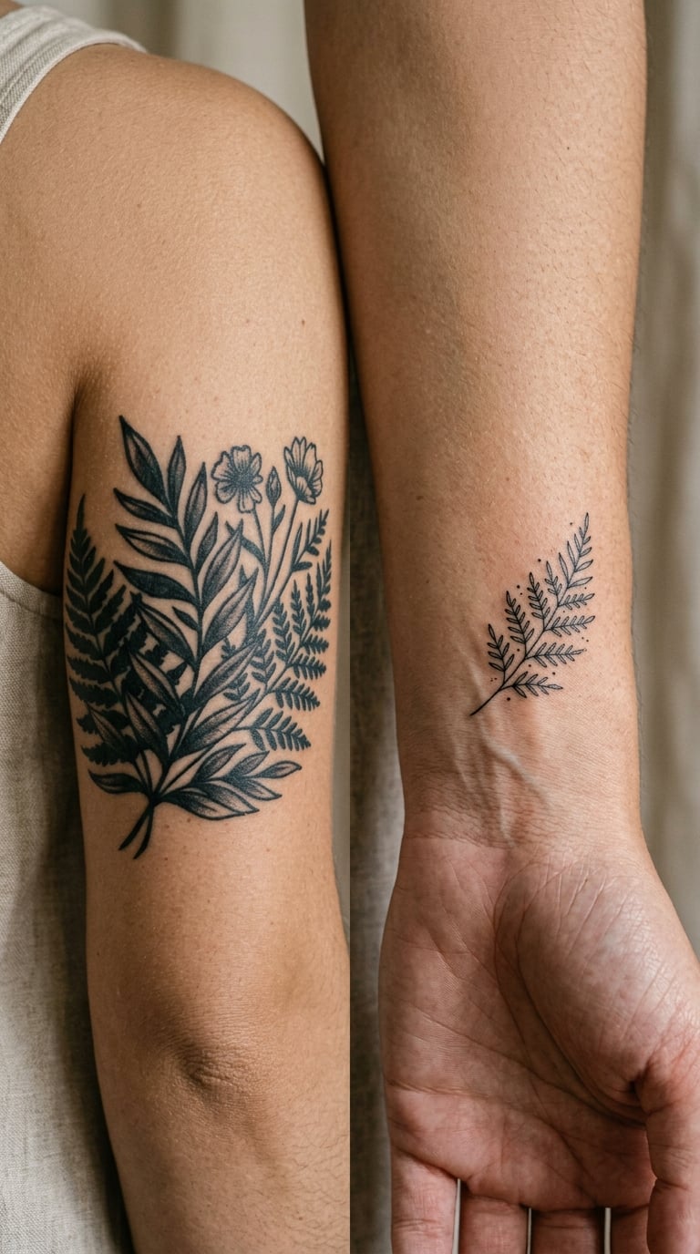
Placement decides how much work your skin does on the design. Flat-ish, protected, low-sun areas wear slowly. Areas that bend, rub, get washed forty times a day, or sit in direct sun all year wear fast.
| Placement | Aging Speed | Best For | Avoid If |
|---|---|---|---|
| Outer upper arm | Slow | Bold traditional, blackwork, large pieces | You want visibility in cold weather |
| Outer forearm | Slow to moderate | Script, geometry, small-to-medium work | Nothing really, it is versatile |
| Upper back | Slow | Irezumi, large illustrative pieces | You want to show it off |
| Chest and sternum | Moderate | Bold medium-scale work | Fine detail you want preserved |
| Thigh | Slow | Ornamental, realism, large line work | Nothing, lots of room |
| Inner wrist | Fast | Small, simple, sentimental pieces | You want the words to stay readable |
| Fingers and hands | Very fast | Wearing a faded one is part of the charm | You care how it looks in ten years |
| Collarbone | Fast | Simple bold shapes | Fine detail or long thin lines |
| Feet, ankles, ribs edge | Fast to moderate | Small simple motifs | Detail that must stay crisp |
| Face and neck | Very fast | Nothing permanent, if you are honest | You want it to look the same in 20 years |
Sun exposure is the other half. A forearm is always out. A design on an outer arm still gets hundreds of hours of direct sun a year for most people, and that is the single biggest controllable factor.
Pain levels by placement
Everyone reads this table differently, so treat it as a rough map rather than a promise.
| Pain Level | Typical Areas | Notes |
|---|---|---|
| Low | Outer upper arm, forearm, thigh, calf | Most first-tattoo territory for a reason |
| Moderate | Shoulder, upper back, calf, chest | Bone proximity makes it sharper and shorter |
| Moderate to high | Collarbone, ribs, sternum, ankle, inner thigh | Thin skin over bone or nerve clusters |
| High | Inner wrist, hands, fingers, neck, spine, armpit | Most fine-line wrist and finger work happens here |
Do Black, Grey and Color Tattoos Fade Differently?
They fade very differently, and the pattern is consistent enough that you can plan around it. In rough order of fade resistance: black, then red and orange, then blue and green, then yellow, then white.
Black holds because it is the darkest, most saturated pigment and because thick fills carry a lot of ink mass. It does not stay jet black forever. It typically shifts toward a softer charcoal or slightly blue-grey as it sits in the dermis, which is the normal look of a well-healed black fill.
Red and orange are next, and they are the color tattoo owners notice first. They are also the colors most associated with patchiness, because a red that fades unevenly across a large area reads as blotches rather than as a lighter version of itself.
Blue and green sit in the middle. Deep navy holds better than a pastel mint, and a forest green holds better than a bright lime, because saturation is doing the work in every case.
Yellow fades badly, and so does anything built on it. The same goes for pale peach, blush, and lavender. These are light pigments, and light pigments carry less pigment per area.
White ink is the most exposed. It is the color most often used for highlights, and those highlights disappear first, leaving the piece with holes in it. On r/tattooadvice and r/agedtattoos, white ink vanishing under sun exposure is one of the most consistent reports, and it is why experienced artists treat white as a decorative accent rather than a structural element.
Grey wash behaves differently from color because it depends on value range. A black and grey piece with deep blacks and clean whites holds together far longer than a soft low-contrast wash.
How Do You Tell When an Old Tattoo Needs Attention?
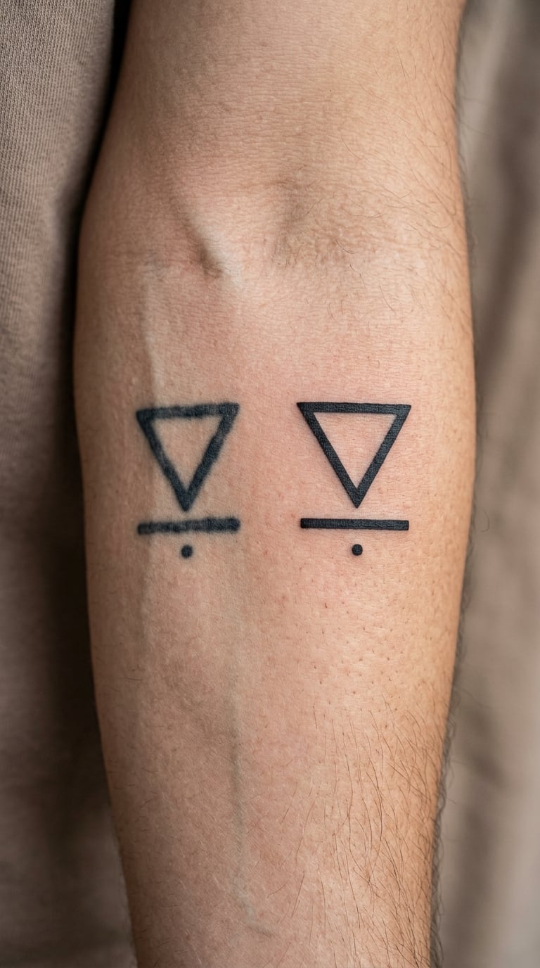
Some change is normal. Every tattoo softens and every tattoo’s color shifts. The question is whether it has moved past normal into something you would want an artist to look at.
Signs that a piece could use a professional review include outlines that have spread enough to merge with the shading next to them, fine interior detail that has turned into a grey area, and patchy color where a large fill has dropped out unevenly rather than lightening evenly.
Another sign is a design that no longer suits its placement. Weight changes, muscle changes, and skin aging can leave a piece stretched or compressed in a way that reads badly even if the ink is holding up.
A tattoo that has been healed for a few years and looks noticeably lighter and flatter than it used to is worth bringing to a consultation. So is one with a healed highlight that has become a hole in the design. An artist can tell you whether a touch-up is realistic or whether a small redesign would serve better.
One more practical check: look at the artist’s healed work rather than fresh work. A fresh tattoo photographed under studio light looks sharper and more saturated than it will ever be again, so judging a style from a fresh portfolio photo tells you almost nothing about how it will hold up.
How Much Do Long-Lasting Tattoo Designs Cost?
Rates change by region, by artist, and by shop minimum, so treat the ranges below as what you are likely to hear quoted in a US shop rather than fixed prices. What is genuinely useful is knowing what drives the number.
| Scale | Typical US Range | What It Covers | What Drives the Cost |
|---|---|---|---|
| Small, single subject | $150 to $400 | A simple symbol, a small botanical, a block word | Shop minimum and hourly rate, not detail |
| Medium | $500 to $1,500 | A forearm piece, a detailed single subject | Hours on the skin, level of detail, color count |
| Large | $1,500 to $4,000 | Thigh, back panel, half sleeve | Session length, staging, whether it needs two days |
| Sleeve scale | $4,000 to $10,000 and up | Full sleeve or full back piece | Total hours, sometimes built over months or years |
Hourly rate and shop minimum are the base. In many US studios an hourly rate runs $80 to $200, with a shop minimum of $150 to $300 that covers the smallest piece no matter how long it takes. Location matters too, and so does the artist’s experience with the specific style, which is a big factor in the price of large illustrative and realism work.
Detail is the most common surprise. Every interior element, every shading transition, and every additional color adds time. A bolder, simpler design costs less to tattoo and usually costs less to fix later.
Custom design work is a separate line item at many shops, either a drawing fee or a charge built into the session. Ask at consultation whether it is credited against the tattoo.
Touch-ups are a later expense, and the way to reduce them is a longevity-first design from the start. Fixing a blurred fine-line piece is far harder and far more expensive than filling in a faded solid black area, because a softened thin line has to be redesigned rather than simply darkened.
What Happens During Tattoo Healing and Aging?
What you see in the first two weeks is not what you keep. Every new tattoo looks sharper and more saturated than the finished piece will ever be, and the healing process is a large part of why.
| Stage | What Is Happening | What It Looks Like |
|---|---|---|
| Days 1 to 3 | Skin reaction, ink settles into the dermis | Redness, warmth, mild swelling, the piece looks bold |
| Days 4 to 7 | Surface skin begins to dry and peel | Flaking, scabbing, faded-looking and patchy |
| Week 2 to 3 | Peeling finishes, skin flattens | The design reappears, still brighter than final |
| Week 4 to 6 | Ink settles deeper, initial lightening passes | True color of the tattoo, less glow than day one |
| Month 3 to 6 | Pigment stabilizes, minor softening begins | Healed look, closest to the long-term result |
| Years 5 to 15 | Line spread, UV exposure, skin texture changes | Slightly softer edges, lighter color, fine detail first |
| Years 20 and beyond | Cumulative sun damage and skin aging | High contrast pieces still read clearly, low contrast do not |
Follow your artist’s aftercare instructions throughout. The week-2 flaking stage is where most people panic, and it is completely normal even when the tattoo looks worse than the day before.
How Do You Help a Tattoo Age Gracefully?
You cannot stop aging. You can slow the part of it that comes from neglect, and that is worth doing.
- Follow your artist’s aftercare instructions for the first weeks, including what they tell you to wash with and how long to keep it covered.
- Use broad-spectrum sunscreen on healed skin every day it is exposed. This is the highest-impact thing you can do after healing is done.
- Cover new ink from intense sun until it has fully healed, and skip tanning beds and sunbeds entirely.
- Avoid harsh skin treatments over the tattoo, including strong chemical peels, lasers used on the surrounding skin, and aggressive microdermabrasion.
- Do not scrub or soak a healing tattoo and do not pick at flaking skin. Both pull ink out of the dermis.
- Ask an artist about a touch-up when something drifts rather than waiting for a piece to become something you regret.
There is nothing wrong with letting a tattoo fade. Plenty of people love a soft, worn piece. This is about making an informed choice rather than assuming the ink stays exactly as it looked on day one.
Mistakes to Avoid
Choosing a very thin design for a high-wear area. A hairline script on an inner wrist is the classic combination that disappoints. The wrist flexes, the skin rubs, and the line was already thin.
Copying a small reference at exactly the size it appears on screen. Screens are flat and bright. Skin is curved, textured, and darker. The 1/3 rule exists for this reason.
Placing meaningful detail over a joint. Elbows, knees, wrists, and ankles flex constantly. A design that has to stay legible should live somewhere still.
Building the whole design on a soft skin tone. Flesh-toned and nude inks are among the least durable, and they disappear into the skin in a way that leaves a vague outline nobody can quite place.
Ignoring aftercare in the first two weeks. This is the only period where behavior genuinely affects the result rather than just the pace of fading.
Healing skin in direct sun. Fresh ink plus UV exposure in the first weeks is the fastest way to lose contrast you paid for.
Expecting every touch-up to be identical. An artist working over a faded piece is doing something closer to a redesign. Expect the result to sit slightly differently from the original.
Judging an artist by fresh photos only. Ask to see healed work, months or years old, in daylight if possible. That is the only honest sample of how their tattooing looks over time.
Frequently Asked Questions
What is the most long-lasting tattoo style?
American Traditional is the most long-lasting style. It uses thick black outlines and solid color packing, so the design has a large amount of ink mass and hard edges holding the image together. Japanese traditional (irezumi), heavy blackwork, and tribal work run close behind. All of them age gracefully because they were never dependent on hairline detail.
Which tattoo colors fade the least over time?
Black fades the least, followed by red and orange, then blue and green, then yellow, and white ink fades fastest. Dark, saturated pigments hold their color much better than pale ones. White ink is usually placed as a highlight, and those highlights disappear first under UV exposure, leaving visible holes in the design.
Do fine-line tattoos always blur with age?
They are more likely to blur, but not always. Line spread is gradual, and a fine-line piece that sits in a protected placement with careful sun protection can stay legible for many years. The ones that soften fastest are small designs on fingers, hands, inner wrists, or anywhere with heavy sun and friction. Bigger, bolder line work on the outer arm holds much longer.
Where should I place a tattoo if I want it to age well?
Pick outer upper arm, outer forearm, upper back, thigh, or calf. These are flatter, less sun-exposed, and rub against clothing less than hands, fingers, inner wrists, collarbones, or the face. Placement is a bigger longevity factor than most people expect, and it costs nothing to choose well before the work starts.
How often should an old tattoo be touched up?
There is no fixed schedule, because UV exposure, placement, and skin type vary so much. Most people look at a piece once a year or two and touch up when outlines have visibly spread, fine detail has merged, or color has gone patchy. Some pieces never need it. Your artist can judge what is actually changing rather than guessing from a photo.
Final Take: Choose Structure Before Trend
The order of decisions matters more than any single choice. Get the structure right first, then line weight, then placement, then aftercare. A trend is the least important input of the four.
For a first tattoo that you want to still like at 60, go bold. A minimalist symbol at a real size, or traditional-inspired work with thick outlines and saturated color, will hold up better than anything delicate you can think of. It costs less to tattoo, it costs less to fix, and it reads as intentional at any age.
If you are building a collection, you have more room. Illustrative and blackwork styles give you scale and density to work with, and they reward an artist with real skill. Just keep the same rule: no design that depends on hairline detail for its meaning.
Whichever way you go, decide what tattoo styles age the best for your placement and your own taste before you sit down. The design outlives the trend, the season, and honestly most of the reasons you got it in the first place.