
20 One Line Quote Tattoo Ideas for Minimalists (October 2026)
A one line quote tattoo is a short phrase set in a single unbroken line of lettering, usually fine-line script or clean small print, placed somewhere quiet on the body. It carries a sentence you read every day while staying small enough to disappear under a sleeve.
These 20 one line quote tattoo ideas were picked for one job: staying readable on skin. Every entry gives you the phrase, the type treatment, a real width in inches, an honest pain rating and one way to make it personal. If you want the wider gallery first, our fine line tattoo ideas and simple line art tattoos roundups cover the non-typographic side of minimal ink.
20 One Line Quote Tattoo Ideas: Quick Guide
| Idea | Style | Best placement | Size | Pain |
|---|---|---|---|---|
| 1. Begin Again | Loose script | Behind the ear | 1.5-2.5 inch | Medium |
| 2. Stay Soft | Upright serif | Inner wrist | 1.5-2.25 inch | Medium |
| 3. Grow Quietly | Hand-lettered script | Inner forearm | 2-3.5 inch | Low to medium |
| 4. Choose Joy | Clean sans serif | Collarbone | 1.5-2.25 inch | Low to medium |
| 5. Fearless | Condensed lettering | Inner bicep | 1.25-2 inch | Low |
| 6. Forward | Stamped capitals | Side of upper rib | 1.75-2.75 inch | Medium to high |
| 7. Not Finished | Micro script | Side of finger | 1-1.5 inch | High |
| 8. Almost There | Modern sans | Above inner elbow | 2-3 inch | Medium |
| 9. Make Room | Italic serif | Top of shoulder | 2-3.5 inch | Low to medium |
| 10. Keep Going | Lowercase minimal | Upper sternum | 1.75-2.5 inch | Medium to high |
| 11. Home Within | Fine line with underline | Inner upper arm | 2-3 inch | Low to medium |
| 12. Beginnings | Restrained serif | Outer ankle | 1.5-2.25 inch | Medium |
| 13. Less, but Better | Compact serif caps | Inner wrist | 2-3 inch | Medium |
| 14. Bloom | Fine-line botanical | Upper arm | 1.75-3 inch | Low to medium |
| 15. Protect Your Peace | Clean lowercase | Between shoulder blades | 2.5-4 inch | Medium to high |
| 16. Trust Timing | Restrained italic | Collarbone | 2-3.25 inch | Low to medium |
| 17. Stay Curious | Upright narrow sans | Side of upper arm | 1.75-2.75 inch | Low to medium |
| 18. Still Becoming | Fine hand lettering | Back of the hand | 2-3 inch | Medium to high |
| 19. This Is Your Sign | Simple modern type | Outer hip | 2.5-3.5 inch | Low to medium |
| 20. Light Takes the Long Way | Flowing calligraphy | Upper back | 3-4.5 inch | Medium to high |
1. Fine-Line “Begin Again” Behind the Ear
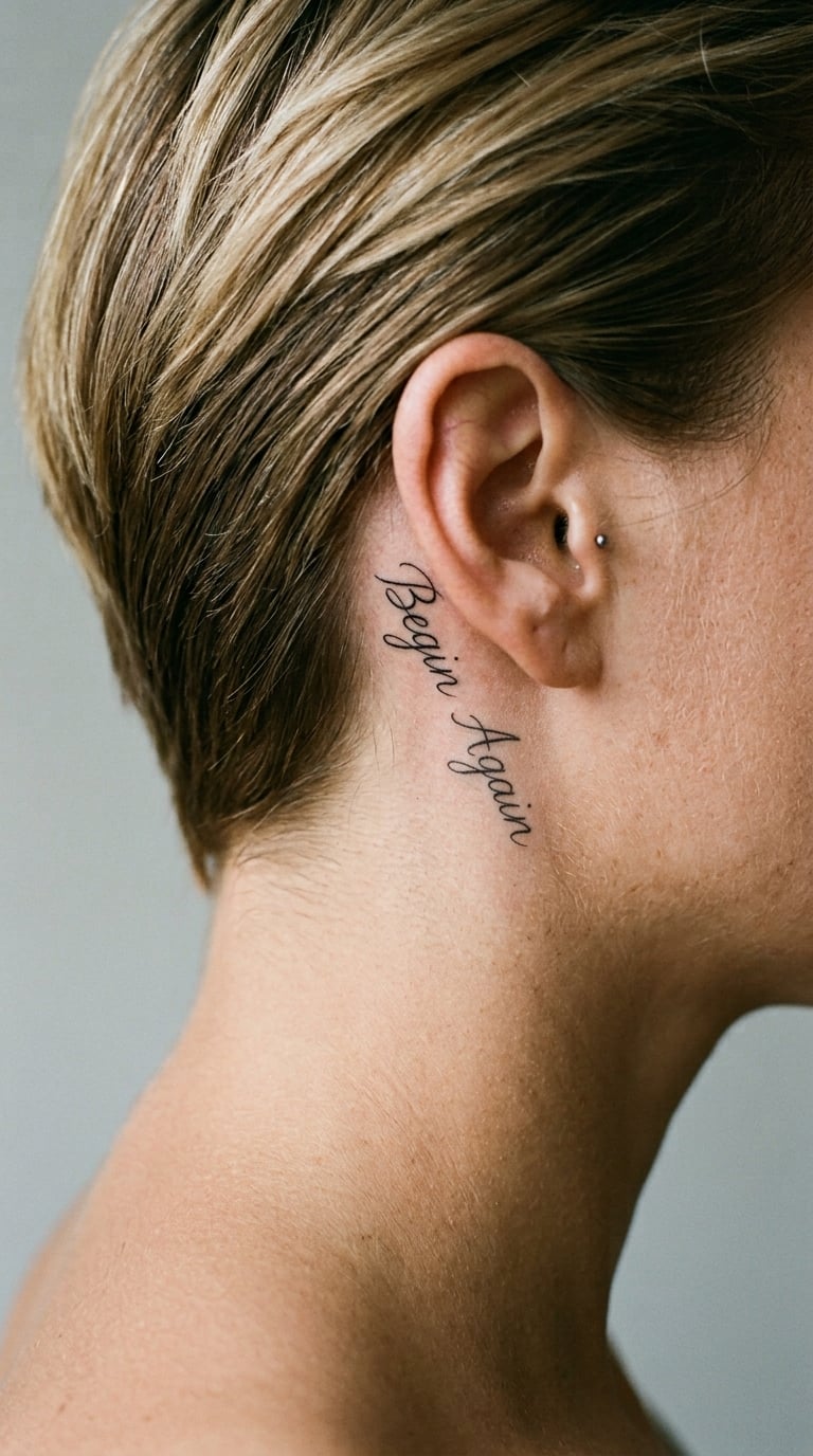
“Begin Again” works because it is a decision rather than a slogan. People usually pick it after a chapter ends, and they like that it stays quiet until they need it.
The lettering is loose script, drawn with a single hairline stroke per word, slightly rising toward the end. Nothing else goes in the frame, no frame, no arrow, no underline.
Placement: Behind the ear, along the curve where the ear meets the skull, or on the neck just under the jaw. Size: 1.5-2.5 inch wide. Style: fine line, black ink. Pain: medium, thinner skin than the forearm and a spot people will notice you are nervous about.
Skin behind the ear is thin and moves with the jaw, and fine lines there fade earlier than they do on the forearm. Book a touch-up window with the artist.
Make it yours: Copy the phrase out of a notebook or a voice note in the handwriting of whoever handed you the line.
2. Minimal “Stay Soft” on the Inner Wrist
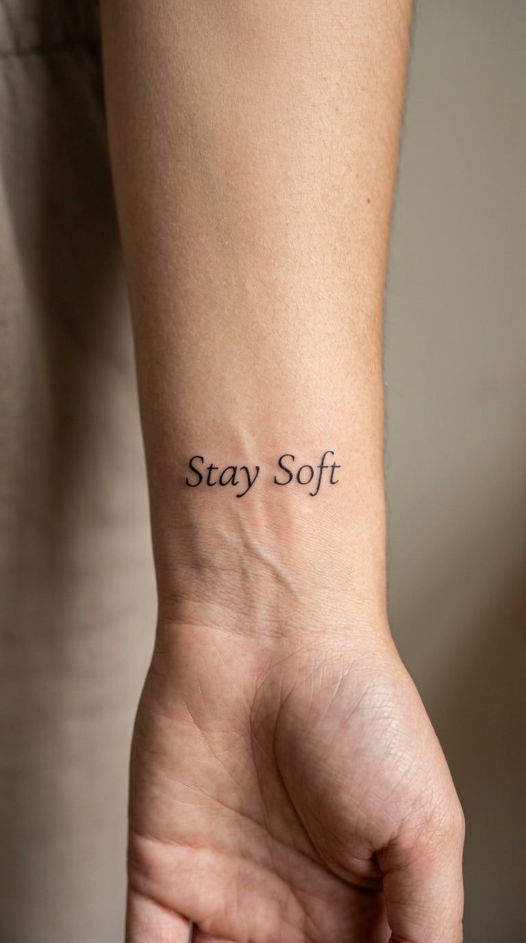
“Stay soft” is the one people describe as a daily reminder rather than a promise to anyone else. It carries no fixed symbolism, so the meaning stays personal.
Set it in small upright serif lettering, thin strokes, generous space between the two words. The restraint is the whole point.
Placement: Inner wrist, running along the forearm side. Size: 1.5-2.25 inch wide. Style: minimalist linework. Pain: medium, and the wrist has veins, bone and a lot of nerve endings close together.
Wrist lines have to follow the contours of the arm rather than sit flat across it, so a good letterer adjusts spacing letter by letter. Expect to turn your arm during the session so the artist can work from several angles.
Make it yours: Use a single thin ampersand instead of a space, or drop the capital so the whole line reads as one breath.
3. Handwritten “Grow Quietly” on the Forearm
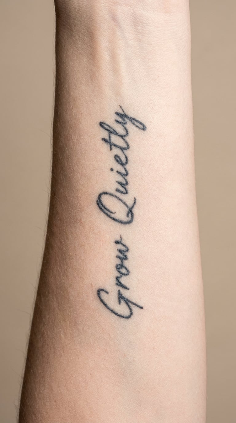
“Grow quietly” suits people who dislike loud statements. The intention is slow, private progress, and the design is usually read as a quiet instruction rather than a declaration.
Relaxed hand lettering, uneven baseline, medium-weight strokes that hold their own. The small wobble is the charm, and it is what keeps this from looking like a printed font.
Placement: Inner or outer forearm, lengthwise so the line follows the arm. Size: 2-3.5 inch wide. Style: fine-line calligraphy. Pain: low to medium on the inner forearm, a bit higher over the elbow-side end.
Script needs more recovery time than block letters, so keep it off the fingers and hands where detail and ink spread together. A forearm gives the line room to breathe.
Make it yours: Add a thin line of small type underneath, or let one word carry a single colour accent while the rest stays black.
4. Tiny “Choose Joy” at the Collarbone
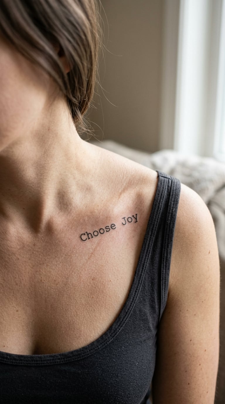
Two words, ten letters, done properly. “Choose joy” is a common first tattoo because the line is short enough to be readable but long enough to feel deliberate.
Clean sans serif, uniform stroke weight, wide letter spacing. No flourishes. It should look like it was set in a document, then placed on skin.
Placement: Collarbone, following the bone, either a few inches along it or centred just above the sternum notch. Size: 1.5-2.25 inch wide. Style: minimalist typography. Pain: low to medium, though skin over the bone is thinner than it looks.
The collarbone curves, so even spacing needs adjusting as the line moves, and hairline sans serif strokes lose width fastest here. Ask for a slightly heavier line weight if you want it to still read in a decade.
Make it yours: Add one small colour accent, a thin thread of red or blue through a single letter, and keep the wording exactly as it is.
5. One-Word “Fearless” on the Bicep
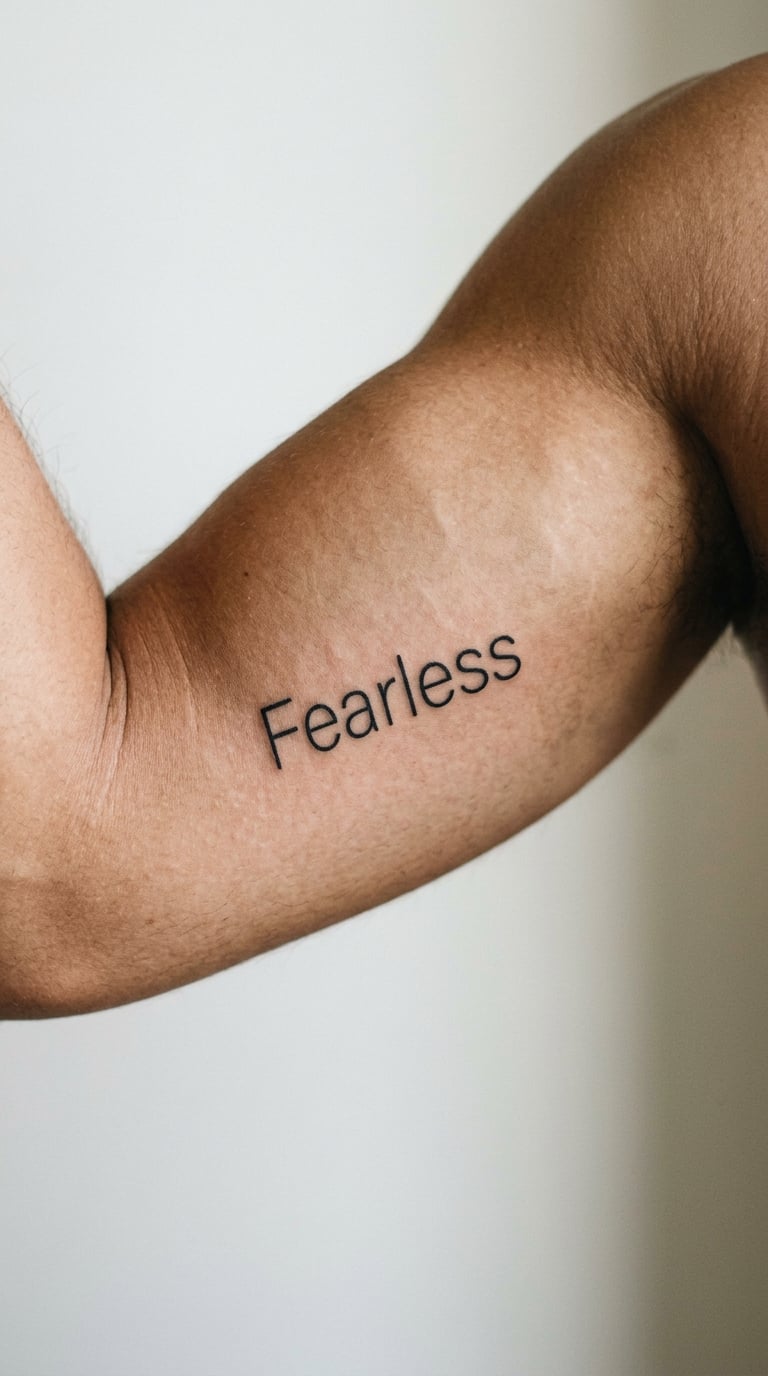
A single word with real confidence behind it, and nothing to explain. “Fearless” is chosen as a statement to read privately rather than one meant for other people to interpret.
Condensed black lettering, narrow and upright, one continuous horizontal line. Narrow type is the key to fitting eight letters without crowding.
Placement: Inner or outer bicep, where the muscle gives the line a flat field. Size: 1.25-2 inch wide. Style: minimalist or fine-line lettering. Pain: low, the softest spot on this list.
Arm movement changes the spacing in front of you, so the artist often works with the muscle relaxed and checks the line both bent and straight. A condensed font also ages better than a hairline script at this size.
Make it yours: Keep the word alone, or add a small companion symbol on the other arm, separate and clearly not part of the line.
6. Stamped “Forward” on the Side of the Rib
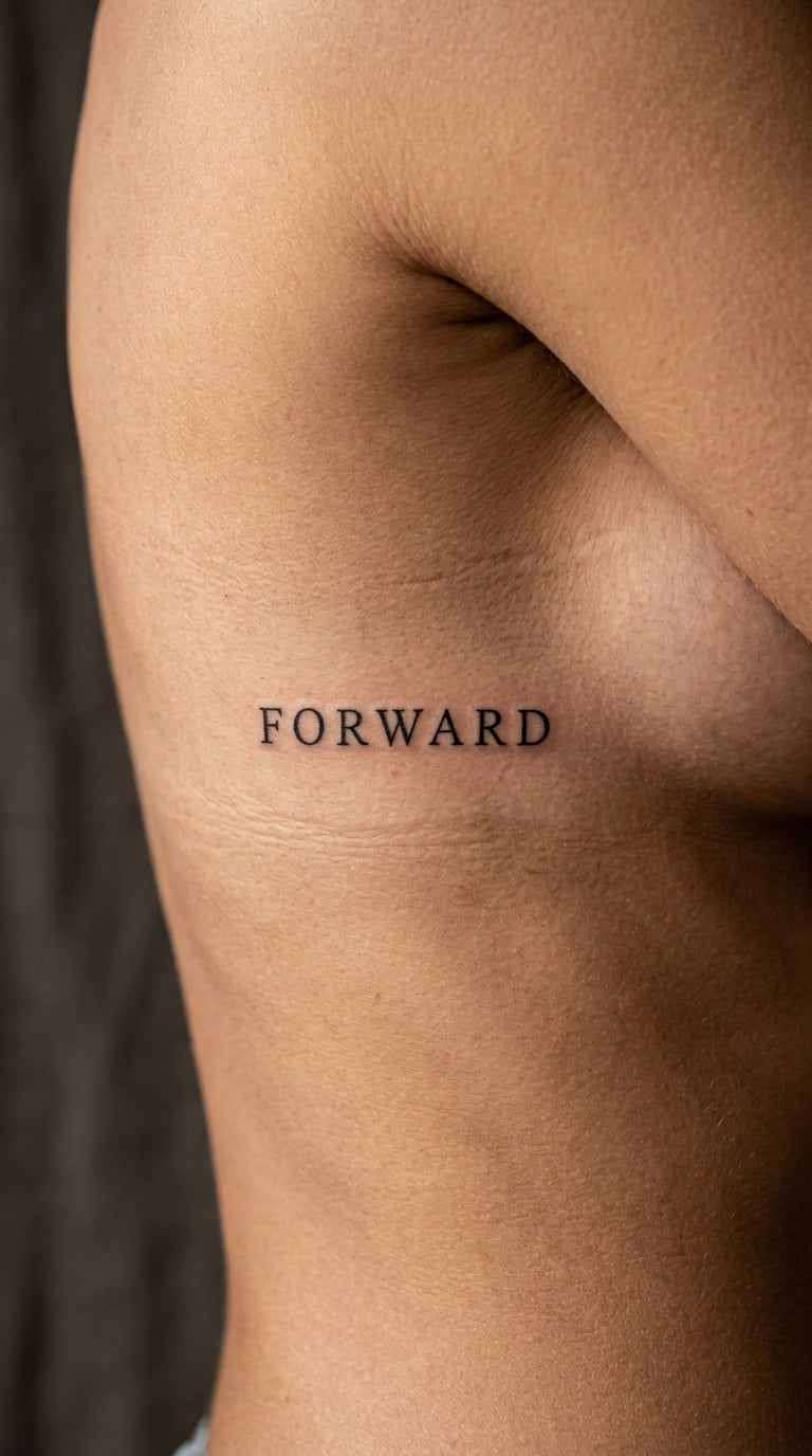
“Forward” reads as a directional intention, and the design has no agreed meaning beyond whatever the person carrying it brings to it.
Small capitals in a stamped style, evenly spaced, still laid out as one continuous horizontal line. Stamped lettering is a compromise between print and script, and it holds up well without a lot of ink weight.
Placement: Side of the upper rib or along the floating ribs, roughly level with the elbow. Size: 1.75-2.75 inch wide. Style: fine-line type. Pain: medium to high, ribs are bone over thin skin and breathing changes the surface constantly.
Every inhale stretches the skin, so a letterer will build in extra spacing to keep letters from colliding. That movement is also what breaks down tight spacing faster on ribs than on flatter areas.
Make it yours: Add a thin hairline rule after the word, no more, or place a matching shorter line just beneath it.
7. Micro-Script “Not Finished” on the Finger
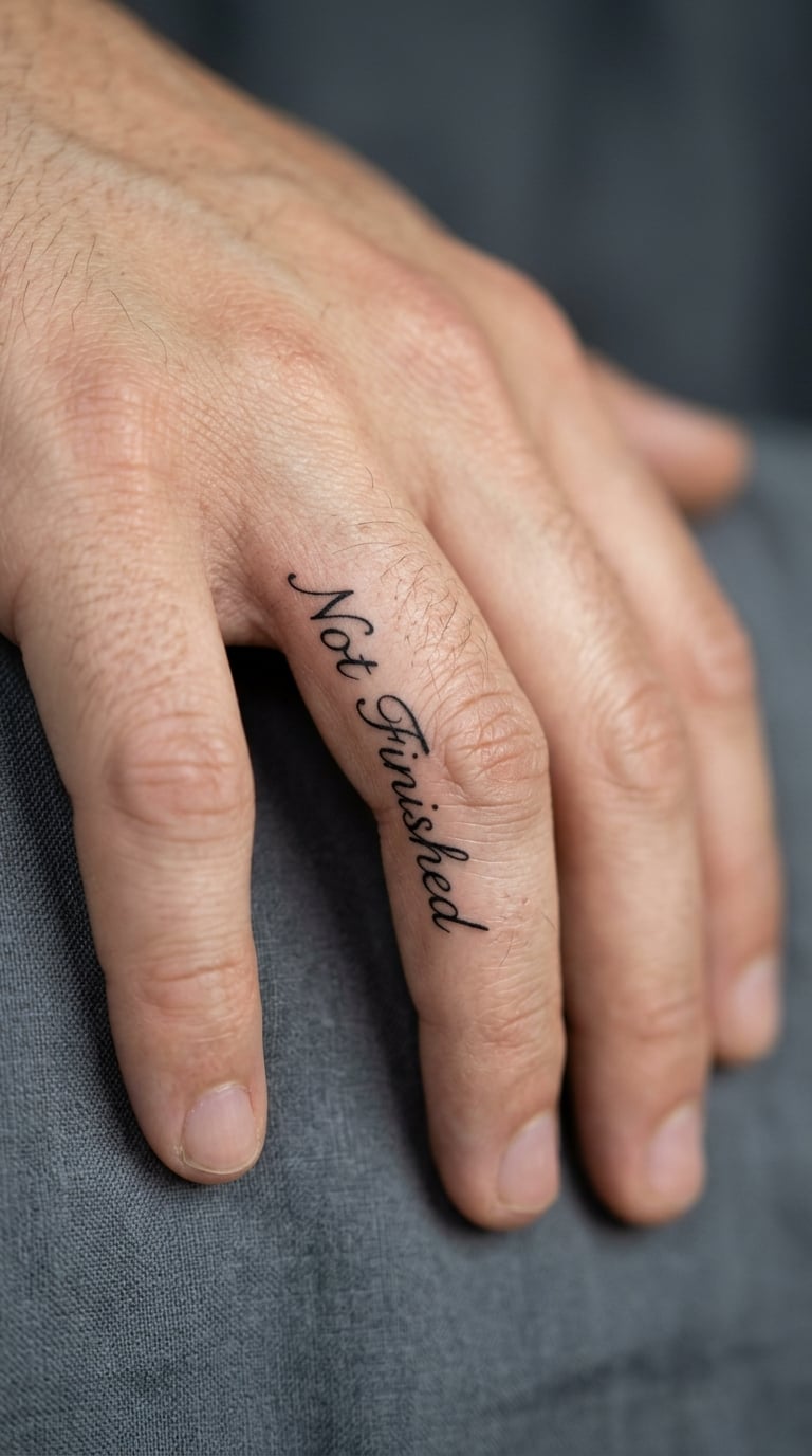
“Not finished” is an open-ended statement about ongoing growth rather than a fixed belief. People like it because it does not need a finish line to be true.
Tiny script, hairline weight, the letters following the curve of the finger. It is the smallest design on this list that still reads clearly, and it needs a steady hand to get right.
Placement: Side of one finger, usually the index or middle, along the flat between the joints. Size: 1-1.5 inch wide. Style: micro fine line. Pain: high, fingers are bone, nerve and tendon with almost no soft tissue between them.
Fingers fade faster than almost anywhere on the body, and knuckle movement stretches the skin, so a long phrase here blurs before it looks worn. Touch-ups are common and most people expect to need one.
Make it yours: Simplify to the single word “Not” in the same script, which gives the ink far more room to stay sharp.
8. Modern “Almost There” at the Elbow Crease
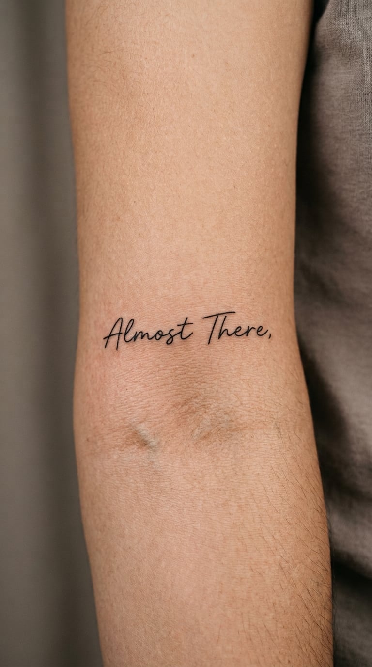
“Almost there” fits people drawn to persistence and to the unglamorous part of finishing something. It reads as encouragement aimed inward.
Spare modern lettering, upright, with wide spacing between the two words. The openness of the type keeps the design from feeling cramped near a joint.
Placement: Just above or below the inner elbow crease, on the flat area rather than directly in the fold. Size: 2-3 inch wide. Style: minimalist type. Pain: medium, the inner elbow is sensitive but the skin is flat and easy to work on.
The crease itself stretches and folds with every bend, so a line set inside it will blur faster and read badly when the arm is bent. Movement through small counters, the enclosed gaps in letters such as a or e, is what softens first here.
Make it yours: Set a small meaningful date in thin type underneath, placed on the outer arm where it will not be affected by bending.
9. Italic “Make Room” on the Shoulder
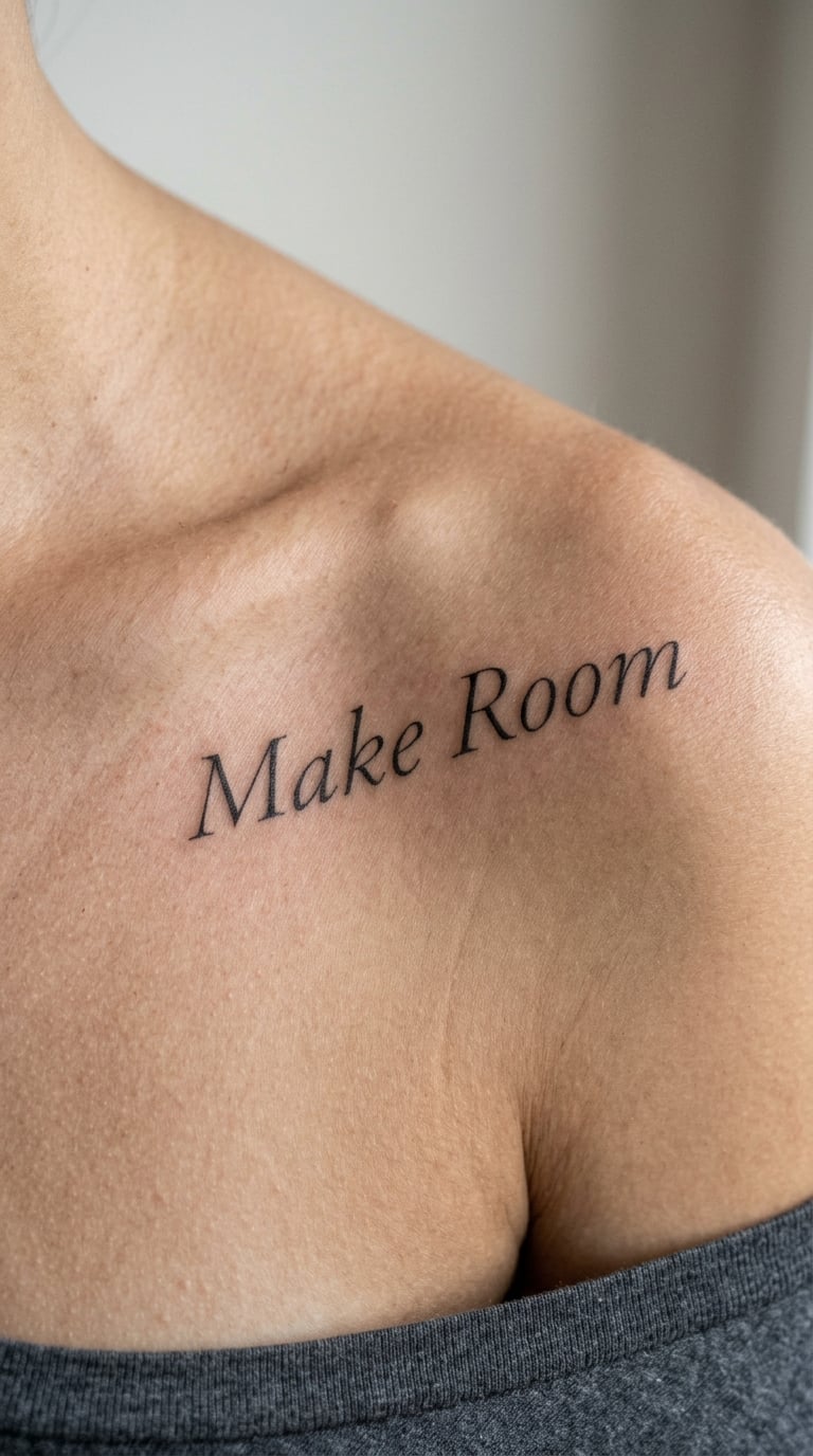
“Make room” can stand for space for priorities, for people, or for a change of pace. People who get it usually describe the same thing: clearing space on a full calendar.
A light italic serif, thin strokes, slanted letters that give the line a sense of movement without adding any ornament.
Placement: Top of the shoulder, collarbone, or upper arm near the shoulder head. Size: 2-3.5 inch wide. Style: fine-line typography. Pain: low to medium, and shoulder skin is forgiving even where it curves.
Curvature is the practical issue here. An italic line that looks straight on paper can sit unevenly across a shoulder, so a good artist widens the spacing to keep the baseline from dipping.
Make it yours: Add a small red or blue accent, a single thin line of colour along the underline stroke, and keep the two words unchanged.
10. Minimal “Keep Going” on the Sternum
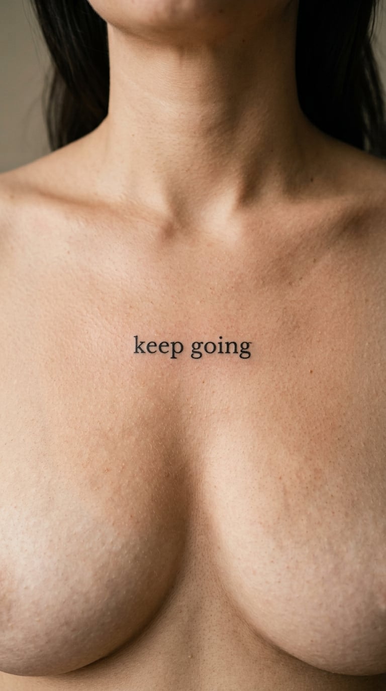
“Keep going” is a private encouragement, and the sternum is where people put the things they say to themselves. The pairing does most of the work.
Restrained lowercase lettering, uniform line weight, one horizontal line with even spacing. Nothing above it, nothing below.
Placement: Upper sternum between the collarbones, or just below the notch. Size: 1.75-2.5 inch wide. Style: minimalist. Pain: medium to high, the breastbone is shallow with very little cushion and every breath moves it.
Breathing movement means spacing gets built in during the session, and a line set too tight across the sternum will drift out of alignment as the skin stretches. Most people choose the placement once and never move it.
Make it yours: Pair it with a companion piece, a small symbol on the opposite forearm, so the two read as a pair without crowding the centre line.
11. Underlined “Home Within” on the Back of the Arm
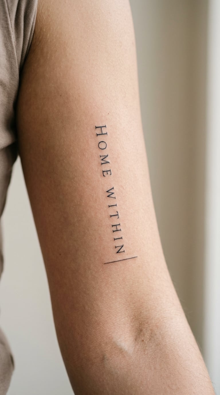
“Home within” is usually about inner security or belonging, and there is no single reading people agree on. That is part of why it holds up over time.
Fine line lettering with one hairline underline running beneath the two words. The underline adds rhythm without turning it into a two-line design.
Placement: Inner upper arm, set vertically from the bicep toward the elbow, or horizontally on the inner bicep. Size: 2-3 inch wide. Style: fine line. Pain: low to medium.
The thin underline is the element most likely to disappear first, since the lowest line weight on the design is the one that loses ink definition fastest. A slightly heavier rule helps it survive.
Make it yours: Extend the underline into a thin line running toward the elbow, stopping where it feels right to you.
12. One-Word “Beginnings” on the Ankle
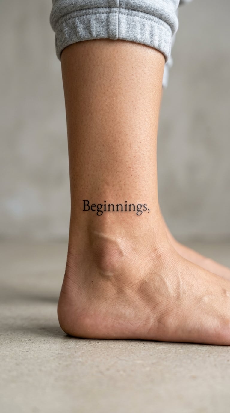
“Beginnings” is picked around a transition, a new job, a move, a first child. The word does the emotional work, so the design can stay spare.
A restrained serif, thin black strokes, tight but not cramped letter spacing. It should look settled, not delicate for its own sake.
Placement: Outer or inner ankle, a few inches above the bone, usually along the line of the Achilles or just above it. Size: 1.5-2.25 inch wide. Style: fine-line lettering. Pain: medium, and ankles swell, move and take a lot of impact.
Anything tiny on the foot or ankle softens noticeably over a few years, and footwear, sun and salt all work on it. Plan on a session that includes a conservative line weight, and a touch-up is common.
Make it yours: Add a birth date in tiny type below the word, or a single small colour mark in the colour you would want on any first day.
13. Compact “Less, but Better” on the Wrist
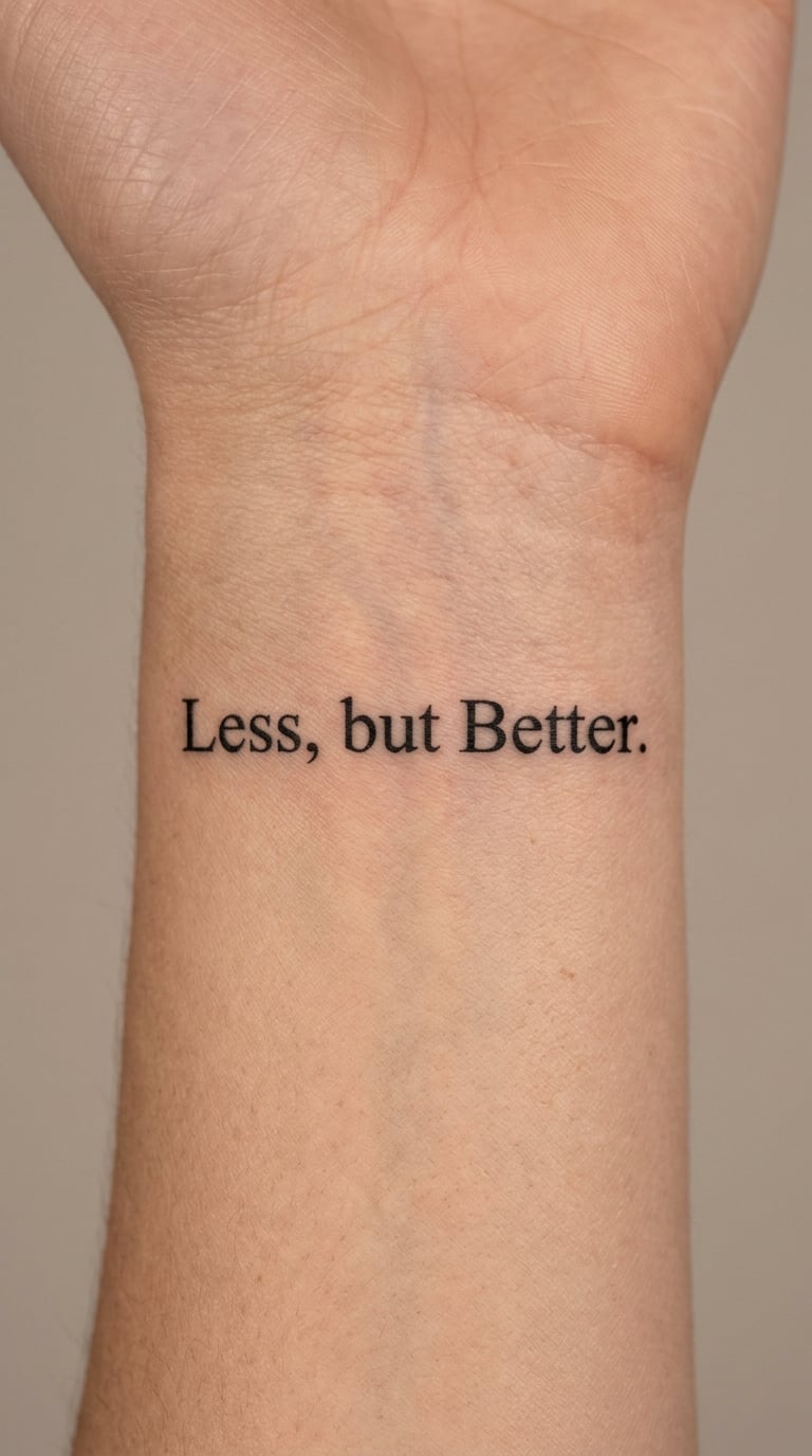
“Less, but better” is the most minimalist line on this list, and it works for people who like a rule they can actually follow. The comma gives it its pause.
Compact serif capitals in a single horizontal line, sized to hold together on a curved surface. The design is about restraint in the type, not about the line being small.
Placement: Inner wrist, set parallel to the forearm. Size: 2-3 inch wide. Style: minimalist typography. Pain: medium, same territory as any inner wrist piece.
Legibility is the real constraint. Compact capitals need enough width per letter to stay readable, and wrists are narrow and change shape noticeably with movement, so ask the artist to test the width before committing.
Make it yours: Try an alternative punctuation treatment, replacing the comma with a thin vertical line or a small gap, and see which version you read more easily.
14. Botanical “Bloom” on the Upper Arm
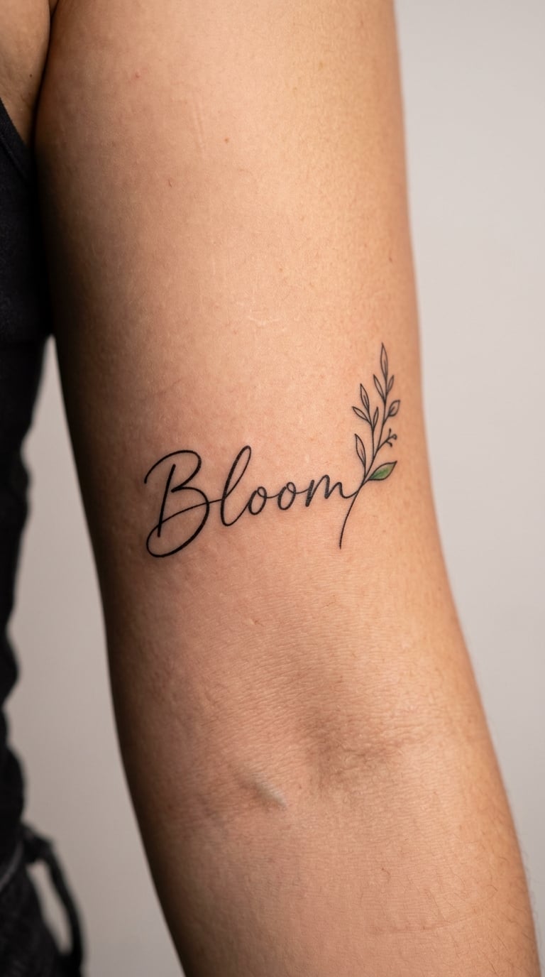
“Bloom” with a small stem is the one place on this list where a tiny illustration sits next to the words, and it still reads as a one line quote tattoo because the word comes first.
The botanical cue supports a personal association with growth, though it carries no fixed meaning on its own. The stem is drawn as a single fine line, one small leaf, nothing more.
Placement: Upper arm, inner or outer, in a flat field below the shoulder. Size: 1.75-3 inch wide. Style: fine-line botanical. Pain: low to medium.
Petal edges and the inside of a leaf are the first parts to soften, so small botanical detail ages before the lettering does. Keeping the stem simple and the word simple is what protects the whole piece.
Make it yours: Add a single colour accent, one small leaf filled in green or another tone, and leave the word in black.
15. Clean “Protect Your Peace” on the Back
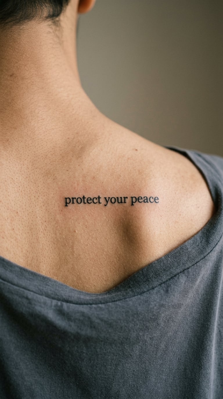
“Protect your peace” usually marks a boundary or a deliberate change in priorities. People say they wanted the sentence on their body rather than only in their head.
Clean lowercase type, one line, spaced so the words separate clearly at a distance. The length of the line is what makes this one different from the two-word designs.
Placement: Upper back, shoulder blade area or mid-back between the blades. Size: 2.5-4 inch wide. Style: minimalist lettering. Pain: medium to high, the back is a long session and the spine area is sensitive bone.
Placing across the spine means the line has to run over a curve that moves when you twist. Long type is harder to keep level there, so a horizontal line on the shoulder blade usually reads better than one centred on the spine.
Make it yours: Add a personal punctuation detail, a thin comma after the first word or a small period at the end, and use it as a marker for how you want the sentence said.
16. Elegant “Trust Timing” on the Collarbone
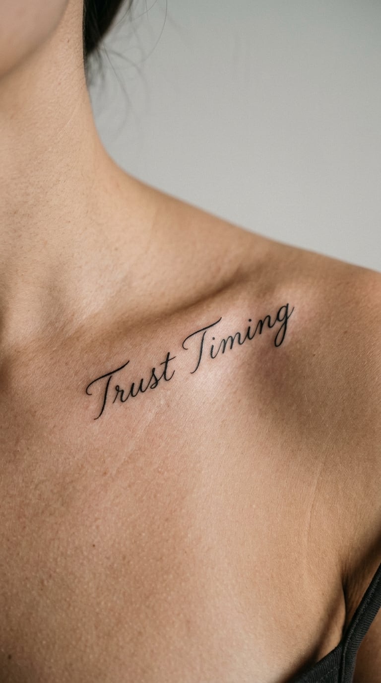
“Trust timing” sits around uncertainty rather than making a promise about an outcome. It is a way of describing patience, not a prediction.
Restrained italic lettering, thin and evenly spaced, the slant doing all the elegance work. This one asks for a light touch and a patient artist.
Placement: Collarbone, following the bone, or across the upper sternum. Size: 2-3.25 inch wide. Style: fine-line type. Pain: low to medium.
Collarbone curves mean the line needs extra spacing to stop italic letters leaning into each other. Thin italics also lose their hairline strokes sooner, so a slightly heavier weight is a sensible ask.
Make it yours: Add a small coordinating symbol, a thin arc or a single small point, as a personal detail that does not change the wording.
17. Upright “Stay Curious” on the Side of the Arm
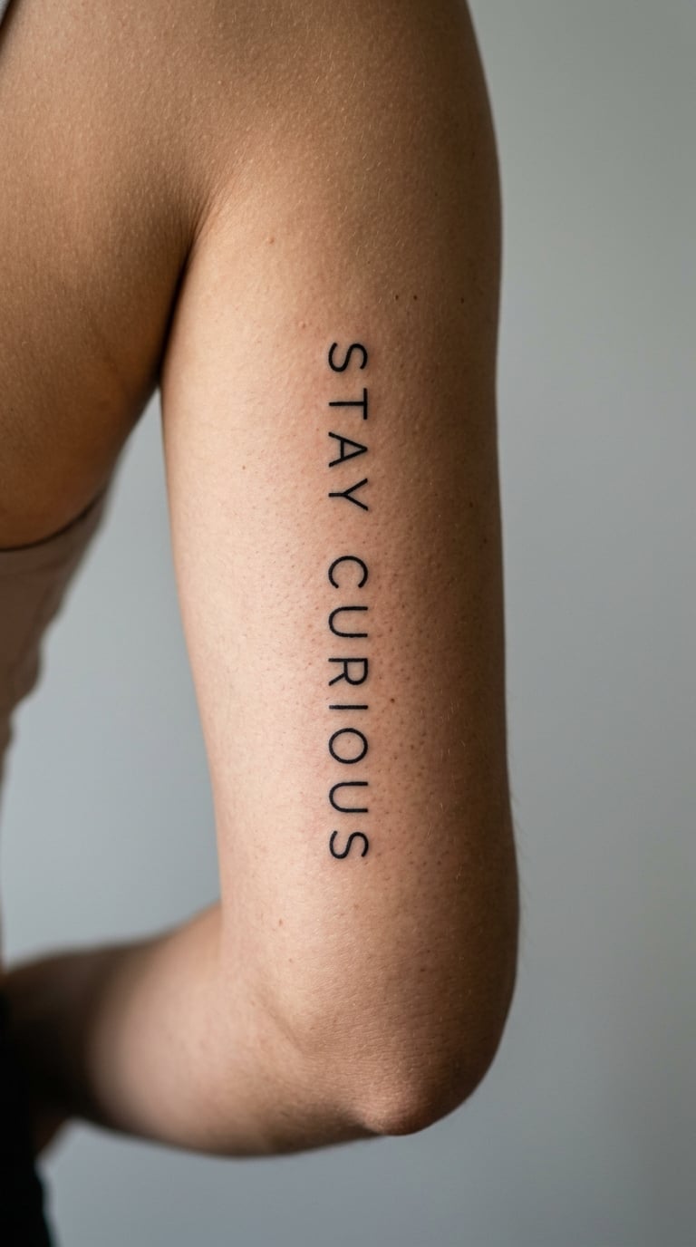
“Stay curious” is chosen for learning and openness rather than for a specific belief. It reads as a habit, and people often get it after changing direction.
Upright narrow sans serif, crisp edges, consistent stroke. Set vertically it uses a long thin space well and stays legible at a small size.
Placement: Inner arm, triceps area, or the forearm, vertical along the muscle. Size: 1.75-2.75 inch wide. Style: fine-line sans serif. Pain: low to medium.
Narrow letter widths need testing before the stencil goes on. Too narrow and the counters fill in with ink as the line heals, which is why a printed sample of the exact type is worth asking for.
Make it yours: Add a small colour accent or a tiny question mark at the end, kept in a single spot so the line itself stays quiet.
18. Delicate “Still Becoming” on the Hand
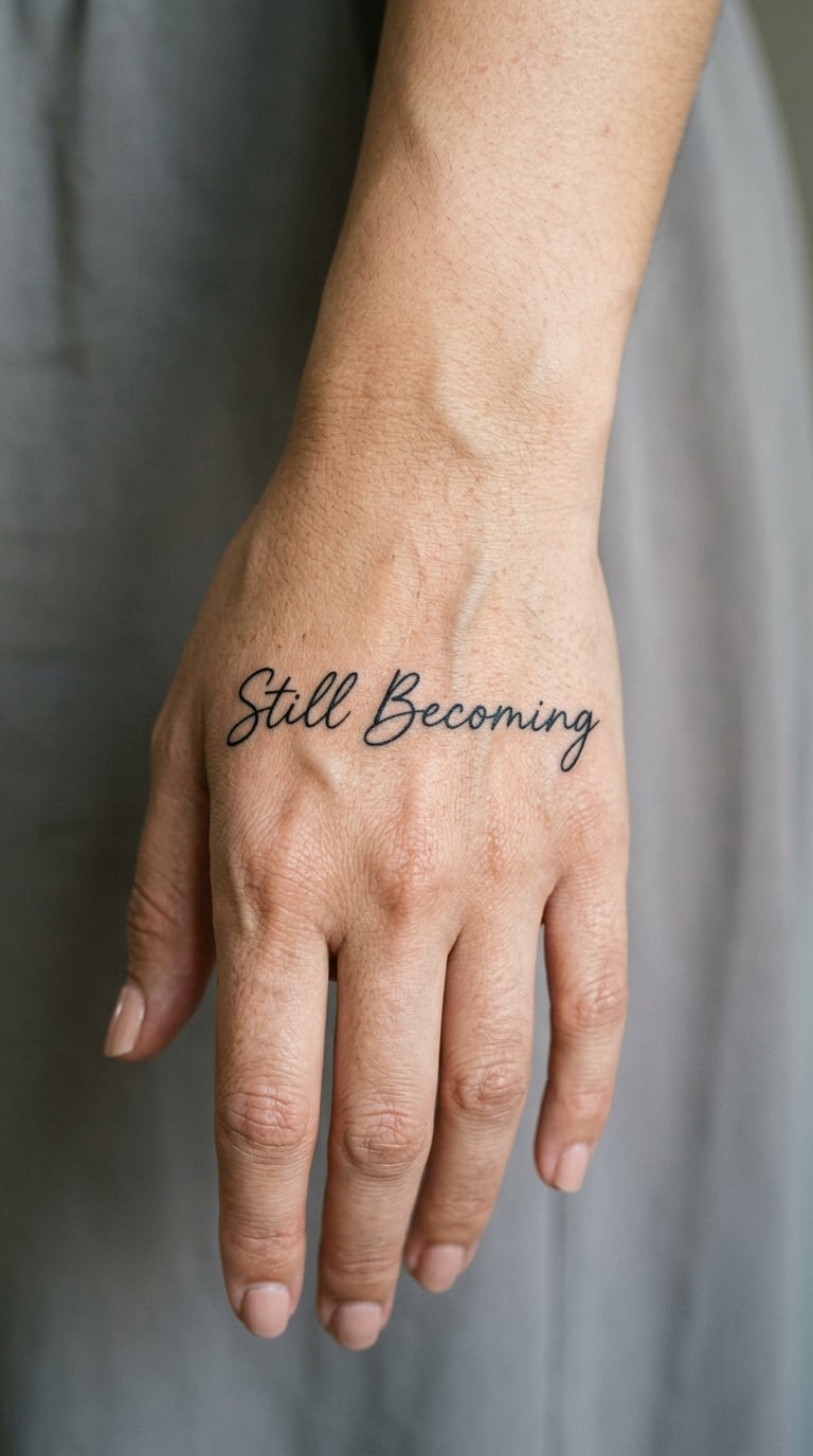
“Still becoming” is deliberately unfinished as a sentence, which is exactly the point. People get it when they are mid-change rather than after it.
Fine hand lettering, slightly uneven, sitting neatly across the back of the hand. A hand has good flat space, so the line can stay straight and well spaced.
Placement: Back of the hand, across the knuckles or just below them, avoiding the joints themselves. Size: 2-3 inch wide. Style: fine line. Pain: medium to high, knuckles are bone and the tendons move under the skin constantly.
Hands fade fast and lose fine detail before anywhere else, mostly through daily use, sun and washing. Tendon movement when you make a fist also shifts the spacing, so avoid placing the line over a tendon.
Make it yours: Simplify it to the single word “Becoming” in the same lettering, or add a matching thin-line piece on the other hand.
19. Understated “This Is Your Sign” on the Hip
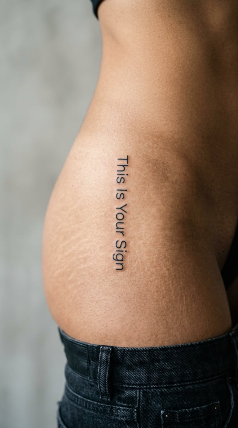
“This is your sign” is a playful prompt to notice a meaningful moment, not a guaranteed prediction. People often pick it for the joke and keep it for the reminder.
Simple modern type, moderate weight, one line following the curve of the hip. Slightly heavier than the fine-line designs here, which suits an exposed area.
Placement: Hip, waist, or upper thigh, along the curve above the hip bone or running vertically on the outer thigh. Size: 2.5-3.5 inch wide. Style: minimalist lettering. Pain: low to medium.
Body movement, sitting and rolling the hip, is the practical issue. The skin here is exposed more than most placements, so sun and friction both work on the line faster.
Make it yours: Add the real date of the event the phrase refers to in tiny type beneath it, turning the joke into something only you can read fully.
20. Flowing “Light Takes the Long Way” on the Back
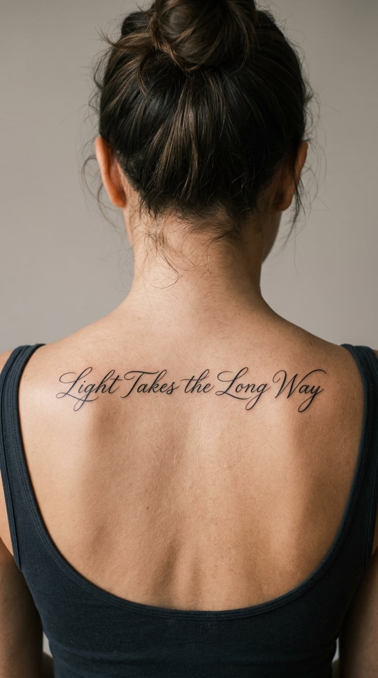
“Light takes the long way” is the most expansive design in the list, and it suits someone drawn to patience and to routes nobody else would take. The meaning is personal rather than fixed.
Gently flowing calligraphy, one continuous line of five words with an easy rhythm and generous spacing. It is the only design here that needs a full line of back to sit properly.
Placement: Upper or mid-back, running horizontally across the shoulder blades. Size: 3-4.5 inch wide. Style: fine-line calligraphy. Pain: medium to high, and expect a longer sitting.
Spine curvature makes a straight horizontal line impossible, so the composition follows the natural sweep of the back instead. Five words in flowing script is the most ink-hungry design here, which means the most time and the most opportunity for the line to blur if the weight is too fine.
Make it yours: Add a small gold accent, a thin line or a single letter touched in gold, to pick out the phrase without changing it.
How to Choose the Right Design
- Script or print? Script looks personal and soft, but it needs more width and more recovery time. Print, especially sans serif, stays readable longest in the smallest spaces. If the placement is small, choose print.
- Minimum readable size. Below roughly one inch of line width, thin script starts to fill in. Ask the artist to show you a healed sample of the same lettering at the same size before you commit.
- Body shape and movement. Any area that folds, creases, stretches with breath or moves when you make a fist will age a thin line faster. Choose a flat, still area for the smallest text.
- Personal meaning. Pick something you would still want to read in ten years, and check the attribution before you commit. The words matter more than the author, but a wrong name is permanent.
- Small placements fade sooner. Fingers, hands, feet and ankles lose fine detail before the forearm, upper arm or back do. Plan on a touch-up conversation with your artist rather than treating the first session as final.
- Test punctuation. A comma, a period or a thin underline changes how a phrase reads. Try two versions side by side before you settle.
Testing 20 one line quote tattoo ideas at real size
Print your three favourites at the actual finished width, stick them on paper, and hold them at arm’s length in daylight. If a phrase only reads when you lean in, it is too fine for the size you picked.
Better still, tape the mockups to the placement itself and look at them through the day, in the dark and in a photo. If you want more short phrases to test against, our single line tattoo ideas gallery has a wider set of minimal one-statement designs. Most people find their shortlist drops from twenty to two very quickly.
Cost and Session Time
Tattoo pricing in the US usually works as an hourly rate with a shop minimum, so a one line quote tattoo costs what the design needs in time, not what the number of words suggests. A single word behind the ear or on a finger is often the shortest sitting on this list. A phrase across the back is closer to an hour or more once the artist draws the lettering, stencils it and works around the spine.
Custom lettering is quoted rather than priced from a flash sheet, because the artist is drawing the type for you. A heavier or more complex style, a longer line and a curved placement all add time, and so does travelling to an artist whose work you actually want. Ask whether the rate includes the stencil, whether a fill-in or revision is covered, and what the shop minimum is before you book.
Everyone books with a mental picture of the healed result, and everyone gets a fresh tattoo. Touch-ups and small revisions are normal, particularly on the finer placements listed here, so it is reasonable to ask what that process looks like at that shop.
Aftercare Basics
- Follow your artist’s aftercare instructions first. They know the line weight, the ink and the placement, and their advice outranks anything general.
- Wash the area gently with clean lukewarm water and unscented soap, then pat it dry with a clean towel or paper. Patting beats rubbing.
- Protect the fresh tattoo from sunlight and friction while it settles, and keep clothing loose over it rather than tight.
- Avoid swimming, soaking, hot tubs and heavy sweating until it has healed, since water and heat are what push ink out of the skin too early.
- Expect some tenderness, a little swelling and ink that looks like a scab as it settles. This is normal for a few days.
- Contact a qualified professional, your artist first, if the area becomes increasingly painful, hot, swollen, starts leaking pus or shows colour that is spreading into surrounding skin.
Frequently Asked Questions
What font is best for a one line quote tattoo?
There is no single best font, but there is a reliable rule: longer phrases and smaller placements need print, and short phrases in open areas can carry script. Thin sans serif and small capitals stay readable in tight spots, while loose script needs a wider, flatter surface and more recovery time. Ask to see a healed sample of the exact lettering at the exact size before you book.
Are one line quote tattoos readable after they heal?
Most are, if the lettering was sized for the placement. Two things decide it: the finished width of the line and the thinnest stroke in the design. A phrase set in hairline script at one inch will fill in as it heals, while a compact print line at two inches usually stays clear for years. This is why every one of these 20 one line quote tattoo ideas comes with a size range.
Does fine-line quote tattoo ink fade quickly on fingers and hands?
Faster than anywhere else on the body. Hands and fingers are used, washed, exposed to sun and moved by tendons all day, and the skin is thin over bone. Fine detail there typically needs a touch-up sooner than a matching piece on the forearm or back, so book with an artist who works small text regularly and plan the first review early.
Can I use a quote tattoo as my first piece of body art?
Yes, a short single line of text is one of the gentler first tattoos: small, quick, in one session, and easy to hide while it heals. Pick two or three words over a full sentence, choose a flat area away from joints and ribs, and go to an artist whose healed lettering you have actually seen. Length and placement matter far more than bravery here.
How do I make a one line quote tattoo personal?
Use your own words, or copy the handwriting of someone who gave you the line, which is the version people describe as the most meaningful. Adding a real date, a single colour accent or a matching piece on someone else makes it specific. Whatever you choose, check the attribution first, because famous mis-quotes are the one regret that cannot be edited later.
Where to Start With a One Line Quote Tattoo
If this is your first piece, start with “Stay Soft” on the inner wrist or “Begin Again” behind the ear. Two words, a flat or forgiving surface, a short sitting, and lettering large enough to still read in five years.
If you are adding to a collection and have room for a real line, “Light Takes the Long Way” across the upper back is the most expansive design here and the one most likely to need a full session.
Whichever you like, shortlist three phrases, print them at their real finished size, and hold them against the placement in daylight. That test does more than any gallery can, and it usually leaves you with one design instead of twenty.