
How to Choose a Tattoo Font: 9 Essential Style Tips (October 2026)
Knowing how to choose a tattoo font comes down to one honest fact: no font file gets tattooed. Your artist draws the letters by hand, so you are choosing a lettering style, a word count that fits the body part, and a set of references, not a typeface that gets stamped onto skin.
That changes the whole decision. Instead of scrolling a font library, you are looking at how a style ages, how it will read from a few feet back, and whether your artist can actually draw it well. Get those three right and the rest is easy. Here is how it works.
How to Choose a Tattoo Font: Quick Guide
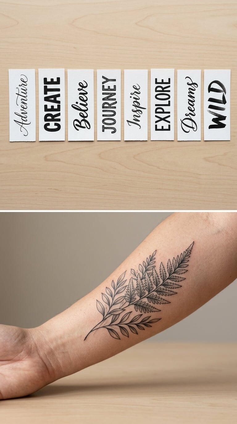
Pick the style that matches the tone of your words and the size of the space, then check that it stays readable when shrunk to tattoo size. Bold, high-contrast styles with a low word count survive longest. Hairline cursive and dense decorative lettering fade first.
| Font family | Visual character | Best message or design | Ideal placement | Key concern |
|---|---|---|---|---|
| Script and cursive | Flowing, joined letters, varied stroke width | Names, dates, short vows, lyrics | Forearm, rib, behind the ear | Hairline details blur within a few years |
| Traditional American caps | Heavy serifed capitals, tall and narrow | Old Western, sailor, memorial lettering | Forearm, upper arm, chest | Style demands real draughtsmanship |
| Blackletter and Old English | Dense angular strokes, medieval look | Family names, loyalty, heritage wording | Forearm, calf, back | Counters fill in as ink settles |
| Serif block | Upright, bracketed serifs, calm weight | Quotes, names, dates, single words | Collarbone, chest, bicep | Can read plain if the serifs are tiny |
| Sans serif | Clean, even strokes, no decoration | Coordinates, minimal word tattoos | Wrist, ankle, fingers | Needs careful spacing to avoid stiffness |
| Monoline | One constant line weight, airy | Single short words, subtle pieces | Wrist, collarbone, rib | Thin lines fade first on hands and fingers |
| Decorative and display | Ornate, flared, high contrast | Flash pairings, banners, one big word | Larger flat areas, thigh, shoulder | Detail is unforgiving at small sizes |
| Hand-lettered and hybrid | Loose, drawn by hand, mixes styles | Personal wording, one-off pieces | Anywhere the artist works often | Trend decay, consistency of stroke weight |
What Makes a Tattoo Font Readable?
Legibility on skin comes down to five things: line weight, letter spacing, stroke contrast, how open the curves are, and how much detail you are asking for relative to the final size. Get one of them wrong and a beautiful reference turns into a smudge.
Line weight is the whole ballgame
Line weight, also called stroke weight, is the thickness of the ink. Tattooed lines always spread slightly as they heal, so a design drawn with a hairline ends up a shade heavier than the reference. A good lettering tattoo keeps a fairly even weight from the thickest downstroke to the thinnest upstroke, with nothing so thin that sunlight can eat it.
Letter spacing decides whether words look like words
Letter spacing, the gap between each letter, is where amateur-looking tattoos give themselves away. Too tight and letters collide into a block. Too wide and the word falls apart. A simple test: squint at your reference from across the room, and if you can still read it, the spacing is probably fine.
Stroke contrast and open counters
Stroke contrast is the difference between thick and thin parts of a letter. Hand-lettered script runs on high contrast, which looks elegant on paper and breaks down on skin faster. Counters, the enclosed white spaces inside letters like a, e and o, are the other weak point. Small closed counters fill in as ink settles, so a letter that was open becomes a blob.
Word count and final tattoo size
Detail and final tattoo size have to be planned together. If your quote runs to twelve words, the lettering has to be large, and that usually means a body part that can take it. If you want it small, cut words instead of shrinking letters. Before you talk to an artist, if you are still working through which wording you want, our tattoo ideas that symbolize growth gallery is a decent place to see how much a short phrase can carry.
Which Tattoo Lettering Style Matches Your Design?
Compare the style against the mood of the words before you compare it against looks. Bold serif block suits something steady and permanent. Script suits something personal and soft. Blackletter reads as heritage and loyalty. Decorative styles pair with an image, never with a message you expect people to read properly.
| Lettering style | Reads as | Best placement | Longevity | Detail risk |
|---|---|---|---|---|
| Traditional American caps | Bold, old, established | Forearm, upper arm, chest | Very good | Low if drawn heavily |
| Script and cursive | Soft, intimate, personal | Forearm, rib, collarbone | Fair, depends on weight | High at small sizes |
| Serif block | Steady, classic, quiet | Chest, bicep, collarbone | Good | Low |
| Blackletter | Heritage, dense, formal | Calf, back, forearm | Good | Medium |
| Sans serif | Modern, restrained, clean | Wrist, ankle, fingers | Good if weight is even | Low |
| Chicano script | Fluent, ornamental, street | Forearm, chest, thigh | Fair to good | Medium to high |
| Typewriter and monospace | Literal, archival, understated | Forearm, ribs, back | Good | Low |
| Brush and modern calligraphy | Handmade, loose, current | Larger areas, shoulder, back | Fair, trend dependent | High |
| Non-Latin scripts | Personal, symbolic, exact | Forearm, back, calf | Good with even weight | Low, meaning risk is high |
Personality should support the words, not compete with them. If the meaning is heavy, keep the lettering quiet so the piece reads as memorial rather than decoration. A large flourishing script across the ribs already carries a lot of visual weight, and a sentimental verse on top of that usually turns fussy.
How to Choose a Tattoo Font by Placement
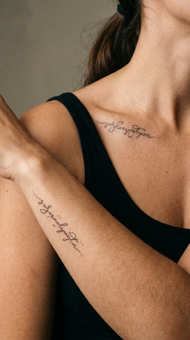
The body part changes the answer more than taste does. A forearm gives you a flat, generous surface and a reader standing at a normal distance. A rib or collarbone curves the baseline so letters tilt and compress. A wrist wraps text around a small cylinder. Finger lettering has almost no flat surface and gets worn by daily contact.
Broad flat areas such as the forearm, thigh and upper back can carry more words at a comfortable size. Curved placements need a simpler style and looser spacing so letters can follow the shape without crowding. Finger and knuckle lettering should be very short, one word or an initial, in a heavy style with open counters.
Skin movement matters as much as surface. Anywhere that flexes constantly, a rib or an inner bicep, thin hairlines get worked into the skin and soften. Anywhere that rubs, wrists and ankles, ink wears off faster. Placement on the fingers or hands, where a tattoo meets sun and washing, ages quickest of all, which is worth weighing before you commit to small lettering there. If you are still deciding on the spot, some of our tattoo ideas that symbolize protection start from placement first.
How to Match a Font to Your Message and Personality
Start with the tone of the words themselves. A memorial line should look like something that was meant to last, so a heavier, steadier style fits. A short joke set in ornate blackletter is a deliberate contrast, and that is your call to make, not a mistake.
Then work on the practical side. Write the exact wording down, count the letters, and compare that number against the space. Capitalisation changes the voice too, since all caps reads as a statement and lowercase reads as a whisper. If two partners are getting matching pieces, both wordings need to work as a pair rather than as two separate designs, and the matching tattoo ideas for roommates gallery shows how much the shared style does the work.
Collect references of healed tattoos, not fresh ones. A photo taken straight out of the session looks sharp and thick, which is misleading. Screenshots of digital fonts tell you almost nothing, since those letterforms are not built for skin. Save ten references of the style you like and note which ones are readable at a distance, and which artist did them.
Then cut your options down to two or three. Send them to the artist early, with the exact wording attached, and ask which one they can draw best. That question alone filters out most of the options that looked great on a screen.
How to Test a Font Before You Get Tattooed
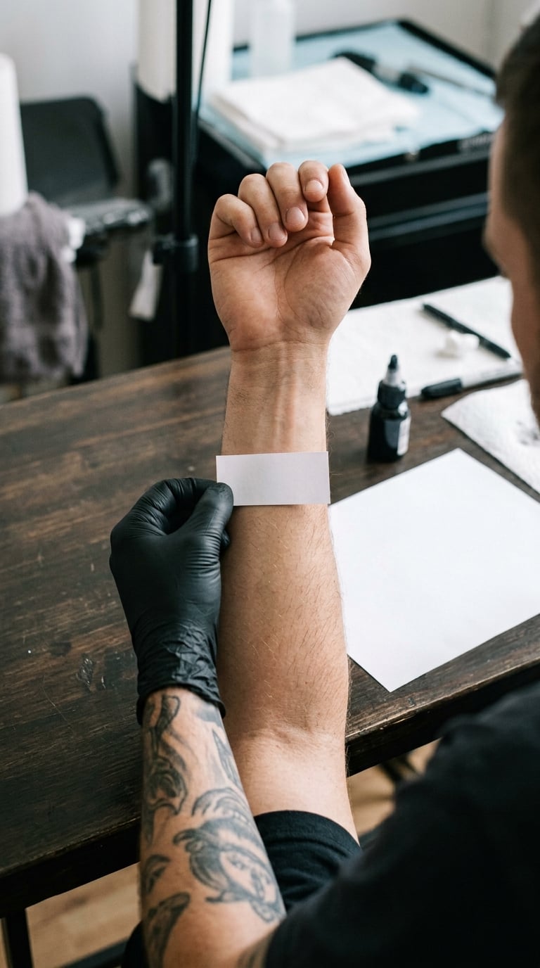
Testing takes ten minutes and it prevents the regret. Print the exact wording in the chosen style at the size you want, tape it to the body part, and check it from the distance a stranger would see it from.
Then put the paper on your arm or leg and take a photo. Look at the photo, not at your arm. This is the moment where most designs fall apart, because a reference that looked balanced on a flat screen looks lopsided on a moving body part.
Add a greyscale test next. Shrink the design to a solid black silhouette and see whether the words are still readable as shapes. If the words dissolve into a black lump at that size, the detail is too dense and the artist will need to simplify it.
Finally, ask the artist to draw a stencil or mark the placement with a skin-safe marker, and check the spelling, capitalisation and dates in that final form. Proofing at stencil stage is the only moment where a typo costs nothing to fix.
How Placement Affects Tattoo Font Pain
Lettering style does not change how much a tattoo hurts. Placement, size, shading and session length do. A small single word in a bold style on an outer forearm is an easy sitting, while the same style shaded and outlined across ribs is a long, uncomfortable one.
| Placement | Relative pain | What usually drives it |
|---|---|---|
| Outer forearm and bicep | Low to medium | Large area, muscle absorbs some sensation |
| Upper arm and shoulder | Low to medium | Thicker skin, big flat surface |
| Back and calf | Medium | Bigger sessions, sensitive to distraction |
| Thigh | Medium | Sensitive skin, easy to sit still for |
| Collarbone and chest | Medium to high | Bone proximity, thin skin, shallow fat |
| Ribs and sternum | High | Bone, thin tissue, movement while working |
| Inner arm and wrist crease | High | Sensitive inner tissue, flexing skin |
| Neck, spine and elbow | High | Bone-heavy, joint movement |
| Fingers, knuckles and hands | High | Little soft tissue, constant contact |
| Armpits, feet and face | High | Very sensitive nerve areas |
Individual tolerance varies more than any table can capture. Eat properly, sleep the night before, and follow whatever your artist recommends for the day of the session. If a lettering piece is a multi-hour job, most studios will happily split the wording into two shorter sittings instead of a single long one.
What Does a Tattoo Font Cost?
Lettering is priced by size, complexity and the artist you book, and it sits at the higher end of studio work compared with simple flash. A single short word in a clean style is the cheapest lettering there is. Custom script, multi-word quotes and any style needing heavy detail cost more, because drawing letters properly takes time.
Most studios quote lettering in three bands rather than listing a menu price. Small lettering, roughly a word or an initial under an inch or two, is the quick band. Medium pieces, two to four inches with custom script, sit in the middle and are the most common request. Large pieces across ribs, back or a full forearm lettering band are quoted per session, sometimes with a minimum.
Ask for the quote in writing before the session and find out what it covers. Common questions: is the design fee separate, is the hourly rate or a flat piece price, does the studio have a shop minimum, are revisions included, is a touch-up within the first year covered, and what happens if the design needs a second sitting. Travel costs, parking and time off work all belong in the same conversation for a big piece.
How Tattoo Fonts Heal and Age
Fresh tattoo is not the finished tattoo. For the first few days lines look slightly raised and blurry, and every letter seems thicker than you drew it. That settles down over weeks, and the real result only shows after a couple of months.
| Time after the session | What lettering is doing | What to do |
|---|---|---|
| Days 1 to 3 | Lines raised, ink slightly spread, redness | Follow your artist’s aftercare instructions |
| Week 1 | Flaking begins, letters look lighter than expected | Keep it clean, do not pick flakes |
| Weeks 2 to 3 | Scaling finishes, skin smooths, contrast returns | Moisturise as instructed, avoid sun |
| Weeks 4 to 6 | Lines settle to final weight, the piece looks like itself | Limit sun, no swimming or heavy soaking |
| Months 2 to 6 | True healed result, thickest and crispest point | Take healed photos for your reference file |
| Years 1 to 5 | Slow even fade, fine lines go first | Sun protection keeps contrast longer |
| Years 5 and beyond | Hairlines and serifs soften, heavy strokes hold best | Plan a touch-up or cover-up if legibility drops |
Rules of thumb for aging. Keep line weight fairly even and avoid anything thinner than the smallest line the artist is comfortable tattooing. Give letters open counters and enough space between them. Keep word counts short, since every extra letter is another chance for a line to close up. Expect finger and hand lettering to fade faster than forearm work, because it is washed, exposed to sun and abraded daily.
Style choice shapes this too. Bold block lettering and traditional caps hold their shape for decades. Thin monoline and fine script read beautifully in year one and get harder to read by year ten. A small photo reference of a healed piece tells you more than a fresh one ever will.
Mistakes to Avoid
- Choosing a novelty font without a readability check. A stencil-style or military-looking typeface photographed from a costume is not lettering. It reads as a joke in a photo and as a blur in ten years.
- Copying lettering too small. If the reference only works at poster size, it will not survive on a wrist. Reduce the word count or grow the area, not shrink the lines.
- Picking an overly complex script. Long flourishes, hairline entry strokes and stacked capitals are the first things to disappear as ink settles.
- Not testing the exact wording. The words you finalise in the session are the words that get tattooed. Bring the final version to the stencil check, not an idea.
- Placing text where skin movement distorts it. A crease that folds through a downstroke bends the letter permanently, and a rib that moves while the artist works changes the spacing.
- Not confirming the artist’s lettering experience. A portfolio full of illustrations says little about lettering. Look for healed text work specifically, and ask how they handle a style they do not draw often.
- Accepting traditional caps with backwards letters. In traditional American cap lettering the A and M are often drawn reversed. Tattoo-literate viewers notice it every time, so ask for them the right way round unless a specific historical piece is the goal.
- Chasing a handstyle that is already fading. Brush lettering and handstyles from the last decade have a short shelf life. If a style needs a certain trend to land, the trend will be gone first.
Frequently Asked Questions
What is the most readable font for a tattoo?
Bold block lettering, whether serif or sans serif, is the most readable tattoo font because it has even stroke weight and open letter shapes. Traditional American caps are the most legible of all when drawn heavy. Readability comes from weight and spacing rather than style name, so test any font at its final size before you commit.
Are script fonts bad for tattoos?
No, script is popular for names, dates and short quotes. It just needs enough weight and space to survive healing. Hairline script with very thin upstrokes and long flourishes fades first, especially on fingers and wrists. A heavier brush script with open counters and tight word spacing holds up far better over decades.
Should tattoo lettering be uppercase or lowercase?
Both work. All caps reads as a statement and suits bold styles such as traditional caps, blackletter and sans serif. Lowercase reads as quieter and softer, which suits personal names and memorials. What matters more is mixing: alternating capitals with very small lowercase letters creates uneven letter height and slows reading, so keep the case pattern consistent.
What is the best font for a small tattoo?
A heavy serif block or clean sans serif is the safest choice for small lettering, usually limited to one word or a name. Small sizes punish fine detail, so avoid hairline script and decorative styles. Give the letters generous spacing, and if the words will not fit legibly at that size, shorten the wording instead of shrinking the letters.
Can I use a font I found online for my tattoo?
Use it as a reference, not as a spec. Your artist redraws the letterforms by hand to suit your placement and their style, so the tattoo will never be an exact copy of a digital font. Bringing a screenshot is useful for showing the feel you want. Look for healed examples in the same style for the real expectation.
Final Font Choice Checklist
Before you approve any design, run it through this list.
- You can read the full wording from a few feet back, in a photo, without squinting.
- The style suits the body part, with enough flat surface for the word count.
- Line weight is even, and nothing is thinner than the artist is comfortable with.
- Letters have open counters and real spacing between them.
- You have seen healed examples of this style, not just fresh photos.
- The artist has done this style before, and drew the design themselves.
- Spelling, capitalisation, dates and coordinates are proofed at stencil stage.
- You know what it will look like faded, and you are still happy with it.
That last line is the real test. Choose the style that survives both the fresh photo and the ten-year photo, and getting the font right stops being a gamble.