
20 French Word Tattoo Ideas: Best Minimalist Designs 2026
French word tattoo ideas run from one quiet word on the inner wrist to a full calligraphic line across the ribs, and the reason people keep coming back to French is that the language squeezes a big feeling into very few letters. A single word like amour or courage carries weight without turning into a paragraph on your skin.
French is also the one tattoo language where a small mistake is very visible. Drop an accent and the word is not decorative, it is wrong. Artists in the community ask more and more clients to confirm spelling and meaning before a stencil goes down, and tattoo press has long treated foreign-language errors as a known category of permanent regret. Every design below shows the accents written out, the literal meaning beside the natural one, and a realistic size, so you can talk to an artist with something concrete in hand.
Most people planning this start by scrolling for hours and choosing nothing. If you want a shorter route, our heartbeat tattoo ideas with meaning and our forearm band tattoo ideas for men cover the placement and sizing side of lettering work if French is one option among several you are weighing.
French Word Tattoo Ideas: Quick Guide
All twenty designs in the same order as the sections below, with the style, the spot that suits it, an honest finished size, and what it usually feels like. Sizes are measured in inches with the metric equivalent, because that is the unit tattoo artists actually work in.
| Idea | Style | Best placement | Size | Pain |
|---|---|---|---|---|
| Amour | Fine-line cursive | Inner wrist | 1.5-2 in (4-5 cm) wide | Low to medium |
| Rêve | Minimalist lowercase | Collar bone | 1.5-2 in (4-5 cm) wide | Medium |
| Bonjour | Micro fine-line | Behind the ear | 1-1.5 in (2.5-4 cm) wide | Medium |
| Force | Traditional black serif | Inner forearm | 3-4 in (7.5-10 cm) wide | Medium to high |
| Lumière | Blackwork script | Outer forearm | 2.5-3 in (6-7.5 cm) tall | Medium |
| Éternité | Fine-line script | Outer ankle | 2-2.5 in (5-6 cm) wide | Low to medium |
| Sauvage | Watercolor | Upper shoulder | 4-5 in (10-13 cm) wide | Medium |
| Paix | Fine-line, spaced | Side of hand | 1.5-2 in (4-5 cm) wide | Medium to high |
| Aventure | Micro fine-line | Inner wrist | 1.5 in (4 cm) tall | Low to medium |
| Joie de vivre | Calligraphic | Lower ribs | 4-5 in (10-13 cm) wide | High |
| Loyal | Bold blackwork | Inner bicep | 3-3.5 in (7.5-9 cm) wide | Medium |
| Papillon | Micro-realism | Inner forearm | 2.5-3 in (6-7.5 cm) wide | Medium |
| Courage | Minimalist | Sternum | 2 in (5 cm) tall | Medium to high |
| Liberté | Fine-line cursive | Outer thigh | 2.5-3 in (6-7.5 cm) wide | Low to medium |
| Se souvenir | Micro, two lines | Inner wrist | 1.5 in (4 cm) wide | Low to medium |
| Resilience | Open script | Forearm or upper arm | 3-4 in (7.5-10 cm) long | Medium |
| Escrime | Blackletter | Inner forearm | 2.5-3 in (6-7.5 cm) tall | Medium |
| Douceur | Soft watercolor | Inner forearm | 2.5-3 in (6-7.5 cm) wide | Medium |
| Chasing dreams | Fine-line, spaced | Upper back | 6-8 in (15-20 cm) wide | Medium to high |
| Bonheur | Micro-calligraphy | Side of wrist | 1-1.5 in (2.5-4 cm) wide | Low to medium |
1. Amour Fine-Line Wrist Tattoo
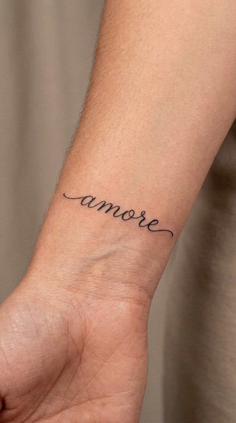
Amour is the obvious starting point and it still works. The design is a single hairline stroke, lowercase, with a soft cursive hand where the a and u stay low and the r lifts slightly. One unbroken line, no shading, no heart, no arrow.
The word simply means love, and the literal reading and the natural reading are the same, so nothing gets lost in translation. Most people choose it for a person, a year, or a version of themselves they are trying to keep.
Placement: inner wrist, set about an inch above the crease, or just below it where the skin is flatter. Size: 1.5-2 in (4-5 cm) across. Style: fine line. Pain: low to medium, a scratchy heat that fades once the first line is placed. Wrist lettering ages well, though the tail of the r softens over the years.
Make it yours: add the date underneath in matching hairline, smaller by half.
2. Rêve Minimalist Collar Bone Tattoo
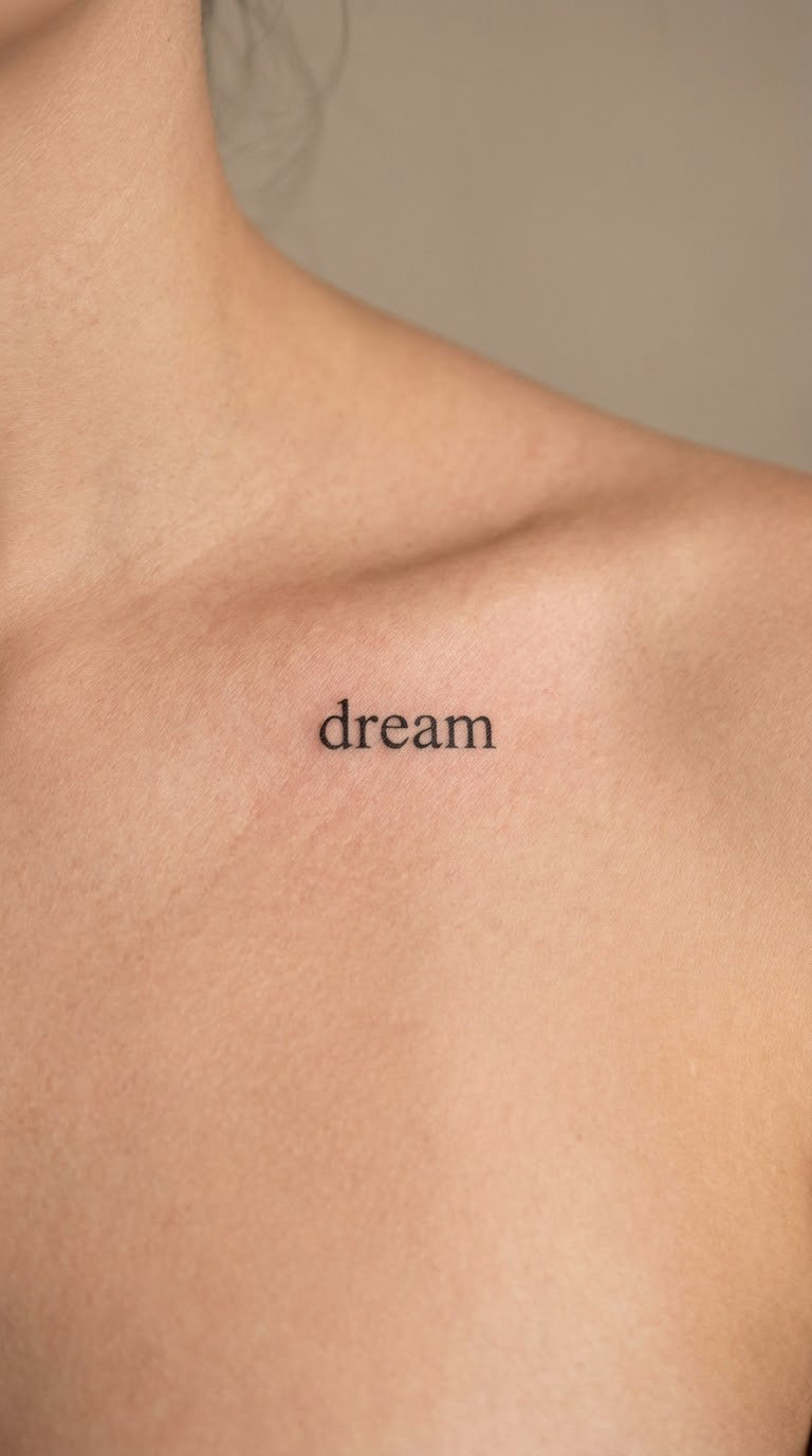
Rêve is four letters and a circumflex, drawn in clean lowercase with even stroke weight and generous spacing between the r and the e. The accent sits on top like a small roof, and it stays visible because the collar bone gives the word a flat, straight run.
It means dream. People pick it for the dreaming part, not the sleeping part, so it tends to sit alongside a decision they made rather than a memory.
Placement: along the collar bone, either one side or centered under the throat. Size: 1.5-2 in (4-5 cm) across, and narrower if you want it truly quiet. Style: minimalist. Pain: medium. Bone is close to the surface here and the collar bone is a sensitive strip, but it heals cleanly in a straight line.
Make it yours: a small four-point star or a thin date underneath, kept smaller than the word so the word still leads.
3. Bonjour Behind-the-Ear Word Tattoo
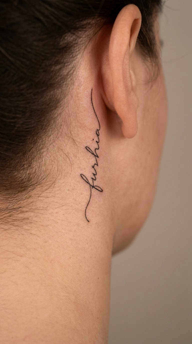
Bonjour is the warmest of the small ones. It is set in a light handwritten print rather than looped script, spaced so the letters do not merge on the curve of the ear, and sized small enough that it reads as a whisper rather than a sign.
It means hello, and in a tattoo it usually means warmth, open doors, the way a person enters a room. That is the whole reason people land on it.
Placement: behind the ear, following the curve, or in the small hollow just below the lobe. Size: 1-1.5 in (2.5-4 cm) across. Style: micro fine-line. Pain: medium. Behind the ear is thin skin over firm cartilage, so it feels sharper than the same line on an arm. Hair regrowth partly hides it, and the curve means the outer letters can blur first if the design is too tight.
Make it yours: pair it with a matching one behind the other ear, or use the plural bonjours in the same hand.
4. Force Traditional Forearm Tattoo
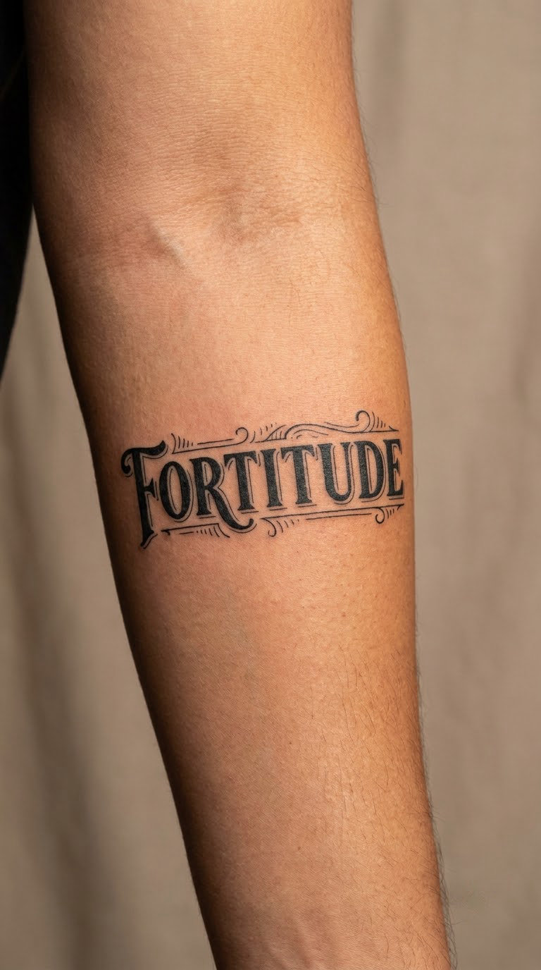
Force is the loudest design in this list. It is set in sturdy serif capitals, black line with solid black fills, and the letters are built to be read from across a room. A small flourish under the e is common, nothing more than a thin scroll or a short line of shading.
It means strength, and in French it carries determination as much as muscle. That reading is why it shows up on forearms, where a person can see it when they close their hand.
Placement: inner forearm, running across the muscle belly. Size: 3-4 in (7.5-10 cm) across. Style: traditional black. Pain: medium to high. Bold black fills mean more passes over the same skin, and the inner forearm is one of the more reactive spots on the body. The line stays crisp for years, which is the point of the style.
Make it yours: a small matching word underneath in the same serif, set half the size, or a hand-drawn shadow under the f.
5. Lumière Blackwork Script Tattoo
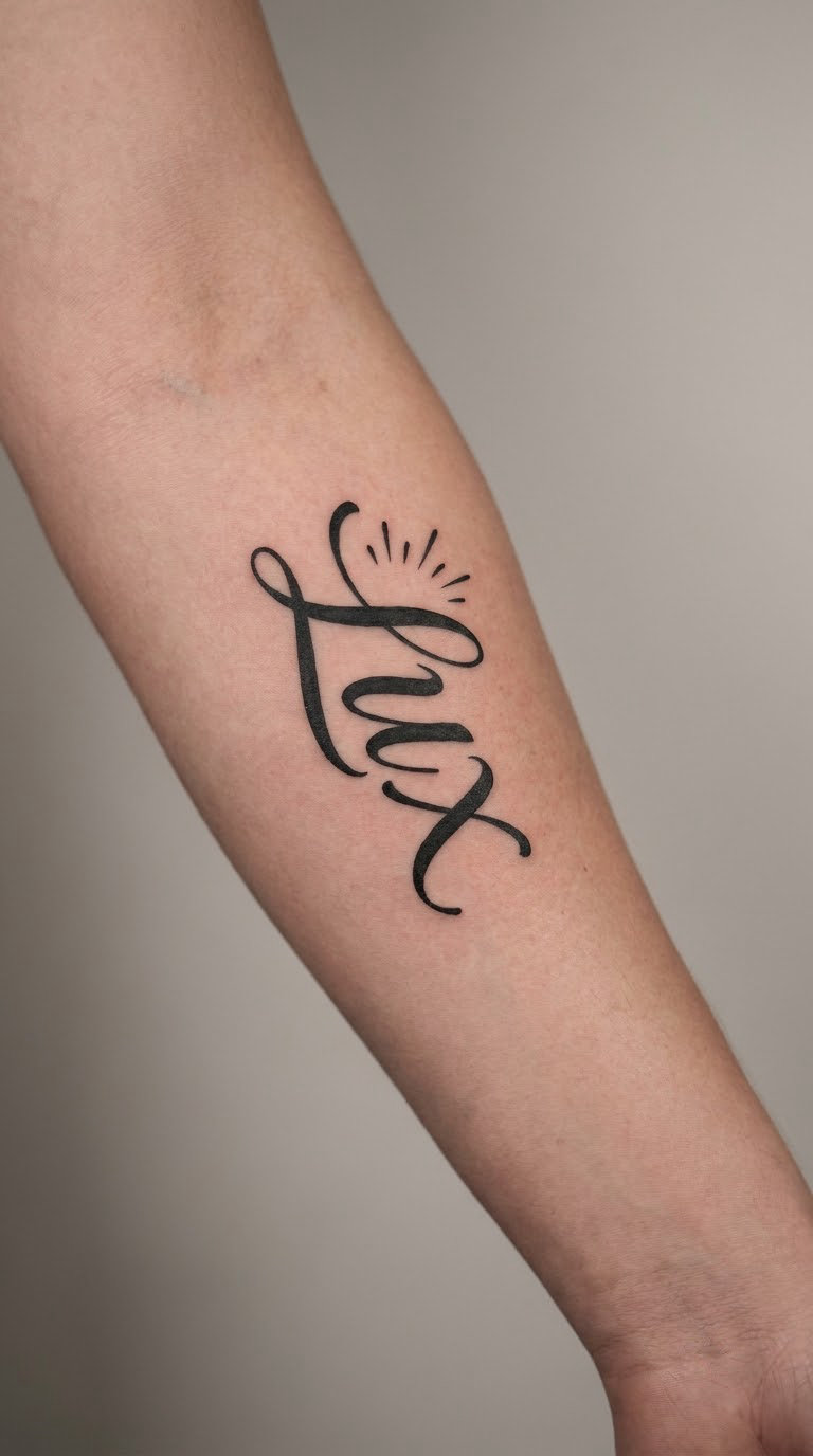
Lumière is a seven-letter word, so it needs a hand that can handle length without shrinking the letters into each other. Here the script is drawn with a thick downstroke and a thin upstroke, set vertically on the outer forearm, with three short radiating lines beside the i as the only decoration.
It means light, and the accent matters: the circumflex turns the u into a different vowel sound, so leaving it off is not a style choice. People usually carry it for hope or for a person who was that for them.
Placement: outer forearm, vertical, or along the inner bicep. Size: 2.5-3 in (6-7.5 cm) tall. Style: blackwork script. Pain: medium. Long words take longer, and the longer session is what people underestimate. Thin upstrokes in a light color wash out first, so a strong black base pays off here.
Make it yours: a small matching element nearby, like a sun outline or a single candle, kept faint so the word stays the subject.
6. Éternité Fine-Line Ankle Tattoo
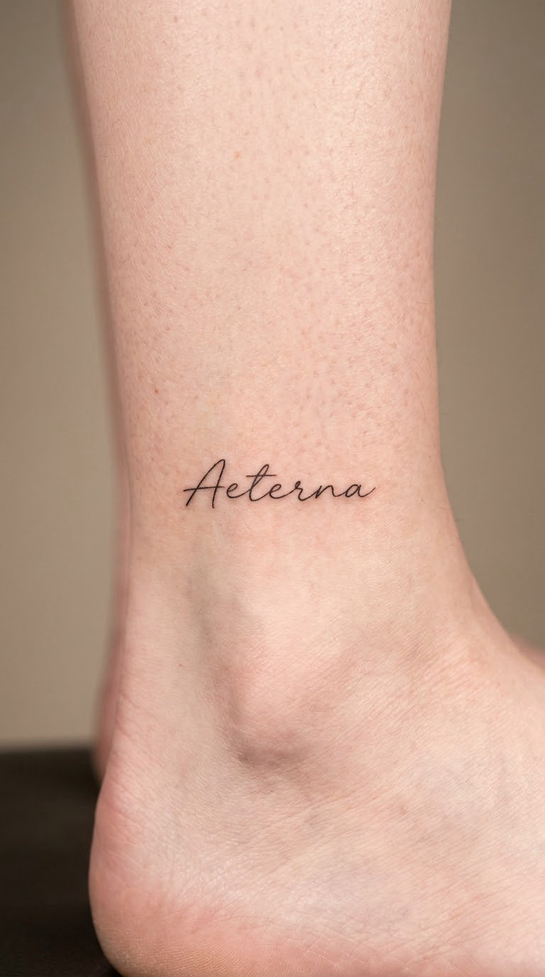
Éternité is nine letters, which makes it a commitment to a fine hand. The design uses balanced script, an even line weight, and the two accents, the acute on the first é and the circumflex on the ê, placed clearly above the baseline. The word follows the ankle bone without crossing it.
It means eternity, and the literal and natural readings match, so it reads as lasting love, a vow, or a long partnership.
Placement: outer ankle, horizontal, or running up the calf from the bone. Size: 2-2.5 in (5-6 cm) across. Style: fine line. Pain: low to medium. The ankle is bony and the sensation is sharp but short, and the session is quick because the area is flat. Expect to see it more often in summer; in boots and heavy socks it disappears, and the fine detail on the outer letters softens with sun exposure over the years.
Make it yours: a ring or band of tiny dots above the word, echoing the ankle line without adding more letters.
7. Sauvage Watercolor Shoulder Tattoo
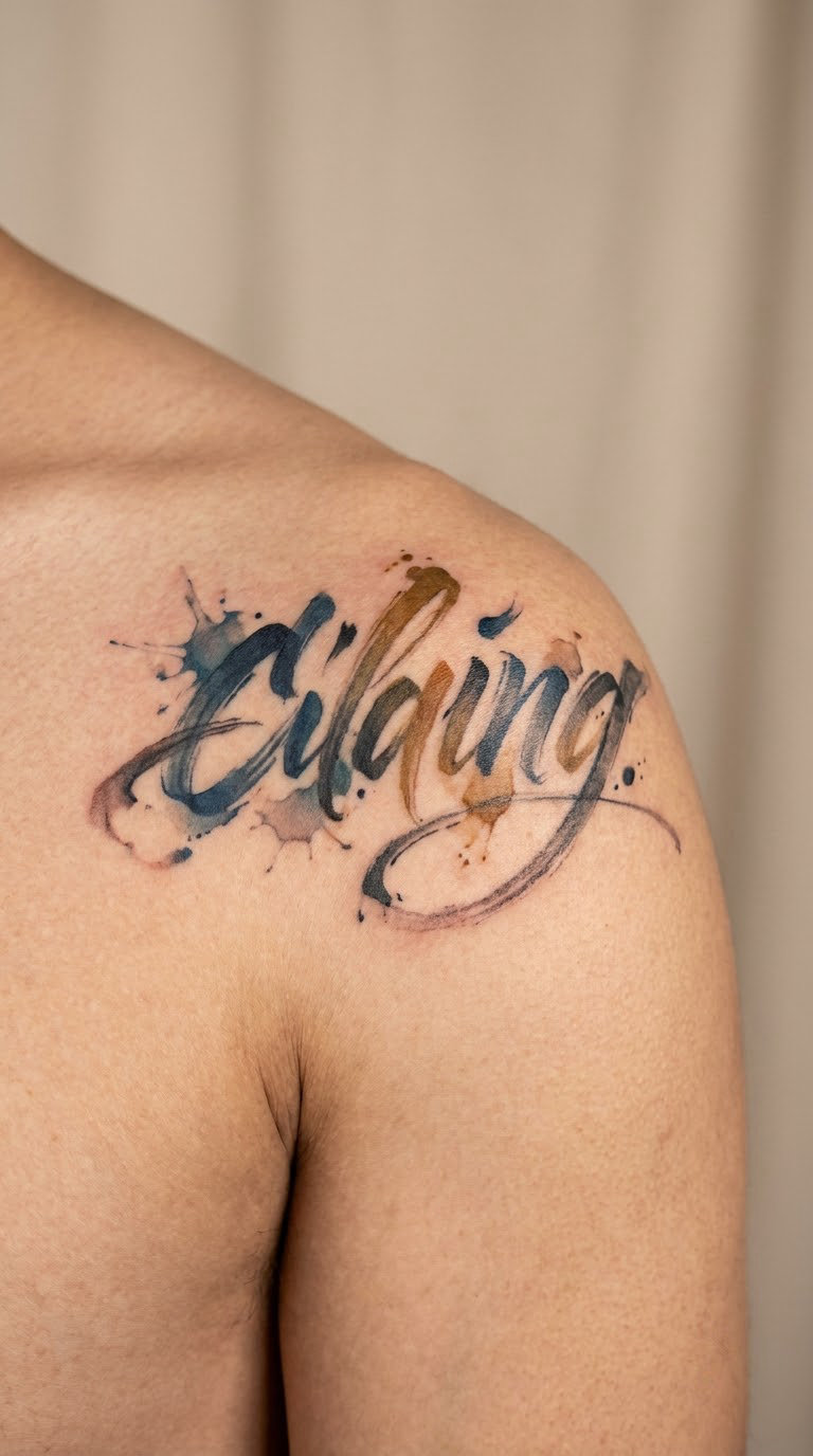
Sauvage is the one on this list that genuinely wants color. The word is brushed in loose lettering, with the edges of the letters bleeding slightly like wet paint, in a muted palette of black, dusty blue and ochre. A few splashes sit outside the baseline and nowhere else.
It means wild, and in French it usually points at an untamed, independent streak rather than anything reckless. The translation is softer than the English word, which surprises people.
Placement: upper shoulder or the top of the arm, where the flat muscle gives the brushwork room. Size: 4-5 in (10-13 cm) across. Style: watercolor. Pain: medium. The shoulder curves in two directions, so the artist is constantly adjusting the line of the word. Pale washes on skin need a touch-up sooner than solid black, so plan on a free or paid check-in within the first couple of weeks.
Make it yours: swap the palette to two colors that mean something to you, and keep the splashes to one side only.
8. Paix Small Hand Tattoo
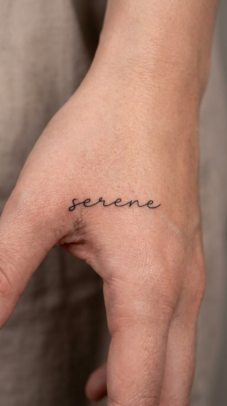
Paix is four letters on a difficult surface. The design uses widely spaced lowercase print, letters about a quarter inch apart, so nothing smears together on the ridge of the hand. No dots, no extra marks, nothing to lose.
It means peace, and it is the quietest statement in this whole set. People choose it after a loud period rather than at the start of one.
Placement: side of the hand near the thumb, or across the back of the hand where it is flat. Size: 1.5-2 in (4-5 cm) across. Style: fine line. Pain: medium to high. Hands are bony, the skin moves with every knuckle, and the veins make some areas sting more than others. This is also the placement that ages fastest, because hands and fingers wrinkle and change shape constantly. Ten years on, expect a softer line and slightly wider spacing.
Make it yours: one small solid dot after the word, or a two-digit year underneath in the same print.
9. Aventure Miniature Wrist Tattoo
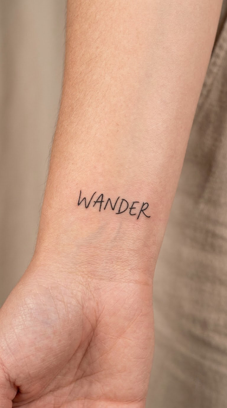
Aventure is a longer word for a small space, so the design stacks it vertically with one letter per line, or compresses it into a small handwritten hand that leans forward as if it is going somewhere. The a and the v stay slightly larger than the rest so the word has an entry point.
It means adventure. People choose it for travel, for a new chapter, or for a goal they are still working toward.
Placement: inner wrist, running along the forearm side of the wrist, or the outer wrist where the skin is flatter. Size: about 1.5 in (4 cm) tall. Style: micro fine-line. Pain: low to medium. The inner wrist is sensitive but the session is short. Stacked lettering gives the artist less room for error, so a slightly larger version heals better than a very tight one.
Make it yours: add a set of coordinates or a travel date under the last letter, small enough to read only up close.
10. Joie de Vivre Curved Stomach Tattoo
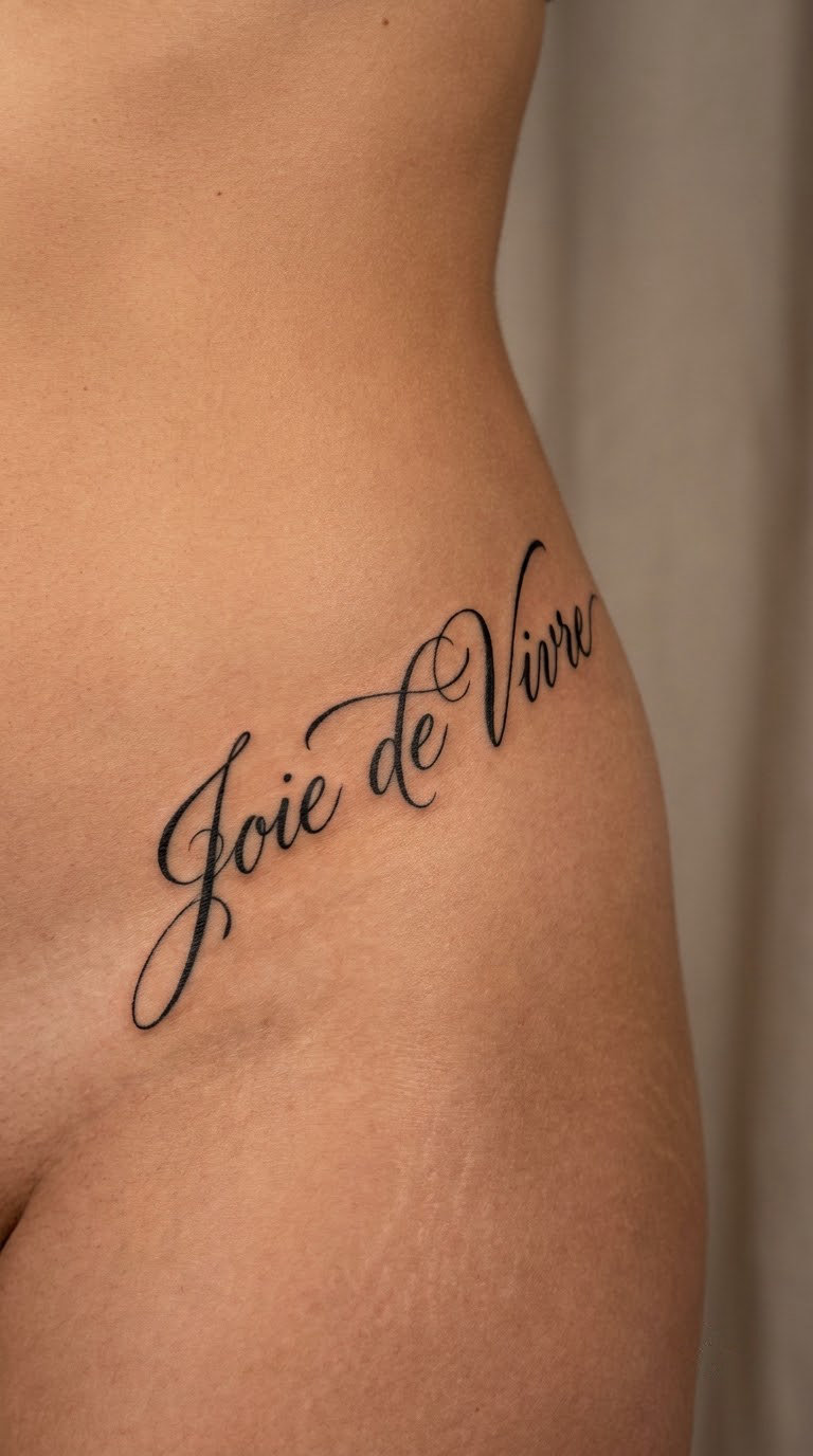
Joie de vivre is two words, so the spacing is the design. The lettering is calligraphic with a long entry stroke on the j, the words arched along a line rather than stacked, and the space between joie and de held as wide as the space inside a word so the phrase reads as one unit.
It means joy of living, or zest for life. The phrase is cheerful rather than philosophical, which surprises people who assume all French tattoos are melancholy.
Placement: along the lower ribs, following the curve, or centered on the upper stomach. Size: 4-5 in (10-13 cm) across. Style: calligraphic. Pain: high. Ribs are the deepest contours on the body and the letters have to stretch over changing depth, so expect a longer, more uncomfortable session. Stretching marks up on the curve and fades back into place, which the artist will plan around.
Make it yours: a single short line under it in a different hand, or a small sun drawn at one end of the arch.
11. Loyal Blackwork Lettering Tattoo
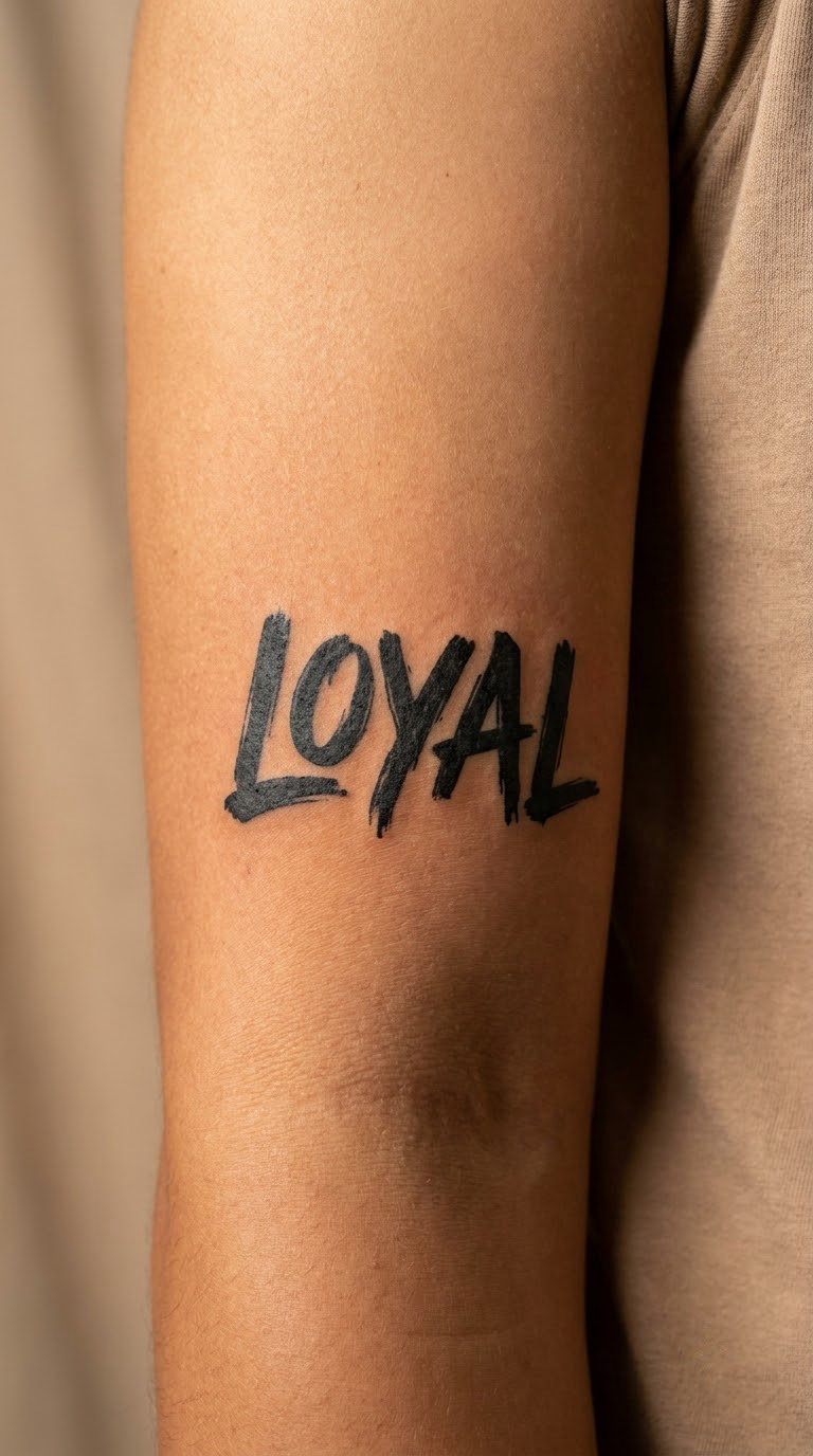
Loyal is an English word that works in a French tattoo because it is a tribute rather than a translation. The design uses heavy hand-lettered type, thick and slightly irregular, with a little distressing in the black so it does not look machine-stamped.
It means faithful, devoted, staying. People use it for a dog, a person, a team, or a version of themselves who did not leave.
Placement: inner bicep, where there is a flat panel of skin between the arm and the torso. Size: 3-3.5 in (7.5-9 cm) across. Style: blackwork. Pain: medium. Solid black at that size takes a while, and the inner bicep gets tender before the end. Dense black holds its shape for a long time, which suits a word you want to still read in twenty years.
Make it yours: a date underneath in a lighter hand, or a single initial in the same heavy type tucked into the y.
12. Papillon Micro-Realism Word Tattoo
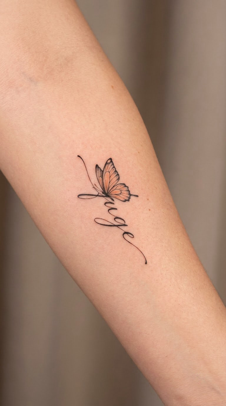
Papillon is the only design here where a picture is doing real work. The word is set in clean lowercase, and the two p stems double as antennae, with a small realistic butterfly wing in muted orange and black sitting where the two l letters meet. One butterfly, not a swarm.
It means butterfly, and with it comes transformation, which is why it keeps reappearing on the first tattoo of people who have just changed jobs, cities or relationships.
Placement: inner forearm, horizontal. Size: 2.5-3 in (6-7.5 cm) across. Style: micro-realism. Pain: medium. The detail work needs a slower hand, and the orange is a second pass over part of the same area. Fine wing detail is the first thing to soften, so an artist who knows micro-realism will simplify the veining on purpose rather than adding it and losing it.
Make it yours: keep the wing in one color only, or add a date under the word in the same lowercase hand.
13. Courage Minimalist Sternum Tattoo
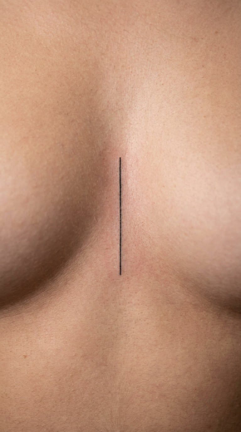
Courage is seven letters in a narrow column, set in a plain upright print with no flourishes. It runs vertically between the collar bones, which is the only stretch of skin long and straight enough to hold a word upright without it curving with the ribs.
It means bravery. People choose it before something difficult rather than after it, which is a different kind of reason from most words in this list.
Placement: sternum, centered, or offset to one side along the sternum line. Size: about 2 in (5 cm) tall and under an inch wide. Style: minimalist. Pain: medium to high. The sternum is thin over bone and the skin moves with every breath, so tell the artist how you breathe and watch them draw the line with you in a few positions. Sitting and standing shift the placement noticeably.
Make it yours: a thin line border on both sides, or a single small anchor at the base of the word.
14. Liberté Fine-Line Thigh Tattoo
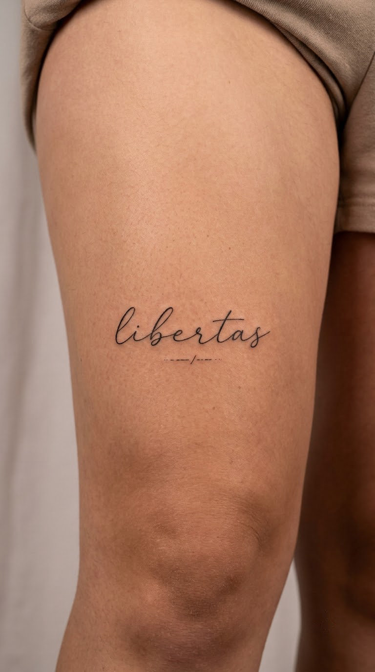
Liberté is written in loose cursive with wide loops and air between the letters, so the word reads as movement rather than as a block of ink. The acute on the last é is left clear of the line above it, which the artist spaces on purpose.
It means freedom, and it is the most requested word in French word tattoo ideas after love, usually by people who have just moved countries or started something new.
Placement: outer thigh, horizontal along the muscle, or the upper inner thigh. Size: 2.5-3 in (6-7.5 cm) across. Style: fine line. Pain: low to medium, with brief stingier spots near the knee. Thigh skin has good muscle under it and heals well, and a word this size sits flat without much distortion. Open cursive on a large flat area stays readable for years.
Make it yours: a small broken line or a set of coordinates tucked under the b, or add a second short word in the same hand below it.
15. Se Souvenir Micro-Tattoo
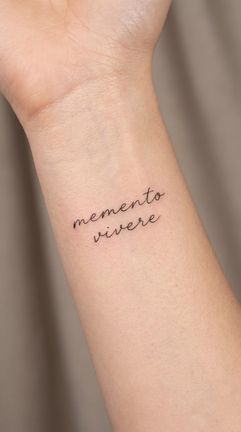
Se souvenir is set on two lines, se above souvenir, in a thin printed hand with an accent kept clear over the first e of souvenir. Two lines rather than one long one, because a single long line at this size would blur into a smear within a few years.
It means to remember, and people usually mean a person rather than an event. It is a common memorial option in this style, kept small on purpose.
Placement: inner wrist, or behind the ear where the design can be hidden. Size: about 1.5 in (4 cm) across. Style: micro fine-line. Pain: low to medium. Very small work on a sensitive spot, so the discomfort comes in short sharp passes rather than a long burn. Tiny details on the wrist fade fastest, and after several years the two lines usually need a refresh more than most other designs here.
Make it yours: a year underneath, or the first letter of a name woven into the s in set lighter than the rest.
16. Resilience Script Sleeve Accent Tattoo
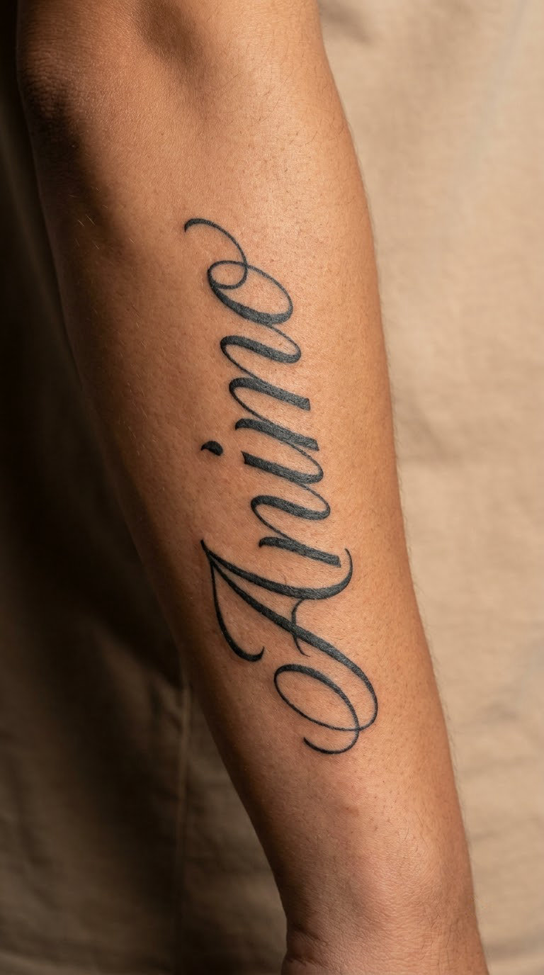
Resilience is a long word with soft middle letters, so the hand is drawn open, with generous counters and no tight joins through the s and the two l shapes. The script runs along the forearm rather than across it, and the line follows the length of the muscle instead of fighting it.
It means recovering strength, the ability to come back. It is often chosen after a hard stretch rather than as a motto for a future self.
Placement: forearm along the inner muscle, or the upper arm. Size: 3-4 in (7.5-10 cm) long. Style: open script, which also works well as an accent between other pieces. Pain: medium. The long session over a curved surface is what people feel most, and the arm needs time to settle between sessions. Open letterforms are the anti-ageing move here, since they lose less than tight calligraphy when the skin stretches over the years.
Make it yours: set it in bold block capitals instead of script if you want it to read at arm’s length, or repeat it on a second arm in a smaller size.
17. Escrime Blackletter Forearm Tattoo
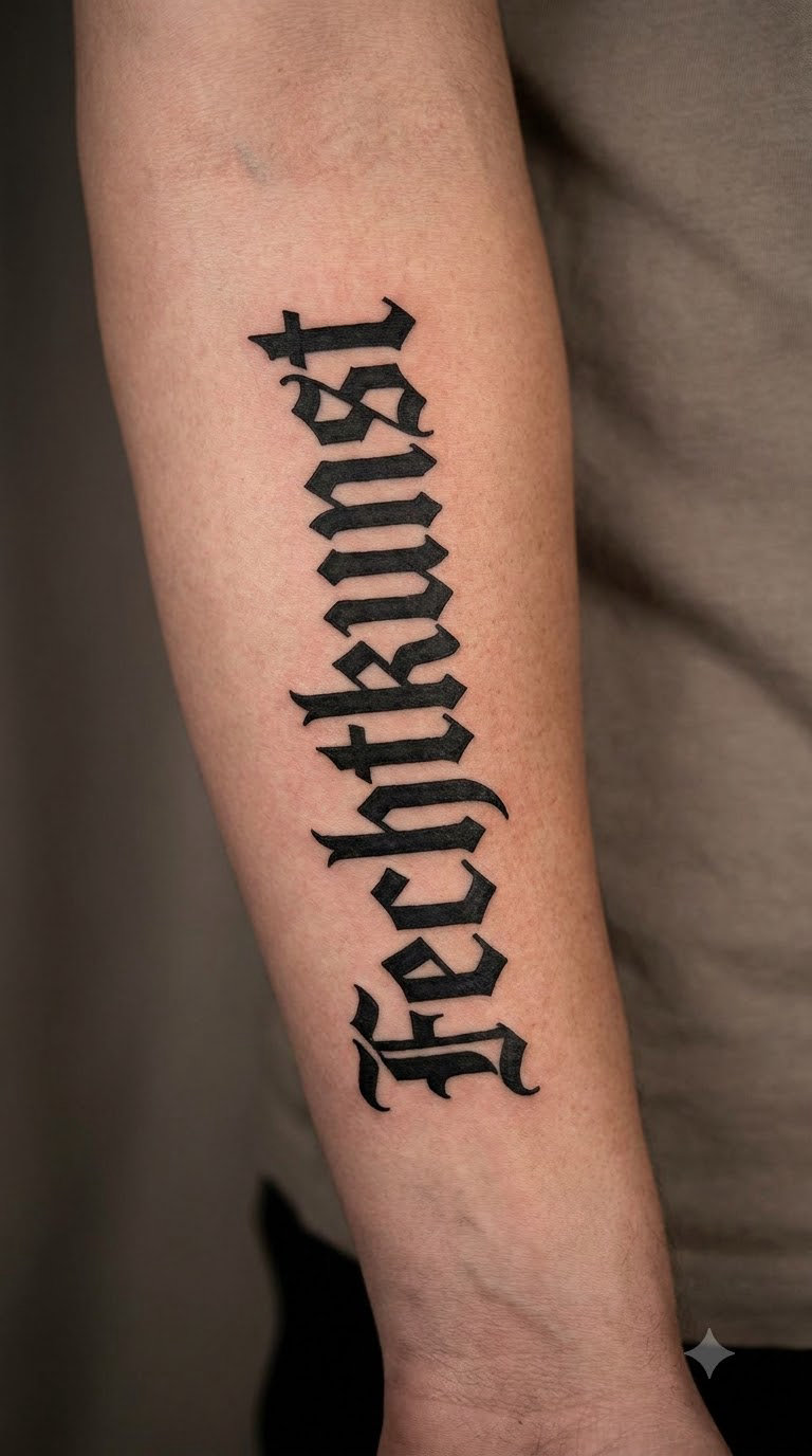
Escrime is the specialist choice in this list. It is fencing, the sport, and it is tattooed in blackletter with sharp Gothic letterforms, vertical on the inner forearm, with the f and the long s built as proper blackletter strokes rather than as approximations.
It means fencing, and it is a word for a discipline rather than a feeling. That is why it suits people who fence, who coach, or who like the idea of controlled, deliberate movement.
Placement: inner forearm, vertical. Size: 2.5-3 in (6-7.5 cm) tall. Style: blackletter. Pain: medium. Blackletter has a lot of internal detail per letter, so it takes time in one small area. The angular strokes are the most durable lettering style there is, and they stay sharp as the skin changes, which suits a word tied to a sport you might keep for life.
Make it yours: a small crossed-swords or mask shape behind the word in thin line, or set the word in the full spelling escrime with the accent-free form only if a fencer has confirmed the style you want.
18. Douceur Watercolor Word Tattoo
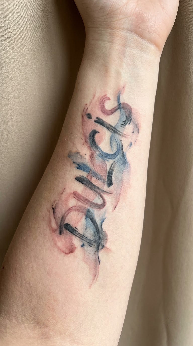
Douceur is brushed lettering again, but softer than sauvage: dusty rose and a washed blue with black line holding the letter shapes together, and the color allowed to sit slightly outside the letters like a wet edge. The strokes are wider, the joins looser.
It means sweetness or gentleness, and the natural reading is tenderness rather than literal sugar. People choose it for a person, a child, or a temperament they like being.
Placement: inner forearm or along the ribs where there is room to let the color spread. Size: 2.5-3 in (6-7.5 cm) across. Style: watercolor. Pain: medium. Translucent color needs more passes than black, and the ink sits a little deeper. Rose and blue hold reasonably well, while the lightest tints fade first, so an artist will usually mix them a touch stronger than looks right in the bottle.
Make it yours: a name or date in small black print underneath, or limit the palette to two colors so the wash reads as intentional.
19. Chasing Dreams Fine-Line Back Tattoo
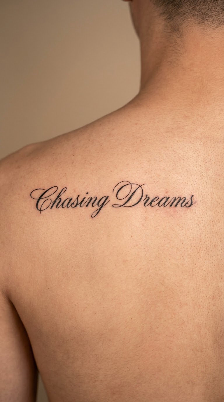
Chasing dreams is the one long phrase here, and it is written in English, set in a French hand. The lettering is clean, upright, evenly weighted and widely spaced, in one line across the upper back so the words have room to breathe instead of crowding each other.
It means chasing dreams, and its personal meaning is the reason it belongs here: the effort of going after something. The French styling changes the tone, not the sentence.
Placement: upper back, centred between the shoulder blades or running across one shoulder blade. Size: 6-8 in (15-20 cm) across. Style: fine line. Pain: medium to high. The back is a large surface and the session is long, and the upper back is ticklish enough that most people fidget. The main risk here is crowding, which is why the spacing has to be drawn before the size is fixed.
Make it yours: break the phrase onto two lines with a wide gap, or add a small line-drawn compass or mountain range underneath in the same weight.
20. Bonheur Micro-Calligraphy Tattoo
Bonheur is the last one because it is the most useful word on the list. Seven letters, one accent-free hand, micro-calligraphy with the downstrokes pressed slightly heavier than the upstrokes so the word still reads at two inches tall. The h and the r get a little air around them.
It means happiness, and it is the word tattoo shops hear most often from people who could not decide between everything else here.
Placement: side of wrist, or the inside of the forearm. Size: 1-1.5 in (2.5-4 cm) across. Style: micro-calligraphy. Pain: low to medium, and the side of the wrist is less reactive than the inner. At this scale the artist has to simplify more than the reference image shows, so agree on a version that works at actual size rather than on paper.
Make it yours: add a small solid dot or a short date in the same hand, or pair it with a tiny matching word on the other wrist.
How to Choose the Right Design
Most people arrive with a word and leave with a word they cannot read from two feet away. Fixing that takes one conversation, not ten more saved images. Here is the order I would work through it in.
Decide on the letterform before the word
Script, serif and blackletter behave completely differently on skin. Fine script looks soft and elegant but its thin upstrokes wear down fastest. Serif and block lettering hold their shape for decades and read from a distance. If you want something that still looks the same in fifteen years, choose a heavier hand.
Match the size to the word length, not the other way round
Short words, three to five letters, can be small and quiet. Longer words, seven letters and up, need more physical width or a stacked or vertical layout, and they need a flatter patch of skin. A nine-letter word forced into a two-inch space is the most common way French lettering ends up unreadable after healing. If you want our matching family tattoo ideas for four, the same sizing rule applies to every word in the set.
Pick the placement from the curve
Words want to follow a line. A forearm gives you a long straight one, a collar bone gives you a short straight one, and ribs give you an arc you can use deliberately. Wrists, ankles and hands work, but every letter there sits on skin that moves or changes shape, so leave more spacing than feels necessary.
Check the French before the design, not after
Have a native speaker or a professional translator confirm the spelling, the accents and the meaning. Ask for the literal reading and the natural reading, because they are not always the same. Ask how a French speaker would say it out loud, and check the register, since some words sound formal or final in a way English softens.
Test your French word tattoo ideas with the artist before you book
Bring the word written out, with accents, in the font you want. Ask the artist to draw it at the real size on transfer paper, put it on the placement and look at it from arm’s length. A word tattoo that only looks good in a photo taken an inch away is not the design you want to live with.
Cost and Session Time
Tattoo pricing varies more by shop and artist than by word, and the honest answer is that nobody can quote you a single price for every French word tattoo. Most studios charge by the hour, and most set a minimum charge for any piece, which matters most for the small one-word designs, since a micro tattoo may still start at the same minimum as a larger piece.
Here is how the variables actually stack up:
- Word length drives time. Three to five letters is a short session. Seven to nine letters, or any two-word phrase like joie de vivre, usually takes noticeably longer because each letter is smaller.
- Style drives time. Solid black fills, blackletter detail and watercolor passes all take longer than a single hairline weight. Two fine lines and a watercolor wash are not the same appointment.
- Placement drives time. Ribs, sternum and the back of the neck are slow areas. A flat forearm or outer thigh is faster.
- Custom lettering costs more than stock lettering. If the artist has never tattooed a specific word in your chosen font, some of the session goes into drawing it well.
- Shop minimums set the floor. For a first small piece, the minimum is often the number that actually gets billed, so ask about it before booking.
- Second sessions are normal for long words. A long phrase, a back piece or a colour piece is often booked in two parts, and the second part carries the same minimum.
Ask for the hourly rate, the shop minimum and whether your word will need one session or two. Those three answers tell you more than any range you find online.
Aftercare Basics
Start with your artist’s aftercare instructions, since they match the products and technique they used. Everything below is general guidance that applies to lettering work.
- Follow your artist’s aftercare guidance first. It overrides anything general, including this list.
- Wash gently, twice a day. Lukewarm water, a fragrance-free wash, and clean hands before you touch the area. Loose pigment and plasma come off with washing, and leaving them on is what scabs.
- Protect the fresh tattoo for the first few days. Loose clothing over it, nothing tight or synthetic, and no shaving near the lines while they are still healing.
- Do not cover it for long. A bandage left on for hours traps heat and moisture. If your artist used a film wrap, follow their timing instead.
- Let it scab on its own. No picking, no scratching, no soaking in a pool, hot tub or sea while the skin is still new.
- Know when to call the artist. Swelling that does not settle, spreading redness, heat, a dull ache instead of an itch, or a colour that is fading far faster than your other tattoos. A blurred letter is a normal part of healing; a line that stays thin and grey after a few months is not, and your artist can reinforce it.
Frequently Asked Questions
Do French word tattoos need the accents?
Yes, keep them. Accents are part of the spelling, not decoration, and a French speaker reads an unaccented word as a different word or a misspelling. Your artist should trace the accents from a written reference you provide, ideally in a document, rather than from memory. If a small spot cannot hold a circumflex cleanly, an artist may simplify the lettering, but they should tell you before the stencil goes down.
What is a good small French word for a first tattoo?
Short words with simple lettering work best for a first piece: amour, reve written with its circumflex, paix and bonheur. Five to seven letters, lowercase, one hairline weight, placed on the inner wrist or the collar bone. Avoid phrases for a first tattoo, since the letters end up much smaller and ageing shows up in thin detail faster. Many of the best French word tattoo ideas on this list start at that size.
How do I check that a French tattoo translation is correct?
Ask a native French speaker or hire a professional translator, and give them the context you mean, not just the word. Ask three things: the correct spelling with accents, the literal translation, and how a French speaker would naturally say it. Include the pronunciation if pronunciation matters to you. Anyone who can confirm the meaning before the stencil is placed has removed the risk that tattoo writers keep warning about.
Are French word tattoos painful?
Most lettering work sits between low and medium. Wrist, ankle and outer thigh are near the lower end, while ribs, sternum, the inner bicep and the back of the neck are the stingier spots. Style changes the session more than placement does: a solid black word or a watercolor piece takes longer in one area, and a longer session usually feels more uncomfortable than a sharper short one.
How small can lettering go before it becomes unreadable?
About one inch wide is the practical floor for a seven-letter word, and short words of four or five letters can go smaller. Below that, letters merge as they heal and as the skin relaxes over the years. Long words need more space, not less: a nine-letter word such as eternite in its full accented form is usually given a stacked or vertical layout so the letterforms stay open. Check the size with transfer paper on the placement before you commit.
What does a misunderstood or mistranslated French tattoo mean?
It usually means the meaning is not what the wearer intended, and native speakers notice immediately. Common causes are a caption that was never checked, a phrase whose literal translation is awkward in English, and a word whose register sounds formal or final. This is why a native-speaker check before booking matters more for French than for most other tattoo languages, and it is a five-minute conversation that cannot be undone later.
A Final French Word Tattoo Idea
If this is your first tattoo, go with the clean amour design on the inner wrist. Five letters, one hairline weight, one meaning, and a placement that heals well and stays quiet under a sleeve.
If you are adding to a collection, the papillon design gives you the most to work with, with the butterfly doing real work in the letterforms, and the couture-lettered options like watercolor sauvage or calligraphy joie de vivre give a bigger surface to work with. Whichever you pick out of these French word tattoo ideas, have the spelling, the accents and the reading confirmed by a native speaker, then ask the artist to draw it at real size on the placement before the stencil goes down.