
22 Greek Word Tattoo Ideas: Small and Timeless Tattoos 2026
A Greek word tattoo is a design that carries a single Greek word, written in the Latin alphabet or in Greek script, chosen for what it means rather than for a name. Most people come to these 22 Greek word tattoo ideas because they want a small piece with real substance: love that is not romantic, courage, truth, or a word connected to home. Plan a few weeks out if you are booking around a season, since good script artists book up quickly.
What makes a word tattoo work on skin is restraint. One word, set in a style that suits your word’s shape, with enough stroke weight to survive healing. Every idea below includes placement, size, style, an honest pain note, and one way to make it yours.
22 Greek Word Tattoo Ideas: Quick Guide
| Idea | Style | Best placement | Size | Pain |
|---|---|---|---|---|
| Agape | Fine-line script | Inner forearm | 2 to 3 in (5 to 8 cm) | Low to medium |
| Eros | Flowing blackwork | Outer forearm | 2.5 to 3.5 in (6 to 9 cm) | Medium |
| Psyche | Minimal line art | Forearm | 1.5 to 2 in (4 to 5 cm) | Low |
| Soma | Watercolor lettering | Upper arm | 2.5 to 3 in (6 to 8 cm) | Low to medium |
| Styx | Blackwork lettering | Forearm | 2 to 3 in (5 to 8 cm) | Medium |
| Ethos | Elegant fine line | Inner arm, vertical | 2 to 3 in (5 to 8 cm) | Low |
| Pathos | Handwritten script | Wrist | 1.5 to 2 in (4 to 5 cm) | Medium |
| Nemesis | Traditional lettering | Upper arm | 3 to 4 in (8 to 10 cm) | Medium |
| Kratos | Blackwork | Forearm | 2.5 to 3.5 in (6 to 9 cm) | Medium |
| Andreia | Fine-line script | Inner forearm | 2 to 3 in (5 to 8 cm) | Low to medium |
| Eleutheria | Minimalist lettering | Outer arm | 3 to 4 in (8 to 10 cm) | Low |
| Xenia | Fine-line calligraphy | Inner wrist | 1.5 to 2 in (4 to 5 cm) | Medium |
| Dikaiosyne | Sculptural lettering | Forearm, horizontal | 4 to 5 in (10 to 13 cm) | Medium |
| Moira | Watercolor script | Shoulder | 2 to 3 in (5 to 8 cm) | Low to medium |
| Ananke | Neo-traditional lettering | Upper arm | 2.5 to 3.5 in (6 to 9 cm) | Medium |
| Sophia | Dainty script | Wrist | 1.5 to 2 in (4 to 5 cm) | Medium |
| Harmonia | Flowing script | Forearm | 2.5 to 3.5 in (6 to 9 cm) | Low to medium |
| Eirene | Traditional blackwork | Outer upper arm | 2.5 to 3 in (6 to 8 cm) | Medium |
| Arete | Fine-line geometry | Forearm | 1.5 to 2 in (4 to 5 cm) | Low |
| Metis | Minimal blackwork | Inner upper arm | 2 to 2.5 in (5 to 6 cm) | Low |
| Aletheia | Delicate script | Forearm | 2.5 to 3.5 in (6 to 9 cm) | Low to medium |
| Kallos | Handwritten blackwork | Wrist | 1.5 to 2.5 in (4 to 6 cm) | Medium |
How Greek words translate into tattoo designs
Greek has no special alphabet for tattoos, so the same word can be written three ways. Transliteration is the Latin-letter version everyone can read: agape, xenia, aletheia. Transcription is the actual Greek script, and it carries visual weight that Latin letters do not. A third route is a modern Greek spelling, which often differs from the ancient form.
Whichever you pick, the lettering carries the design. Script styles feel personal, block lettering feels steady, and a word with long letters such as dikaiosyne suits wide spacing and sculptural shapes. Supporting elements help only when they stay quiet: one small dot of colour, or nothing at all.
1. Agape in Fine-Line Script
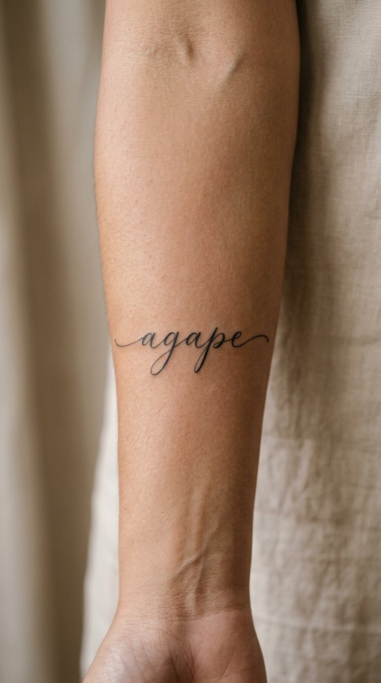
Agape renders as a short, soft word with a looping descender, which makes it a joy to draw in fine-line script. Single-weight black lines, generous letter spacing, and no extra flourish. Six letters means it can sit small and still read.
The Greek word is associated with selfless or unconditional love, and in Greek writing it carries affection more broadly than romance. People choose it for family, for a friend, or for a relationship. It is a word to wear, not a promise that anything is protected.
Placement: inner forearm, or the soft area below the collarbone. Size: 2 to 3 in (5 to 8 cm) across. Style: fine-line script with slightly heavier downstrokes.
Pain: low to medium, a scratchy tap rather than a deep ache. Fine line on the inner arm softens over the years. Make it yours: add the date it was given in tiny numerals under the descender.
2. Eros in Flowing Blackwork
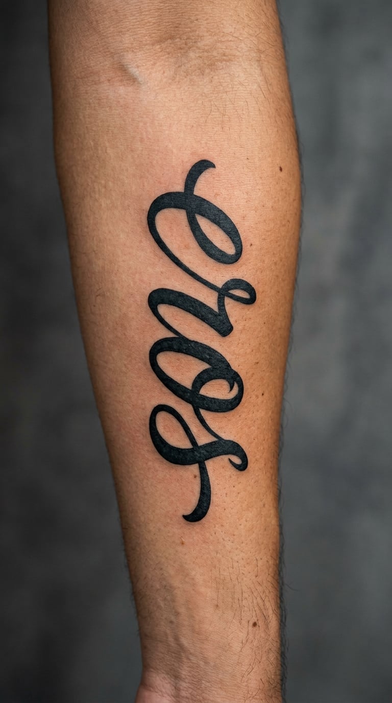
Eros is four letters with a strong horizontal rhythm, so flowing blackwork suits it well: thick downstrokes, tapered exits, a little negative space between letters. The capital can carry a long swash that balances the short word.
Eros is both the ancient personification of love and the Greek word connected with desire and attraction. Tattooing the lettering instead of a winged figure keeps the meaning in the word rather than in an illustration of Cupid.
Placement: outer forearm, reading horizontally. Size: 2.5 to 3.5 in (6 to 9 cm). Style: expressive blackwork lettering.
Pain: medium, the forearm takes ink steadily. Bold strokes hold their shape longer than hairlines. Make it yours: let the final s finish in a single drawn-out line that follows the forearm curve.
3. Psyche in Minimal Line Art
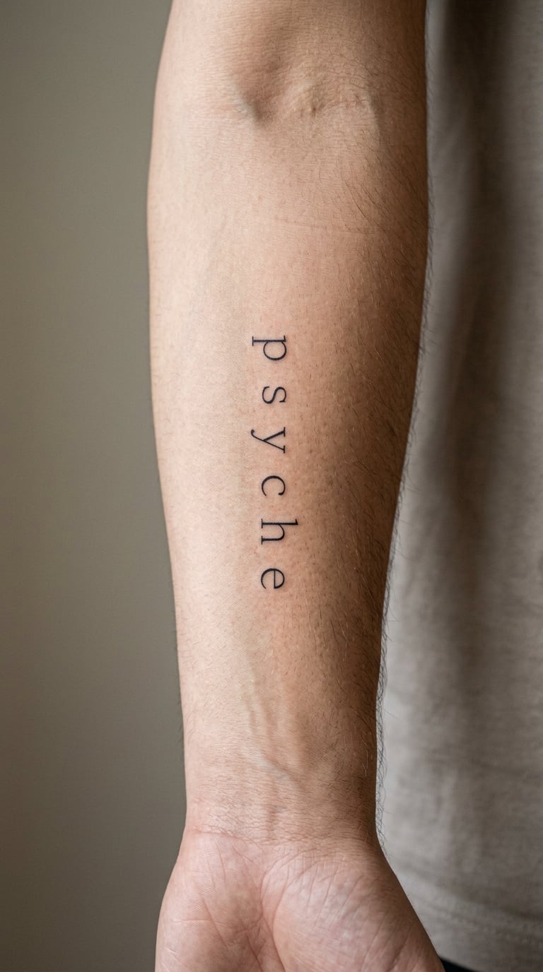
Psyche looks good in clean lowercase line art: even 1.5 mm lines, uniform pressure, letters set far enough apart that each one reads on its own. Nothing else in the composition, because the word is short enough that detail would crowd it.
The Greek word is associated with soul, mind, and breath, and it has a layered history that includes the personified Psyche of myth. Meaning shifts between wearers, so ask yourself which reading is yours before you commit to a placement.
Placement: forearm or the inside of the upper arm. Size: 1.5 to 2 in (4 to 5 cm). Style: minimal single-line lettering.
Pain: low, small surface area. Lowercase script placed near a joint will blur as the skin moves. Make it yours: use the Greek form Ψυχή instead of Latin letters for a piece tied to reading.
4. Soma in Watercolor Lettering
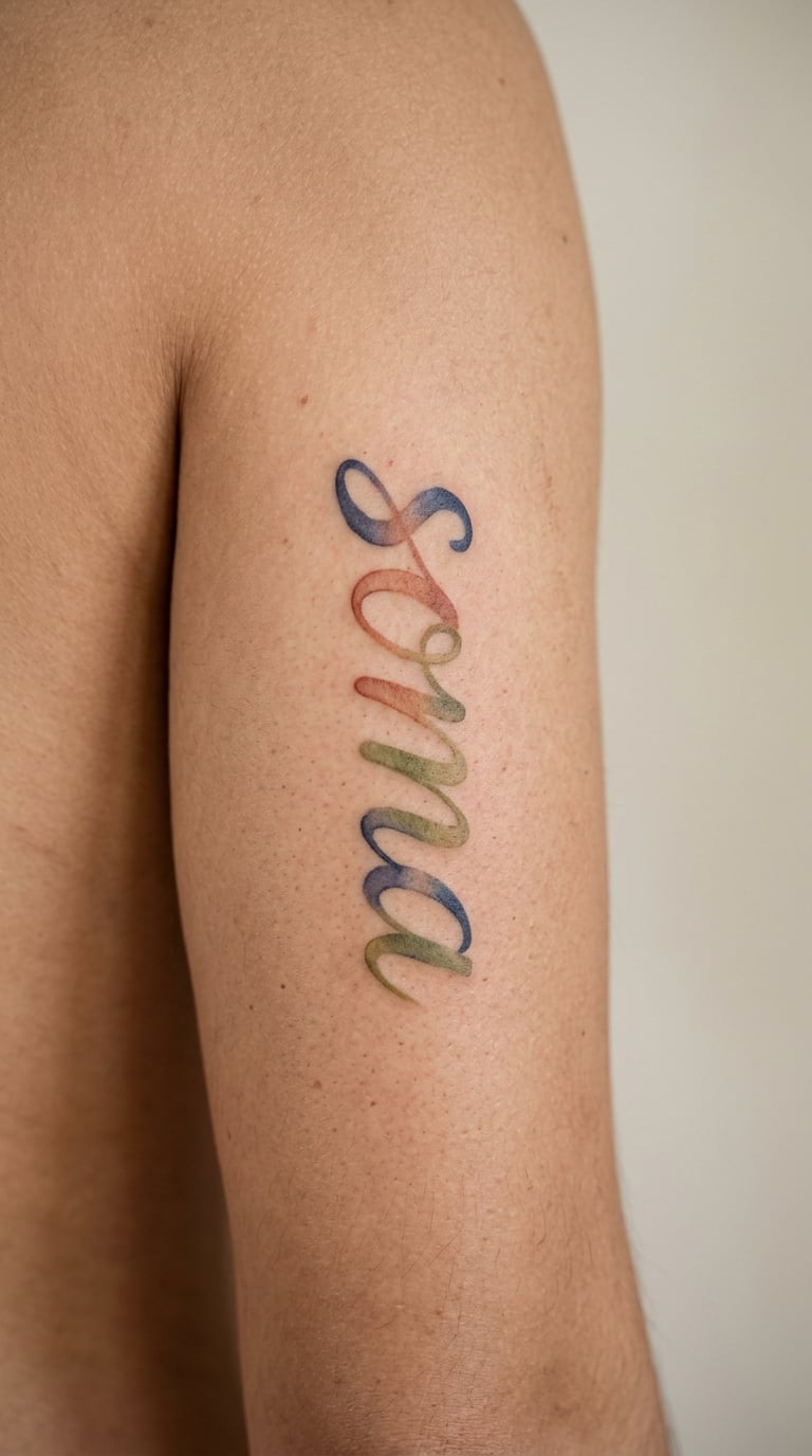
Soma in watercolor is a piece about colour. Four broad letters, each filled with a translucent wash that overlaps at the edges, leaving the paper-white of skin showing through. Ink on the upper arm gives the colour room to breathe.
Soma is the Greek word for body, and people tend to choose it as a focus on physical being, on being present in a body, or on something specific about their own body and its limits. It reads as attention rather than a fixed doctrine. If the idea you want to carry is inherited rather than physical, our guide to 20 DNA tattoo ideas takes the same personal route with a different symbol set.
Placement: upper arm or shoulder blade. Size: 2.5 to 3 in (6 to 8 cm). Style: loose watercolor lettering with soft edges.
Pain: low to medium, and a coloured session runs longer than a black one. Watercolour softens as it settles, so the healed version is lighter than day one. Make it yours: add one accent stroke in a single colour that matters to you.
5. Styx in Blackwork Lettering
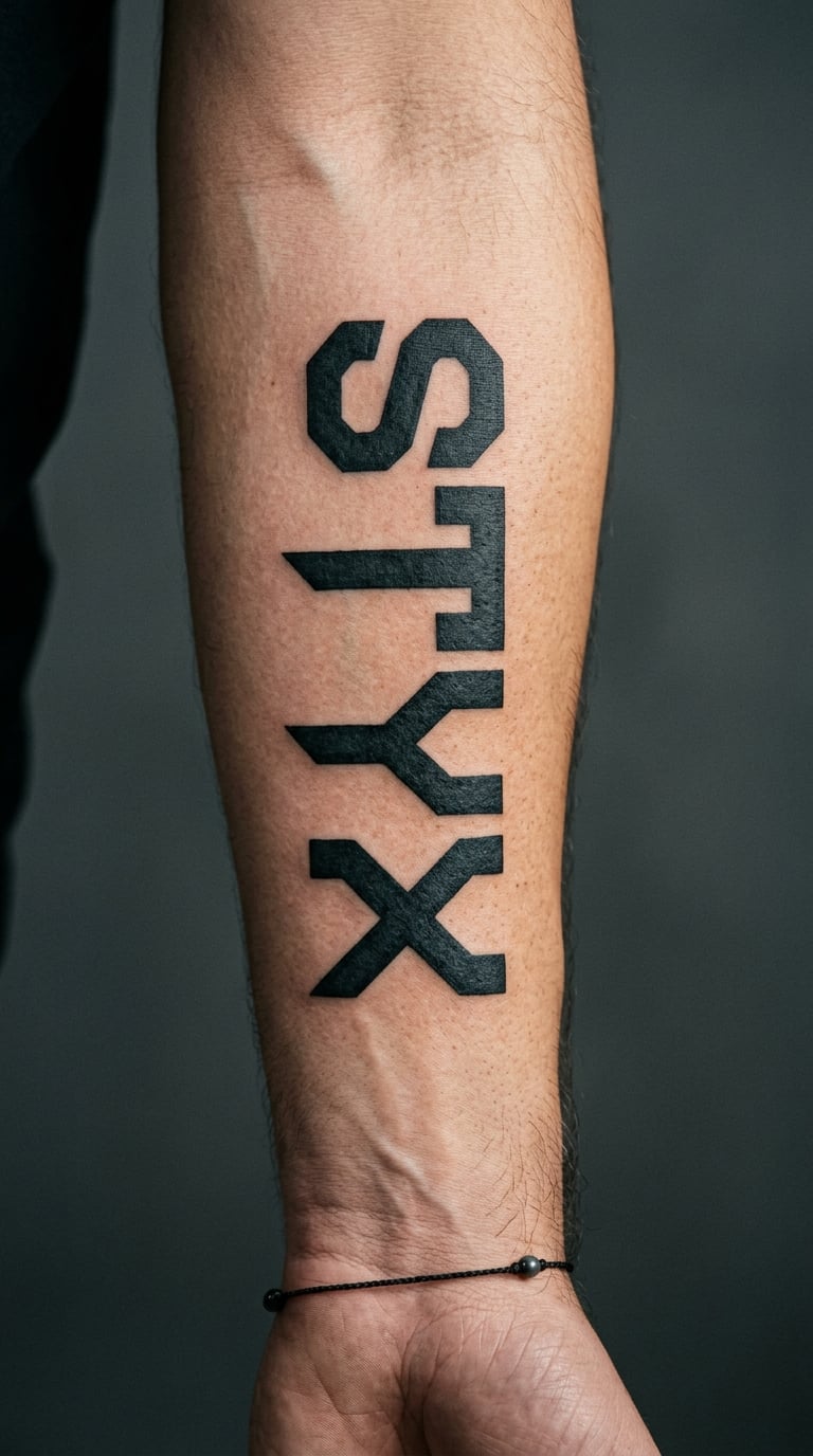
Styx is four letters with sharp angles, so dense angular blackwork is the honest style for it. Fill the letterforms almost solid, then cut clean triangular gaps so the negative space does as much work as the ink.
Styx is the name of the river in Greek myth and the personification associated with it, bound up with oaths and with the crossing between life and what follows. Personal readings often add resolve or permanence. That is a modern layer, not the ancient definition.
Placement: forearm, centred. Size: 2 to 3 in (5 to 8 cm). Style: angular blackwork with geometric counters.
Pain: medium where solid packing builds heat. Dense black holds its edge better than outline work. Make it yours: keep the crossbar of the x below the baseline, a small detail most artists will happily try.
6. Ethos in Elegant Fine Line
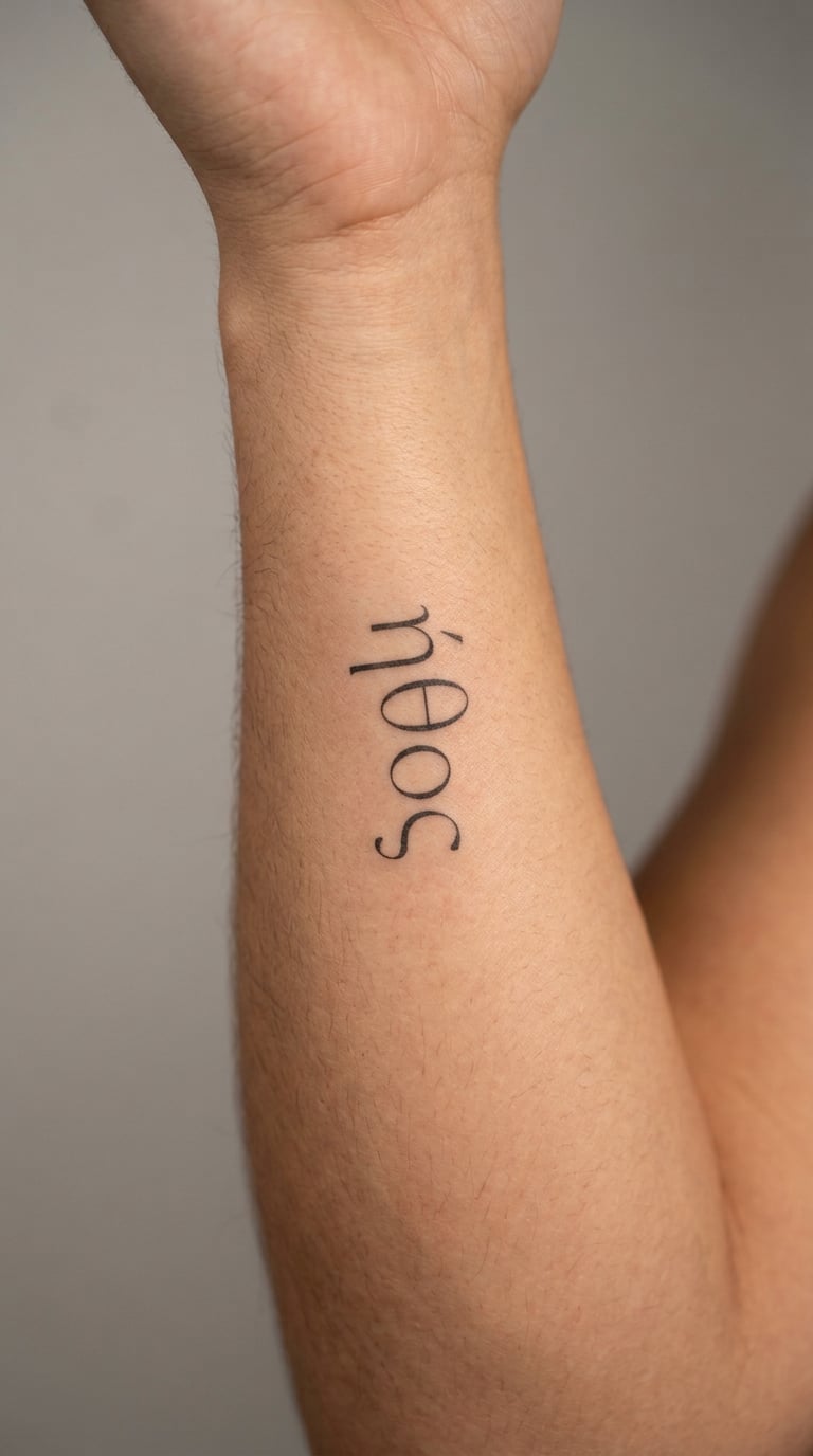
Ethos is five narrow letters that suit tall, thin lettering. Set it vertically along the inner arm and the word reads like a quiet inscription, with the letters stacked rather than stretched. Line weight stays even across all five.
Ethos is the Greek term for character, for the guiding principles someone lives by, and for the spirit that persuades. It turns up in speeches about public life, which is where the persuasive sense comes from.
Placement: inner arm, vertical, or the sternum. Size: 2 to 3 in (5 to 8 cm) tall. Style: narrow elegant fine line.
Pain: low. Vertical text on the inner arm stretches as the arm moves, so expect a little line softening. Make it yours: place it along a scar or a line you already have, so the word follows existing geometry.
7. Pathos in Handwritten Script
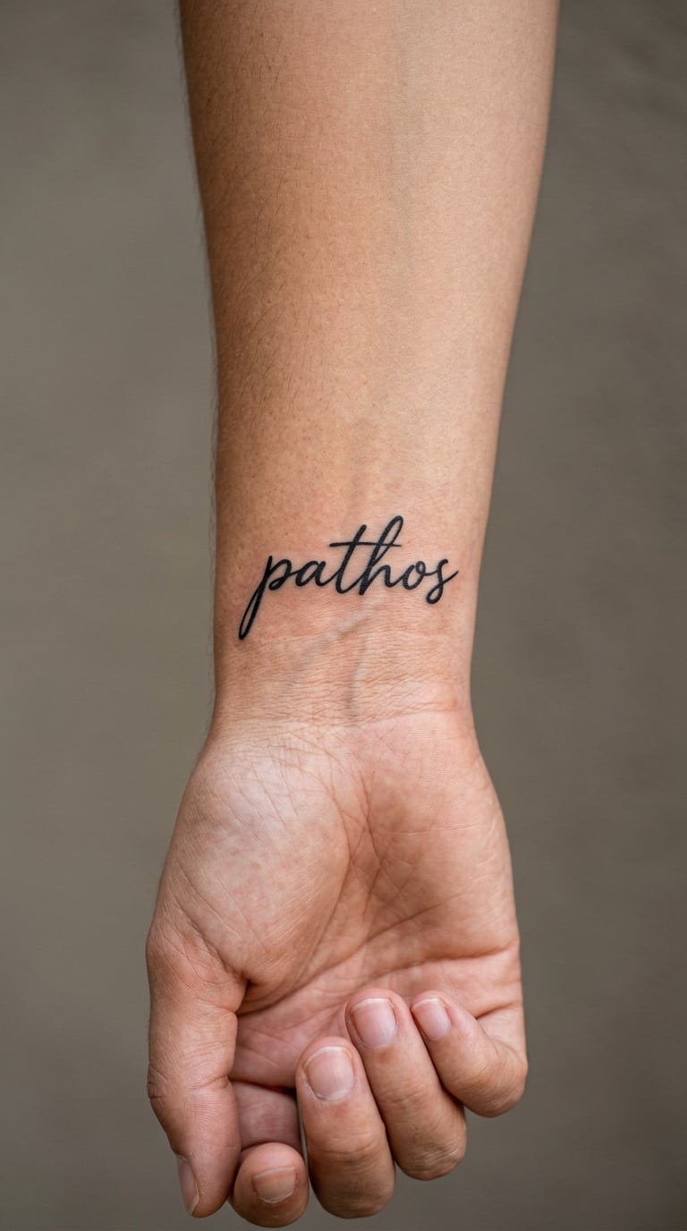
Pathos in handwritten script should look slightly imperfect, like a hand wrote it rather than a template. Keep the loops open and the baseline consistent, and size it so the tall h and long s still read at arm’s length.
Pathos is associated with emotion, with appeal, and with expression that reaches people. It is not a word that always means sadness, though plenty of wearers land there, especially after a hard year.
Placement: wrist, running along the bone just above the hand. Size: 1.5 to 2 in (4 to 5 cm). Style: handwritten script with a monoline feel.
Pain: medium, wrists are bony and the skin is thin. Wrist script softens fastest of any placement here, so ask for heavier strokes. Make it yours: trace the first line of a note you wrote and let the artist build the word around its rhythm.
8. Nemesis in Traditional Lettering
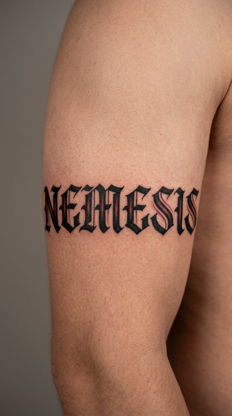
Nemesis is seven letters, which gives a traditional lettering artist room to work. Bold black outlines, a low-contrast red wash tucked into the inner parts of each letter, nothing illustrative. The word does all the talking.
In Greek usage nemesis points to opposition and rivalry, and to the force that checks excess. That second sense is the one people come for. Treat any protective meaning as your own reading rather than an ancient guarantee.
Placement: outer upper arm or across the chest. Size: 3 to 4 in (8 to 10 cm). Style: bold traditional lettering with restrained colour.
Pain: medium over the upper arm, more sensitive near the armpit. Red fill fades noticeably faster than black outline. Make it yours: have the lettering angle slightly downward, so the word reads as settling rather than standing.
9. Kratos in Blackwork
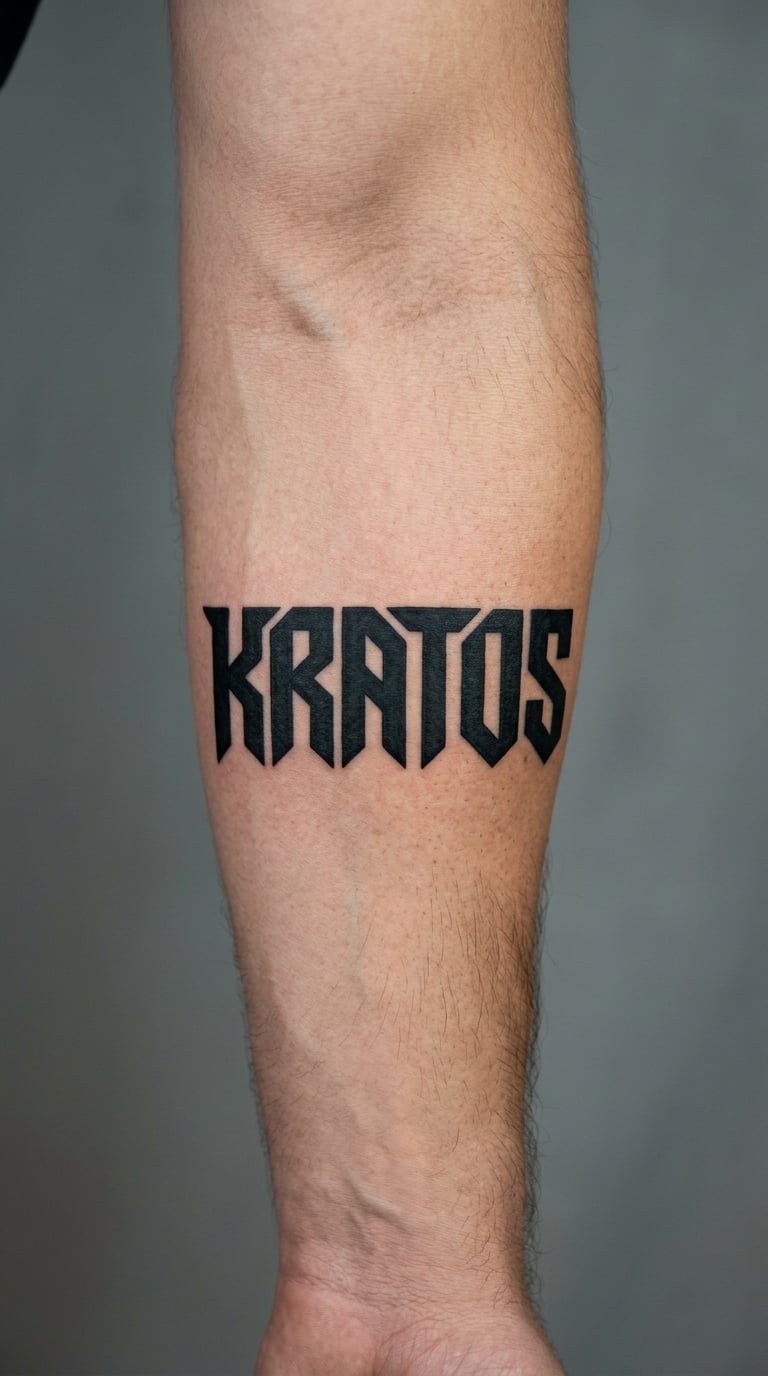
Kratos wants weight. Heavy geometric blackwork gives each letter a thick body, tight counters, and square terminals, so the word reads as a solid block. Six letters at that density make a proper statement forearm piece in miniature.
Kratos is the Greek word for power, rule, and strength, and the personification of that force in Greek myth. In modern pop culture the same spelling is attached to a particular fictional hero, so if you want the older sense, keep the design word-only.
Placement: forearm, centred and horizontal. Size: 2.5 to 3.5 in (6 to 9 cm). Style: geometric blackwork with sharp internal angles.
Pain: medium, and solid packing on the forearm needs breaks. Dense black outlasts almost every other style. Make it yours: set the word on its own line and put a short second word beneath it, so the piece stacks.
10. Andreia in Fine-Line Script
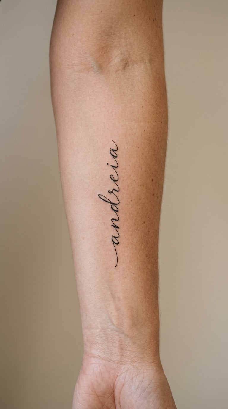
Andreia is a seven-letter word that looks good in an even, uncluttered script, with the letters spaced so the word breathes along the forearm. The tall d and the final a give the line two anchors, which helps with balance.
Andreia is a Greek term for courage, and in older usage it carried the sense of manly valour. Modern readers usually take the courage half and leave the historical framing behind, which is a reasonable place to stand.
Placement: inner forearm, parallel to the tendon line. Size: 2 to 3 in (5 to 8 cm). Style: restrained fine-line script.
Pain: low to medium. Seven letters take longer than four, so plan for a two-hour slot. Inner forearm script softens at the wrist end first. Make it yours: ink it in a warm brown instead of black for a quieter look over time.
11. Eleutheria in Minimalist Lettering
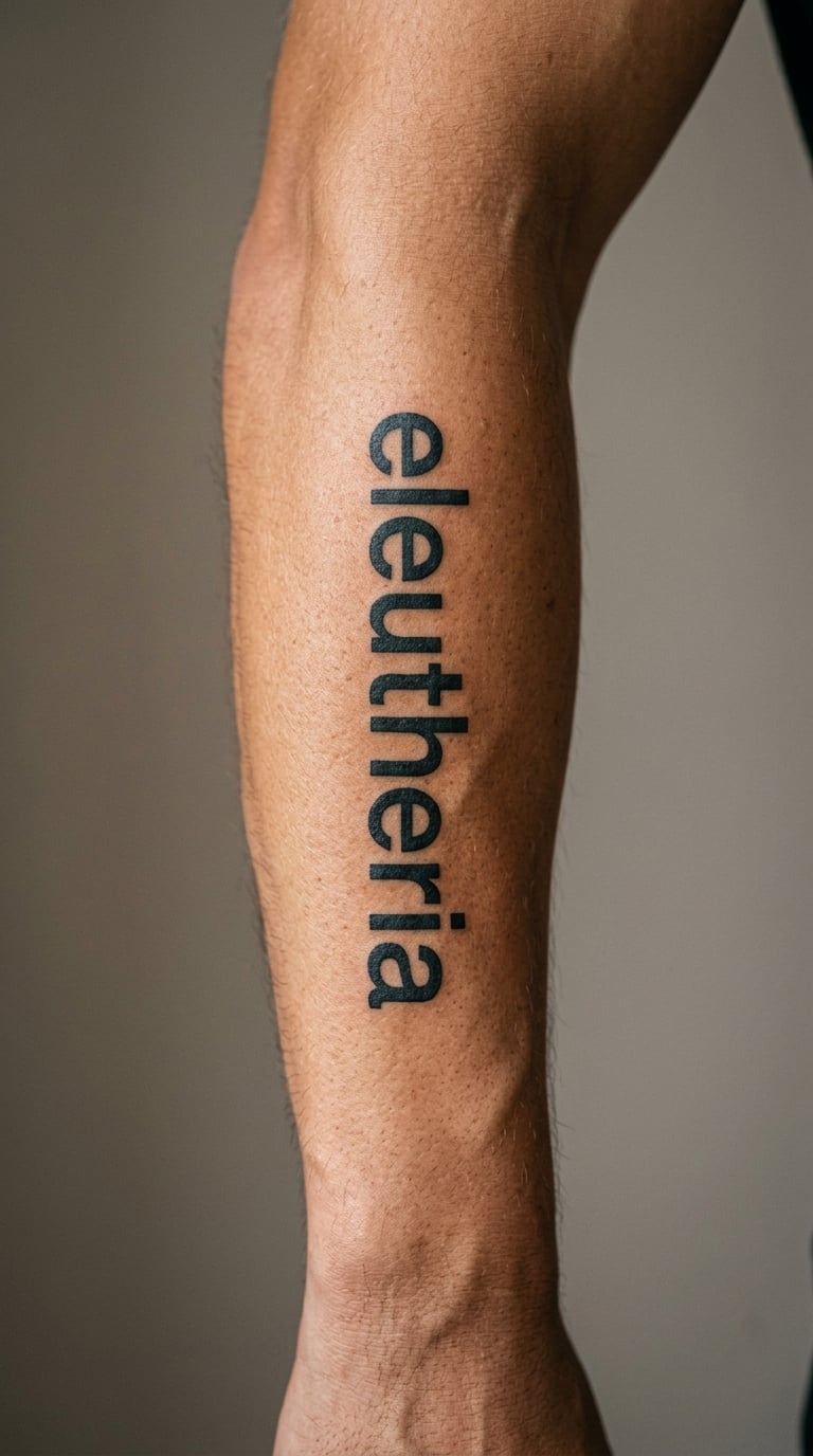
Eleutheria is a long word, so the design has to be decided before the placement is. Minimalist black lettering with square ends, uniform weight, and no connectors looks calm and reads clearly, especially with a stroke at least 1.5 mm wide.
Eleutheria is the Greek word for freedom or liberty. It is a common choice for a life change, a move, or a new chapter, and it works well as a first word tattoo because it says something about the wearer rather than about anyone else. If the story behind your change involves a place rather than a word, 20 best hiking tattoo ideas with meaning handles the same idea without lettering.
Placement: outer arm or along the side of the torso. Size: 3 to 4 in (8 to 10 cm), which suits the word’s length. Style: minimalist sans-serif lettering.
Pain: low on the outer arm. Scale and stroke weight decide how it ages: thin small letters blur within a few years. Make it yours: leave one letter slightly wider than the rest, the way a signature does.
12. Xenia in Fine-Line Calligraphy
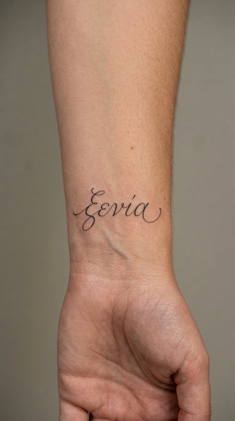
Xenia is short, with one tall letter and one that dips, which makes it a gift for a calligrapher. Fine-line calligraphy with a broad nib gives the x a shaded downstroke and the final a a small curl. No hearts, no cups, no food.
Xenia is the ancient Greek concept of hospitality: the generous reception of a guest, treated as a serious duty rather than a pleasantry. Wearers often extend it into how they treat people, which is a personal reading of an old social idea.
Placement: inner wrist, or above it at the forearm crease. Size: 1.5 to 2 in (4 to 5 cm). Style: fine-line calligraphy with a shaded downstroke.
Pain: medium on the wrist. Broad-nib shading puts more ink in one pass, which helps the word hold together. Make it yours: add a date in the same hand when the piece marks a house-warming or a return home.
13. Dikaiosyne in Sculptural Lettering
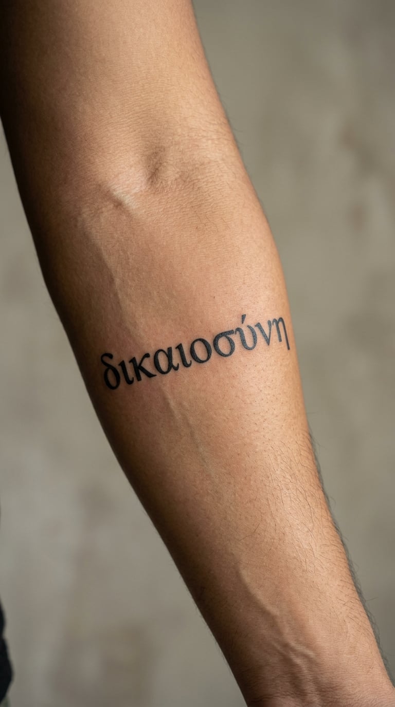
Dikaiosyne is the longest word in this list, so it needs the widest canvas. Sculptural lettering means letters with real volume: shaded inner faces, a highlight edge, and generous width per character. Ten letters across a forearm is the honest way to keep them readable.
The word is connected with justice, with righteousness, and with fairness. It came into Greek writing through a set of civic ideas about how a city treats its people, which is why it suits a law, ethics, or public-service tattoo.
Placement: forearm, horizontal, or across the upper chest. Size: 4 to 5 in (10 to 13 cm). Style: sculptural lettering with light shading.
Pain: medium, and a word this size needs a full session. Longer words stretch as skin moves, so keep the ends on flatter areas. Make it yours: break the word across two lines and put the second line on the inner arm, so the piece wraps.
14. Moira in Watercolor Script
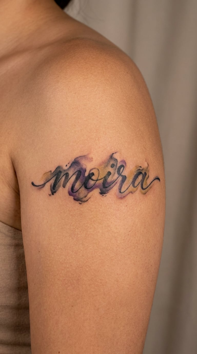
Moira in flowing script wants a wet look: the colours bleed into each other at the edges, and the black is smoky rather than flat. The shoulder takes a wide, soft shape well, so the word can arc slightly with the bone.
Moira is the ancient Greek term for fate, portion, or allotted share. A lot of people read it as acceptance, which is a personal framing rather than the ancient one. Some wear it as a reminder to stop arguing with what cannot be changed.
Placement: shoulder or upper chest. Size: 2 to 3 in (5 to 8 cm). Style: flowing script with wet-into-wet colour.
Pain: low to medium. Gold pigment needs a full session and fades to a warmer tone as it heals. Make it yours: use the date of one specific change instead of a birth date, so the word points at an event.
15. Ananke in Neo-Traditional Lettering
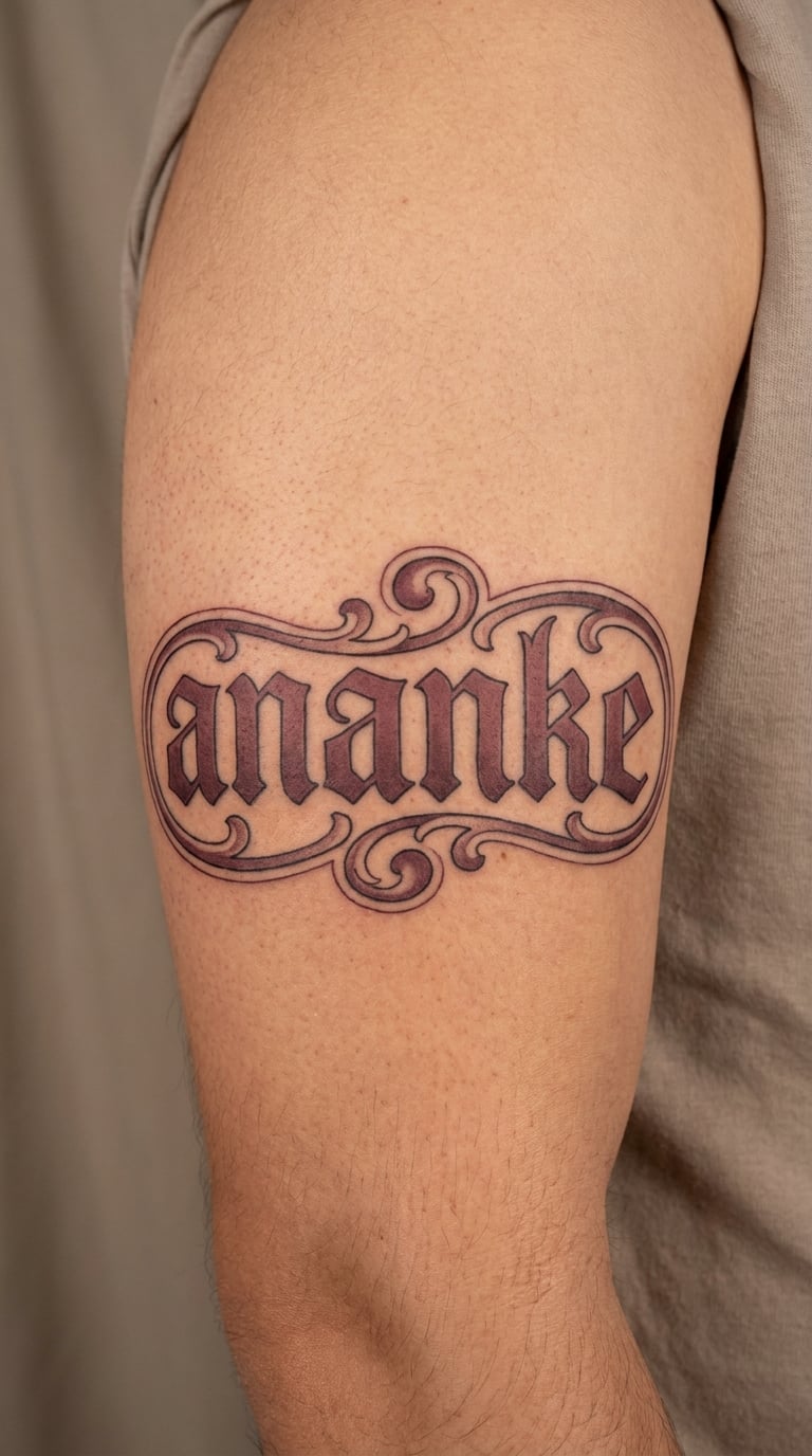
Ananke takes neo-traditional lettering well because the six letters have enough body to hold shading. Bold black line, a restrained burgundy shade in the inner thirds, and a single highlight on the downstrokes. Nothing illustrative crowds the word.
Ananke is associated with necessity, compulsion, and inevitability. The goddess of that name appears in Greek myth as a force that binds. Reading it today as resilience, as the strength that comes after the thing you could not change, is a modern choice.
Placement: upper arm, or the back of the shoulder. Size: 2.5 to 3.5 in (6 to 9 cm). Style: neo-traditional lettering with limited shading.
Pain: medium, the upper arm feels more than the forearm. Burgundy shading will soften within a few years. Make it yours: have the first a lean forward, giving the word a small push at the start.
16. Sophia in Dainty Script
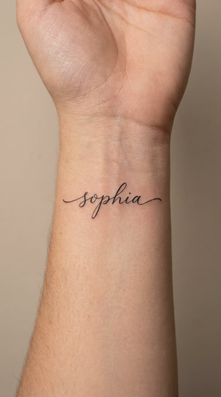
Sophia is short and symmetrical, with a tall h in the middle that anchors it. Dainty script works if the artist weights the strokes slightly heavier than usual, so the six letters do not vanish after a few years. It is a good first word tattoo.
Sophia is the Greek word for wisdom, and it appears in philosophy, in scripture, and in the naming of countless people and places. Most wearers take the plain sense of it: judgement, learning, knowing.
Placement: centred on the wrist, or the inner forearm. Size: 1.5 to 2 in (4 to 5 cm). Style: dainty script with reinforced downstrokes.
Pain: medium on the wrist. Dainty lines on the wrist fade quickest of anything in this list, so agree the line weight in the consultation. Make it yours: add a small dot above the i to echo a printed book you love.
17. Harmonia in Flowing Script
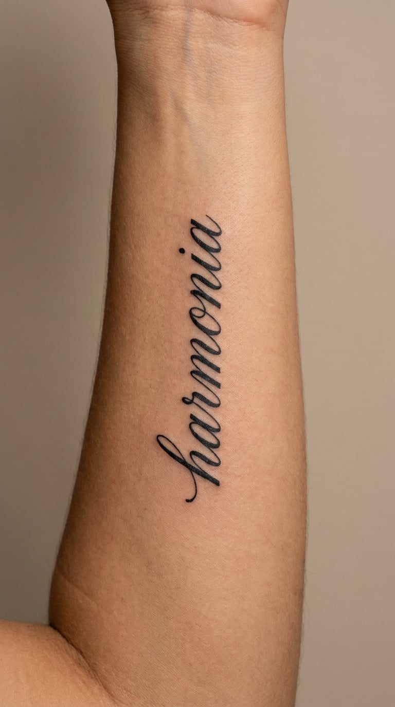
Harmonia has a musical feel to it, but the lettering can carry that without any instrument. Eight letters in a flowing script, spaced like notes, the ascenders leaning slightly forward so the whole word moves. No emblem, no tuning fork.
Harmonia is the Greek form connected with harmony, proportion, and ordered arrangement. In Greek thought the word covers both musical and social balance, which makes it easy to place on a piece about a relationship, a household, or a body in training.
Placement: forearm or the inside of the upper arm. Size: 2.5 to 3.5 in (6 to 9 cm). Style: flowing script with even spacing.
Pain: low to medium. Eight letters in a fluid hand can run long, so book a full session. Flowing script loses its sharpest curves first. Make it yours: set the word on a slight arc that follows the line of your collarbone.
18. Eirene in Traditional Blackwork
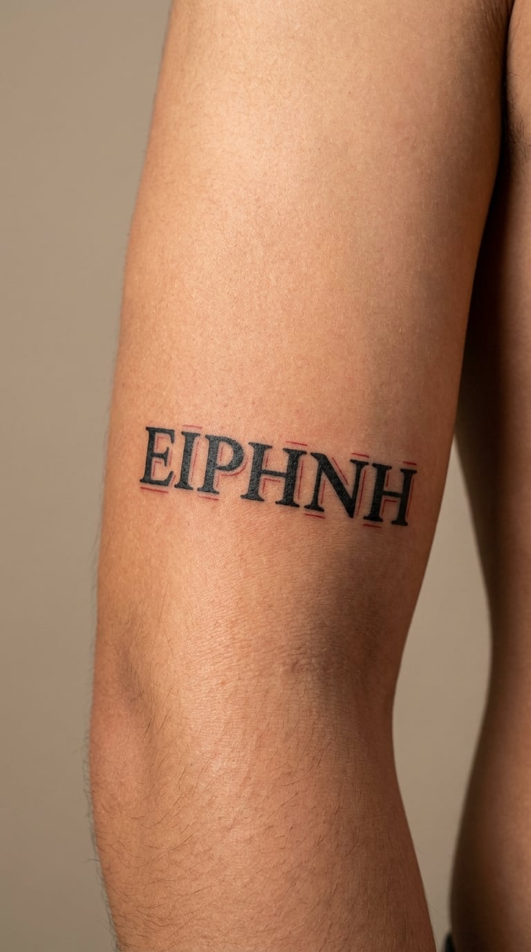
Eirene is six letters that fill an upper arm well in bold traditional blackwork. Solid black bodies, a red accent line running through part of the word rather than all of it, and a slight lean to the capital for movement.
Eirene is the Greek word for peace, and the personification of peace has her own body of Greek myth. She is often confused with the Roman Pax, which is a different figure with a different story. The word itself is simply peace.
Placement: outer upper arm. Size: 2.5 to 3 in (6 to 8 cm). Style: traditional blackwork with red accents.
Pain: medium on the outer upper arm. Traditional line work hides small shakes well, which suits a first longer word. Make it yours: put the red accent in a single national or team colour rather than pure red.
19. Arete in Fine-Line Geometry
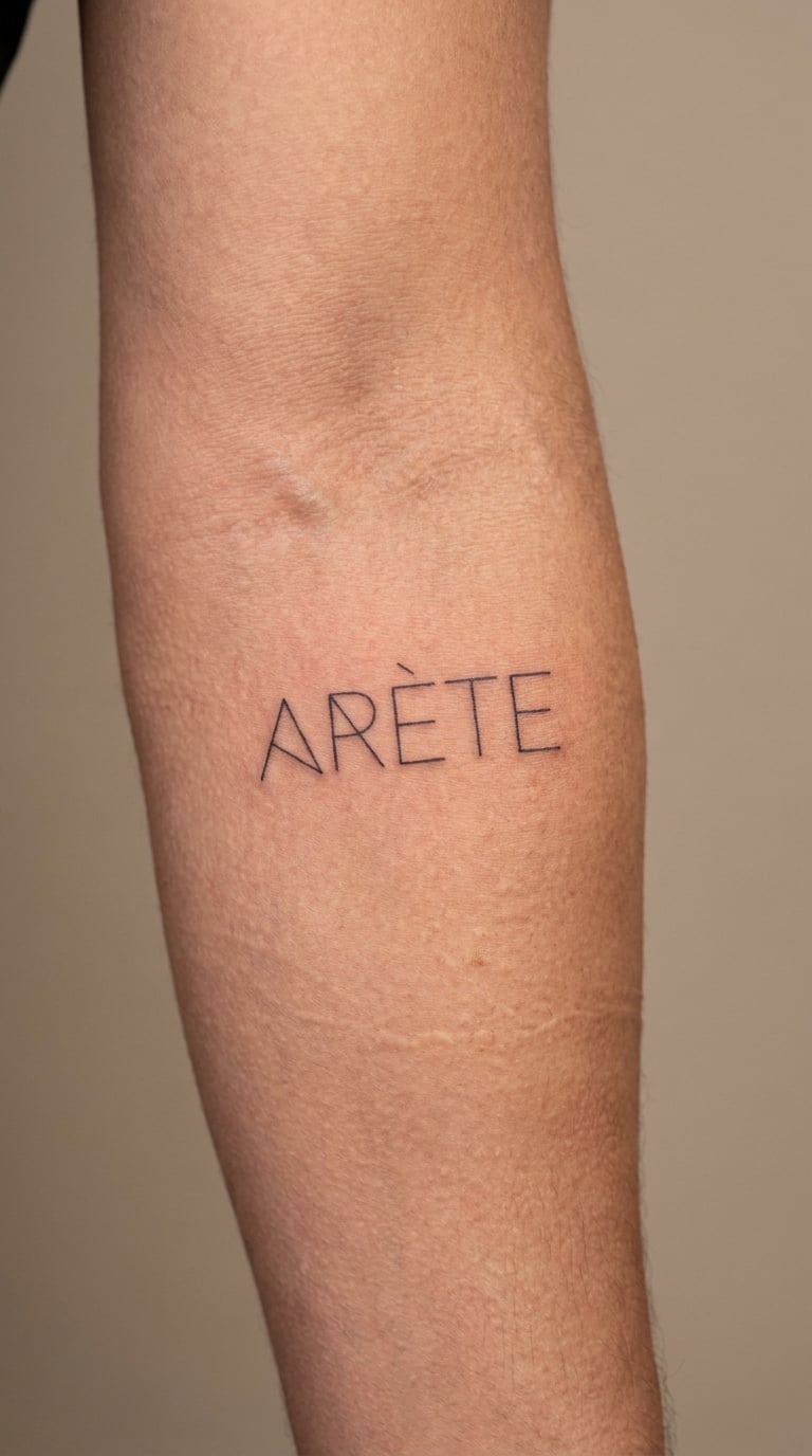
Arete is five letters with a mirrored feel, so geometric fine-line lettering works: strokes built from clean angles, symmetrical weight, and hairline construction lines that do not survive. No laurel wreath, no athlete, no discus.
Arete is an ancient Greek term for excellence, for virtue, and for doing the thing you were made for at the level you are capable of. It appears constantly in discussion of the ideal person, which is why it suits a graduate or a performer.
Placement: forearm, or the back of the hand. Size: 1.5 to 2 in (4 to 5 cm). Style: symmetrical geometric fine line.
Pain: low on the forearm, more sensitive on the hand. Fine geometry blurs over time, so avoid going below 1.5 mm. Make it yours: build the letterforms around a shape you already have, such as a wrist bone or an old scar.
20. Metis in Minimal Blackwork
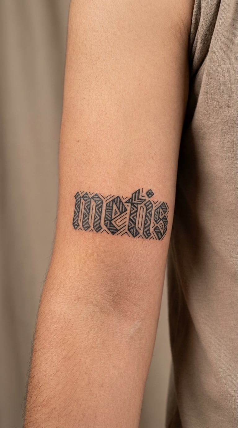
Metis is compact lettering: five letters, each built from a few straight strokes filled with flat black. Minimal blackwork reads well because every line carries the whole word, and there is no shading to muddy it as it ages.
Metis in Greek thought covers intelligence that is practical: skill, craft, cunning, and strategic thinking. It is the wisdom that knows how a thing gets made. No one style of tattoo makes someone wise, so treat the word as an intention.
Placement: inner upper arm, ribs, or the side of the torso. Size: 2 to 2.5 in (5 to 6 cm). Style: minimal geometric blackwork.
Pain: low, though ribs and the torso stay sensitive. Flat black with no grey shading ages more evenly than mixed tones. Make it yours: run the word along a rib gap so the body shapes the letter spacing for you.
21. Aletheia in Delicate Script
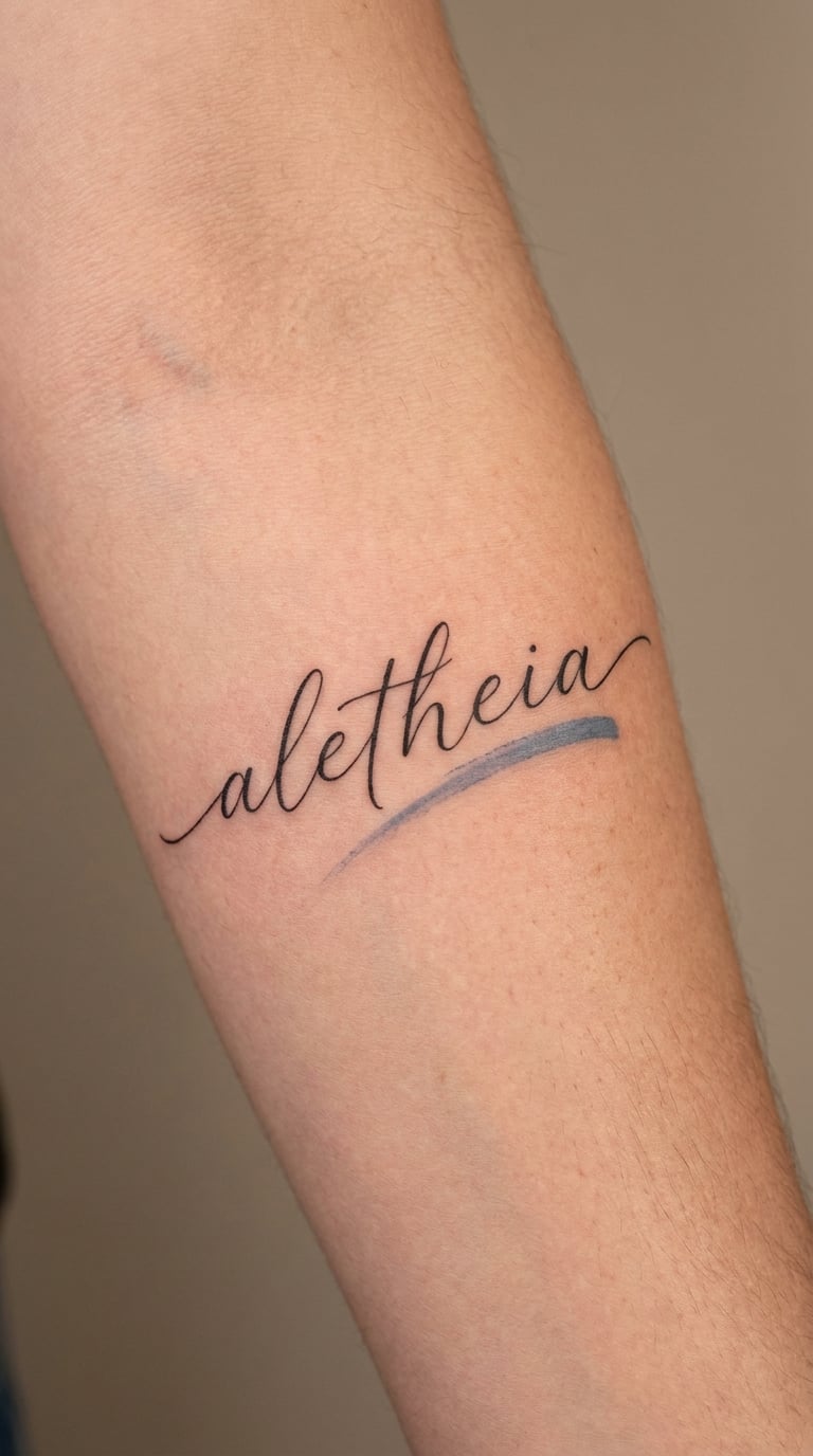
Aletheia is the longest of the short, elegant words here, and delicate calligraphy suits it because the ascenders give the line rhythm. Eight letters in a light hand, with one muted blue accent stroke behind the a at the start. No more colour than that.
Aletheia is associated with truth, disclosure, and unconcealment. The idea in Greek writing is not simply accuracy but the act of bringing something hidden into the open, which makes it a stranger and more interesting word than a plain synonym for truth.
Placement: forearm or the inside of the upper arm. Size: 2.5 to 3.5 in (6 to 9 cm). Style: delicate script with a single colour accent.
Pain: low to medium, and the extra accent colour adds time. A light hand needs a touch-up session sooner than a bold one. Make it yours: place it on a body part you rarely see, which suits a word about disclosure.
22. Kallos in Handwritten Blackwork
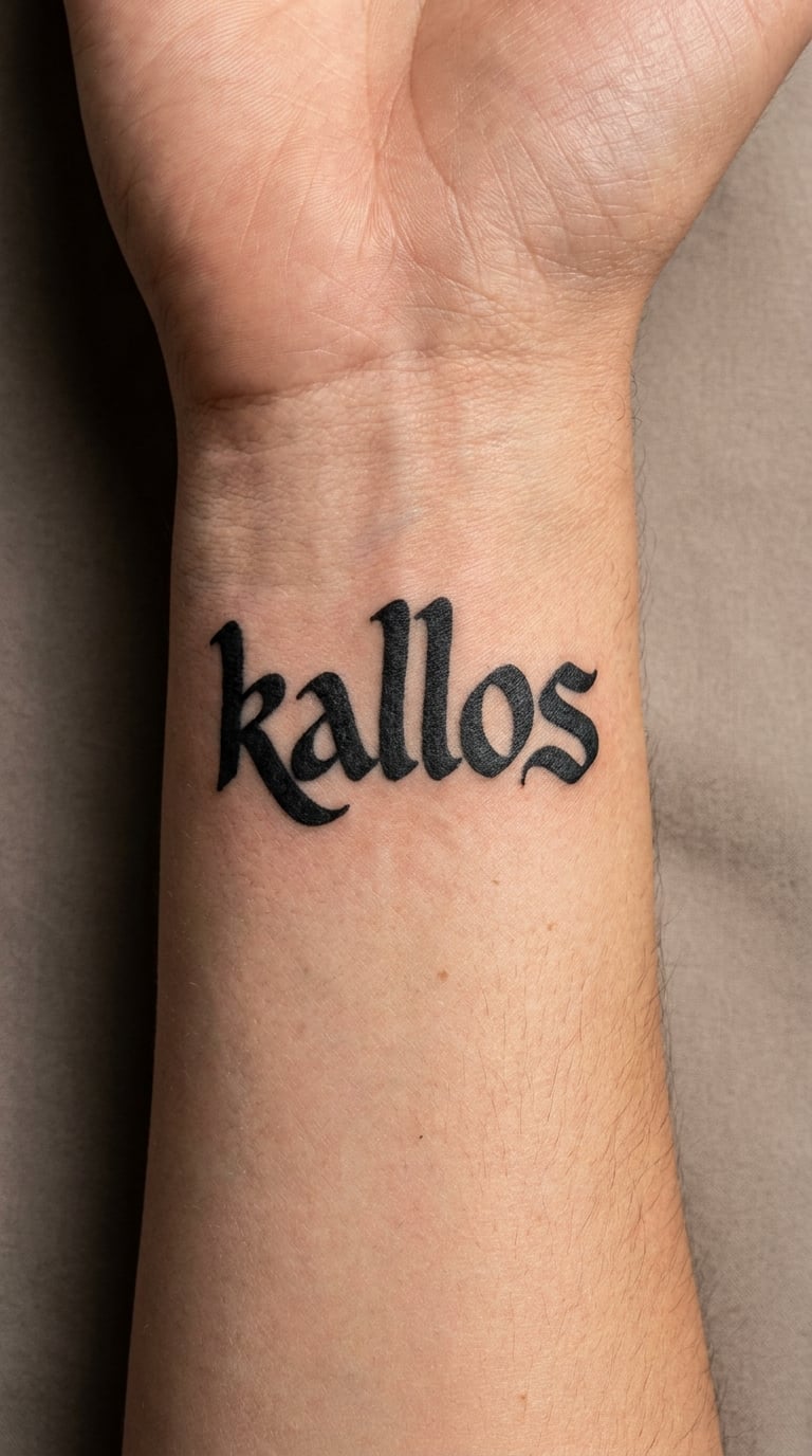
Kallos is six letters full of curves, so handwritten blackwork gives them room. The loops get enough weight to stay legible, the baseline tilts slightly, and the k opens up rather than closing on itself. A hand that looks written, not typeset.
Kallos is associated with beauty or with the beautiful, and in older Greek writing the word covered excellence in general rather than looks alone. Many wearers land on appreciation of something beautiful, and define that for themselves.
Placement: wrist, or the inside of the arm above it. Size: 1.5 to 2.5 in (4 to 6 cm). Style: expressive handwritten blackwork.
Pain: medium on the wrist. Wrist curves blur fastest, so ask the artist to weight up the loops. Make it yours: let the first k drop below the line, so the word starts low and lifts.
How to Choose the Right Design
Start with the spelling, not the picture. Write the word in the exact form you want, then have it checked by a Greek speaker or a university classics account before you book. Artists copy lettering from a reference, and a reference with one wrong letter is a permanent error. Users on tattoo forums describe this fear more than any other, and it is the easiest problem to solve early.
How to check the spelling of a Greek word tattoo idea
Confirm the transliteration against a Greek dictionary rather than a shop page. Decide whether you want ancient or modern Greek, since the two differ, and know that most tattoos drop the accent marks and breathings because they turn a fine line into a smudge. If you are working in Greek script, ask the artist for a portfolio of Greek letterforms specifically, because a Latin font file with swapped characters does not count.
Next check legibility. A word needs roughly a third of an inch of height per letter before it reads comfortably from arm’s length, and a script with thin hairlines will blur faster than a block letter. Placement follows legibility: inner forearm and inner arm are forgiving, wrists and fingers are the fastest fading, and long words like dikaiosyne need flat skin rather than a curve.
Last, sit with whether the word’s history fits you. Words like styx, nemesis and kratos come from a mythological frame that many people enjoy wearing, and others find heavy. A word that means courage to you may read as something else to a stranger, and that is fine, but you should know which version you are signing up for. If you would rather work with a set mark that already carries its own system of meaning, 24 constellation tattoo ideas for women is a good place to compare how symbol-only designs hold up over time.
Cost and Session Time
Most studios charge by the hour and apply a shop minimum, so session length drives everything. A tiny word like psyche or xenia is often a short appointment of roughly an hour. A medium piece such as eleutheria, kratos or harmonia usually takes one to three hours depending on the lettering style. A long word like dikaiosyne, or anything with shading, usually needs a full session and sometimes a second one.
Rough US price bands for lettering work: a single short word usually lands somewhere around $80 to $200, a medium word with custom script or blackwork runs $200 to $450, and a long word with shading or colour starts around $450 and can pass $900 once the artist is customising the lettering. Hourly rates in most US cities sit between $75 and $200.
Fine line work takes longer than it looks like it should, because the artist slows down to keep the line even. Watercolour and traditional shading add time again. City studios, artists with full books, and any piece that needs a custom font design sit at the expensive end of a shop’s range, so ask for a quote at the consultation rather than assuming.
Aftercare Basics
- Follow your artist’s aftercare instructions first, since they match the ink and the skin you were tattooed on.
- Keep the area clean and gently washed, and pat it dry rather than rubbing it.
- Leave any film or protective covering alone while it does its job, and do not pick at it.
- Keep the fresh tattoo away from swimming pools, hot tubs, and heavy sun while it settles.
- Sleep on clean linen for the first nights, and wear loose clothing over the placement.
Expect a touch-up on fine-line script, especially on the wrist. That is normal and it is part of getting lettering to hold.
Frequently Asked Questions
What does a Greek word tattoo mean?
A Greek word tattoo means whatever the chosen Greek word has meant in the Greek language. Words like agape carry affection, eros carries desire, sophia carries wisdom and aletheia carries truth. The meaning comes from the word itself, not from the style, the placement, or the number of letters. Check the spelling and translation before booking, and pick a word whose real sense you can live with.
Should Greek word tattoos be written in lowercase or uppercase?
Either works, and the choice comes down to style. Lowercase suits script and handwritten work because letterforms connect naturally. Uppercase reads more clearly at small sizes and holds its shape better once healed, especially on wrists and fingers. Whichever you pick, ask the artist for a slightly heavier stroke in fine-line styles, since thin hairlines are the first thing to soften over the years.
What is the best size for a Greek word tattoo?
For most short words, two to three inches across reads comfortably at arm’s length, which covers everything from agape to kratos. Long words such as dikaiosyne need four to five inches to stay legible. Under about 1.5 inches tall per letter, script starts to blur together as it heals, so smaller is not always more tasteful. Wrist and hand placements need more size, not less.
Do small Greek word tattoos fade easily?
Small fine-line tattoos fade fastest, and the ones that blur first are the hairlines and the counters inside letters. Placement matters as much as size: inner forearm and inner arm hold ink better than wrists, fingers and ribs. Ask the artist to weight up the downstrokes, skip grey shading, and plan a free touch-up once the piece is fully healed, usually a few months in.
Can two people get matching Greek word tattoos with different meanings?
Yes, and it is a common choice for family and couples, because each person can read the same word through their own life. Use the same word and the same lettering style on different placements, so the pieces look related without looking stamped. Just agree on the spelling first, since two artists working from different references is the easiest way to end up with two different words.
If you are starting from scratch, sophia or agape in fine-line script is the easiest place to begin: short, balanced, and forgiving of a first-tattoo wobble. If you already have lettering and want something with more presence, kratos in geometric blackwork or dikaiosyne across the forearm will read as a deliberate piece rather than an addition. Bring the checked spelling, a reference, and your placement to the consultation, and let the artist redraw the word in their own hand before you commit.