
20 Old English Lettering Tattoo Ideas: Blackwork (October 2026)
Old English lettering tattoo ideas are built on one thing: contrast. Thick angular black strokes, bevelled edges and diamond serifs, laid over open white space so the letters still read from across a room. Call the style blackletter, Gothic or textura, which is what most tattooers actually say in a consultation. Every design below is drawn as a plan, not a photograph, so you can hand something concrete to your artist.
It suits anyone who wants a name, a date or a short phrase that carries weight, whether you are booking your very first tattoo or adding a fourth piece to a lettering collection. Before you commit, note one thing: the artist hand-draws the letterforms, and the words have to be spelled exactly how you want them on skin, permanently.
Old English Lettering Tattoo Ideas: Quick Guide
| Idea | Style | Best placement | Size | Pain |
|---|---|---|---|---|
| 1. Wedding name and date | Compact Textura caps | Inner forearm | 3 by 1 inch | Low to medium |
| 2. Split-flourish initial | Bold blackletter | Outer upper arm | 2.5 inch tall | Medium |
| 3. Vertical first name | Old English script | Inner forearm | 4 by 1.25 inch | Low |
| 4. Two-word phrase | Dense Gothic caps | Outer forearm | 3.5 by 1 inch | Medium |
| 5. Memorial name and year | Restrained blackletter | Inner upper arm | 3 by 1.25 inch | Medium |
| 6. Coordinates in numerals | Blackletter and numerals | Inner wrist | 2 by 0.75 inch | Medium |
| 7. Four directions ring | Circular capitals | Outer forearm | 2 inch diameter | Medium |
| 8. Psalm 23:23 citation | Refined blackletter | Upper back | 5 by 1.5 inch | Medium to high |
| 9. Surname banner | Arched Textura caps | Outer upper arm | 3.5 by 1.5 inch | Medium |
| 10. Knuckle initials | Heavy blackletter caps | Index-finger knuckles | 0.6 inch tall each | High |
| 11. Wedding band wrap | Narrow blackletter | Ring finger | 1 by 2.25 inch wrap | High |
| 12. Two-word wrist statement | Wide-pen capitals | Inner wrist | 2.5 by 0.75 inch | High |
| 13. Spine quote | Stacked Gothic lines | Spine, mid back | 6 by 2 inch | Medium to high |
| 14. Rib motto | Tall blackletter caps | Lower ribs | 4 by 1 inch | High |
| 15. Flowing ankle name | Looser blackletter | Outer ankle | 2.25 by 0.75 inch | Medium |
| 16. Neck name | Lighter blackletter | Side of neck | 3 by 0.8 inch | Medium to high |
| 17. Behind-ear initial | Bold single capital | Behind the ear | 1.25 inch tall | Medium to high |
| 18. Palm word | Miniature blackletter | Centre palm | 2 by 0.75 inch | High |
| 19. Chest monogram | Gothic monogram | Below collarbone | 3 by 2 inch | Medium |
| 20. Square quote block | Dense blackletter square | Upper back | 5 by 5 inch | High |
1. Blackletter Wedding Name and Date
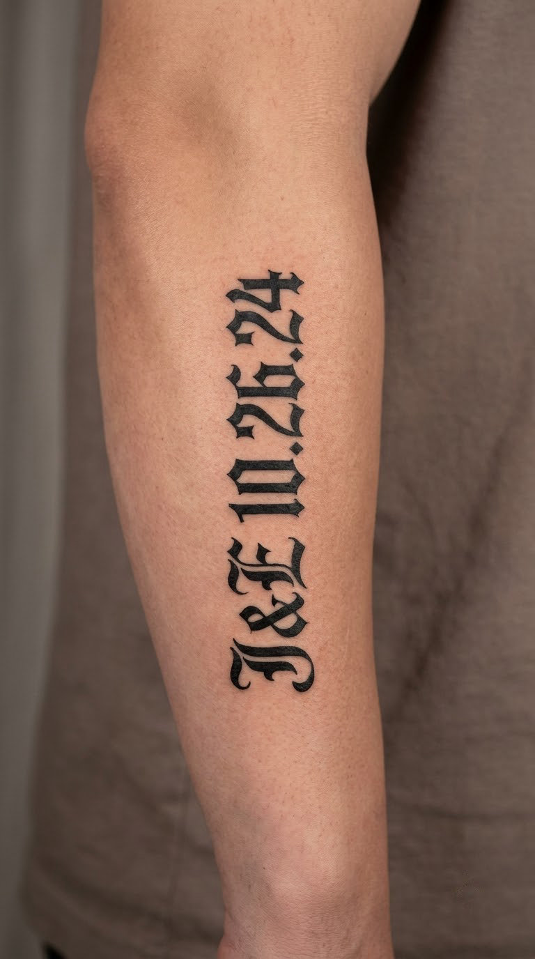
A surname in compact Textura capitals, the wedding date in smaller numerals beneath it, and nothing else. The whole thing is one tight unit, usually a single-line name with a thin rule or small diamond as the divider. The letters are broad, so the negative space between them does the work rather than extra decoration.
People pick this one because it is a private mark that still looks formal from a distance. It suits anyone who wants their wedding date on them without announcing it.
Placement: Inner forearm, a few inches above the wrist crease.
Size: Roughly 3 by 1 inch (7.5 by 2.5 cm) for a surname plus date.
Style: Compact blackletter capitals, solid black line, no shading.
Pain: Low to medium. The inner forearm is fleshy and takes ink well. Line weight will soften slightly over the years if the forearm is repeatedly flexed in the sun, so a touch-up around year five is normal.
Make it yours: Add a small diamond or hairline rule between the name and the date instead of a full banner.
What Makes Old English Lettering Tattoo Ideas Work on Skin?
Readability is a spacing problem before it is a drawing problem. Blackletter alternates thick and thin strokes, so when letters are packed tightly the counters fill in and the word turns to mud.
Three things keep it legible. Broad strokes at least as thick as the fine detail inside them, generous space between letters, and enough room around the design so the outline is not cropped by a sleeve or a shirt. A name that reads at arm’s length in a photo will read on skin, a name that only works on screen will not. If you are picking from an old english lettering tattoo ideas list, check the size line first. Most of these designs stop being readable below about 1 inch of cap height, and the small placements in the table above are already at that floor.
2. Ornate Initial with Split Flourishes
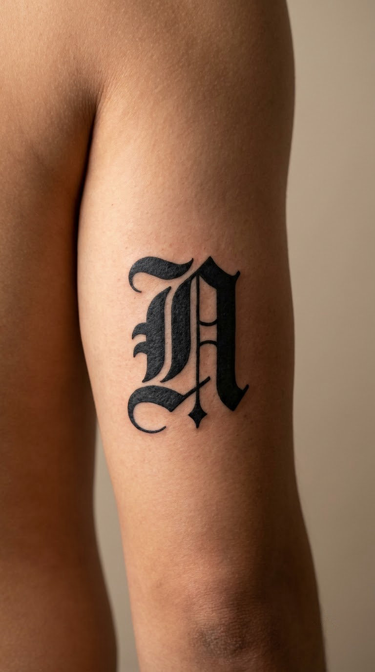
One capital letter, drawn heavy, with the vertical stem split and flourishes curling away in opposite directions. The flourish lines stay thin and taper off, so the piece reads as a letter first and an ornament second. That order is what keeps it wearable rather than looking like a coat of arms.
It is a first-tattoo-friendly piece, and a favourite for someone whose surname begins with a letter that looks good on its own.
Placement: Outer upper arm or the fleshy outer forearm.
Size: 2 to 3 inches tall (5 to 7.5 cm).
Style: Bold blackletter with restrained flourishes, solid black fill.
Pain: Medium on the upper arm, which is a large flat canvas and easy to work. The thin taper at each flourish tip is the first part to blur, so expect minor softening there after several years.
Make it yours: Choose the letter with the most vertical stroke in your surname and add a small cross or star at the centre of the split.
3. First Name in Vertical Old English Script
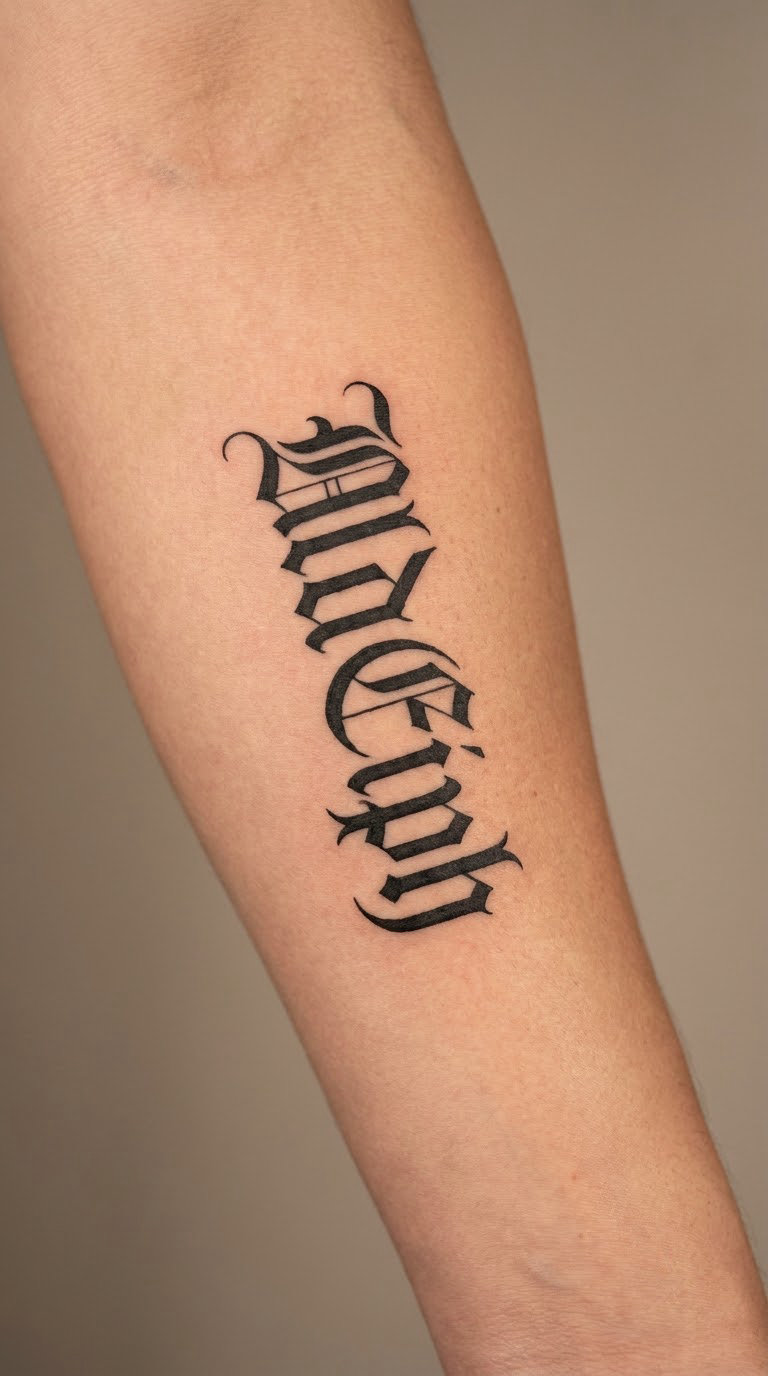
The letters stack one under another, top to bottom, with alternating tall and short characters so the column has rhythm. A lowercase-style script treatment with tall ascenders reads more elegant than a row of block capitals, and stacking solves the problem of a long name running out of horizontal room.
Chosen for a first name that would be too long in one line, or simply because a vertical piece follows the arm rather than fighting it.
Placement: Inner forearm running from below the elbow toward the wrist.
Size: 4 inches long by 1.25 inches wide (10 by 3 cm).
Style: Old English script, black ink, single-needle work.
Pain: Low on the inner forearm. Ageing note: the same stroke blends over time, which suits script more than it hurts it.
Make it yours: Let the first letter break the column slightly, overlapping the line below it.
Want more layouts like this? Our arm tattoo lettering ideas round-up covers the forearm placements in more depth.
4. Steady and Strong Blackletter Phrase
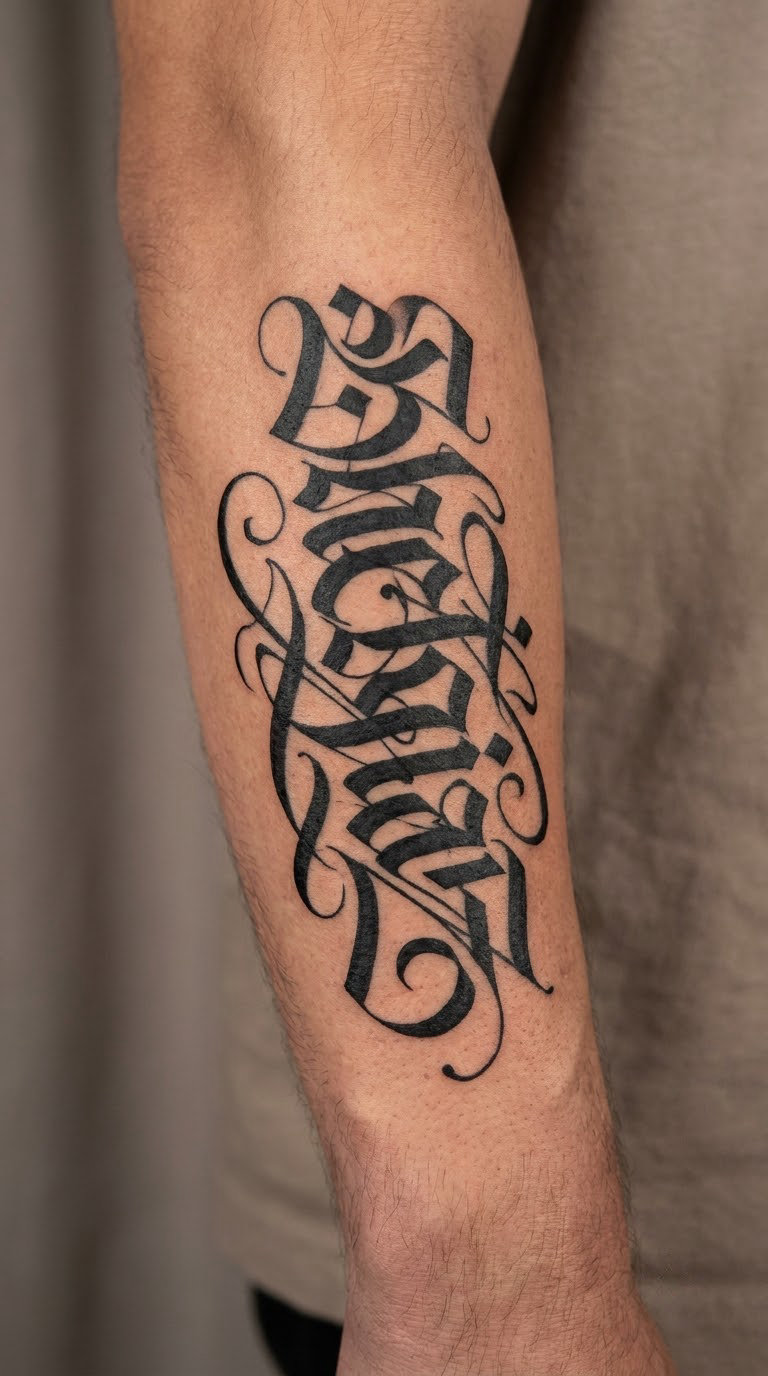
Two words, set in dense Gothic capitals with heavy vertical strokes and tight but even spacing. Phrases in this style are assertive by nature, so the design stays plain: no banner, no scrollwork, no shading. A thick black band with clear white counters is all it takes.
Most people choose it as a personal motto rather than a quote from anywhere in particular.
Placement: Outer forearm, laid along the muscle.
Size: 3.5 by 1 inch (9 by 2.5 cm).
Style: Dense Gothic capitals, solid black.
Pain: Medium. The outer forearm is firmer than the inner side, so it stings a little more. Dense black fills also mean more passes over the same area.
Make it yours: Add a thin black outline band under the words to anchor the composition on a moving muscle.
5. Memorial Name with Birth Year
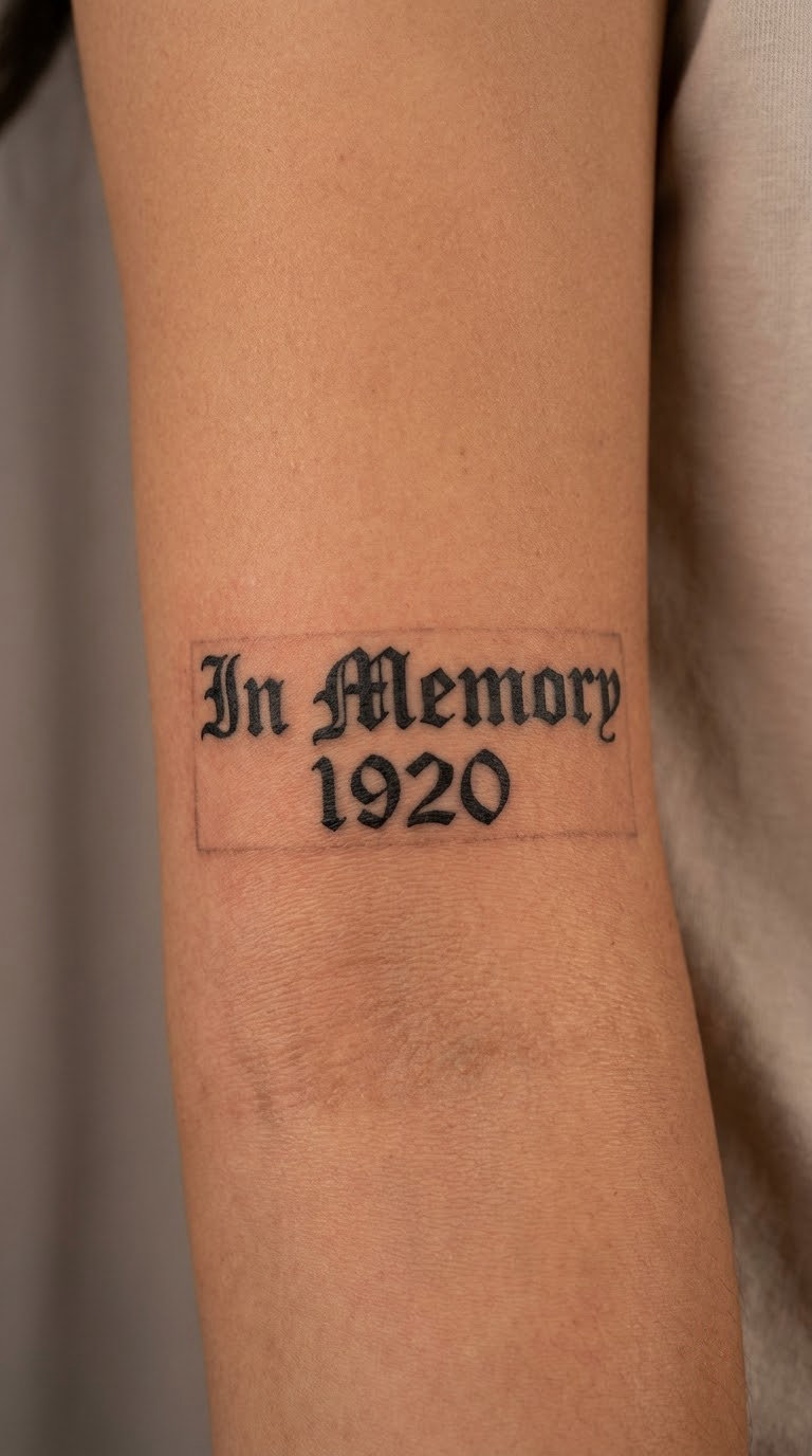
A first name in straightforward blackletter, the birth year below it in numerals, and a small diamond or cross-shaped divider between. Restraint is the point. Memorial lettering in heavy Gothic often gets over-designed, and the detail that clutters the piece is the detail that softens first.
It is usually chosen to remember a parent, grandparent or sibling without adding a date of loss that the wearer may not want on skin.
Placement: Inner upper arm, over the biceps.
Size: 3 by 1.25 inch (7.5 by 3 cm).
Style: Restrained blackletter, black ink, minimal flourishes.
Pain: Medium. Honest ageing note: the numerals are the weak point, so make them the same stroke weight as the letters, not smaller and thinner.
Make it yours: Use a birth year only, leaving the year of loss out of the design.
6. Coordinates in Gothic Numerals
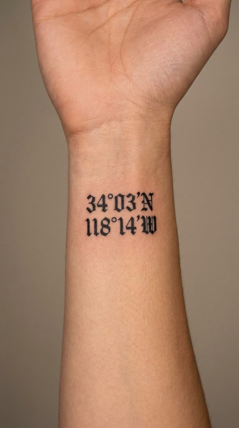
Latitude and longitude, or simply the name of a birthplace, rendered in the same blackletter as the numerals. The trick is consistency: the digits and the letters are drawn in one hand with one pen angle, so they sit on the same line. A serifed digital font next to blackletter letters is the version that looks wrong.
Chosen for a birthplace, a meeting point, or anywhere else that has coordinates rather than a name you would spell out loud.
Placement: Inner wrist, above the pulse point.
Size: 2 by 0.75 inch (5 by 2 cm).
Style: Blackletter and Gothic numerals, black ink.
Pain: Medium to high on the inner wrist, which is bony and full of nerve. Wrist tattoos catch sun and watch straps, so the numerals will need a refresh sooner than arm lettering.
Make it yours: Round the figures to two decimal places so the line fits the width.
If a number is what matters to you, our Roman numeral birth date tattoo ideas show the other way to set a date in ink.
7. Four Directions Ring Lettering
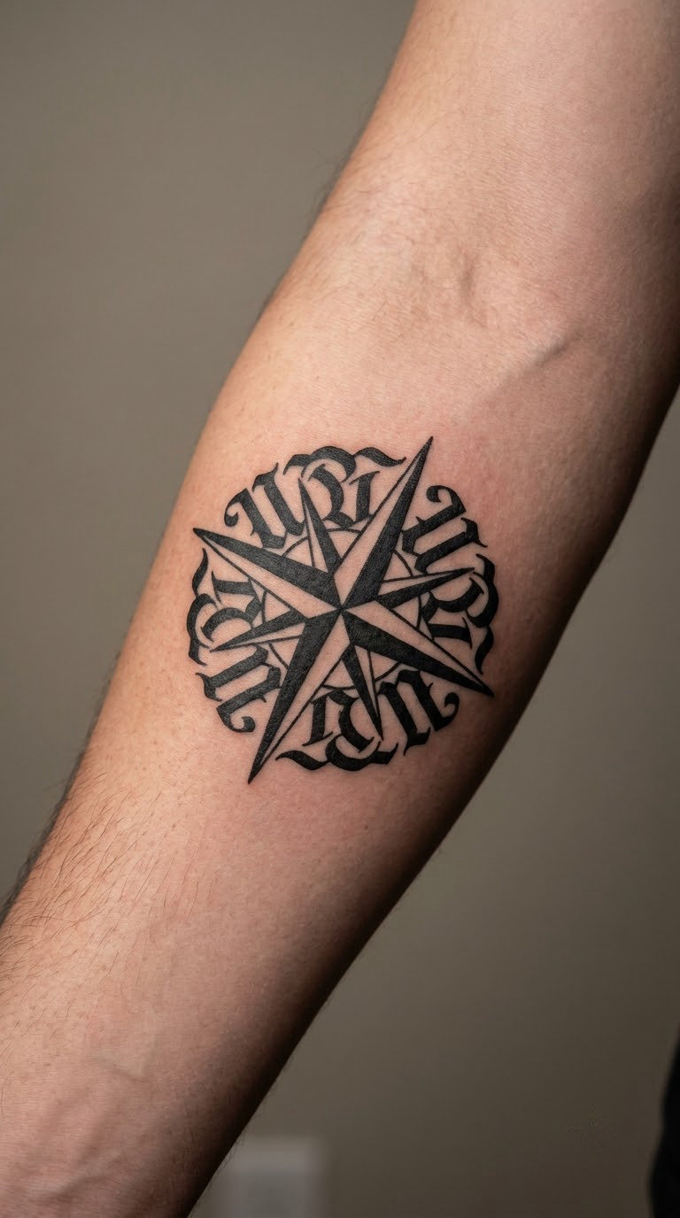
Four capital letters, N, E, S and W, set in a circle and rotated to sit upright on the curve. The circular structure is doing all the work, so no compass rose, no star and no arrowhead get added. Any extra symbol in the middle just competes with the ring of letters.
Chosen as a quiet reference to travel, homecoming or a person who is always oriented to somewhere else.
Placement: Outer forearm or outer upper arm.
Size: 2 inch (5 cm) diameter, or 2.5 inch if you want the letters wider apart.
Style: Bold blackletter capitals in a circular arrangement.
Pain: Medium. A curve like this means the artist changes angle constantly, and the mid-shaft of the arc gets revisited as the outline closes. Curved text takes a touch longer to settle.
Make it yours: Put the direction you were born facing at the top of the circle instead of N.
8. Psalm 23:23 Calligraphic Citation
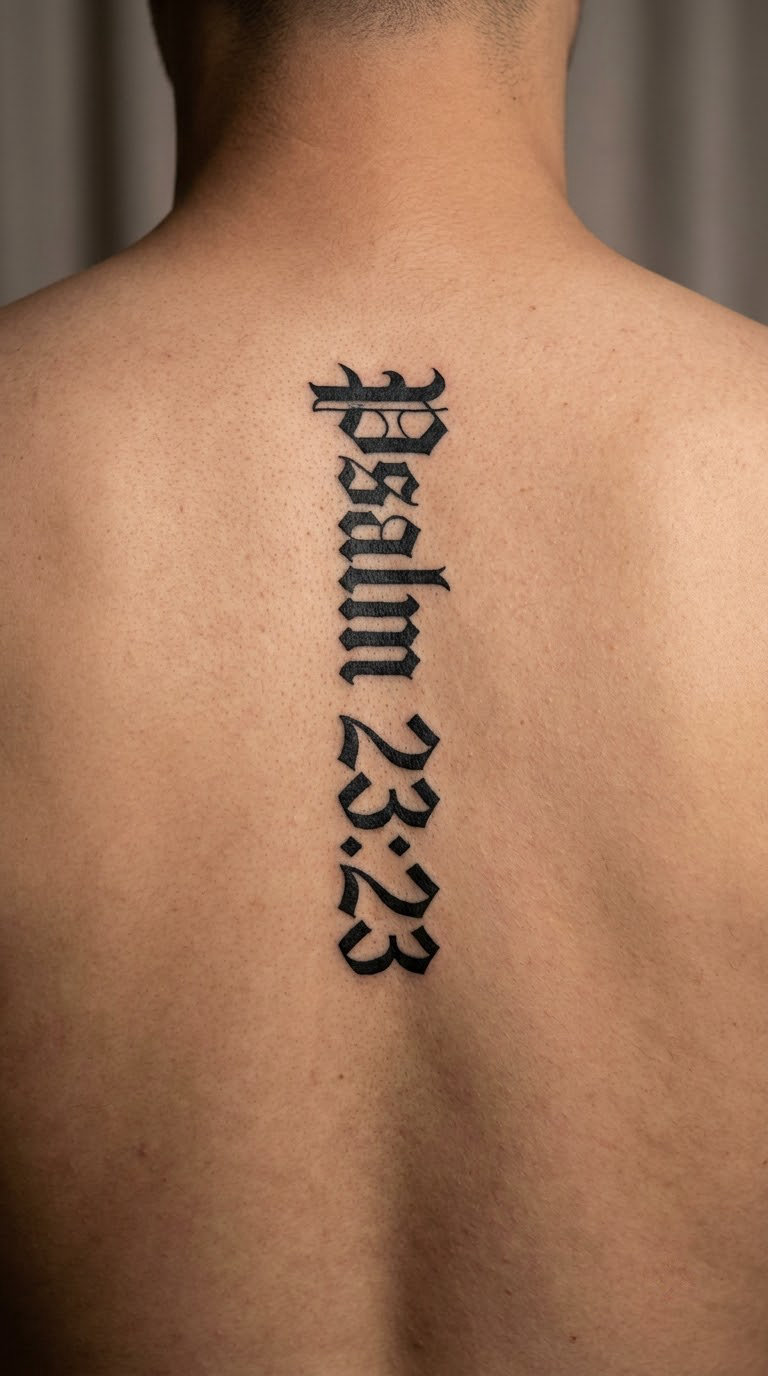
The verse as a citation, in blackletter, with the reference and the words set apart by a thin rule. Use a public-domain rendering, or a short original phrase, rather than a modern paraphrase from a book or a lyric. The composition is wide and single-line across the back, where there is room to keep the strokes honest.
Faith lettering is one of the most requested categories in blackletter, and this verse is the most requested one inside it.
Placement: Upper back between the shoulder blades, or a single line low across the ribs.
Size: 5 by 1.5 inch (12.5 by 3.75 cm).
Style: Refined blackletter calligraphy, black ink.
Pain: Medium to high. The back is a large area, so the session is long, but the bone is shallow and the discomfort comes in waves rather than a steady sting. Get comfortable early and it is very manageable.
Make it yours: Set the citation in small numerals under the line and keep the words as the largest element.
9. Old English-Style Surname Banner
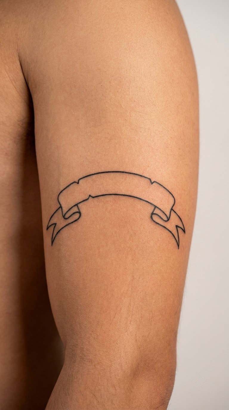
A family name stretched across a shallow arch with a banner running under it, the ends of the banner tapered to a point. The arch is the detail that makes the difference: a straight banner of solid black behind dense letters turns into one block of ink, while an arched banner leaves white gaps above the text and under the tails.
Usually a family name, sometimes a married name, occasionally a place name that matters to the family.
Placement: Outer upper arm, angled slightly with the shoulder.
Size: 3.5 by 1.5 inch (9 by 3.75 cm).
Style: Arched Textura capitals with a solid black banner.
Pain: Medium on the upper arm. Ageing note: banner fill is a large solid area, and a big flat block of black is exactly what an over-healed or sun-exposed tattoo can look patchy. Keep it out of direct sun where you can.
Make it yours: Add a second, smaller arch above with a single initial, then leave a finger’s width of white between the two.
10. Two Initials Across the Knuckles
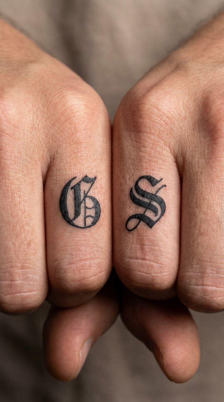
A matched pair of initials on adjacent knuckles, each one letter in heavy blackletter capitals, sized so both sit comfortably between the joints. Scale is the whole exercise. A letter that fits when the finger is straight can ride up into the crease when the hand closes.
Chosen for a matching pair with a partner, a sibling or a friend, and popular as a first piece for someone who wants small and low-commitment.
Placement: Index and middle finger knuckles, or index fingers of both hands.
Size: About 0.6 inch (1.5 cm) tall per letter.
Style: Heavy blackletter capitals, black ink.
Pain: High. Knuckles sit right on bone and the skin is thin, so it is a sharp, localised feeling. Hand lettering also ages fastest of any placement, because knuckles crease, hands get washed twenty times a day, and they take sun. Plan on a refresh every few years.
Make it yours: Have the artist check the line weight against your own finger movement before the stencil goes on, rather than after.
For younger skin, the kids initials tattoo ideas round-up covers small-format lettering that needs to keep growing with the hand.
11. Wedding Band Blackletter Wrap
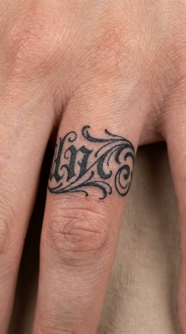
A surname or a single word running most of the way around the ring finger, letters following the curve of the digit rather than sitting in a straight band. The word starts where the hand naturally rests and stays visible when the palm faces inward, which is what makes it work.
Chosen to mirror a wedding band without competing with it, and usually paired with a plain band tattooed a finger or two away.
Placement: Ring finger, wrapping about two thirds of the way around.
Size: 1 inch wide by 2.25 inch circumference (2.5 by 5.5 cm).
Style: Narrow blackletter, black ink, no banner.
Pain: High. Finger skin is thin, bony and highly nerve-dense, and the curve forces frequent angle changes. A ring-finger tattoo also swells noticeably for the first few days, which is part of why artists book those sessions when you can avoid them for a week or so.
Make it yours: Start the word at the knuckle side so the first letter stays visible with the hand open.
12. Two-Word Wrist Statement
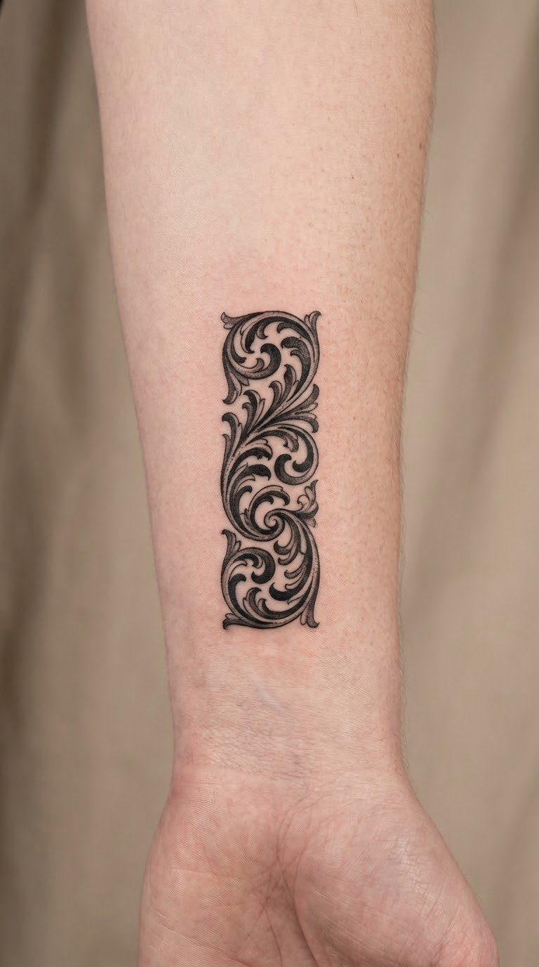
Two short words in wide-pen blackletter capitals, lettered with a broad pen angle so the thick strokes are genuinely thick. Two words is about the limit of what reads at this size. A third word forces the artist to shrink every stroke, and shrinking thick strokes is how a wrist design turns to mush within a few years.
Chosen for a small daily statement, the kind of thing that is for you and nobody else.
Placement: Inner wrist, centred a little above the crease.
Size: 2.5 by 0.75 inch (6.25 by 2 cm).
Style: Wide-pen blackletter capitals, black ink.
Pain: High. The inner wrist is the most nerve-dense area most people will ever have tattooed. It is a short session, which helps.
Make it yours: Set the two words on a slight upward curve so the composition follows the wrist rather than crossing it.
13. Spine Quote in Stacked Gothic Lines
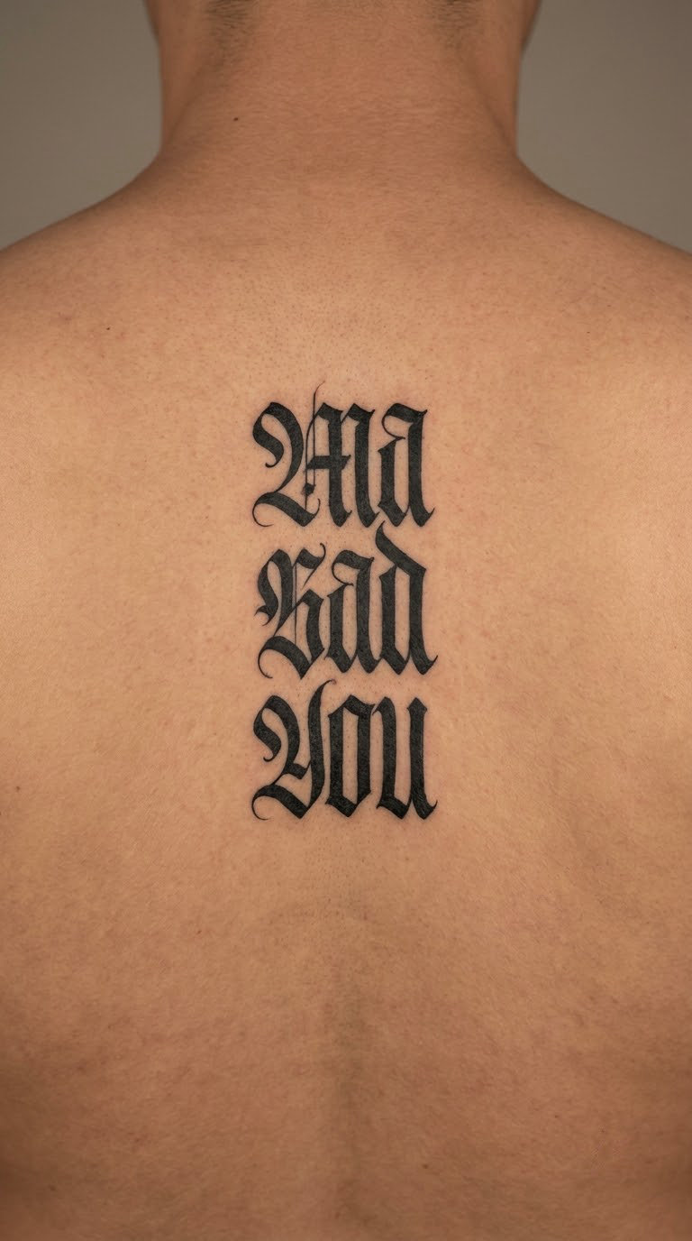
A short original or public-domain phrase broken into three stacked lines running down the spine, each line centred on the axis of the body. Line length is the discipline here. Every line should be roughly the same width, or the piece looks like it drifted. The artist will want to see you standing and sitting before finalising the line breaks.
Chosen when a long-ish phrase matters more than any single word in it.
Placement: Upper and middle back, centred on the spine.
Size: 6 by 2 inch (15 by 5 cm).
Style: Stacked Gothic lines, black ink, no flourishes between them.
Pain: Medium to high, and long. Back sessions run two to three hours for a piece this size, so the discomfort accumulates even if the pain level is not extreme. A good break halfway through is worth asking for.
Make it yours: Add a small date at the base in numerals, sized to match the last line rather than shrinking.
14. Rib Motto in Tall Blackletter
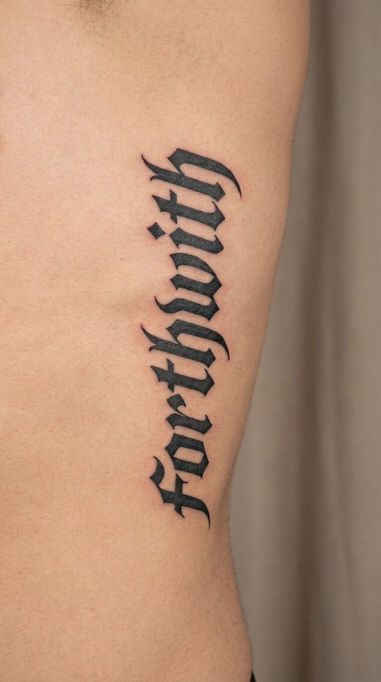
A narrow two or three word motto in tall capitals with open counters, set on a baseline that curves with the rib line. Tall narrow letters on a curved surface is the hardest geometry in this list. The trick is leaving air inside each letter, so the black does not pool in the stretch marks beside the ribs.
Chosen for something said often and meant literally, often a value rather than a quote.
Placement: Along the lower ribs, either side, or centred under the chest.
Size: 4 by 1 inch (10 by 2.5 cm).
Style: Tall blackletter capitals, black ink, curved baseline.
Pain: High. Skin over rib is thin and the bone is close, and the movement of breathing works the area the whole session. Breathe slowly and normally rather than holding your breath to make it stop moving.
Make it yours: Follow the rib curve for the baseline instead of keeping the line dead straight, which also leaves more room for each letter.
15. Ankle Name in Flowing Blackletter
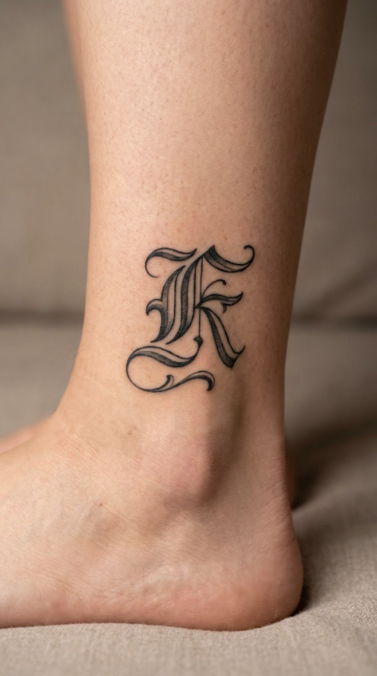
A first name in a looser, more flowing blackletter treatment, with light flourishes that follow the tendon line rather than crossing the bone. Ankle skin moves with every step and flexes hard at the shoe line, so a design that sits below the malleolus ages very differently from one that sits across it.
Chosen as a small, quiet name that only shows when you roll a trouser cuff.
Placement: Outer ankle, above or just behind the malleolus.
Size: 2.25 by 0.75 inch (5.5 by 2 cm).
Style: Flowing blackletter, black ink, light flourishes.
Pain: Medium. The ankle bone is sensitive, but the Achilles area is more meaty and takes it well. Ageing note: footwear rubs this spot, and sun exposure on the lower leg is high, so expect the flourishes to soften noticeably faster than arm lettering.
Make it yours: Angle the baseline along the tendon and keep the flourishes on the back of the leg, away from the shoe.
16. Neck Name with Diamond Terminal
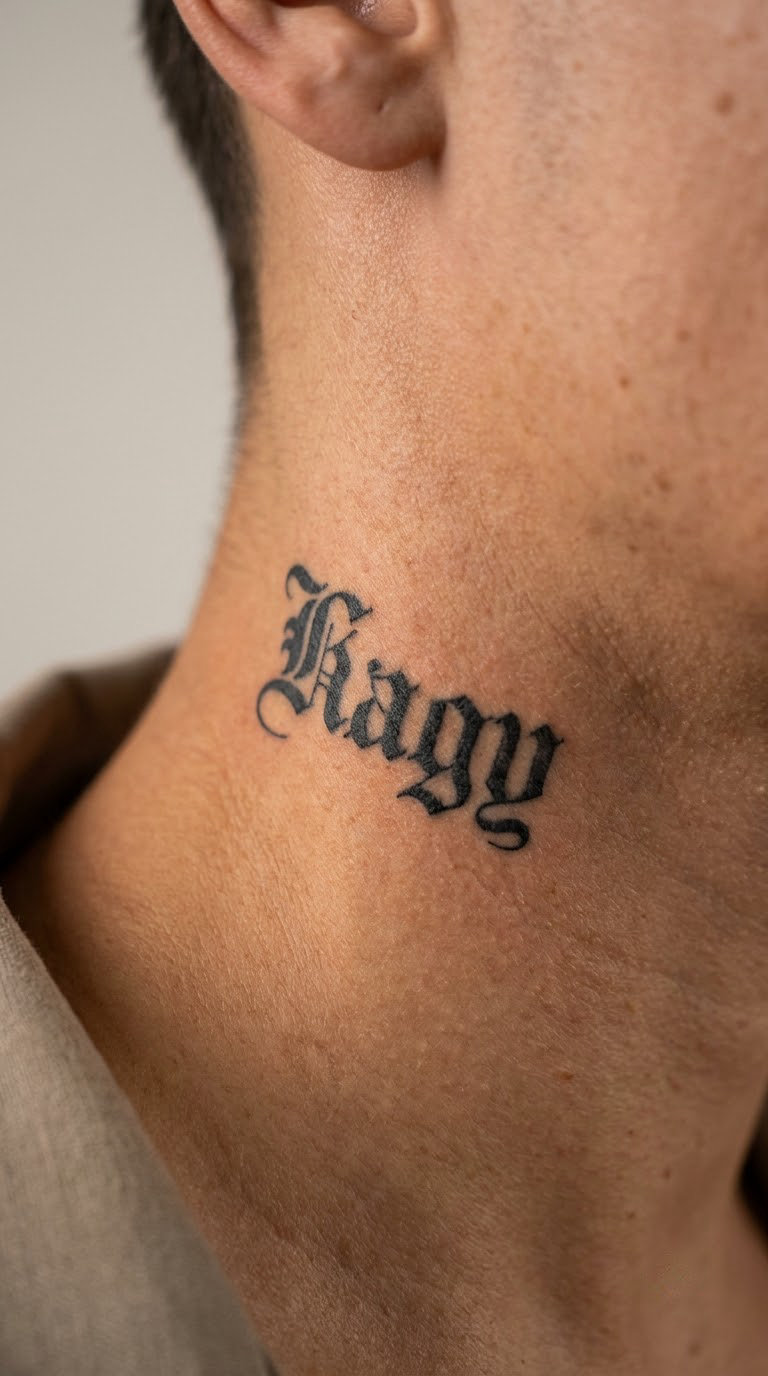
A side-neck name in lighter blackletter, ending in a single diamond terminal where the last letter tapers away. One terminal, not three. Neck skin is visible, expressive and permanently on display, so the design reads as refined rather than heavy if there is only one ornament and plenty of white space between the letters.
Chosen for a name that is also part of a longer phrase, or by someone who wants lettering visible without announcing it from the front.
Placement: Side of the neck, below and behind the ear, on the muscle rather than over the vein.
Size: 3 by 0.8 inch (7.5 by 2 cm).
Style: Lighter-weight blackletter, black ink, one diamond terminal.
Pain: Medium to high, and it thrums. The neck pulses, so you can see and feel the heartbeat in the area being worked, and some people find that more distracting than the pain itself. Expect visible redness and swelling for a couple of days.
Make it yours: Put the diamond at the end of the first name and let the surname run without a terminal.
17. Behind-the-Ear Single Initial
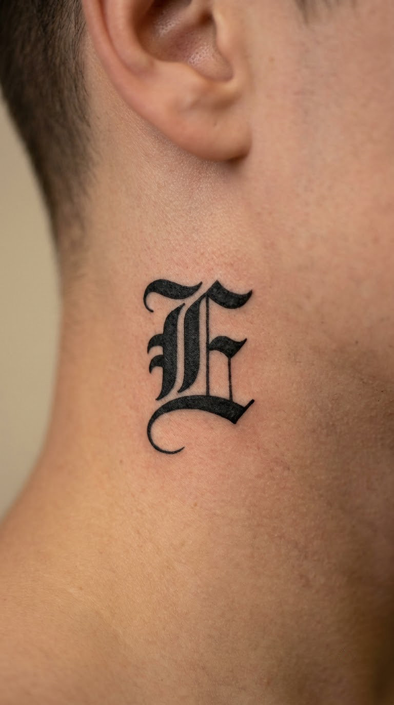
One compact capital, drawn with strong letter shapes and a short flourish dropping toward the earlobe. There is barely two inches of usable skin between the ear and the skull, so the letter has to do all the work on its own. Anything with a second line or an internal detail will crowd and blur.
Chosen for a surname initial, a lost loved one’s initial, or simply a spot where a small letter still feels like a secret.
Placement: Directly behind the ear, tucked into the gap between ear and skull.
Size: 1.25 inch (3 cm) tall, no wider than the flat area behind the ear.
Style: Bold single capital, black ink, one short flourish.
Pain: Medium to high. The skin is thin, the area is awkward to reach and you cannot see it while it is being done. Hair regrowth over the spot during healing is a real irritation, so plan around a haircut.
Make it yours: Angle the letter slightly with the head instead of standing it straight up, which follows the natural space better.
18. Palm Word in Miniature Blackletter
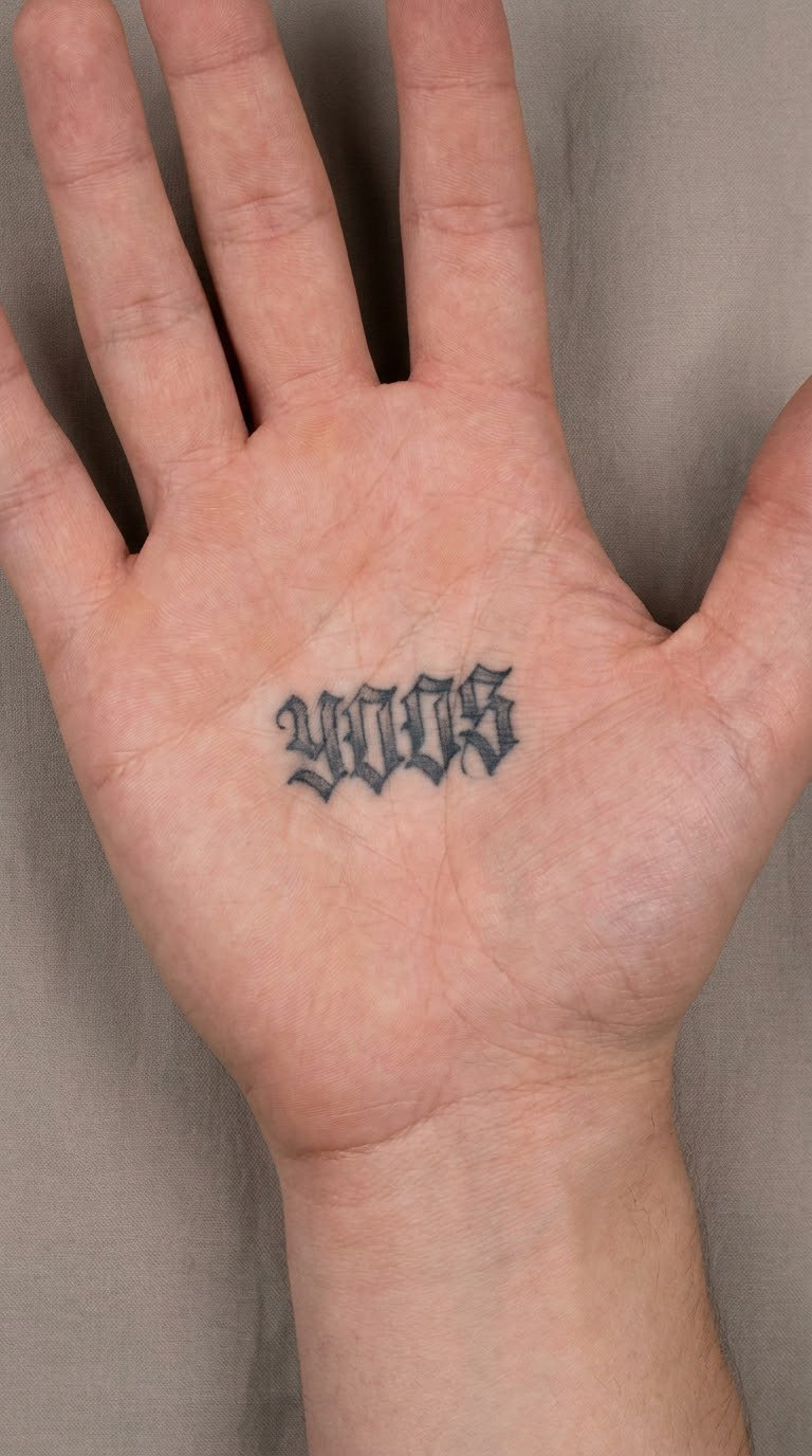
A single word in chunky blackletter with generous counters and almost no hairline detail, set in the fleshy centre of the palm. Miniature palm lettering works because bold survives and thin does not. The design is redrawn by the artist rather than traced from a template, since the hand’s daily movement changes the skin in ways no flat file can predict.
Chosen as a private word that only you and the person holding your hand ever see.
Placement: Centre of the palm, below the fingers, clear of the wrist crease.
Size: 2 by 0.75 inch (5 by 2 cm).
Style: Miniature blackletter, black ink, chunky and simple.
Pain: High. Palm skin is thick, densely nerve-rich and glued to underlying tissue with few soft areas. Palm tattoos are also the least visible of any placement, which is the reason people choose them. Ageing note: constant washing, movement and sun add up, and this is a placement where a touch-up every few years is close to standard.
Make it yours: Pick four or five letters maximum and let the letterforms be heavier than the reference images you bring.
19. Chest Monogram with Gothic Flourish
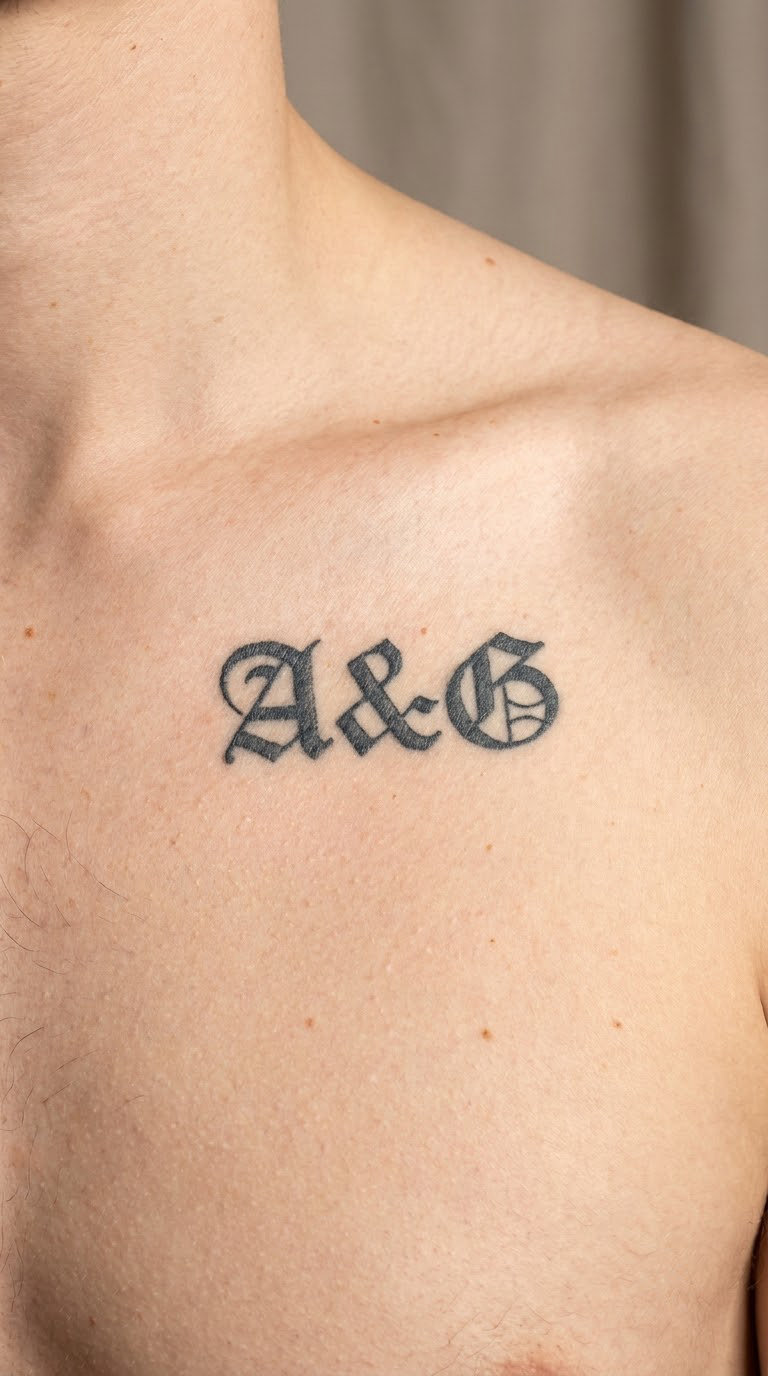
Two initials locked together as a monogram, the letters overlapping so they share a stroke, with a small ornamental tail dropping away to one side. Overlapping letters is the classic monogram move and it is what stops two capitals from looking like an accident. The tail keeps it from reading as symmetrical and stiff.
Chosen for a couple’s shared initials, a family pairing, or a personal set of two letters.
Placement: Below the collarbone on either side, or centred on the upper chest.
Size: 3 by 2 inch (7.5 by 5 cm).
Style: Gothic monogram, black ink, one ornamental tail.
Pain: Medium. The chest is sensitive near the sternum and near the collarbone, so the pain depends entirely on where the piece lands. Collarbone placements hurt more than most people expect for such a flat area.
Make it yours: Mirror the monogram so the design reads the same in a mirror, which matters more for initials than for names.
20. Square Blackletter Quote Block
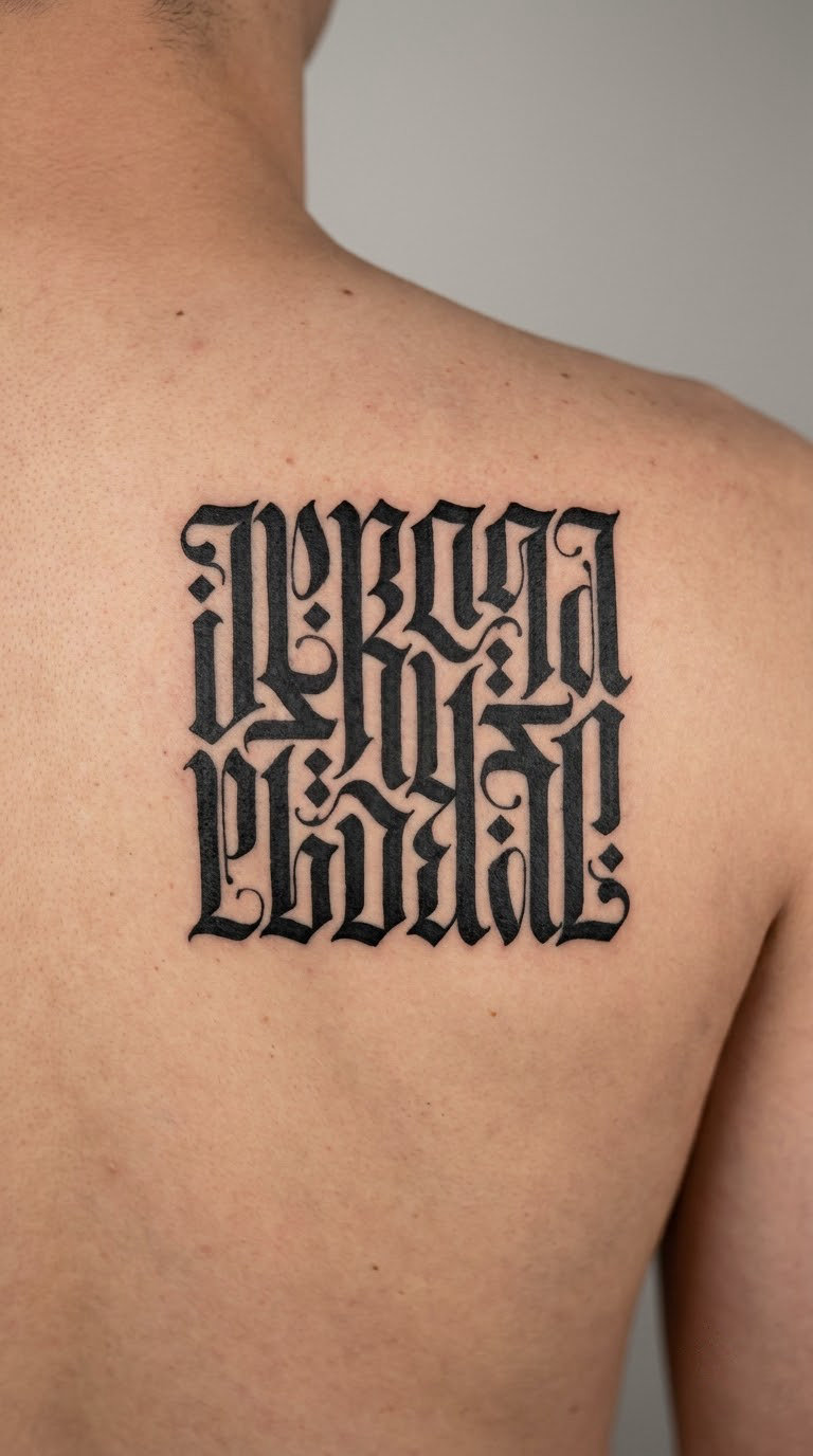
The boldest option here: a short original or public-domain quotation set as a dense square of blackletter, with internal spacing worked carefully so the lines do not merge into a black block. A square has to be big to work, and a big one has to sit somewhere flat and uncovered. The upper back below the shoulder blades is the usual answer.
Chosen by people who already have smaller lettering and want a single piece that anchors the whole collection.
Placement: Upper back below the shoulder blades, or a flat section of the outer thigh.
Size: 5 by 5 inch (12.5 by 12.5 cm) at minimum. Below 4 inches the internal spacing collapses and the whole thing greys out.
Style: Dense blackletter square, black ink, no colour.
Pain: High, and it is a multi-session piece. Four to six hours is normal, and a block this dense usually gets split across two appointments with a heal in between. Sitting through the second session after a rough first one takes some commitment.
Make it yours: Break the square with a thin white channel between lines, which keeps the words separate without adding a colour.
How to Choose the Right Design
Work through these six in order, and most of the decision-making happens before you sit down with an artist.
- Script style first. Textura is the dense, rectangular work most people picture when they say Old English. Lombardic capitals are wider, calmer and easier to read. Decide which of the two you actually like before you pick a word, because the same words look like completely different designs in each.
- Letter count against placement. Count first, then look at the placement. A two-word statement works at the inner wrist. A ten-word quote does not, at any size a wrist can hold.
- Size is the legibility decision. Aim for at least 1 inch of cap height on anything smaller than a name, and never shrink letters to make a phrase fit. Fewer words, bigger letters, always.
- Contrast and open counters. Blackletter has a natural black-to-white rhythm. Designs that add shading or grey wash inside the letters lose that rhythm and age faster.
- Placement against movement. Knuckles, fingers, ankles and palms crease, rub and get sun. The inner forearm, upper arm, outer thigh and back sit still and stay readable longest.
- Meaning last, honestly. Pick the words for what they say to you, and check the spelling with your artist before the stencil goes down. A permanently misspelled name is the one mistake in this list that cannot be quietly fixed.
Cost and Session Time
Lettering is priced by the piece and by the hour, and custom lettering means the artist is drawing the design for you rather than pulling a finished one from a book. Small single words, initials and dates are usually a short session, often well under an hour, and they sit at the low end of the range.
Short phrases land in the middle, and a full quote block is a long booking of several hours, often split across two sessions. Detail, placement, shop minimums and the individual artist’s hourly rate move the total more than the number of words does, so a single word in a large piece can cost more than three words in a small one. A square quote block is at the top of every range, and so is anything a letterer is drawing freehand on the day. Most studios have a minimum charge that applies even to the smallest custom piece, so ask about it when you book rather than at the counter.
Aftercare Basics
- Follow your artist’s aftercare instructions first, since they will know how deep and how dense your particular piece went. Everything below is general.
- Wash the area gently with clean water and a mild, unscented soap for the first couple of weeks, then pat dry rather than rubbing.
- Keep it out of direct sun while it heals, and be careful with it later. Black ink holds colour best on skin that is not constantly exposed.
- Wear loose clothing over the tattoo for the first few days, and change anything that feels damp against the ink.
- Expect the first two weeks to include flaking, itching and a slightly raised texture. Let flakes come off on their own and do not pick them.
- Do not soak, swim or cover the piece tightly while it is healing. If anything looks wrong to you, go back to the artist who did it.
Frequently Asked Questions
What is Old English-style tattoo lettering?
Old English-style tattoo lettering is text inked in the blackletter calligraphic style developed in medieval Europe, with thick angular strokes, bevelled edges and diamond serifs. The name is loose: what tattooers actually draw is blackletter, usually the dense rectangular Textura form, or a Lombardic capital for a calmer look. It is used for names, dates, initials, single words and short quotes, almost always in solid black.
Are Old English-style tattoo letters difficult to read?
They can be, and the reason is spacing rather than style. Blackletter alternates thick and thin strokes, so letters packed too close fill in their own counters and the word turns grey and unreadable. A good letterer solves this by leaving white space between letters and keeping every thin stroke at least as visible as the details inside the thick ones. Ask to see a healed example of their work rather than a fresh studio photo, since fresh ink always looks sharper than it will in five years.
How small can a blackletter tattoo be?
For a single initial, about 0.6 inch tall is realistic. For a short word, 1 inch of cap height is a sensible floor, and anything more detailed than a name wants at least 1.5 inch. Below those sizes the thin strokes in blackletter start to fill in during healing and the design loses its edges within a few years. If the words you want will not fit at a legible size, fewer words in bigger letters is the right trade.
Where is the least painful placement for Old English-style lettering?
The inner forearm and the upper arm are the easiest. Both are fleshy, well away from bone, and take black ink without much fight, so sessions are shorter too. The inner wrist, fingers, knuckles, ribs, neck and palm are all considerably more sensitive because the skin there is thin, bony or densely nerve-rich. Backs and chests sit somewhere in the middle and depend on exactly where the piece lands.
Do Old English-style tattoos fade quickly?
The lettering itself ages well, and the placement decides the rest. Black ink holds its colour for decades on the upper arm, outer thigh and back, and holds it noticeably less well on hands, fingers, ankles and anything that takes constant sun or friction. A well-spaced, heavy-stroked blackletter piece on a still area of skin can stay sharp for decades with nothing more than occasional touch-ups. A thin, crowded design on a knuckle will not, and no aftercare changes that.
How many sessions does a detailed blackletter quote take?
A short phrase of two or three words is usually a single session. A multi-line quote or a dense square block is commonly split across two appointments with a full heal in between, because the artist needs to draw on skin that has already settled. A five-by-five-inch square block can run four to six hours in total. Book the split sessions rather than trying to push it through one sitting, and expect a touch-up afterwards once the ink settles.
Conclusion
If this is your first tattoo, start with the split-flourish initial or the wedding name and date on the inner forearm. Both are small, both sit still, and both are big enough to stay readable in ten years, which is the bar that matters most.
If you already have lettering and want the piece that anchors everything else, the rib motto or the square quote block is the honest answer. The ribs pay for it in the session. The square block pays for it in patience and a second appointment. Worth it, in my view, if you have the range of skin to put it on.