
20 Spine Quote Tattoo Ideas for Women (October 2026)
The best spine quote tattoos for a first piece are short: two or three words at most, set in a fine-line script you can still read in a mirror. Lines like “I am enough,” “Stay soft” and “Begin again” hold up far better on a curved back than a full sentence ever does.
That is the honest starting point for the 20 spine quote tattoo ideas for women below. Every design here comes with the placement that flatters it, a realistic size, the style name you can actually ask for, and how much you are signing up for on a bony part of the body. If you are planning this for late spring, book now, because a healed fine-line piece still needs a few months of settling before photographs look like the reference images.
20 Spine Quote Tattoo Ideas for Women: Quick Guide
| Idea | Style | Best placement | Size | Pain |
|---|---|---|---|---|
| I Am Enough | Fine line | Upper to mid spine | 1.5 to 3 inch | Low to medium |
| Begin Again | Flowing script | Nape to mid-back | 2 to 3.5 inch | Medium |
| Stay Soft | Delicate fine line | Upper spine | 1.5 to 2.5 inch | Low to medium |
| Choose Joy | Minimalist | Mid spine | 2.5 to 4 inch | Medium |
| Trust Timing | Micro calligraphy | Upper to mid spine | 2 to 3 inch | Medium |
| Almost There | Fine line | Nape and upper back | 1.5 to 2.5 inch | Low to medium |
| Whole | Fine line botanical | Upper spine | 1 to 2 inch | Low to medium |
| Present | Minimalist typescript | Between the shoulder blades | 1.5 to 2.5 inch | Low to medium |
| Breathe | Calligraphy | Nape to mid-back | 2 to 3.5 inch | Medium |
| Shine Anyway | Blackwork lettering | Mid spine | 3 to 4.5 inch | Medium |
| No Detour | Minimal line art | Upper spine | 2.5 to 4 inch | Medium |
| Bloom Later | Watercolor | Mid spine | 3 to 5 inch | Medium |
| Soft Armor | Ornamental script | Upper to mid spine | 2.5 to 4 inch | Medium |
| Still Becoming | Fine line italic | Mid spine | 3 to 4.5 inch | Medium |
| Fearless | Single-word type design | Upper to mid spine | 2 to 3.5 inch | Medium |
| Home in Me | Black and grey script | Upper spine | 2.5 to 4 inch | Medium |
| One Day at a Time | Simple typography | Mid spine | 3.5 to 5 inch | Medium |
| Wild Grace | Watercolor lettering | Upper to mid spine | 3 to 5 inch | Medium |
| Keep Going | Minimalist type | Mid spine | 2 to 3.5 inch | Low to medium |
| Free | Brush script blackwork | Upper spine | 2.5 to 4 inch | Medium |
1. Fine-Line “I Am Enough” Vertical Spine Quote
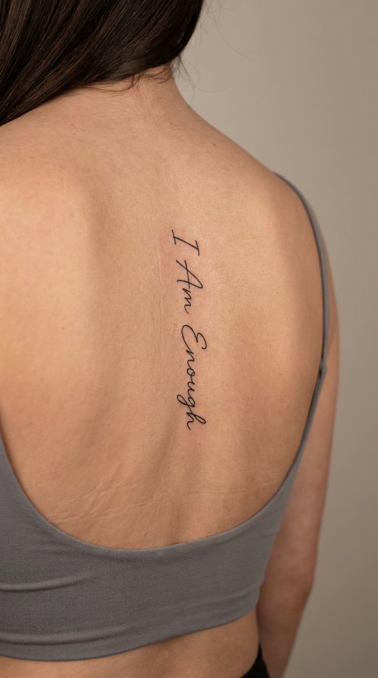
The design is a narrow lowercase affirmation in single-needle line work, the words running top to bottom down the centre of the back with a hand-lettered baseline rather than a typeset one. Letters stay thin and separate, and the line weight is kept identical from the first capital to the last letter so it does not look like two different quotes stitched together.
People choose it as a private instruction to themselves, the kind of sentence that does not need an audience. The spine is a spot only you see unless you turn around or wear an open back, so the message stays yours.
Placement: Upper spine down to the middle of the back, centred between the shoulder blades. Size: 1.5 to 3 inch tall, which is roughly 38 to 76 mm. Style: fine line.
Pain: Low to medium. It is single-needle work with no shading, so the sensation is a fine scratch over bone. The nape is the tender part; by mid-back most people settle. Fine line softens and spreads a little in the first two years, and touch-ups at around the one-year mark are normal.
Make it yours: Drop the capital on every word so the line reads softer, or keep all three capitals if you want the piece to hold its shape better as it ages.
How These Vertical Spine Quotes Read on Skin
Readability is a line-weight problem, not a length problem. Letters that sit too close together fill in as the skin settles, and the gap inside an “e” is the first thing to disappear, so an experienced artist widens tracking on any word with tight counters.
Orientation matters just as much. A vertical quote that runs straight down the centre line follows the body’s most familiar axis, which means the eye travels it easily even from across a room. Curved alignment that hugs the hollow of the back looks softer in photographs, but it forces the words to arc, and arcs make tall letters like “l” and “b” lean.
Before you commit, ask to see a healed photograph of the exact line weight you are booking, ideally one taken at arm’s length. If you cannot read the words in that shot, it will not read on your back either.
2. “Begin Again” in Flowing Handwritten Script
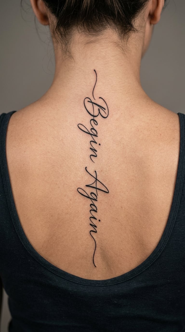
This version is a loose handwritten script with connected letters and a slight upward lean, the entry stroke on the capital B looping back under itself before the word breaks. The descender on the g dips below the baseline and the two words are separated by a small hand-drawn dash rather than a printed space.
It is a restart line, usually chosen after something ended, so the words tend to carry a specific story rather than a general mood. That personal weight is the point; nobody else on the internet has your reason for it.
Placement: Nape to mid-back, starting just under the hairline if you want the top of the script hidden until you move. Size: 2 to 3.5 inch tall, about 5 to 9 cm. Style: calligraphy.
Pain: Medium. The nape is bone and skin with almost nothing between needle and bone, and connected script means fewer lift-offs, which people often find steadier than tiny separate letters. A touch of colour in the ink deepens the black and slows the greying.
Make it yours: Have the artist copy the actual handwriting from a note you wrote to yourself, spacing the words to fit the space rather than the other way round.
3. “Stay Soft” in Delicate Fine-Line Type
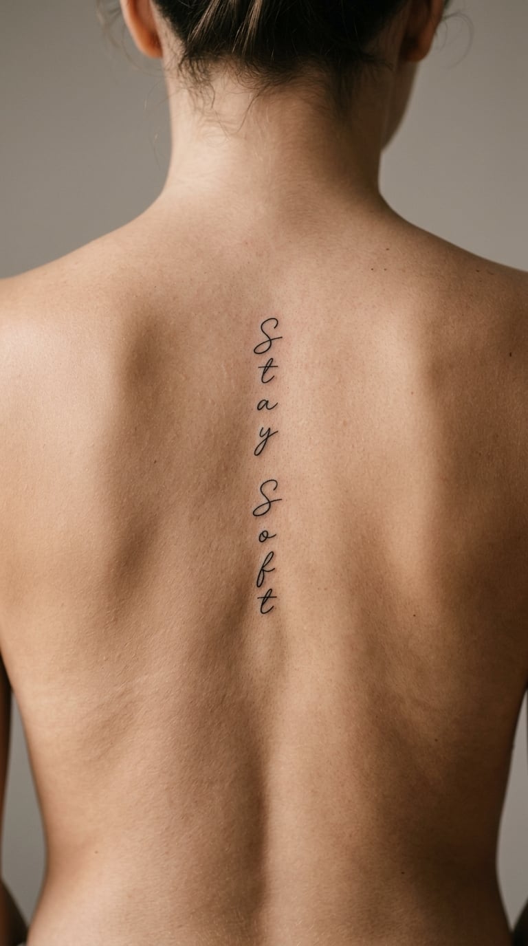
Two words set in a light, upright fine-line typeface, evenly tracked and centred over the upper spine. There is no shadow, no underline and no ornament, so the design reads as a single quiet line of text with generous space on both sides.
It is a gentle message, and that is worth being honest about. Some people want a line that says something fierce; this one does the opposite, and it suits wearers who are done performing strength for an audience.
Placement: Upper spine, centred between the shoulder blades, or a little higher where the curve of the neck gives the words more room. Size: 1.5 to 2.5 inch tall, 4 to 6 cm. Style: fine line.
Pain: Low to medium. Small letters mean fewer passes over the same skin, which is kinder on a sensitive area. Very fine type is the first thing to blur, so ask for slightly heavier lines than the reference photos look, and expect a touch-up inside the first year.
Make it yours: Add a thin hairline rule above the words, a few millimetres tall, so it anchors the type without turning it into a design.
4. “Choose Joy” in a Minimal Vertical Layout
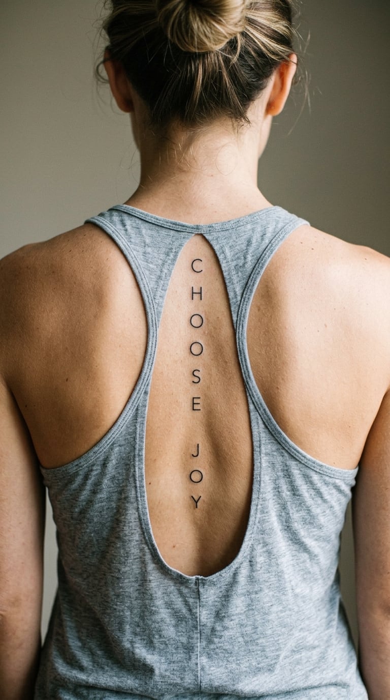
The letters here are separated rather than connected, with wide, even spacing between each character so the words read as a column of individual marks. Every letter is upright and the same height, giving the design a calm, architectural rhythm that photographs well from behind.
It is an upbeat phrase, and it tends to be chosen during a reset period, sometimes after a hard year. The lightness of the layout matters as much as the words; the same line in heavy script would read as a command instead of an invitation.
Placement: Mid spine, running vertically from between the shoulder blades toward the waist. Size: 2.5 to 4 inch tall, 6 to 10 cm. Style: minimalist.
Pain: Medium, mostly because spaced lettering means more individual passes and a longer session. Wide tracking also means larger letters, which is kinder to a bony area than micro text. A design like this holds its shape well, so ageing tends to soften the edges rather than blur the words.
Make it yours: Set each word on a slight diagonal offset down the spine, a millimetre or two per word, so the line follows the natural curve of your back rather than fighting it.
5. “Trust Timing” Follows the Curve of the Spine
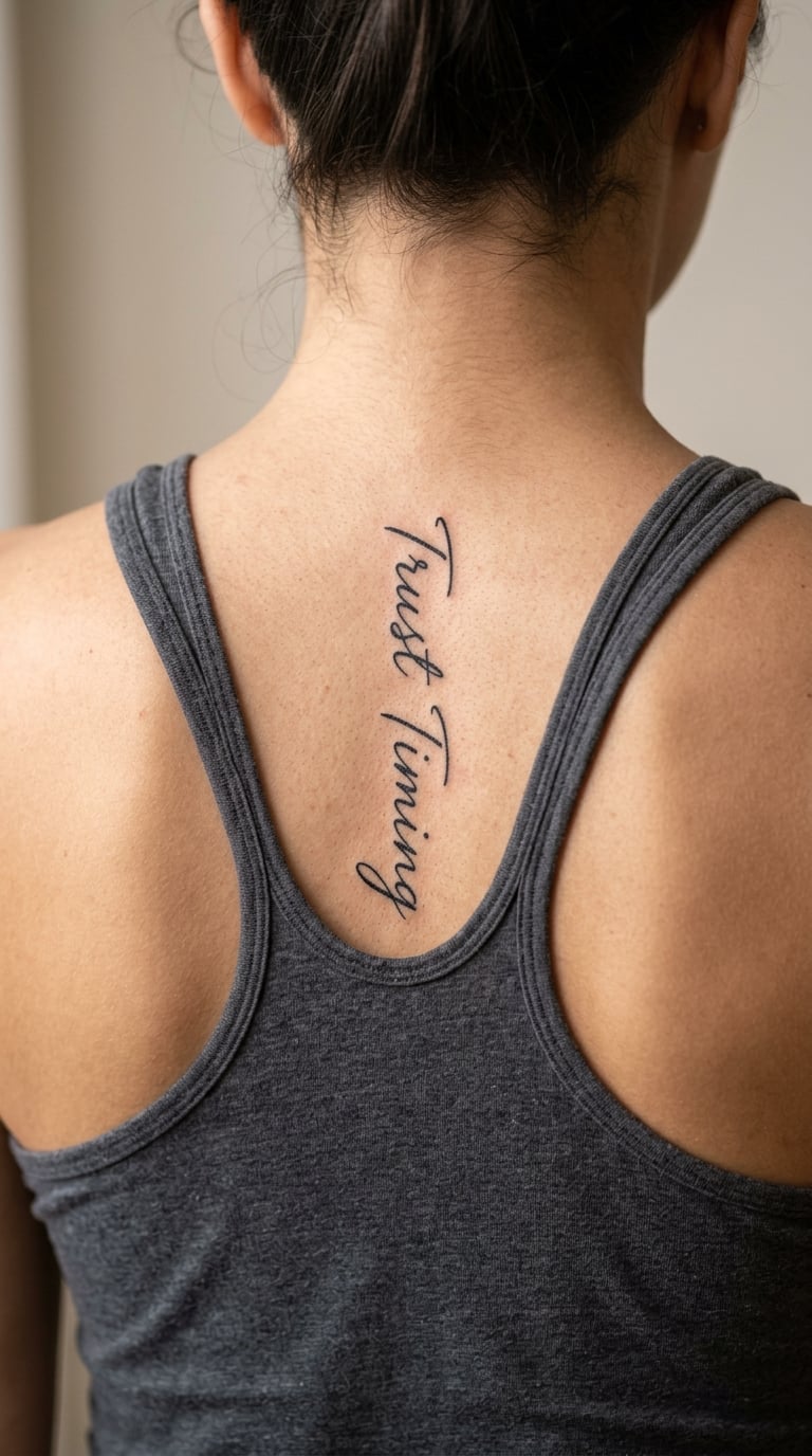
A slightly arched line of micro-calligraphy that sits in the natural hollow between the shoulder blades rather than on a dead-straight vertical. The letters are small and even, and the whole phrase bends with the back so it looks like it grew there instead of being applied.
It is a patience line, usually chosen after a period of waiting on something that took longer than expected. The arch is the design’s quiet detail, since it makes the words look settled rather than pinned on.
Placement: Upper to mid spine, in the dip of the back where the surface curves away. Size: 2 to 3 inch wide, 5 to 7.5 cm. Style: micro-calligraphy.
Pain: Medium. Small calligraphy on a curved surface needs slower work and more passes, and the curve means the artist changes the angle constantly. Micro lettering is delicate, so a slightly heavier line and a touch-up at around a year will keep the small counters open.
Make it yours: Have the arch measured to your own back rather than drawn freehand, so the line sits in the hollow you actually have instead of a generic curve.
6. “Almost There” in Tiny Lowercase Script
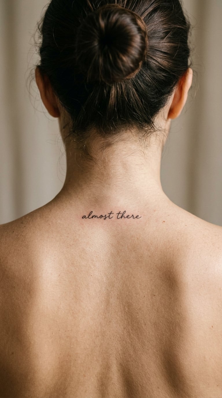
All lowercase, small and compact, with a fine hand-lettered script and no capitals to break the line. The words sit in a tight block just below the nape, so the whole design reads as one quiet paragraph of texture when you catch it in a mirror.
It is a motivation line rather than a statement, the sort of thing said to someone who is nearly through something difficult. The lowercase treatment is deliberate; it keeps the tone private and unannounced.
Placement: Nape and upper back, high enough that the first word tucks under the hair. Size: 1.5 to 2.5 inch tall, 4 to 6 cm. Style: fine line.
Pain: Low to medium, and the shortest sitting on this list. The nape flinches more than it hurts, so most people manage it in one go. This is the size range where blur is a genuine risk, so plan on a touch-up in the first year and keep the aftercare gentle.
Make it yours: Add a single small dot between the two words, matched to the line weight, instead of a larger separator that would fight the small letters.
7. “Whole” with a Single Botanical Accent
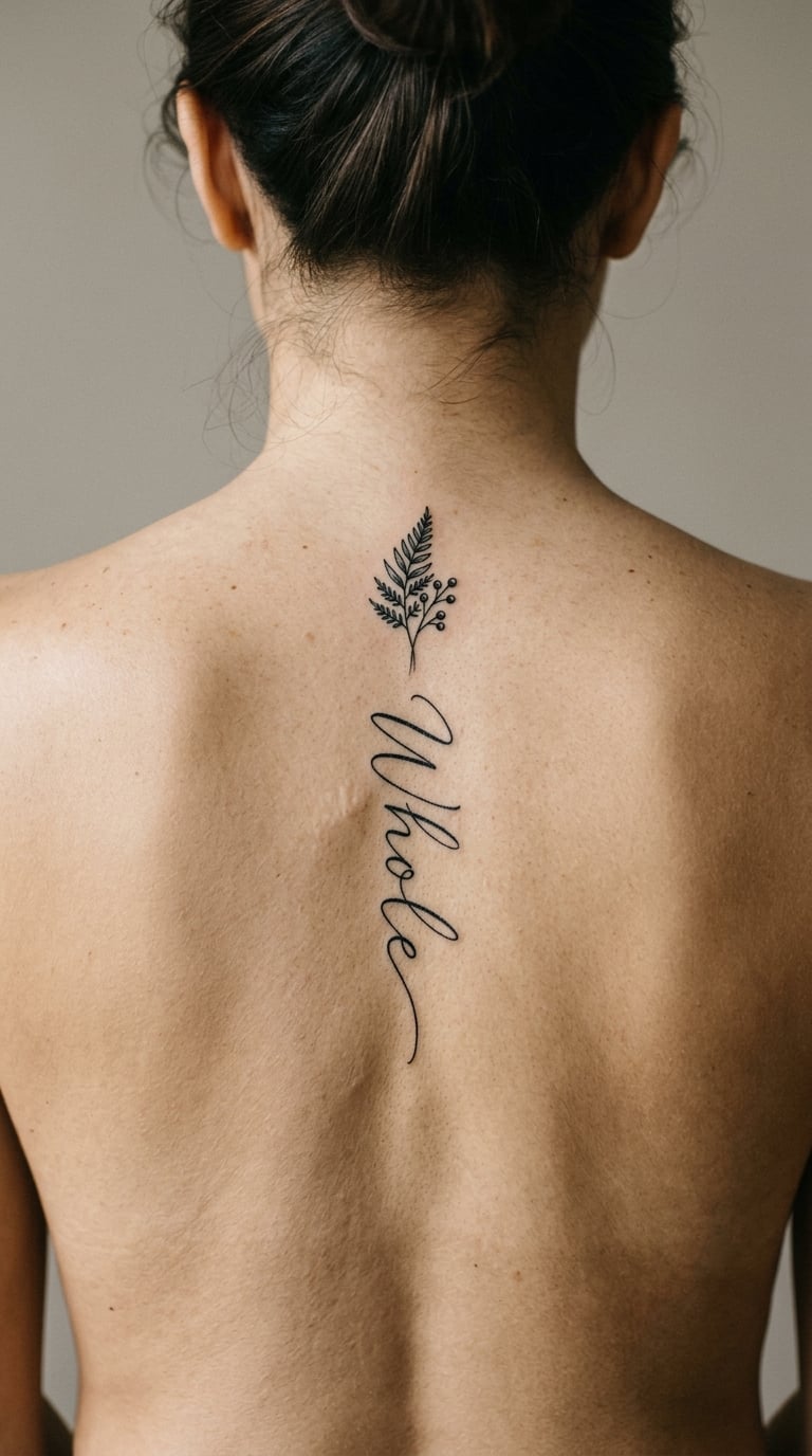
One compact word in black fine line, with a small leaf or short stem placed just after the final letter. The accent is tiny, no bigger than a fingernail, and it is the only non-letter element in the design.
It is self-affirming without being loud, and it works as a first back piece because the lettering is small and the composition is simple enough for a less experienced artist to execute cleanly. Wearers usually describe the word rather than the plant, so pick the flower for how it looks, not for what it is said to mean.
Placement: Upper spine, centred. Size: 1 to 2 inch tall, 2.5 to 5 cm. Style: fine line botanical.
Pain: Low to medium, and quick. A small piece on a bony area is over before discomfort has time to build. The leaf’s fine stem is the detail most likely to soften with sun exposure, so keep it covered when you can.
Make it yours: Use a leaf from a plant that actually grew for you, sketched from a photograph of the real thing rather than a stock drawing.
8. “Present” as a One-Word Back Tattoo
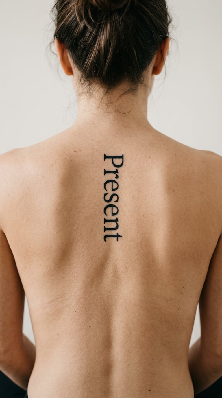
A single word set in a clean, slightly condensed sans-serif, centred between the shoulder blades so the type sits flat and symmetrical. The design is a wordmark rather than a sentence, which means the letters can be large enough to stay crisp without the piece taking over the back.
It is chosen for presence rather than for a story, a one-word reminder that suits people who find long quotes heavy. As a single word it is also the easiest of these designs to place later, since a wide word spreads horizontally across the shoulder blades and fills the space evenly.
Placement: Between the shoulder blades, or slightly lower at the start of the mid spine. Size: 1.5 to 2.5 inch tall, 4 to 6 cm. Style: minimalist typescript.
Pain: Low to medium. Large block letters go down in fewer passes than fine script, so this is one of the shorter sittings here. San-serif strokes hold their edges well, which makes it a good pick if you are worried about legibility over time.
Make it yours: Add a small date under the word in the same typeface, four to six characters tall, so it reads as a quiet line of type rather than a second design.
9. “Breathe” in Airy Handwritten Script
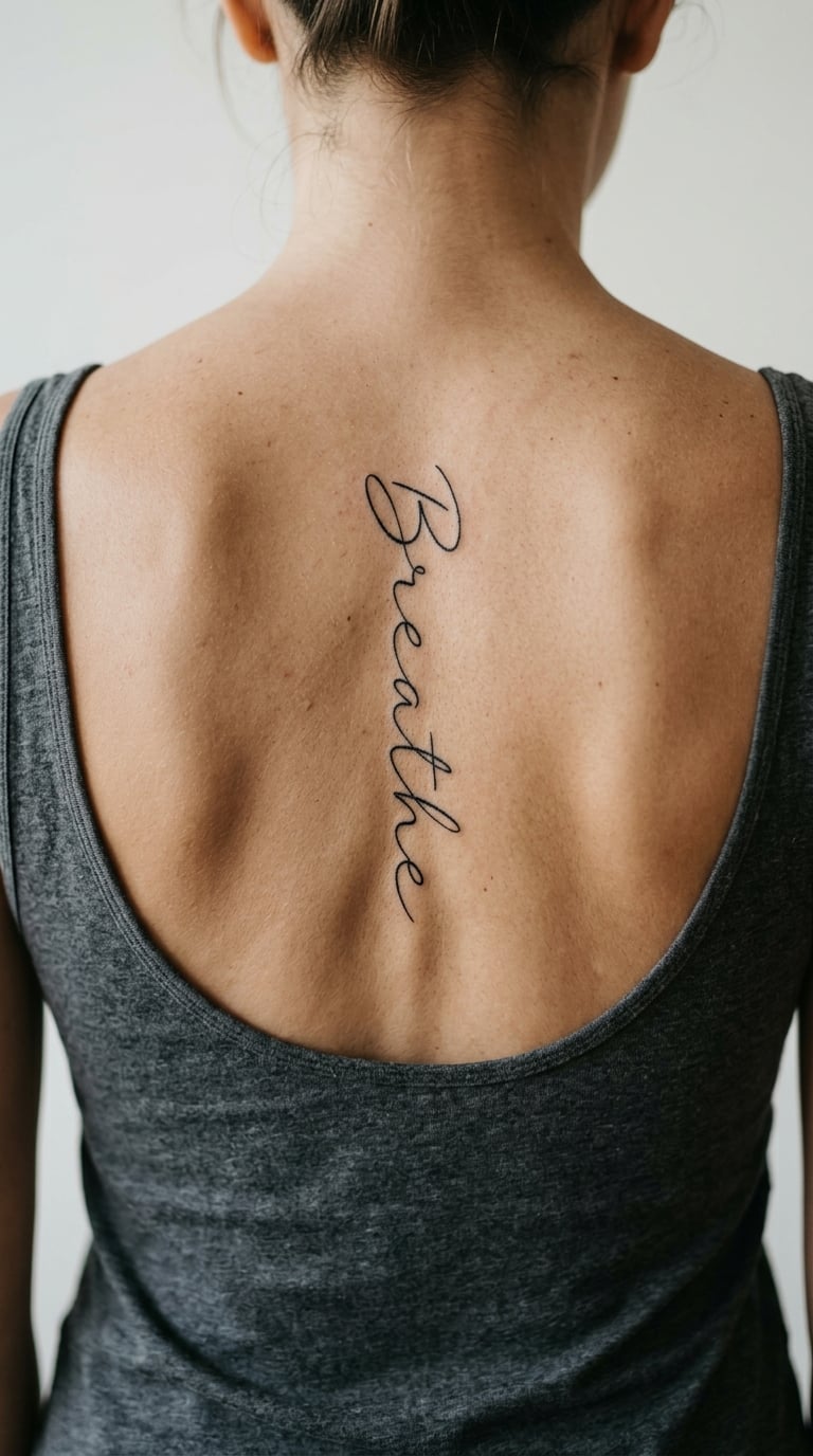
An open, relaxed script with a single oversized capital B and plenty of air between the letters, so the word looks like it breathes between each character. The strokes vary slightly in weight the way a real handwriting pen does, which keeps it from looking machine-set.
It is a grounding word, and people tend to pick it during recovery, a demanding stretch at work, or a period of anxiety. The looseness is the point: the same word in tight lettering would feel like an instruction to control your breathing.
Placement: Nape to mid-back, with the capital near the base of the neck. Size: 2 to 3.5 inch tall, 5 to 9 cm. Style: calligraphy.
Pain: Medium. Varying stroke weights mean the artist slows down, and a wider script covers more skin than a tight one. Fine highlights in the thin upstrokes are the first parts to fade, so a top-up after the first summer helps more here than a deep initial pass.
Make it yours: Have the word angled a few degrees off the centre line so it sits along the dip of the back, which reads more relaxed than a ruler-straight column.
10. “Shine Anyway” in Strong Blackwork Lettering
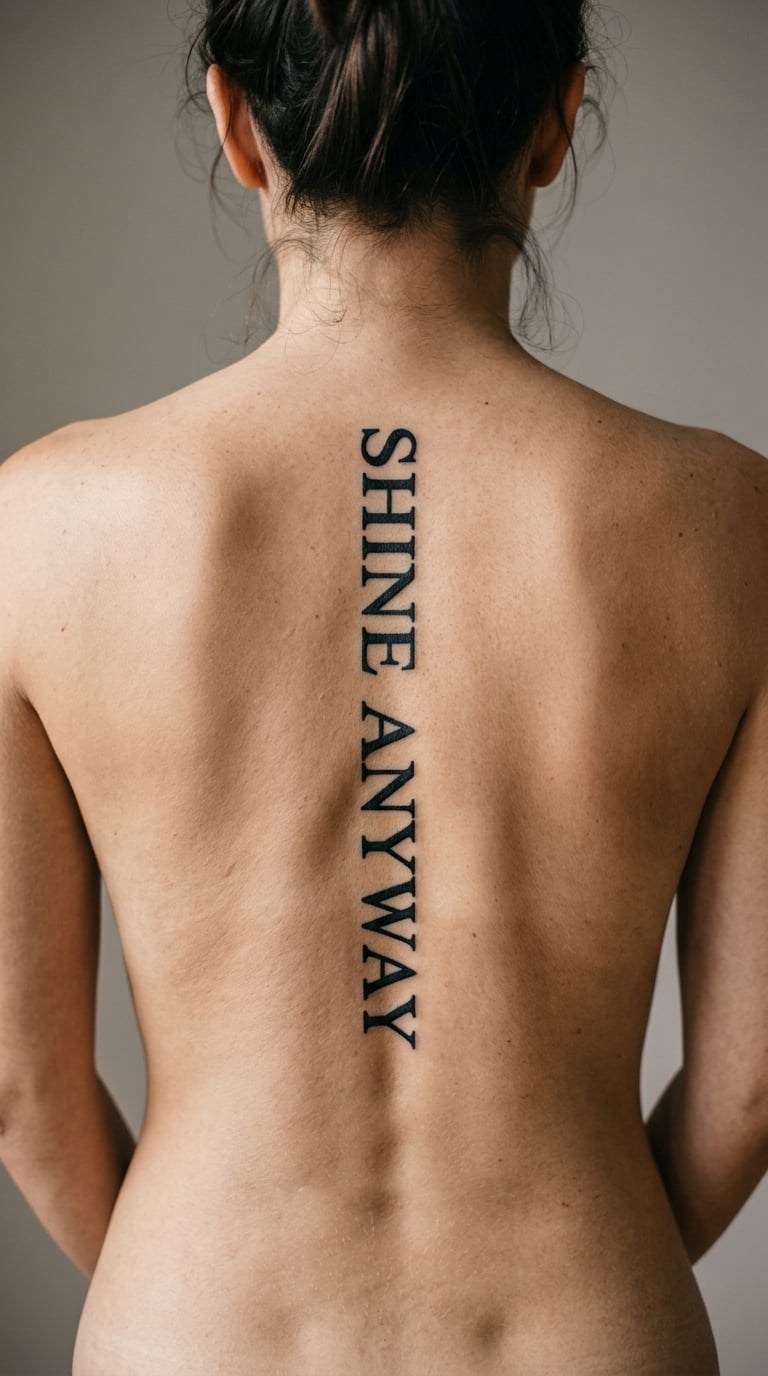
Clean, evenly weighted black letters with real weight to them, spaced apart so each one holds its own shape. The line is confident and slightly larger than the fine-line pieces on this list, and the ink is packed solid so the edges stay defined as it heals.
It is the defiant option in the set, usually chosen after a period of being underestimated. At this weight the piece reads from a short distance, which is the trade for losing the whisper-thin quality of a one-needle line.
Placement: Mid spine, running vertically to the natural waistline. Size: 3 to 4.5 inch tall, 7.5 to 11 cm. Style: blackwork lettering.
Pain: Medium, and heavier than fine line because solid black means repeated passes over the same area. Book it as a longer sitting and take a proper break partway through. Bold letters are the most forgiving of ageing on the back, so this is a good design if the words matter more than the delicacy.
Make it yours: Keep the two words stacked as one column but set them in a slightly different weight so the line has a pulse instead of a flat block.
11. “No Detour” with Subtle Arrow Linework
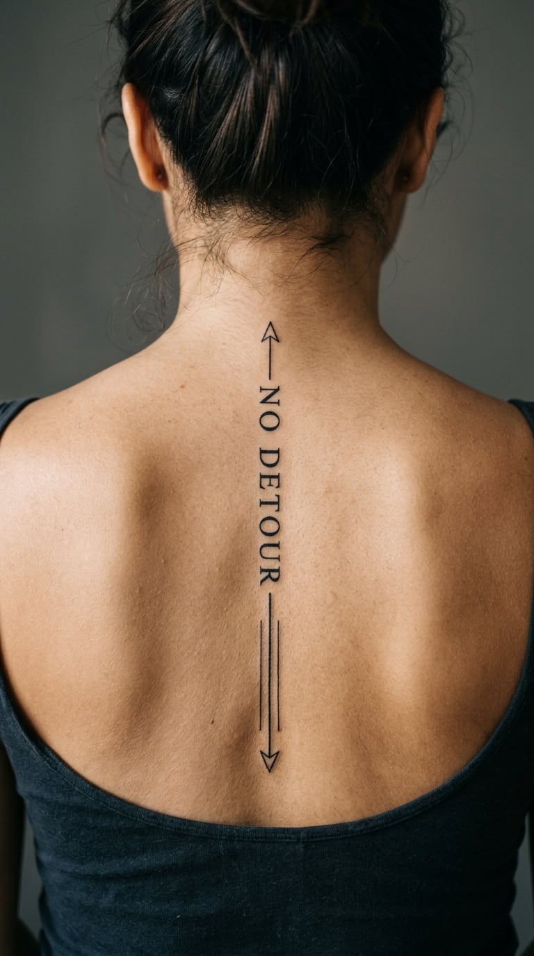
The words are set plainly, and the arrow linework is kept low-key: a single thin shaft with a small open head, running beside or just below the text rather than cutting through it. Nothing is filled, and the line stays under a millimetre wide.
It is a decision line, and it suits people who like a direction metaphor without the heavy-handedness of a full compass or compass rose. Wearers tend to describe it as a reminder to keep moving on something they had already chosen.
Placement: Upper spine, or running down to the mid-back with the shaft following the text. Size: 2.5 to 4 inch tall, 6 to 10 cm. Style: minimal line art.
Pain: Medium. Two elements mean a longer session, and the line work is thin enough that it takes patience. Arrowheads are where fine line loses definition first, so keep the head a touch heavier than the shaft rather than matching them exactly.
Make it yours: Angle the shaft toward a real direction you are going, so the detail carries something only you know about.
12. “Bloom Later” with a Watercolor Flower
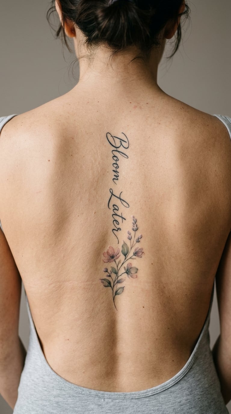
The quote is inked in black or charcoal script, slightly loose at the edges, with a small translucent flower placed at the end of the last word. Colour is used like a wash, built from a few overlapping tones rather than a filled petal, so the flower looks like ink bleeding into damp paper.
The line itself is about timing, and the flower is the reason people describe this one as a tattoo with a second half. Most wearers attach it to a period of waiting, a new garden, or a season that turned out better than expected.
Placement: Mid spine, vertical, with the flower trailing below the final word. Size: 3 to 5 inch tall, 7.5 to 13 cm. Style: watercolor.
Pain: Medium, and the session runs long because colour needs layering and drying time. Watercolour softens faster than black line, particularly the palest tones, so a refresh within the first year is normal and worth budgeting for.
Make it yours: Bring a photograph of a flower from your own garden or a bouquet you were given, and let the palette follow it rather than picking a colour at the shop.
13. “Soft Armor” in Ornamental Lettering
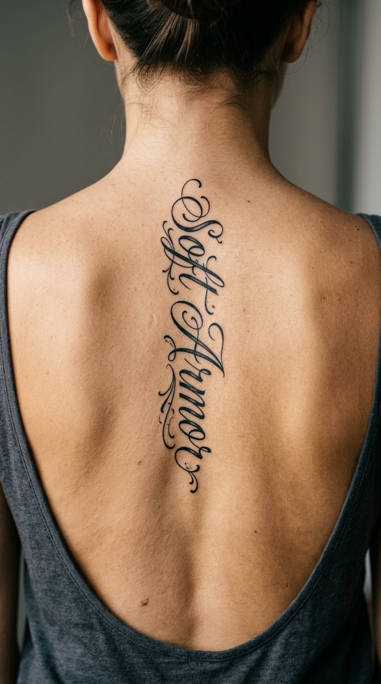
Elegant black lettering with restrained flourishes: a looped capital, hairline extensions off a few stems, and nothing more. The detail stays ornamental rather than illustrative, so the design reads as one considered piece of typography instead of letters with a drawing attached.
It is a private reminder about strength, and the softer tone of the words is the interesting part. Plenty of people arrive at strength through something they would not call fierce, and this design lets both sit in the same line.
Placement: Upper to mid spine, centred so the flourishes have room on both sides. Size: 2.5 to 4 inch tall, 6 to 10 cm. Style: ornamental script.
Pain: Medium. Hairline flourishes take extra passes, and thin decorative work is unforgiving on a curved surface. Keep flourishes away from the waistband line and be honest with your artist if you would rather they simplified the design than push the detail too fine.
Make it yours: Use an initial that matches the first letter of your name, drawn in the same ornamental style, so the top of the piece feels personal from above.
14. “Still Becoming” in Italic Fine Line
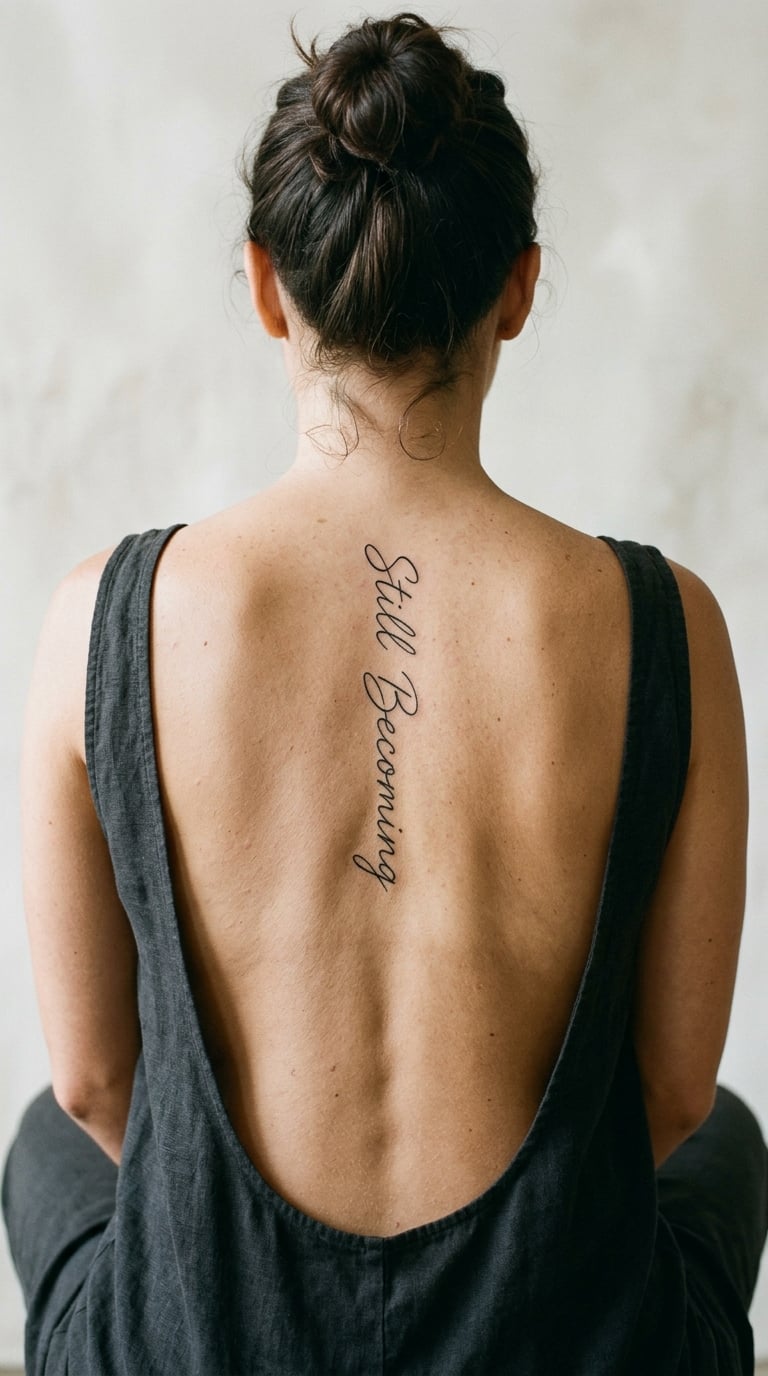
A longer phrase, so the layout matters more than the style here. The letters are slanted, connected at the baseline only, and stacked one word beneath the next so the reading direction is down the back rather than across it.
It is an unfinished-edges line, chosen by people who do not want a message about arriving. Fifteen characters is about the practical limit for a fine-line vertical before the letters start to crowd, and this design sits just inside that limit.
Placement: Mid spine, from between the shoulder blades down toward the waist. Size: 3 to 4.5 inch tall, 7.5 to 11 cm. Style: fine line script.
Pain: Medium, and this is a longer sitting than a single word. More surface area over bone means fatigue rather than a sharper spike. Italic strokes lean and thin on the exit side, so those are the areas most likely to fade unevenly, and a touch-up at around a year is worth it.
Make it yours: Stack the words with a hand-drawn line break that matches the natural length of your spine, so the rhythm of the piece fits your back rather than a template.
15. “Fearless” in a Clean Single-Word Design
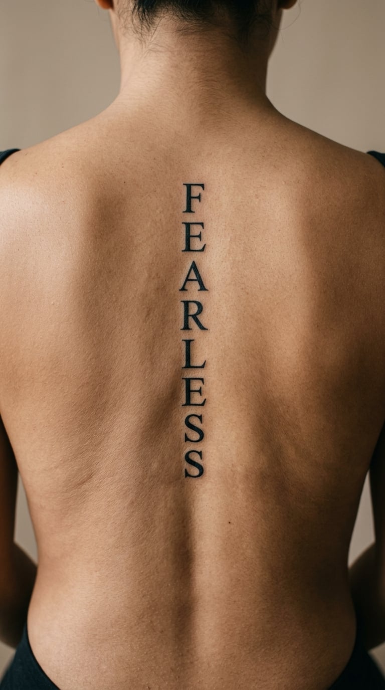
A single bold word in clean lettering with a strong baseline and a sharp serif or a plain sans-serif, sized large enough to fill the space between the shoulder blades. The composition is symmetrical and sits flat, so it reads as a wordmark rather than a line of text.
It is a statement piece, and people usually pick it at a moment when they have already done the thing they were afraid of. Because the letters are large, it is visible in a swimsuit or a backless top, which is the opposite trade to the fine-line options on this list.
Placement: Upper to mid spine, centred and wide across the shoulder blades. Size: 2 to 3.5 inch tall, 5 to 9 cm. Style: single-word type design.
Pain: Medium. Solid letterforms mean more passes over a smaller area, which is a different kind of discomfort from fine line: more pressure, less of it in many small places. Large shapes hold their edges well, so this is a lower-risk design if legibility years from now is your priority.
Make it yours: Put a birth date underneath in a much smaller, quieter typeface, sized so it registers only when someone is standing close.
16. “Home in Me” in Soft Black-and-Grey Script
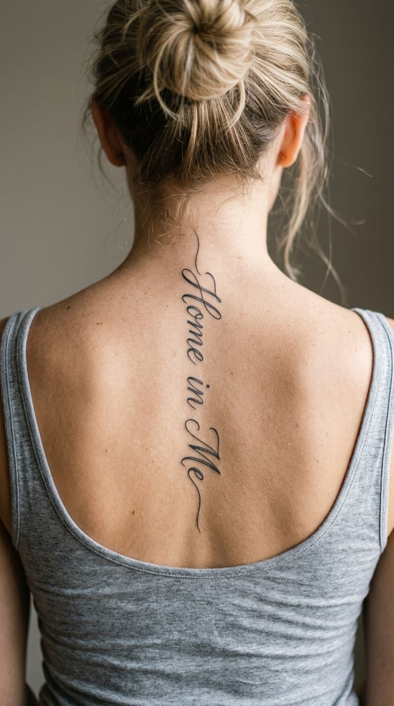
A gentle handwritten phrase with soft grey wash or light shading tucked behind the downstrokes, like a shadow following the ink. The black stays dominant and the grey sits low, so the piece has depth without ever looking like a full colour tattoo.
It is a belonging line, often tied to family, home, or a period of feeling unmoored. The soft shading gives it more presence on skin than a plain script while staying quiet enough for everyday wear.
Placement: Upper spine, following the curve so the shading catches light along one side. Size: 2.5 to 4 inch tall, 6 to 10 cm. Style: black and grey script.
Pain: Medium. Any shading means going over the same skin repeatedly, and the back is sensitive about midway down. Grey wash needs a top-up sooner than solid black, so treat the first-year refresh as part of the piece rather than a surprise.
Make it yours: Have the grey shaped like a specific shadow you remember, such as a window frame or a doorway, rather than a generic blur behind the letters.
17. “One Day at a Time” Stacked in a Narrow Column
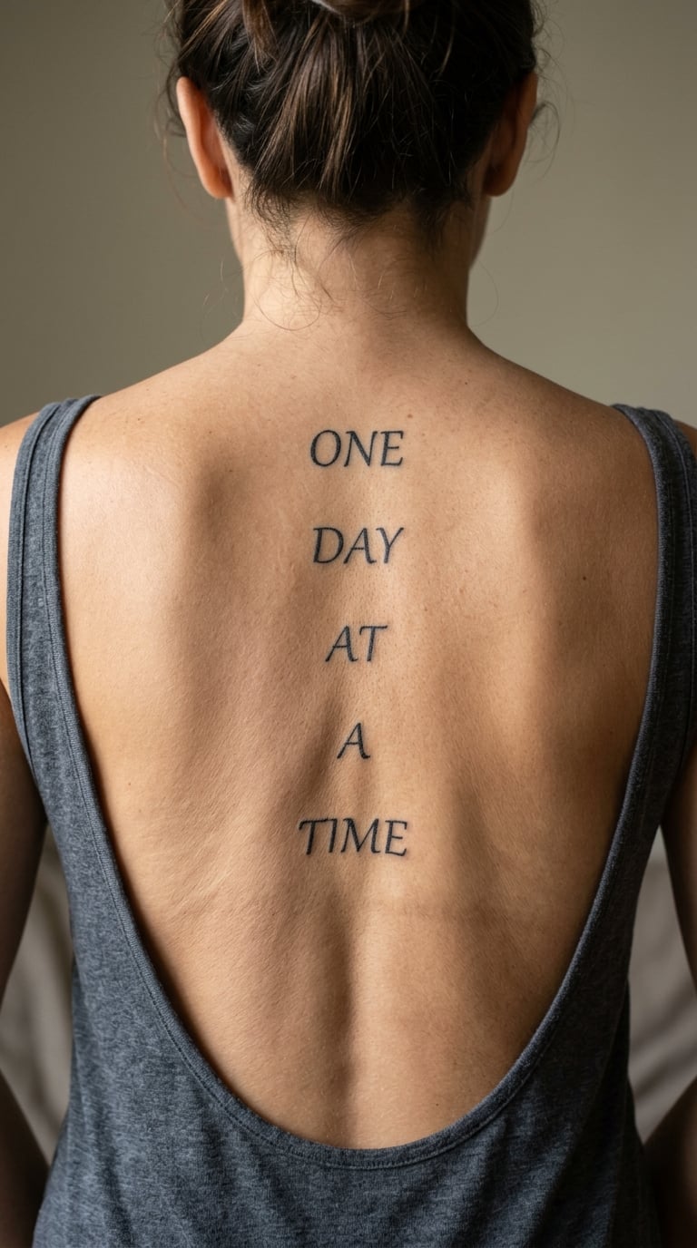
The words are set one under another in a narrow centred column, each word on its own line, in a simple upright typeface with even spacing between lines. It is a layout choice rather than a style choice, and it uses the full height of the mid-back without widening at all.
It is the recovery line on this list, chosen by people working through something one day at a time rather than all at once. Because each word is a separate line, the capitals line up on the left edge of the column, which gives the piece structure a single flowing line would not have.
Placement: Mid spine, from between the shoulder blades to the waist. Size: 3.5 to 5 inch tall, 9 to 13 cm. Style: simple typography.
Pain: Medium, and expect a longer sitting than the single-word pieces because this is the largest area on the list. It is still untattooed skin rather than repeated shading, so the discomfort stays steady instead of climbing. Simple upright letterforms are among the most durable choices for the back.
Make it yours: Change the last word to whatever you are actually working on, so the column becomes a short sentence of your own rather than a borrowed one.
18. “Wild Grace” in Loose Watercolor Lettering
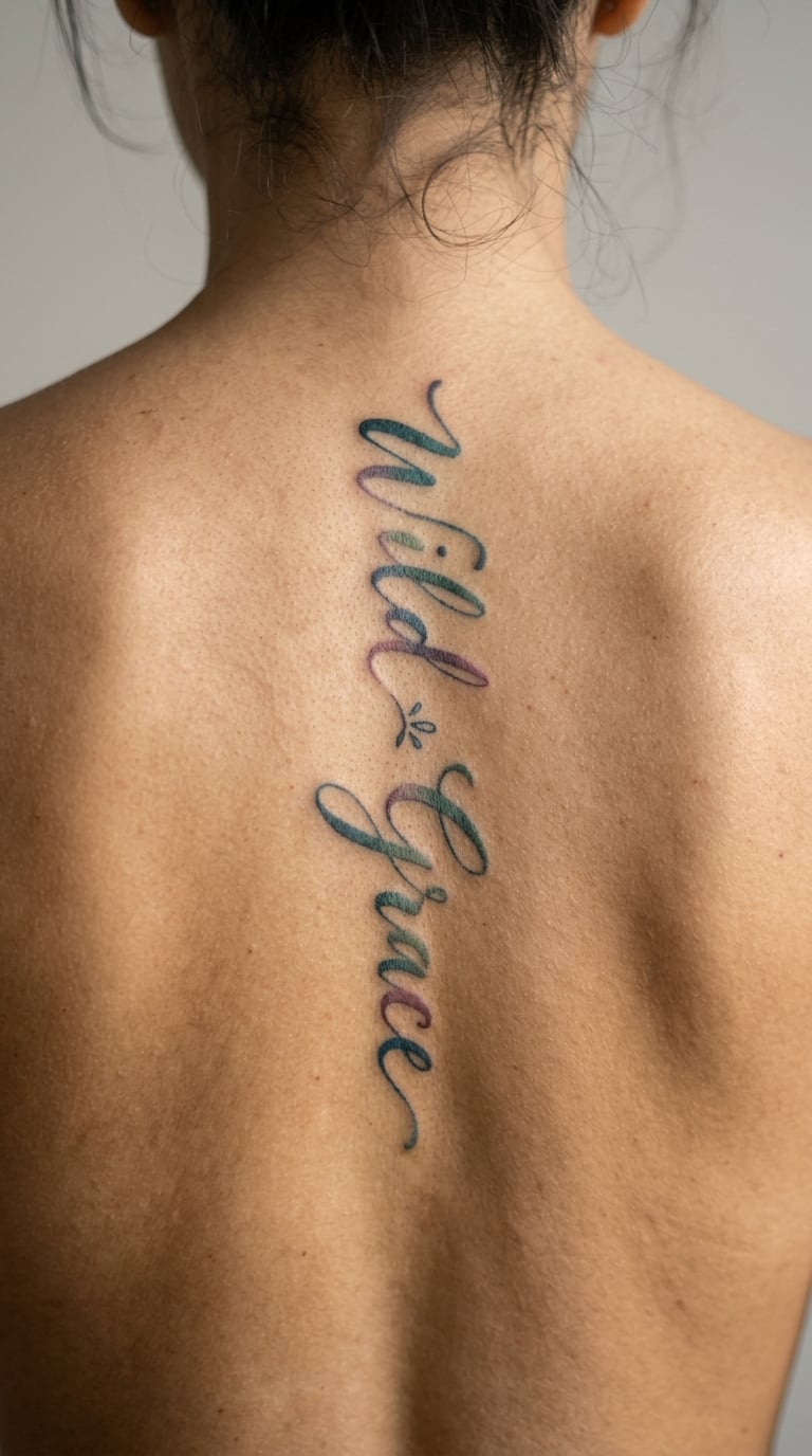
Expressive translucent lettering where the colour moves unevenly through the words, with a few areas denser than others and one or two dry-brush edges where the ink skipped. Colour stays inside a restrained range rather than spreading across the whole back.
The phrase holds two ideas at once, which is why it works for people who resist choosing between untidy and composed. Wearers usually talk about it as capturing a mood rather than making a claim, which is unusual for a quote tattoo and part of its appeal.
Placement: Upper to mid spine, with the letters running down the natural line. Size: 3 to 5 inch tall, 7.5 to 13 cm. Style: watercolor.
Pain: Medium. Watercolour lettering needs several passes as the colour builds, so the session is long and the area stays sensitive. Translucent ink fades more quickly than solid black, especially the light tones, so plan on a colour refresh and a careful summer.
Make it yours: Choose a two-colour palette from something you own, such as a scarf or a painted wall, so the piece stays tied to a place rather than a trend.
19. “Keep Going” in Minimalist Block Type
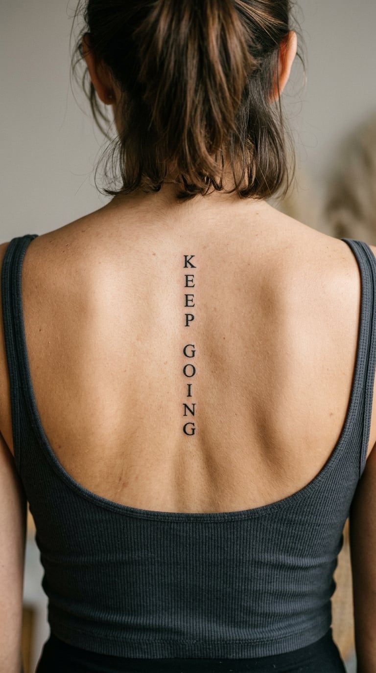
Two words in clean sans-serif block lettering, the same height and weight, with ordinary even spacing and no styling at all. It is the most modern-looking entry on this list and the least decorative, and the design depends entirely on proportion and placement.
It is a working line, chosen by people mid-project rather than after the fact. Because the type is plain, the piece sits comfortably next to other tattoos later without looking like a different book in the same library.
Placement: Mid spine, centred, with the words on one line rotated to run vertically. Size: 2 to 3.5 inch tall, 5 to 9 cm. Style: minimalist type.
Pain: Low to medium. Block letters with straight edges go down quickly, so this is usually a short appointment on a bony area. Straight-edged type is durable and easy to touch up, which makes it a sensible choice if you want the words intact rather than soft.
Make it yours: Use an unusual font weight, such as a light or a wide cut, so a plain phrase still feels like it was chosen by you and not copied from the first search result.
20. “Free” in a Bold Sweeping Script
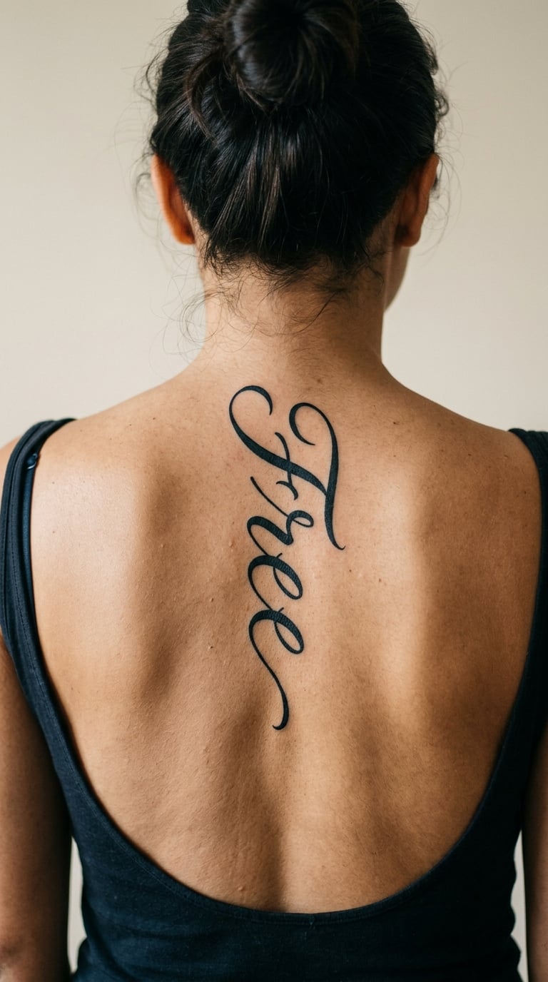
A confident final word in brush-like script with strong thick and thin contrast, long sweeping exit strokes and a good amount of empty space around the letters. The strokes taper to sharp points, which is what gives the piece its movement rather than a heavy, static look.
It is the celebration option, usually chosen after something ended well, and it is the design in this set most likely to be read from a distance. The negative space around the letters does as much work as the ink, so it wants a back with room for it.
Placement: Upper spine, centred, where the flat area between the shoulder blades supports wide strokes. Size: 2.5 to 4 inch tall, 6 to 10 cm. Style: brush script blackwork.
Pain: Medium. Bold sweeps mean pressure, and the tapering points take a steady hand and time. Thick strokes stay readable as the piece ages, while the thin tapered ends soften first, so a touch-up every few years keeps the shape sharp.
Make it yours: Add a small swirl at the end of the final stroke, one you draw yourself, so the word ends with something that came from your hand.
How to Choose the Right Design
Start with length, because that decides almost everything else. Longer phrases need a longer run of clear skin, and a quote that fits the nape on a stencil can end up crowding the waist. A practical way to think about it:
| Quote length | Fits where | Suits |
|---|---|---|
| 1 word, up to 7 characters | Upper or mid spine | First tattoos, small budgets, open-back dresses |
| 2 short words, up to 12 characters | Upper to mid spine | The most reliable all-round choice |
| 3 to 4 words, up to 20 characters | Mid spine to waist | Longer sessions, firmer line weight |
| 5 words or more | Consider stacking or splitting it | Collectors already planning more pieces |
Then weigh a few other things. Line weight is the decision that most affects whether the words survive: the finer the line, the more private the piece, and the sooner it needs a refresh. Placement is the decision people regret most, and the most common regret in client conversations is going lower than you wanted. Sit upright in a chair, lean forward, and check the placement in a mirror before you commit, because a placement that looks right leaning forward can sit much lower when you stand. Working through a shortlist of spine quote tattoo ideas for women, keep the ones you can still read at arm’s length in the mirror; that single filter removes more designs than any style preference.
Style is a smaller decision than people expect. A first tattoo on the spine usually wants readability over detail, which means larger letters, a clean line, and no hairline flourishes. Colour, especially watercolour, looks wonderful in a healed photograph and needs more maintenance than black line does.
Finally, live with the words. Keep the phrase in your notes for a few months and read it on a bad day as well as a good one. If it only makes sense during the week you are getting it, it will age harder than something you would happily say to a stranger reading it over your shoulder.
Cost and Session Time
A short fine-line phrase is one of the more affordable back pieces, because the work is measured in minutes rather than hours. Longer phrases, watercolour, and anything with shading or ornamental detail push the appointment up, since artists price by time and shop minimums apply to every booking.
Rough US ranges, so you know what to expect before you start asking. A single fine-line word usually lands somewhere around $80 to $180. A two-word phrase with a slightly heavier line weight sits around $150 to $300. A three or four word vertical quote, especially with a second colour or shading, runs closer to $300 to $600. Larger watercolour or ornamental pieces can start at $600 and climb well past $1,000 once the artist is layering colour and taking the time it needs. All of these are guideposts rather than quotes, because the shop and the artist set the real number.
Most artists charge an hourly rate, and a shop minimum means the appointment has a floor cost even if your tattoo only takes half an hour. Travel, city, and the artist’s own booking list move the final number more than the design does, so two people with the same phrase can pay very different amounts. Ask for the full estimate including the shop minimum before you book, not just the hourly figure.
Session length is usually the more useful number. A single word can be done in one sitting of well under an hour. A four-word phrase, or anything with colour or shading, often runs two to three hours and may need a second session so the artist is not working past their own concentration. Expect to be leaning forward or lying on your side for much of it, and plan the day around that rather than booking it before work.
Aftercare Basics
Follow your artist’s aftercare instructions first, since they will know how deep your particular lines went. On top of that, the basics that keep vertical lettering crisp are straightforward:
- Wash the area gently with unscented soap and lukewarm water, then pat it dry with a clean towel rather than rubbing it.
- Keep anything with a waistband, clasp, or strap away from the fresh ink for as long as your artist tells you to, since friction across the lower back is the fastest way to wear a fine line down.
- Choose loose clothing and a shirt that does not run across the shoulder blades, and do not sleep on the fresh side for the first few nights.
- Keep the area out of long hot showers, pools, and open sun while it settles, and do not soak it.
- Watch it rather than poking it, and go back to the artist if anything looks raised, wet, or open, instead of treating it yourself.
Sun is the long-term one worth planning around. Vertical lettering on the back is uncovered far more often than lettering on an arm, so a shirt over the back on a sunny day does more for the design over five years than any product you can buy afterwards.
Frequently Asked Questions
What does a spine quote tattoo feel like?
Most people describe it as a fine scratch over bone rather than a deep pain, with the nape area the most reactive and the mid-back the most manageable. Single-needle lettering with no shading is usually over quickly. The bigger factor is duration: a longer phrase means leaning forward or lying on your side for hours, and the discomfort builds from tension rather than from the needle itself.
How long should a spine quote tattoo be?
Two short words, up to about twelve characters, is the sweet spot. One word of up to seven characters suits the upper or mid spine and the shortest appointment. Three or four words need a run of clear skin from the shoulder blades to the waist, a firmer line weight and a longer sitting. Five words or more is usually better stacked or split into a second piece.
Will a fine-line spine quote stay readable?
Fine line stays readable when the letters are not too small and the counters are left open. Ask to see healed photographs at arm’s length, because fresh line is darker and sharper than the settled result. Expect a touch-up around the one-year mark, and again every few years if you wear low backs and swim often, since sun exposure softens hairlines faster on the back than almost anywhere else.
What placement makes a vertical quote easiest to read?
A straight line down the centre of the spine, starting around the upper or mid spine, is the easiest to read because it follows the body’s most familiar axis. Placement lower on the back often sits closer to the waistband, where clothing rubs and the words get hidden. Sit upright, lean forward, and check the placement in a mirror before you commit to a height.
Can I wear a backless dress with a spine quote?
Yes, and that is one of the reasons this placement appeals. The design shows in open-back dresses, halter tops and low-cut swimwear, then disappears under everything else, which gives you control over who reads it and when. Keep in mind that a placement too low can be covered by a bra band or a waistband, so check where the words end before you commit.
How do I make a short quote personal?
Change the treatment rather than the words. Have the artist copy your own handwriting from a note you wrote, add a date in a much smaller typeface underneath, or place one small accent such as a leaf or a swirl. Keeping the words short and making the details specific is what stops a common phrase from reading like everyone else’s.
Conclusion: Where to Begin
If this is your first back piece, start with a short fine-line affirmation like “Whole” or “Present”. Both are single words, both read from a mirror, and both leave room for a second piece later if you want one. Every one of the 20 spine quote tattoo ideas for women here is a starting sketch rather than a finished brief, so treat the phrase as a starting point and adjust it to your own wording before the stencil goes on.
If you are already collecting, “Shine Anyway” or the watercolour “Bloom Later” will hold more attention and cost you more maintenance. Either way, confirm the exact wording, the scale and the height with your artist, because the words are the only part you cannot change later.