
20 Graffiti Tattoo Ideas (2026): Bold Street-Inspired Designs
Twenty graffiti tattoo ideas, sorted by the thing people actually decide first: how big the piece is and where it goes. A spray-paint tag on the inner forearm behaves nothing like a mural panel on the thigh, so each design below comes with a placement, a realistic size in inches, the style name an artist would actually use, a pain note and one way to make it yours.
If you’re planning this around a birthday or a trip, book the appointment four to six weeks out, not one. Artists who do good lettering often have longer books than generalists, and a mural piece needs a second and sometimes third session before it is finished.
A tattoo reads as graffiti when it borrows the visual logic of aerosol writing: bold black outlines, chunky bubble or block letterforms that interlock, edges that fade like sprayed mist, and paint that runs downward in a few controlled drips. The lettering is usually the artwork, not a frame around a picture, which is why these designs age faster than a rose or a bird and why legibility is the honest concern in every caption below. You will also hear writers say tag, piece, throw-up, wildstyle and sticker when they describe exactly these shapes: a tag is a fast signature, a piece is a full lettered composition, a throw-up is a simplified block form, wildstyle adds sharp interlocking points and spray effects, and sticker style is the filled, hard-edged version.
20 Graffiti Tattoo Ideas: Quick Guide
Twenty graffiti tattoo ideas, compared side by side, so you can narrow the field before you sit down with an artist. Read the pain column as a general range for that placement rather than a promise.
| Idea | Style | Best placement | Size | Pain |
|---|---|---|---|---|
| 1. Blackwork spray-paint tag | Blackwork, loose handstyle | Inner forearm | 5-9 inch (13-23 cm) | Medium |
| 2. Color spray-paint wordmark | Color lettering with spray edges | Outer upper arm | 4-7 inch (10-18 cm) | Medium |
| 3. Bubble-letter name | Traditional bubble lettering | Shoulder, deltoid | 3-5 inch (8-13 cm) | Low to medium |
| 4. Wildstyle arrow | Wildstyle, black and grey | Forearm | 6-10 inch (15-25 cm) | Medium to high |
| 5. Minimal linework symbol | Fine line | Inner wrist | 1.5-2.5 inch (4-6 cm) | Low |
| 6. Stenciled city tag | Stencil, black ink | Outer calf | 4-6 inch (10-15 cm) | Medium |
| 7. Mural-style rose with halo | Mural realism with spray halo | Upper chest, shoulder | 4-6 inch (10-15 cm) | Medium |
| 8. Abstract dripping letter | Minimal black letterform | Side of neck | 2-3 inch (5-8 cm) | High |
| 9. Chiaroscuro block on sternum | Blackwork, 3D shading | Sternum | 3-5 inch (8-13 cm) | High |
| 10. Graffiti eye with splatter | Graphic black and grey | Outer upper arm | 4-6 inch (10-15 cm) | Medium |
| 11. Handstyle signature | Fine-line handstyle | Side of the hand | 2-3 inch (5-8 cm) | Medium to high |
| 12. Checkerboard block | High-contrast blackwork | Outer bicep | 4-6 inch (10-15 cm) | Medium |
| 13. Blackwork throw-up on the rib | Throw-up, flat fill | Lower ribs | 4-7 inch (10-18 cm) | High |
| 14. Neon watercolor tag | Watercolor with black linework | Outer ankle | 3-5 inch (8-13 cm) | Medium |
| 15. Brick-wall graffiti panel | Illustrative black and grey | Inner forearm | 4-6 inch (10-15 cm) | Medium |
| 16. Spray can and lettering | Traditional, muted color | Upper back | 6-9 inch (15-23 cm) | Low to medium |
| 17. Dotwork butterfly | Dotwork with spray edge | Shoulder blade | 4-7 inch (10-18 cm) | Medium |
| 18. Micro graffiti arrow | Micro, minimal drips | Collarbone | 1-2 inch (2.5-5 cm) | Medium |
| 19. Black-and-grey mural panel | Mural realism | Outer thigh | 8-14 inch (20-35 cm) | Medium |
| 20. Hidden tag behind the ear | Fine line, minimal | Behind the ear | 1.5-2.5 inch (4-6 cm) | Medium to high |
1. Blackwork Spray-Paint Tag on the Forearm
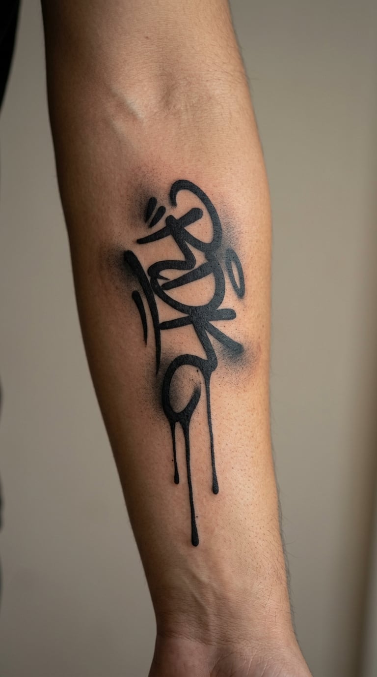
This design is a loose black handstyle tag with soft overspray around a hard signature, the closest thing to a piece of aerosol writing translated into permanent ink. The artist keeps a thick line on the downstrokes, thins the exits to almost nothing, and lets three or four drips run downward from the baseline.
Tags are the signature of a writer, so this one is usually chosen as a stand-in for a name or a crew without spelling anything out.
Placement: inner forearm reads flat and faces outward when the arm rests. Outer forearm works if you want it visible while your arm is at your side. Size: 5-9 inch (13-23 cm) long is the working range; wider than that and the drips stop reading as deliberate. Style: blackwork with a loose handstyle skeleton. Pain: medium, mostly the forearm’s inner surface near the elbow crease, and misty overspray needs repeated passes, so expect a long sitting. Black lines hold their weight well, but soft spray fades back toward the line over the years. Make it yours: have the first initial run into the final stroke so the whole word reads as one movement.
2. Color Spray-Paint Wordmark on the Upper Arm
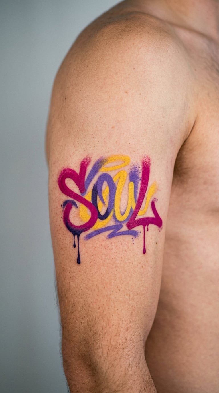
This is a bright color wordmark built from layered lettering, where a second pass of a lighter shade sits slightly offset behind the first to fake sprayed depth. Edges fade into a soft gradient instead of stopping at an outline, and two short drips break the lower line.
Wordmarks get picked for nicknames, hometown names or single words that hold a memory, and the color makes the piece read loud from across a room.
Placement: outer upper arm, ideally on the deltoid-to-bicep stretch where a word can sit in one line. Size: 4-7 inch (10-18 cm) is plenty; spray aesthetics rely on soft focus, and crisp detail fights the style. Style: color lettering with sprayed edges. Pain: medium, and filling solid color takes longer than the outline. Light and mid-tone pigments shift fastest, so the pale inner glow goes first. Make it yours: keep the core lettering black and make only the halo colored, which costs less in the chair and lasts longer on skin.
3. Bubble-Letter Name on the Shoulder
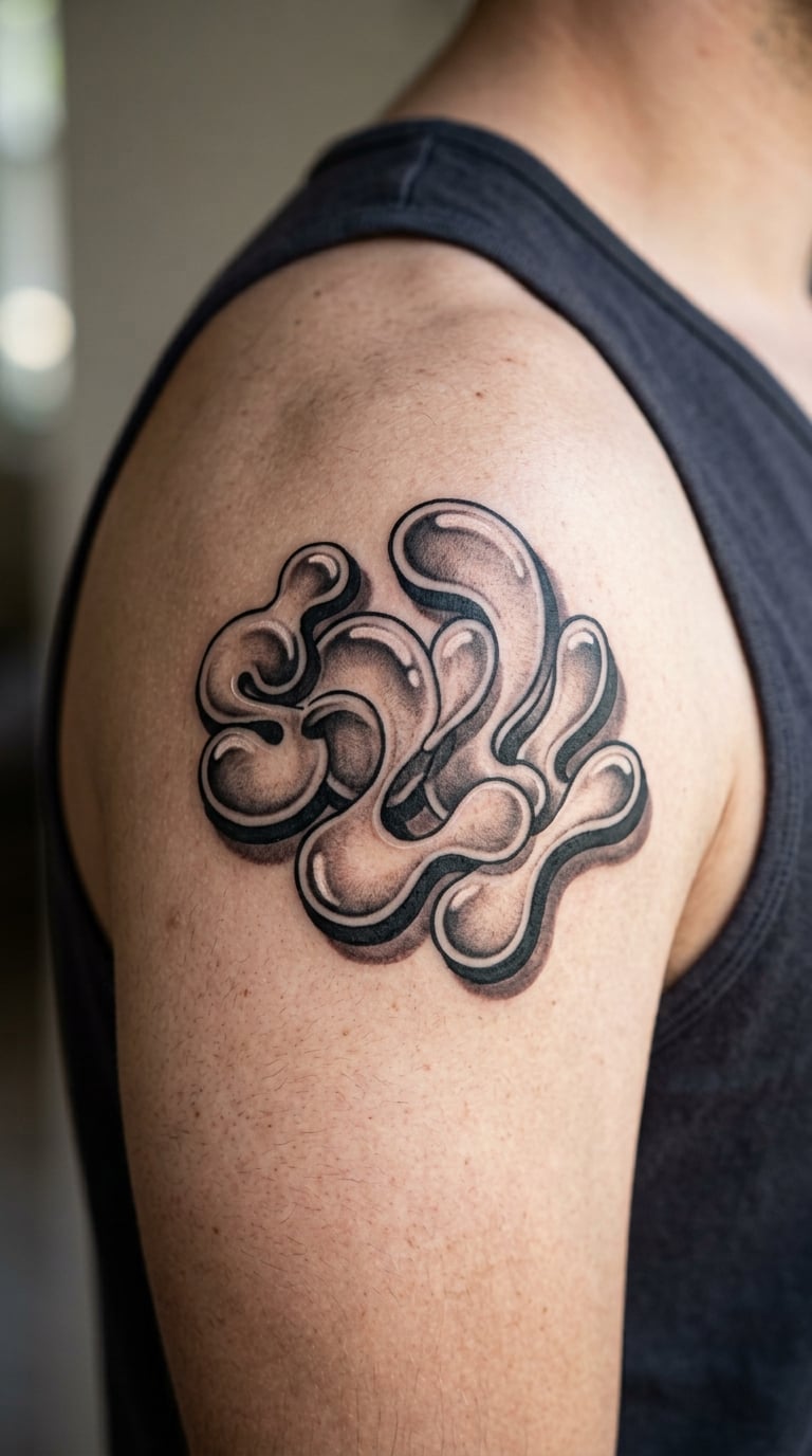
This design is a classic bubble-letter name, the rounded style where each letter inflates into a fat oval with a highlight on top and a shadow underneath. It sits inside a thin outline and stays legible because every letter keeps its own gap.
It is the most approachable entry into lettering work because the shapes are simple and forgiving, and it also stacks cleanly with other lettering pieces later.
Placement: shoulder and deltoid take it best, since the rounded contour matches the inflated letters. Size: 3-5 inch (8-13 cm) for a name, one inch per letter as a rough guide. Style: traditional bubble lettering. Pain: low to medium on the shoulder, though the inner arm near the armpit stings. Bubble outlines are thick, which ages more gracefully than hairlines, but the interior highlights are the first detail to soften. Make it yours: add a two-tone fill so the shadow side carries a second color rather than plain black.
4. Wildstyle Arrow on the Forearm
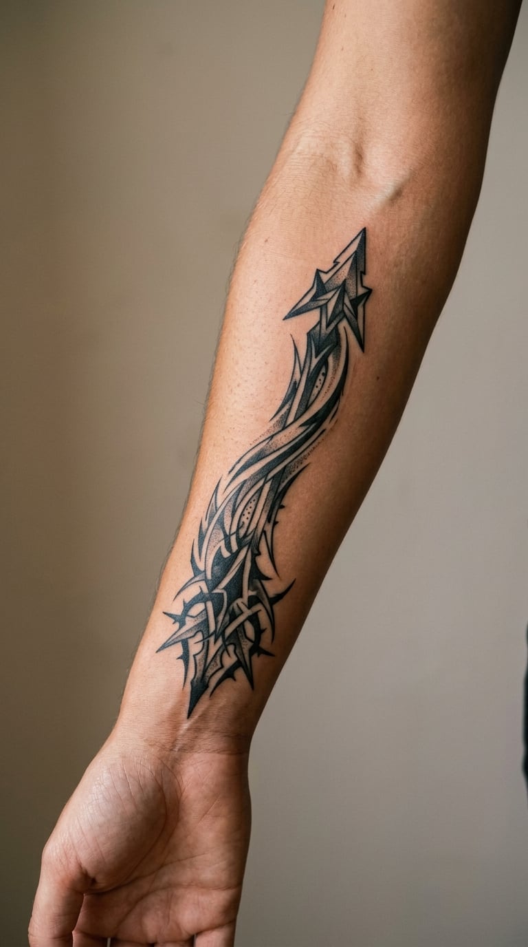
This design is an energetic wildstyle arrow, built from layered arrowheads that lock into each other, spiked extensions off the shaft, and a tapered trail that suggests speed. A few hard black outlines hold it together with grey shading behind.
Arrows are the standard motion symbol in graffiti, so people take them when they want the tattoo to point somewhere rather than name something.
Placement: run it along the forearm from wrist to elbow so the trail follows the bone. Size: 6-10 inch (15-25 cm); under four inches the interlocking points collapse into each other. Style: wildstyle, black and grey. Pain: medium to high across a long forearm, with the elbow end the rough patch. Dense spike work blurs as fine grey shading spreads, so ask for harder black. Make it yours: give the trail a second small arrowhead so the direction reads twice instead of once.
5. Minimal Linework Graffiti Symbol on the Wrist
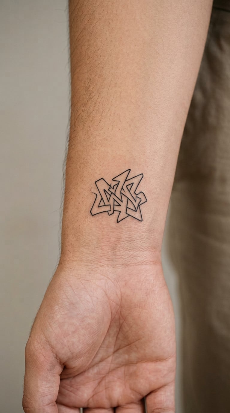
This design is a minimal single-line symbol, one interlocking letter or an abstracted marker shape drawn with a thin continuous stroke and lots of empty space. It borrows the tag logic of graffiti without committing to any readable word.
It suits people who like the energy of the style but do not want their tattoo to be a name other people read out loud.
Placement: inner wrist is the classic choice, visible when you turn your palm up. Size: 1.5-2.5 inch (4-6 cm), which is as large as fine line should go on a curved surface. Style: fine line. Pain: low, and the wrist is a quick sitting. Fine lines on the wrist fade and blur noticeably within a few years because of sun, movement and skin texture. Make it yours: request a single break in the line, like the gap in a spray stroke, so it reads as drawn rather than printed.
6. Stenciled City Tag on the Calf
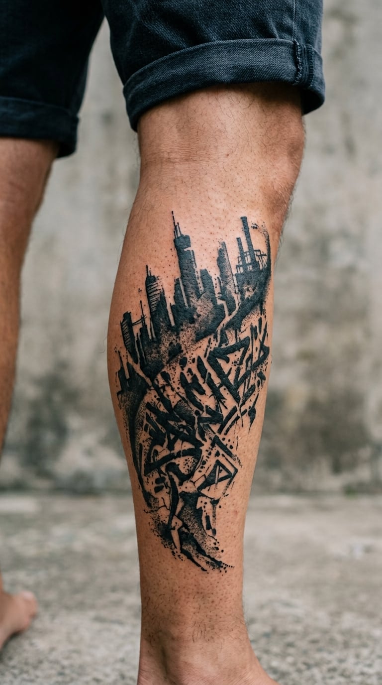
This design is a stencil-based city tag, where a hard-edged shape is cut so the ink misses in patches, leaving broken coverage that imitates a weathered spray. A simplified skyline or block silhouette usually sits under the word.
Stencil work reads as urban and illicit, and it holds up on a leg because the broken texture survives fading better than a smooth gradient does.
Placement: outer calf has room and a clean curve to follow. Size: 4-6 inch (10-15 cm) tall keeps the stencil bridges intact. Style: stencil, black ink. Pain: medium, with the shin-side edges more sensitive than the calf muscle. Tapering stencil lines soften into grey puddles within a few years, so a bolder cut is worth asking for. Make it yours: use the shape of a local landmark or your city’s abbreviation rather than a generic block.
7. Mural-Style Rose with Spray-Paint Halo
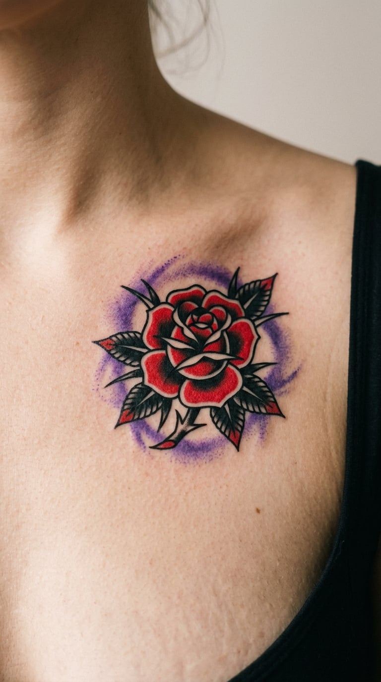
This design combines a traditional rose with a loose circular spray halo, so a realistic flower with fine petal shading sits inside a soft cloud of sprayed colour. The contrast between the two is the whole point: careful linework inside a deliberately careless ring.
It reads as a tribute to a mural wall where a flower was painted over a spray background, and it carries none of the character or logo issues a named piece would bring.
Placement: upper chest or shoulder, where the halo’s circle can sit evenly. Size: 4-6 inch (10-15 cm) across. Style: mural realism with a spray-paint edge. Pain: medium on the chest, higher near the collarbone. Fine petal shading and the misted halo both fade at different rates, so expect a touch-up on the mist. Make it yours: pick the halo colour to match something you already own rather than going for maximum brightness.
8. Abstract Dripping Letter on the Side of the Neck
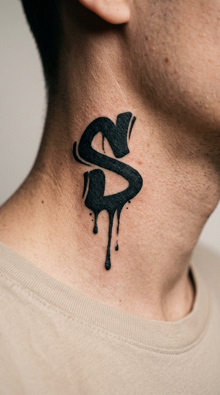
This design is a single abstract letter with three deliberate drips, kept minimal enough that the paint runs are the only detail. It works as a statement piece that does not spell out anything personal.
Neck pieces are chosen for visibility, not subtlety, so most people who want this one already know that going in.
Placement: side of the neck, behind the jaw and above the collarbone. Size: 2-3 inch (5-8 cm) tall; larger letters crowd the neck’s taper. Style: minimal black letterform with drips. Pain: high, and the neck skin is thin over muscle. Sun exposure on the side of the neck is the main ageing risk here: black fades to charcoal noticeably faster than on the upper arm. Make it yours: add a single red or blue accent line down one edge to make the black read warmer without going full colour.
9. Chiaroscuro Graffiti Block on the Sternum
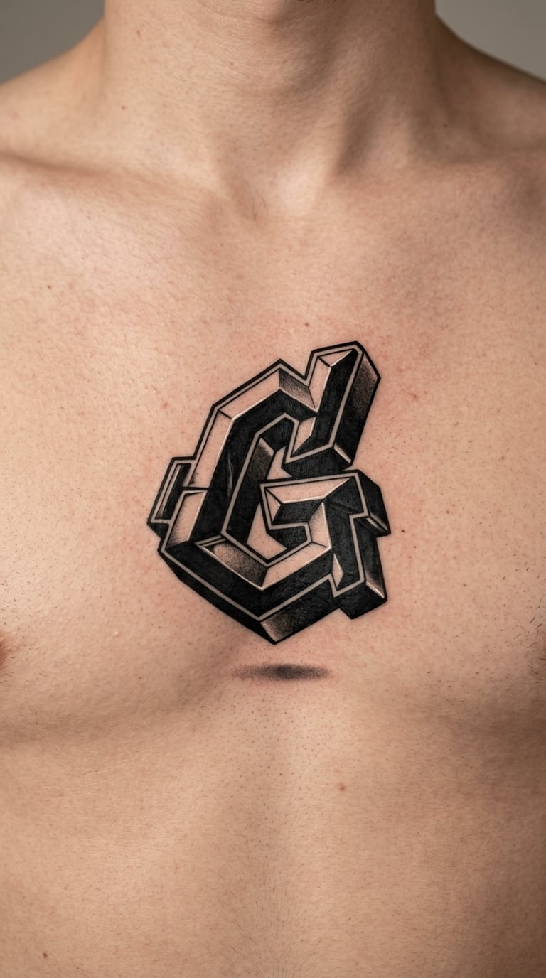
This design is a dimensional block letter shaded with chiaroscuro, the old-master trick of leaving a bright highlight inside a dark form so the letter looks cut from metal. One small drop shadow gives it a shadow to sit on.
It is the graffiti version of a traditional initial, usually taken for a single letter with real weight behind it.
Placement: centred on the sternum below the collarbone, where the body is broad enough to carry the form. Size: 3-5 inch (8-13 cm). Style: blackwork with 3D shading. Pain: high, and the sternum bone is the reason most people brace for this one. The white highlight inside the black is the first thing to grey out, which softens the whole illusion. Make it yours: stack two initials vertically and angle the second slightly for depth.
10. Graffiti Eye with Paint Splatter on the Upper Arm
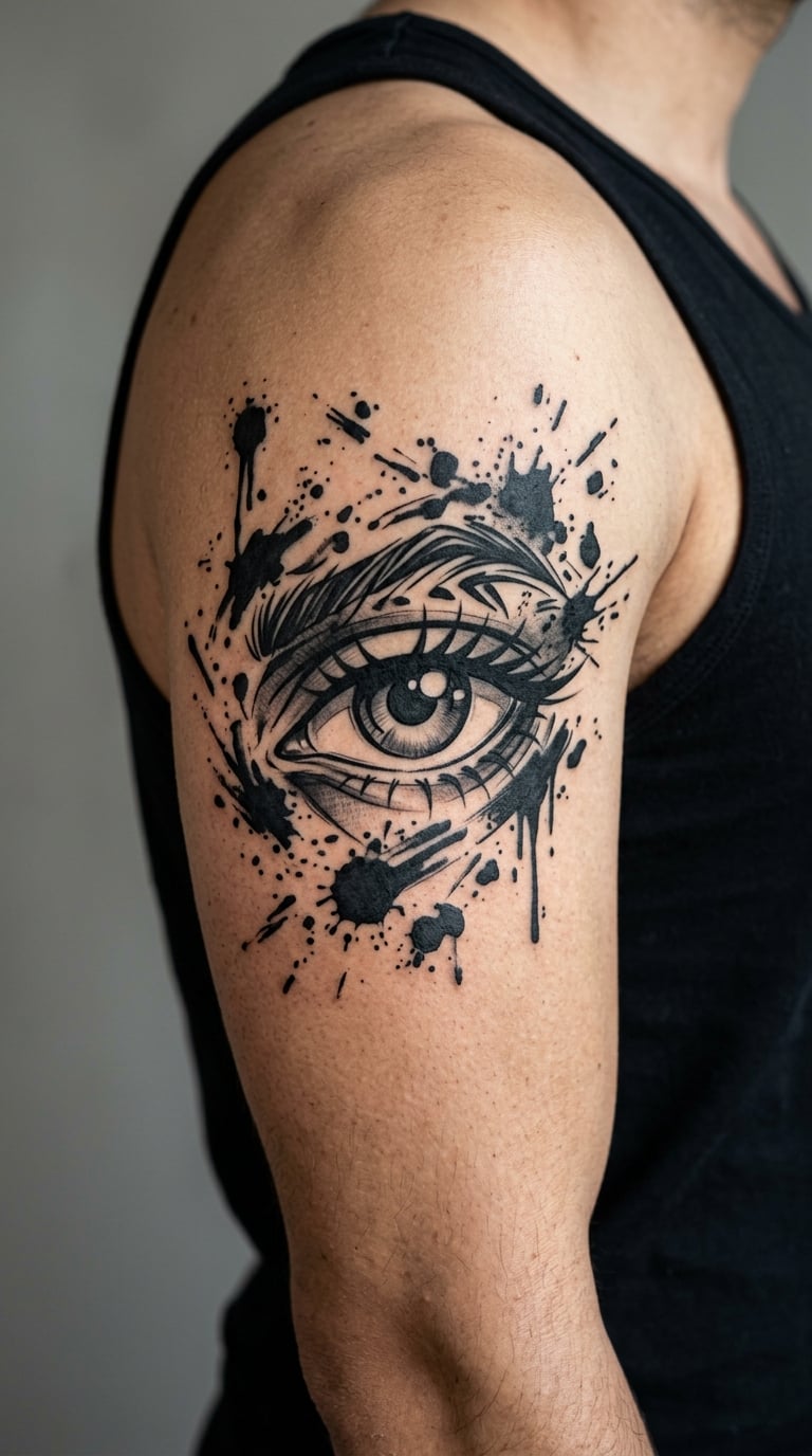
This design is a graphic eye surrounded by irregular splatter, drawn with a hard black lash line, a shaded iris and a scatter of paint marks that break the frame in three or four directions. The composition stays open rather than boxing the eye in.
Eye imagery is about watchfulness, and pairing it with splatter keeps it graphic rather than sentimental.
Placement: outer upper arm gives the splatter room to spread. Size: 4-6 inch (10-15 cm) for the eye alone, plus an inch of space each side for the marks. Style: graphic black and grey. Pain: medium, dipping toward the armpit on the inner edge. Tiny splatter dots are the first casualties of ageing, so ask the artist to size them at least like a pencil tip. Make it yours: run the iris as a halftone gradient instead of solid black and add one spot of colour in it.
11. Handstyle Signature on the Side of the Hand
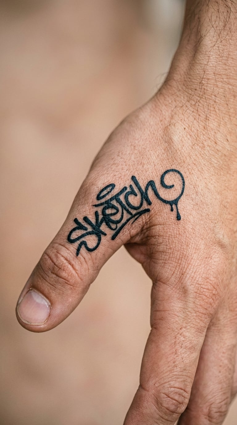
This design is a compact handstyle signature, the fast connected cursive form with letters running into one another and a single drip placed deliberately rather than by accident.
It is a signature rather than a name, which makes it the most personal and the least readable option in this list.
Placement: side of the hand near the thumb, or the inner wrist below the palm crease. Size: 2-3 inch (5-8 cm). Style: fine-line handstyle. Pain: medium to high, and hands bruise and swell more than other areas for a day or two. This is the design most likely to need a rework: hand skin creases, sun and daily wear pull fine script apart within a few years. Make it yours: trace the signature from your own actual hand so it is yours, then have the artist thicken the middle of each letter.
12. Checkerboard Graffiti Block on the Bicep
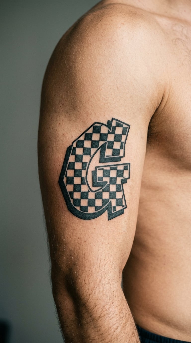
This design is a checkerboard graffiti block, where a hard alternating square pattern fills a block letterform and carries the whole piece on contrast alone. The checks stay the same size across the letter so the pattern does not warp.
High-contrast black and white patterns read as graphic design rather than drawing, which makes this a strong standalone piece with no meaning attached.
Placement: outer bicep, with the checks rotated to follow the arm’s curve. Size: 4-6 inch (10-15 cm). Style: high-contrast blackwork. Pain: medium, though each check is a separate fill pass. Small squares need a minimum size; below roughly an eighth of an inch they merge into grey within a couple of years. Make it yours: let the checkerboard spill past the outline on one side so the shape looks broken on purpose.
13. Blackwork Throw-Up Letter on the Rib
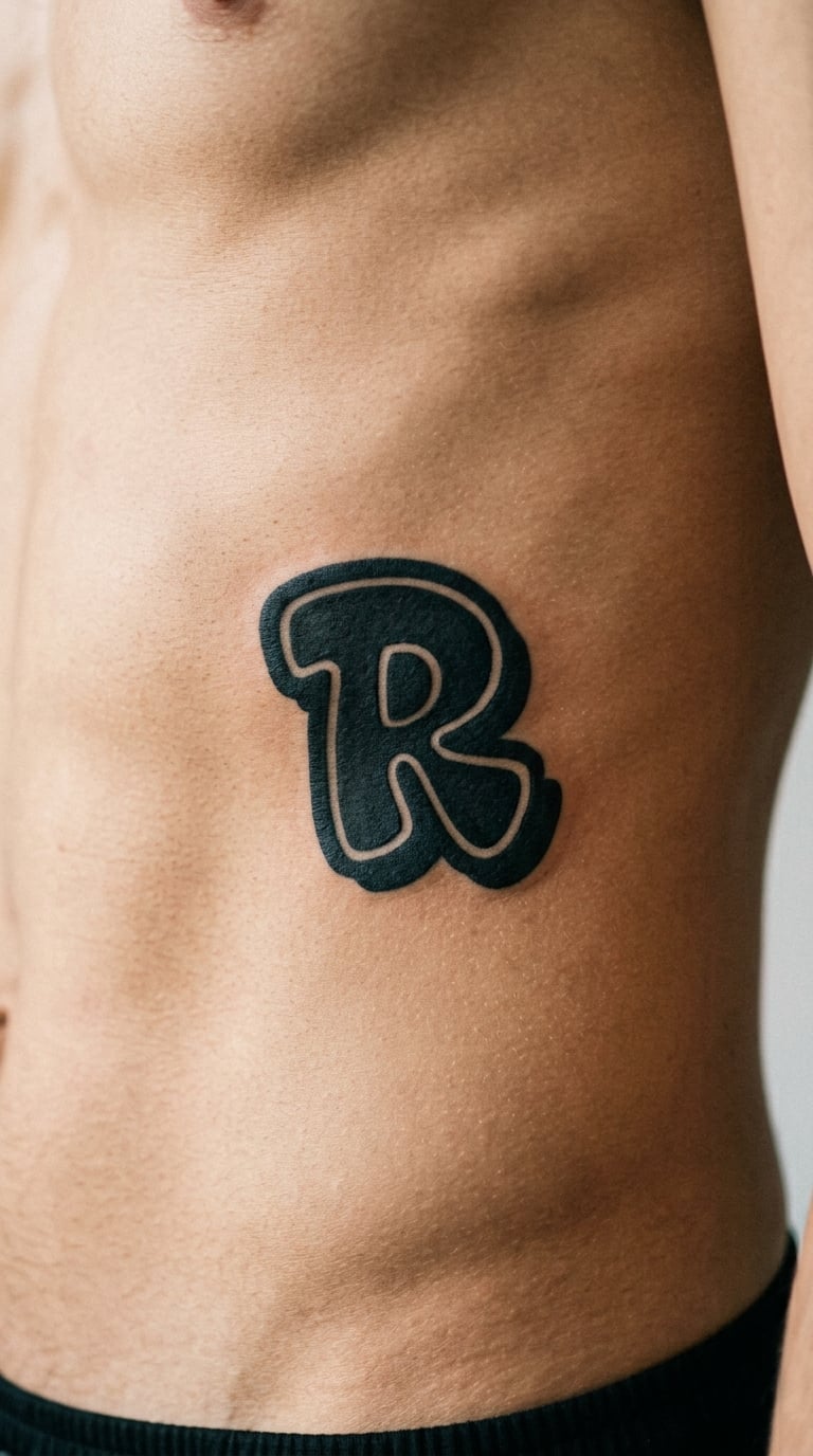
This design is a throw-up letter, the simplified graffiti form with a thick outline, a flat fill and almost no interior detail, plus one small shadow that gives it lift off the skin.
Throw-ups are the most compressed piece of lettering graffiti has, so they translate to skin better than any other style and are a good choice for a first lettering tattoo.
Placement: side of the lower ribs follows the body’s curve and keeps the letter visible in a mirror. Size: 4-7 inch (10-18 cm). Style: throw-up, flat fill. Pain: high, because rib skin is thin and sensitive and the area moves when you breathe. Thick fills and hard outlines are among the most durable marks a tattoo artist can make. Make it yours: two interlocking throw-up initials read as one mark and hide the extra width a single long word would create.
14. Neon Watercolor Tag on the Ankle
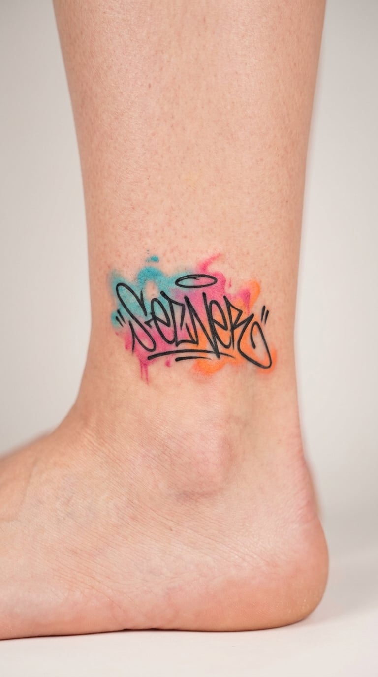
This design is a neon watercolor tag, where transparent cyan, pink and orange pigment bleeds loosely while a crisp black wordmark stays sharp in the middle. Hard edge meets soft wash in the same composition.
It is the softer counterweight to heavy black graffiti work, and people choose it when they want colour without the weight of a full mural.
Placement: outer ankle, above the bone. Size: 3-5 inch (8-13 cm). Style: watercolor with black linework. Pain: medium, and the ankle bone makes the outer edge more sensitive. Watercolour is a stain, not a fill, so it settles into the skin and stays softer but stable. Make it yours: keep the black lettering monochrome and let only the wash carry colour, which reads sharper and ages better.
15. Brick-Wall Graffiti Panel on the Forearm
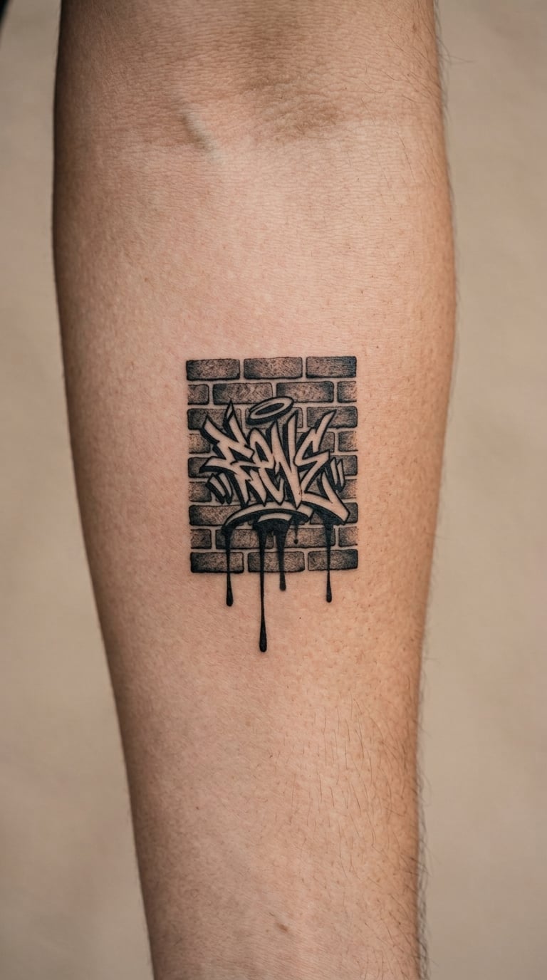
This design is a brick-wall graffiti panel: a simplified running-bond brick pattern with a central tag on top of it and three drips running down the mortar lines.
Wall pieces are the most direct lift from a mural alley to skin, and they suit people who like the setting more than the lettering.
Placement: inner forearm, where the panel can read like a rectangle on a flat surface. Size: 4-6 inch (10-15 cm) with at least half an inch per brick course. Style: illustrative black and grey. Pain: medium, and long sitting because the panel is mostly straight fills. Fine mortar lines fade first, so ask for fewer, heavier courses rather than realistic thin ones. Make it yours: run the drips down from the top edge as well, so the wall looks freshly painted rather than weathered.
16. Traditional Spray Can and Lettering on the Back
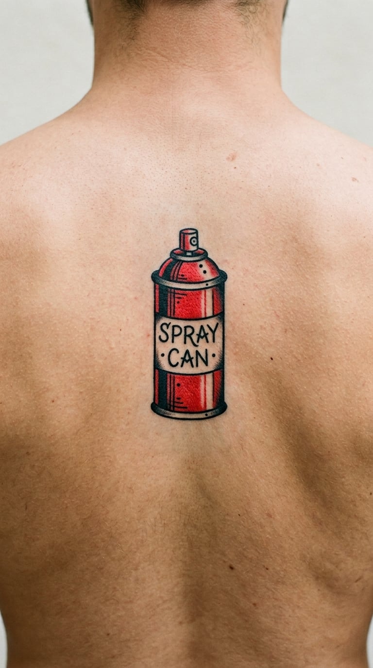
This design is a traditional-style aerosol can drawn with clean outlines, light shading and muted colour, set beside a simple hand-lettered word. Nothing on the can carries a brand, which is what makes it tattooable.
It works as an emblem of the medium itself, and the wide flat back gives the artist room to breathe.
Placement: upper back between the shoulder blades, or a single forearm. Size: 6-9 inch (15-23 cm) for the whole composition. Style: traditional with muted colour. Pain: low to medium on most of the back, with the shoulder blades more sensitive than the space between them. Traditional line work and shading hold up well; keep the palette to two or three colours. Make it yours: have the lettering read as a single word you use as a nickname rather than a full sentence.
17. Graffiti Butterfly in Black Dotwork on the Shoulder
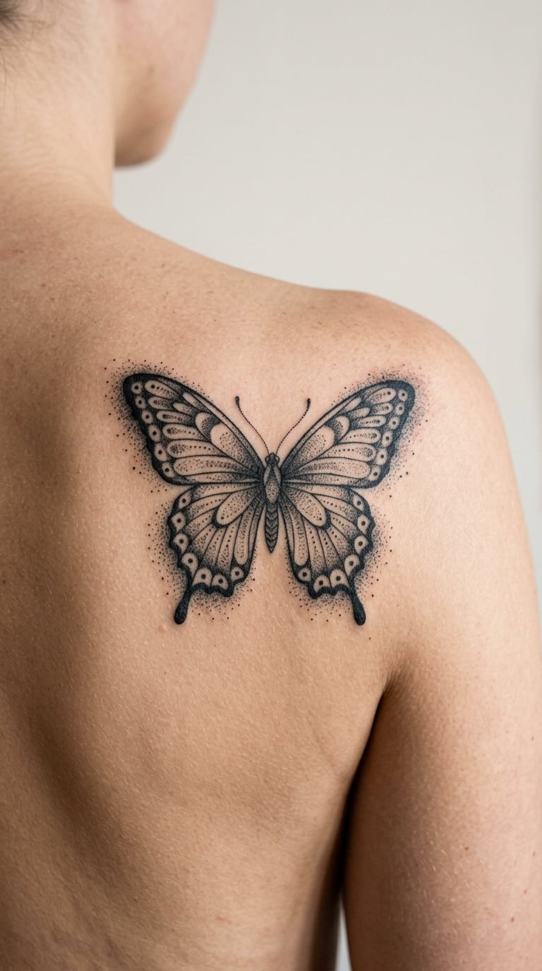
This design is a dotwork butterfly with symmetrical wings built from stippled shading, finished with a loose dotted edge that reads as sprayed overspray around the whole shape.
Butterflies mean change and transition to most people who pick them, and the dotwork keeps the piece balanced and quiet rather than loud.
Placement: shoulder blade, where the natural angle of the wing mirrors the bone. Size: 4-7 inch (10-18 cm) wingspan. Style: dotwork with a spray-edge treatment. Pain: medium, with long sittings since dotwork means many small passes. Sun-exposed shoulder dotwork greys unevenly, so it wants a touch-up every few years. Make it yours: add one small block-letter initial at the centre of the body as the only hard edge in an otherwise soft design.
18. Micro Graffiti Arrow on the Collarbone
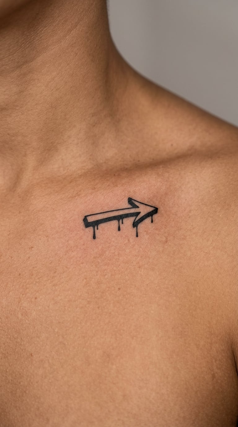
This design is a micro graffiti arrow, small enough to sit under the collarbone with three short drips and a lot of clean space around it. It is the smallest design in this list that still reads as graffiti rather than as a plain arrow.
Small directional marks are popular for first tattoos because they cost less, heal faster and are easier to hide at work.
Placement: collarbone, running horizontally. Size: 1-2 inch (2.5-5 cm); under one inch the drips merge and the arrowhead fills in. Style: micro, minimal. Pain: medium, because the collarbone is bone-adjacent even at a tiny scale. Micro work is the first to blur, so keep the design to a single stroke weight. Make it yours: add a two-digit year in the same line weight below it, spaced an inch away so it stays legible.
19. Black-and-Grey Mural Panel on the Thigh
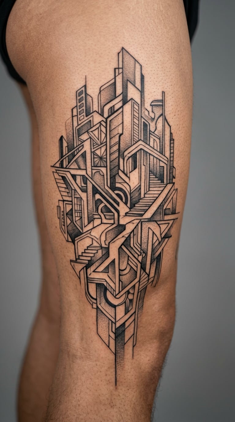
This design is a black-and-grey mural panel, a larger illustrative composition of layered abstract urban shapes with overlapping outlines and enough open space that the panel does not turn into a grey block.
Mural work is the ambitious end of graffiti tattooing and takes a commitment in sessions, so it usually suits someone already building a collection.
Placement: outer thigh, the flattest large surface on the body and the easiest place to hide a piece of this size. Size: 8-14 inch (20-35 cm) across. Style: mural realism in black and grey. Pain: medium, and each session is long enough that the thigh gets sore in a specific spot. Grey washes spread over time, so darker grey reads better than pale. Make it yours: keep one clear negative-space shape in the centre, since a fully packed panel loses its shapes first.
20. Hidden Graffiti Tag Behind the Ear
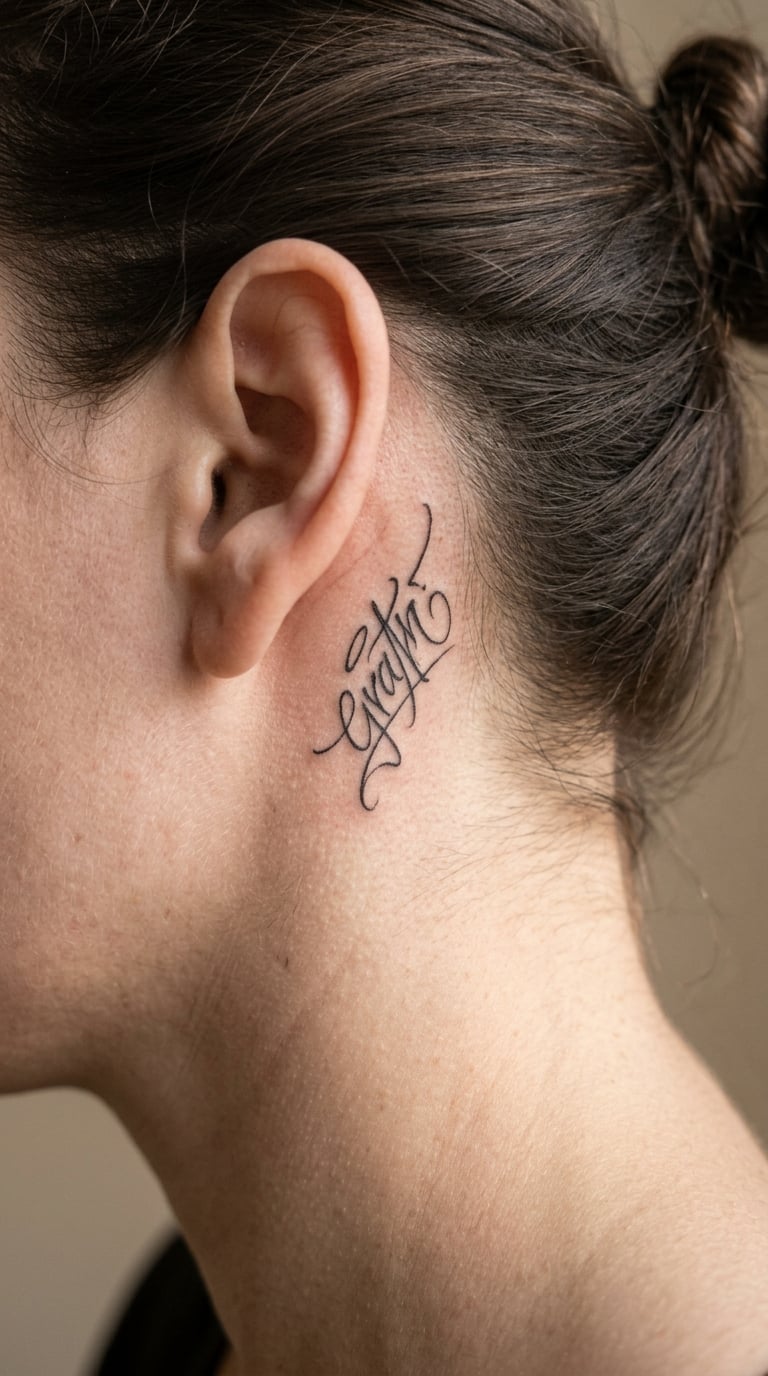
This design is a small fine-line tag behind the ear, drawn with clean single-weight strokes and no surrounding imagery. It is the most discreet idea here and the easiest to keep private.
Hidden placements are usually chosen by people who like the design enough for themselves, which is a useful thing to know when you are choosing one.
Placement: just behind the ear, tucked into the hairline. Size: 1.5-2.5 inch (4-6 cm). Style: fine line, minimal. Pain: medium to high; the skin here is thin, the surface curves and hair grows through the area. Scaling down is essential, because simplified shapes are the only ones that read on a curve this tight. Make it yours: pick a two-letter monogram over a full tag so the shape stays clear when it’s the only thing you can see.
How to Choose the Right Design
Choosing between twenty graffiti tattoo ideas comes down to five questions, and you can answer all of them before you talk to anyone.
Which graffiti tattoo ideas suit a first tattoo? A micro arrow, a two-letter throw-up or a minimal wrist symbol. One session, low cost, easy to cover up later if your taste changes.
How much detail can the placement hold? The rule is simple: halve the detail for every halving of size. A design that reads across a brick wall will not survive on a collarbone at an inch long.
Colour or monochrome? Bright colour reads well on the forearm, calf and upper arm, where there is muscle to hold it. Monochrome survives better on bony or frequently exposed placements, and it hides touch-ups more easily.
Lettering or motif? Lettering is the heart of graffiti style, and it is also what ages worst as letterforms drift and skin changes. If longevity matters more than the literal word, choose a motif such as the eye, the arrow or the rose.
One session or a series? Anything under six inches is usually one sitting. A mural panel like idea 19 realistically runs three sessions, and your skin needs the recovery time between them.
One more thing worth settling early: how you hand over the reference. Bring a photo of your own piece or of a style you like, and tell the artist which part you want, rather than asking for a copy of a famous mural. Tattooers decline famous-mural requests regularly, and telling them what you like about the letterforms gets you a better tattoo than a copied image would. If your taste runs toward board graphics and street-scene lettering rather than pure tags, our 22 skateboard tattoo ideas roundup has a few designs that translate just as well.
Cost and Session Time
Tattoo prices run by size and detail rather than by style, so a graffiti piece costs what any piece of that size costs. Rates vary by city, by shop minimum and by artist, so treat the bands below as rough planning guides and confirm current rates with the studio before you book. Prices change, and so does the artist’s book, so no number here is a quote.
- Micro (under 2 inch): usually charged at the shop’s session minimum, one sitting of 30-60 minutes.
- Small (2-4 inch): one sitting of 1.5-2 hours, commonly quoted as a single hourly rate or a flat small-piece rate.
- Medium (4-7 inch): one or two sittings depending on colour saturation.
- Large (7-14 inch): a multi-session commitment, usually three sessions with a planning session before the first.
Two things push a graffiti piece toward the higher end of its band: heavy colour saturation, which needs more passes and more pigment, and fine detail inside the letterforms, which slows the needle down. A bold black throw-up in the same size as a mural-style panel is the cheaper version of both.
Aftercare Basics
Follow your artist’s aftercare instructions first; they know exactly what they did in that session. Alongside those, standard practice covers the rest.
- Keep the area clean and wash it gently as instructed, then pat it dry rather than rubbing.
- Leave any second skin or scab alone. Picking at it is the main cause of scarring and patchy ink.
- Keep it out of direct sun while it heals, and be gentle in the shower for the first couple of weeks.
- Skip the gym on heavy sweat days while the skin is still tender, and wear loose clothing over it.
- Expect colour to look duller for two to three weeks, then settle into its final shade as the skin heals.
- Ask about a free touch-up check after healing, since soft spray edges and drips are usually where it is needed.
Frequently Asked Questions
Do graffiti tattoos fade quickly?
Black linework and thick fills hold up well, but soft spray edges, thin grey shading and pale colour are the first to fade. Lettering also ages as styles change, so shapes can stay crisp while the word feels dated. Covering it daily slows this down considerably.
What is the best placement for a small graffiti tattoo?
The inner wrist, the collarbone and the outer bicep all work well because the skin is smooth and the area is easy to hide at work. The ankle is flatter than most people expect and takes small designs cleanly. Avoid hands and fingers unless you accept that fine lettering there blurs fastest of anywhere on the body.
Should I choose black-and-grey or colour graffiti lettering?
Colour suits the forearm, calf and upper arm, where muscle gives the pigment room to sit. Black and grey is easier to touch up, hides fading better and works on smaller or bony placements. A common compromise is a black wordmark with a colour halo, spray edge or single accent drip, which keeps the detail sharp.
How do I find an artist who can tattoo graffiti-style lettering?
Look for a portfolio with actual letterforms in it, not just photorealistic work, and check whether the artist has done throw-ups, tags or wildstyle before. Colour throw-ups and fine blackwork are different skills, so match the artist to the design. Ask to see healed work if possible, since healed lettering is the honest test.
Can fine-line graffiti tattoos be placed on fingers or hands?
You can, but hand and finger lettering is the fastest-fading placement on the body. Skin creases, sun, washing and daily wear pull fine script apart, so most lettering there needs a rework within a few years. If you want a hand placement, ask for a thicker single-weight stroke or a simple shape rather than a small word.
How much does a graffiti tattoo usually cost?
It is priced by size and detail like any other tattoo, so micro pieces are usually charged at the shop minimum while a medium wordmark runs one or two sittings. A large mural panel is a multi-session commitment. Rates depend on city, artist and shop minimum, so check current pricing with the studio before you book anything.
If this is your first tattoo, start with the micro arrow, the two-letter throw-up or the minimal wrist symbol: one session, a manageable sitting, and a design you will still want in ten years. If you are adding to an existing collection, the checkerboard block and the throw-up on the rib are the easiest to sit next to existing lettering, while the mural-style rose or the black-and-grey thigh panel give you the scale that smaller pieces never will.