
20 Script Tattoo Ideas for the Collarbone (October 2026)
These script tattoo ideas for the collarbone cover twenty designs that actually suit the shape of the clavicle, with the phrase, the font, the realistic size in inches and how it looked to get tattooed. Collarbone script reads as quiet and considered rather than loud, which is exactly why people keep coming back to it.
The clavicle is the flattest, straightest line on the front of the body, and script follows a line. Short phrase or single word, placed along the bone or just under it, the lettering looks like it was designed for the spot. Bring these to a consultation as a starting point, not a decision. If you are planning a few months out, autumn and winter are the easiest months to wear a fresh collarbone piece without sandal straps, necklace chains and seatbelt edges rubbing across it.
20 Script Tattoo Ideas for the Collarbone: Quick Guide
| Idea | Style | Best placement | Size | Pain |
|---|---|---|---|---|
| 1. Stay Wild | Fine line cursive | Along the bone, 2 inch gap from the neck notch | 2.5-3.5 in wide | Medium-high |
| 2. Breathe | Modern brush script | Just above the bone, outer half | 1.5-2 in wide | Medium |
| 3. Not All Who Wander Are Lost | Copperplate, two lines | Below the bone, centred on the sternum notch | 4-4.5 in wide | High |
| 4. Wild and Free | Arched fine line | Riding the curve of the bone | 3-3.5 in wide | Medium-high |
| 5. Two Names and a Date | Handwritten-modern hybrid | Below the bone | 4-5 in wide | High |
| 6. Est. 1998 | Vintage italic serif | Above the bone, near the shoulder end | 1.5-2 in wide | Medium |
| 7. I Will Fear No More | Roman-style calligraphy | Along the bone, single line | 4-4.5 in wide | Medium-high |
| 8. Love Is Patient | Modern script, two lines | Below the bone, slightly off-centre | 2.5-3 in wide | High |
| 9. LET GO | Sans-serif capitals | Above the bone, generous spacing | 2-2.5 in wide | Medium |
| 10. In Us, one line each | Matching fine line cursive | Mirror placements | 1.5-2 in wide each | Medium-high |
| 11. Birth Coordinates | Fine line script | Above the bone, toward the shoulder | 3-3.5 in wide | Medium |
| 12. Always, in All Ways | Spencerian flourish | Below the bone | 3.5-4 in wide | High |
| 13. Lumen | Delicate italic serif | Just under the bone, inner end | 1-1.5 in wide | Medium |
| 14. Still Becoming | Two-line fine line | Along the bone, arched | 2.5-3 in wide | Medium-high |
| 15. Home | Bold brush script | Above the bone, centre | 1.5-2 in wide | Medium |
| 16. Your Own Handwriting | Custom lettering | Anywhere along the line | Varies | High |
| 17. Choose Joy | Fine line script with a sprig | Below the bone | 2.5-3 in wide | High |
| 18. A Date, Nothing Else | Minimal fine line script | Along the bone, tiny | 1.5-2 in wide | Medium-high |
| 19. Onward | Brush script with a long tail | Above the bone, tail toward the shoulder | 2-2.5 in wide | Medium |
| 20. She Believed, So She Did | Elegant copperplate, two lines | Below the bone | 4-4.5 in wide | High |
Short phrase and affirmation designs run 1.5 to 3.5 inches wide and sit best just above or just below the bone. Anything past four inches needs the two-line treatment and a lower placement, where the soft tissue is slightly thicker.
1. Fine-Line Stay Wild Following the Bone
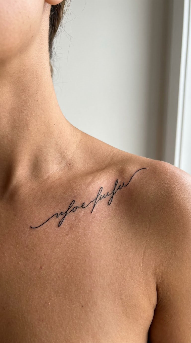
This is the one design that shows up in almost every collarbone reference board, and it works because two short words sit comfortably on one line of bone without crowding it. The letters are thin, slightly slanted, with generous spacing between them and no fill, so the script stays quiet against skin rather than reading as a sticker.
People choose it for the reminder rather than the wording. It reads as an outdoorsy, self-assured thing without being a full sentence.
Placement: along the bone, starting about 2 inches from the notch between the collarbones, running outward toward the shoulder · Size: 2.5-3.5 in wide, 0.3-0.5 in tall (6.5-9 cm) · Style: fine line cursive, single pass linework · Pain: medium-high, sharp and intense while the needle is on the bone, brief because the session is short. Fine line on the collarbone softens and blurs faster than chunkier work, so expect a touch-up offer in a year or two.
Make it yours: keep the two words and add the year you first said it, tucked under the second word in half the line weight.
2. Single-Word Breathe in Modern Brush Script
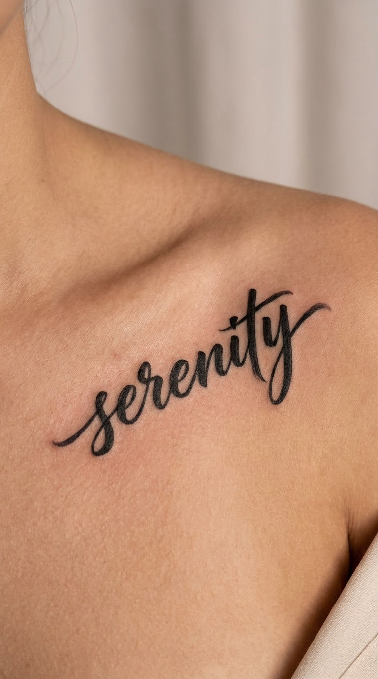
A modern brush script is built from pressure changes: thin upstrokes, thick downstrokes, a slight bounce between letters. One word is enough, and the thick parts of the strokes hold up far better than hairline weights do.
It is a word you read to yourself, which is the whole point on a spot like this.
Placement: just above the bone on the outer half, where the skin is smooth and a low neckline will not press the fresh work · Size: 1.5-2 in wide, 0.4-0.6 in tall (4-5 cm) · Style: modern brush script, one colour, no shading · Pain: medium, easier than the bone itself because the line sits on soft tissue over the shoulder edge.
Make it yours: add a second small word underneath in a lighter weight, the way a signature is signed twice.
3. Not All Who Wander Are Lost in Copperplate
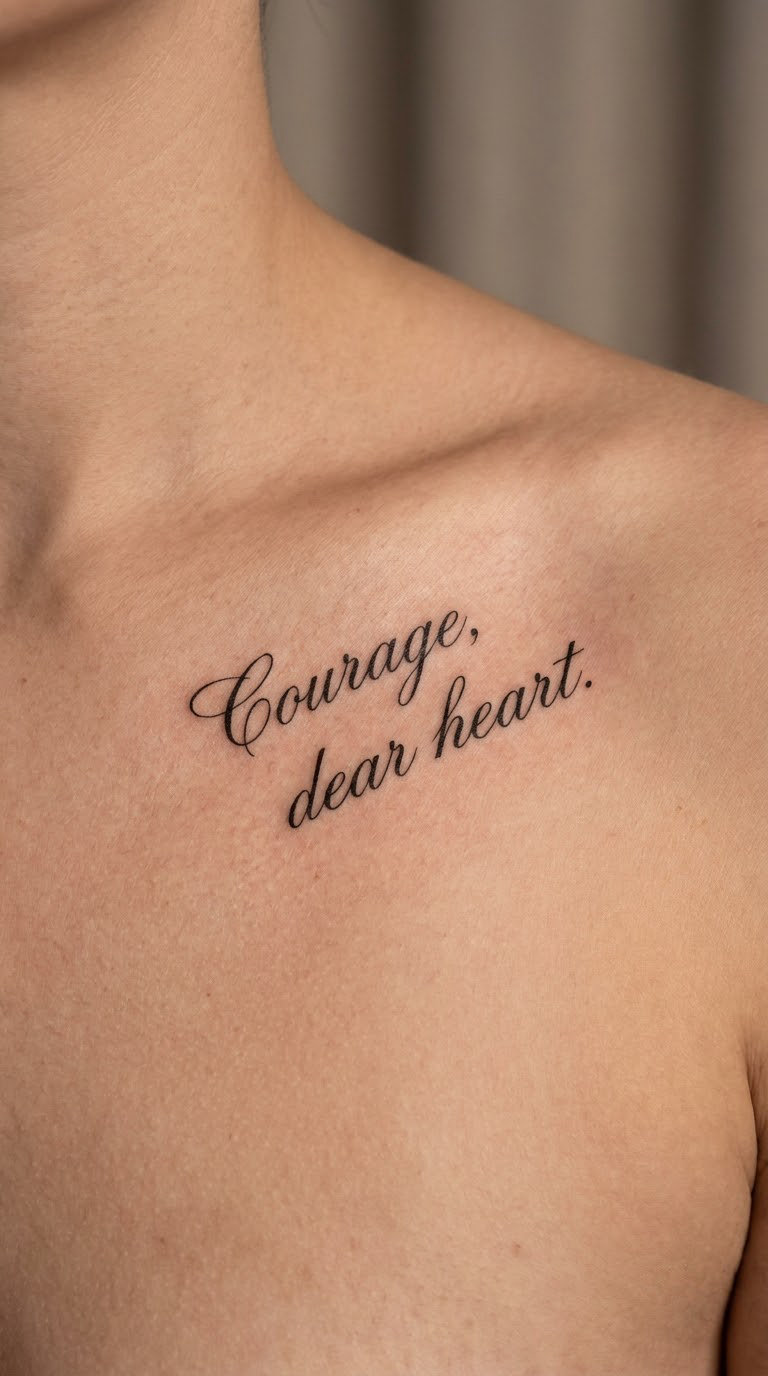
Two lines of copperplate sitting below the bone, the words evenly balanced rather than stretched edge to edge. Copperplate is the formal cousin of everyday script, with shaded downstrokes and a slight rightward slant, and it holds a longer phrase without the line turning wobbly.
It is a line people tend to attribute to Tolkien, whether or not that is the source, so bring the reference text you actually want and confirm it with your artist before the stencil.
Placement: below the bone, centred under the notch, which puts the two lines on flatter tissue and keeps the text from sliding toward the shoulder · Size: 4-4.5 in wide (10-11.5 cm), each line under 0.4 in tall · Style: copperplate, two balanced lines · Pain: high. This is the longest single-area session on the list and it sits over the bone the whole way.
Make it yours: drop the middle words and keep the two that carry it, which turns a quote into a statement.
4. Wild and Free Arched Over the Bone
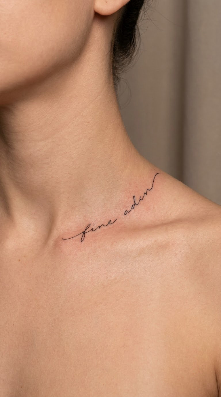
Rather than a ruler-straight baseline, the two words arc gently to follow the natural rise of the clavicle toward the shoulder. The arc is subtle, maybe a quarter inch of lift, and it is what stops the piece from looking pasted onto a flat surface.
It suits people who like the outdoorsy, travelling-in-a-van version of a quote tattoo rather than anything formal.
Placement: riding the bone with the arc, outer two-thirds of the line · Size: 3-3.5 in wide (7.5-9 cm) · Style: arched fine line cursive · Pain: medium-high where the arc crosses the bone, easing as the words move out over soft tissue.
Make it yours: have the arc echo a coastline, a mountain ridge or a road you drove, a shape you can describe in one line and the artist can redraw.
5. Two Names and an Anniversary Date
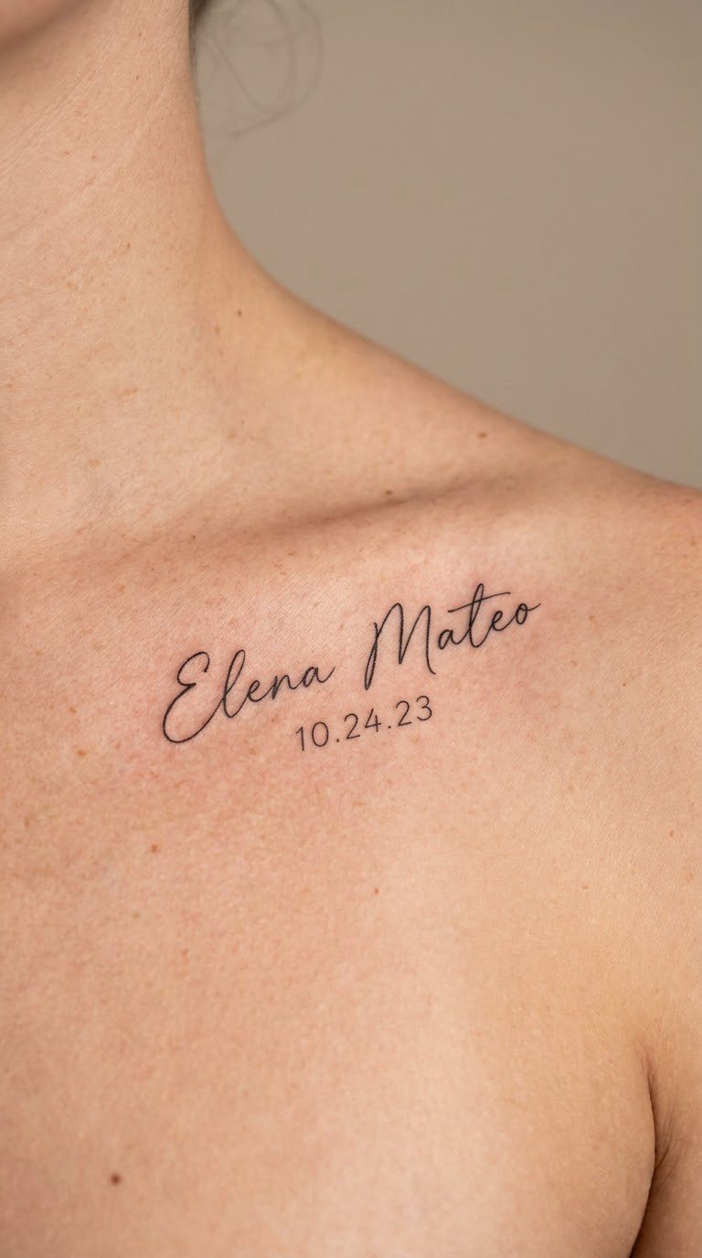
Two first names on one line with the date tucked beneath in a smaller, simpler hand. The name script leans toward neat and upright rather than looped, because long, fussy capitals on a thin area start to close up as the skin heals.
Wedding dates, the day you met, the year a child was born. Whatever it is, the structure stays the same.
Placement: below the bone, with a little more than a finger width of clearance from the neck notch · Size: 4-5 in wide for the names, date underneath at about half the letter height · Style: fine line script, two sizes, no fill · Pain: high for a piece this wide. Budget a break halfway, because lettering fatigue is real and tired linework shows.
Make it yours: use your actual handwriting as the reference for one of the two names.
6. Est. 1998 in Vintage Italic Serif
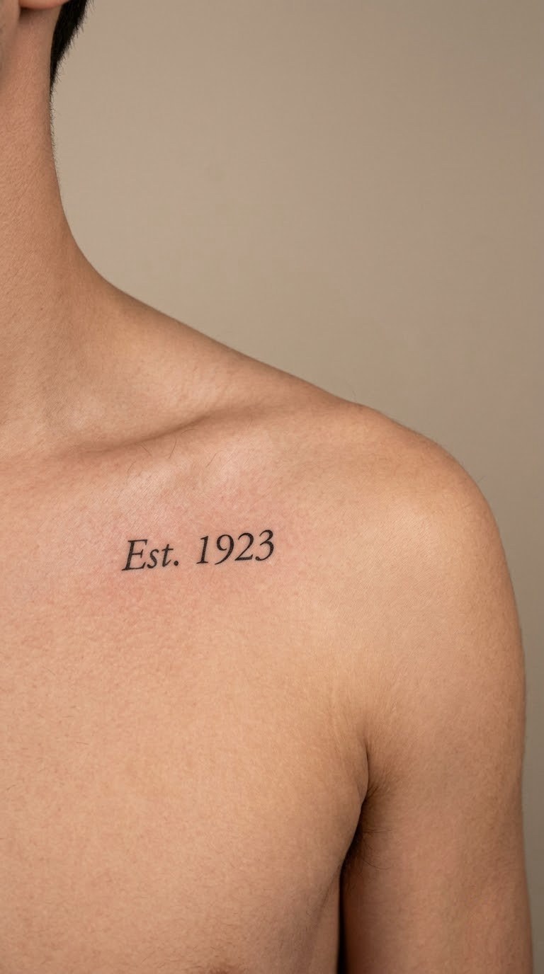
Italic serif lettering with hairline strokes and short, sharp serifs gives a date a printed, old-label look. Written small and slightly condensed, it sits above the bone as a quiet signature detail rather than a statement.
It works as a birth year, a founding year for something that mattered, or the year you started something you are still doing.
Placement: above the bone near the shoulder end, the flattest part of the whole area · Size: 1.5-2 in wide, under 0.4 in tall (4-5 cm) · Style: italic serif, fine line with hairline contrast · Pain: medium. Short and in a soft-tissue area, often the shortest session on this list.
Make it yours: put a small dot, star or coordinate pair after the year in the same serif style so the design has an ending.
7. I Will Fear No More, Psalm 121
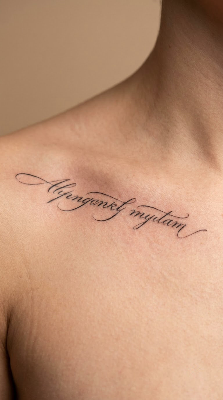
Tall, upright calligraphy in one line along the bone, with the capitals given extra height and the whole phrase kept to a single uncurved baseline. The formal hand is deliberate here; it stops a scripture reading like body graffiti.
The line comes from Psalm 121 in the Book of Common Prayer. Bring the exact wording and the reference number you want, printed, so the artist is not working from a screenshot of a phone.
Placement: along the bone, one line, starting near the notch · Size: 4-4.5 in wide (10-11.5 cm) · Style: roman-style calligraphy, single line, no embellishment · Pain: medium-high, the full length of the bone.
Make it yours: end the line with the reference number in half-size lettering, which keeps a long phrase feeling deliberate.
8. Love Is Patient, 1 Corinthians 13
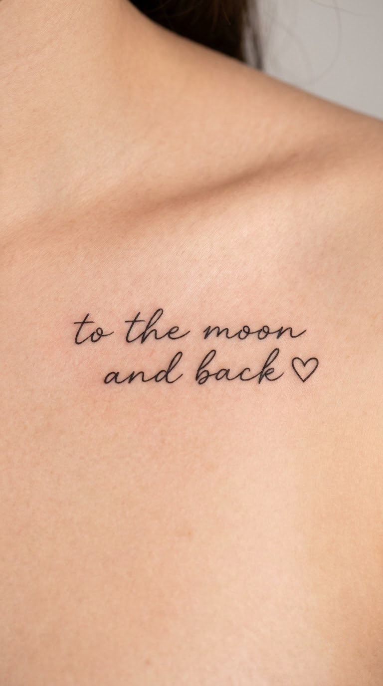
Two short lines of modern script below the bone, the second line indented under the first so it reads like a book title rather than two random sentences. Many people add one small outlined heart or a single dot at the end; it stops the lettering looking unfinished.
The phrase is one of the most tattooed lines from 1 Corinthians 13, and a lot of people have it partly from memory. Check the full verse before you commit to short form.
Placement: below the bone, set slightly off-centre rather than dead centre · Size: 2.5-3 in wide (6.5-7.5 cm) · Style: modern script, two lines, one accent element · Pain: high. Below the bone on the upper chest is thin skin over bone with little to absorb it.
Make it yours: use your grandmother’s handwriting from a card she sent you as the lettering reference.
9. LET GO in Clean Sans-Serif Capitals
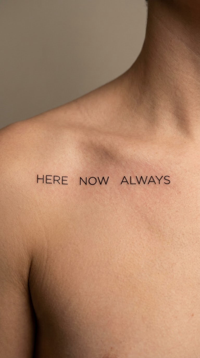
Not script in the handwriting sense, but lettering, and it is the deliberate opposite of everything else on this list. Wide-tracked capitals in a plain sans-serif, thin strokes, no flourishes and no terminal curls.
Somebody asking for a script tattoo still ends up here, because the words matter more to them than the handwriting. It reads as graphic and current rather than sentimental.
Placement: above the bone, generous tracking so the letters do not merge as they heal · Size: 2-2.5 in wide (5-6.5 cm) · Style: sans-serif capitals, thin black linework · Pain: medium, the line stays on soft tissue above the bone.
Make it yours: set the same phrase in a different weight in a second row, small, underneath, as a quiet echo.
10. In Us, One Matching Line Each
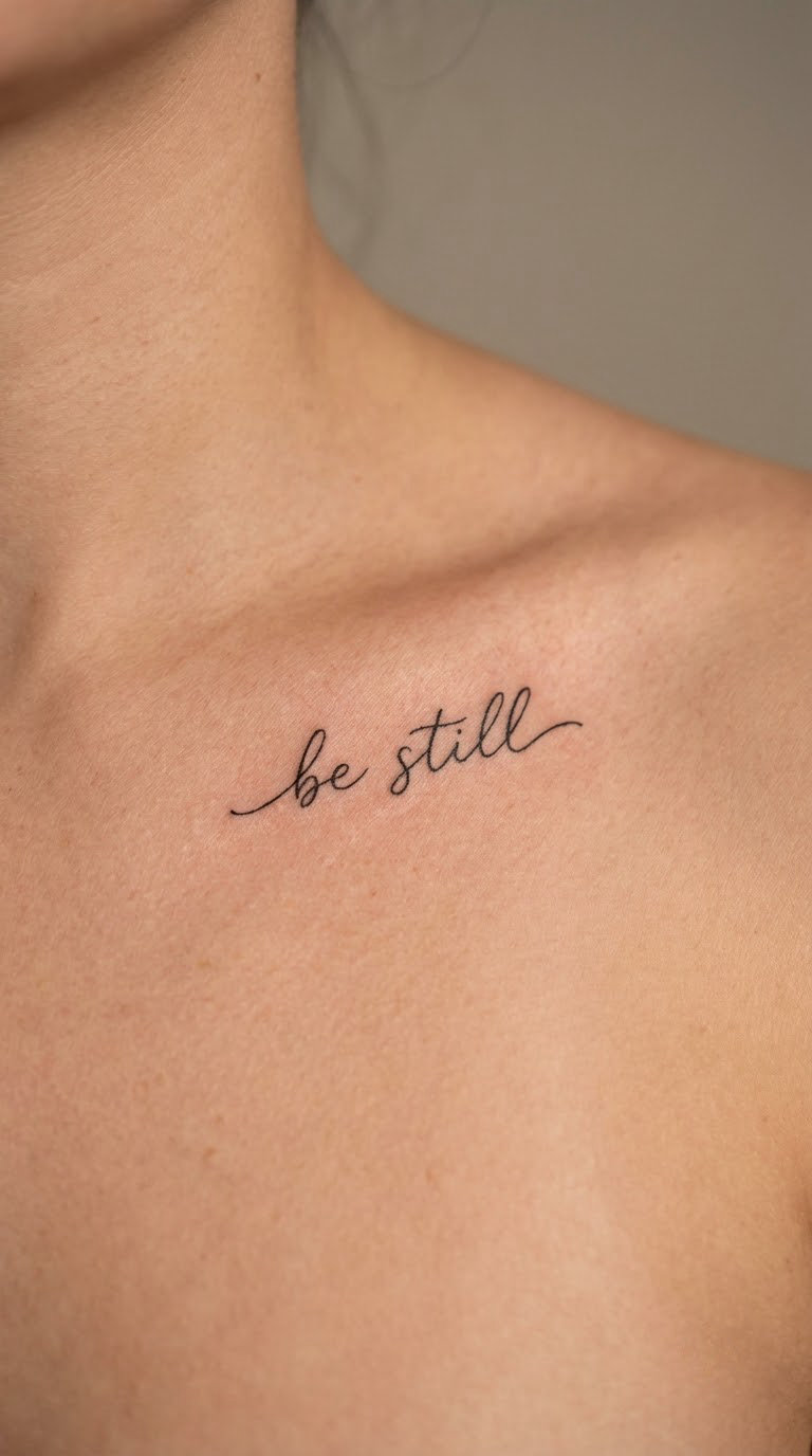
The partner version of a matching piece: one short script line each, placed as mirrors of each other, often the same two words or two halves of one sentence. It reads as private even when other people can see it.
Matching tattoos fail when the two halves were designed by two different hands, so send your partner to the same artist, or bring the same reference and the same line weight to both appointments.
Placement: mirrored along the bone on each side, or both on the same side, stacked · Size: 1.5-2 in wide each (4-5 cm) · Style: fine line cursive, matched line weight · Pain: medium-high per side, done in two separate sessions.
Make it yours: split a date across both sides, the way the phrase is split across both people.
11. Birth Coordinates in Fine Modern Script
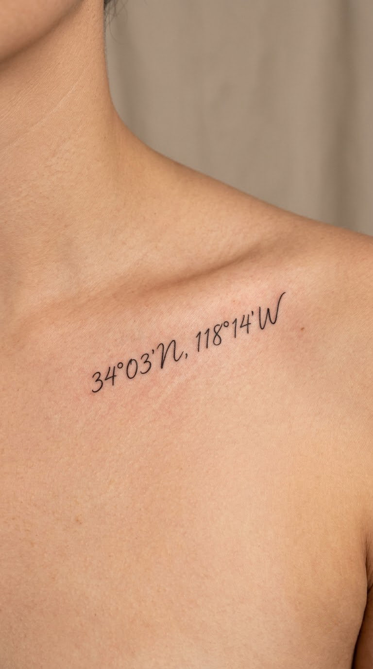
A place’s coordinates in a small, even script, running along the bone. Latitude and longitude are longer than a date, which is why they usually go on the flatter part of the line rather than at the curve.
It is the design that ends a sentence about someone without saying who, which is why it is popular for a hometown, a birth place or the spot that matters to you.
Placement: above the bone toward the shoulder, on a straight run of skin · Size: 3-3.5 in wide (7.5-9 cm) · Style: fine line script, numerals with clear legibility · Pain: medium to medium-high. Numerals with the degree symbol take longer to line up than letters do.
Make it yours: set the numbers in the same hand as a birth date on the other side, so the two pieces match without being identical.
12. Always, in All Ways in Spencerian Flourish
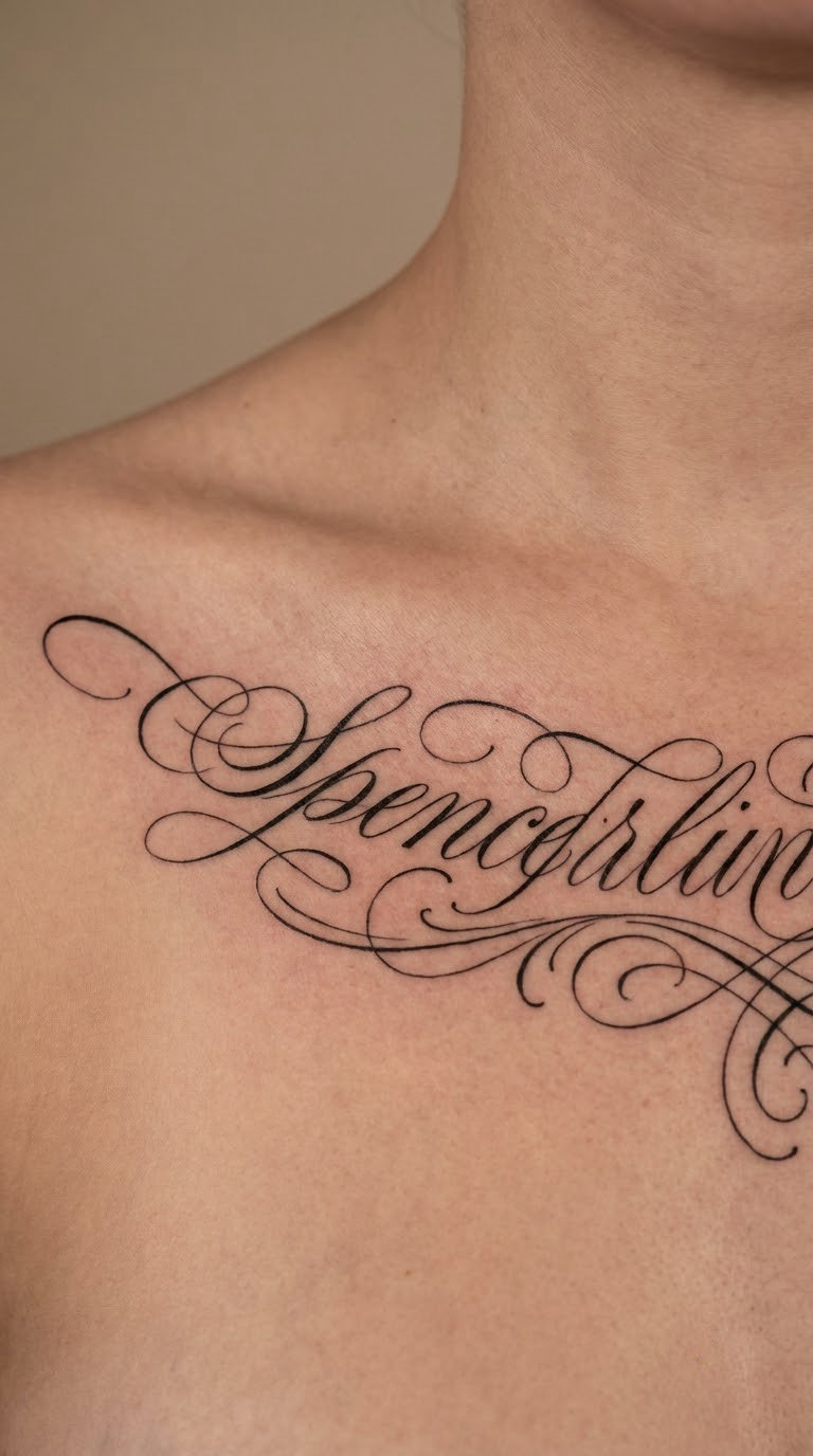
Spencerian is the nineteenth-century American cursive style, with a steep slant, oval-shaped letterforms and long entry and exit strokes that loop into flourishes. Done small, the loops are what carry it; done large, the whole thing turns into decoration and the words get lost.
It reads as a letter or a keepsake, and it is the one style on this list where a real lettering portfolio matters more than any other.
Placement: below the bone, where the extra width is available, kept far enough from the notch that the flourishes do not creep onto the neck · Size: 3.5-4 in wide (9-10 cm) · Style: Spencerian script, fine line, controlled flourishes · Pain: high. Flourishes mean long, continuous passes, and long passes on this bone are the hardest to sit still for.
Make it yours: have one capital carry a small personal symbol, a leaf or a star, tucked into its top loop.
13. Single-Word Lumen in Delicate Italic Serif
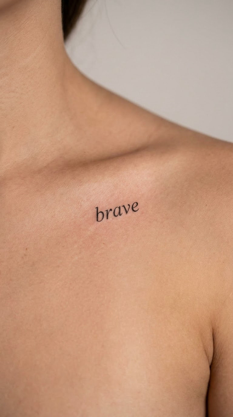
One word in a light italic serif, sitting under the inner end of the bone where the skin is thinnest and the placement is easiest to hide. Serif capitals here would look formal, so most artists keep them small or pick a softer face.
It is the smallest and least showy design here, which is the point.
Placement: just below the inner third of the bone, close to the neck, or on the opposite side if you want it private · Size: 1-1.5 in wide, 0.3 in tall (2.5-4 cm) · Style: italic serif, hairline weight · Pain: medium, sensitive because of how little tissue there is, over quickly because it is small.
Make it yours: choose a word in another language you can actually pronounce, and get the diacritics correct in the reference you send.
14. Still Becoming, Two Lines Fine Line
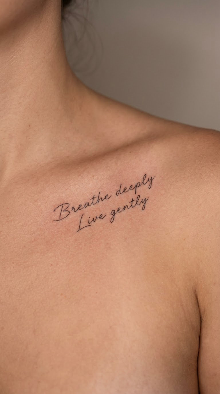
Two lines in a light, even fine line script, the second line shorter and sitting under the first, following the arc of the bone. It is an affirmation design that reads as a statement rather than a slogan, because the line weight is quiet.
Most people get it after a hard year, and a good number say it is the one tattoo people ask them about most.
Placement: along the bone, arched, positioned so the two lines sit on nearly the same plane · Size: 2.5-3 in wide (6.5-7.5 cm) · Style: two-line fine line script, even line weight · Pain: medium-high across the full run of the bone.
Make it yours: add the year at the end of the lower line in half-size lettering, a private date for a private promise.
15. Home in Bold Brush Script
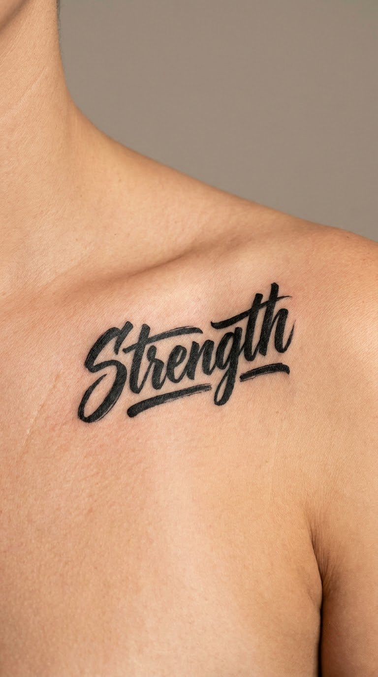
One word, thick and confident, in brush script. Bold line weight is the one style choice that ages well here, because there is enough ink in each stroke to survive a decade of sun and washing.
It suits people who wanted lettering and found that hairlines made them nervous.
Placement: above the bone, centred, the ideal spot for a bold shape that needs its own space · Size: 1.5-2 in wide, 0.5-0.7 in tall (4-5 cm) · Style: bold brush script, solid black, no shading · Pain: medium, fewer passes over the same skin than a fine line design needs.
Make it yours: pick a word in a language the person will keep saying, and get the spelling and any accents confirmed in writing.
16. Your Own Handwriting, Turned Into a Font
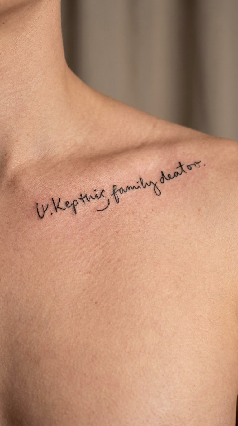
An artist takes a sample of your own handwriting and builds a small custom alphabet from it, so the tattoo reads like something you wrote rather than a computer font. The letterforms stay imperfect, which is exactly the appeal.
It is the most personal version of a script tattoo and the least common, because it takes real drafting time up front.
Placement: anywhere along the line of the bone, the phrase drawn to fit the available run · Size: set by how much of the bone the phrase needs, usually 2.5-4 in · Style: custom lettering from a handwriting sample, fine to medium line weight · Pain: high, since longer, custom work means more time on the bone. Ask for it as a two-hour slot so nobody is rushing.
Make it yours: send three samples, a few words each, in different moods, so the artist can pick the most consistent shapes.
17. Choose Joy With a Small Sprig
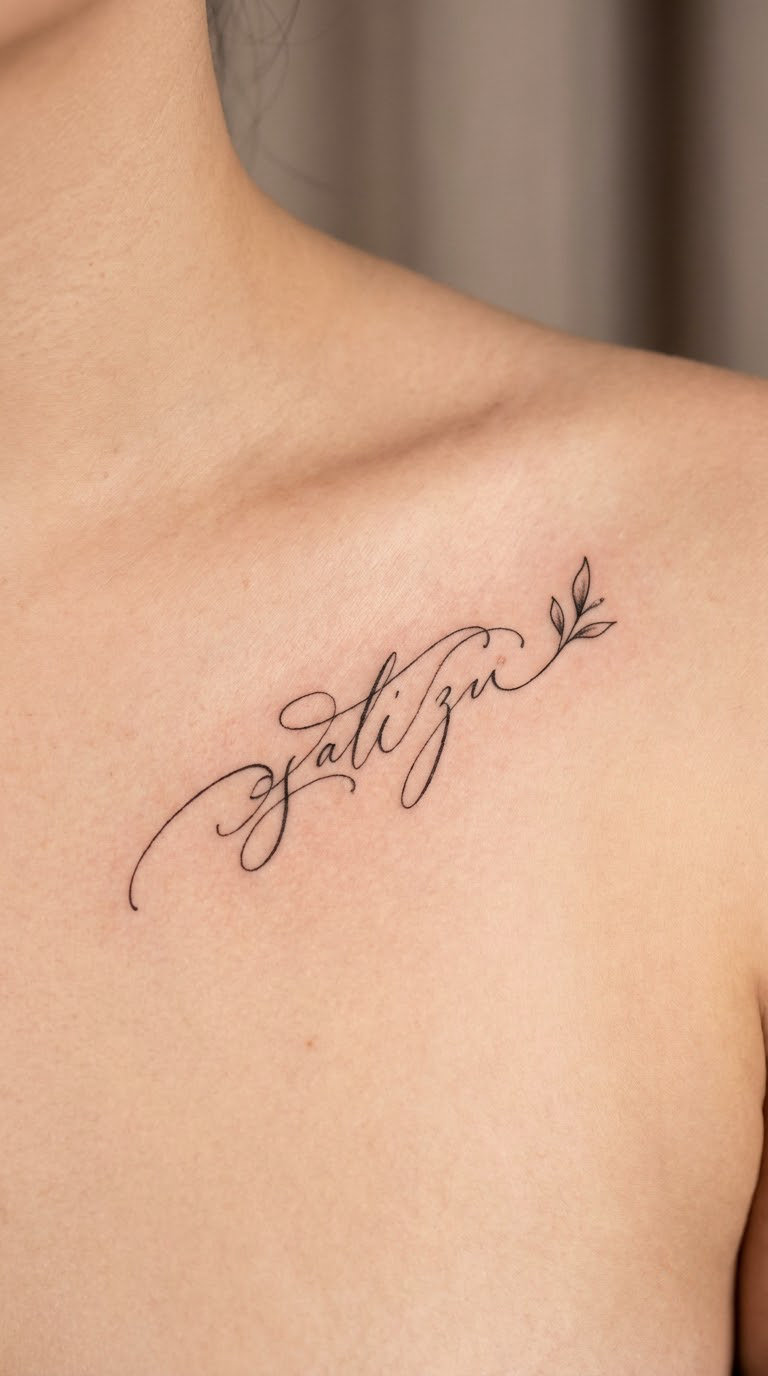
Two short words in fine line script with one small botanical sprig, a stem and three or four leaves, tucked at the end of the line so the design finishes instead of stopping. The sprig is drawn in the same line weight as the text.
Mixing a small symbol into lettering is the most common fix for a design that reads as unfinished, and it is the least risky one.
Placement: below the bone, with the sprig pointing outward toward the shoulder · Size: 2.5-3 in wide for the text, sprig around 0.7 in long (6.5-7.5 cm total) · Style: fine line script plus single-line botanical work · Pain: high. Leaf shading and stem lines are fiddly, and fiddly means longer on a sensitive bone.
Make it yours: have the sprig be a real plant from the place the phrase comes from, drawn from a photo you bring.
18. A Date, Nothing Else
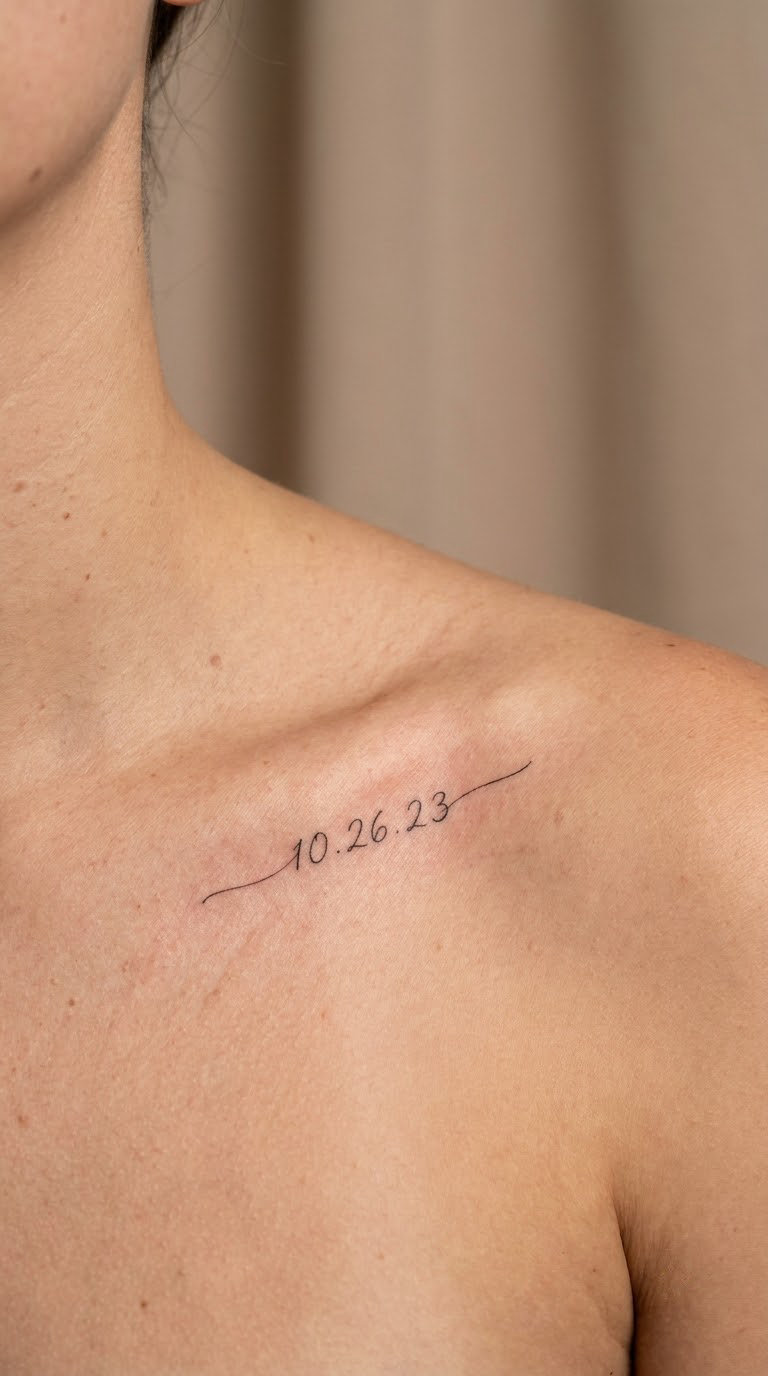
A date in a small, unstyled script, no capital flourish, no symbol, no second line. This is the most restrained design on the list and the easiest to add to later without the piece needing to be reworked.
People choose it for a birthday, an anniversary or the year something ended.
Placement: along the bone, centred or slightly out toward the shoulder · Size: 1.5-2 in wide, 0.25-0.35 in tall (4-5 cm) · Style: minimal fine line script · Pain: medium-high, a bone-length tap of a design. Under twenty minutes for a lot of people.
Make it yours: use your day-month-year order rather than the numerical one your country uses, and write the year in full.
19. Onward With a Long Sweeping Tail
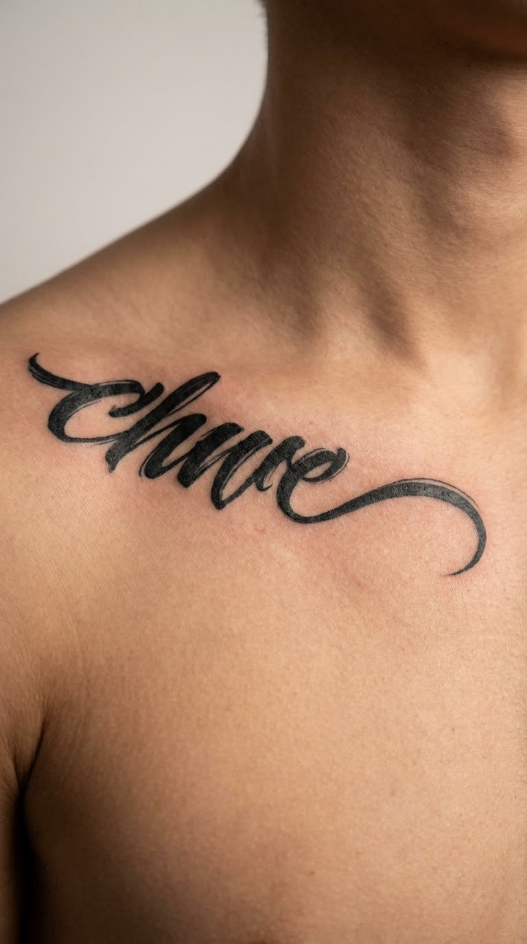
One word in a bold brush script where the final letter runs out into a long tapered tail aimed toward the shoulder. The tail uses the length of the clavicle, so the word itself stays short.
It reads as movement rather than as text, which makes it a good option if you want lettering that looks like design.
Placement: above the bone with the tail running outward along it, the whole design ending before the shoulder joint · Size: 2-2.5 in wide including the tail, 0.6 in tall · Style: brush script, bold downstrokes with a tapered finish · Pain: medium, mostly on soft tissue, though the tail crosses back over the edge of the bone.
Make it yours: let the tail end in a tiny drop of ink, or a filled circle, so the sweep has a deliberate stop.
20. She Believed, So She Did in Copperplate
The long-quote version: two lines of even copperplate, each line matched to the same width so the block sits square rather than ragged. The capitals are tall, the spacing generous, and there is no illustration competing for attention.
It is the design to pick if you have a full sentence you care about, and it is the one that needs the most consultation, because the words have to be cut down or split well.
Placement: below the bone, the only placement on this list with enough flat width for a two-line block · Size: 4-4.5 in wide, each line under 0.4 in tall (10-11.5 cm) · Style: copperplate, two balanced lines · Pain: high and long. This is a two-hour session, and you will want a break in the middle of the second line.
Make it yours: change the wording to your own version of the line before it is drawn, since editing it after the stencil is far harder.
How to Choose the Right Script Style
Style decides more about how the tattoo ages than the phrase does. A line weight matched to the placement and the amount of sun it takes beats a prettier font every time.
What is the best script style for a collarbone tattoo?
Modern script or copperplate in a medium line weight is the safest all-round choice: enough ink to hold its shape, enough flow to follow the bone. Fine line is the most elegant and the least forgiving.
| Style | Reads as | Best on the collarbone when | Long-term legibility | Artist difficulty |
|---|---|---|---|---|
| Modern script | Clean, current, everyday | You want one word or a short phrase with a soft hand | Good at medium weight | Medium |
| Fine line cursive | Delicate, quiet, intimate | The phrase is short and the piece is for you, not the room | Fades and softens; plan on a touch-up | High |
| Copperplate | Formal, classic, keepsake | You have real words and a longer line to fill | Excellent, thick shaded strokes | High |
| Italic serif | Printed, old, understated | The content is a date, a year or a name | Very good | Low to medium |
| Sans-serif capitals | Graphic, current, plain | The words matter more than the handwriting | Very good, best with wide tracking | Low |
| Spencerian flourish | Vintage, romantic, ornate | You are adding to an existing lettered piece | Good if kept small | High |
| Custom handwriting | Yours, unmistakably | The letters are someone else’s memory | Depends on the sample | Highest |
Ask to see finished healed work, not fresh work. Fresh lines always look crisp; the honest test is a piece three years old.
How Many Words Actually Fit on the Collarbone
Most disappointing collarbone script was a good idea squeezed into too little skin. The clavicle gives you a straight run of roughly 3 to 5 inches of usable width, and that is the whole budget.
What goes wrong with long script tattoo ideas for the collarbone
Long phrases force the artist to shrink the letterforms. Once the capitals drop under about a quarter inch tall, thin strokes merge as the skin heals, spacing collapses and the phrase becomes unreadable at a normal viewing distance.
| Phrase length | What to use | Placement | Realistic width |
|---|---|---|---|
| 1 word, up to 7 letters | Any style, including fine line | Above or below the bone, either end | 1-2 in (2.5-5 cm) |
| 2-3 words, up to 18 characters | Modern script or medium copperplate | Along the bone or just below it | 2.5-3.5 in (6.5-9 cm) |
| 4-6 words, up to 32 characters | Copperplate, two balanced lines | Below the bone only | 4-4.5 in (10-11.5 cm) |
| Full quote, 8 words or more | Do not do it here | Forearm, rib, thigh or back | Not a collarbone design |
If your phrase will not fit on one line, split it into two lines of equal length rather than shrinking the letters. Two lines also read faster.
Where to Place It: Along the Bone, Above It or Below It
The bone gives three workable positions and they do not suit the same designs. Choosing the wrong one is the second most common reason a good design looks slightly off.
Along the bone. The lettering baseline follows the clavicle, which is why script suits this spot. It is the most elegant position and the most exposed to sun, and it is the most painful of the three because the needle is working over bone.
Just above the bone. There is a layer of soft tissue here, so it hurts noticeably less and takes colour more cleanly. This is where fine line and small designs sit best, and it is the easiest position to style around.
Just below the bone. The flattest, widest area of the upper chest and the only one that fits a two-line block. Slightly more padding than the bone itself, so the first hour is easier there too.
For a first piece, start above the bone. For something long, go below it. For a single word with real weight to it, follow the bone and book a longer slot.
Is the Collarbone Painful to Tattoo?
Yes, it is one of the more sensitive spots on the body. The clavicle sits close to the surface with very little soft tissue over it, so the needle finds bone quickly and the sensation is sharp and intense rather than dull. What softens it is duration: a short phrase is a short session, often under an hour, and the intensity passes quickly.
| Placement | Approx. pain out of 10 | Why |
|---|---|---|
| Collarbone, directly on the bone | 7-8 | Bone is close to the surface, thin covering |
| Upper chest, just below the bone | 6-7 | Slightly more tissue, still very lean |
| Just above the bone, toward the shoulder | 5-6 | More soft tissue, moving surface |
| Sternum, centre of the chest | 8-9 | Bone, thin skin, and often involuntary movement |
| Inner arm | 6-7 | Thin skin, very sensitive nerve endings |
| Outer upper arm | 4-5 | More muscle, thicker skin |
Everyone’s scale is different, and these are community impressions rather than measurements. Eat properly, sleep, and skip the alcohol. People who move around make the linework worse, not the session shorter.
How to Brief Your Artist So the Spelling Is Right
A misspelled quote is the one regret that cannot be washed off, and it happens because of rushed references, not bad artists. Most of it is preventable in the ten minutes before you sit down.
Send a clean, typed reference before the appointment. A PDF, a text message or a note in your own phone’s notes app is better than a screenshot of a meme. Type the phrase, check it character by character, and include the punctuation you want.
Ask for the stencil. Lettering should be transferred, drawn onto skin, checked for spelling, size and baseline, and only then inked. An artist who freehands a phrase on the collarbone without a stencil is telling you something about how that phrase is going to look.
Read the stencil before the first line. You have standing permission to ask the artist to lift the ink, wipe it and redo it. Nobody sensible minds, and every tattooer has wiped one.
Request a slightly heavier line weight than the reference shows. Screen photos of fine line exaggerate how thin it is; on skin over bone, one step heavier is the difference between a tattoo that is still legible in ten years and one that needs reworking.
Ask for a two-hour slot for anything over three words, and plan where you want the breaks. Lettering quality drops when the artist is rushing the last third of a line.
Healing and Aftercare for Thin-Line Collarbone Script
Always follow your artist’s aftercare instructions first. These notes describe what is particular about this placement, on top of the care your artist gives you.
| Stage | What is happening | What to do |
|---|---|---|
| Days 1-3 | Redness, swelling, ink sitting near the surface | Gentle washing, pat dry, no collars or chains, sleep off the shoulder |
| Weeks 1-2 | Flaking and itching as the surface sheds | Moisturise thinly, do not pick or scratch, keep fabric soft against it |
| Weeks 3-4 | Top layer gone, the real line showing | Start daily broad-spectrum SPF 30 or higher on the area once healed |
| Months 1-6 | Settling, slight fade, final spacing visible | Compare with your original photo, book a free touch-up if the artist offers one |
| Years 1+ | Slow fade, finest strokes blur first | Year-round sun protection on the chest area if you want it to hold |
The collarbone is exposed more than most tattooed areas. Shirt collars, necklace chains, bra straps, seatbelt edges and backpack straps all cross fresh ink, and friction is what lifts a fine line early.
Sun is the other one. The upper chest is uncovered far more often than a forearm or a rib, and the thinnest strokes go first. If you want the phrase crisp in ten years, the daily SPF habit is doing more work than the aftercare ointment did in week one.
Give it a full eight weeks before judging it. Healing line weight looks light for weeks, and a lot of people chase a touch-up they did not need.
Cost and Session Time for a Collarbone Script Tattoo
Shop minimums and hourly rates vary a lot by city and artist, so treat the ranges below as the going rate for lettering work rather than a quote. A lettering specialist costs more than a generalist, and the extra is usually worth it.
A single short word usually takes 20 to 45 minutes and lands between 100 and 250 dollars. Two or three words run 45 to 90 minutes, roughly 200 to 400 dollars. A two-line quote is a two-hour booking in most studios, somewhere around 300 to 550 dollars.
Ask for the artist’s rate and the estimated time before you book, and treat a quote that never mentions whether your phrase fits as a warning. Custom lettering from your own handwriting costs more than a font, because of the drafting time before the session starts.
Wear something that drops below the collarbone and take any chains off before you arrive. A low-necked top or an off-shoulder shirt lets the artist see the whole area and reach the placement without you pulling fabric over your face.
Styling Your Collarbone Script Tattoo
The placement does the styling work for you. It shows most in an off-shoulder, boat neck or deep scoop, where the line of text sits in clear space rather than under fabric.
A V-neck frames a two-line design neatly because the V follows the same angle as the two lines. Round necklines sit closer to the bone and work well with a single word.
Chains and pendants fight with fine line. Anything resting on the collarbone will rub, snag and cast a shadow across the letters, so keep necklaces above the area or wear them on the other side.
For layering, plan the second piece in a different place, further out on the shoulder or lower on the chest. Two script pieces along the same bone tend to compete once both have healed and softened.
If an old or misspelled collarbone script needs reworking, talk to a lettering specialist about covering it with a darker, bolder design in the same style family rather than a black block. A new bold script or a full blackwork band along the bone hides thin, blurred lettering better than another fine line ever will.
Frequently Asked Questions
What are some good script tattoo sayings?
Short sayings work best on a collarbone because the bone only gives you 3 to 5 inches. Reliable short options include stay wild, breathe, still becoming, choose joy, onward, not all who wander are lost, love is patient, and I will fear no more. Two to three words is the sweet spot: long enough to mean something, short enough to stay legible once healed.
Is the collarbone painful to tattoo?
Yes, the collarbone is one of the more sensitive placements, usually 7 or 8 out of 10, because the clavicle sits close to the surface with very little tissue over it. The sensation is sharp and intense. What makes it manageable is the length: a short phrase is often a session of under an hour, and the pain is brief rather than lingering.
What is the best script for tattooing?
Modern script or copperplate at a medium line weight is the safest all-round choice for the collarbone, since both carry enough ink to survive years of sun and washing. Fine line cursive is the most elegant and the most likely to blur. Italic serif suits dates and names, and sans-serif capitals suit people who care more about the words than the handwriting.
How bad is the pain for a collarbone tattoo?
Think sharp rather than throbbing. The needle reaches bone almost immediately on the collarbone itself, so it rates around 7 to 8 out of 10, while the area just above the bone rates closer to 5 or 6 because more soft tissue sits there. Deep breaths help more than distraction, and staying still gives the artist a cleaner line.
How long does it take for a script tattoo to heal?
Surface healing takes 10 to 14 days, with the visible flaking happening in week one or two. The tattoo keeps settling for four to six weeks, which is when the true line weight appears. Judge the result at eight weeks, not at two, and book a touch-up from six months if the artist offers one, especially for fine line work.
What is the 1/3 rule tattoo?
Artists use the third rule as a sizing guide: whatever you want drawn, the widest element should fill no more than a third of the space available. On a collarbone, that means a single word around 1.5 to 2 inches wide and a short phrase no more than about 3.5 inches, so the lettering looks deliberate rather than crowded.
What pain is equal to a tattoo?
People most often compare tattooing to a heavy sunburn on a sensitive spot, or to the sting of a long injection. In practical terms, most placements sit between 4 and 7 out of 10, the collarbone around 7 to 8, and the sternum and ribs higher. The collarbone ranks high because the bone is close to the skin, not because the work is difficult.
For a first tattoo, start small: one word, a date, or a two-word phrase in a medium line weight, placed just above the bone where it hurts least. If you already have lettering and want something with more going on, go bolder, the sort of script you can read from across a room. The placement does not change between the two, only how much weight the design is carrying.