
24 Cursive Font Tattoo Ideas for Minimalists (October 2026)
A cursive font tattoo is lettering tattooed in a flowing, connected script, used for a name, date, single word, or short quote. The joined letterforms read like real handwriting, which is why script is the most requested lettering style for anything personal. The catch: the same joins and hairline strokes that look delicate on a screen are the first parts to blur once ink settles into skin.
These 24 cursive font tattoo ideas are built for people who want one elegant line of words and nothing else, no illustration crowding the words. Every entry below names the style, the placement, a realistic size in inches and centimetres, and how the design ages. If you are also planning something non-script, our [fingerprint tattoo ideas for memorial](https://thewe.cc/fingerprint-tattoo-ideas-for-memorial/) roundup covers a very different mood entirely.
Cursive Font Tattoo Ideas: Quick Guide
| Idea | Style | Best placement | Size | Pain |
|---|---|---|---|---|
| 1. Single name | Fine line | Inner wrist | 1.5-2.5 in (4-6 cm) | Low to medium |
| 2. Tiny date | Connected script | Inner forearm | 1.5-2 in (4-5 cm) | Medium |
| 3. One-word meaning | Romantic script | Collarbone | 2-3 in (5-8 cm) | Medium |
| 4. Minimal quote | Light script | Inner forearm | 3-4 in (8-10 cm) | Medium |
| 5. Initials | Signature script | Behind the ear | 0.5-1 in (1.5-2.5 cm) | Medium to high |
| 6. Vow fragment | Elegant script block | Inner upper arm | 2-3 in (5-8 cm) | Medium |
| 7. Floral word | Botanical script | Outer forearm | 2-3 in (5-8 cm) | Medium |
| 8. Signature with branch | Contrast script | Wrist | 2.5-3.5 in (6-9 cm) | Medium |
| 9. Tiny affirmation | Light script | Rib | 1.5-2.5 in (4-6 cm) | High |
| 10. Coordinates | Looping script | Inner wrist | 1.5-2 in (4-5 cm) | Low to medium |
| 11. Spine word | Handwritten script | Upper spine | 4-6 in (10-15 cm) | High |
| 12. Ankle phrase | Light script | Above the ankle | 2-3 in (5-8 cm) | Medium |
| 13. Childhood word | Petite script | Wrist | 1.5-2 in (4-5 cm) | Low to medium |
| 14. Romantic sentence | Restrained script | Upper back | 6-9 in (15-23 cm) | Medium |
| 15. Flourished capital | Ornate script | Chest near collarbone | 1.5-2 in (4-5 cm) | Medium |
| 16. Lyric fragment | Small script | Forearm | 2-3 in (5-8 cm) | Medium |
| 17. Fountain-pen word | High contrast | Forearm | 2-3 in (5-8 cm) | Medium |
| 18. Side-rib phrase | Narrow vertical script | Side of ribs | 3-5 in (8-13 cm) | High |
| 19. Word with dotwork star | Minimal script | Wrist | 1.5-2 in (4-5 cm) | Low to medium |
| 20. Watercolor word | Soft grey wash | Forearm | 2.5-3.5 in (6-9 cm) | Medium |
| 21. Script ring | Connected script | Finger | 0.3 in wide band | High |
| 22. Curved name | Light script | Upper shoulder | 3-4 in (8-10 cm) | Medium |
| 23. Sternum initial | Minimal script | Upper sternum | 1-1.5 in (2.5-4 cm) | Medium |
| 24. Blackwork statement | Blackwork script | Forearm | 4-7 in (10-18 cm) | Medium to high |
1. Single Name in Flowing Fine Line
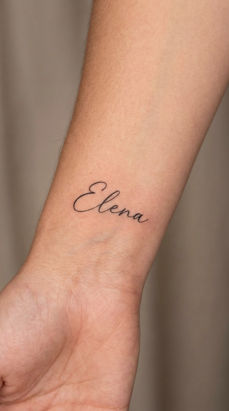
What a Flowing Cursive Name Looks Like and Why It Works
This is the starting point for most first cursive tattoos. One name, written in a monoline script where every upstroke carries roughly the same weight, no shading, no underline. The line stays connected from the first capital to the last letter.
A name is usually chosen for the person it belongs to rather than for symbolism, though it very often belongs to a child, a partner, or someone already gone. Nothing about the design needs explaining to strangers, which is exactly the appeal.
Placement: inner wrist, along the tendon line, or the soft inner forearm just above it. Size: 1.5 to 2.5 inches (4 to 6 cm) wide. Style: fine line, monoline script. Pain: low to medium, a scratchy sustained sting rather than sharp pain.
The honest ageing note: fine line on the wrist is where fading shows first, since hands and wrists are exposed to sun and movement constantly. Book a touch-up in about six months. Make it yours: add a tiny second line beneath with a single date, kept to the same stroke weight.
2. Tiny Date in Connected Script
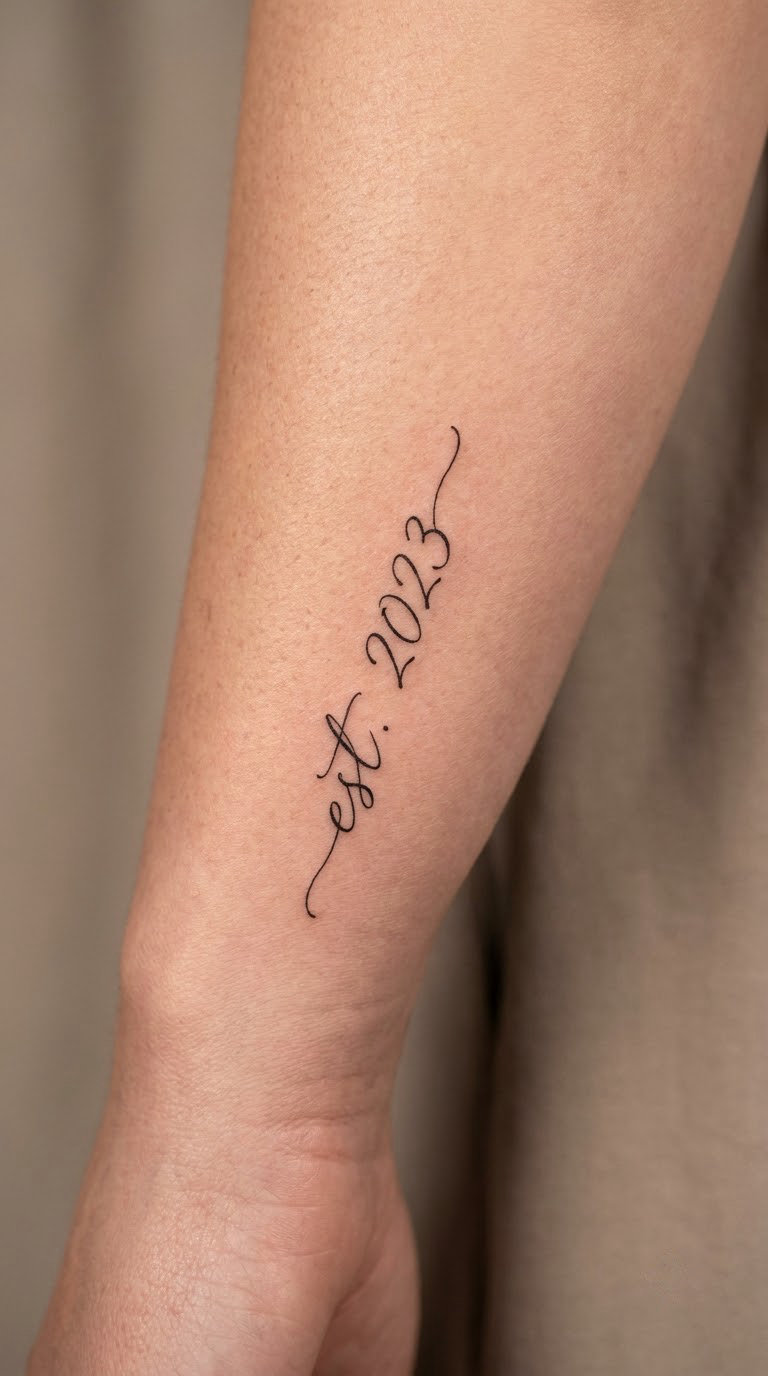
A wedding date, a birthday, or the day something important happened, written in digits inside a connected script. Digits are the hard part here: many scripts join numbers loosely, so the artist has to open the spacing just enough that a 4 does not drift into a 1.
People pick a date for the plain reason that it is the one piece of information they never have to look up. It works as a memorial marker too, often for a parent, without needing the word “gone” anywhere near it.
Placement: inner forearm, wrist crease, or the inside of the upper arm. Size: 1.5 to 2 inches (4 to 5 cm). Style: connected fine-line script. Pain: medium, slightly more than a wrist piece because the inner forearm is denser.
Ageing note: numbers blur before letters do, so keep it above 1.5 inches. Make it yours: run it in the same script as a matching name piece on the opposite wrist.
3. One-Word Meaning on the Collarbone
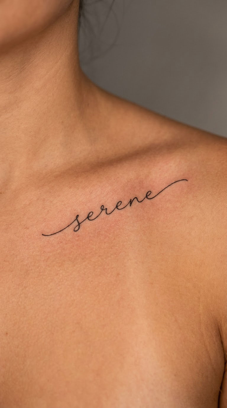
One word, set horizontally or on a very shallow arch so the letters follow the line of the bone rather than fighting it. Romantic scripts with long entry strokes into the first capital sit well here because the collarbone gives a natural baseline to sit on.
Words chosen for this spot are short and emotional: a virtue, a name used as a word, a word from a language the wearer speaks. The collarbone is visible but not loud, so it suits people who want meaning without explanation.
Placement: along one collarbone, or centred under the sternum notch. Size: 2 to 3 inches (5 to 8 cm). Style: romantic script, fine line. Pain: medium; bone sits close under the skin here, so expect a sharper sensation than the forearm.
Ageing note: the hollow between the collarbone and the shoulder collects ink movement and fades unevenly. Make it yours: set the word on a slight upward curve so the ends lift rather than droop.
4. Minimal Quote on the Inner Forearm
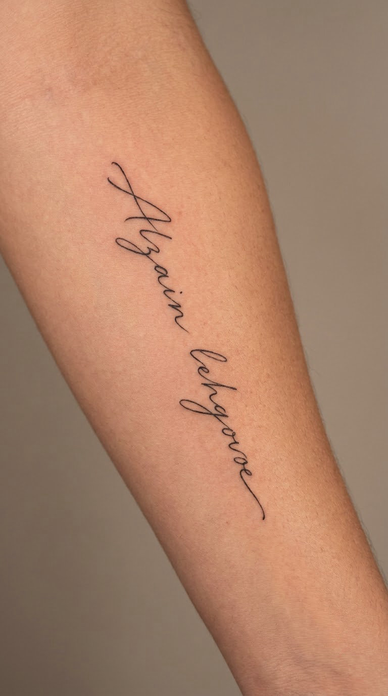
Two or three words, not a full sentence, set in a light script with generous spacing between words. The trick to a readable quote is less about the font and more about the air you leave between the words, and about cutting any flourishing capitals down to one per design.
Short quotes are chosen because they are something the person actually says out loud, not a paragraph of borrowed text. The forearm is a popular spot because it reads as private until you roll your sleeve.
Placement: inner forearm, running parallel to the radius, or across the upper inner arm. Size: 3 to 4 inches (8 to 10 cm) for three words. Style: light script, fine line. Pain: medium, a long steady burn along a flat surface.
Ageing note: four-word-plus quotes start merging first. Make it yours: drop the punctuation, since a small comma disappears anyway, and let the words carry the meaning.
5. Signature-Style Initials Behind the Ear
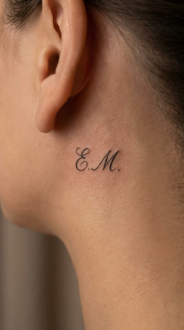
Two or three letters written in the rhythm of an actual signature, loops included, tucked into the soft skin behind the ear or just under the hairline at the nape. The signature rhythm matters more than the specific typeface: uneven, personal, unmistakably one person’s hand.
Initials here are usually inherited, a grandmother’s hand or your own, and a discreet spot is chosen so it stays something only you and a few people ever see. If you are also weighing smaller pieces, our [kids initials tattoo ideas](https://thewe.cc/kids-initials-tattoo-ideas/) roundup has the miniature versions covered.
Placement: behind the ear, or the nape just above the hairline. Size: 0.5 to 1 inch (1.5 to 2.5 cm). Style: signature script, monoline. Pain: medium to high, thin skin over bone with little soft tissue.
Ageing note: this is the fastest-fading area on the body, so expect a touch-up. Make it yours: hand the artist a photo of the real signature and let them keep the loops but straighten the baseline.
6. Wedding Vows in a Small Script Block
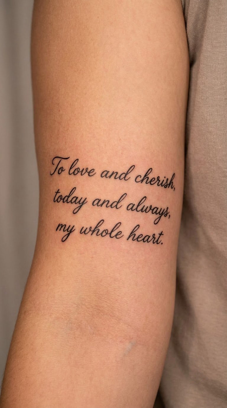
A vow fragment, usually one line of a few words, set as a small centred block of three short lines. Each line is the same length or deliberately staggered, and the whole block is treated as one shape rather than three separate tattoos.
This is chosen when a person wants the promise visible to themselves without a full sentence covering a forearm. The words matter more than the occasion, so many couples use the same phrase in different handwriting.
Placement: inner upper arm, or below the shoulder on the outer arm. Size: 2 to 3 inches (5 to 8 cm) tall for three lines. Style: elegant script block, fine line. Pain: medium, softer on the upper arm than the forearm.
Ageing note: stacked lines lose their baseline as the arm moves over time. Make it yours: have the artist letter each line separately first on paper, then stack them with equal gaps.
7. Floral Word in Botanical Script
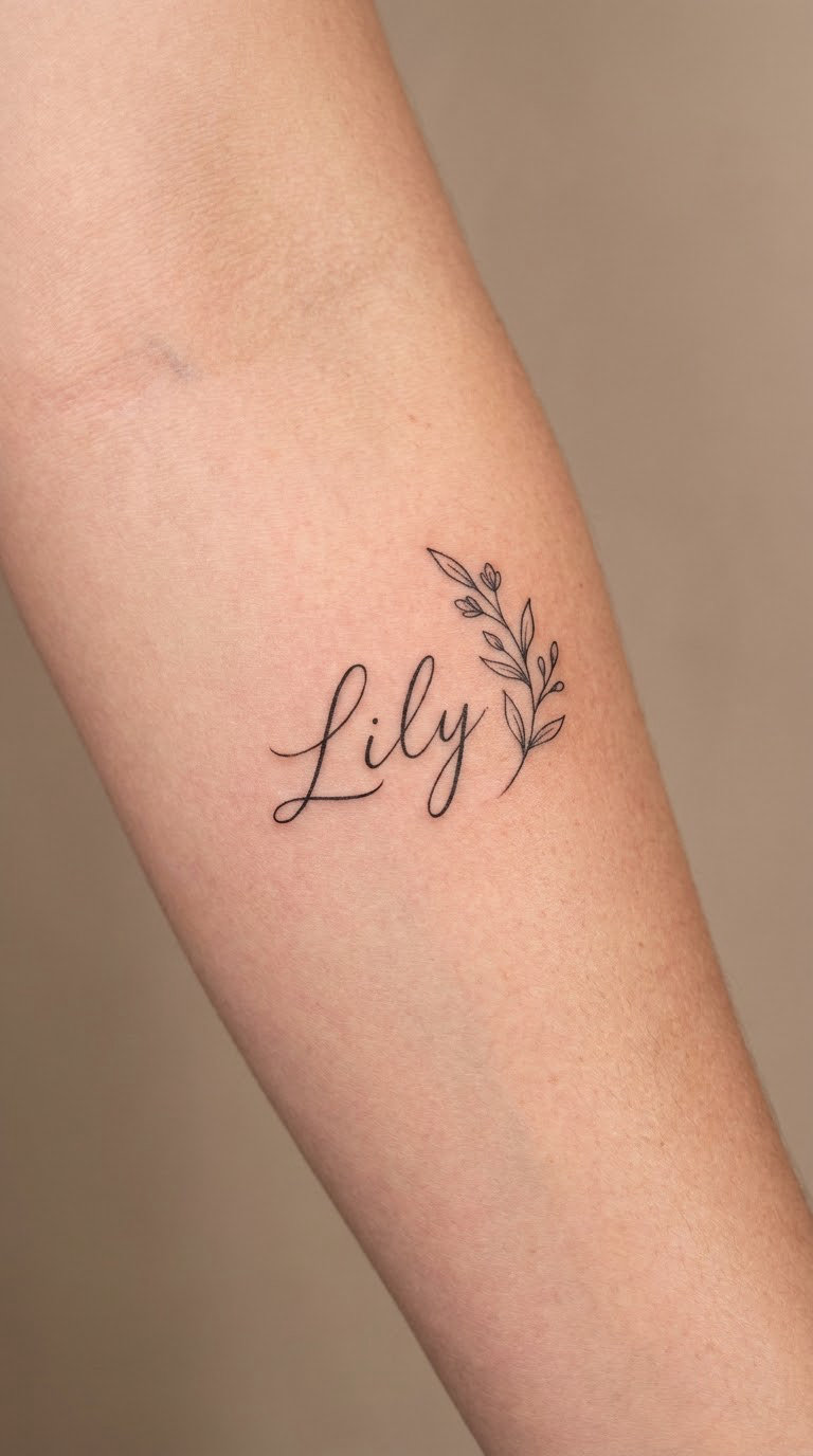
A single word naming a flower, a plant, or a herb, written in a script that leans toward botanical illustration, with one small sprig of two or three leaves tucked under the last letter. The accent stays under two inches so the word still reads first.
Usually the word is a birth flower, a wedding flower, or a plant connected to a place the person is from. The sprig is there to confirm the meaning, not to become a second design competing for attention.
Placement: outer forearm, or the inside of the upper arm. Size: 2 to 3 inches (5 to 8 cm) including the sprig. Style: botanical linework with fine-line script. Pain: medium on the outer forearm, higher over the elbow side.
Ageing note: thin leaf outlines fill in before the lettering does. Make it yours: use the birth flower of the month you were born rather than a generic bloom.
8. Contrast Signature with Fine-Line Branch
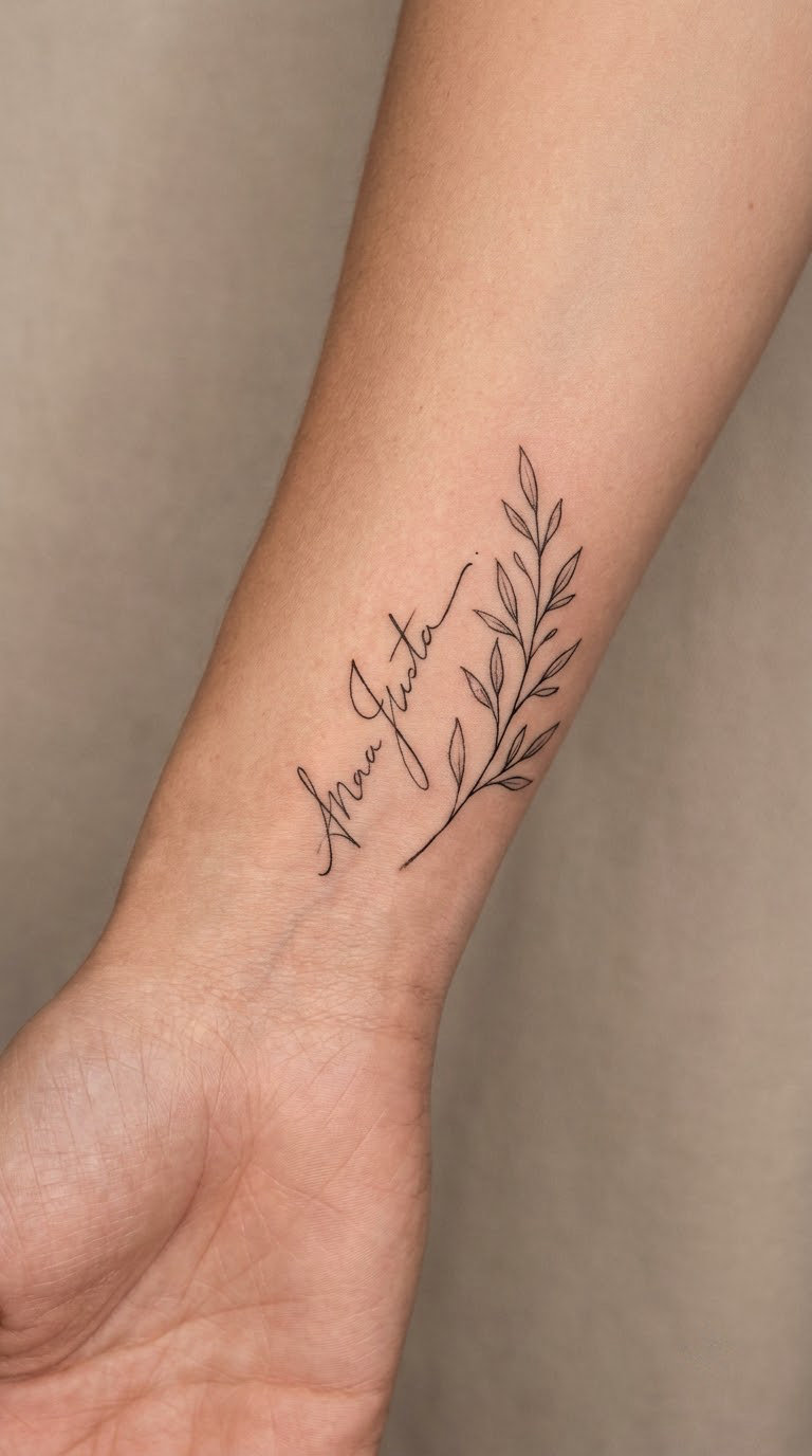
One expressive word, written in a script with real thick-and-thin contrast, paired with a single long branch of about six leaves that runs under the word and extends past it. The branch gives the composition a direction and stops the lettering from floating.
This one is picked when the wording is a surname or a place name, something with weight behind it. The contrast in stroke weight makes the word feel more assertive than the gentle romantic scripts.
Placement: outer wrist, or the lower outer forearm. Size: 2.5 to 3.5 inches (6 to 9 cm) including the branch. Style: high-contrast script with fine linework. Pain: medium, and the branch’s fine tips need a steady hand from the artist.
Ageing note: hairline connections in high-contrast scripts fill in first, so keep the script above 2 inches. Make it yours: point the branch toward the direction you came from, or the one you are going to.
9. Tiny Affirmation on the Rib
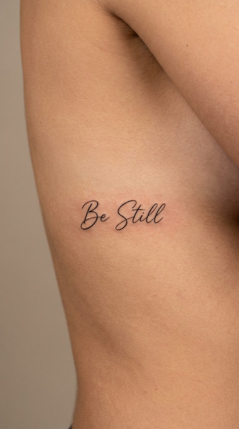
A two-word reminder such as a personal motto, set in a light script along one rib, following the curve of the bone rather than crossing several. Two words is the sweet spot; three or more on a rib reads as a smudge from more than a foot away.
These are chosen for private daily use, something read rather than explained. That privacy is the reason people accept a spot that is hard to see and awkward to reach.
Placement: side of the ribs, following the curve, ideally on one side only. Size: 1.5 to 2.5 inches (4 to 6 cm). Style: light script, fine line. Pain: high, thin skin stretched over bone with no muscle to cushion it.
Ageing note: ribs move constantly, and the stretch flattens tight joins over time. Make it yours: keep it to the two words you would actually say out loud on a hard day.
10. Coordinates in Travel-Inspired Script
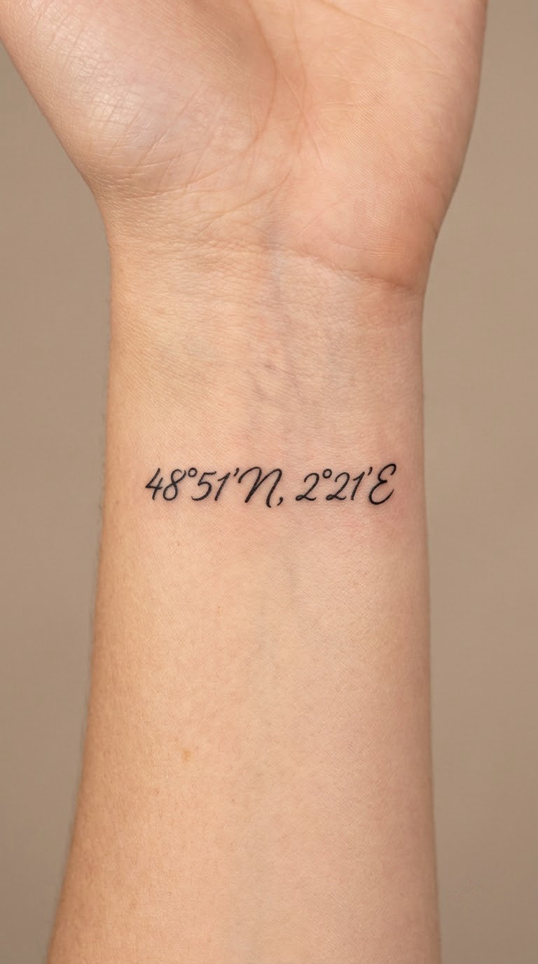
Latitude and longitude written in digits inside a connected script, often with the place name in small print-style capitals underneath or above. The script does the softening, the capitals do the precision.
Coordinates are picked because they point to a specific spot rather than a general idea of a trip, often a first trip, a proposal spot, or somewhere one person has never been and intends to be.
Placement: inner wrist, inner forearm, or the back of the hand. Size: 1.5 to 2 inches (4 to 5 cm) wide. Style: connected script with a small caps line. Pain: low to medium on the wrist, higher on the knuckles.
Ageing note: decimal points and degree symbols vanish quickly, so verify the stencil carefully. Make it yours: use the coordinates of somewhere you plan to go, not somewhere you have already been.
11. Handwritten Word Along the Spine
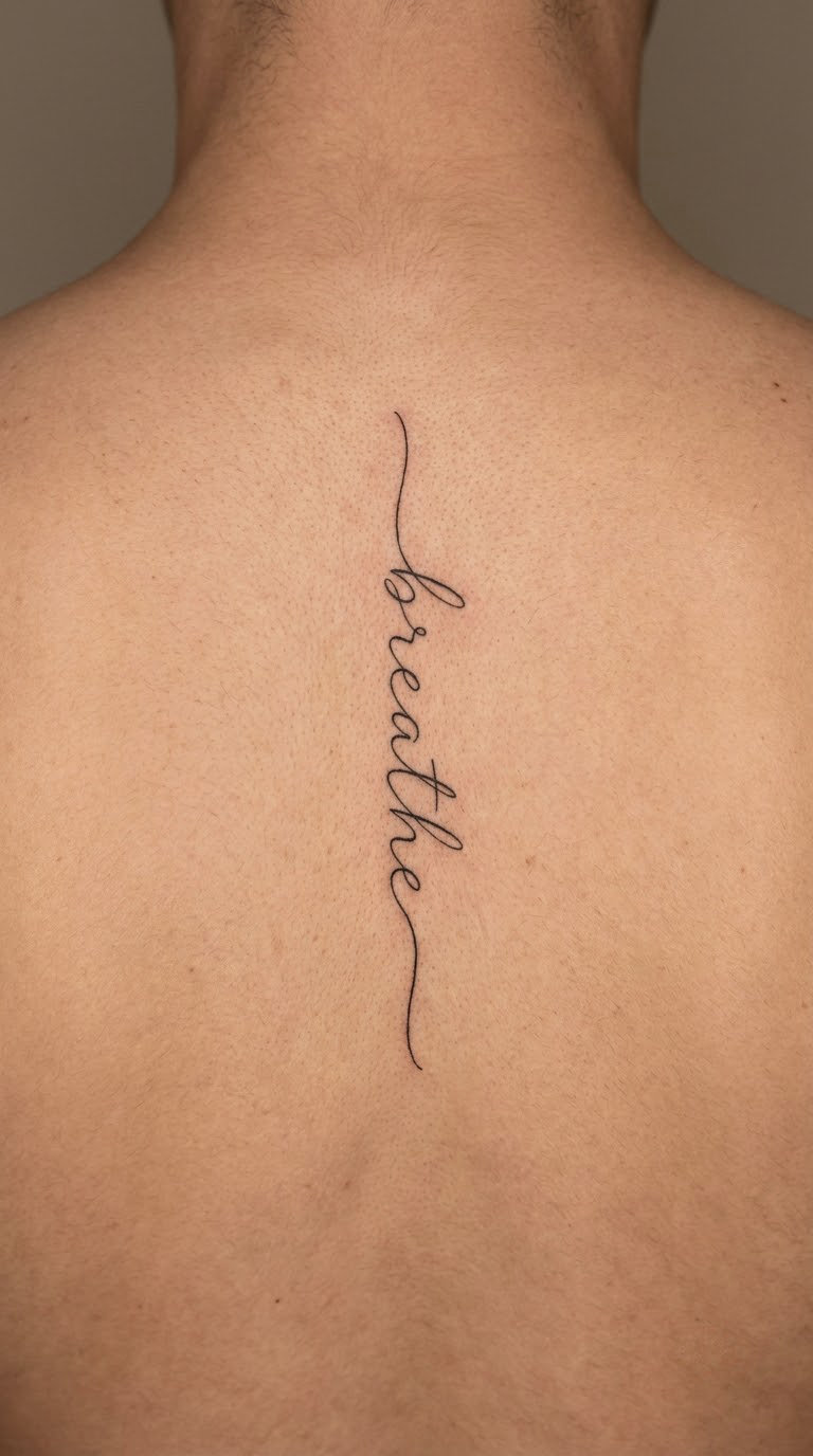
One word read from top to bottom, letters stacked down the line of the spine with even gaps. The artist works letter by letter, checking the vertical rhythm at every step, because a word written sideways and rotated is not the same as a word stacked on purpose.
Spine words are chosen because the placement itself carries meaning, running down the back feels like something meant to be discovered later, by someone close, or by yourself.
Placement: upper to mid spine, following the natural dip between the shoulder blades. Size: 4 to 6 inches (10 to 15 cm) tall for one word. Style: handwritten fine-line script. Pain: high, and you will be asked to sit or lie still for it.
Ageing note: a vertical word loses its tension if letters drift off the centre line as the skin moves. Make it yours: have the artist letter the word upright on paper first, then work down from the top letter.
12. Two-Word Phrase on the Ankle
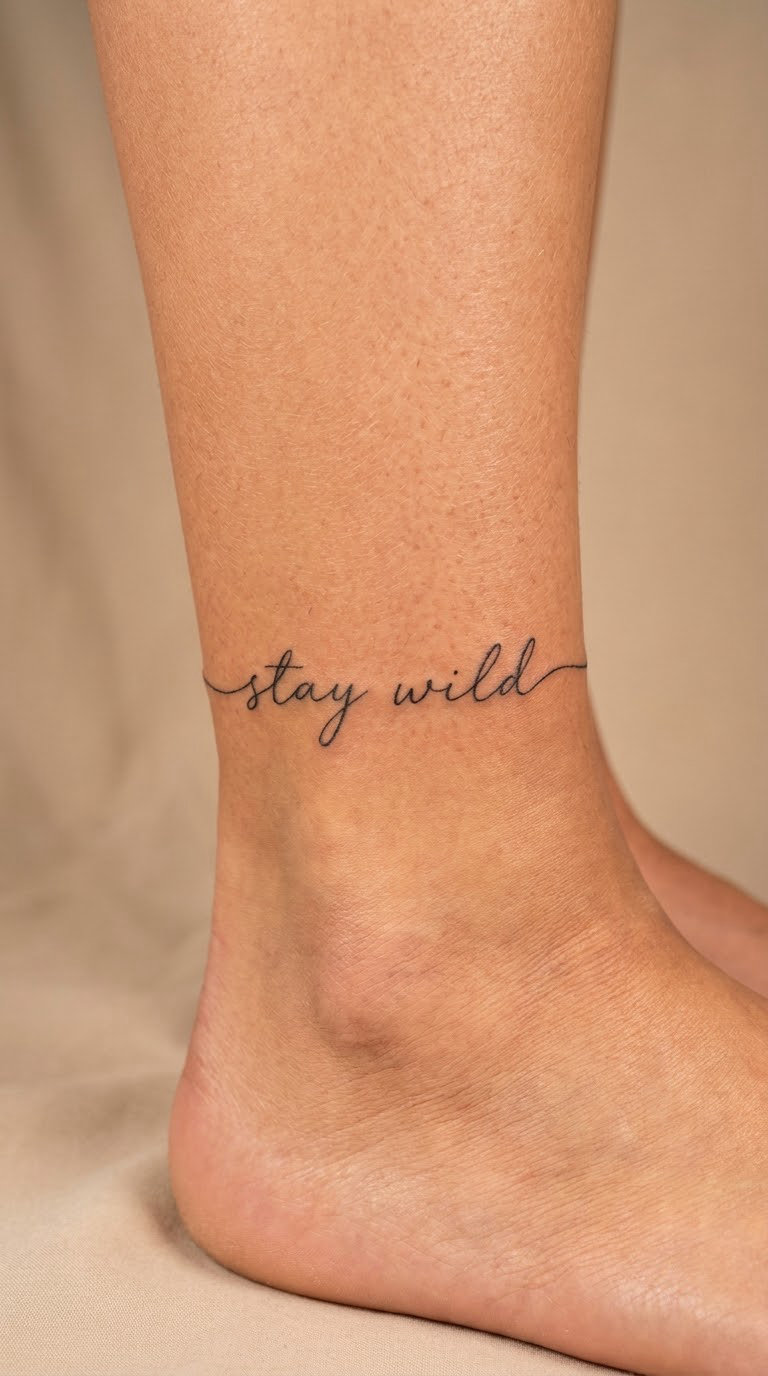
Two words set in a light script that arcs just above the ankle bone, or wraps around the ankle in a loose ring of open script. The line has to negotiate a bone that sticks out and then narrows sharply below it.
Ankle scripts get chosen for the way they are seen in motion, walking, dancing, and mostly in summer, and often for wording a partner shares. They are the least hidden option in this list and the easiest to notice.
Placement: above the ankle bone, or circling the lower calf. Size: 2 to 3 inches (5 to 8 cm) across. Style: light script, fine line. Pain: medium on the calf, high where the bone is closest to the surface.
Ageing note: footwear rubbing and sun exposure both work at this spot. Make it yours: pick a phrase you would be happy to read while wearing sandals all summer.
13. Childhood Word in Petite Script
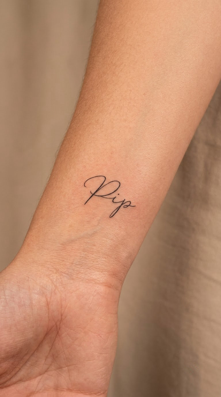
A nickname, a pet name, a word from a home language, or a term from a specific year, written small and tight in a petite script with tall even lowercase and a single modest capital. Nothing is emphasised twice.
These are chosen for nostalgia rather than tribute, and the smallness is deliberate: a person who wants the memory on them, not an announcement about it. The word is often one only a handful of people would recognise.
Placement: inner or outer wrist, or under the jaw near the earlobe. Size: 1.5 to 2 inches (4 to 5 cm) long. Style: petite fine-line script. Pain: low to medium on the wrist, high at the neck.
Ageing note: at this size only the most common letter shapes survive a decade. Make it yours: use the exact spelling from the old handwritten version, even if it is misspelled.
14. Romantic Sentence on the Back
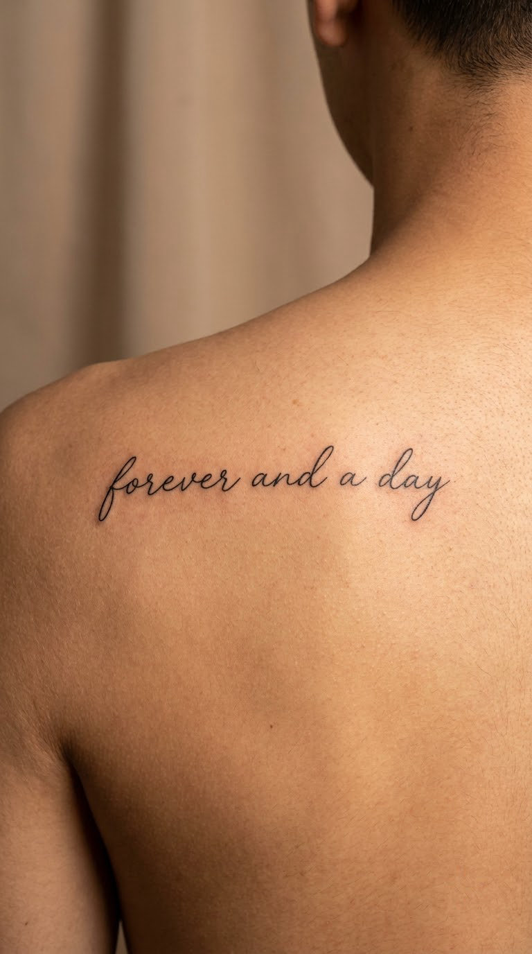
A full short sentence, usually five to eight words, set in two or three lines across the upper back between the shoulder blades. The lines are kept parallel and evenly gapped so the block reads as one rectangle of text rather than a drifting ribbon.
Longer text gets chosen when a single word is not enough, and the back gets chosen so the sentence can be complete without living in a place everyone reads. Most people who do this keep it hidden.
Placement: across the upper back, centred between the shoulder blades. Size: 6 to 9 inches (15 to 23 cm) wide. Style: restrained elegant script, fine line. Pain: medium, a long session over a broad flat area.
Ageing note: a long sentence has more opportunities to blur, so cap the word count. Make it yours: choose wording that would still be true to someone reading it in forty years.
15. Monogram with Flourished Capital
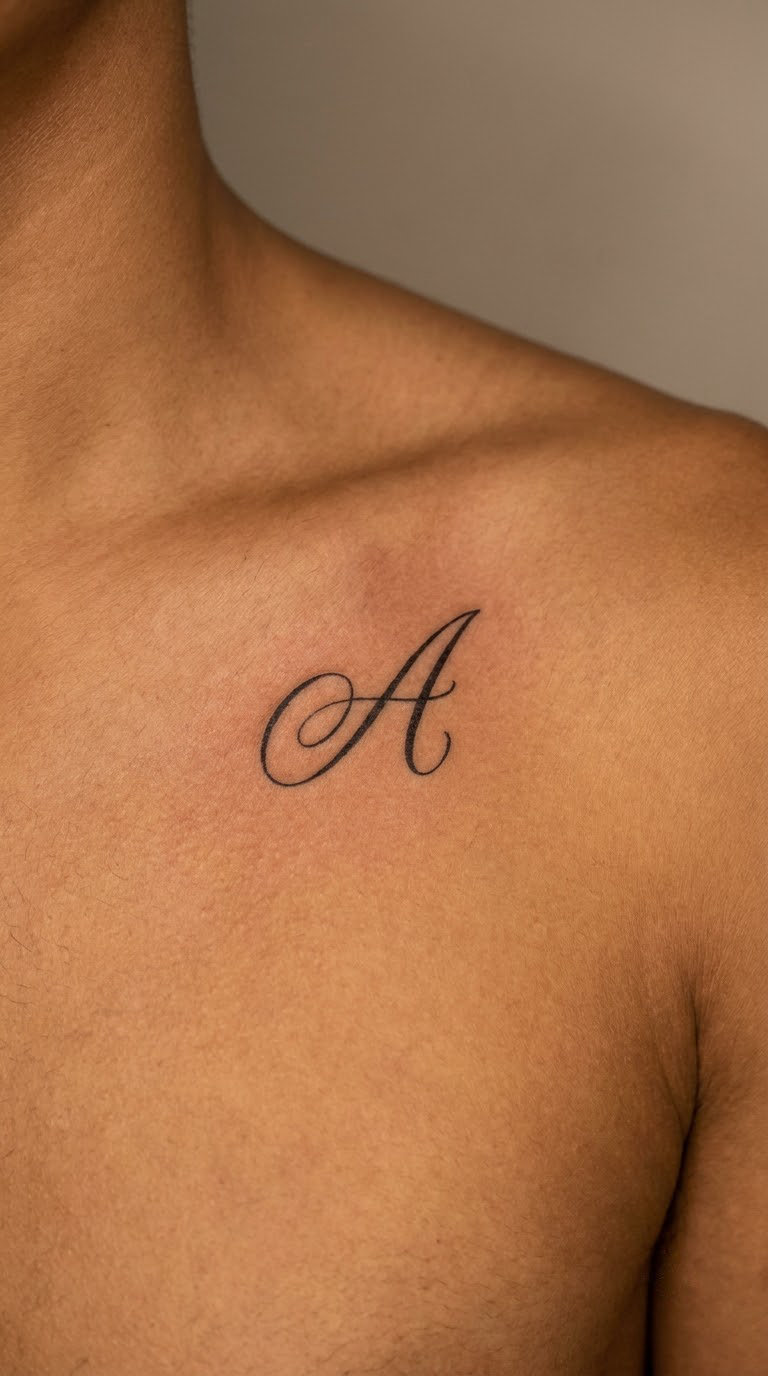
One capital letter with a generous flourish, either a long entry stroke or a looping exit, on its own. A single letterform does the same job as a whole word and reads at a distance, which is unusual for script.
Monograms get chosen for a surname, a family initial, or a first letter of a name, and they suit anyone who wants lettering with presence but no sentence attached.
Placement: chest near the collarbone, outer shoulder, or the back of the hand. Size: 1.5 to 2 inches (4 to 5 cm) tall. Style: ornate script capital, fine line. Pain: medium on the chest, high over the knuckles.
Ageing note: a single capital is one of the most durable script choices since there are no joins to fill in. Make it yours: commission the letterform from your own handwriting, not from a font.
16. Music-Inspired Lyric in Small Script
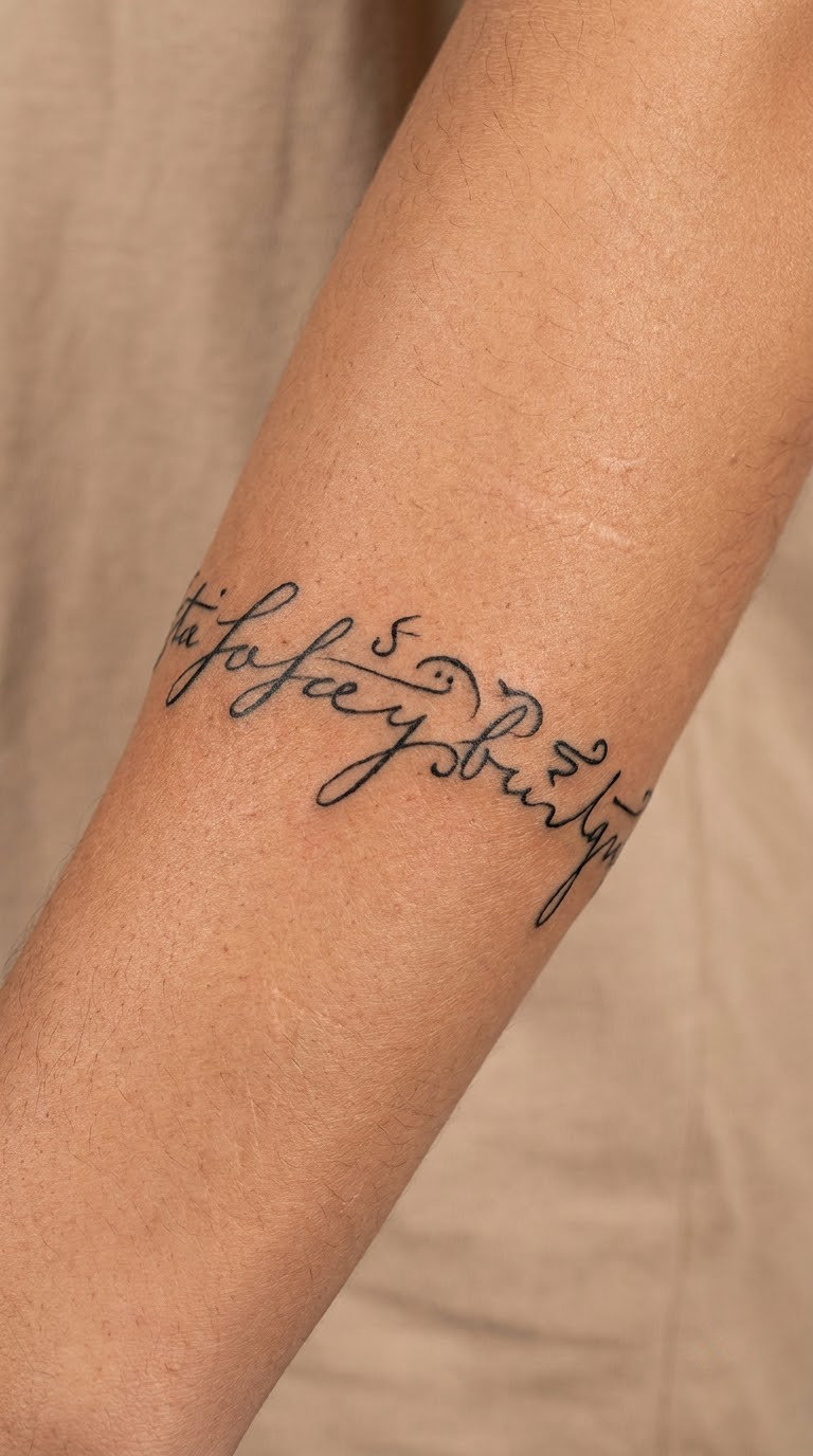
One line from a song, usually the refrain, in a small flowing script, sometimes with the artist and title in fine print-style capitals underneath. The lettering is written out longhand rather than traced from an album cover or a music video frame.
Lyrics get chosen because the line means something different to the listener than it did to the writer, which is the whole reason people carry them. The line is also usually altered slightly to fit the body.
Placement: inner or outer forearm, or the upper arm. Size: 2 to 3 inches (5 to 8 cm) for the lyric line. Style: small script, fine line. Pain: medium.
Ageing note: keep the credits line at least twice the height of the lyric so it does not sink into the script. Make it yours: redraw the line by hand so the tattoo is your version, not a reproduction.
17. Fountain-Pen Word in High Contrast
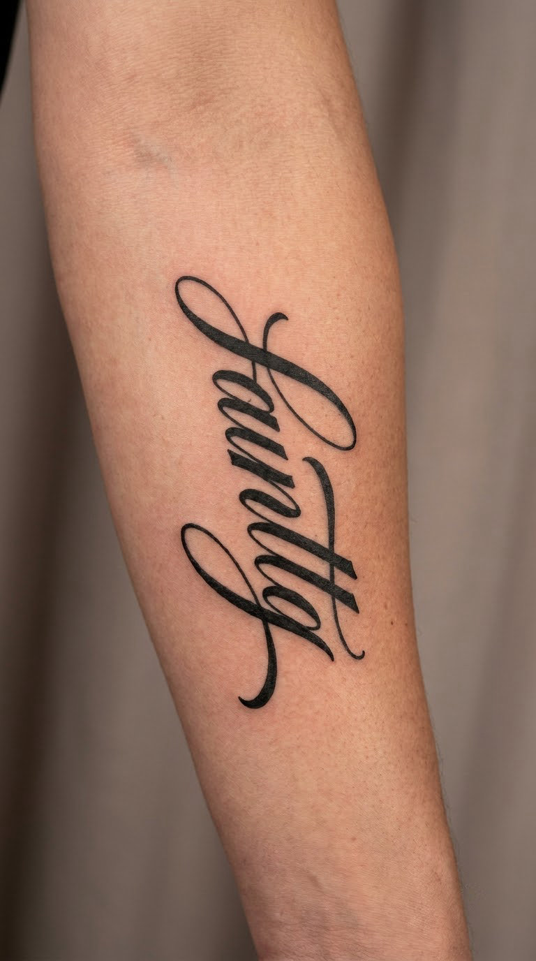
A single word in a high-contrast calligraphic script with heavy downstrokes and genuinely fine upstrokes, the way a fountain pen behaves on paper. It is bolder than most minimalist script and still counts as one line of type.
People choose this when delicate script feels too faint for them, or when the word itself is short and strong enough to carry the weight of a heavy stroke. It suits a forearm better than a wrist.
Placement: outer or inner forearm, rib, or the shoulder. Size: 2 to 3 inches (5 to 8 cm). Style: high-contrast calligraphic script. Pain: medium, and heavy passes need more pressure and time.
Ageing note: the thin upstrokes are the weak point here and will need at least one touch-up. Make it yours: ask for a slightly heavier upstroke than the font preview shows, one shade darker than feels right.
18. Vertical Script on the Side of the Ribs
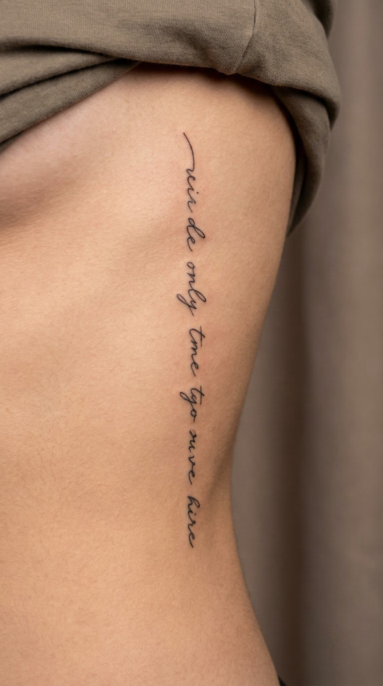
A short phrase in a narrow vertical column running along the side of the torso, letters upright, stacked with clean even gaps. Narrow columns are the most demanding script layout because there is no horizontal room to fix a problem by spacing.
The side ribs are chosen when someone wants a long piece of text that still reads as one line. The column turns vertical space into a horizontal sentence.
Placement: side of the ribs, from the underarm down toward the waist. Size: 3 to 5 inches (8 to 13 cm) tall. Style: narrow fine-line script. Pain: high, ribs are bone and skin with almost nothing between them.
Ageing note: the skin stretches here, so tight joins flatten faster than elsewhere. Make it yours: keep it to three or four words, laid out one word per row, and check the spacing on paper first.
19. Minimal Word with a Dotwork Accent
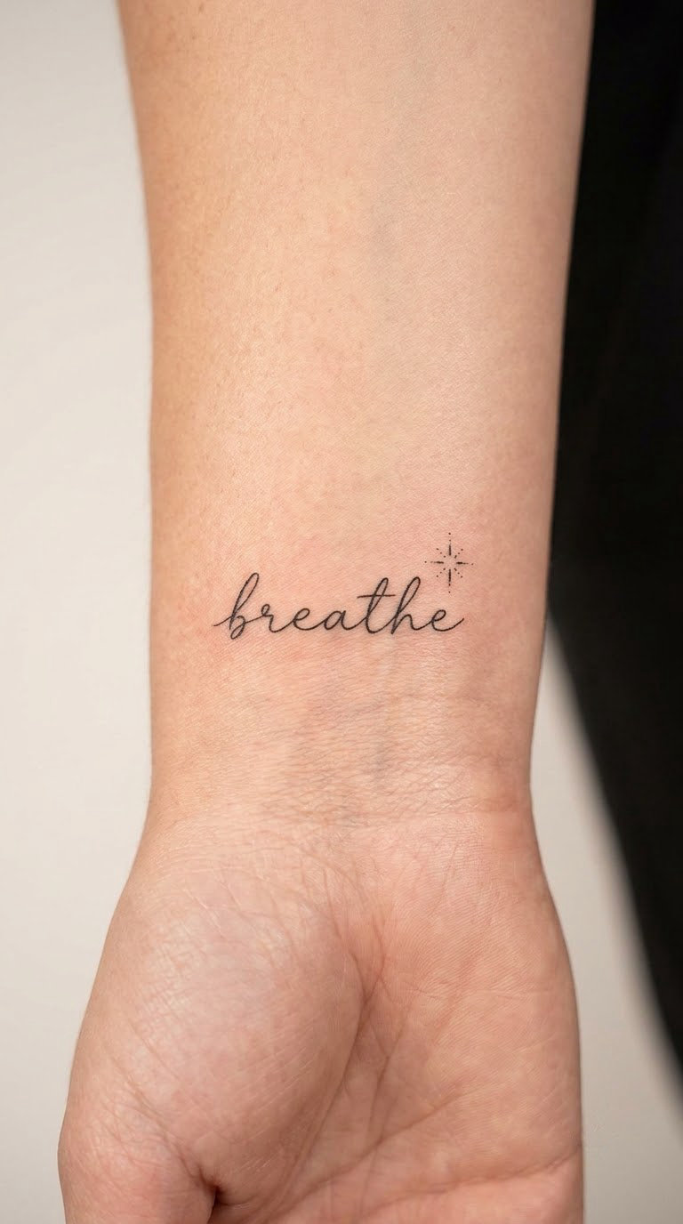
One cursive word with a small geometric accent, usually a dotwork star, four dots in a diamond, or a single seed of tiny dots, placed at the end of the word where a period would sit. The accent stays under a quarter inch.
Accents get added when the word alone feels unfinished, and the second element gives the eye a fixed point to land on. It is the smallest possible step beyond pure minimalist lettering.
Placement: inner or outer wrist, behind the ear, or the ankle. Size: 1.5 to 2 inches (4 to 5 cm) for the word, accent about 0.25 inch. Style: minimal script with dotwork. Pain: low to medium, and dotwork is quick because each dot is a single tap.
Ageing note: individual dots can fade out unevenly, so ask for a slightly larger dot size. Make it yours: use a constellation of three dots, or the dot count matching a date that matters to you.
20. Soft Grey Watercolor Word
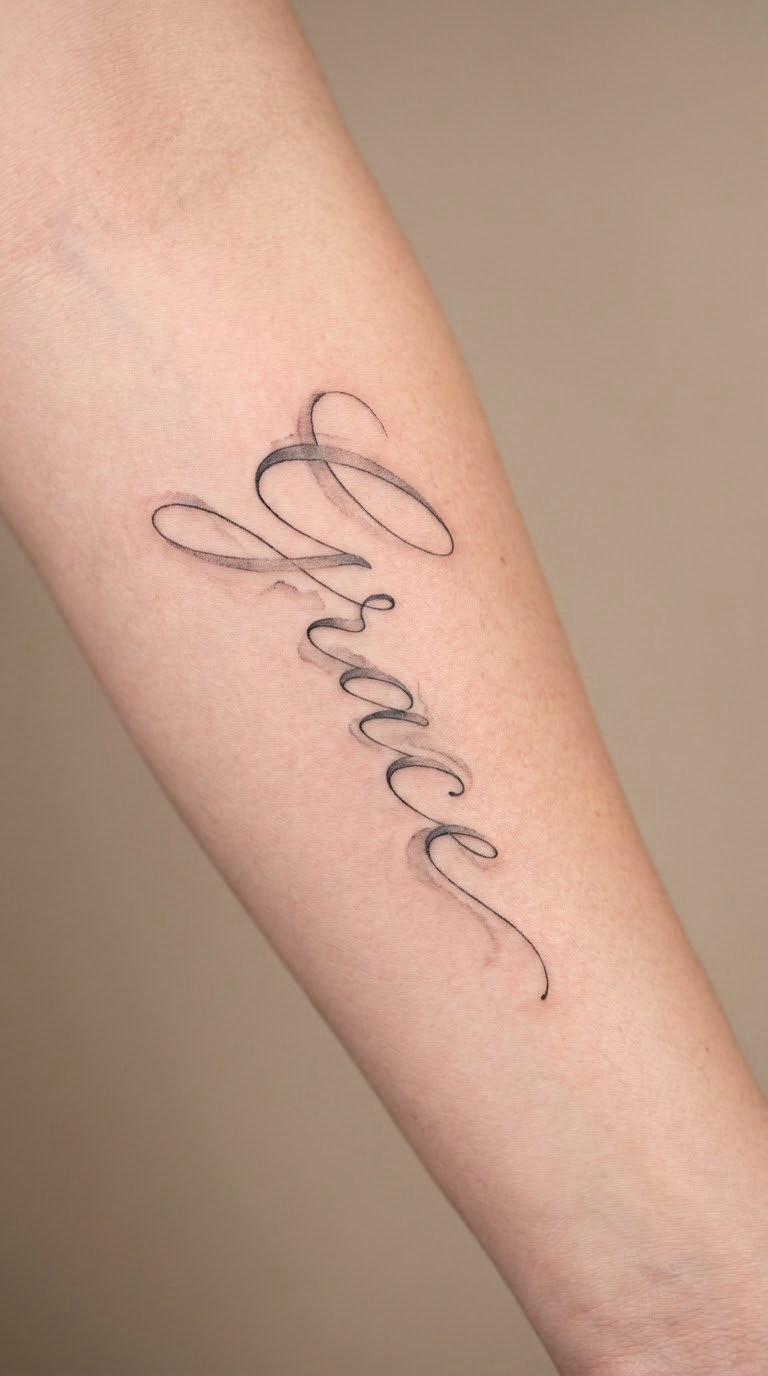
A word in flowing script with translucent grey washes bleeding out past the letter edges, while the lettering itself stays in fine black outline. The wash is a soft halo, not a filled shape, so the word still reads cleanly.
This is the gentlest version of a quote or a name, and it gets chosen when black at full strength feels too stark. It is the one entry here where the technique, not the wording, is the point.
Placement: forearm, upper arm, or the shoulder. Size: 2.5 to 3.5 inches (6 to 9 cm) so the wash has room. Style: soft grey watercolor with black fine line. Pain: medium, and grey washes mean more passes over the same skin.
Ageing note: grey pigment fades unevenly and faster than black, so expect the halo to soften noticeably. Make it yours: keep the wash to one colour, since two greys on skin usually turn muddy.
21. Connected Script Ring
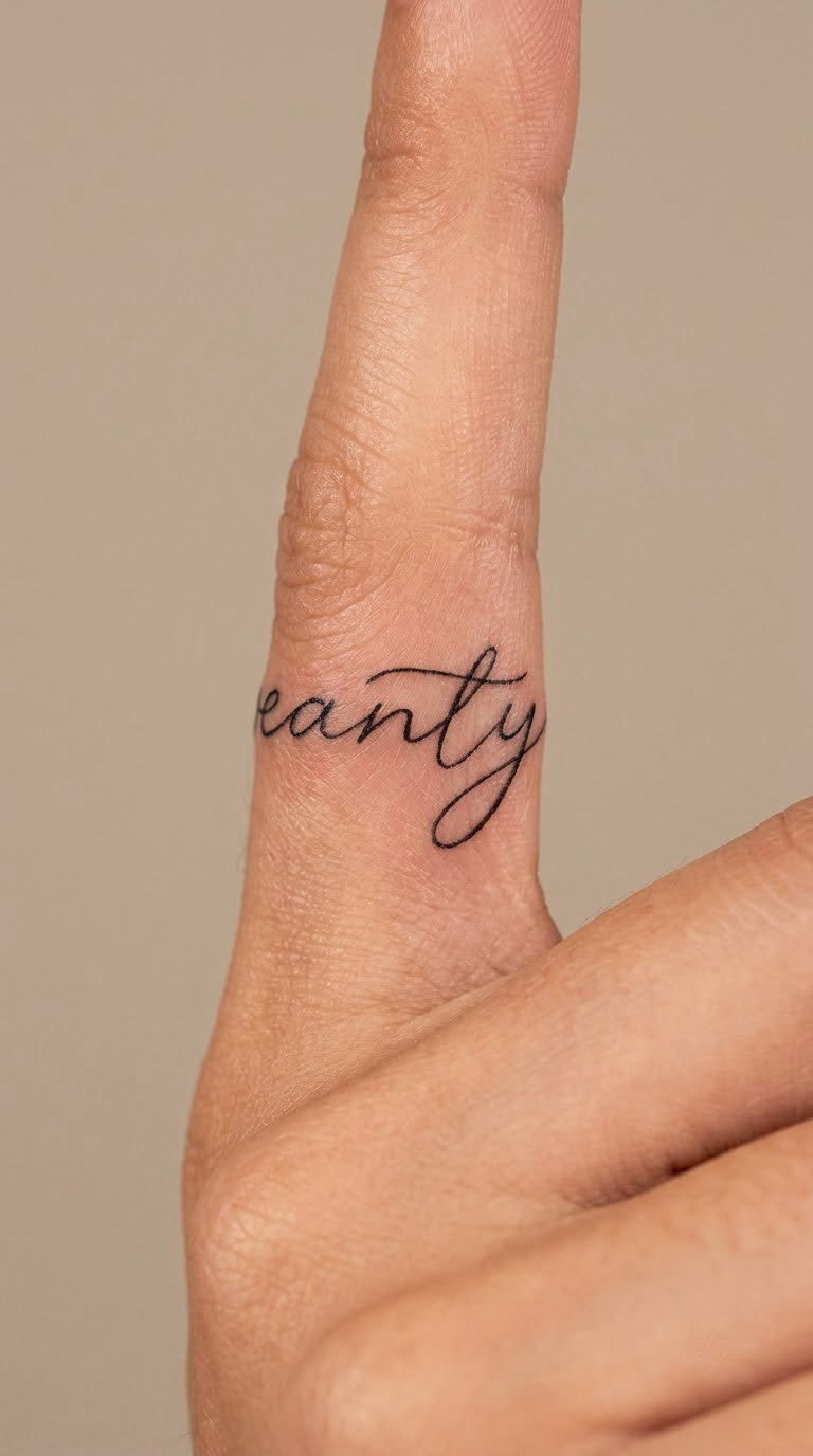
A short word, a date, or a single initial written in connected script and wrapped around a finger like a ring, with the first and last letters meeting neatly. Finger wrapping means the design has to be redrawn in a smaller diameter than any screen version.
Ring scripts get chosen as worn jewellery that never comes off, and because the repetition of the word around the finger rewards a close look. Matching rings on different fingers are common.
Placement: ring finger, middle finger, or thumb. Size: about a third of an inch (8 mm) tall, a full wrap of the finger. Style: connected fine-line script. Pain: high, bone across the whole joint and no muscle anywhere.
Ageing note: hands fade fast, and this one is visible in every photo you take. Make it yours: order a test print at actual size and hold it against your finger before the stencil goes on.
22. Curved Name Over the Shoulder
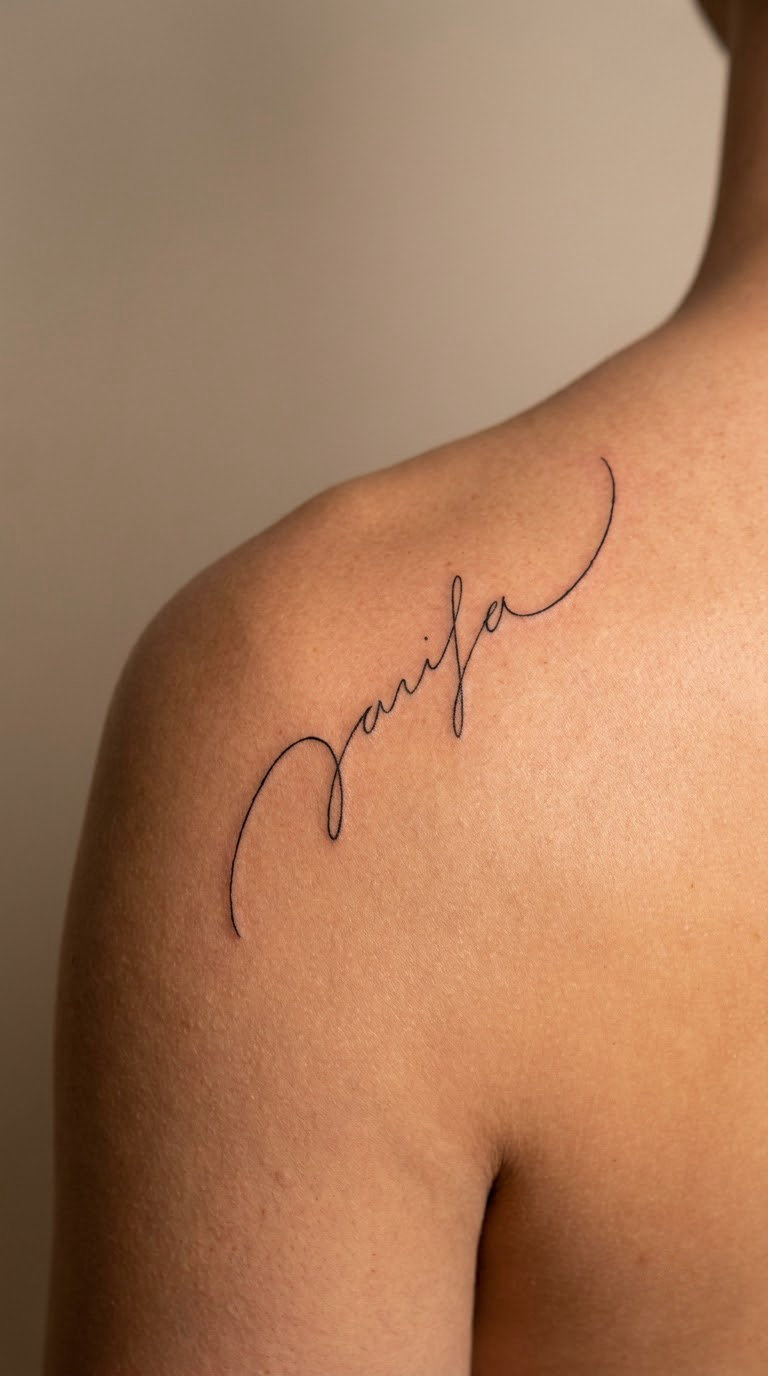
A name in a light script arched over the top of the shoulder so the letters follow the dome of the muscle and disappear toward the upper back. The word is drawn to the curve, not stamped on and bent afterwards.
Shoulder names get chosen when a wrist piece would be too public, and the arch makes the text visible from the side without announcing itself from the front.
Placement: top of the shoulder, running front to back over the deltoid. Size: 3 to 4 inches (8 to 10 cm) along the arch. Style: light script, fine line. Pain: medium, and the curve means the artist works in short sections as the skin changes shape under the arm.
Ageing note: the shoulder is a common sleeve starting point, so leave room if a sleeve is a maybe. Make it yours: have the artist trace the actual shoulder line with a pen before lettering, so the arch matches your build.
23. Tiny Script on the Sternum
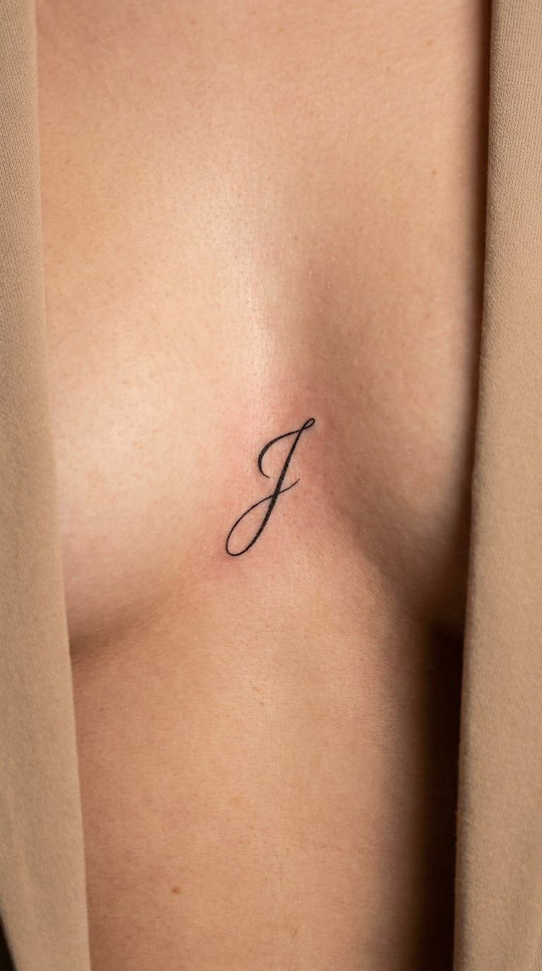
A single word or initial placed between the collarbones, running down the centre line of the upper sternum. Vertical script here needs to be compact and centred, because any drift shows immediately against that straight bone.
Sternum lettering is chosen for how it reads from above and in a fitted top, and because the location carries a certain gravity without saying anything. Initials and one-word mantras both work here.
Placement: upper sternum, between the collarbones, on the vertical centre line. Size: 1 to 1.5 inches (2.5 to 4 cm) tall. Style: minimal fine-line script. Pain: medium to high, bone directly under the skin, though the area is small.
Ageing note: cleavage and movement stretch this area constantly, so open spacing matters more here than anywhere. Make it yours: draw the composition mirrored in a photo first, since that is how you will read it in a mirror.
24. Blackwork Script Statement
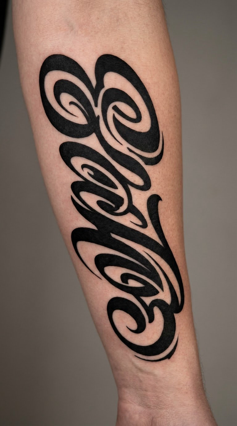
A short statement in script rendered as blackwork: heavy filled downstrokes, sharp negative-space cuts where letters meet, and dramatic capitals that anchor the composition. The joins are chiselled out of solid black rather than drawn as fine lines.
Blackwork statements get chosen when a fine-line version would read as too quiet, and they suit someone adding to an existing blackwork collection. This is the boldest entry here and the least minimal in execution, even though the design is still only words.
Placement: outer forearm, upper arm, or the calf. Size: 4 to 7 inches (10 to 18 cm). Style: blackwork script. Pain: medium to high, long solid fills take more time in one sitting.
Ageing note: solid black holds up better than any script in this list; the risk is the opposite, chunky areas around a knuckle. Make it yours: cap the statement at four words and let one capital carry the whole piece.
How to Choose the Right Design
If you take one thing from this list, take the sizing rule. Everything else is a preference, but a script that is too small for its placement will blur no matter how careful the artist is. Ask to see the design at final size, printed, before the stencil goes on. A screen at 100 percent tells you nothing.
Choose for the body part, not the font. Wrists, fingers, and the sternum take nothing longer than one or two words. Flat, broad areas like the forearm, upper arm, and back can carry a phrase. Curved, bony areas like the ribs and collarbone need shorter text and wider spacing, because the line will follow the curve rather than sit on top of it.
Pick the weight before the style. If a script’s upstrokes are hairline thin in the font preview, ask for them a shade heavier. Thin upstrokes fill in during healing, and the letter shapes merge. Monoline script with an even weight is the safest choice for small work; high-contrast and romantic scripts are prettier on paper and need more room than people expect.
Limit the flourishes. One decorated capital per design is plenty. Every capital in a swashy script turns the composition into noise, and the decorative parts are the first to blur.
Check spelling before the stencil. Read the artist’s drawing yourself, letter by letter, out loud. Meaningful names and quotes are where the permanent regrets come from, and the fix takes two minutes. If you are combining pieces, our [heartbeat tattoo ideas with meaning](https://thewe.cc/heartbeat-tattoo-ideas-with-meaning/) covers the matching-piece side of that.
Look at the whole collection. If you already have tattoos, check how the new script sits beside them. Light fine line next to a bold blackwork piece looks thin rather than delicate, and it is much harder to add to later. A tattoo artist can tell you in a minute whether the line weight will hold up next to what you have.
Cost and Session Time
Most US shops charge by the hour for lettering, typically somewhere between 80 and 200 US dollars per hour, with the rate shaped heavily by the city and by how specialised the artist is. Freehand custom lettering sits at the upper end of that range, because the design is drawn for your words and your placement rather than traced from a file.
As a rough guide, a small single word on the wrist or a date is often 100 to 200 dollars in total, a short phrase on the forearm usually runs 200 to 400, and a larger quote or a back piece can go from 400 up into the thousands. Shop minimums are common, and plenty of shops set one that a small piece will never reach, which is a fair question to ask when you book.
Time and price together: a fine-line word is usually a single sitting of 30 to 90 minutes, a forearm phrase can run one to three hours, and a large back statement is more likely to be split across two sessions. Plan the split rather than pushing through it, because a design that has to stop and restart often shows the seam.
Two things move the number. First, the artist: lettering is a specialist skill, and a tattooer who does nothing but script can command more than one who does everything. Second, the placement: ribs, spine, and collarbone take longer than flat, well-supported areas. If a quote comes back far below the shop’s usual rate, the design is probably being traced rather than drawn, and that is where spelling errors creep in.
Aftercare Basics
Follow your artist’s aftercare instructions first. They know how deep they went and how much ink is in the skin, and their advice takes priority over anything general written here.
After that, keep it simple. Wash gently with lukewarm water and unscented soap twice a day for the first few days, pat dry with clean hands, and do not scrub or soak it.
Protect it from the sun for the first couple of weeks. Fresh ink fades and fades unevenly under direct exposure, and this matters more for a delicate script than for a solid black piece.
Skip the friction. Loose clothing over the area, no tight waistbands across fresh forearm or rib work, and nothing scratching at the forming scab.
Expect the usual settling. A line that looks slightly blurred or patchy in the first week often sharpens as the skin settles, which is exactly when people panic. Do not judge the legibility until it is fully healed.
Contact your artist, not the internet, if something looks off after healing, if a letter has genuinely merged, or if the skin is behaving in a way that worries you. Bring a photo of the healed area and your artist will tell you honestly whether it needs a free or paid touch-up.
Frequently Asked Questions
Will a cursive tattoo still be readable in ten years?
A well-scaled cursive tattoo with moderate stroke weight usually stays readable for decades. Hairline-thin upstrokes are the real risk: they fill in during healing and blur faster. Ask for upstrokes a shade heavier than the font preview shows, keep single words above 1.5 inches, and plan a touch-up around six months. Wrist, finger, and behind-ear work fades first, and sun exposure speeds it up.
Why do cursive tattoos turn to mush after healing?
Script fails at the joins and the thinnest parts of each letter. As ink settles into skin, those points swell slightly and neighbouring strokes touch, so an e and an o start sharing a wall and the word stops reading. A heavily decorated script with a dramatic capital on every word is the worst case. Simple letterforms, even stroke weight, and generous spacing between words are the reliable fix.
What font is best for cursive tattoos?
For a small tattoo that must last, an even-weight monoline script is the safest choice because every stroke is the same thickness and nothing can fill in unevenly. For a forearm or back piece, a moderate-contrast calligraphic script looks better and has room to spare. Avoid anything with hairline upstrokes under a quarter inch tall, and one decorated capital per design is plenty.
Should I bring a font printout or let the artist design it?
Bring it, but treat it as a direction rather than an instruction. A mockup pulled from a screen or saved off a design board is drawn for a flat page, so the artist will need to redraw it to fit your body, and a direct trace of a stock font is how misspellings get inked. Ask for the design drawn, read it yourself letter by letter before the stencil, and approve the placement on your body first.
Do cursive tattoos hurt more than other lettering?
Not because they are script. Pain follows placement, skin thickness, and how long you sit still. Ribs, the spine, the collarbone, and fingers rate high because bone sits close under thin skin. The wrist and inner forearm rate low to medium. Session length matters too, and a long fine-line piece on the forearm becomes uncomfortable well before the nerve endings do.
Conclusion
If this is your first tattoo, start with number one or number ten: a single name or a set of coordinates in fine line at around two inches, somewhere on the wrist or inner forearm. It is a small commitment, it heals in a predictable way, and it teaches you how your skin takes ink before you ask for anything bigger.
If you already have tattoos and want a statement, number 24 or number 14 is the route: a blackwork script statement or a short sentence across the upper back, both of which have the space to carry longer wording without turning to mush.
Whichever one you land on, pick wording you would still be glad to read out loud, and check it letter by letter before anything is stenciled. These 24 cursive font tattoo ideas are a starting point for that conversation with your artist, not a substitute for it.