
24 Kids Initials Tattoo Ideas (September 2026) – Small & Simple
Kids initials tattoo ideas are everywhere online, and the reason is simple: initials are the shortest way to keep someone’s name with you. A parent’s back-of-arm letter, a sibling’s initials on a wrist, a grandmother’s two letters behind an ear. These designs stay readable at sizes a full name could never hold, which is why they work on small, bony places that reject almost any other tattoo.
What separates a good one from a plain letter is proportion. A single initial at half an inch reads clearly from across a room, while a name squeezed into the same space turns to mush. The 24 designs below each come with a realistic size, a placement that suits the shape, and an honest note about how the lettering looks in fifteen years. I have leaned on what people actually choose and what ages well, not on what photographs well for a single afternoon.
Kids Initials Tattoo Ideas: Quick Guide
Read the table first, then jump to the design that caught you. Sizes are real, measured in inches across the widest part of the design, and pain is rated for the suggested placement on a 1 to 10 scale. Designs marked high pain sit near bone, on a rib or a knuckle, and most of them are worth it anyway.
| Idea | Style | Best placement | Size | Pain |
|---|---|---|---|---|
| 1. Linked sibling initials | Fine line | Inner forearm | 1.5 in wide | 3 |
| 2. Birth date and initial | Minimal script | Inner wrist | 2 in tall | 4 |
| 3. Initial with star | Fine line blackwork | Outer forearm | 1.5 in | 3 |
| 4. Parent and child initials | Minimal blackwork | Upper inner arm | 2 in | 3 |
| 5. Initials in an infinity loop | Continuous line | Inner wrist | 1.5 in | 4 |
| 6. Rainbow initials | Colour fine line | Outer forearm | 2 in | 4 |
| 7. Initials inside paw prints | Fine line | Outer wrist | 2 in | 4 |
| 8. Floral initial wreath | Botanical fine line | Inner forearm | 2 in | 3 |
| 9. Soft gradient lettering | Blackwork gradient | Forearm | 2.5 in tall | 4 |
| 10. Single initial and heart | Fine line | Inner wrist | 1.5 in | 4 |
| 11. Three sibling initials | Fine line | Inner forearm | 2.5 in wide | 3 |
| 12. Initials with house number | Monogram | Outer wrist | 2 in | 4 |
| 13. Crescent moon and stars | Fine line | Inner forearm | 2 in | 3 |
| 14. Sunflower-wrapped initials | Botanical fine line | Outer forearm | 2 in | 4 |
| 15. Jersey number with initials | Bold block | Outer forearm | 2.5 in | 3 |
| 16. Initials over a paint stroke | Colour blackwork | Inner forearm | 2.5 in wide | 3 |
| 17. Stacked script initials | Handwritten script | Inner wrist | 1.5 in tall | 4 |
| 18. Varsity block initials | Traditional block | Forearm | 2 in | 3 |
| 19. Initials from an open book | Fine line illustrative | Inner forearm | 2 in | 3 |
| 20. Coordinates with initials | Micro lettering | Outer wrist | 2 in | 4 |
| 21. Initials on a kite | Fine line illustrative | Outer forearm | 2.5 in tall | 3 |
| 22. Pencil-stroke initials | Fine line | Wrist | 2 in | 4 |
| 23. Musical note with initials | Fine line | Inner forearm | 1.5 in | 3 |
| 24. Cursive name and final initial | Handwritten script | Inner wrist | 2.5 in wide | 4 |
1. Linked Sibling Initials
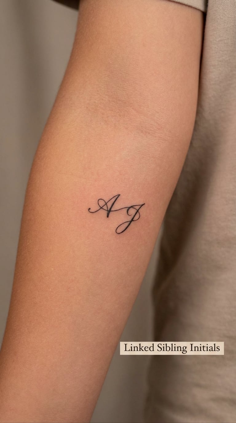
Two initials joined by a single hairline stroke, letterforms leaning slightly toward each other. Nothing is shaded, nothing is filled, and the whole thing fits in the span of three fingers.
People choose this one because siblings share everything already. The line between the letters is the point: two people, one mark, and it stays uncluttered no matter how the skin curves.
Placement: Inner forearm, a few inches above the wrist crease, or the flat of the outer forearm for larger muscle. Size: 1.5 to 2 inches wide. Style: Fine line, single needle weight. Pain: Low, around 3 out of 10 on the forearm. A single-needle stroke fades faster than a filled letter, so expect the connecting line to soften before the letters do.
Make it yours: Add a tiny birth year under the line in the same weight, or match the pair with a matching piece on your own forearm in the same spot.
Kids Initials Tattoo Ideas: Linked Initial Placement and Proportions
Proportion decides whether linked initials read as one design or as two letters that drifted apart. Leave about a quarter of the letter’s own width as the gap between letters, then run the connecting line through the lower third of both letters rather than straight across the middle, where it collides with the crossbar of an A or the bowl of a B.
Line weight matters as much as spacing. On an inner forearm the skin is soft and slightly mobile, so a very thin line can sink in over the forearm’s curve. Ask for a line that holds its width when the arm bends, and keep the design to a height where each letter is at least a quarter inch tall. Viewing distance is the last factor: if you want it readable at conversational distance, cap the letter count at two. Three linked initials need the flat of the upper arm.
2. Birth Date and First Initial
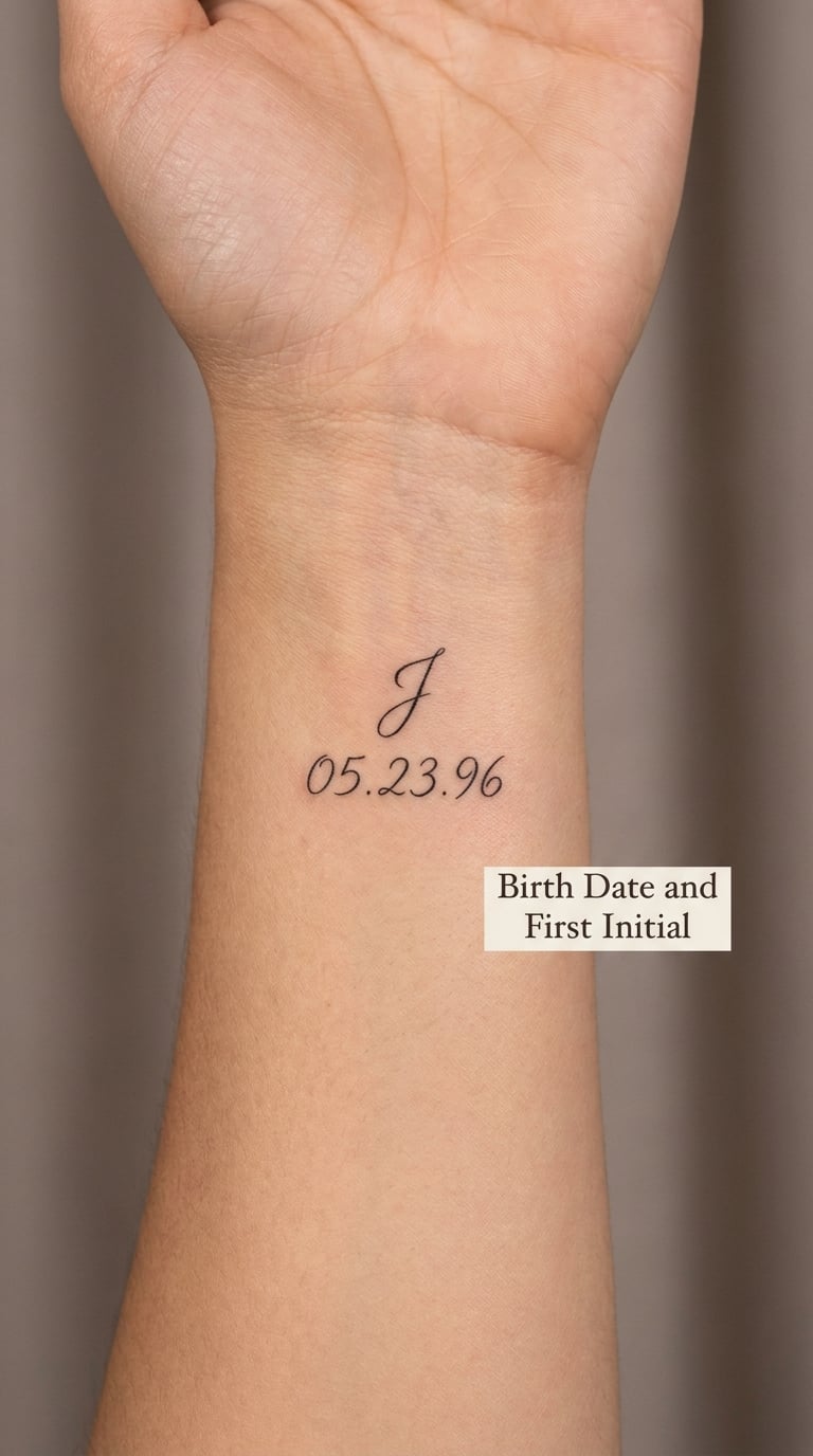
A single upright initial in clean script, with a birth date written in a smaller hand directly beneath it. The date is usually a month, a day and the year in short form, kept to one line.
This is the version most parents land on first, because the date turns a letter into a record. It is also the one people ask artists to spell twice, so get the date in writing before the stencil goes on.
Placement: Inner wrist, running along the forearm, or stacked under the collarbone. Size: about 2 inches tall as a stack. Style: Minimal script. Pain: Medium, around 4 out of 10, because the inner wrist is thin and sensitive. Script thins and blurs faster than block lettering, so ask for a slightly heavier hand and plan on a touch-up within the first year.
Make it yours: Use the child’s birth month in a small accent colour, or add a tiny coordinate line for the hospital.
3. Initial with Hand-Drawn Star
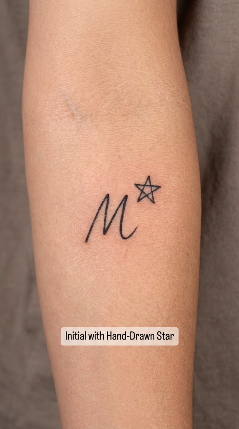
One initial, one five-point star, sized so the star sits at roughly the same height as the letter. The star is drawn with slightly irregular points, hand-worked rather than geometric, and it touches the initial at one edge so the two shapes share a line.
Stars get chosen for the people a parent loves and the people they lost, and for almost nothing else. That means the same star can turn into a memorial piece years later without a redesign.
Placement: Outer forearm, ankle, or behind the ear. Size: 1.5 inches across including both elements. Style: Fine line blackwork. Pain: Low, around 3 out of 10. Star points are where the line can dry out and drop a pixel, so a good artist doubles the point passes.
Make it yours: Swap the five-point star for a four-point sparkle, or add a small solid dot where the letter and star meet.
4. Parent and Child Initials
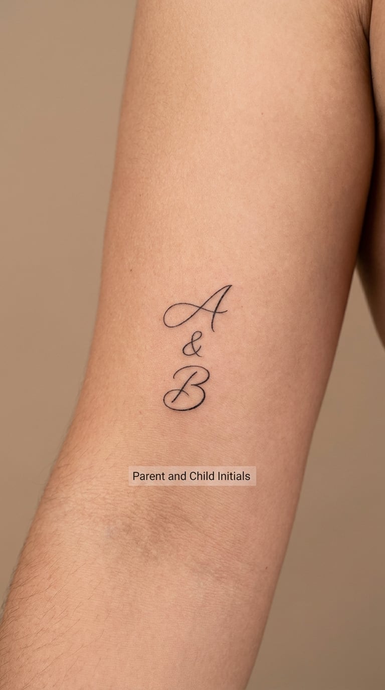
Two or three initials in a tight horizontal row, with the parent’s letter the same size as the child’s rather than a decorative frame around it. Simple sans-serif or a light serif, all in one weight.
Matching family sets are the most requested thing in the letters I have read about, and the mistake is always the same: the parent’s piece grows elaborate so it “stands out”, and then it never sits well beside the child’s. Keeping both plain is what makes the pair look intentional. If you want a fuller family piece to work alongside it, our 68 Meaningful Father Son Tattoo Ideas That Show Deep Love has layouts built for a whole set.
Placement: Inside of the upper arm, matching spot on both people. Size: about 2 inches. Style: Minimal blackwork, equal weight. Pain: Low, around 3 out of 10. Equal weight letters hold their edges far longer than a mix of thin script and solid fill.
Make it yours: Add a third initial in a different position when a sibling joins, or keep the same lineup and add a date underneath later.
5. Two Initials in an Infinity Loop
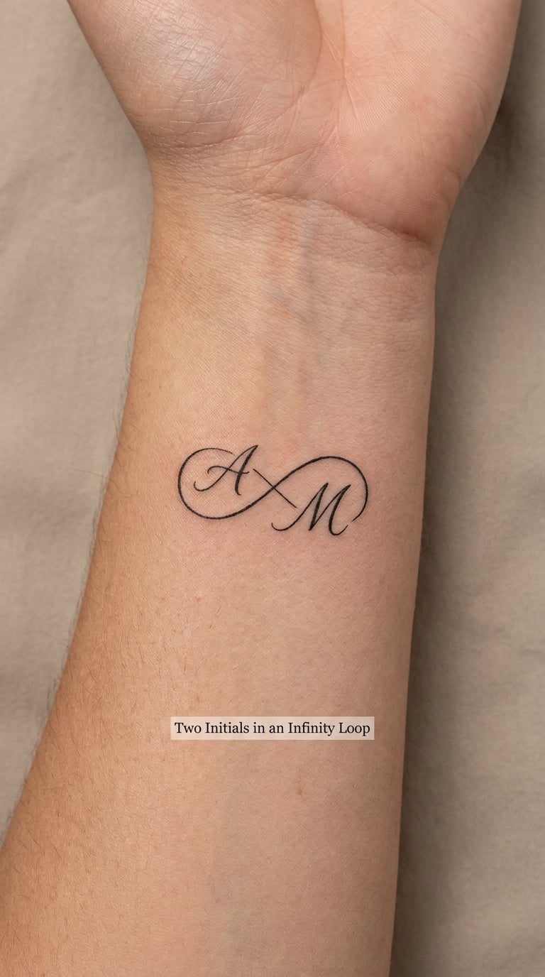
A continuous line that crosses itself to form an infinity shape, with the two initials sitting inside the loops rather than tangled through the crossing. The line stays even in width all the way around.
An infinity is the most chosen symbol here for long relationships that have not gone anywhere, which covers a lot of ground: a partner, a parent, a friendship, a child who will outlive you. It reads as one continuous line, which is what makes it work at small sizes.
Placement: Inner wrist, or the hollow just above the collarbone where the skin is flat. Size: 1.5 inches wide. Style: Continuous-line fine line. Pain: Medium, around 4 out of 10. The single crossing point is the part that softens first, and the tiny gaps where letters meet the loop can close up over the years, so keep the letters off the crossing itself.
Make it yours: Put the initial in one loop and a date in the other, or tint the line a single shade of colour so it reads as a modern graphic rather than a fine-line piece.
6. Rainbow Initials
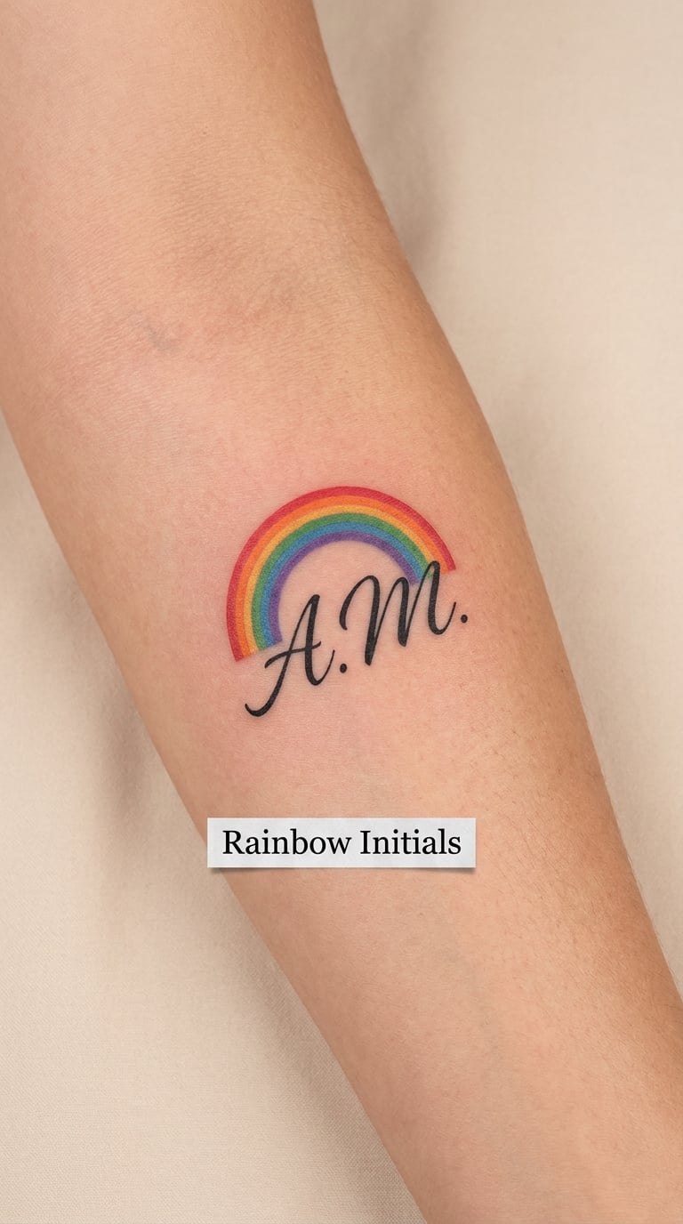
Two initials in solid black, framed above and around by a small rainbow arch built from six clean colour bands. No cloud, no shading gradients, just evenly weighted arcs.
Rainbows turn up for children in a way other symbols do not, and the arch shape does the work: it holds the letters in a frame without needing a border box, so the piece stays small.
Placement: Outer forearm, calf, or the upper arm. Size: 2 inches wide. Style: Colour fine line with black lettering. Pain: Medium, around 4 out of 10, since coloured bands mean more passes over the same skin. Yellow is the first colour to fade on skin and in sun, so ask the artist to load it heavier and keep the arch small enough that fading is not the first thing anyone sees.
Make it yours: Use the child’s birth month colours, or reduce the arch to three bands if you want a quieter look.
7. Initials Inside Paw Prints
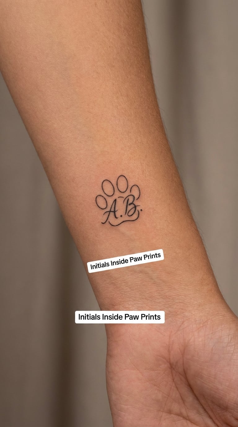
A small paw print in fine line with the two initials held in the negative space of the pad, or tucked directly beneath the toes. One pad shape, one set of toe beans, nothing else.
Plenty of people get a child’s initials with the family’s dog, and plenty more tattoo each child’s initial next to a paw so the piece can be joined later as a set of four.
Placement: Outer wrist, outer ankle, or the calf. Size: 2 inches. Style: Fine line illustrative. Pain: Medium, around 4 out of 10; the outer wrist is bony. Toe beans are the smallest elements in the design and they blur within a decade, which is usually fine because the initials carry the piece.
Make it yours: Add a paw for a second pet later, or use the child’s handprint instead of toes to keep the design purely about the kid.
8. Floral Initial Wreath
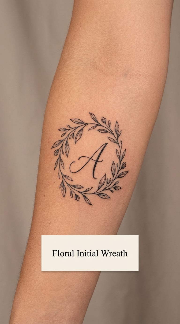
One initial with two small leafy sprigs curling around it, one on each side, leaving the top of the letter clear. Line weight thin, leaves filled with just enough grey to separate them from the letter.
Botanicals usually mean the birth flower or a plant the family grew, and that personal reason is the whole design. A dense bouquet around one letter turns into mud, so the version that works is the spare one.
Placement: Inner forearm, rib, or the back of the shoulder. Size: 2 inches. Style: Botanical fine line. Pain: Low to medium, around 3 out of 10 on the forearm and higher near the rib. Leaf tips and thin stems soften noticeably within ten years, so keep leaves broader than stems and skip hairline detail.
Make it yours: Swap in the birth flower, or use a sprig from a plant your family planted, drawn from a photo you bring to the appointment.
9. Soft Gradient Lettering
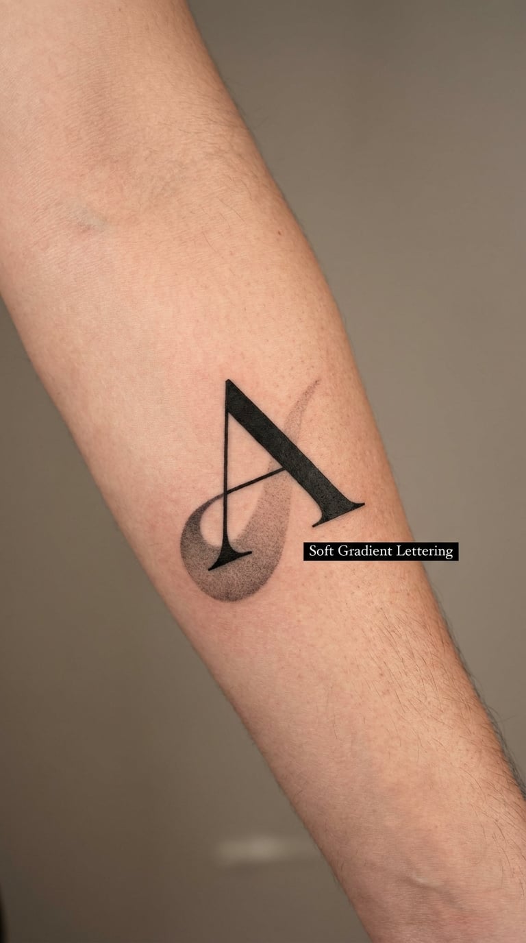
A single initial in solid black, with a soft grey fade dropping away beneath it like a shadow. No outline, no colour, just the contrast between a dense letterform and a light wash.
Gradients let one letter carry more visual weight than two thin ones would, which is useful when you want the design to register from a distance but keep only one name in it.
Placement: Forearm, upper arm, or calf. Size: 2.5 inches tall. Style: Blackwork gradient. Pain: Medium, around 4 out of 10; shading means repeated passes. The letter holds well, and the grey wash loses density first, so expect the fade to sit lower and lighter on an old piece than in a portfolio photo.
Make it yours: Add a matching faded initial for a sibling, spaced the same way along the arm, or run the fade downward so it reads like falling rain.
10. Single Initial and Heart
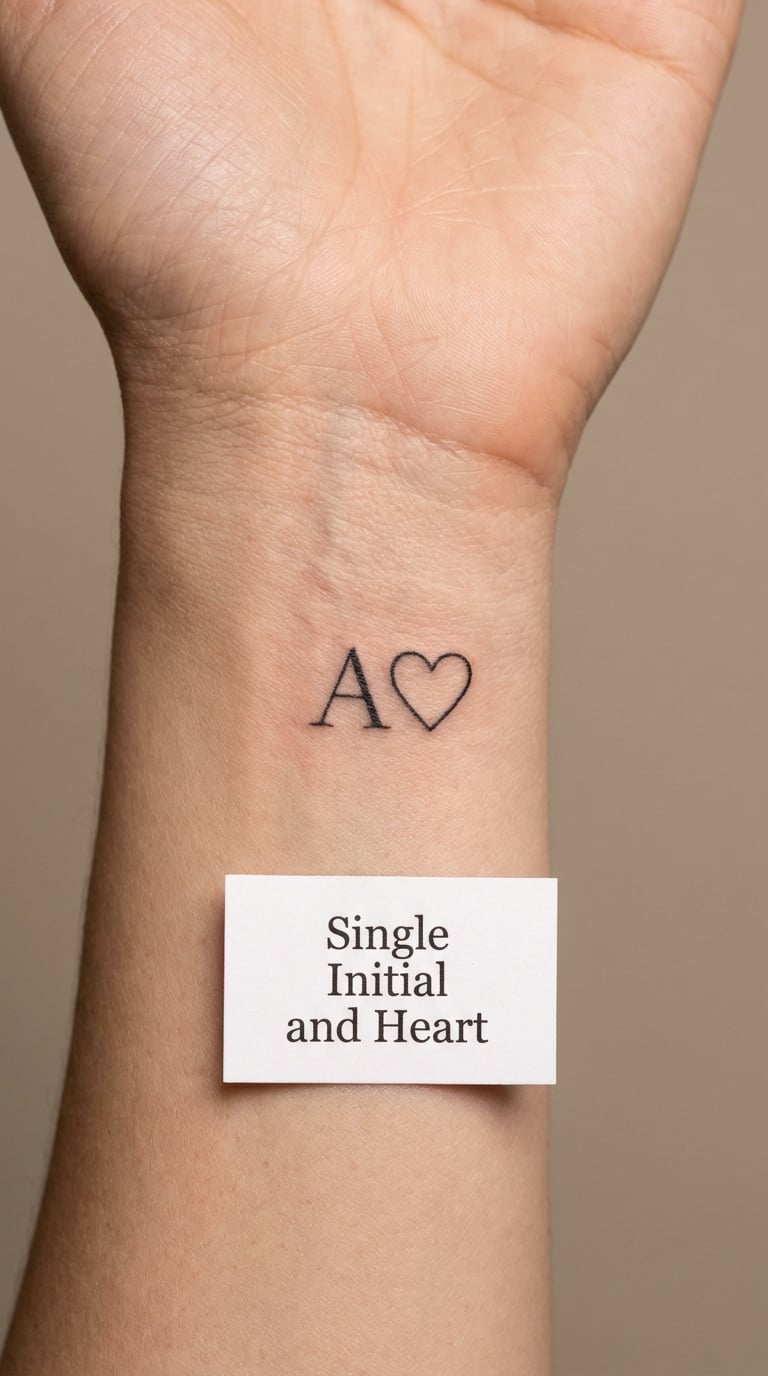
One letter and one heart outline, the heart drawn with a single continuous line and the two shapes side by side at equal height. No banner, no scroll, no name underneath.
The heart is the plainest way to say the obvious thing, and that is exactly why it lasts. It is also the one most likely to already be on someone’s wrist, so making the heart your own shape matters more here than usual.
Placement: Inner wrist, or the inner arm above the elbow. Size: 1.5 inches. Style: Fine line. Pain: Medium, around 4 out of 10 on the inner wrist. The heart’s inner corner is a pinch point where ink gathers, so it can blur slightly and make the shape read a little rounder with age.
Make it yours: Give the heart a hand-drawn irregularity so it is not a clip-art shape, or tuck a tiny date into the heart’s lower point.
11. Three Sibling Initials
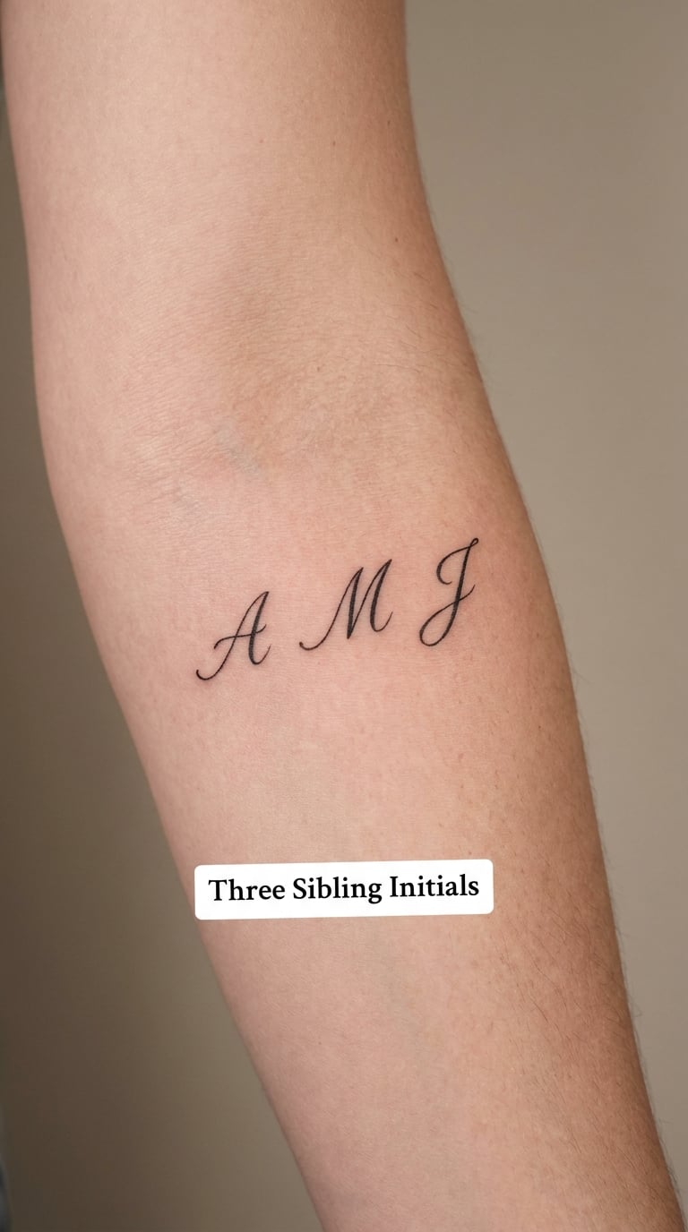
Three letters in a single horizontal row, evenly spaced, with the middle letter in a heavier weight so the eye lands in the centre. Everything sits on one baseline, nothing overlaps.
Three is where families of initials start to get crowded, and crowding is what makes initials unreadable. Even spacing and one consistent weight solve it in a way that nesting the letters does not.
Placement: Inner forearm or the flat of the upper arm. Size: 2.5 inches wide. Style: Fine line with one weighted centre. Pain: Low, around 3 out of 10. At this size each letter needs to stay about a quarter inch tall, and anything narrower turns to grey smudges within a decade.
Make it yours: Add a fourth initial in a second row below, or use birth order by stepping the letters down diagonally.
12. Initials as a House Number
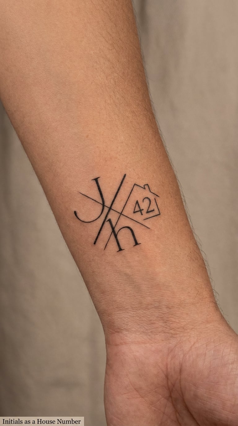
Two initials in clean linework crossed by a small house or street number, the number set in a plain numeral face. The crossing is deliberate rather than accidental, with the number laid over the letters.
A home tattoo is about place rather than a person, and pairing it with a child’s initials turns a street address into a keepsake. Families who have moved more than once tend to use the first home instead.
Placement: Outer wrist, inner forearm, or the arch of the foot. Size: 2 inches. Style: Minimalist linework monogram. Pain: Medium, around 4 out of 10. Numerals run narrower than letters and lose their counters first, so a solid slab numeral holds its shape better than an outline one.
Make it yours: Use your postal code instead of a street number, or add a single line for the year the family moved in.
13. Crescent Moon and Star Initials
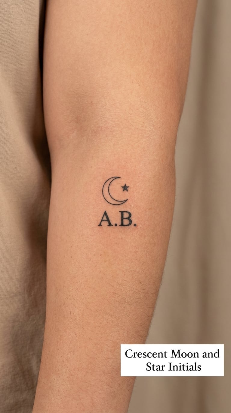
Two initials set below a slim crescent moon with one or two small four-point stars, the moon drawn as a clean arc with even thickness rather than a shaded blob.
The moon shows up for late-night babies and for the sky, and it is a quiet motif that does not fight the letters. Keeping the crescent narrow is what makes this work at wrist scale.
Placement: Inner forearm, behind the ear, or the ankle bone. Size: 2 inches. Style: Fine line. Pain: Low, around 3 out of 10; behind the ear runs higher because of the bone. Small star points and the moon’s inner curve are the first details to blur, so the piece keeps its silhouette long after the detail softens.
Make it yours: Add a third star only if you go bigger than 2 inches, or place the initials inside the crescent’s curve instead of beneath it.
14. Sunflower-Wrapped Initials
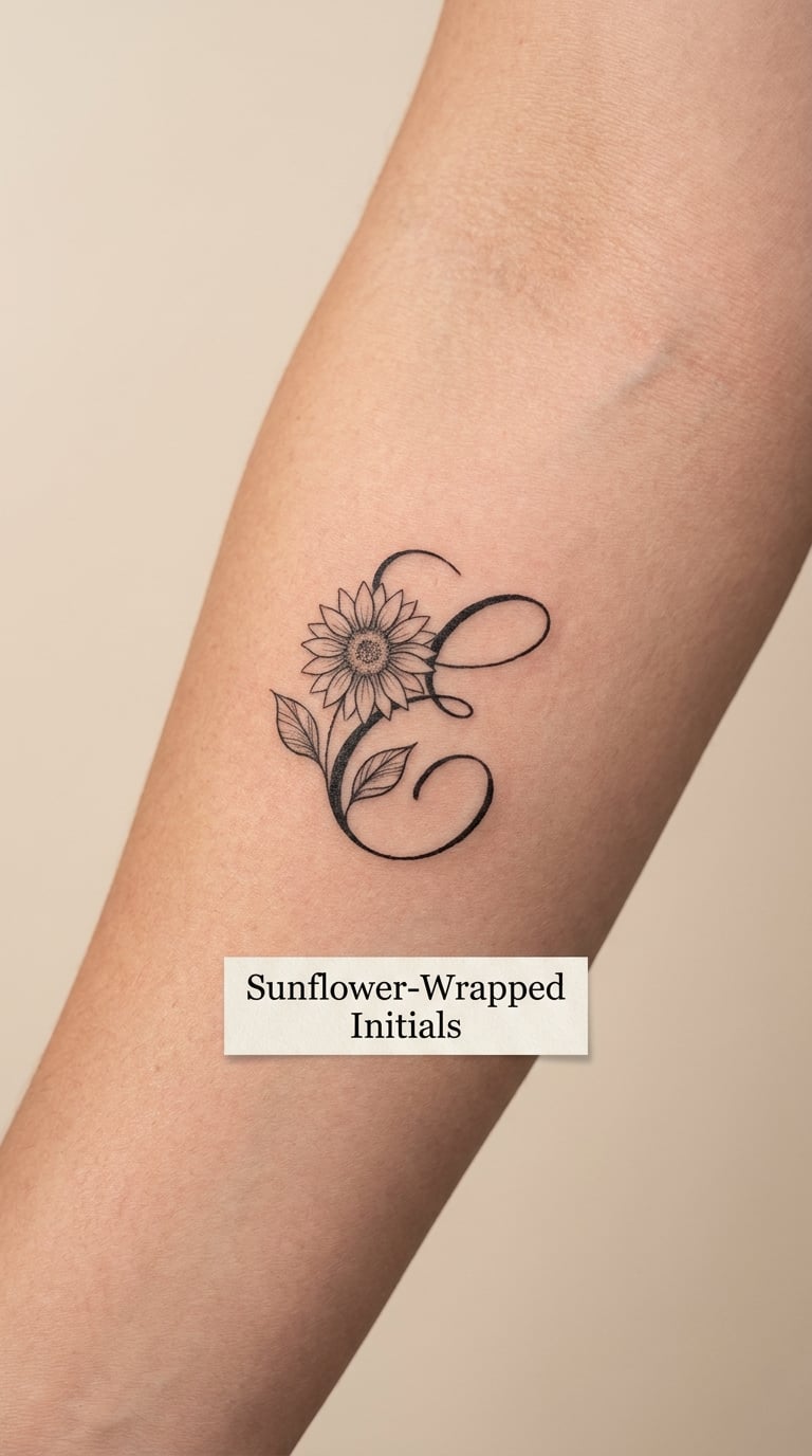
A single sunflower at a small scale, its centre filled with dotwork or stipple, wrapping one initial with two leaves. One bloom, two leaves, no extra stems trailing off the edge.
Sunflowers are chosen for a specific person, a birth flower, or simply a warm look that photographs well. One bloom gives you that warmth without the clutter of a garden.
Placement: Outer forearm, calf, or shoulder. Size: 2 inches. Style: Botanical fine line with a stippled centre. Pain: Medium, around 4 out of 10, since the flower head needs many small passes. Petal tips and stipple fade first, and the flower ends up looking like a soft dark circle, which still reads correctly as a sunflower.
Make it yours: Use the birth flower of the month the child was born, or add a small date in the gap under the bloom.
15. Jersey Number with Initials
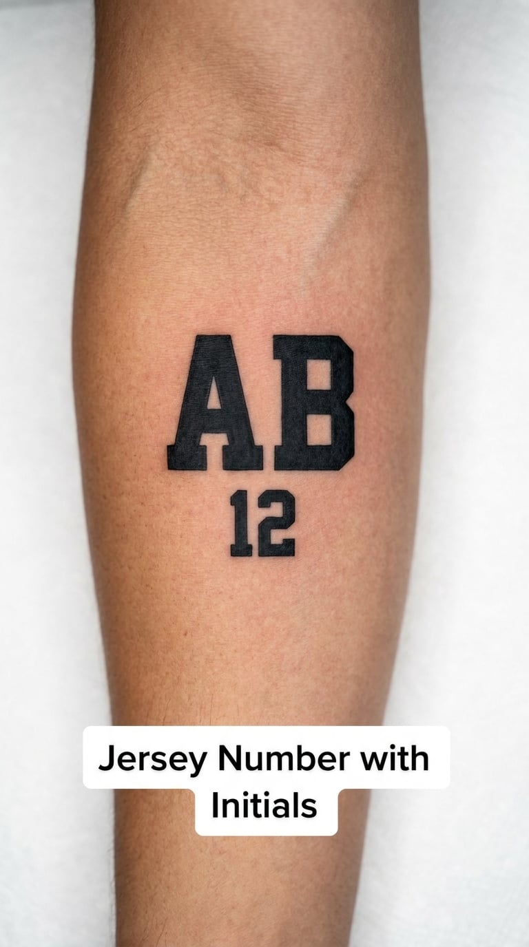
Two block initials stacked over a single number, both in the same athletic typeface, with the number roughly the same width as the letters. No team name, no crest, no colours.
Sports fans tattoo numbers, and pairing the number with a child’s initials turns a favourite player into a family one. Avoid anything that reproduces a league or club logo exactly; a plain number in a block face is the safe version.
Placement: Outer forearm, upper arm, or the calf. Size: 2.5 inches. Style: Bold block lettering. Pain: Low, around 3 out of 10. Block faces and solid numerals are among the most durable lettering styles, so this is a good pick if you want something that still looks deliberate in thirty years.
Make it yours: Use a retired number, or outline the number and fill the initials solid to separate the two elements.
16. Initials Over a Paint Stroke
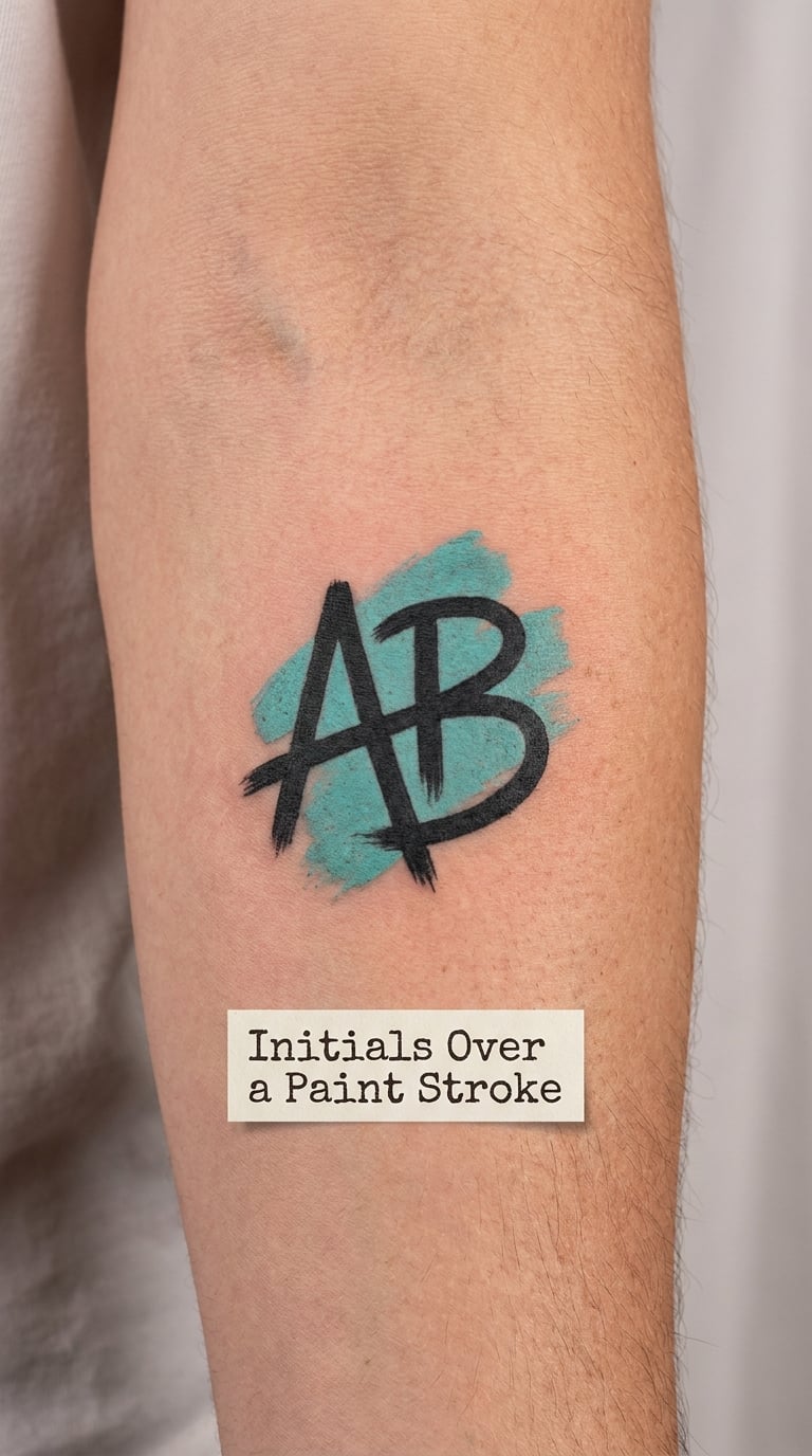
A short single-colour paint swipe with clean black initials laid across it, the letters breaking the top and bottom edges of the stroke so they read as sitting on top rather than inside it.
The paint stroke is a creative-leaning motif, and it is a good way to make one letter feel less bare without adding a symbol that carries meaning you did not intend.
Placement: Inner forearm, thigh, or the back of the shoulder. Size: 2.5 inches wide. Style: Colour blackwork, one accent colour. Pain: Medium, around 3 to 4 out of 10 depending on the spot. The swipe is the element that fades first, and a bright colour goes paler and patchier within a few years of sun exposure, so ask for a deeper tone and a tight edge.
Make it yours: Use a colour tied to the child’s room, or add a second thin swipe in a second colour offset behind the first.
17. Stacked Script Initials
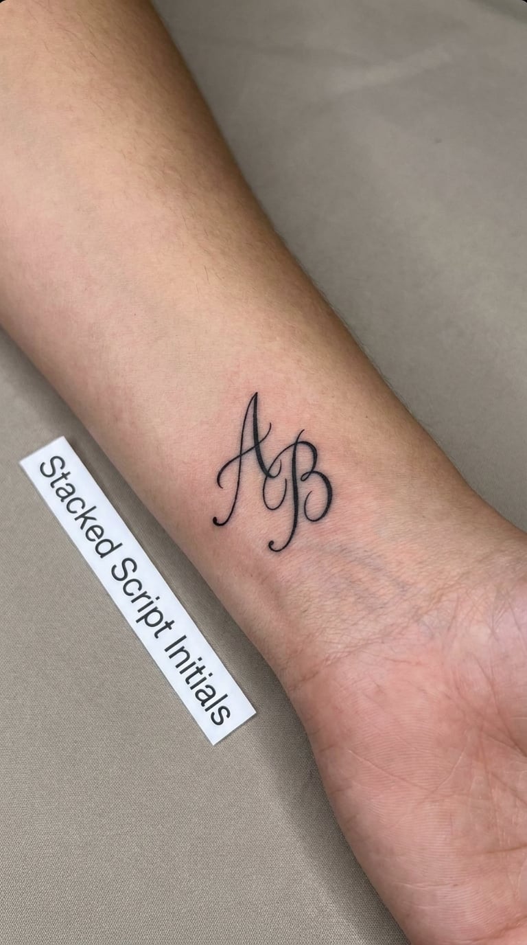
One or two initials written in a light handwritten script, stacked vertically with tight but even spacing, each letter the same width and centred on the one above.
A vertical stack uses far less width than a horizontal pair, which makes it the practical choice for wrists and ribs. Script is chosen for the handwriting look rather than the readability, and knowing that before you book matters.
Placement: Inner wrist, or vertically along the rib. Size: 1.5 inches tall. Style: Handwritten script. Pain: Medium, around 4 out of 10. Script loses the most definition of any lettering style on skin, so agree a heavier line weight up front and plan a touch-up in the first year, then roughly every five years after.
Make it yours: Have the artist letter it in the actual handwriting from a birthday card, or keep the first letter capitalised and the rest lowercase for a softer read.
18. Varsity Block Initials
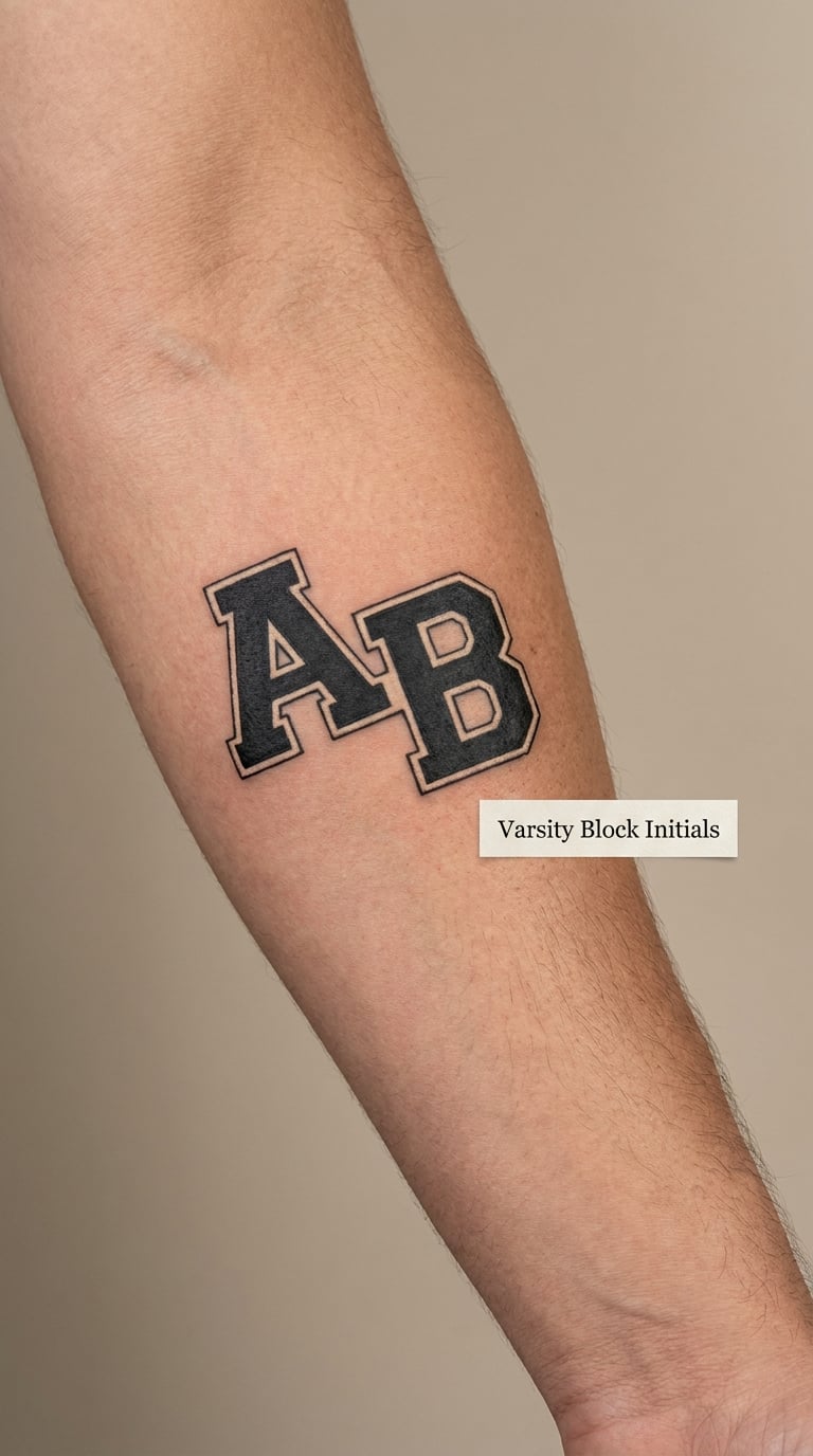
Compact block letters with slightly squared serifs and a thin outline in a contrasting tone, laid out side by side. The shape is the point, not the decoration.
Varsity lettering gets chosen by parents who want something bold and unfussy, and it is the most legible option for small placements. Cream or a muted tone inside the outline keeps it from looking like a cartoon.
Placement: Forearm, calf, or the upper arm. Size: 2 inches. Style: Traditional block with light outline. Pain: Low, around 3 out of 10. Solid fills and heavy outlines age better than almost any other lettering, so this is the low-maintenance choice. The secondary colour inside the outline fades first, and in a decade the letters read as solid blocks with a faint edge.
Make it yours: Add a small year underneath in a thinner weight, or use the child’s school colours for the outline rather than a shade from a palette.
19. Initials Emerging from an Open Book
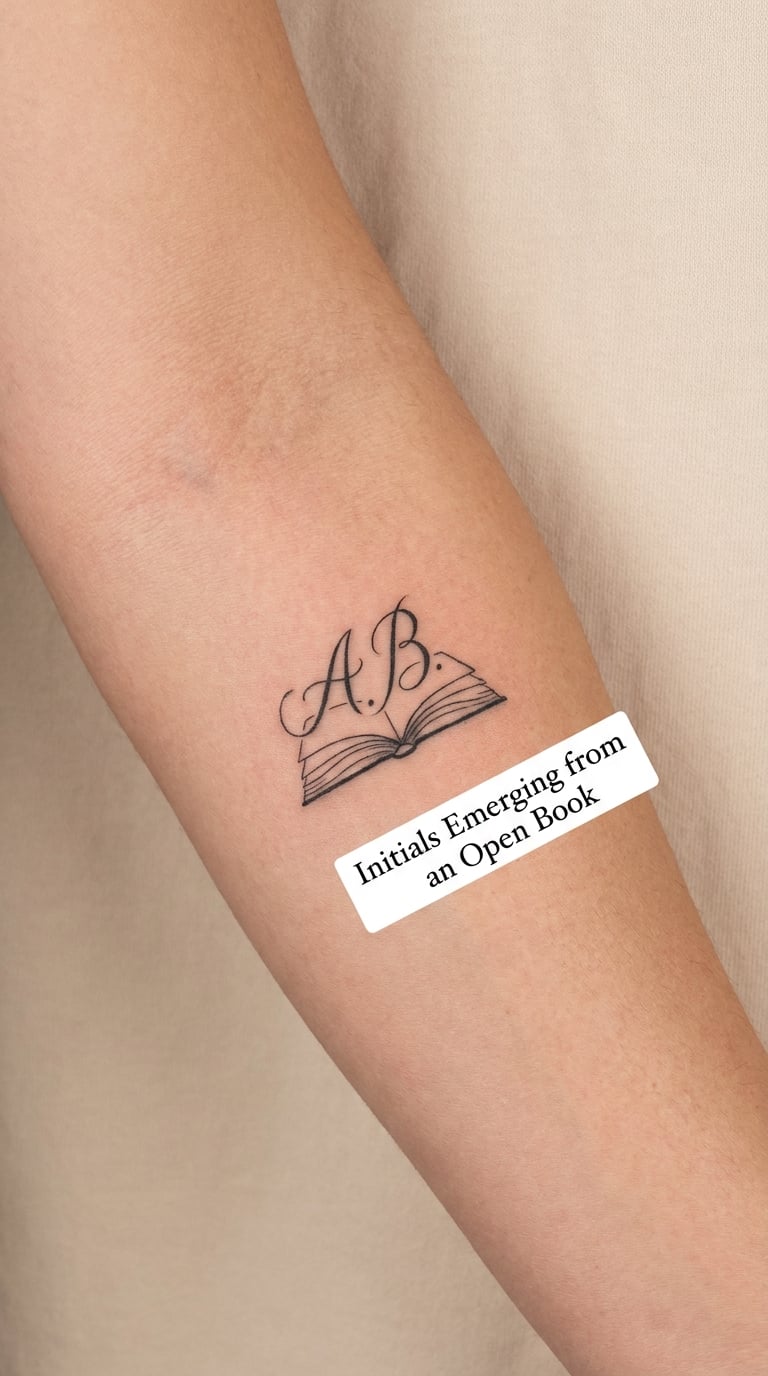
An open book drawn in fine line with two page edges visible, and the initials rising upward out of the middle of the book as if lifted from the page. No characters, no text on the pages.
Reading is the reason for this one, usually for a parent marking a child’s love of books. The book outline is simple on purpose, because page detail at this scale becomes noise within a few years.
Placement: Inner forearm, upper arm, or the back of the shoulder. Size: 2 inches. Style: Fine line illustrative. Pain: Low, around 3 out of 10. The book corners are sharp points that soften fastest, so an artist may round them slightly or double-pass them to hold the shape.
Make it yours: Add a ribbon marker, or put a single short line of the child’s favourite book title in micro lettering above the initials, accepting that the title will need a touch-up more often than the letters.
20. Coordinates with Family Initials
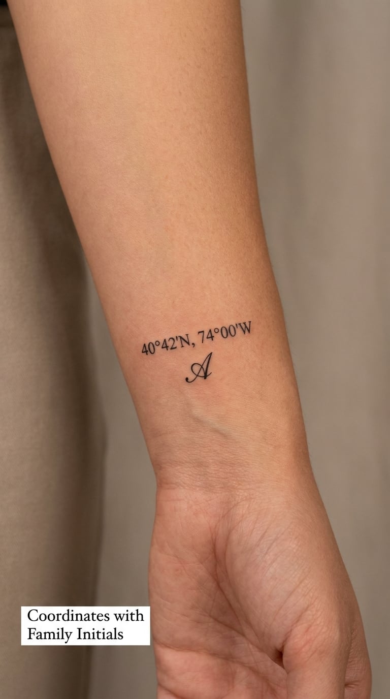
A latitude and longitude line in small plain numerals with one initial beside or beneath it, laid out with the numbers on a single baseline. Small, even, unstyled numerals.
Coordinates mark the place a person or family began, and they pair with a child’s initials when that place matters, a birth city, a house on a street, the first flat.
Placement: Outer wrist, inner arm, or the rib. Size: 2 inches. Style: Micro lettering, black. Pain: Medium, around 4 out of 10. This is the design most at risk from ageing: micro numerals blur together and the decimal points disappear, so ask for numerals at least a quarter inch tall and keep the coordinate short, and expect a touch-up every few years rather than once.
Make it yours: Use the coordinates of the hospital, or add a second line with a date under the numbers.
21. Initials on a Kite
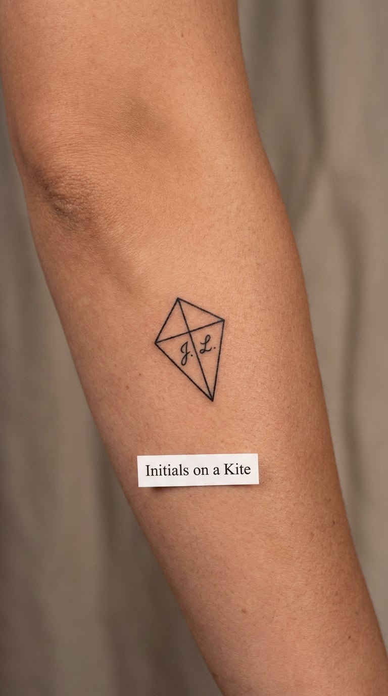
A kite drawn as a simple geometric shape with two cross spars and a short tail, and the two initials sitting in the centre of the sail. The shape is recognisable from a few strokes alone.
A kite is a childhood-memory motif, used for the thing a child used to love doing, or a nod to a family nickname. The geometric outline is what keeps it readable once the details are gone.
Placement: Outer forearm, calf, or the upper arm. Size: 2.5 inches tall including the tail. Style: Fine line illustrative. Pain: Low, around 3 out of 10. Initials placed inside a small shape are the weak point, since a small filled letter inside a thin outline fades faster than either element would alone, so ask for solid rather than outline letters.
Make it yours: Give the tail a few diamond shapes, or put the initial in the top triangle and the second in the lower one.
22. Pencil-Stroke Initials
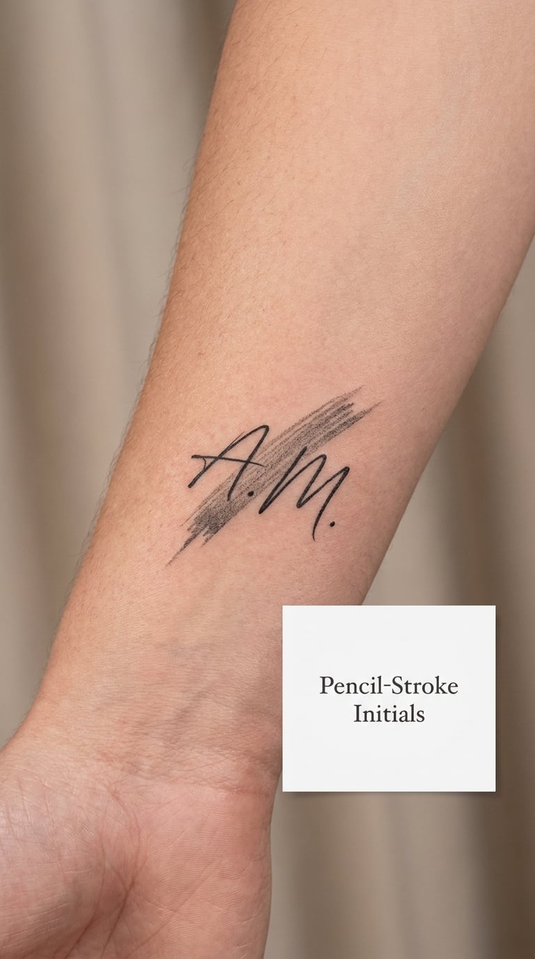
Two fine-line initials resting over a short diagonal pencil stroke shaded with a few parallel hairlines, angled up across the wrist. The letters stay upright while the stroke runs underneath.
The school motif is for a child who is in school or was starting school the year the design was made, and it grows into a marker of a stage rather than a stage-specific keepsake.
Placement: Wrist, inner forearm, or the back of the hand. Size: 2 inches. Style: Fine line with hand shading. Pain: Medium, around 4 out of 10. Shading is done as separate hairlines rather than a grey wash, which costs more passes and settles as separate lines, and those separate lines are what fade into a pale band eventually. Keep the shading to five or six lines rather than filling the stroke.
Make it yours: Add a tiny eraser end to the stroke, or use a coloured pencil tone for the shading while keeping the initials black.
23. Musical Note with Two Initials
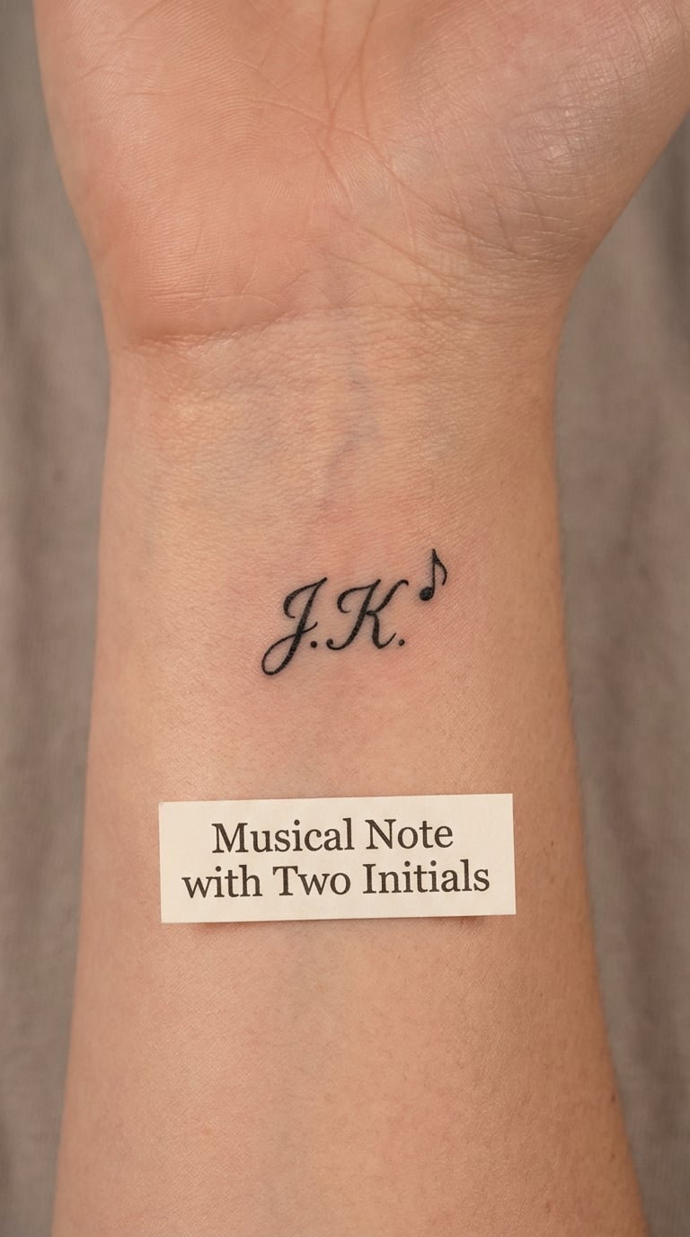
One eighth note with a filled notehead and a single stem, paired with two initials below it. Nothing else in the frame, no treble clef, no staff lines.
It is for the child who plays, and it works well because a single note is a complete symbol on its own. Adding a staff is the usual mistake, and staff lines turn to grey stripes within a few years.
Placement: Inner forearm, behind the ear, or the collarbone. Size: 1.5 inches. Style: Fine line with solid black notehead. Pain: Low, around 3 out of 10. A filled notehead holds its density well, but the flag at the top of the stem is a small shape that softens early, and a very short flag can disappear altogether.
Make it yours: Use a treble or bass clef instead of a flag, or add a second note a small distance away to suggest a line rather than a single sound.
24. Cursive Name and Final Initial
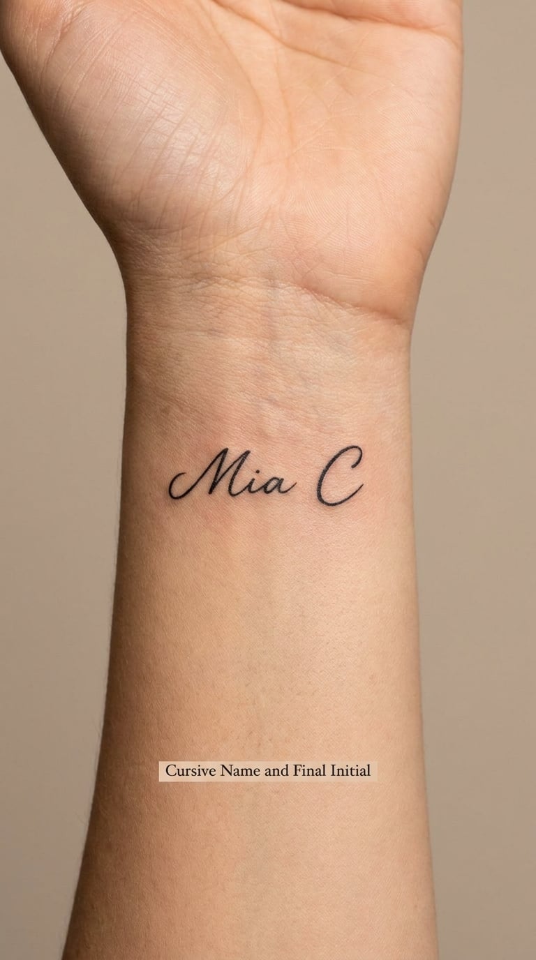
A short first name written in restrained cursive with a slightly larger capital at the end standing in for the family surname. The name stays small and the capital carries the emphasis.
This is the compromise for people who want a name rather than a letter, and the last capital gives the surname without spelling it out. The cursive has to be simple, because an ornate hand turns unreadable at this scale within a decade.
Placement: Inner wrist, along the rib, or the inner arm above the elbow. Size: 2.5 inches wide. Style: Handwritten script. Pain: Medium, around 4 out of 10. More characters means more small loops, and loops are what close up first, so agree the shortest readable version of the name before the stencil goes on and check the spelling twice.
Make it yours: Have the name written in the actual handwriting from a card or a note the child wrote, or add a small date beneath the capital.
How to Choose the Right Design
Six checks will tell you more than any amount of browsing. Run through them before you book, and take your reference images to the consultation.
Legibility first. A design that reads from arm’s length when it is fresh will still read in twenty years. Squint at your reference image: if the letters merge into a shape at that size, the line weight is too thin or the script is too loopy.
Match simplicity to the age of the wearer. Tattooing a five-year-old means committing on their behalf to something they chose when they could not weigh permanence. A single initial or a plain linked pair is the design most likely to look considered on a teenager in ten years, and a small motif built around it can be added later.
Let the placement decide the size, not the other way round. Wrists, ankles and finger sides are curved and bony. Keep anything with fine detail off them, and hold each letter to at least a quarter inch tall so it survives sun and age. Flat areas, the inner forearm, upper arm, calf and the flat of the shoulder, carry small detail far better.
Check the style against skin tone and sun exposure. Fine single-needle line and soft grey gradients show up less on deeper skin and hold their edges longer there, while thin script on any skin tone needs a heavier hand and a realistic touch-up plan. Very fair skin exposes every faded stroke sooner, and sun-damaged skin holds ink less evenly, so a bolder block style is the safer pick in both cases.
Give it one real reason. A birth date, a house number, a jersey number, a handwriting sample. A design with a specific anchor reads as considered even when it is simple, and it is far less likely to be something you regret than a design chosen because it looked nice in a photo.
Ask to see the artist’s lettering portfolio. Lettering is a specialism inside tattooing, and a strong illustrative artist can be weak at small script. If the work you want is mostly letters, look specifically for hand-lettering samples at small sizes, and ask them to draw your initials to scale on paper first so you can judge the design before any ink goes in.
Cost and Session Time
Small lettering work is priced by the artist, the shop and where you are, so treat these as realistic US ranges rather than a quote. A micro single initial usually lands somewhere between 100 and 200 US dollars, a small two-initial design with an added element between 150 and 300, a medium piece with colour or a motif between 250 and 450, and a larger or more illustrative composition at 400 US dollars and above.
Session time follows the same order. A single micro initial takes about 15 to 30 minutes. A small two-initial design with one added symbol runs 30 to 60. Medium pieces with colour or illustrative work take one to two hours, and larger compositions are often booked as a full sitting of two to four hours.
Shop minimums matter more than the design does. Plenty of studios will not take a booking for a piece that takes twenty minutes, because the chair time costs them the same as a long session, so your single initial may get quoted at the shop minimum rather than a per-letter rate. City, artist reputation, whether the lettering is custom-drawn for you, and how much consultation time you want all move the number. Ask for the total at the consultation, not a range, and ask whether touch-ups are included.
Aftercare Basics
Follow your artist’s aftercare instructions first. They know exactly what they did to your skin and how that piece will respond, and their directions override anything general you have read, including this section.
Beyond that, five basics cover most of it. Wash gently with clean lukewarm water and unscented soap, then pat the area dry with something soft rather than rubbing it. Keep it protected where the artist tells you to, and leave any film or covering alone for as long as they said, because pulling it off early is the most common way people set their own tattoo back.
Avoid friction and water for the first couple of weeks, which realistically means no swimming, no soaking, no baths that put the area under water, and being careful with tight clothing over a wrist or forearm piece. Skip shaving over a new design. Keep it out of strong sun while it heals, and be consistent with sunscreen on a healed lettering tattoo afterwards, since that is what shortens the life of fine line work more than anything else.
Watch it rather than fussing over it. Some redness, swelling and a light flaking that looks like dry skin are ordinary parts of settling in. If something looks wrong to you, feels hot, or is leaking, stop guessing and contact the studio, and take medical advice from a clinician rather than from a forum.
Frequently Asked Questions
What is a good age for getting an initial tattoo?
There is no fixed right age, and the decision is usually about judgment rather than birthdays. Most people wait until they can sit through a session calmly, understand that a tattoo is permanent, and choose the letters themselves rather than being talked into them. A parent or guardian needs to be involved for a minor in most places, and local law on tattooing anyone under eighteen varies by state and country, so check before booking. A single initial is the most common starting point for exactly this reason.
What is the best size for kids initials tattoo ideas?
Keep each letter at least a quarter inch tall, and size the whole design to the placement rather than the other way round. A single initial usually sits between half an inch and one inch; a two-initial design runs one and a half to two inches across. Below a quarter inch, letters lose their edges within a few years of sun exposure and the design reads as a smudge. Bony, curved places such as wrists, ankles and finger sides need larger letters, not smaller ones, because skin movement there drags the line.
Do initial tattoos on fingers fade quickly?
Yes, faster than almost anywhere else. Finger skin is thin, moves constantly, rubs against everything you pick up, and often sees a lot of sun, and tattoo ink settles more shallowly on the extremities than on the forearm. Letterforms and small numerals blur within a few years, and fine line detail is usually gone within a decade. If a finger is where you want the design, go with solid block letters at a generous size and plan on a touch-up every few years. Most people get better long-term wear from the inner forearm, the rib, or behind the ear.
Should matching family initials use the same style?
Using the same style, or at least the same line weight and size, is what makes a matching set look deliberate rather than accidental. Identical copies read as a set; two different styles in the same family read as two unrelated decisions, even when the letters are the same. What you can vary is the arrangement, so the parent’s initial sits on the inside of the forearm and the child’s on the wrist, both at the same height and weight. Bring both reference images to the same consultation if the pieces are far apart in time.
Can a tattoo artist combine initials with a small drawing?
Almost always, since a single added symbol is well within normal lettering-and-illustration work. The usual sequence is to find an artist whose portfolio already includes hand lettering at small sizes, bring a clear reference for both the letters and the symbol, and agree the design in a consultation before the appointment. What tends to go wrong is scale: a symbol drawn at full size beside initials turns the letters into an afterthought, so ask the artist to lay out the composition with the initials as the largest readable element and the drawing as support.
How should I choose a permanent children’s tattoo design?
Start from the letter itself and work outwards. Choose a style whose shapes you can read at the size you are considering, check the spelling twice with the artist before the stencil goes on, and pick a placement whose skin suits the line weight. Then pick one specific reason for the design, such as a birth date or a handwriting sample, since a design with an anchor ages better than one chosen only for looks. Finally, check the artist’s lettering portfolio at small sizes and get the design drawn to scale on paper first, so you are approving a drawing rather than a photograph.
Which Kids Initials Tattoo Idea Should You Choose First?
If this is a first tattoo, choose a single strong initial or a plain linked pair, in a solid weight rather than a thin script. It reads at any size, heals predictably, and it leaves you room to add a motif or a second letter later without a redesign. A small initial-led design such as the star, the heart or the open book suits someone already building a collection, since the letter gives you a shape to keep returning to.
Whatever you pick, take a paper drawing of the exact design and the exact spelling to a reputable artist, along with a parent or guardian where one is needed, and let them talk you out of anything the skin there cannot hold. These 24 kids initials tattoo ideas are a starting gallery, not a decision. The right one is the sketch you can still like in twenty years.