
20 Best Virgo Tattoo Ideas for Women (September 2026)
These virgo tattoo ideas for women cover twenty designs an artist could actually draw, each with a real placement, a realistic size and an honest pain note. The best one is usually the smallest design you would still feel good about in ten years, and that is usually not the loudest one.
Virgo runs August 23 to September 22, and the sign’s iconography is narrow: the glyph, the maiden, the constellation, the ruling planet Mercury, birth flowers. That narrowness is exactly the problem people hit when they search. On r/TattooDesigns, one poster asked for a second Virgo design and complained that everything online was either the one they already had or too plain to bother with. The fix is rarely a more complicated design. It is a different style, a different placement, or a second motif sharing the space with the glyph.
Every design below names the linework, the size, the style and how it ages, so you can brief an artist instead of pointing at a phone screen. If you are still torn between a few, the 50+ cute small tattoo ideas for women gallery is a good place to see how small pieces sit on real skin.
Quick Guide
| Idea | Style | Best placement | Size | Pain |
|---|---|---|---|---|
| Fine-line symbol behind the ear | Fine line | Behind the ear | 1 to 1.5 inch | Medium |
| Minimalist glyph on the wrist | Minimalist fine line | Inner wrist | 1.5 to 2 inch | High |
| Virgo and Leo pair | Fine line | Collarbone | 3 inch span | Medium |
| Geometric constellation | Geometric linework | Upper shoulder | 3 inch | Medium |
| Botanical glyph | Botanical fine line | Inner forearm | 3 inch tall | Medium |
| Watercolor zodiac mark | Watercolor | Rib area | 2.5 inch tall | High |
| Celestial moon and Virgo | Black and grey | Upper back | 5 inch wide | Medium |
| Hand holding a star | Micro realism | Inner forearm | 2 inch long | Medium |
| Glyph in a circular ornament | Ornamental | Upper arm | 2.5 inch wide | Medium |
| Floral composition | Floral with muted colour | Upper hip | 4 inch wide | Medium |
| Roman numeral birthday | Fine line script | Outer ankle | 2 inch wide | Medium |
| Dotwork symbol | Dotwork | Sternum | 3 inch tall | High |
| Sunflower behind the glyph | Colour realism | Forearm | 3 inch wide | Medium |
| Line-art maiden | Contemporary line art | Outer upper arm | 4 inch tall | Medium |
| Blackwork glyph with dots | Blackwork | Forearm | 2.5 inch tall | Medium |
| Glyph with Mercury orbit | Minimalist linework | Inner arm | 3 inch wide | Low |
| Handwritten wordmark | Handwritten script | Side waist | 3 inch long | High |
| Small zodiac wheel | Fine line | Nape of the neck | 3 inch wide | Medium |
| Moon and symbol on the hand | Fine line | Side of the hand | 1.5 inch wide | High |
| Portrait with glyph | Black and grey realism | Upper arm | 4 inch tall | Medium |
1. Fine-Line Virgo Symbol Behind the Ear
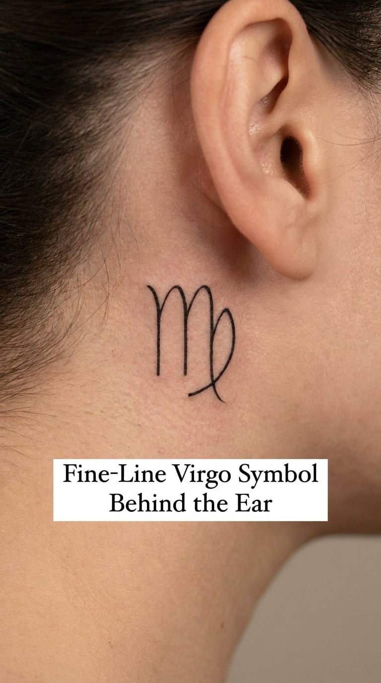
A fine-line Virgo glyph behind the ear is one continuous black line: two shallow arches, then a third stroke that loops closed and crosses itself at the base. Single-needle work means the artist changes machine mid-session for that one thin line, and the whole thing fits in the hairline-to-neck space in about an hour and a half.
Most people choose it as the quietest way to wear a zodiac sign. It is not announcing anything, but it is not hiding either, and the Virgo symbol is the only mark in the design, so what it means stays personal.
Placement: behind the ear, or slightly higher along the curve where the skull meets the neck. Size: 1 to 1.5 inch wide. Style: fine line. Pain: medium, the needle bounces off cartilage. Ageing: behind the ear fades faster than most flat spots, so expect a touch-up there. Make it yours: add one tiny star at the loop, or place it level with the lobe so a pair of earrings frames it.
2. Minimalist Virgo Glyph on the Wrist
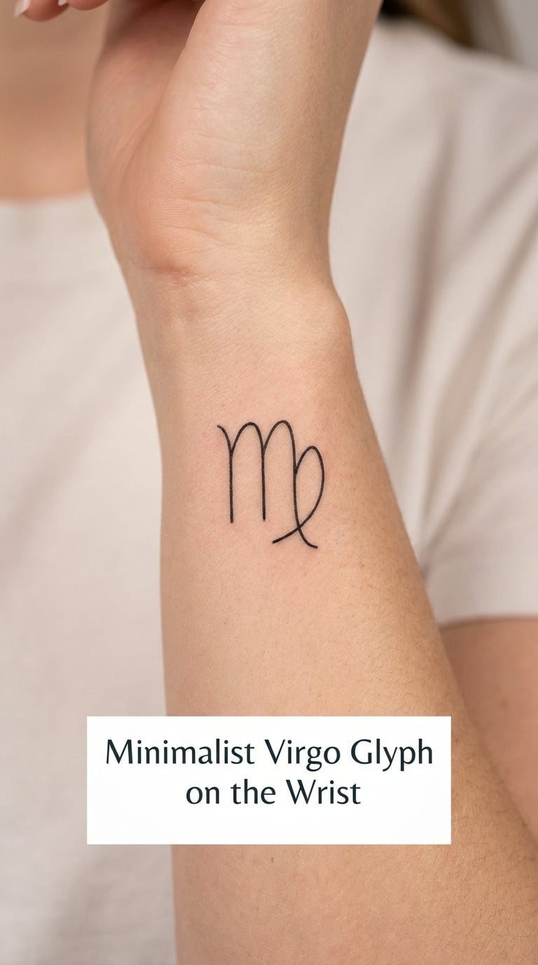
The wrist version is the most requested Virgo placement, and the reason is practical. The inner wrist is flat, bony and about two inches of usable width, which is exactly the space a clean glyph needs. There is no shading to place and no detail to lose, so the artist can keep the line crisp in a short sitting.
Ask for a line weight that matches the size rather than a thick marker outline. A 2 inch glyph drawn heavy looks clumsy; a 2 inch glyph drawn with a fine needle looks deliberate. If you already have small pieces elsewhere, the 70+ small wrist tattoo ideas that women will love gallery shows how other sizes sit in the same spot.
Placement: inner wrist, above the crease. Size: 1.5 to 2 inch wide. Style: minimalist fine line. Pain: high, wrists are bony and the skin is thin. Ageing: hold the design to something simpler than fine filigree here. Make it yours: use your birth date in Roman numerals underneath in 8-point lettering.
3. Virgo and Leo Symbol Pair on the Collarbone
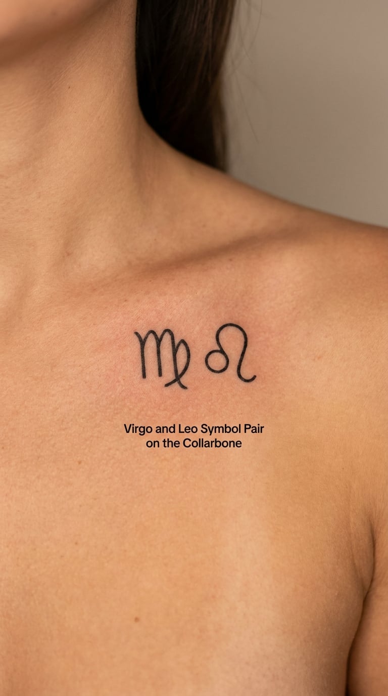
Pairing Virgo with Leo puts two glyphs on one line, and the composition works best when they are equal in size with a small gap between them. The Virgo symbol sits first, the Leo loop second, both at roughly 1.5 inches so neither reads as an afterthought.
People usually choose this for a relationship or a birthday, sometimes a partner who is a Leo. It also works as a complementary-sign piece, one sign held next to the other rather than merged into a single emblem.
Placement: along the collarbone, centred, or a few inches above it across the upper chest. Size: 3 inch span for the pair. Style: fine line. Pain: medium, and the collarbone edge is the tender part. Ageing: collarbone ink takes a beating from bra straps and bags, so keep the line simple. Make it yours: have the matching date worked into the gap as a tiny numeral cluster.
4. Geometric Virgo Constellation on the Shoulder
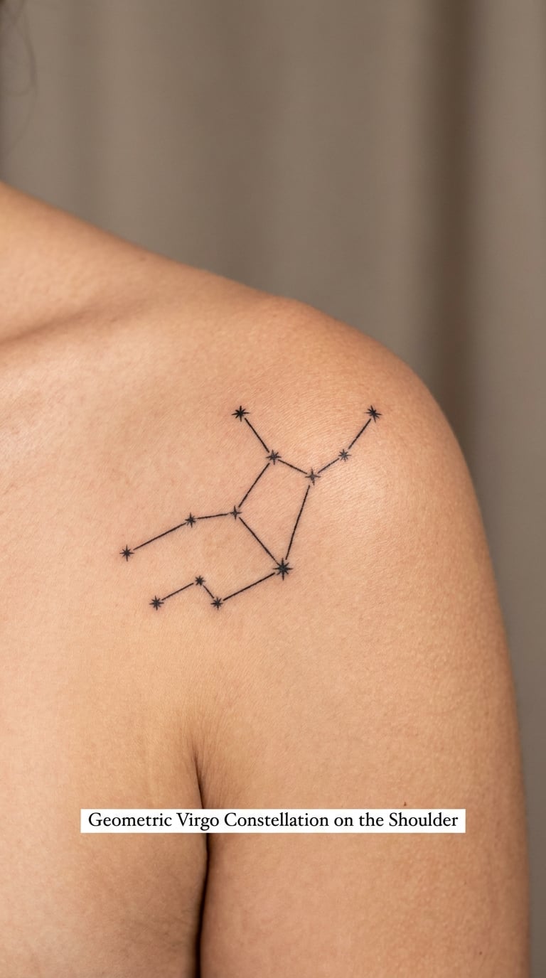
A geometric constellation takes the real star pattern and draws it in straight segments rather than curves. Small filled stars mark each point, a fine line connects them, and a faint frame of longer straight lines holds the shape. Because it is all geometry and no shading, it heals flatter than most line work.
The shoulder has a wide, mostly flat plane, so a 3 inch composition fills it without crowding. This is the design I suggest to anyone who already owns a small glyph and wants the same sign to look completely different.
Placement: upper shoulder or the top of the shoulder blade. Size: about 3 inch wide. Style: geometric linework. Pain: medium, the shoulder cap is close to bone. Ageing: constellation lines are thin, so plan a refresh in year five or so. Make it yours: faint the latitude and longitude of your birth town in tiny type under the pattern.
5. Botanical Virgo Symbol on the Forearm
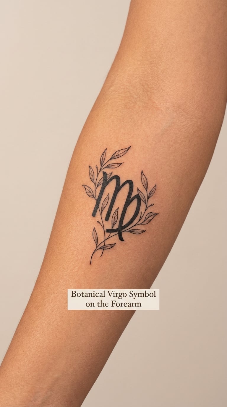
A botanical build wraps the Virgo glyph in stems and narrow leaves that grow out from the letterforms rather than sitting beside them. One or two blossoms, drawn with a few confident strokes each, finish the composition. The line weight stays even so no single leaf shouts louder than the symbol it grows from.
This is a good route for someone who loves plant work but does not want a floral sleeve. Chrysanthemum, poppy and morning glory are all listed as Virgo birth flowers, so a single bloom is a legitimate nod rather than decoration.
Placement: inner forearm, running along the length of it. Size: about 3 inch tall. Style: botanical fine line. Pain: medium, the inner forearm is a reliable spot. Ageing: tiny leaves blur first, so avoid a mass of them. Make it yours: use a leaf shape from a plant that matters to you instead of a flower.
6. Watercolor Virgo Zodiac Mark on the Rib
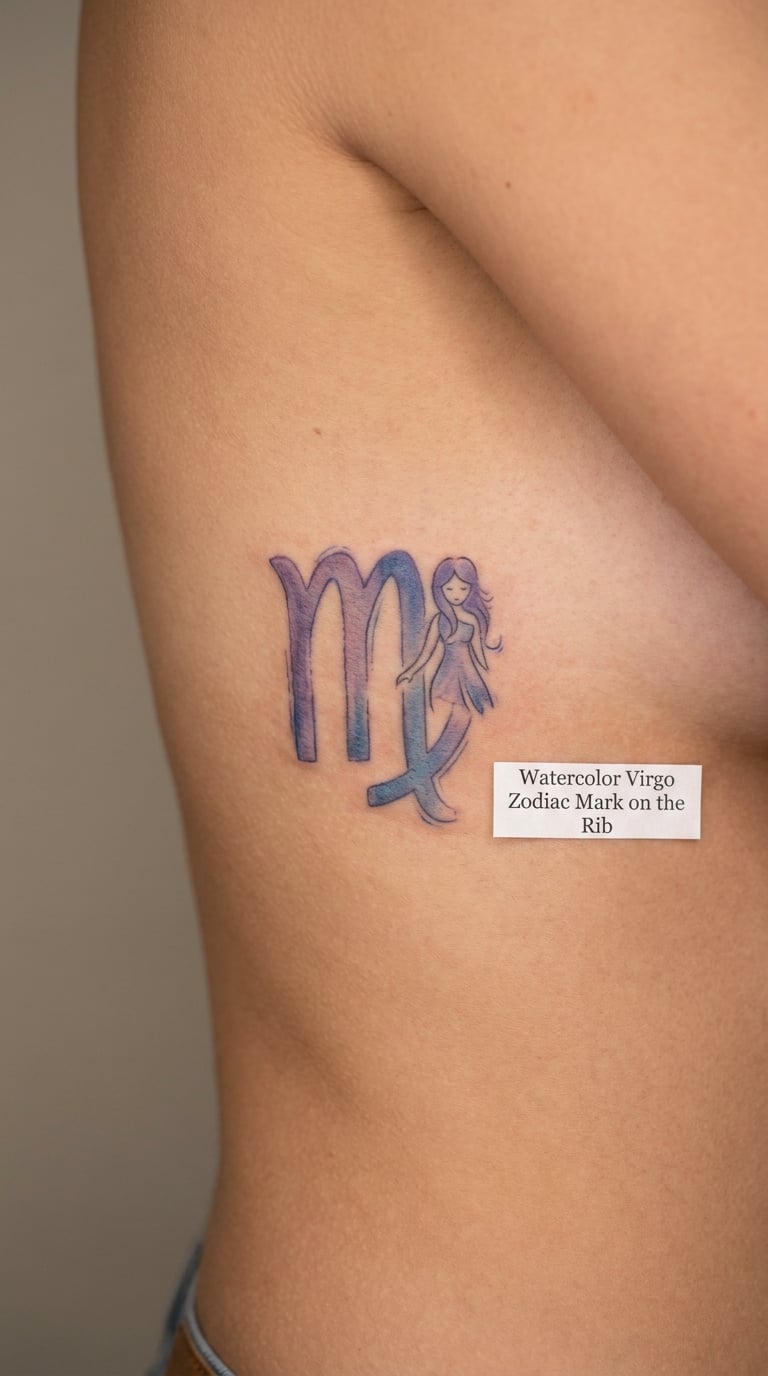
Watercolor Virgo work uses soft pigment bleeding past a hard black outline. The glyph itself is drawn in a single confident line, then diluted violet, dusty blue or a warm ochre is worked outward and left uneven on purpose. The gaps in the wash are the design, not a mistake to be filled in.
It suits someone who wants colour without committing to a traditional or neo-traditional look. The palette does the shouting instead of the linework, so the symbol can stay small and quiet.
Placement: the rib area, or the outer upper arm. Size: about 2.5 inch tall. Style: watercolor. Pain: high, ribs and the area beside them sting badly. Ageing: pale washes fade first, so choose a slightly deeper pigment. Make it yours: name two colours you already wear and let the artist mix the wash from them.
7. Celestial Moon and Virgo Design on the Back
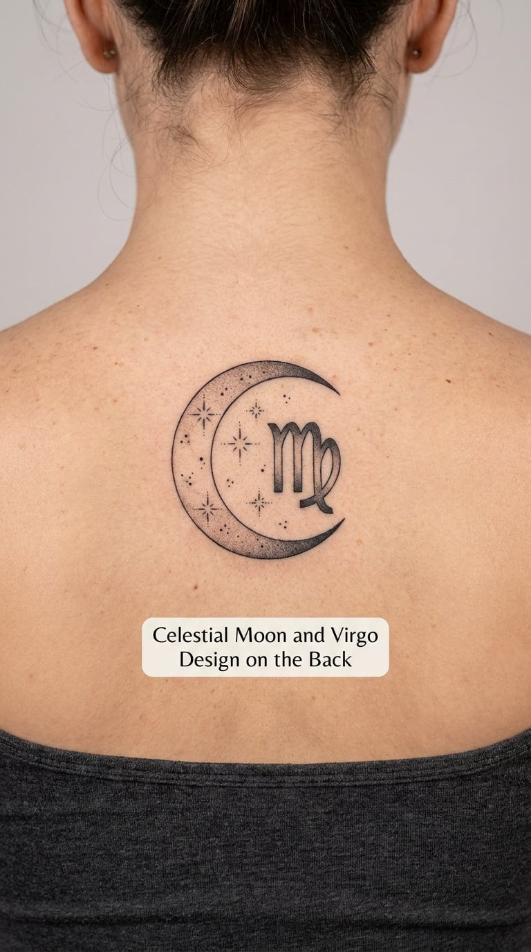
This composition puts a crescent moon at one side, the Virgo glyph at the other, and a scatter of small four-point stars between them. Shading is soft grey wash inside the moon, solid black on the glyph, leaving the space in the middle open so the back breathes.
The moon and stars here are atmosphere rather than symbolism. Nobody reading it learns anything about Virgo beyond the glyph itself, which is often exactly what the wearer wants from a large back piece.
Placement: centred on the upper back between the shoulder blades. Size: about 5 inch wide. Style: black and grey realism. Pain: medium, and you will be lying down for it. Ageing: grey wash needs a refresh while the black holds. Make it yours: set the moon phase to the sky on the day you were born.
8. Micro-Realism Hand Holding a Star
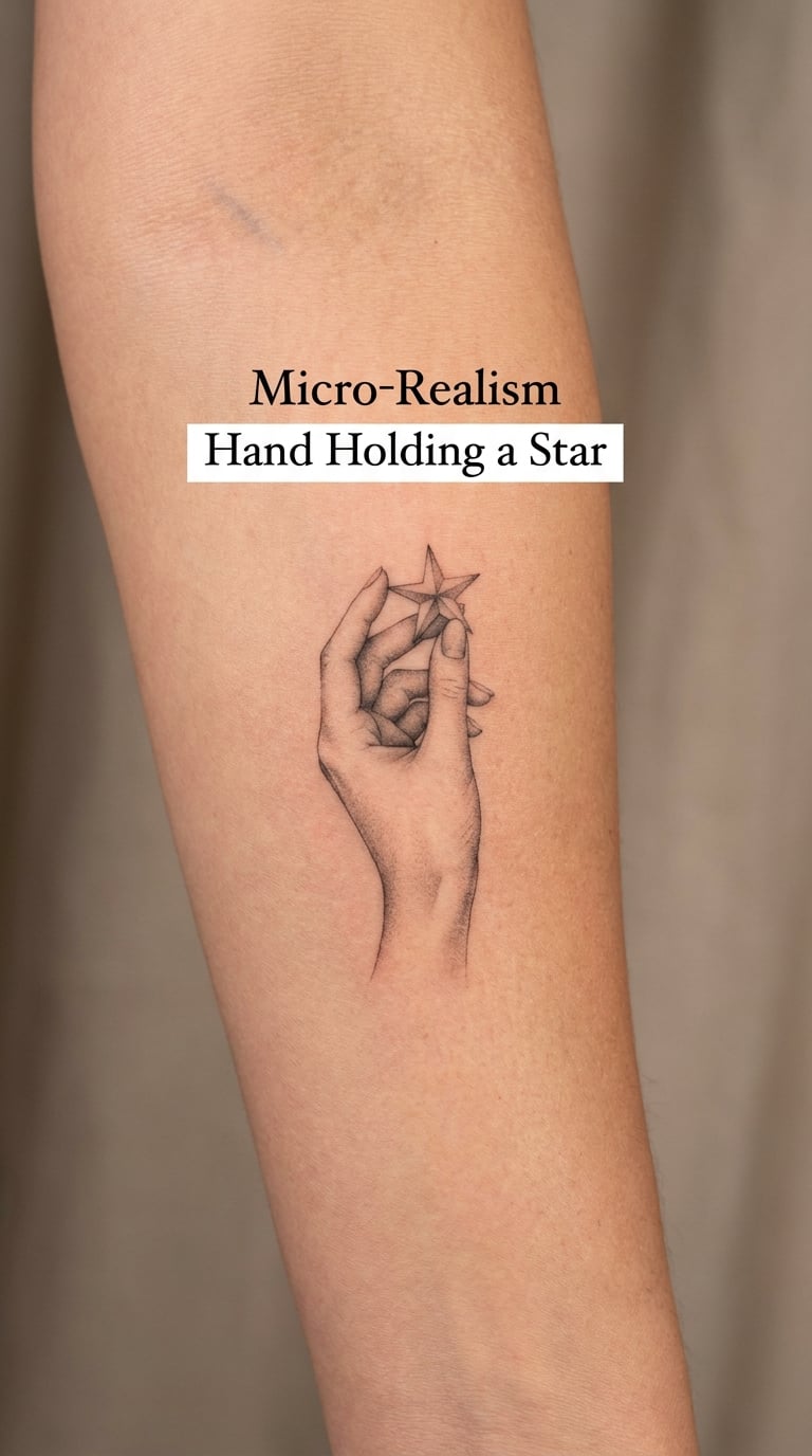
A small realistic hand, fingers curled around a five-pointed star, rendered in black and grey with soft shading in the knuckles and a fine highlight along the top of each finger. It is a figurative piece at a scale that still fits inside one sitting, which is unusual for realism and the reason it works well as a first detailed tattoo.
The star ties it to a zodiac context without drawing the glyph. It is also the design I would pick for someone who finds a plain symbol too cold and wants something closer to a portrait than an emblem.
Placement: inner forearm or the soft area below the collarbone. Size: about 2 inch long. Style: micro realism. Pain: medium. Ageing: tiny shading gradients are the first thing to soften, so expect touch-ups. Make it yours: keep the star a birth-year or birth-month shape, or hand it a small trail of dots.
9. Virgo Glyph in a Circular Ornament
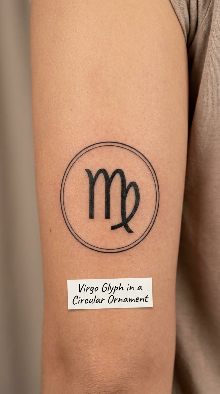
A thin single-line circle around the glyph is the cheapest way to make a plain symbol look composed. The circle needs to be true: if it is drawn freehand it wobbles, so it is usually stencilled or compass-guided first and inked once, without a second pass.
From there the border can stay plain, pick up a fine dotted inner ring, or break into a short repeating line pattern at the top and bottom. All three stay ornamental rather than decorative, so the design reads the same in ten years as it does on day one.
Placement: upper arm or the back of the shoulder. Size: 2.5 inch across. Style: ornamental fine line. Pain: medium and even. Ageing: a closed shape holds its shape; that is the whole point of the border. Make it yours: split the circle and put a date in the gap, or add two short initials at the sides.
10. Floral Virgo Design on the Hip
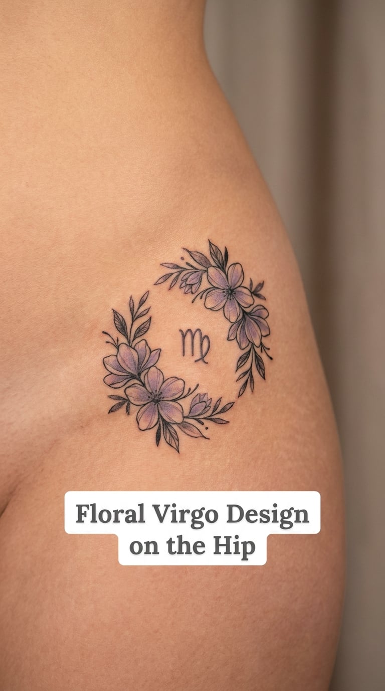
A floral hip piece works because the body does the curving. The artist maps the placement of the flowers to the actual line of the hip, so stems follow the form instead of sitting flat on it. Petals are drawn with a few clean edges each, and a muted lavender or dusty pink wash sits behind black linework for depth.
You can go black-only, and for a lot of women that is the better call, because the colour is what dates fastest. If you keep the fill, ask for one shade rather than three.
Placement: upper hip, curving onto the thigh or the low back. Size: about 4 inch wide. Style: floral with muted colour, or black-only floral. Pain: medium, the hip dips near the bone. Ageing: soft fills fade sooner than outlines. Make it yours: use your birth flower as the largest bloom, with the glyph as the centre.
11. Roman Numeral Virgo Birthday on the Ankle
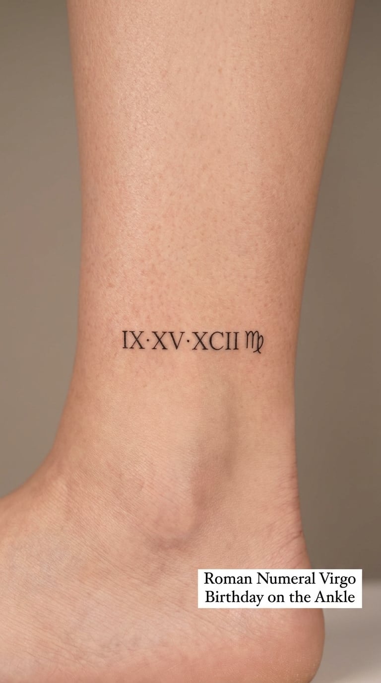
Roman numerals stay readable longer than most script because each character is a straight, evenly weighted shape with no loop to fill in. A full birth date in this style needs about 2 inches of width at 8-point lettering, which fits the outer ankle comfortably above the bone.
The Virgo accent is optional. A single small glyph under the date keeps the sign without turning the whole piece into a zodiac statement, and a woman who wants the date to be the main event can leave it off entirely.
Placement: outer ankle, or just above it on the lower calf. Size: about 2 inch wide. Style: fine line script. Pain: medium, thinner skin than the forearm. Ageing: ankles get sun and shoe rubbing, so keep lettering bold enough to survive. Make it yours: add coordinates instead of the month, or run the date in a gentle arc.
12. Dotwork Virgo Symbol on the Sternum
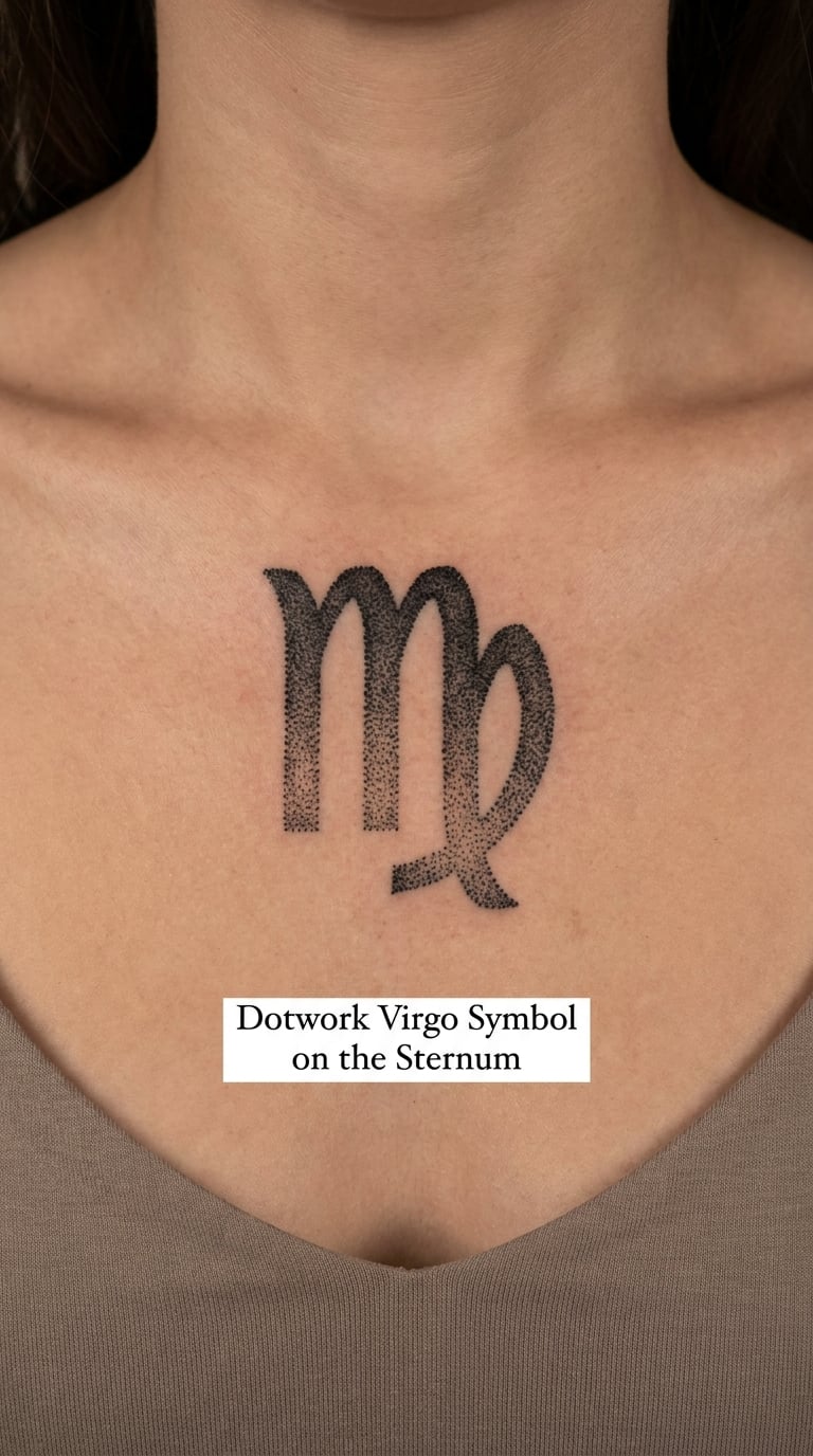
Dotwork builds the glyph out of graduated black dots rather than outlines. Density carries the shape: tight, dark dots in the heaviest areas, wider spacing toward the edges, and clean empty skin between them. Nothing else is added, because extra dots would blur the pattern and the negative space is what makes it read as deliberate.
The sternum is a curved, slightly hollow area between the collarbones, and a symmetrical 3 inch design centred on it draws the eye straight down. Expect a longer sitting; this is a placement that rewards patience and a good position.
Placement: centre of the sternum, below the collarbones. Size: about 3 inch tall. Style: dotwork. Pain: high, bone and thin skin. Ageing: dots soften into grey, which is expected but worth knowing. Make it yours: extend the dot gradient downward into a scattered trail that thins out.
13. Sunflower Behind the Virgo Glyph
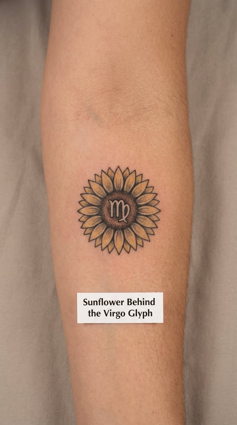
The trick to a sunflower zodiac piece is keeping the structure honest. Long pointed petals radiate in two clear rings, each petal outlined in black with a small amber wash inside, and the Virgo glyph sits clean and centred in the dark disc at the middle. Loose, blurry petals are what make a sunflower look cheap.
This is the design for someone who wants a genuinely colourful zodiac tattoo and does not mind that it reads from across a room. The colour is the whole point, so pick deep yellow and near-black rather than pale pastels.
Placement: forearm or calf. Size: about 3 inch across. Style: colour realism. Pain: medium, the forearm is forgiving. Ageing: yellow fades toward grey fastest, so ask for a warmer pigment. Make it yours: place a small date inside the lower petal ring where it reads as texture.
14. Minimal Line-Art Virgin Figure on the Upper Arm
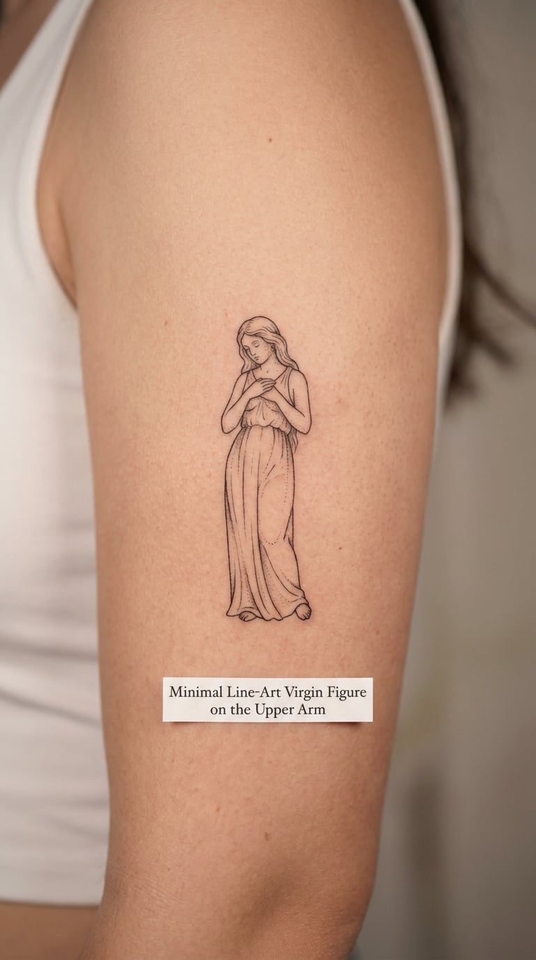
This is contemporary line art rather than illustration: a standing figure drawn with unbroken, confident contour lines, with almost no shading and a long robe suggested by three or four vertical strokes. The face is simple or turned away, and the hands are loose at the sides.
Virgo is the maiden, so this draws the sign’s traditional figure directly. It does not carry a fixed personal meaning on its own, and most people choose it for the image rather than for a claim about themselves. Bring a reference you like the line quality of, and let the artist draw the figure fresh.
Placement: outer upper arm, or the back of the upper arm. Size: about 4 inch tall. Style: contemporary line art. Pain: medium. Ageing: a few long lines survive better than a busy face, which is the point of the style. Make it yours: give the figure a flower or a book, then keep the rest spare.
15. Blackwork Virgo Glyph with Dot Accent
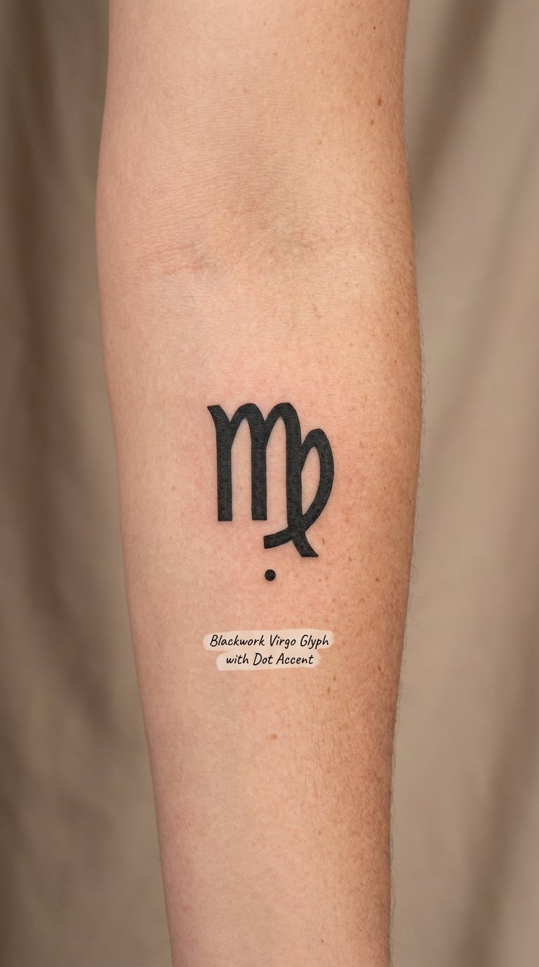
Blackwork is a solid, high-contrast approach: the glyph is filled in completely with no interior line detail, so it reads as a shape rather than a drawing. A short trail of three or four graduated dots beside it gives the composition some movement and stops it looking like a sticker.
This is the version for someone who likes graphic, bold tattoos and finds hairline work too faint for their taste. A solid black shape holds its edges far better over the years, so it ages more gracefully than a fine-line equivalent.
Placement: forearm, upper arm or calf. Size: about 2.5 inch tall. Style: blackwork. Pain: medium, and solid fill feels heavier than outline. Ageing: solid black is the most forgiving kind of ink over time. Make it yours: cut the dot trail into a short line of your birth month numbers.
16. Two-Element Virgo and Mercury Design
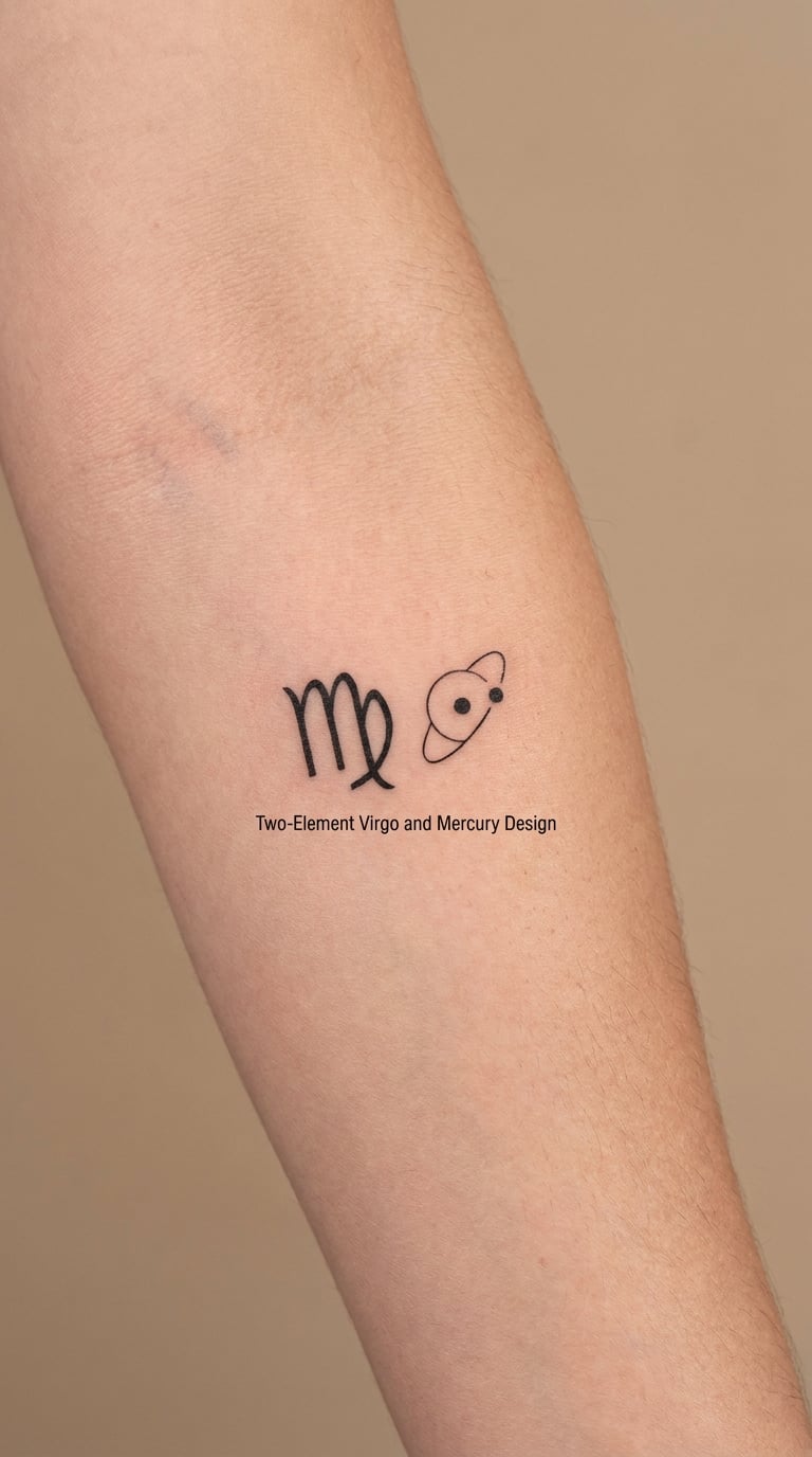
Two elements, nothing else: the Virgo glyph on one side, and a small planet with a single thin orbit ring on the other. The two marks sit at the same optical weight, roughly an inch apart, with a lot of open skin between and around them. A ruled-planet pairing is a traditional zodiac reference, but the exact arrangement is entirely the wearer’s choice.
It is a good first design for anyone who wants a concept rather than a picture, and it scales down to an inch and a half without losing anything.
Placement: inner arm, forearm or the inside of the upper arm. Size: about 3 inch wide as a pair. Style: minimalist linework. Pain: low to medium, and quick. Ageing: the thin orbit ring is the fragile element, so ask for a slightly heavier line there. Make it yours: tilt the pair along the forearm rather than keeping it level.
17. Handwritten Virgo Wordmark on the Side Waist
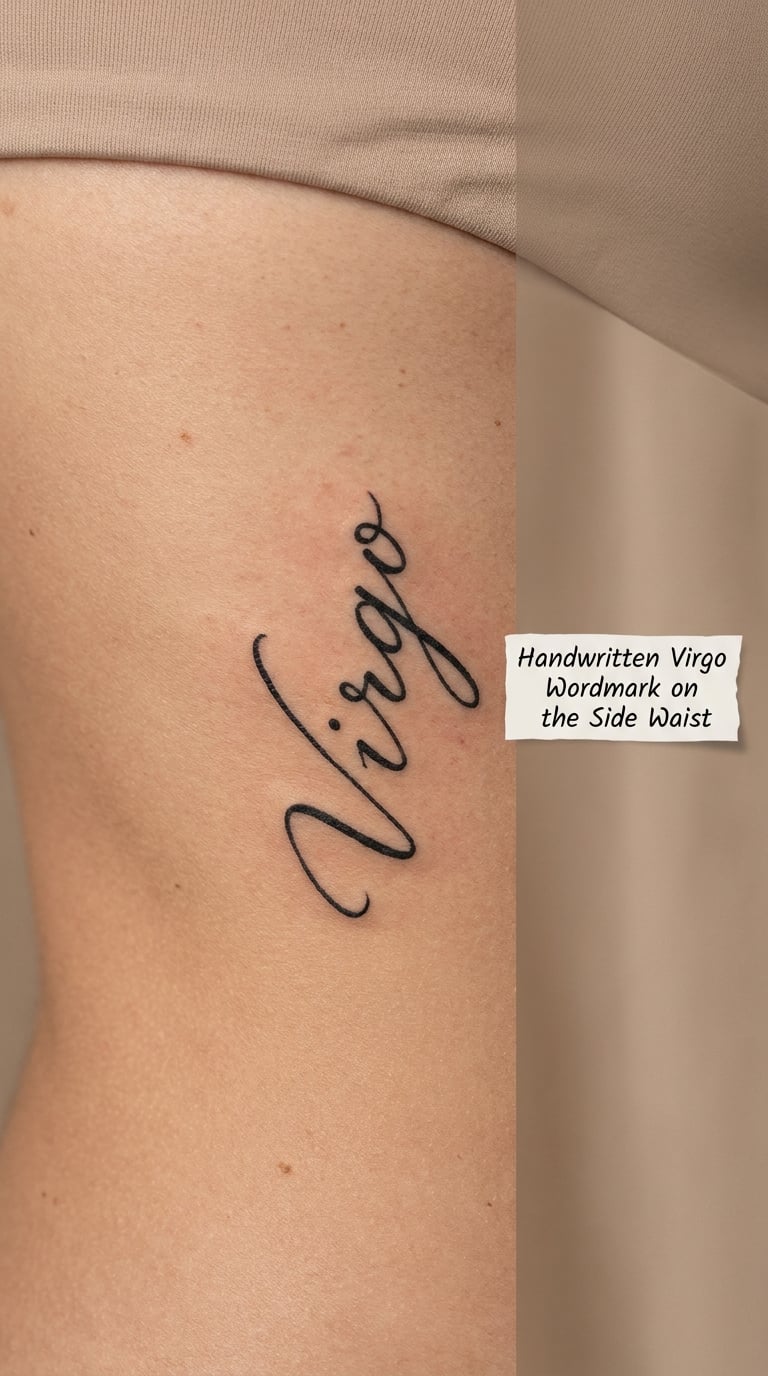
A wordmark just spells the sign in a caller’s hand, and the design work is in the letterforms. Loops are kept open, ascenders are short and consistent, and the five letters are spaced evenly so the word does not collapse as the body curves. A signature-style version in heavy black ink is the opposite approach and much more assertive.
The side waist gives the artist a long gentle curve to run the word along, which flatters both the lettering and the shape. It is a private spot, visible mainly when a top rides up or when you are reaching for something.
Placement: side waist, running diagonally along the curve. Size: about 3 inch long. Style: handwritten script. Pain: high, ribs and side body are the worst of it. Ageing: thin script softens, so a bolder hand holds longer. Make it yours: have the letters match your own signature instead of a standard script.
18. Small Zodiac Wheel on the Nape
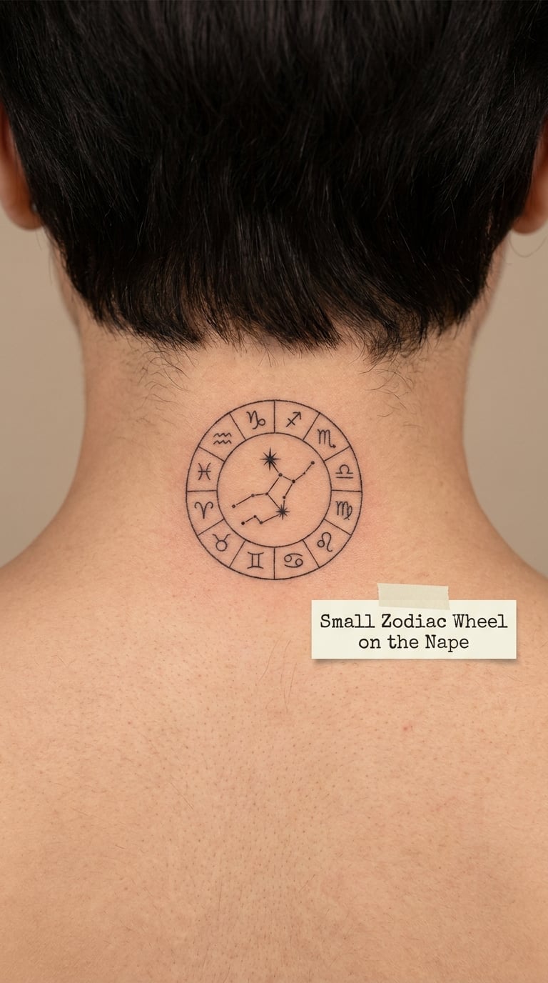
A zodiac wheel is the whole circle of signs arranged in order, with Virgo picked out in solid black while the other eleven stay as thin outlines. The nape is one of the few spots where a design can be larger and more detailed and still stay out of sight, which is why this composition is a good compromise for someone who wants a full concept rather than a single letterform.
Hair covers it entirely when it is down. If you show it often, the fine circular lines around the outside will need refreshing sooner than a solid shape would. The 70+ beautiful neck tattoo ideas for women gallery has more pieces that use this same discreet framing.
Placement: nape, centred, just above the hairline. Size: about 3 inch wide. Style: fine line with one solid accent. Pain: medium, leaning forward helps. Ageing: circular linework softens into a ring over time. Make it yours: set your birth sign on the ring’s edge and leave the rest unlabelled.
19. Crescent Moon and Virgo Symbol on the Hand
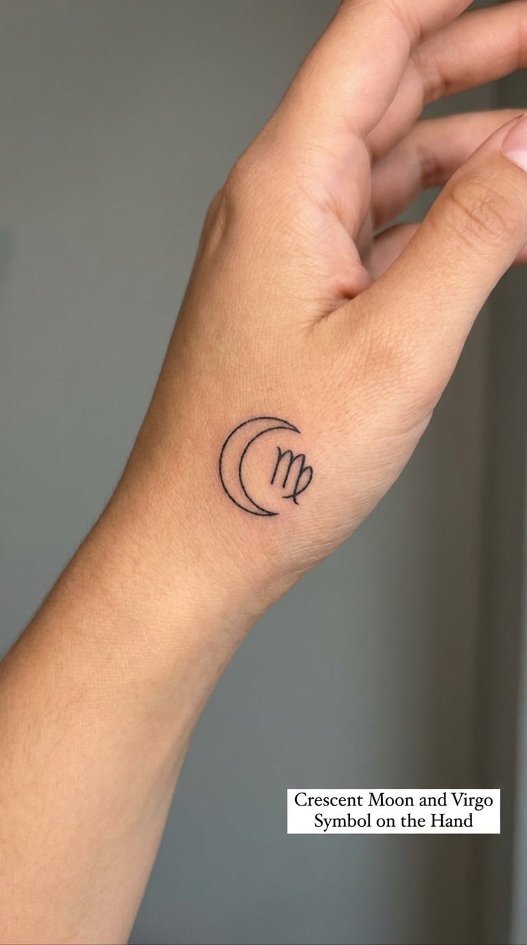
Two tiny marks, a thin crescent and a small glyph, sit on the side of the hand where a ring or a watch strap would not be. At 1.5 inches across the whole design there is very little to work with, so the artist keeps the crescent as a single stroke and the glyph as two or three lines.
Hands take the most wear of any placement on this list. Washing, sun and movement all hit the same few square inches, and fine lines here blur faster than anywhere else. If you want this spot, accept a bold line weight and a touch-up in a few years rather than a hairline design that disappears.
Placement: side of the hand, below the little finger, or the back of the wrist. Size: about 1.5 inch wide. Style: fine line or light blackwork. Pain: high, hands sting and knuckles catch the needle. Ageing: fastest fade of any placement here. Make it yours: add a small solid dot in the crescent’s opening as a birth month marker.
20. Black and Grey Portrait with Virgo Glyph
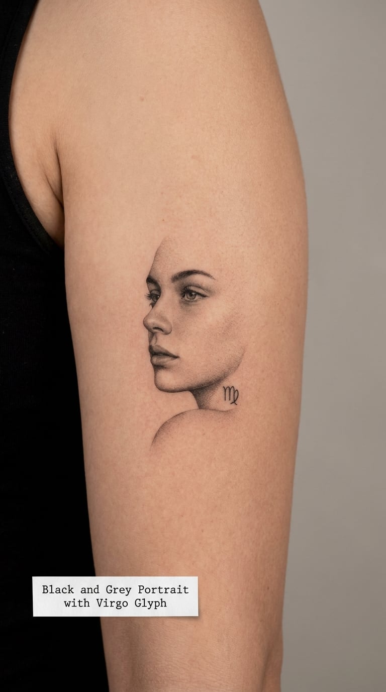
The most expressive option on the list. A black and grey portrait at about 4 inches tall, shaded with smooth gradients, with a small Virgo glyph tucked near the shoulder or behind the neck of the figure. Portrait work benefits from a long conversation before the session, because the shading choices decide how the piece ages.
This is not a first-tattoo design. It is the one to choose when you already have small pieces and want something that anchors a growing collection, and it should sit on a flat, broad area so the whole face is visible rather than curving away.
Placement: upper arm or outer thigh. Size: about 4 inch tall. Style: black and grey realism. Pain: medium, and a long sitting. Ageing: high-contrast portraits last best, so ask for a stronger contrast range. Make it yours: have the glyph sit at a specific spot that means something to you, or leave it out entirely and let the portrait speak.
How to Choose the Right Design
Work through these six before you book anything, in this order.
- Line weight first. If the smallest line in your design is thinner than about 0.5 mm, expect to refresh it. Thin lines look better in photographs than they do after a decade of sun and washing.
- Scale second. Choose the largest size you would still be happy to see on an office day. For most of these designs, going up a size rarely fixes a design that felt wrong at the small size.
- Colour, or no colour. Black-only ages best and costs less time. Watercolour, lavender and yellow are the ones that fade first, so choose them knowing they will need work.
- Style has to match your other tattoos. A fine-line glyph next to a heavy blackwork piece will look like two different people live in your body. Check line weight across the whole set, not design by design.
- Placement before drawing. Collarbones, ribs and the side waist are curved and tender; forearms, upper arms and the shoulder are broad and forgiving. Have the artist stencil on your body before the design is finalised.
- Experience last. Fine-line glyphs, circles and script are forgiving for a first piece. Portraits, dotwork and anything figurative are not. Match the ambition of the design to how many tattoos you have already healed.
Cost and Session Time
Most studios charge by the hour, and the price difference between designs comes mostly down to how long the needle runs and how many sessions it takes. A single fine-line glyph is usually the shortest piece on this page, often under an hour of needling once the stencil is placed. A zodiac wheel, a botanical composition or a celestial back piece is commonly booked as a two-to-four hour sitting.
A black and grey portrait is the biggest jump. Portrait shading needs a long stretch of unbroken work to keep gradients smooth, so four-inch pieces are often split across two sessions, and the artist will tell you before the first one that the piece is not finished on the day.
- Tiny, simple glyphs: one short session, priced at the low end of a shop’s rate card.
- Small compositions with a second motif, a border or a little shading: a standard sitting of a few hours.
- Medium pieces such as the constellation, the floral hip design or the sunflower: a longer sitting, frequently two sessions.
- Large or portrait work: multi-session, quoted individually before the first appointment.
Shop minimums are the thing that catches people out. Plenty of studios set a floor for a booking, so a two-hour minimum can apply to a piece that would only take forty minutes. Ask about the minimum, the hourly rate and the deposit when you enquire, and expect artist rates, travel and complexity to shift the final figure quite a bit. Get the quote in writing before you commit.
Aftercare Basics
- Follow your artist’s aftercare instructions first. They watched the session and know what your skin did, so their instructions override anything general you read online.
- Wash gently. Clean the area with lukewarm water and a mild unscented soap, twice a day, then pat it dry with something clean rather than rubbing it.
- Protect it from sun. Keep new ink covered from direct sun while it settles, and use sunscreen on healed work in that spot for good measure, since sun is what fades fine lines fastest.
- Choose loose clothing. Anything tight over the tattoo rubs and holds heat. Sleepwear and soft cotton are kinder for the first few nights, especially on the rib, hip and wrist placements.
- Leave the scab alone. Itching is normal and picking is how patchy ink happens. If a scab comes off early, stop touching it and let the artist advise.
- Know when to call the artist. Get in touch if colour washes out of the line, if the area stays hot and swollen past the first few days, or if anything here worries you. Their number on the aftercare sheet is there for exactly this.
Frequently Asked Questions
What is the best Virgo tattoo for a first tattoo?
A fine-line Virgo glyph is the safest first piece: one shape, no shading, and a short session. Add a thin circular border or two small stars and it stops looking like everyone else’s, without adding much time. Save portraits, dotwork and figurative designs until you have healed a few simpler tattoos and know how your skin takes ink.
Where should a woman place a Virgo zodiac tattoo?
The inner forearm, upper arm and upper shoulder are the most forgiving spots because they are broad and flat. The collarbone and behind the ear suit smaller work. Wrist, ribs, side waist and the hand sting more and fade faster, so keep those designs simple and the line weight bold. Have your artist stencil the design on your body before it is finalised.
Do fine-line Virgo tattoos fade easily?
Yes, more than people expect. Very thin single-needle lines soften and blur within a few years, and behind the ear, on the hand and on the ankle it happens sooner. Ask for a slightly heavier line weight, avoid placing hairline work where your hand or a bag rubs, and plan on a refresh every five years or so rather than treating it as permanent.
What size should a small Virgo symbol tattoo be?
About 1.5 to 2 inches wide for a plain glyph, and around 2.5 inches if you are adding a circular border or a dot accent. Below an inch the letterforms lose their shape and the work gets fiddly. Bigger than 3 inches, ask for a second motif rather than scaling the symbol up, because an enlarged plain glyph reads as unfinished.
Can I combine the Virgo symbol with flowers or stars?
Yes, and that is the easiest way to stop a Virgo design looking generic. Two motifs work best: the glyph with a small leaf or stem, with a crescent moon, or with a set of constellation stars. Three or more in a small area turns into clutter. Chrysanthemum, poppy and morning glory are the birth flowers listed for Virgo, so a single bloom is a meaningful choice rather than decoration.
Is a Virgo tattoo meaningful without a birth chart?
Yes. The glyph is a zodiac sign marker and people wear it for that reason alone, exactly as they wear a star sign without reading a chart. The designs here do not assign fixed meanings to the moon, stars or flowers, so whatever the piece means comes from your own reason for choosing it. Many wearers say a zodiac piece is a birthday mark and little more, and that is perfectly enough.
Conclusion
Pick the smallest design that still feels like yours. For a first tattoo, a fine-line glyph behind the ear, on the wrist or inside a thin circle covers it, heals predictably and costs you one short sitting. If you already have small pieces and want this sign to anchor a collection, the geometric constellation, the botanical forearm build or the black and grey portrait are the ones that hold attention.
Whichever you choose, take the reference to an artist, get it stenciled on your body, and settle the line weight before the first line goes in. That single conversation is what separates a design that still looks good in ten years from one that reads as a stock zodiac symbol by year three.