
20 Best Back of Neck Tattoo Ideas for Women (September 2026)
The nape is the one placement where you decide, every single morning, whether the whole world gets to see your tattoo. Hair down and it is private. Ponytail up and it is the first thing anyone in the room reads. That control is why back of neck tattoo ideas for women keep filling the same search results year after year, and why the designs that work there are so specific.
Short version: the best nape tattoos are simplified, spaced away from the hairline, and drawn slightly larger than they look in a reference photo. The curve of the neck and the movement of the skin distort anything drawn at a literal size, and hair grows back through it.
If you are planning ahead, this is the season to book rather than rush. A haircut about a week before the session means the artist can see the full canvas, and it is also when you find out how your hair actually sits over that spot day to day.
Quick Guide: 20 Back of Neck Tattoos at a Glance
| Idea | Style | Best placement | Size | Pain |
|---|---|---|---|---|
| Fine-line peony half-collar | Fine line botanical | Centre of the nape, hairline clearance | 3-4 in (8-10 cm) wide | High |
| Single stem rose | Blackwork with grey wash | Upper nape, slightly off-centre | 2.5-3 in (6-8 cm) | High |
| Cursive name | Fine line script | Across the nape, following the curve | 4-5 in (10-13 cm) wide | High |
| Roman numeral date | Fine line serif capitals | Lower nape, near the collar | 2-3 in (5-8 cm) wide | Medium-high |
| Hometown coordinates | Minimal technical | One side of the nape | 2-2.5 in (5-6 cm) | High |
| Wildflower trail | Loose fine line | Curving along the hairline | 5-6 in (13-15 cm) wide | High |
| Smudged butterfly | Fine line with soft shading | Centre nape, low | 2.5-3 in (6-8 cm) | High |
| Hummingbird and flower | Micro-realism with colour | Upper nape, off-centre | 2-3 in (5-8 cm) | High |
| Crescent and star cluster | Line and dotwork | Centre nape | 2-3 in (5-8 cm) | High |
| Moon phase arc | Minimal line | Low nape, following the neck curve | 3-4 in (8-10 cm) wide | Medium-high |
| Dotwork chrysanthemum | Dotwork | Centre of the nape | 2.5-3 in (6-8 cm) | High |
| Watercolour orchid | Watercolour botanical | Upper nape | 3-4 in (8-10 cm) tall | High |
| Eucalyptus sprig | Fine line botanical | Side of the nape near the hairline | 2-3 in (5-8 cm) | Medium-high |
| Coiling serpent | Blackwork illustrative | One side, running down toward the shoulder | 4-6 in (10-15 cm) long | High |
| Geometric curves | Abstract black line | Centre nape, large | 5-7 in (13-18 cm) wide | High |
| Ink brushstroke | Sumi-e inspired | Across the nape, diagonal | 4-5 in (10-13 cm) | High |
| Micro-realism dragonfly | Micro-realism | Low nape, above the collar | 1.5-2 in (4-5 cm) | Medium-high |
| Black moth | Solid blackwork silhouette | Centre nape, slightly high | 3-4 in (8-10 cm) wide | High |
| Personal star map | Fine line and dotwork | Centre nape, wide and flat | 5-6 in (13-15 cm) wide | High |
| Pearl strand | Realism with soft grey | Sitting right on the hairline | 3-4 in (8-10 cm) wide | Medium-high |
1. Fine-Line Peony Half-Collar for a Soft, Feminine Look
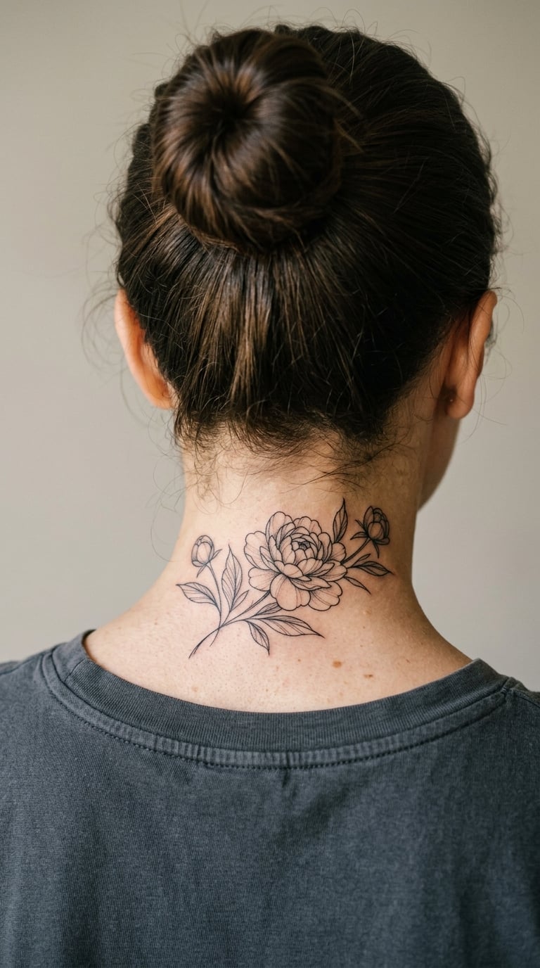
A peony half-collar is a fan of fine black linework that sits just below the hairline, open at the bottom like a necklace that never closes. The petals are drawn with a single needle and kept airy, with a lot of skin showing between strokes.
Peonies are the most requested bloom in nape searches, and the reason is the shape: a half-collar fills the curve of the neck without fighting it.
Placement: centre of the nape, at least half an inch below the hairline · Size: 3-4 in (8-10 cm) wide · Style: fine line botanical · Pain: high. Movement under the skin makes the sting keep going between passes, and soft neck skin shows every stray line as it settles, so expect a touch-up. Make it yours: swap one bloom for a second stem of eucalyptus so it reads as a garden rather than a repeat.
2. Single Stem Rose in Blackwork with Grey Wash
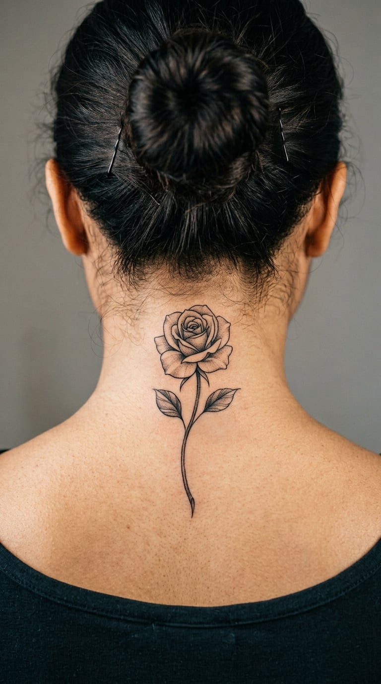
One stem, one bloom, two leaves. The rose is shaded with a diluted grey wash rather than solid black, so the stem keeps a soft edge that survives a moving neck better than a hard outline.
It is a quieter version of the peony, and the grey keeps it from reading as heavy in a formal photograph.
Placement: upper nape, sitting a little off-centre so it peeks out rather than centres · Size: 2.5-3 in (6-8 cm) tall · Style: blackwork with grey wash · Pain: high, and the shaded areas take more passes so the session runs longer. Wash can look patchy while it heals, then settle down by week three. Make it yours: add two tiny dots below the stem for the date you got it.
3. Cursive Name in Fine Line Across the Nape
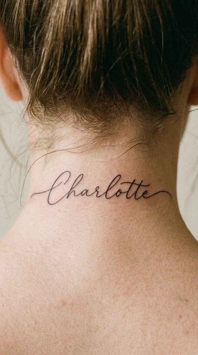
Script across the nape is the most personal design in this list and the one that needs the most care. A single word, or a short name, set in a loose cursive with long exit strokes that follow the arc of the neck instead of sitting straight across it.
The meaning is the point. Most people get a name, a nickname, or a word that only makes sense to two people.
Placement: across the nape, following the natural curve · Size: 4-5 in (10-13 cm) wide · Style: fine line script · Pain: high, and script is the most likely design here to blur slightly, so keep the thinnest strokes around 1mm. Make it yours: have the artist hand-draw the lettering with a dip pen before transferring it, so the spacing is measured rather than traced.
4. Roman Numeral Date Set in Fine Line Serifs
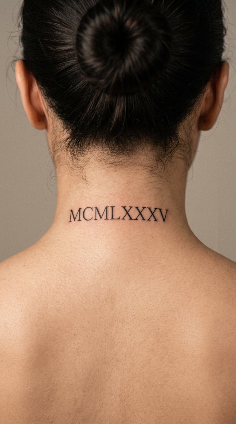
Roman numerals in thin serif capitals, spaced with real air between each character. On the nape the numerals read almost like a spine, and their even rhythm suits the curve better than script does.
It is the standard anniversary or birthday choice, and people usually get one date per tattoo rather than a full list.
Placement: lower nape, just above the collar line where the skin is flatter · Size: 2-3 in (5-8 cm) wide · Style: fine line serif capitals · Pain: medium-high, less than a full bloom because there is less black to lay down. Two-letter years like IX read best at this size. Make it yours: add a tiny laurel or branch under the numerals, kept to a single line.
5. Hometown Coordinates in Minimal Technical Line
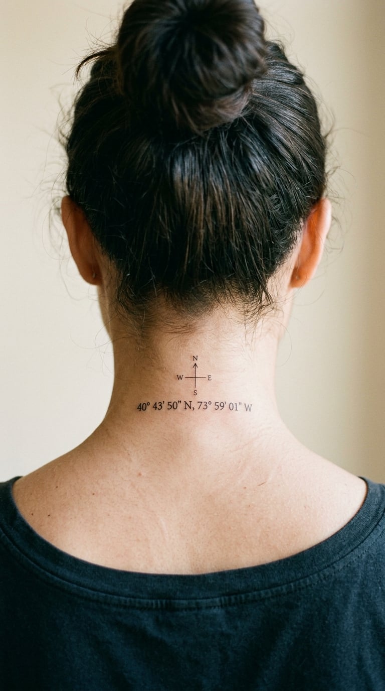
A latitude and longitude pair set in plain sans-serif numerals, sometimes with a tiny compass point or the town name underneath. It is a design that means nothing to anyone except the person wearing it.
Places matter more than most tattoo meanings, and coordinates keep that private in a way a name cannot.
Placement: one side of the nape, tucked where hair falls forward · Size: 2-2.5 in (5-6 cm) wide · Style: minimal technical line · Pain: high, because numerals mean lots of short strokes and every restart stings. Block capitals, not script, keep it legible. Make it yours: use the coordinates of somewhere you have actually been, not the town you were born in.
6. Wildflower Trail Curving Along the Hairline
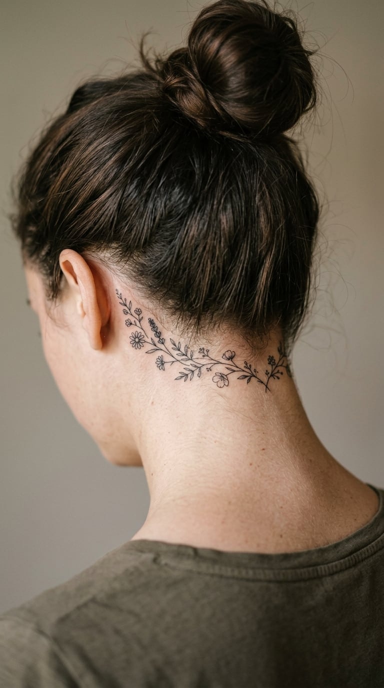
A thin vine of small wildflowers, daisies and seed heads, running in a shallow curve along the base of the hairline. Stems stay one line wide, blossoms are left open rather than filled.
It works as a single standalone piece, and it also slots in nicely beside an existing nape tattoo without needing a cover-up.
Placement: curving along the hairline, one end stopping short of the neck crease · Size: 5-6 in (13-15 cm) wide · Style: loose fine line · Pain: high, and the long curve means a long session with the head tilted. Hair regrows into this one more than any other on the list, so plan for it. Make it yours: name the real flowers that grew along a road or in a garden you know.
7. Butterfly With One Smudged Wing
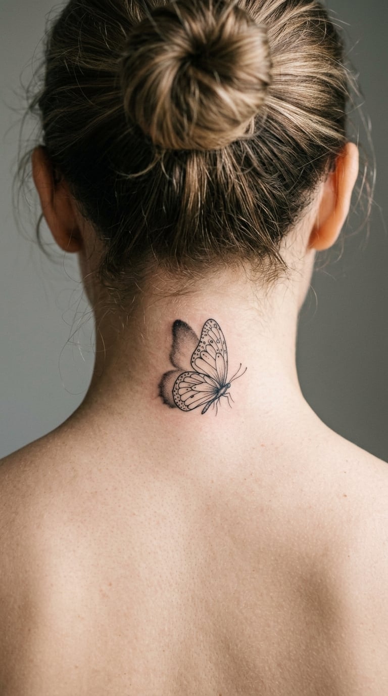
A butterfly drawn in fine line where one wing is complete and detailed, and the other fades into a soft blur that never quite closes. The smudge is intentional, and it reads as a wing in motion rather than a mistake.
Butterflies are chosen for change and for beginnings, and the blurred side keeps the design from feeling like clip art.
Placement: centre of the nape, sitting low so the shape stays intact above the neck crease · Size: 2.5-3 in (6-8 cm) wide · Style: fine line with soft shading · Pain: high, and the gradient shading is a lot of needle work. Blur spreads with skin movement over time, so ask for it tighter than you think. Make it yours: have the blurred wing face the side your hair covers least.
8. Hummingbird at a Single Flower in Micro-Realism
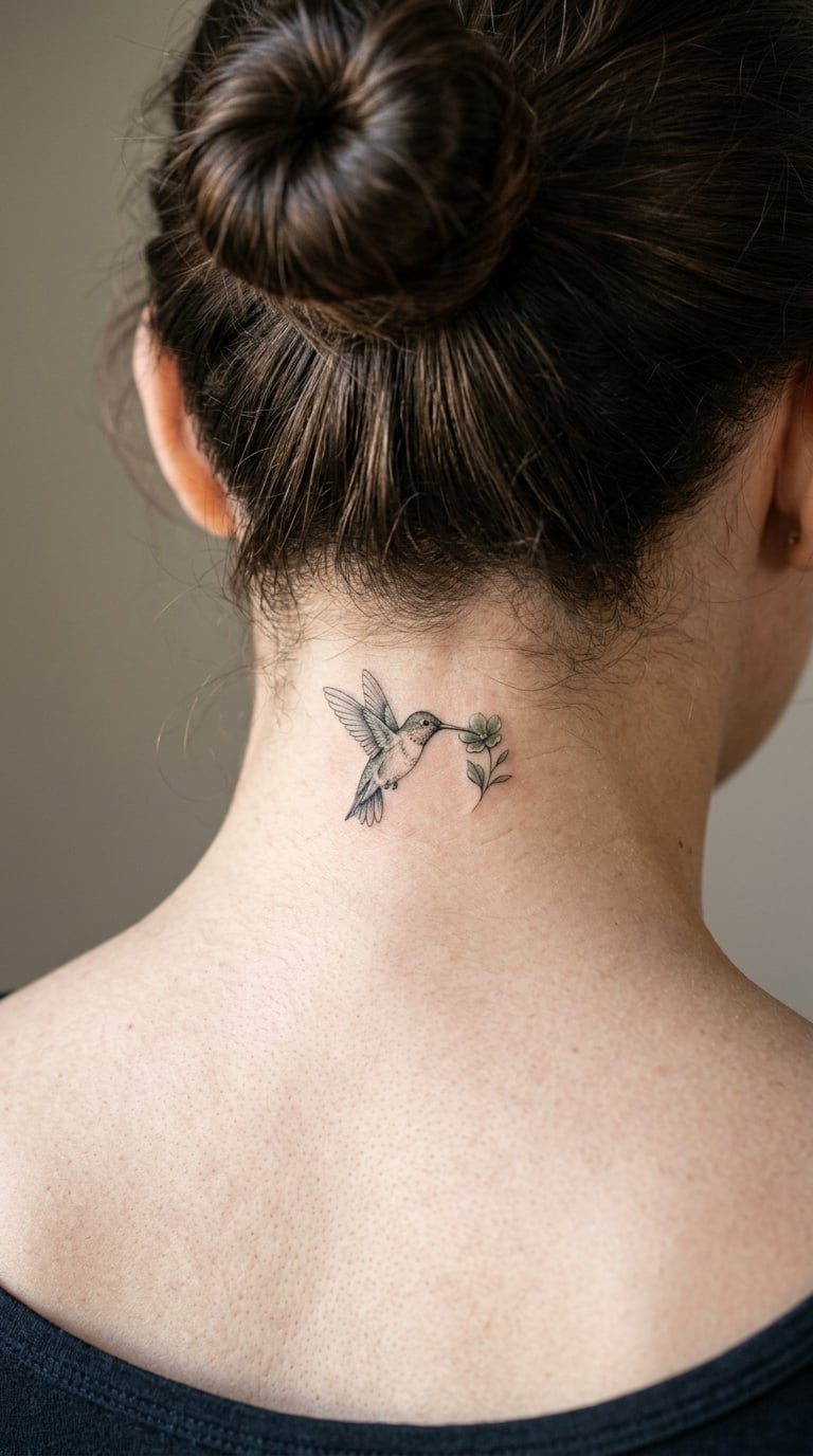
A hummingbird rendered in micro-realism, wings mid-beat, hovering beside one small flower. Wings are usually left as open lines with a wash, while the body carries the actual detail.
It is a lighter piece than it looks in a photo, and people pick it for the movement rather than the bird.
Placement: upper nape, off-centre so the beak points toward the ear · Size: 2-3 in (5-8 cm) · Style: micro-realism with a single colour accent · Pain: high, and the tiny wing detail means short passes with frequent breaks. One colour only, because more than that muddies at this size. Make it yours: pick a flower that actually grows where you grew up.
9. Crescent Moon and Star Cluster in Line and Dotwork
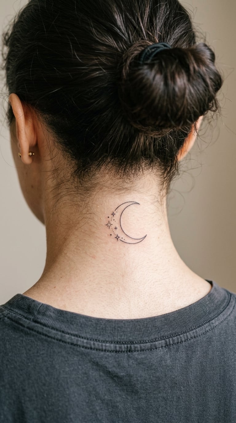
A thin crescent with a scatter of small stars and dots falling away from it, the whole thing in one line weight. Some versions run the stars in a diagonal drift rather than a tidy ring.
Celestial pieces are usually about cycles and timing rather than any single story, and the crescent reads as the more grown-up choice of the two shapes.
Placement: centre of the nape, with the star drift falling toward one shoulder · Size: 2-3 in (5-8 cm) · Style: line and dotwork · Pain: high, and dots are slow going on a curved surface. Keep the stars at least 1mm across or they soften into grey smudges within a couple of years. Make it yours: plot real star positions for the night something happened.
10. Moon Phase Arc in Minimal Line
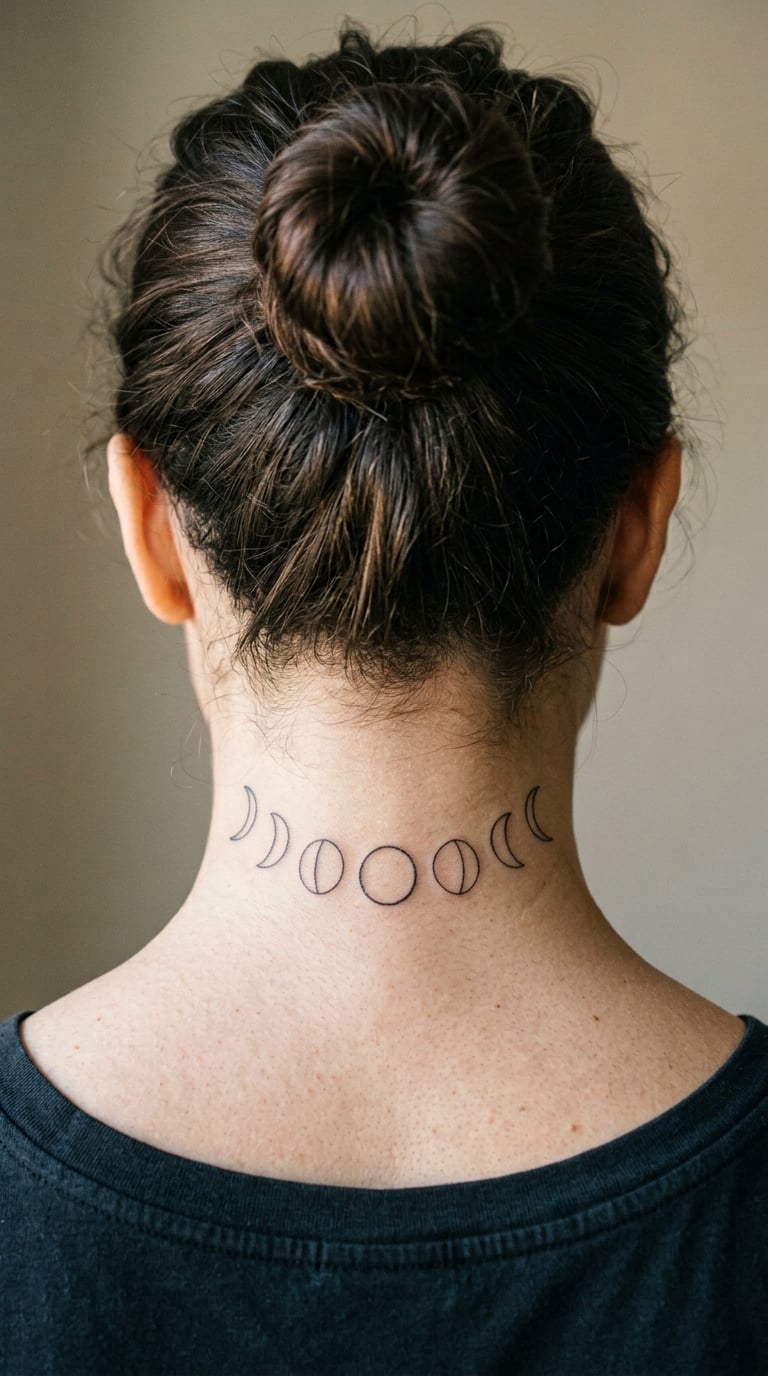
Eight moon phases set in a shallow horizontal arc, each one a simple outline. New moon and full moon usually get solid black, the rest stay as fine circles.
It is the most common gift-style nape design, and it works for birthdays, cycles, or a year that mattered.
Placement: low nape, following the curve just above the collar · Size: 3-4 in (8-10 cm) wide · Style: minimal line · Pain: medium-high, on the lower end of the neck scale, since the skin there is thicker and flatter. Hair resting on the collar is what irritates it, not the needle. Make it yours: have the artist size each moon to match the real relative sizes rather than making them identical.
11. Chrysanthemum in Dotwork
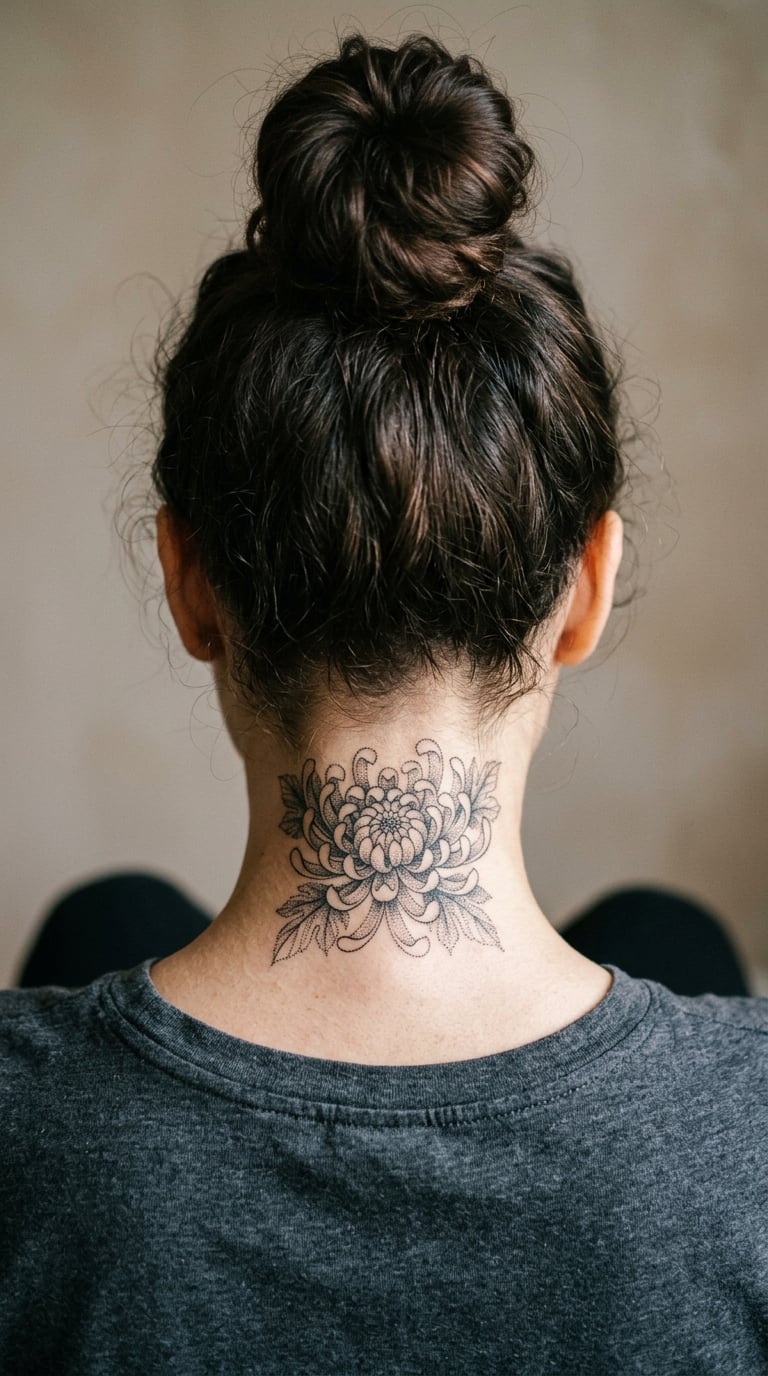
A chrysanthemum built entirely from dots, petals radiating out in layered rows with the density falling off toward the edges. No outline, no shading blocks, just graduated dot size.
Dotwork has almost no hard lines to blur, which is why it holds its shape on a neck better than an outline flower does.
Placement: centre of the nape, kept clear of the hairline so hair does not sit on the outer petals · Size: 2.5-3 in (6-8 cm) · Style: dotwork · Pain: high, and dotwork takes a long time, so expect breaks to be part of the session. Dots on the outer edge can fade unevenly if they go too small. Make it yours: ask for the dot density to fall away in the direction your hair falls.
12. Orchid in Loose Watercolour
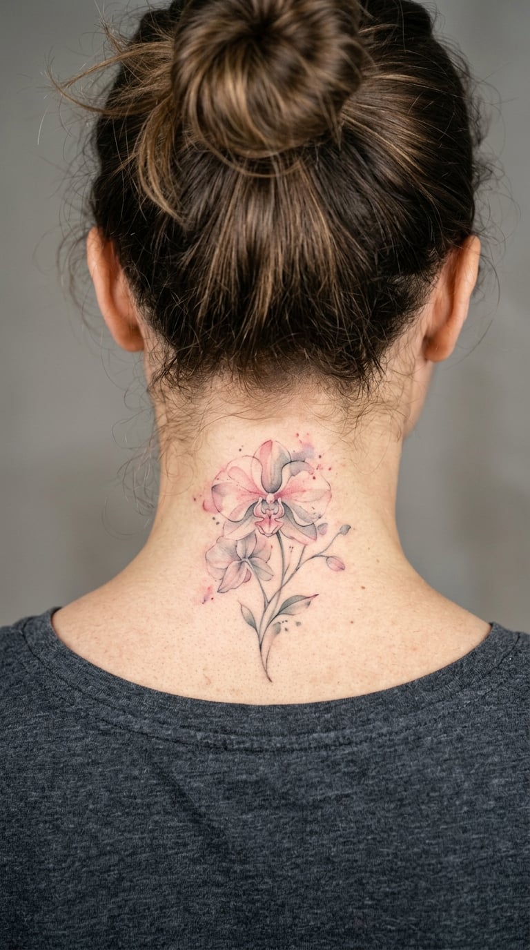
An orchid painted in loose watercolour, with colour bleeding past the line work in places and the background left white. It is the softest design here and the one that photographs best in daylight.
Orchids are usually chosen for elegance rather than a fixed symbol, and plenty of people get one to mark a parent or a grandmother.
Placement: upper nape, angled slightly so the stem runs toward one ear · Size: 3-4 in (8-10 cm) tall · Style: watercolour botanical · Pain: high, and colour means a longer session with more passes over the same skin. Pale washes fade first, so darker centres hold up longer. Make it yours: choose the actual species from a family flower and name it in your head, not on your skin.
13. Eucalyptus Sprig in Fine Line
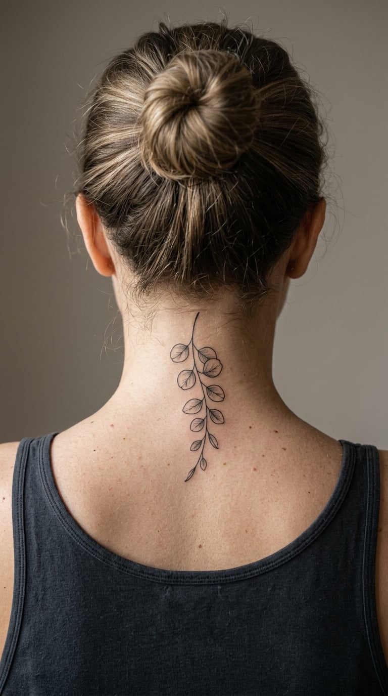
A single eucalyptus stem, rounded leaves alternating down each side, drawn in one consistent line weight with no fill. Simple, quiet, and the least demanding design on this list to get right.
It works as a first tattoo, which is worth knowing given how often people are talked out of a neck piece entirely.
Placement: one side of the nape, where hair falls forward over it naturally · Size: 2-3 in (5-8 cm) · Style: fine line botanical · Pain: medium-high, gentle on the scale because the design is mostly open skin. One line weight means fewer passes and less swelling. Make it yours: add a second, smaller sprig lower down for a matching companion piece.
14. Serpent Coiling Down the Neck
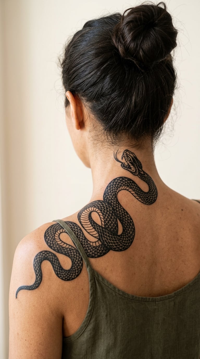
A serpent drawn in solid black with the body coiling once or twice before the head drops toward the shoulder. Black fills and clean gaps between the coils, no grey.
It is the boldest design here, and people tend to choose it for the transformation-and-renewal reading that snakes carry in most traditions.
Placement: one side of the nape, running down toward the shoulder so the coil has room to unroll · Size: 4-6 in (10-15 cm) long · Style: blackwork illustrative · Pain: high, and the solid black fill is the most demanding work in this article. It extends past the nape, so ask how the artist plans the transition onto the shoulder. Make it yours: have the head turned back over the shoulder rather than facing forward, which reads better from the side.
15. Abstract Geometric Curves in Black Line
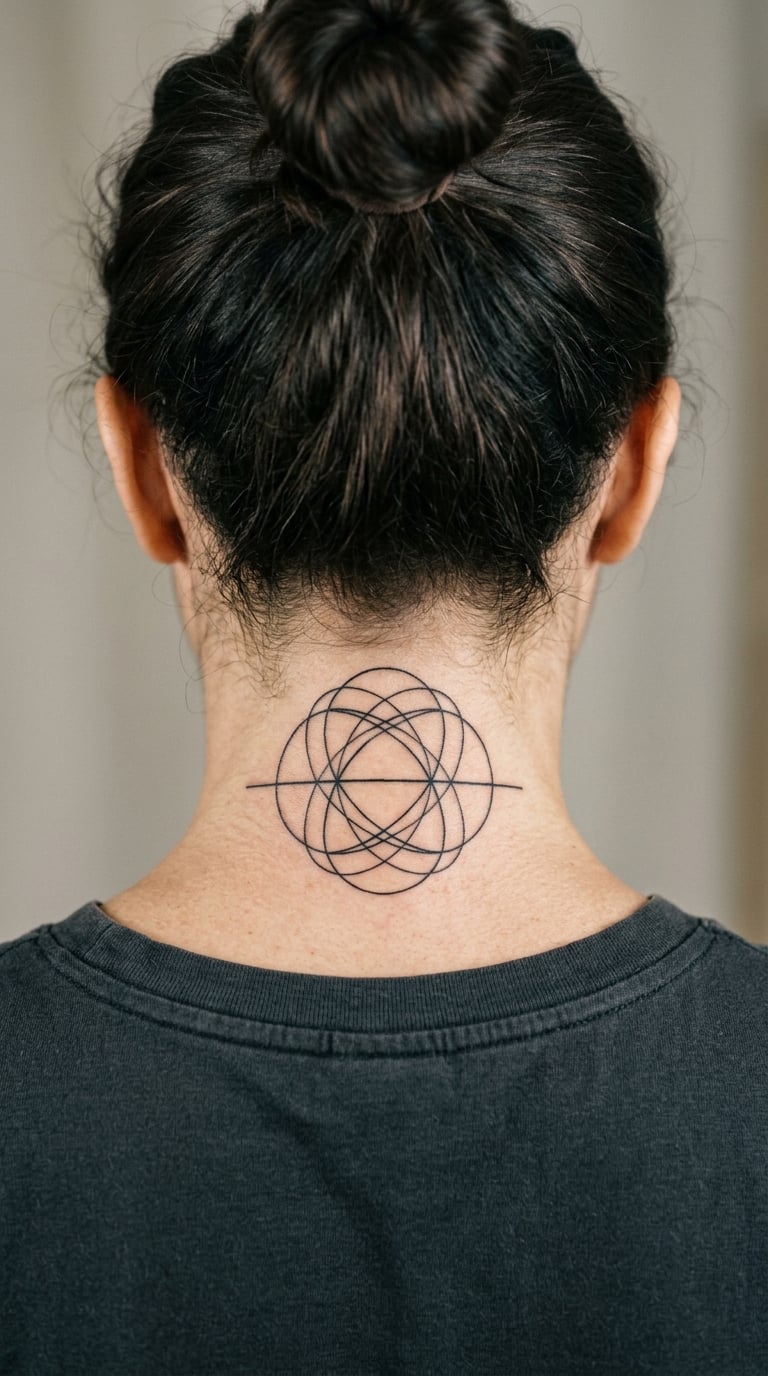
Overlapping arcs, one or two straight lines, and the occasional half circle, laid out so the gaps between them are as considered as the marks. No symmetry required, though plenty of people choose it.
Abstract pieces get picked when words would say too much, or when you want something that reads as one shape from far away and a pattern up close.
Placement: centre of the nape, and this is one design that benefits from going large enough to fill the curve · Size: 5-7 in (13-18 cm) wide · Style: abstract black line · Pain: high, and large means a long session in an uncomfortable position. Straight lines crossing the curve will bow as the neck moves, so ask for them to be drawn slightly arched. Make it yours: have one arc follow the shape of your collarbone rather than sitting flat.
16. Sumi-e Ink Brushstroke
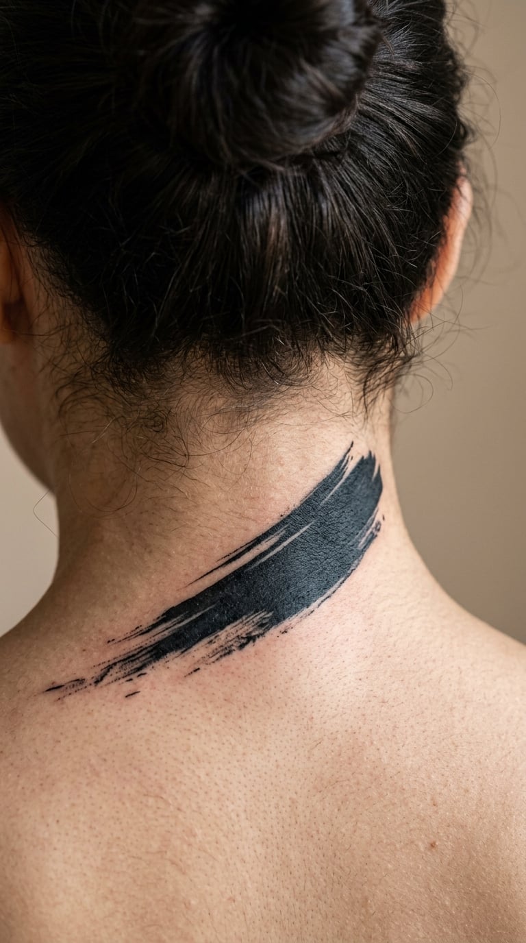
A single wide brushstroke in black, dry-brushed so the edges break up and the ink pools darker in the middle. Some versions add a faint second stroke behind it.
It is the least literal design on this list and the easiest to make personal, because the composition can be entirely abstract.
Placement: diagonal across the nape, angled toward one shoulder so it follows the muscle · Size: 4-5 in (10-13 cm) · Style: sumi-e inspired black wash · Pain: high, because a wide wet line means repeated passes over healing skin and the sting builds each time. Ask for a borderless edge. Make it yours: have the stroke taper to nothing at one end, the way a real brush lifts.
17. Dragonfly in Micro-Realism
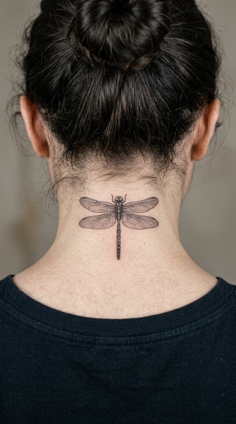
A dragonfly held level, wings stretched left and right with the veining picked out in hairlines. Body shading is kept to a few grey tones.
It is small, symmetrical, and reads cleanly from behind, which is exactly what a nape design has to do.
Placement: low nape, above the collar, where the surface is flattest · Size: 1.5-2 in (4-5 cm) · Style: micro-realism · Pain: medium-high, and the wing veins are fiddly enough that the artist will need breaks. The one design here where going slightly bigger than expected helps. Make it yours: keep the wings a touch longer than life size so they still read through hair.
18. Black Moth With Long Antennae
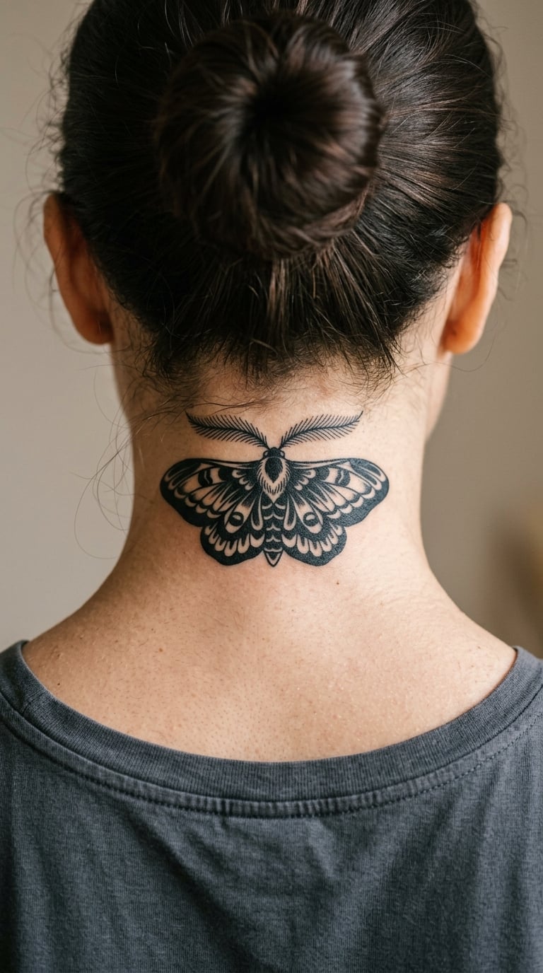
A moth in solid black with a symmetrical wing shape, the body built from a few negative-space cuts and the antennae drawn long and feathered. No gradient, no grey.
Moths carry a night and transformation reading, and the solid fill is what gives it weight on a curved neck.
Placement: centre of the nape, sitting slightly high so the lower wings do not get pushed by the neck crease · Size: 3-4 in (8-10 cm) wide · Style: solid blackwork · Pain: high, and solid fill is a lot of repeated passes. Colours and sun exposure on the neck both wear the black down faster than the arms. Make it yours: have the antennae trail a few inches further than life size so they read at a distance.
19. Personal Star Map in Fine Line and Dots
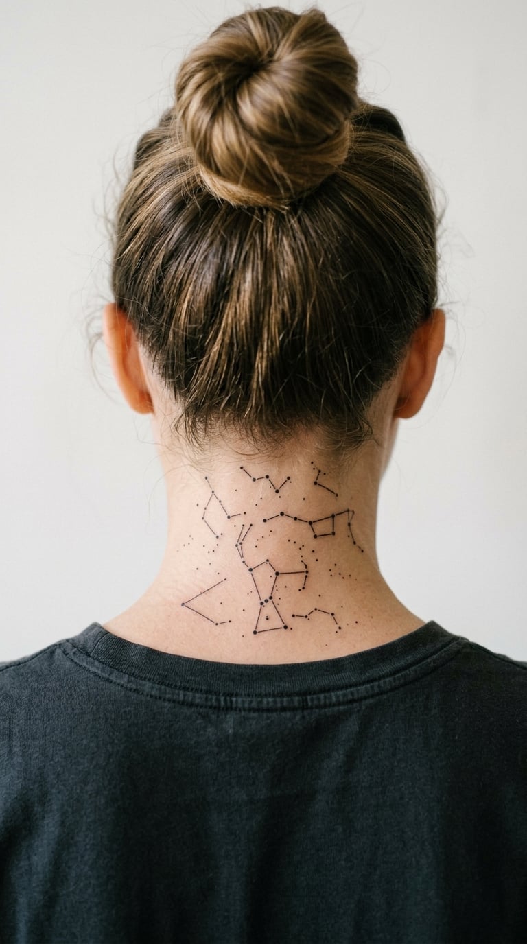
The sky from one specific night, plotted as dots joined by hairlines, sometimes with the date and one place name in small capitals underneath. Wide, flat, and symmetrical by nature.
Everyone has a night they want to remember, and this is the clearest way to carry it without writing it out.
Placement: centre of the nape, laid out wide rather than tall so it follows the shoulders · Size: 5-6 in (13-15 cm) wide · Style: fine line and dotwork · Pain: high, and the connecting lines take as long as the dots. Bring the coordinates to the session, and let the artist plot the real sky rather than freehand it. Make it yours: use the sky from the night you were born if the date matters, or the night of a specific event.
20. Pearl Strand Resting at the Hairline
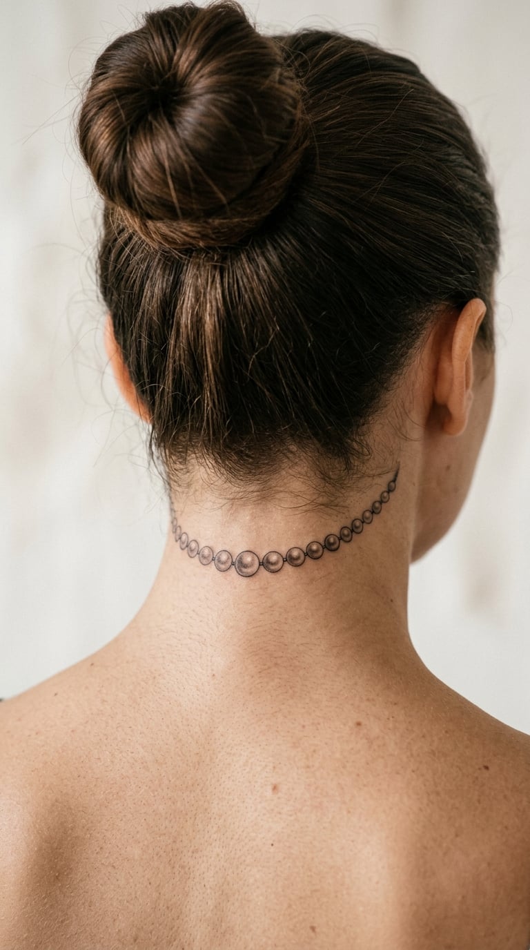
A strand of graduated pearls sitting right along the hairline, each one shaded so the light comes from the same direction. Slightly larger in the middle, tapering at both ends.
It reads as jewellery from a few steps back, which is the trick that makes it work on a neck that curves this much.
Placement: sitting directly on the hairline, which means it will always be partly framed by regrowth · Size: 3-4 in (8-10 cm) wide · Style: realism with soft grey · Pain: medium-high, since each pearl is a small patch of repeated shading. The hairline is the one spot where you and the artist should agree early on exact placement. Make it yours: have the pearls graduated to match a real necklace you own.
How painful is a back of the neck tattoo?
More than most people expect. People who already have tattoos on their hands, arms or ribs consistently rate the nape as one of the harder sessions, often the hardest they have had.
Three things stack up. The skin is thin and densely nerve-ending rich, the neck never stops moving while you sit there, and a shaky head means the artist restarts. Reddit threads in r/tattoos and r/tattooadvice are full of people comparing it to having hair pulled rather than to a normal tattoo needle.
The useful comparison is against your collarbone and the side of your neck. The nape usually beats both, because you cannot see it and cannot brace against the sting. What helps most is a decent session length, a short break every fifteen or twenty minutes, and going in fed and watered rather than running on caffeine and nerves.
How hair regrowth changes a nape tattoo
Hair grows back through the design, and that is the part nobody warns you about properly. Here is roughly what it looks like over a year.
- Two weeks: hair is at stubble length and sits over most of the design. You will see the top edge only.
- Two months: the piece is framed by hair above and below, and the middle reads best. This is the phase most photos are taken in.
- Six months: regrowth partially covers the lower edge unless the tattoo sits high. Colour and fine line both look duller under hair.
- One year: with regular trims above the hairline, the tattoo is permanently visible with hair down. Without a trim, most of it disappears.
Booking your haircut a week or so before the session makes the difference. You see the placement clearly on the day, and you learn now whether you will actually keep it trimmed, because that decision changes which designs suit you.
How to choose the right design for the nape
Pick something that survives a curve and a moving surface, not something you liked in a flat photo. A few rules I would give anyone booking a nape session.
- Keep the thinnest lines around 1mm. Anything finer softens into a grey blur within a few years, and the neck takes sun and friction all day.
- Draw it larger than the reference. The nape foreshortens badly, so a design that looks right flat reads as compressed on skin. Ask the artist to scale it up before transferring.
- Leave clearance from the hairline. Anything sitting on it will be half-hidden the week you get it and permanently framed by regrowth after.
- Prefer blackwork or dotwork to fine outlines. Solid fills and dots hold their shape here better than thin outlines. Colour is fine but fades faster on an area that is rarely covered.
- Brief the artist, do not hand over a saved pin. Show references for the style and the feeling, then let the artist redraw it. Copying an existing design is a copyright problem and it still will not sit right on your neck.
- Look for nape work in their portfolio. Not good tattooing in general, specifically pieces on curved neck skin. That is a different skill.
Cost and Session Time
Tattoo pricing varies by city, artist and shop minimum, so the only honest way to talk about it is by size and time rather than a single number. Most studios charge either an hourly rate or a flat price per piece, and almost all have a shop minimum that a small nape tattoo will still meet.
A dainty script word or a small dragonfly is usually a short session, somewhere around an hour, and often at or near the shop minimum. A peony half-collar, a star map or an abstract curve piece runs two to three hours. The serpent and the full geometric design are the two here that a single sitting may not finish, and a good artist will tell you that in the consult rather than pushing through.
Colours and micro-realism add time, because shading is repeated passes rather than one. The one thing worth budgeting extra for is a touch-up, which the nape usually needs because of the movement.
Aftercare Basics
Follow your artist’s aftercare instructions first, above anything written here. They will know how their own work was inked. Beyond that, the nape has a few specific things to watch.
- Treat the first two weeks as the healing window. No swimming, no saunas, and no soaking.
- Expect flaking. The neck sheds skin constantly and constant movement lifts scabs faster than on an arm, so this is normal rather than a sign it went wrong.
- Wash it daily with whatever your artist specified, then pat dry. Do not leave it wrapped and damp.
- Keep sunscreen on the nape when it is uncovered. The back of the neck is one of the most sun-exposed spots on the body and it is where fading shows first.
- Avoid scratchy hair products and heavy conditioner on the area while it is healing, since residue sits right where fresh skin is forming.
- Watch the edges of the design, not the centre. The outer line fades first because the skin there stretches and moves most.
- Book a free check-in if the artist offers one. A nape piece that has dulled along an edge can usually be reinforced before it sets.
Is a neck tattoo a red flag at work?
Usually not, and the honest answer depends far more on your industry than on the tattoo. In offices, schools, healthcare and most customer-facing roles, visible neck ink is a conversation with a manager rather than a career event.
Conservative sectors, religious schools, some law enforcement roles and a handful of corporate dress policies are where it does matter. If that describes your work, a nape piece is a reasonable choice anyway, since hair down hides it completely and that is your call to make every morning. Plenty of people who have the nape covered plus both sides report no effect on their life at all, which is the counterweight to the usual warnings online.
Frequently Asked Questions
How painful is a back of the neck tattoo?
More than most people expect, and more than an arm or rib piece. The skin is thin, nerve-rich and never still, and the sting builds across a long session as the same skin is worked repeatedly. Most people compare it to hair being pulled rather than a normal tattoo needle. Short breaks every fifteen or twenty minutes make the biggest difference.
How long does a back of the neck tattoo take to heal?
A small nape tattoo looks healed at about two weeks and is fully settled in six to eight. The neck stays mobile the whole time, so flaking and lifting scabs are more common here than on an arm. Plan on a visible touch-up at around six months, since the outer line of a design wears down first and is easy to reinforce.
Do neck tattoos damage hair follicles?
No. The needle only enters the top few layers of skin, and hair follicles sit deeper than that, so they are not affected. The design will be obscured by regrowth for a while, and friction from hair over a fresh tattoo is irritating rather than damaging. Trimming above the hairline keeps the piece framed and visible without touching the follicles at all.
Is a neck tattoo a red flag at work?
In most industries it is not, though it is worth a conversation with your manager before you book. Offices, healthcare and customer-facing work treat visible neck ink as an ordinary tattoo. Conservative schools, religious institutions, some law enforcement roles and strict corporate dress policies are the exceptions. With hair down, a nape piece is fully hidden whenever you want it hidden.
How much does a back of the neck tattoo cost?
It depends on your city, your artist and the shop minimum far more than on the placement. Small script or a single small insect is a short session and often priced at the studio minimum. Larger work like a peony half-collar, a star map or an abstract curve runs two to three hours. Most studios charge hourly or flat per piece, so ask for the total before the session starts.
What is the 1/3 rule tattoo?
The 1/3 rule is a visibility guideline rather than a design technique. The idea is that a tattoo placed on the lower third of the body tends to be easier to cover, so it invites less comment in professional settings. It is not specific to the nape and not a rule artists follow. For a back of the neck piece, the hairline and your hair length already decide visibility far more than the rule does.
Where to start
If this is your first tattoo, do not start with a serpent or a full star map. The eucalyptus sprig, the moon phase arc and the dragonfly are the three here that need the least line work, hold their shape best, and are easiest to live with while your hair is doing whatever it is doing.
If you are adding to a collection, the peony half-collar and the geometric curve piece are the two that leave room to build around later. Show the artist the references you like, ask them to redraw at nape scale, and get the placement agreed in person before anything goes on skin.