
20 Hieroglyph Tattoo Ideas: Best Ancient Symbols (October 2026)
Hieroglyph tattoo ideas sit somewhere between writing and ornament, and that is exactly why they hold up as permanent pieces. Twenty hieroglyph tattoo ideas, each with the symbol named, the style that suits it, a placement that flatters it, and the size it needs to stay legible in ten years.
Egyptians called hieroglyphs medu netjer, the words of the gods, and the script was reserved for temple walls, tombs and religious texts rather than daily notes. What works on skin is restraint: fewer symbols, honest line weight, and a reference the artist actually sourced. Updated for 2026, and written for anyone getting their first script tattoo or adding a fourth piece to a wall of symbols.
People who book these usually fall into two camps. One wants a name in a real translation. The other wants a single symbol that carries protection, rebirth or a tie to Egyptology. Both work. What does not work is a string of glyphs pulled from a random generator, and I will show you how to spot that before you sit down.
20 Hieroglyph Tattoo Ideas: Quick Guide
All twenty designs below, in the same order as the details that follow, with realistic sizes for adult skin.
| Idea | Style | Best placement | Size | Pain |
|---|---|---|---|---|
| 1. Ankh and lotus | Fine line | Inner forearm | 2-3 in | Low |
| 2. Name cartouche | Fine-line lettering | Outer upper arm | 3-4 in tall | Medium |
| 3. Eye of Horus | Blackwork | Upper chest | 4-6 in | Medium |
| 4. Scarab | Fine-line realism | Wrist or ankle | 1.5-2 in | Medium |
| 5. Sacred ibis | Fine line with one colour accent | Calf | 5-7 in | Low |
| 6. Geometric falcon | Geometric blackwork | Shoulder | 4-5 in | Medium |
| 7. Papyrus column | Fine line | Forearm, vertical | 5-8 in tall | Low |
| 8. Anubis | Minimal blackwork | Upper arm | 5-7 in | Medium |
| 9. Lotus and ripples | Line work with one accent | Lower back or calf | 6-9 in | Low |
| 10. Pyramid and sun disk | Fine line | Forearm | 3-4 in | Low |
| 11. Djed pillar | Black and grey | Inner upper arm | 4-6 in | Medium |
| 12. Was scepter | Clean line art | Forearm or calf | 4-5 in | Low |
| 13. Maat feather | Micro-realism | Behind the ear | 1.5-2.5 in | Medium |
| 14. Water lines and zigzags | Graphic abstract | Ankle or forearm band | 6 in band | Medium |
| 15. Star pattern with sun disk | Fine line | Inner arm | 2-3 in | Low |
| 16. Sphinx | Neo-traditional | Thigh or shoulder | 6-8 in | Medium |
| 17. Scribe palette and reed | Fine line with one accent | Forearm | 3-4 in | Low |
| 18. Vertical glyph column | Script, sourced glyphs | Calf or forearm | 6-10 in tall | Medium |
| 19. Cobra | Blackwork with gold accent | Upper back | 5-7 in | High |
| 20. Lotus, sun and sparrow | Fine line trio | Shoulder | 7-9 in | Medium |
1. Fine-Line Ankh and Lotus Combination
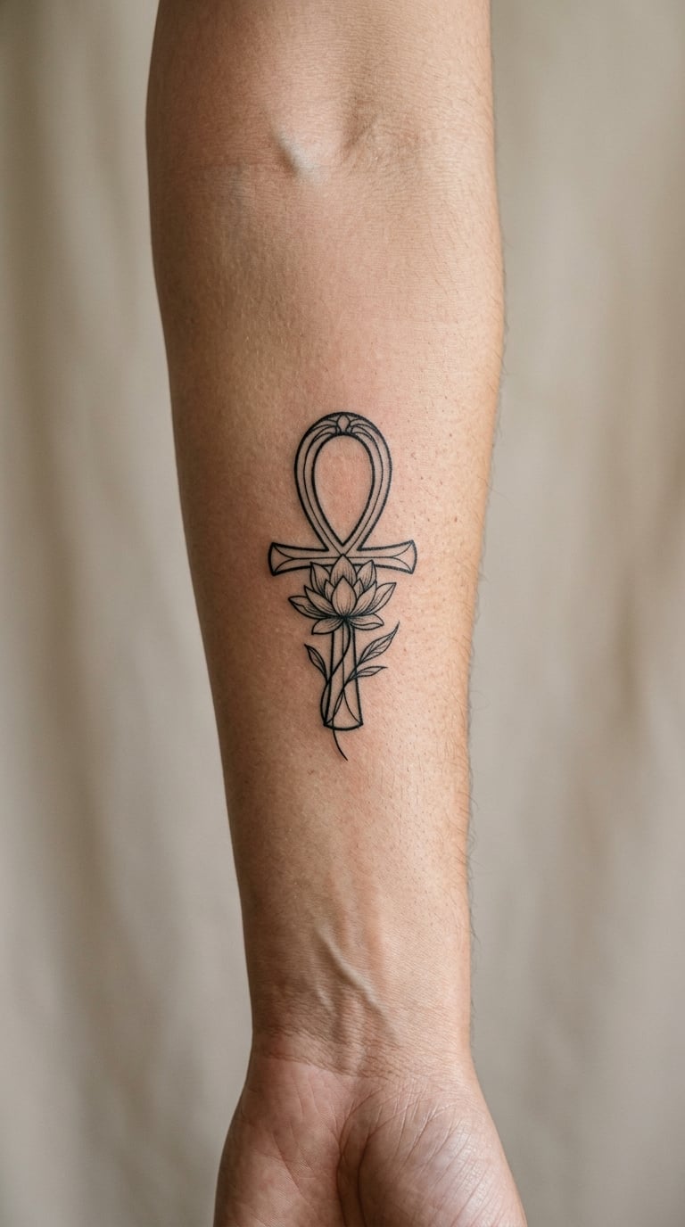
The ankh, a loop above a T-shaped cross, sits at the centre with a small lotus tucked below it. Everything is single-needle weight, maybe 1mm lines, with generous empty space between the loop and the petals.
People choose this because the ankh was the hieroglyph for life itself and the lotus opens at sunrise. Combined, they read as a quiet promise rather than a boast.
Placement: inner forearm, wrist to mid-forearm, where the flat muscle keeps lines straight. Size: 2-3 inches (5-7 cm) tall. Style: fine line. Pain: low, mostly a scratchy feeling. Fine line on the inner forearm softens faster than most areas, so expect slight blurring around year five. Make it yours: swap the lotus for a single date numeral underneath, or run the stems into a matching piece on the opposite arm.
2. Cartouche with a Personal Name
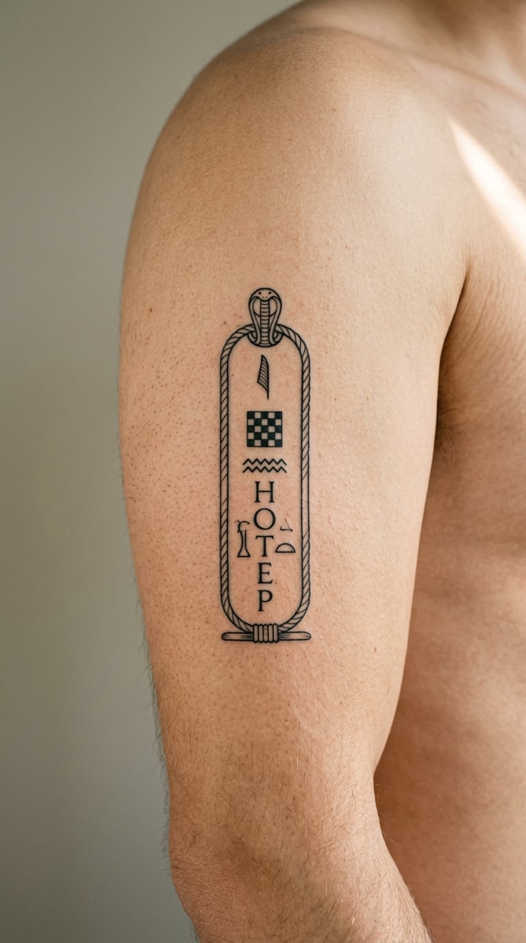
A cartouche is the oval ring that enclosed a royal name, and it works beautifully as a frame for a modern one. Inside the ring, a short name or phrase is written in sourced glyphs, stacked vertically with even spacing between each sign.
This is the design that rewards research most. Have the glyph string verified before the stencil goes down, because lettering is where tattoos go wrong most often.
Placement: outer upper arm or the flat of the forearm. Size: 3-4 inches (7-10 cm) tall for three or four glyphs. Style: fine-line lettering. Pain: medium on the bicep, medium-low on the forearm. Make it yours: add a small nefer sign beneath the ring, or set the name in a two-column layout for a longer name.
3. Eye of Horus in Blackwork
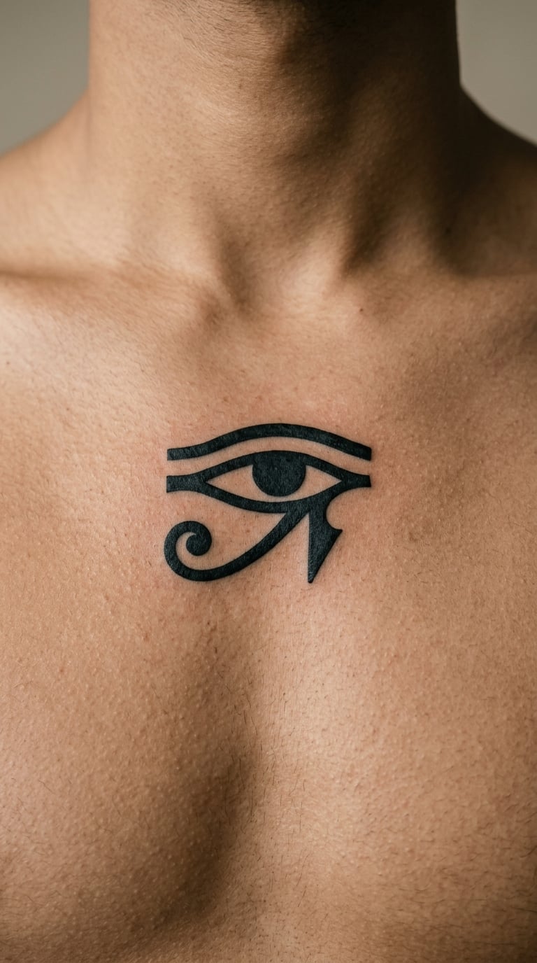
The Eye of Horus, or wedjat, is a stylised eye with a curved brow and a long marking under it. In blackwork the shape is reduced to a few confident blocks, with the brow thickened and the tail drawn as a single tapering stroke.
It belonged to Wadjet and was used as a protective emblem, which is the reason most people want it. Keep the geometry symmetrical and it reads instantly at any distance.
Placement: upper chest, sternum, or shoulder blade. Size: 4-6 inches (10-15 cm) across for the full form. Style: blackwork. Pain: medium over the sternum, medium-high on the ribcage. Solid black softens less than shading, so it ages well. Make it yours: pair it with a second smaller eye in the same weight on the opposite shoulder to build a symmetrical set.
4. Scarab in Fine-Line Realism
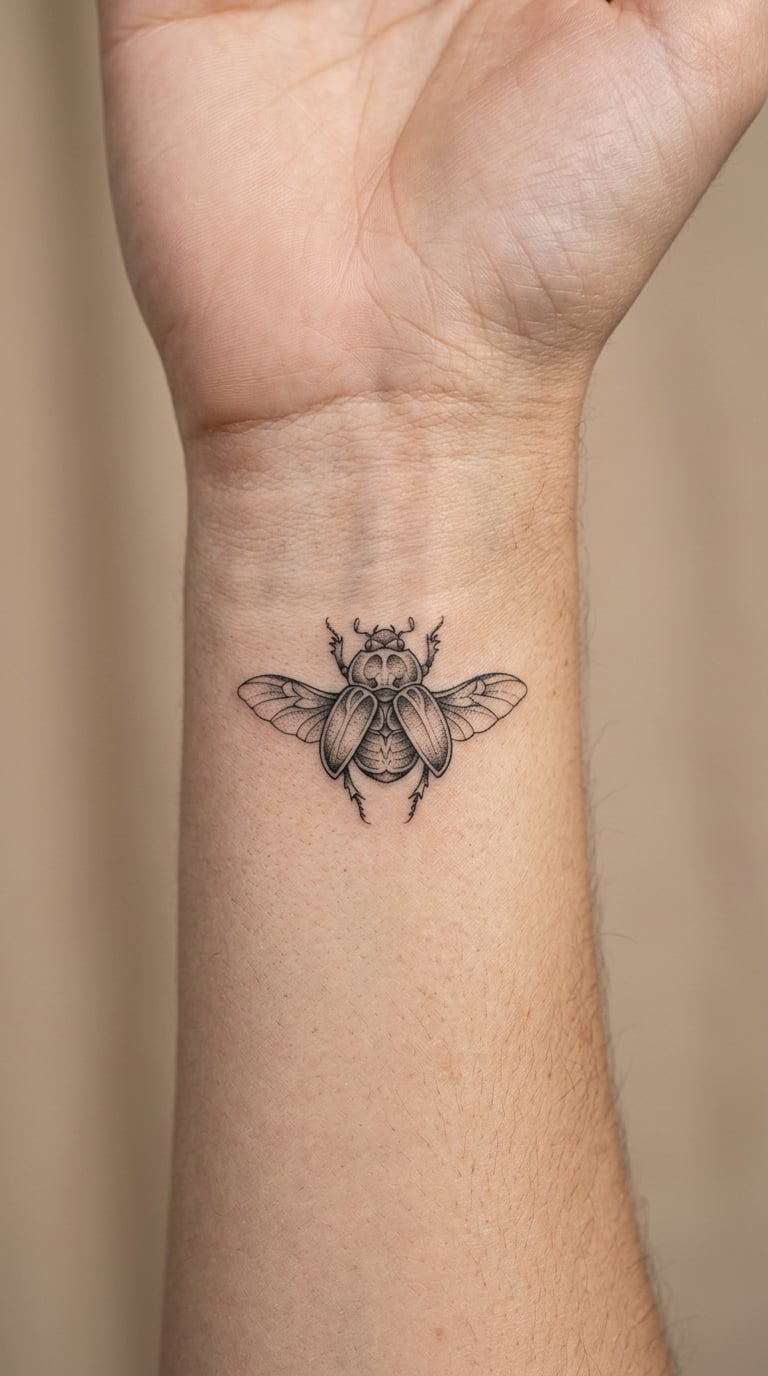
A scarab rendered in fine-line realism keeps the head, split wing cases and six legs, but the artist holds the detail to two or three levels of grey. The shell gets a soft gradient, the legs stay single-needle.
Khepri, the scarab-headed figure, was tied to the rising sun and to rebirth, which is why this motif keeps turning up on memorial pieces. Nobody wears one for a single fixed reason, so let the artist draw the reference from a museum source.
Placement: wrist, ankle, or the inside of the forearm. Size: 1.5-2 inches (4-5 cm) long. Style: fine-line realism. Pain: medium on the wrist, medium-low on the ankle. Tiny barb detail on a small scarab will blur over a decade, so the artist should simplify rather than shrink. Make it yours: angle the body of the beetle upward toward the shoulder, or add one muted green tone to the shell.
5. Sacred Ibis with Small Feather Detail
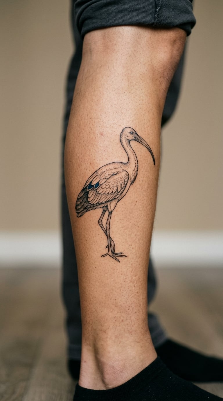
The ibis stands in profile on a thin leg, neck curved into a long downward beak that follows the body line. The artist keeps the body as an outline and simplifies the wing to three or four internal strokes, then adds one restrained colour accent, usually blue or deep teal, on a single feather group.
Thoth, the ibis-headed scribe of the gods, is the reference point here, associated with writing, knowledge and measured speech. Most wearers are drawn to the elegance of the line rather than the story.
Placement: calf, outer thigh, or the back of the upper arm. Size: 5-7 inches (12-18 cm) tall. Style: fine line with one colour accent. Pain: low, the calf is a forgiving spot. The colour accent is the weak point, so expect to need a touch-up on the hue within two years. Make it yours: place a small reed-pen glyph near the beak, or run the bird along the calf so the beak points down toward the ankle.
6. Falcon with Geometric Body Pattern
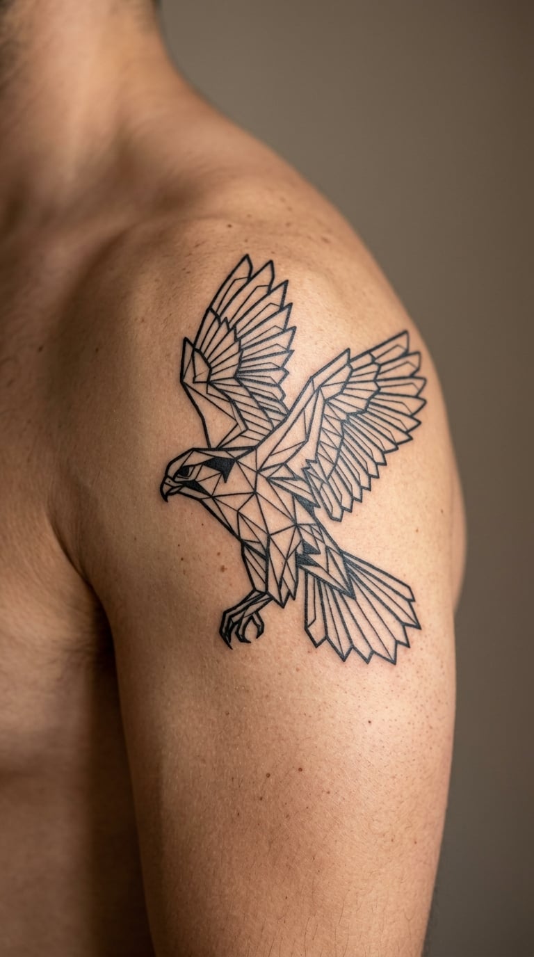
Rather than drawing feathers one by one, the artist builds the bird from repeated angular shapes stacked along the back, with open skin left between each one. The hooked beak and the angled wing edge give it the character; the rest stays graphic.
The falcon form is associated with Horus. Decorative versions often drop the religious framing and keep the silhouette, which is the right call for most first-tattoo clients.
Placement: shoulder cap, upper back, or the side of the thigh. Size: 4-5 inches (10-13 cm) from beak to tail. Style: geometric blackwork. Pain: medium on the shoulder, medium-low on the thigh. Bold filled shapes hold their edge longer than fine hairlines. Make it yours: change the negative space to a tight dotwork fill behind the wing, or run two of them mirrored along the spine.
7. Papyrus Column with Fine-Line Detail
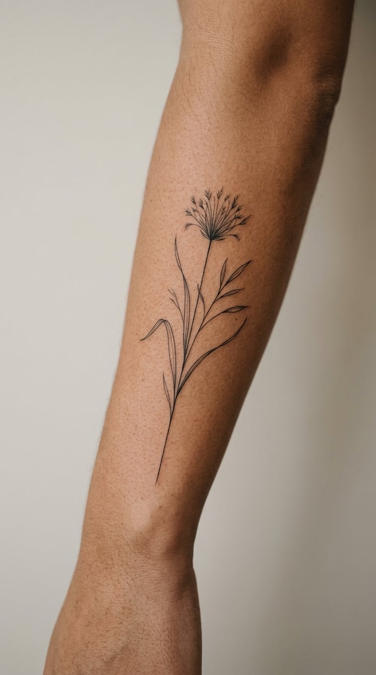
The papyrus plant grows straight up from a fan of narrow leaves with a small triangular umbel at the top. In fine line the stem becomes one confident vertical and the leaves angle out in threes, with cross-hatching reserved for the base.
It shows up constantly on Egyptian temple walls as part of marsh and abundance scenes, and a column of it reads as order and growth without needing a translation. Good filler piece for an open forearm.
Placement: side of the forearm running vertical, or the inner calf. Size: 5-8 inches (12-20 cm) tall. Style: fine line. Pain: low to medium. The smallest leaf tips are the first thing to go soft, so the artist should widen them rather than add more. Make it yours: add a short date in small numerals along the stem, or repeat the plant twice at different heights to make a rhythm.
8. Anubis in Minimal Blackwork
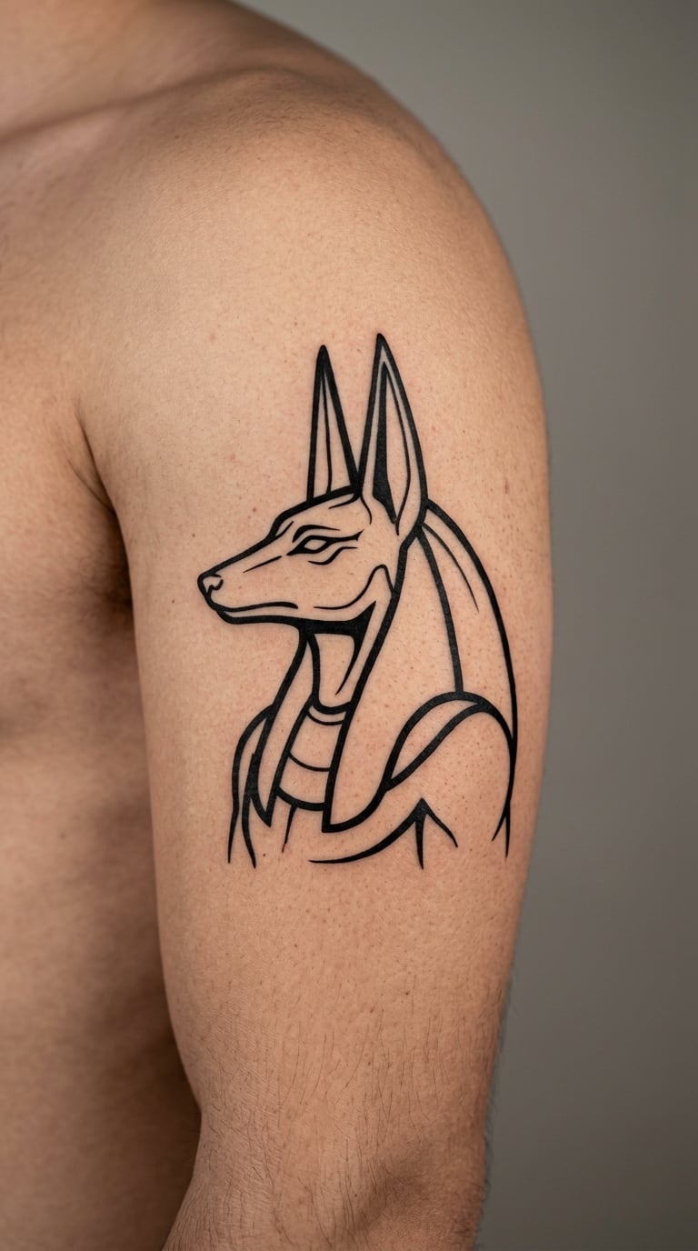
Anubis is drawn in profile: the long jackal muzzle, the tall pointed ears, a narrow body, and a staff held in front. Minimal blackwork means the artist keeps the outline heavy, the interior almost empty, and lets the negative space do the work of the fur detail.
He is the jackal-headed god associated with embalming, guiding the dead and weighing what is weighed. Plenty of people take the shape rather than the theology, and that is a reasonable way to approach it.
Placement: outer upper arm, calf, or the side of the torso. Size: 5-7 inches (12-18 cm) tall. Style: minimal blackwork. Pain: medium on the arm, higher on the ribs. Contour lines stay sharp longer than any kind of shading here. Make it yours: vary the line weight so the staff reads darkest, or tuck a small djed form at the base of the figure.
9. Lotus and Water Ripple Composition
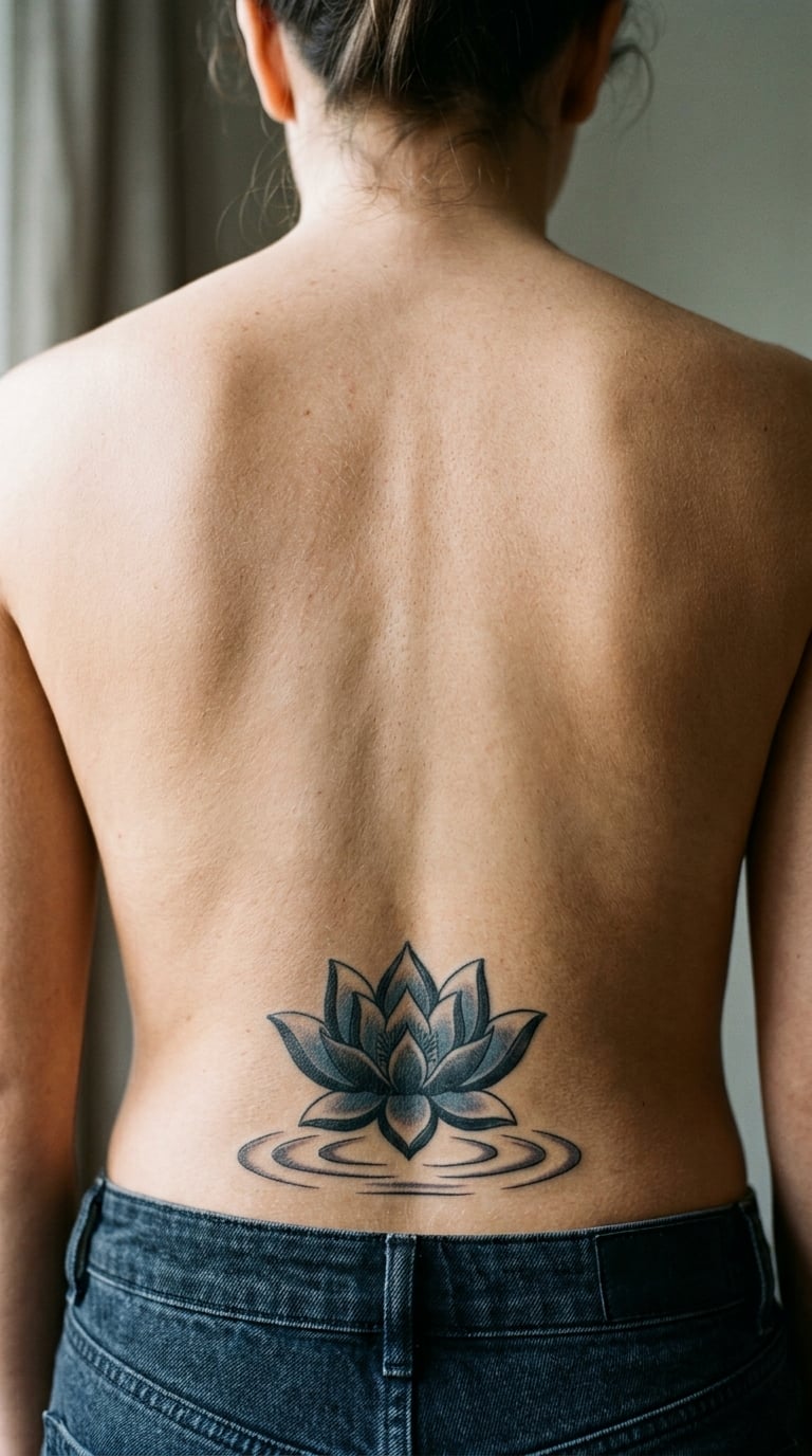
A lotus sits at the top of the composition with its petals opening upward, and three or four horizontal water lines run beneath it with the spacing kept even. One muted blue or green carries the ripples, and the lotus stays black line work.
The water sign is one of the commonest glyph forms in the script, and the lotus blooms with the sun. Together they make a nature-focused piece that still belongs in a symbol collection.
Placement: lower back, calf, or the inner forearm. Size: 6-9 inches (15-23 cm) wide. Style: line work with one accent colour. Pain: low to medium, and the lower back is a spot people describe as scratchy rather than sharp. Blue and green fade first, so keep the accent pale. Make it yours: add a second smaller bloom offset below the first, or ink the ripples in a warmer teal to match an existing piece.
10. Pyramid and Sun Disk Outline
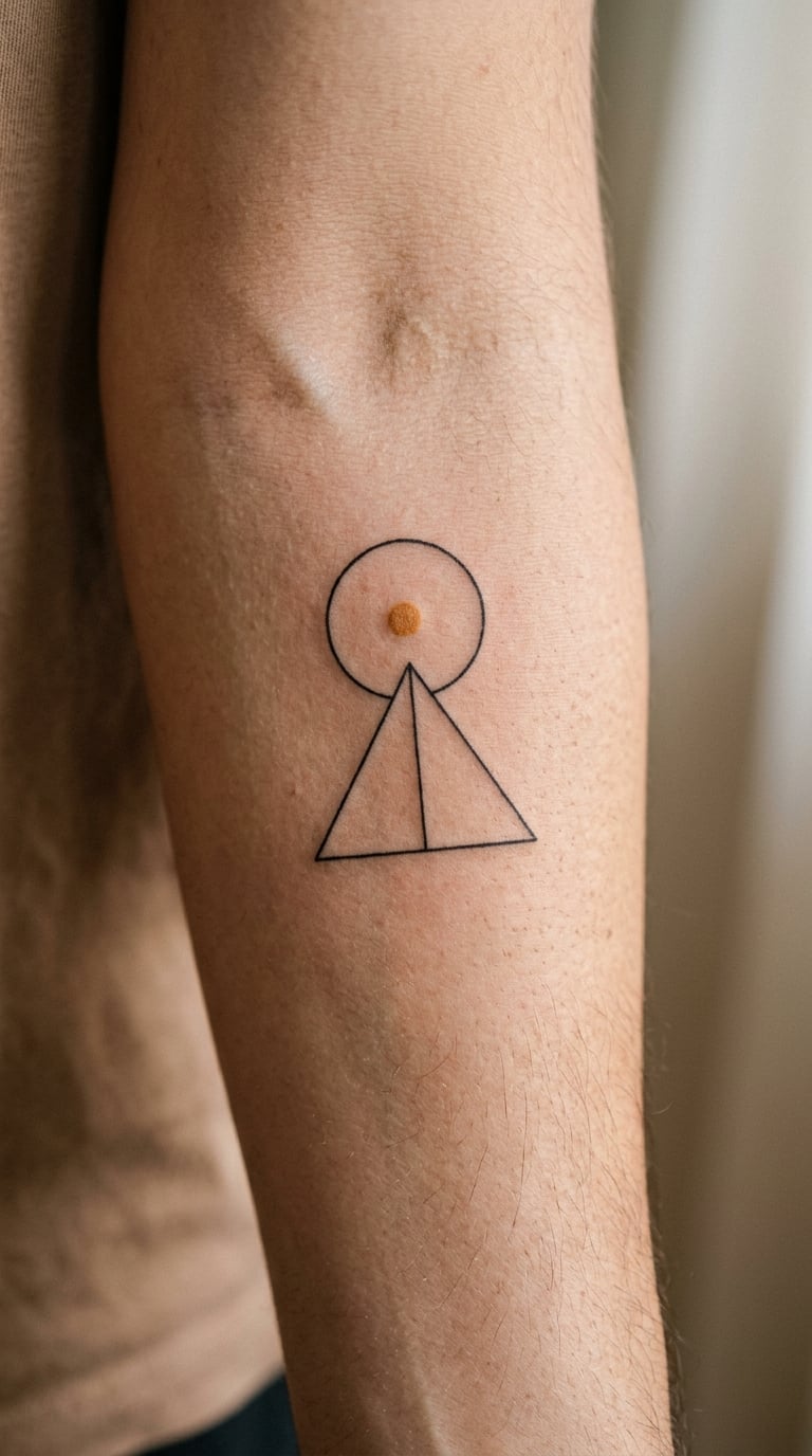
Two elements, nothing else: a triangle with one internal line marking a face edge, and a clean circle floating above it. A small warm ochre or gold wash in the disk is the only colour in the piece.
This is a scene rather than a glyph, built from shapes the script itself uses. It works well as a filler between a script column and something heavier, and it is one of the safer choices for a first piece.
Placement: forearm, ankle, or the inner upper arm. Size: 3-4 inches (7-10 cm) tall. Style: fine line with a light colour fill. Pain: low almost anywhere. A filled circle is the detail that softens first, so the artist should leave a ring of clean outline around it. Make it yours: stack three disks rising above the pyramid, or shrink the whole scene for a matching wrist piece.
11. Djed Pillar in Traditional Detail
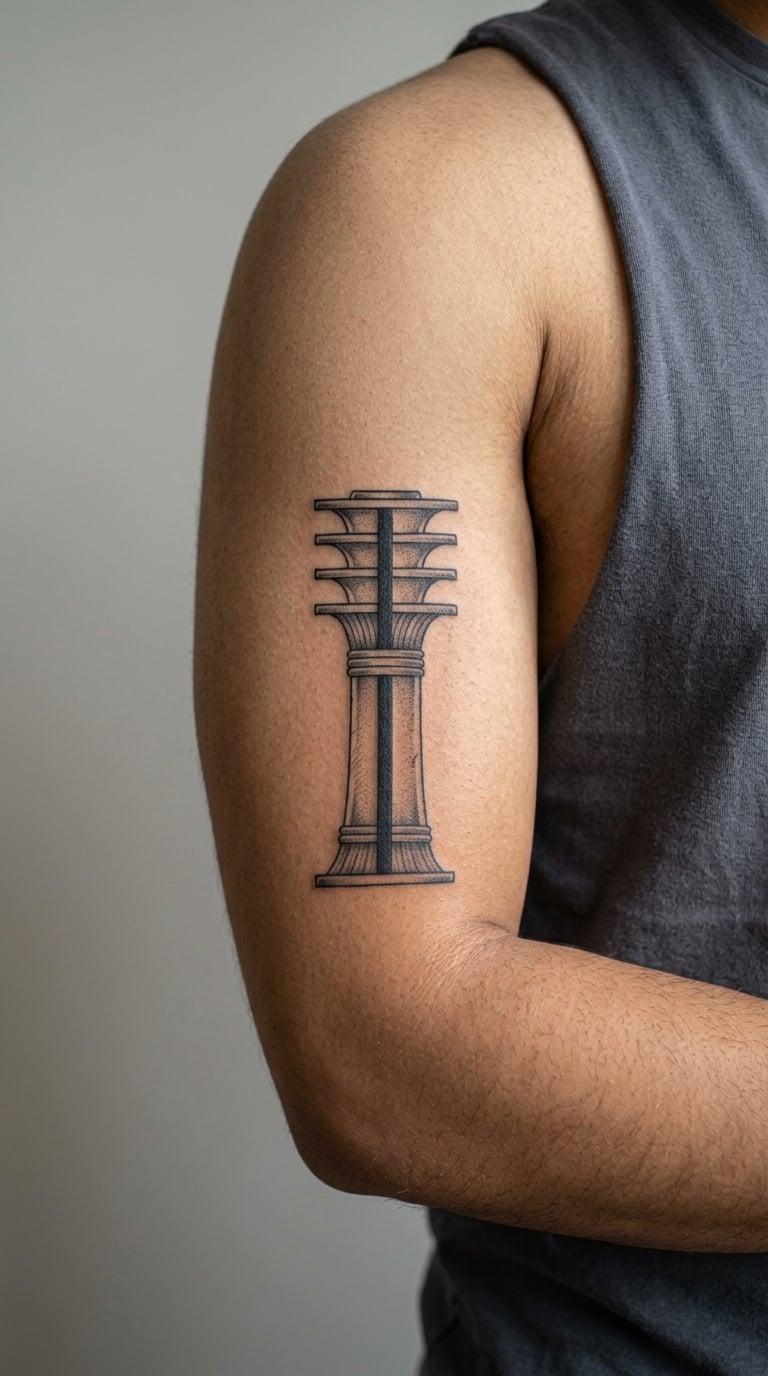
The djed is a column of stacked horizontal bars on a thick central shaft, with a flared base. Black and grey rendering gives the bars depth, with the topmost bar darkened and the lower shaft fading toward grey.
It was associated with stability, endurance and the backbone of the world, and it appears on temple architecture and in funerary texts. The silhouette is unmistakable once you have seen it.
Placement: inner upper arm, forearm, or the side of the calf. Size: 4-6 inches (10-15 cm) tall. Style: black and grey. Pain: medium, a little more on the inner bicep. The stacked bars give the design structure that survives ageing better than scattered fine detail. Make it yours: add a small ankh resting at the base, or leave a wider gap between the top two bars so the form reads instantly at a glance.
12. Was Scepter in Clean Line Art
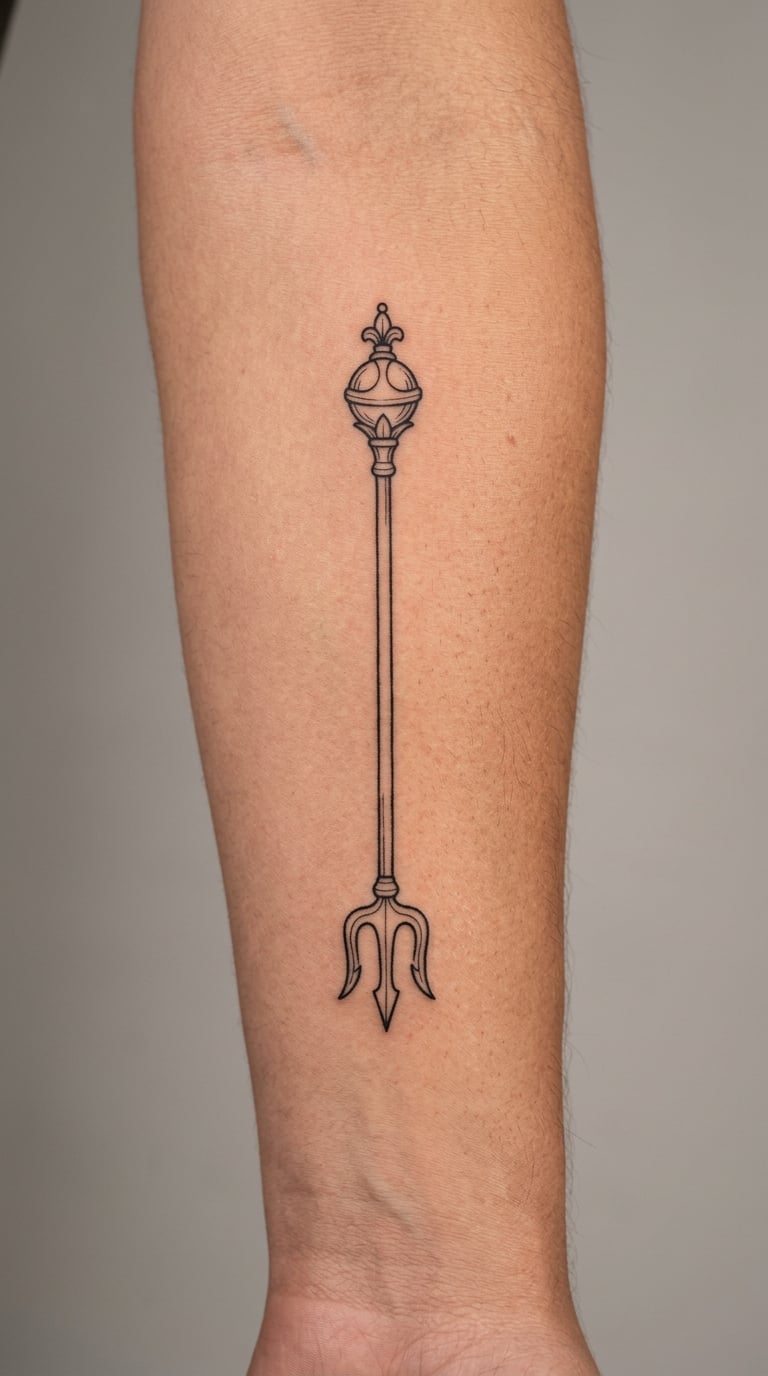
The was scepter is a long staff with a forked, animal-headed base and a squared top. Clean line art keeps it to a slim shaft, a simple angular head and a clearly defined fork at the bottom.
It signalled dominion and the power to grant, and gods are usually shown holding it. As a single object on its own it makes a quiet, graphic piece that carries its meaning without a paragraph of explanation.
Placement: forearm, calf, or the back of the upper arm. Size: 4-5 inches (10-13 cm) tall. Style: clean line art. Pain: low. The forked base is small and fussy, so that end blurs first; ask the artist to open the fork slightly wider than the drawing feels necessary. Make it yours: angle it diagonally to follow the forearm line, or add one contrasting accent tone behind the shaft.
13. Maat Feather in Micro-Realism
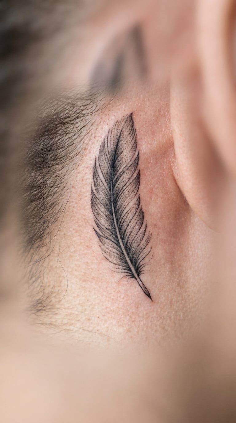
A single feather, upright, with a soft central shaft and barbs rendered as fine alternating strokes that stay darker near the base and lighten toward the tip. The artist holds the detail deliberately short of the photoreal end.
The feather of Maat is tied to truth, balance and right order, and it turns up in judgement scenes from funerary texts. It is often chosen as a quiet marker of a value rather than a claim about the wearer.
Placement: behind the ear, on the ribs, or the inner forearm. Size: 1.5-2.5 inches (4-6 cm). Style: micro-realism. Pain: medium, and behind the ear is more sensitive than most people expect. Micro barbs soften noticeably within five to eight years, so a slightly bolder barb is the smarter call. Make it yours: tilt the feather away from the ear for a reading position, or tint the tip a muted gold.
14. Hieratic Water Lines and Zigzags
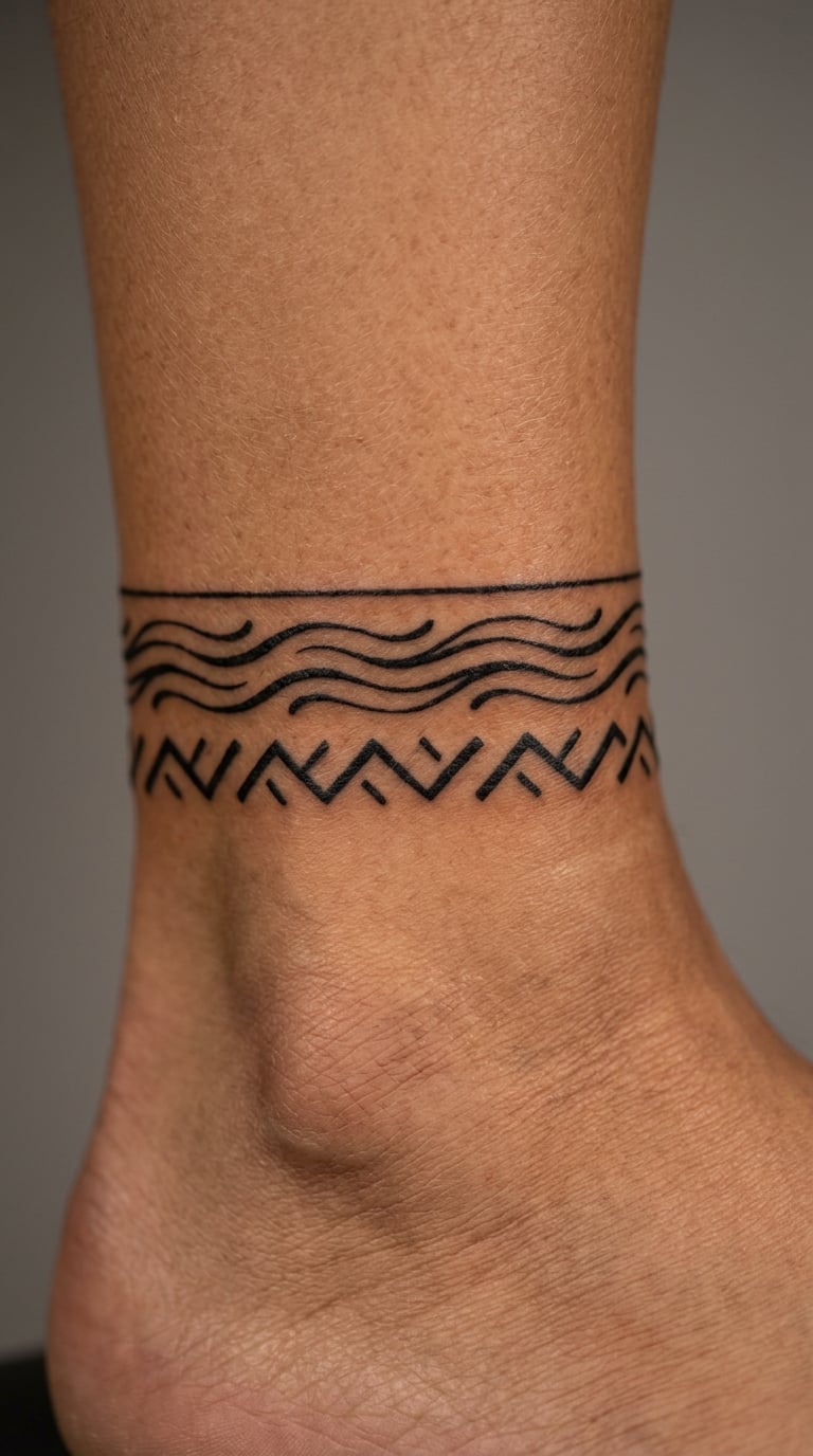
This is the most graphic idea on the list. Rows of short horizontal water strokes are stacked with even gaps, and a few sharp zigzag forms sit between them. The spacing does the work, and nothing is filled solid.
These marks are ordinary hieratic signs used in the script for water and for hills and terrain. Pulled out of a text they stop being writing and become rhythm, which is the honest way to use them.
Placement: around the ankle as a band, or a horizontal forearm band. Size: about 6 inches (15 cm) of band, two to three rows. Style: graphic abstract. Pain: medium on the ankle bone, low on the forearm. Short strokes in repeated rows tend to blur into each other, so keep the gaps wider than the lines. Make it yours: vary the row count to match the number of people or years it stands for, or run the band around the upper arm as a single strip.
15. Star Pattern with Solar Disk
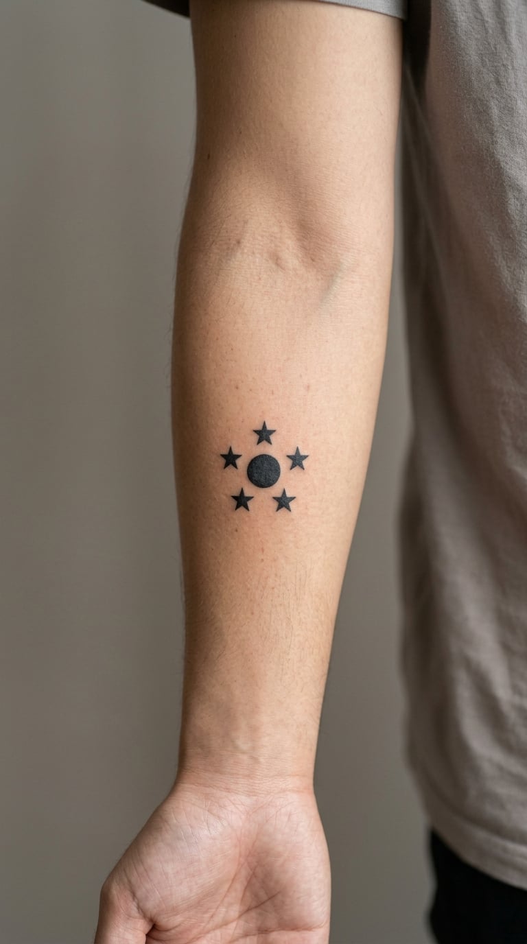
A plain circle sits in the middle with a ring of simple five-point stars around it, spaced evenly and drawn at the same size. No gradients, no shading, no extra ornament.
Stars appear in the night sky scenes painted across temple ceilings, and the sun disk is a recurring form. Combined they make a small, balanced piece that reads from across a room.
Placement: inner arm, behind the ear, or the ankle. Size: 2-3 inches (5-7 cm) across. Style: fine line. Pain: low. Points on stars are the fragile part, so ask for slightly rounded tips and the design will still be sharp years later. Make it yours: use a real number of stars tied to something specific, or set the disk slightly off-centre and let two stars trail off the side.
16. Sphinx in Neo-Traditional Style
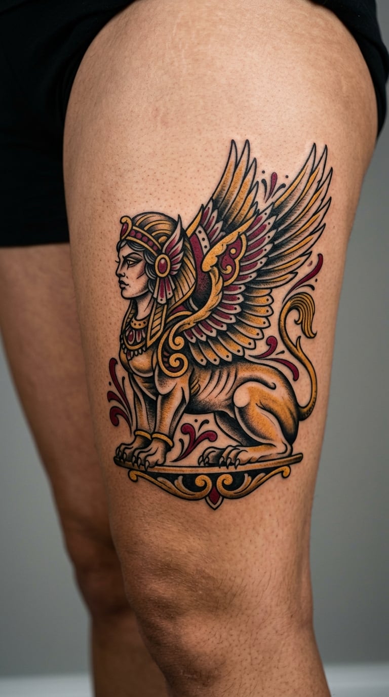
The sphinx is drawn with thick black outlines, a strong outline shadow and a limited palette, usually a deep red and a muted gold. The nemes headdress stripes stay bold and the body is built from clean blocks rather than soft rendering.
Placed with the human head and the lion body side by side, it references the guardian figures that line temple approaches. Neo-traditional styling keeps the shape readable while letting colour do the decorating.
Placement: thigh, shoulder, or across the upper back. Size: 6-8 inches (15-20 cm) long. Style: neo-traditional. Pain: medium on the thigh, higher across the shoulder blade. Filled colour holds better than hairline shading, and a red and gold palette is forgiving. Make it yours: swap the gold for a deep green to sit with an existing piece, or add a hard black background block behind the headdress.
17. Scribe Palette and Reed Motif
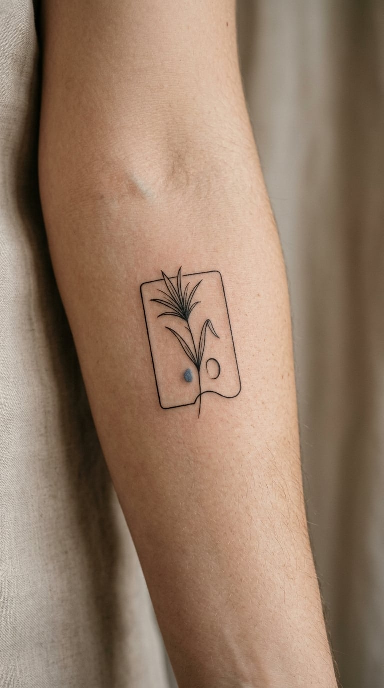
The scribe palette is a small rectangular or oval case with a well for ink, drawn in clean geometric outline. Beside it sits a single reed form with a narrow nib, and one muted colour accent picks out the ink well.
Scribes, and the god Thoth in his ibis form, were the writers of the script itself, which makes this a quietly self-referential choice for anyone tattooing words. It is also an easy shape to place and a good filler.
Placement: forearm, inner arm, or the chest. Size: 3-4 inches (7-10 cm) across. Style: fine line with one accent. Pain: low. Keep the accent inside a shape rather than as a thin wash across the outline so it survives better. Make it yours: have the reed angled as though mid-stroke, or add a tiny matching palette piece on the opposite forearm.
18. Hieroglyph-Style Vertical Column
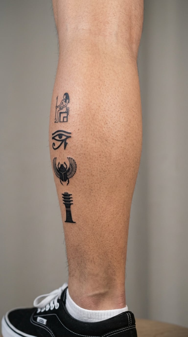
Four or five sourced glyph forms stacked in a single vertical column, each sign separated by a consistent gap, with the signs kept large enough to read as distinct shapes rather than texture. Black line work, no filler dots.
This is the one to plan carefully. Bring reference images from a museum source, and ask who verified the reading. Ancient Egyptian writes mostly consonants, so a name translation looks incomplete to people who expect full spelling, and that is not an error.
Placement: side of the calf, forearm, or the inner bicep. Size: 6-10 inches (15-25 cm) tall. Style: script, sourced glyphs. Pain: medium, higher over a large calf panel. A column this size is where fading shows up fastest, so the minimum height per sign matters more than the count. Make it yours: verify a real name or a date and have the column read top to bottom, matching the direction the artist confirmed with you.
19. Cobra in Blackwork and Gold
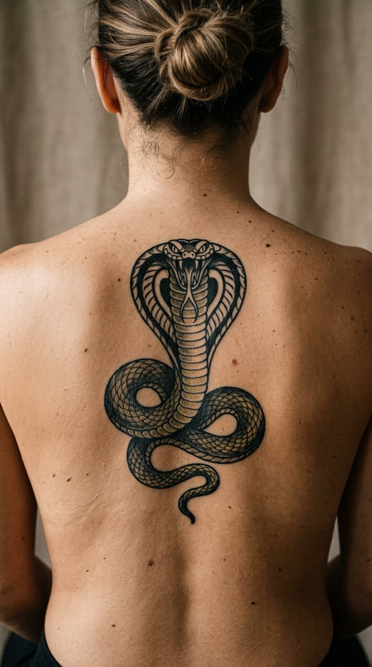
The cobra is drawn in blackwork with a heavy outline, a clearly shaped hood and a body that curves in one confident S. Selective gold is worked into the scale texture on the hood, and nowhere else.
Uraeus cobras appear on royal regalia and as protective figures at temple entrances. The gold is the difficult part of this piece, because gold across a wide area dulls quickly and the artist should keep it to a narrow band.
Placement: upper back, thigh, or the side of the forearm. Size: 5-7 inches (12-18 cm). Style: blackwork with a gold accent. Pain: high on the upper back, medium on the thigh. Expect to need a colour refresh within two to three years. Make it yours: keep the gold to the eye and hood ridge only, or add a small sun disk at the head of the curve.
20. Lotus, Sun, and Sparrow Study
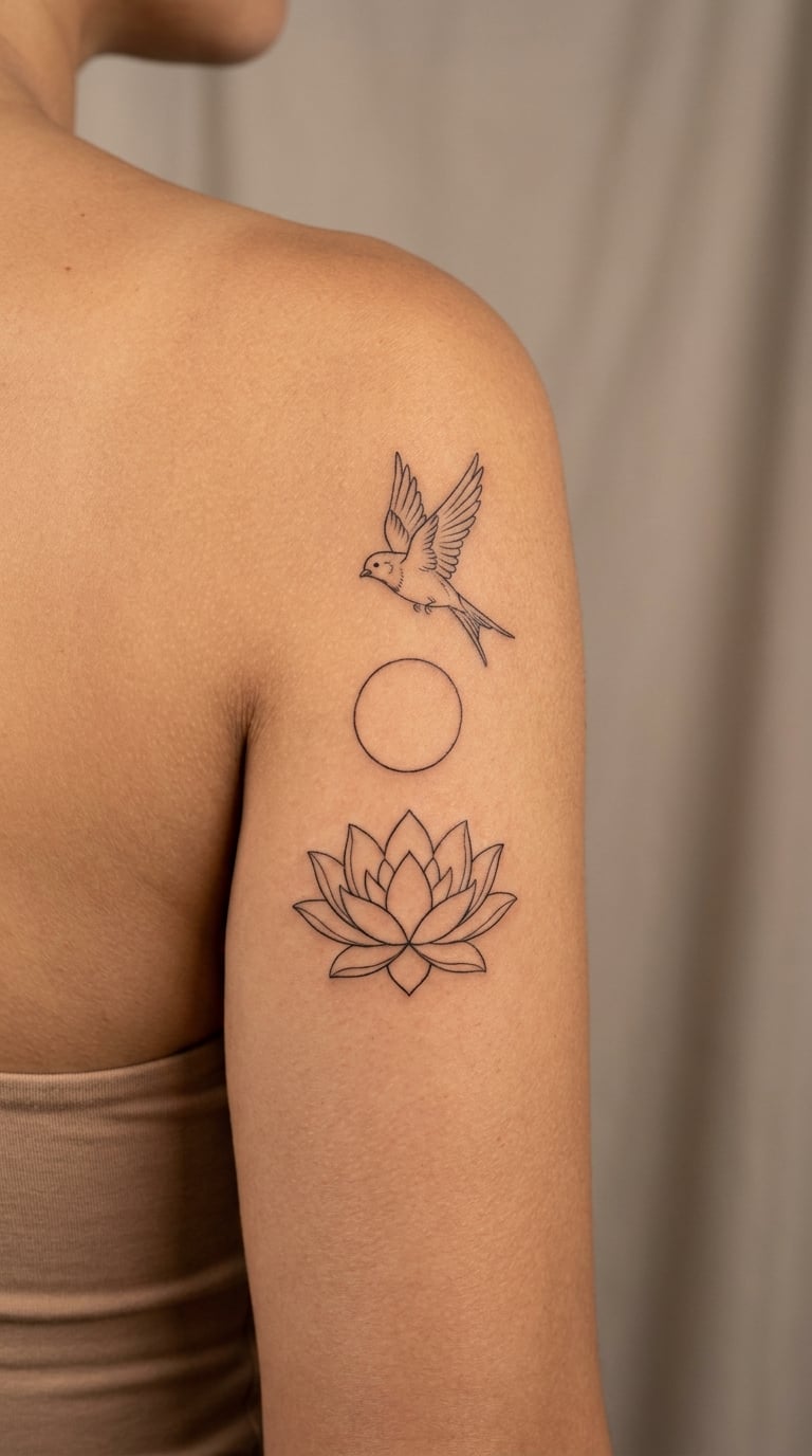
Three elements arranged in a clear vertical order: a lotus at the base, a plain sun disk in the middle, and a small sparrow at the top facing in toward the disk. Line weights stay matched across all three so nothing looks added later.
Small birds run through Egyptian marsh and field scenes, and the lotus and disk do the symbolic work. As a composition it has a hierarchy, so it needs enough room to breathe rather than being compressed into a small gap.
Placement: shoulder cap, outer upper arm, or the side of the calf. Size: 7-9 inches (18-23 cm) tall. Style: fine line. Pain: medium, higher on the shoulder cap. The sparrow’s wing detail is the piece most likely to soften, so the artist should simplify the feather count. Make it yours: arrange the three symbols so the composition echoes a date that matters, or place the trio at the top of a forearm column that continues into other pieces.
How to Choose the Right Design
Pick the reference before the style. A design that came from a museum image or a verified chart will look more convincing than one assembled from whatever turned up in a search, and you can tell the difference once it is on skin.
Match line weight to the placement. Hairline work on hands, fingers and the inside of the wrist will blur within a few years. Move it to the outer forearm, the shoulder or the calf, where there is more flesh and less abrasion.
Give each glyph room to exist. Three signs need at least an inch and a half of height each to stay readable. Scaling a five-glyph column down to look delicate is how names turn into smudges.
Decide whether it is a translation or a texture. A real translation gets verified and sourced. Decorative texture is fine as decoration, as long as you are not claiming it says your name.
Think about what comes next. A single ankh leaves room for a matching piece. A full calf column commits the whole leg. If you already have a symbol collection, choose a shape that fills a gap rather than duplicating a line weight.
Check the stencil, not the mood board. Ask to see the layout before it is transferred, and confirm the glyphs face the direction you agreed. Mirrored lettering is the most common error in script work and it is nearly impossible to fix once healed.
Readers coming from a broader symbol set often start with something like our 20 DNA tattoo ideas roundup, then come back to script work once the placement is settled. Botanical clients tend to land somewhere between the two, and our 20 wisteria tattoo ideas gallery covers how much line weight a curved motif can hold.
Cost and Session Time
Cost for hieroglyph work tracks size, detail and placement, exactly as it does for any detailed design. Micro pieces behind the ear or on a rib take the least time. A forearm or calf column of sourced glyphs is a multi-hour session, and a chest or back composition can run a full day with a break.
Here is how the variables move:
- Micro — a single small sign, under two inches, usually finished inside an hour or two.
- Small spot — one symbol at two to four inches, commonly a single session of two to four hours.
- Medium — a composed design at four to seven inches, three to five hours depending on colour and placement.
- Larger — a vertical column, a sphinx, or a back piece, six hours or split across two sessions.
Shop minimums, hourly artist rates, consults and touch-ups all vary, and travel adds to the total. Ask for a quote that breaks down size, placement and whether a second session is included, so nothing surprises you on the day.
Aftercare Basics
- Follow your artist’s aftercare instructions first. They know what they did in your session.
- Wash gently with clean water and a mild unscented soap, then pat dry rather than scrubbing.
- Keep friction and sun off the area while it heals. Loose clothing over fresh work is more comfortable than tight fabric.
- Expect some flaking and tenderness in the first week. Do not pick at the flakes.
- Skip shaving over a healing design and keep swimming pools and hot tubs out of it for a few weeks.
- Contact the artist first with a question, and a healthcare professional if you develop spreading redness, heat, pus or a fever that does not settle.
Frequently Asked Questions
Are hieroglyph tattoos accurate or just decoration?
Both exist, and it is worth knowing which one you are booking. A real translation is built from sourced signs, usually checked against a museum reference or a verified alphabet chart, and a cartouche name should come with someone who can explain the reading. Decorative texture is repeating signs for rhythm. It can look good, but it does not say anything, so do not let anyone claim a generator string spells your name.
What does the Eye of Horus mean?
The Eye of Horus, called the wedjat, belonged to the goddess Wadjet and was used as a protective emblem, often placed on funerary objects to guard the wearer in the afterlife. It is also read as wholeness and restoration because the eye was mythologically restored after being damaged. That is why it is one of the most requested hieroglyph symbols, and why it works as a first piece without needing explanation.
How small can a hieroglyph tattoo be before it blurs?
Give every sign at least an inch and a half of height, and keep line weight above a hairline. Anything thinner than about 1mm tends to soften within five to eight years, and repeated short strokes blur into each other first. Hands, fingers and the inner wrist wear against clothing daily and fade fastest, so if the design is small and detailed, put it on the outer forearm, the shoulder or the calf instead.
Will the artist mirror my hieroglyphs?
It happens often enough to check every time. Lettering gets mirrored by mistake, and in Egyptian script the reading direction depends on which way the figures face, so a flipped layout can read backwards or read as something else entirely. Ask to see the drawn layout before the stencil is transferred, confirm the direction out loud, and have a verified translation sent to you in writing before the session starts.
Will my name actually translate into hieroglyphs?
Partly, and the limitation is normal. Ancient Egyptian wrote mostly consonants, so a name appears as a consonant skeleton that readers restore when they speak it. A cartouche name can still be accurate and recognisable to a trained reader, it just does not look like Latin spelling. If someone offers you a full phonetic spelling, that came from a modern convention, so ask which system the translation uses before you commit.
Is a hieroglyph tattoo disrespectful?
Mostly it comes down to accuracy and context. Wearing a genuine symbol, understanding what it refers to, and having a verified translation is how people describe treating the script seriously. Copying a decorative string because it looked good in a photo, or inking sacred text as filler, is what tends to draw criticism. Ask questions, use a real reference, and be honest if the piece is ornament rather than a translation.
Where to Start
If this is your first tattoo, take idea 10, the pyramid and sun disk, or idea 1, the fine-line ankh. Both are simple shapes, both need under four inches, and both forgive a beginner artist without looking like a compromise.
If you already have a symbol collection, idea 18, the sourced vertical column, does the most work, and idea 19, the cobra in blackwork and gold, gives you something bold to anchor a limb. Either way, get the reference verified and the layout approved before the stencil goes down. Updated for 2026.