
22 Poetry Tattoo Ideas: Best Words and Verses (October 2026)
These 22 poetry tattoo ideas cover the full range of what people actually get inked: a single opening line in fine-line script, a sonnet running down the forearm, a raven for Edgar Allan Poe, a word in calligraphy so ornate it takes four sittings, and a colour bloom you can only explain with the poem that inspired it. Every entry below gives you the words, the poet, a realistic size, an honest pain note, and a way to make it yours.
A poetry tattoo is a permanent skin inscription of a line or stanza of verse, and that is what makes it different from a portrait or a sleeve: the words are the artwork. The appeal is that the line stays after the mood that sent you looking for it has passed. The risk is the same thing. If you have been circling a line from Mary Oliver or Rumi for months, the first thing to sort out is why that line and not a more famous neighbour.
Updated for October 2026. If you are more drawn to symbols than sentences, my 24 constellation tattoo ideas for women and 20 crescent moon tattoo designs cover the same personal-significance idea in image form. Below, though, the writing does the work.
22 Poetry Tattoo Ideas: Quick Guide
| Idea | Style | Best placement | Size | Pain |
|---|---|---|---|---|
| 1. Famous opening line | Fine-line script | Inner forearm | 2-3 in tall | Low to medium |
| 2. One defining word | Elegant calligraphy | Inner wrist | 1-1.5 in | Low |
| 3. Shakespeare sonnet column | Blackwork column script | Inner forearm | 5-6 in tall | Medium |
| 4. Dickinson flower and line | Botanical fine line | Outer upper arm | 3-4 in | Medium |
| 5. Whitman blackwork line | Bold blackwork | Upper arm band | 0.75-1 in tall | Medium to high |
| 6. Rumi calligraphy | Balanced calligraphic script | Upper back | 4-5 in wide | Medium |
| 7. Keats botanical half-line | Botanical fine line | Outer forearm | 3-4 in | Medium |
| 8. Poe raven | Blackwork illustration | Outer forearm | 3-4 in | Medium |
| 9. Shakespeare character portrait | Micro-realism | Calf | 2-3 in | Medium |
| 10. Haiku in three lines | Minimalist lettering | Inner forearm | 1.5-2 in | Low |
| 11. Vine wrapping a verse | Illustrative fine line | Outer upper arm | 4-5 in | Medium |
| 12. Moonlit line | Watercolour with black line | Shoulder | 2-3 in | Low |
| 13. Quill and inkwell | Traditional line art | Inner upper arm | 2.5-3.5 in | Low to medium |
| 14. Open book with washes | Linework with watercolour border | Outer forearm | 3-4 in | Medium |
| 15. Branches forming a heart | Fine line | Ankle | 2-2.5 in | Medium |
| 16. Lightning and storm line | Single-colour fine line | Calf | 2.5-3.5 in | Medium |
| 17. Pressed flower beneath verse | Watercolour | Shoulder | 3-4 in | Low to medium |
| 18. Minimal mountain range | Minimalist fine line | Inner arm | 3-4 in wide | Low |
| 19. Antique atlas map | Fine-line cartographic | Upper thigh | 3-4 in | Medium |
| 20. Red ink emphasis word | Black script with red accent | Forearm | 2.5-3.5 in | Medium |
| 21. Typewriter fade-in verse | Typewriter font | Inner wrist | 1.5-2 in | Low to medium |
| 22. Abstract ink bloom | Watercolour and black ink | Upper back | 4-6 in | Medium |
1. Famous Opening Line in Fine-Line Script
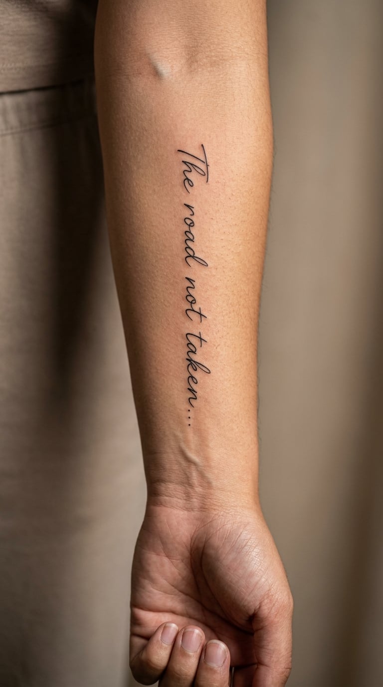
The idea is simple and it works because so many poems open with a line that reads like a door handle. Take the first line only, set it in a light monoline script with generous letter spacing, and keep every flourish off the capitals. Thin single-needle line with no shading, so the piece stays quiet against the arm.
People choose an opening line when the poem is long and the tattoo cannot be. It is also the version that survives best, because five to nine words hold their shape years later where twenty words start to lose their edges.
Placement: inner forearm, ribs, or just under the collarbone. Size: 2-3 in (5-7.5 cm) tall, roughly the width of your hand. Style: fine line, single-needle script. Pain: low to medium, a scratchy persistent feeling rather than sharp. Fine line on the inner arm softens noticeably after five to seven years, so plan for a refresh. Make it yours: add the publication year in a smaller line beneath, or the initial of the person you found the line with.
2. One Defining Word in Elegant Calligraphy
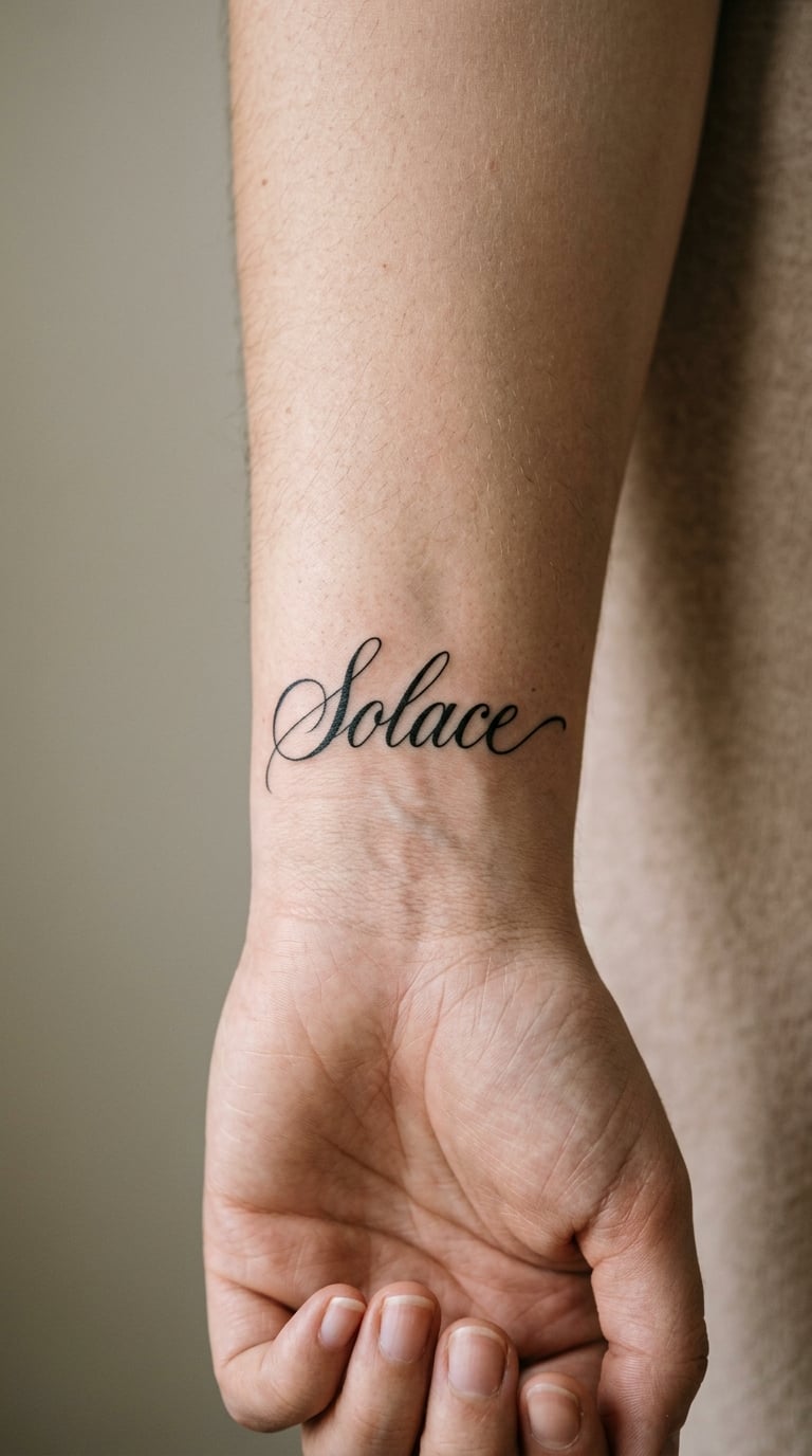
One word, drawn rather than typed. The letterforms swell and thin, the terminals curl, and the whole thing sits in a small rectangle of skin with nothing around it. This is the design for people who love a poem but cannot commit to inking the sentence it came from.
Words that work here are short and weighted: stay, burn, otherwise, mercy. A single word means whatever you say it means once it is on skin, which is a freedom long quotations do not give you.
Placement: inner wrist, behind the ear, or at the base of the throat. Size: 1-1.5 in (2.5-4 cm) across. Style: brush calligraphy in black. Pain: low, and the wrist takes it calmly. Be honest about ageing: ornate scripts with hairlines and swash details blur first, so ask for a slightly heavier downstroke. Make it yours: have the artist hide a small initial inside the tail of the final letter.
3. Shakespeare Sonnet in Column Script

Four to eight lines of a sonnet, stacked as one narrow uninterrupted column with a hairline rule or nothing at all separating the top from the bottom. The composition is architectural: even line weight, consistent side margins, and line breaks placed so the metre does not stumble halfway down the arm.
Sonnet 18 or 116 both sit well in blackwork because the language is dense but short. A single column also hides the fact that you chose four lines rather than the whole thing, because the eye reads a shape, not a count.
Placement: inner forearm for vertical flow, or the flat of the upper arm if you want the column to read top to bottom without bending around a limb. Size: 5-6 in (13-15 cm) tall, 1.5 in wide. Style: blackwork column, either a monoline serif or a restrained Roman capital. Pain: medium over a long session, and expect a two-session job. Make it yours: set the first publication reference or a date at the base in a smaller size.
4. Emily Dickinson Flower and Line Design
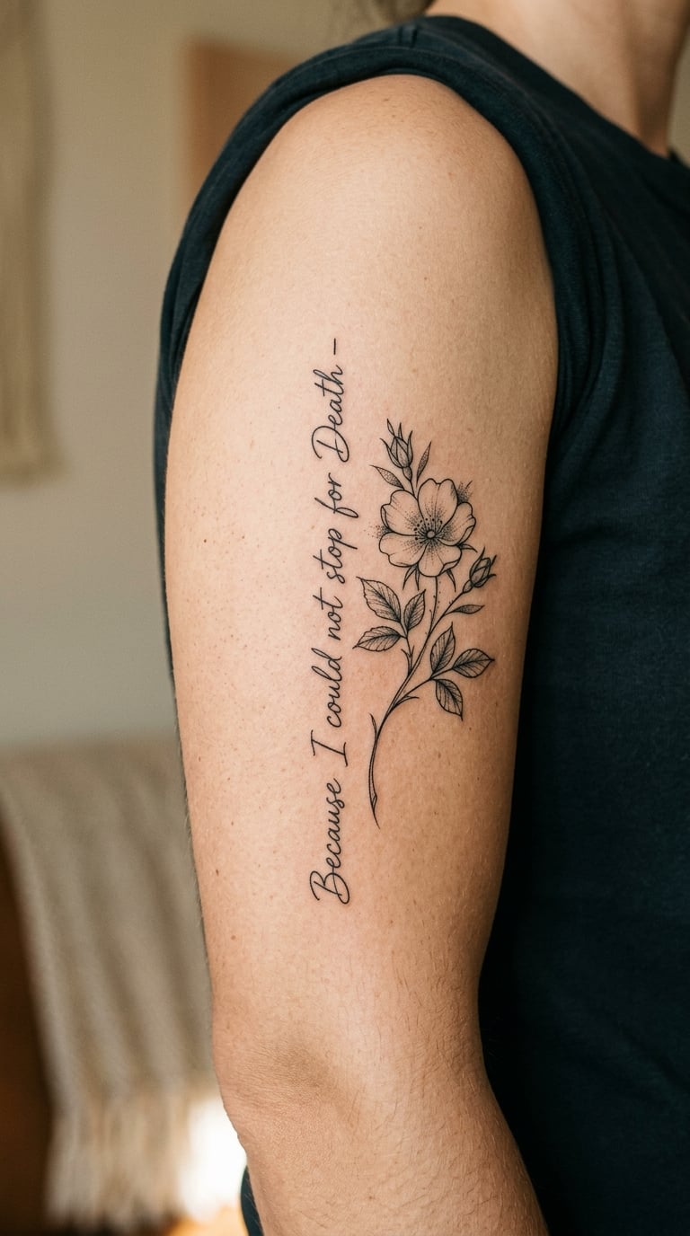
Take a short Dickinson line, set it in a small upright serif or light script, and give it exactly one botanical element: a single stem, a few leaves, one bloom. Sparse shading, plenty of untouched skin around both halves, so the flower and the words breathe separately.
Dickinson is a popular choice because her lines are self-contained and their meaning is personal rather than fixed. That is worth knowing: the design is not carrying a message to other people. It is a note to yourself.
Placement: outer upper arm, the flat above the elbow, or the back of the shoulder. Size: 3-4 in (7.5-10 cm) across. Style: botanical fine line with light stippling on the petals. Pain: medium, with the flower and the text adding up to a two-hour sitting. Petal edges and thin petal shading are the first things to soften, so ask for confident lines. Make it yours: swap in a flower that means something to you, such as a foxglove or a sprig of heather from a place you have been.
5. Walt Whitman Line in Blackwork
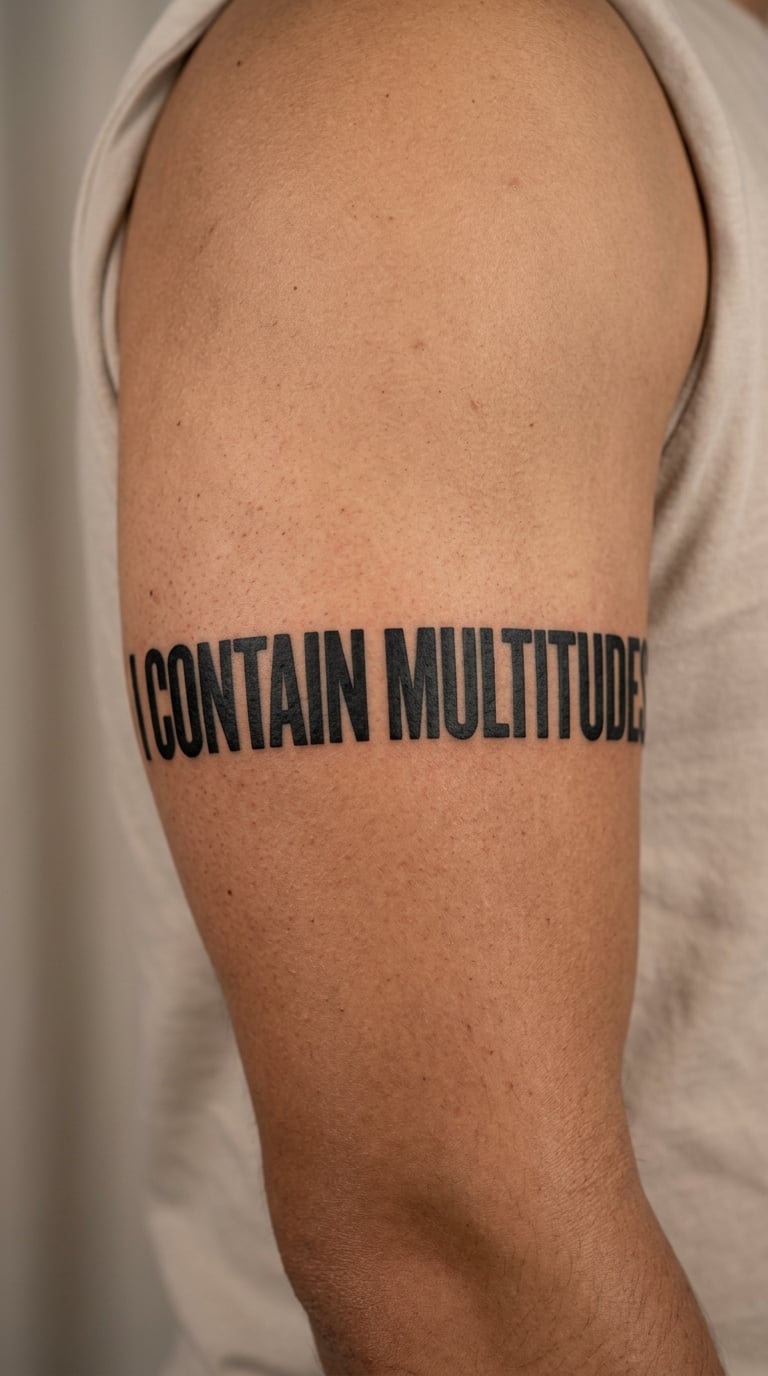
Whitman wants a heavier hand. Set the line in a bold condensed serif or a slab, fill the letters solid, and let the text run as a band around the upper arm so it reads only when you turn. Dense, consistent, no ornament at all.
A line from Song of Myself carries expansiveness, and the band placement matches it. It is the sort of piece people describe as a sleeve they can still wear to work, because the words hide in plain sight.
Placement: upper arm band, calf band, or across the upper back. Size: 0.75-1 in (2-2.5 cm) tall letters running 7-9 in around the arm. Style: blackwork with solid filled letters. Pain: medium to high on the upper arm because the biceps area resists and stretches. Solid black fades to grey faster than line work, so keep the fill dense. Make it yours: run one narrow muted colour line beneath the band, or stitch two separate lines together with a small divider dot.
6. Public-Domain Rumi Calligraphy
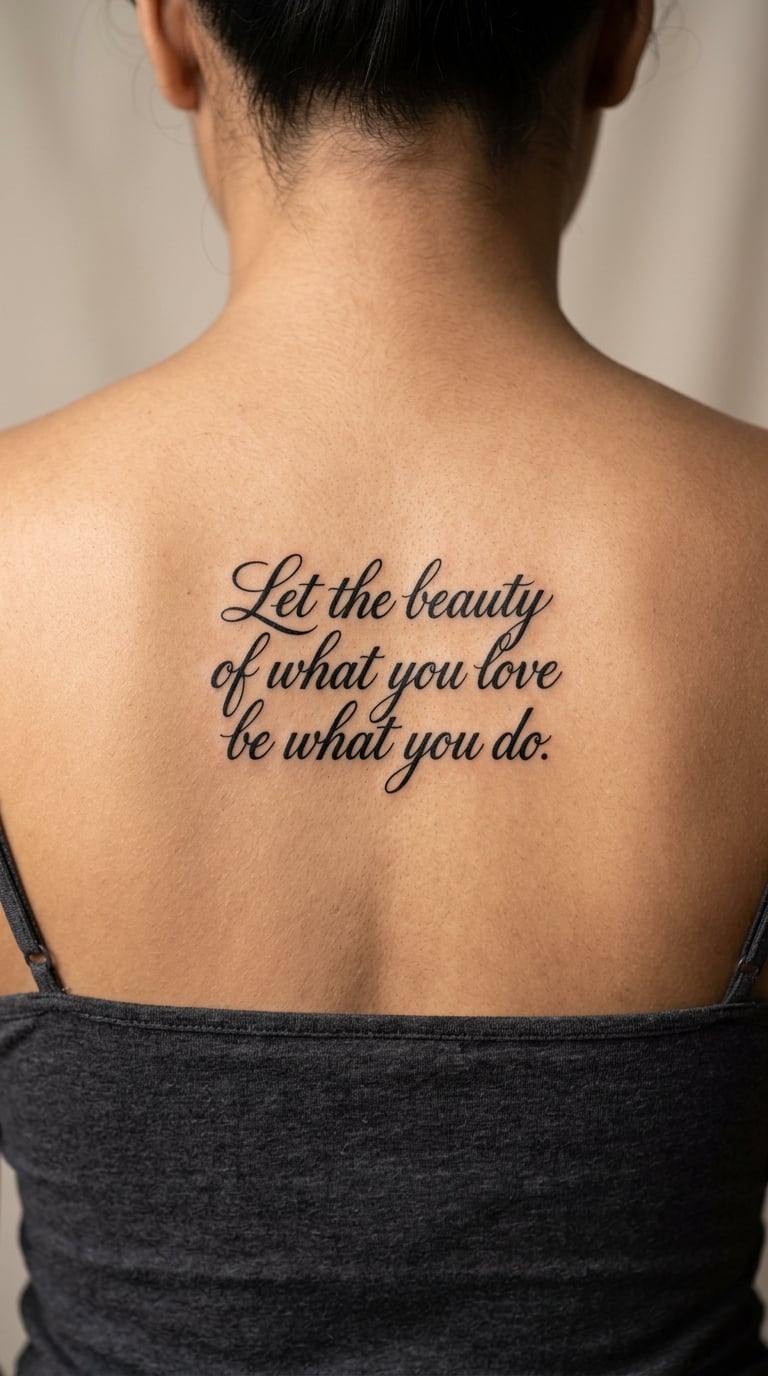
Rumi in a balanced calligraphic script, centred on the upper back beneath one shoulder blade with a lot of empty skin around it. The composition is symmetrical and quiet: one line of the quotation, generous margins, no frame, no border, no ornament.
Rumi is widely translated, which gives you room to choose the wording that fits rather than the wording that is technically original. Check the translation you like against two sources, because versions differ by a word or two and the difference matters if you are the kind of person who will read it daily.
Placement: upper back, upper arm, or the nape. Size: 4-5 in (10-13 cm) wide, 1-1.5 in tall. Style: calligraphic script, black only. Pain: medium; the upper back is sensitive but the surface is flat, which is the point. Make it yours: add the year the translation you chose was published, or the date you first read the passage.
7. Keats Botanical Half-Line
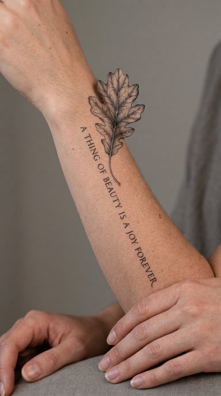
A half-line from Keats set beside one realistic leaf, all in black and grey. The leaf carries the detail work, veins and slight tonal falloff, while the text stays quiet so the two halves do not compete.
The Keats lines people keep are sensory rather than narrative: something about a season, a bird, a scent. Pairing one with a single botanical element gives the piece a subject even when the words are abstract.
Placement: outer forearm, calf, or ribs. Size: 3-4 in (7.5-10 cm) across. Style: botanical fine line, black and grey shading on the leaf only. Pain: medium, and the outer forearm bruises visibly for a day or two. Vein detail in fine grey is the first casualty of ageing, so keep the vein work minimal. Make it yours: use a leaf from the plant in the poem rather than a generic one, which changes the design without changing the words.
8. Poe Raven in Blackwork
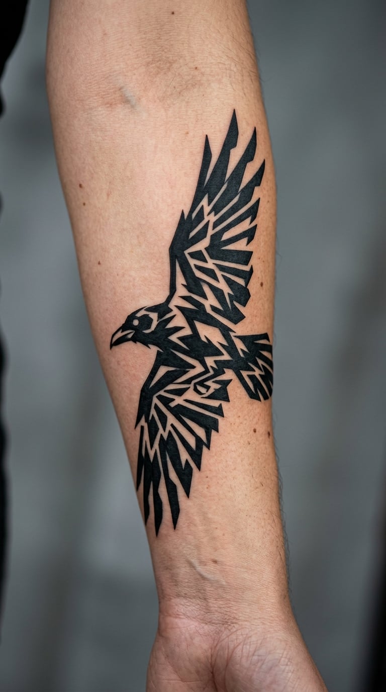
A raven in flight, built from bold angular shapes and negative space rather than feather-by-feather realism. Solid black masses, a few white gaps cut out to suggest wing separation, wings mid-downstroke. No lettering required, and no copying of any published illustration.
Poe’s bird is the obvious pick for a dark, brooding piece, and blackwork suits it because the image reads as a shape from across a room. If you want the poem present too, a single short line beneath the bird is enough; the illustration already carries the atmosphere.
Placement: outer forearm, upper arm, calf, or behind the ear at a smaller scale. Size: 3-4 in (7.5-10 cm) at forearm scale. Style: blackwork illustration with negative space. Pain: medium; solid black packing is a long, boring stretch of needle rather than a sharp one. Make it yours: have the eye rendered as a single small shape so it reads as watching you from a distance.
9. Shakespeare Character Portrait in Micro-Realism
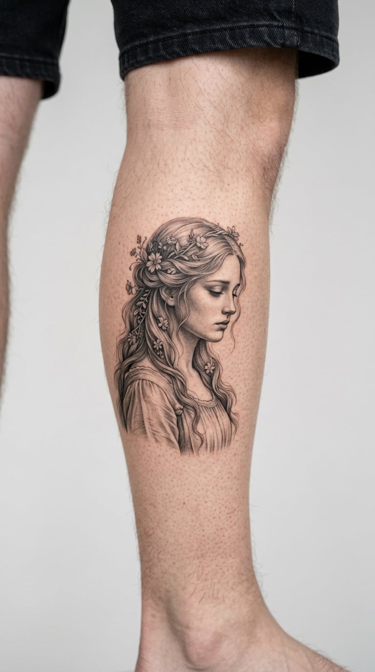
A small grayscale portrait of a Shakespeare character rather than a real actor: restrained facial shading, no heavy shadow under the cheekbone, no dramatic studio lighting. Portrait of a character, not a celebrity likeness, which is both the safer and the more interesting route.
This one suits people who love the play and do not want the words on their skin. Sit with your artist on pose, costume suggestion, and whether the figure is looking at the viewer or away, because those three choices change the whole tone.
Placement: calf, forearm, or the flat of the upper arm. Size: 2-3 in (5-7.5 cm). Style: micro-realism in black and grey. Pain: medium, one to two hours. Honest ageing note: shading under the eyes and around the mouth softens first, so ask the artist to build the face from firm edges rather than gradient. Make it yours: add one line of the character’s speech beneath the portrait in a small typewriter face.
10. Haiku Stacked Across Three Lines
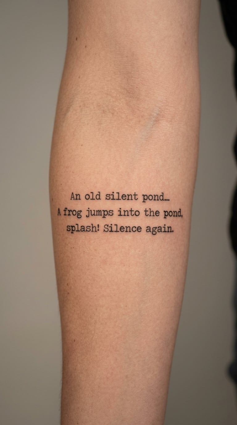
A haiku gives you the tightest possible form: three lines, seventeen syllables, nothing spare. Set it in a minimal sans-serif or a light geometric font, centred, with even line spacing and no decorative background of any kind.
The constraint is the appeal. A three-line poem sits comfortably in a small space, and unlike a longer passage you cannot overthink the selection, because the form already decided how much text there is.
Placement: inner forearm, ribs, or the inside of the upper arm. Size: 1.5-2 in (4-5 cm) wide, about 1 in tall. Style: minimalist lettering, black. Pain: low to medium. A colour accent usually hurts here; the plain block of text is the point, and colour on seventeen syllables tends to look like a logo. Make it yours: leave the haiku unsigned so the only trace of the poet is the metre.
11. Tangled Vine Wrapping a Short Verse
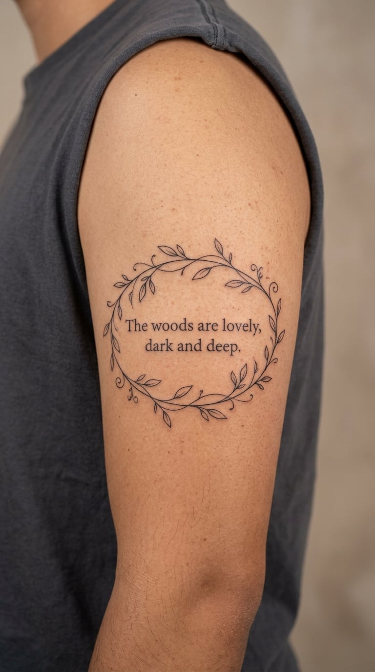
A single curling vine that frames a short verse rather than crossing over it. The lettering stays readable in the open space, and the vine does the decorative work, climbing one side and closing under the last line.
Anything with a growth shape suits this layout, and a vine is the most forgiving because it can absorb a curve that the text could not. If you have a wisteria or wildflower in mind instead, the same structure works, and my 20 wisteria tattoo designs cover the flower side in more detail.
Placement: outer upper arm, thigh, or the back of the shoulder. Size: 4-5 in (10-13 cm) tall. Style: illustrative fine line with light grey shading. Pain: medium. Small leaves and thin tendrils are the first details to disappear, so keep leaf interiors solid and tendrils few. Make it yours: have one leaf left deliberately unfinished in outline, as though the vine is still growing past the words.
12. Moonlit Line in Watercolour
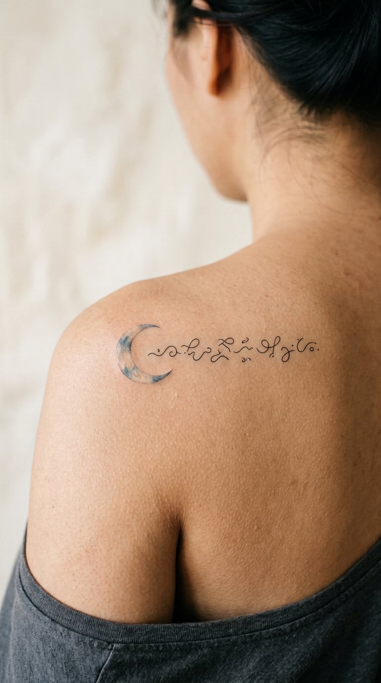
A pale crescent moon with a soft blue-grey wash bleeding out behind it, and one short poetic line in clean black beside it. Loose at the edges, controlled where the letters are, so the text stays crisp while the colour stays atmospheric.
Watercolour suits lines about night, distance, or absence, and the softness of the wash quietly offsets how permanent the words are. That tension is exactly what makes a lot of people choose this style for verse.
Placement: shoulder, upper back, or the outer arm. Size: 2-3 in (5-7.5 cm) across. Style: watercolour with black line text. Pain: low on the shoulder, medium if you place it on bone. Ageing note: colour lightens over time, so a soft blue-grey wash settles rather than fades. Make it yours: choose the moon phase that matches the line, which is a small detail only two people will ever know.
13. Quill and Inkwell Line Art
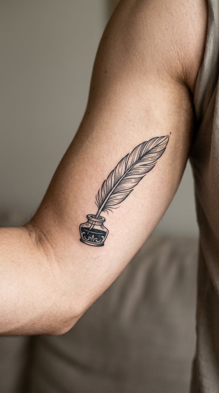
A single feather quill resting in an inkwell, drawn in black line art with light hatching for the shadow underneath. No text, no colour, no scroll, no banner. The image is the act of writing, which is enough on its own.
This is the design for someone who wants to mark that they write, or that someone else wrote for them, without inking a single line of verse. It also pairs well as a second piece, sitting near a small text tattoo on another part of the body.
Placement: inner upper arm, forearm, or the back of the hand. Size: 2.5-3.5 in (6-9 cm). Style: traditional line art with fine hatching. Pain: low to medium; the inkwell gives the artist a dense patch to work into. Make it yours: tint the ink in one colour so it matches another tattoo, or have a short line of verse sit beneath the inkwell in tiny type.
14. Open Book with Watercolour Borders
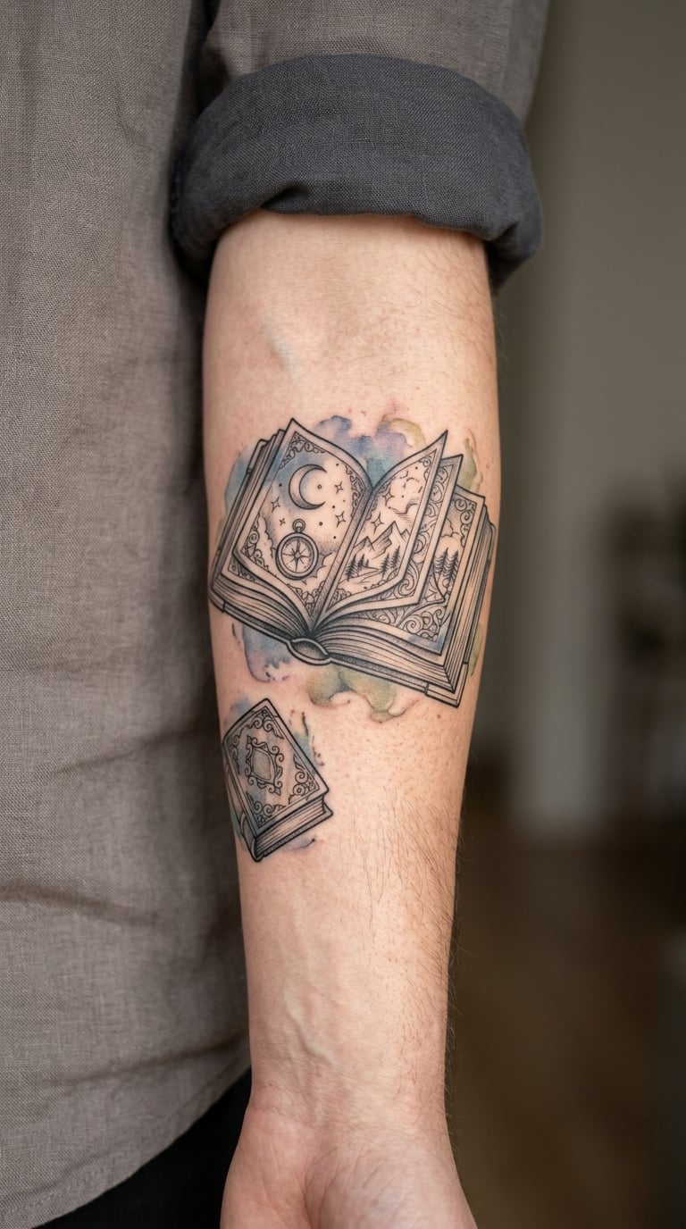
An open book in black and grey linework, pages suggested with a few confident lines rather than drawn word by word, and loose muted watercolour borders bleeding out from the edges of the pages. Colour sits at the margins; the centre stays readable.
It works as a tribute piece, a graduation mark, or simply a nod to a collection you keep going back to. The border is where you can put personality, and the page interior is where you keep it quiet.
Placement: outer forearm, chest, or the upper back. Size: 3-4 in (7.5-10 cm) wide. Style: linework with a watercolour border. Pain: medium, and shading the page edges takes time. Border colour fades first because it sits at the edge of the design, so expect the shape to outlive the colour. Make it yours: add a discreet initial on the open page or a single line of type in the gutter between the pages.
15. Branches Forming a Heart in Fine Line
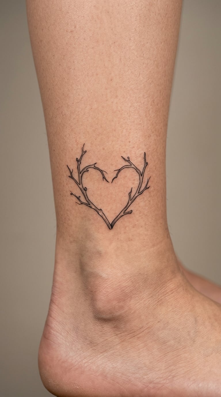
Two bare branches that join into a simple heart outline, with minimal interior detail and no leaves inside the shape. The recognition happens in the silhouette rather than the drawing, which is why it works at ankle size.
There is a long folk tradition of reading heart shapes and branches symbolically. Treat that as background noise rather than meaning, and choose this for its line quality if you like the shape and for whatever you attach to it yourself.
Placement: ankle, inner wrist, or the outer rib. Size: 2-2.5 in (5-6 cm). Style: fine line, black. Pain: medium on the ankle, which has thin skin over bone and complains about it. Thin twig ends blur over the years, so ask for a slightly heavier terminal line. Make it yours: add a small date tucked into the point of the heart where the branches meet.
16. Lightning and Storm Line in One Color
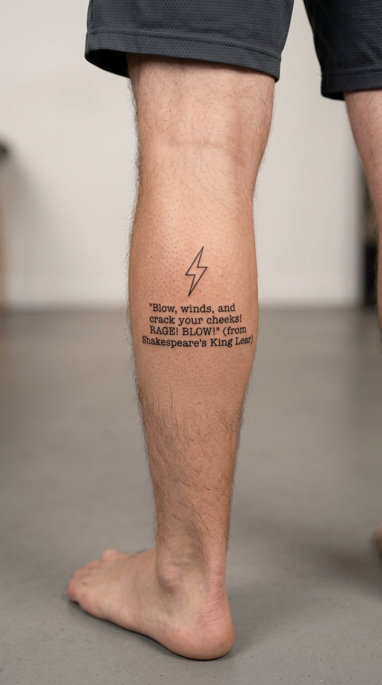
One compact lightning bolt in a single colour, with a short storm-related verse set beneath it in the same ink. No gradient sky, no clouds, nothing atmospheric: the bolt carries the whole idea on its own.
Storm lines are popular for a reason. They tend to be short, which suits tattooing, and they describe a force rather than a scene, which keeps the design abstract even with words attached.
Placement: calf, outer forearm, or the shoulder. Size: 2.5-3.5 in (6-9 cm) tall including the text. Style: single-colour fine line. Pain: medium; the calf bruises more than you expect. Make it yours: add the coordinates or the date of the storm the line describes, which is a genuinely personal detail that nobody else will read the same way.
17. Pressed Flower Beneath a Poetry Line
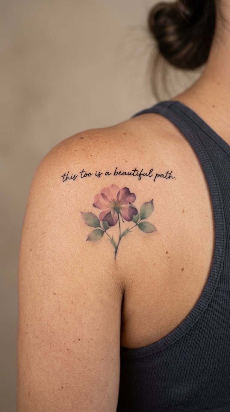
One flower rendered as if pressed flat: translucent, slightly faded at the edges, layered so you can see light through the petals. A short verse in clean black sits above it, and there is no border around either half.
Pressed-flower work is one of the most personal choices you can make here, because you can bring a real bloom. Talk to your artist before it fades out completely, and ask them to work from a photograph if the real thing will not last.
Placement: shoulder, upper back, or the outer arm. Size: 3-4 in (7.5-10 cm) across. Style: watercolour with transparent layering. Pain: low to medium. Translucent washes are hard to heal evenly, so expect a touch-up on the lightest areas. Make it yours: use a flower from a person, a garden, or a wedding you were part of, and put the date of that day in the line above it.
18. Minimal Mountain and Peak Line
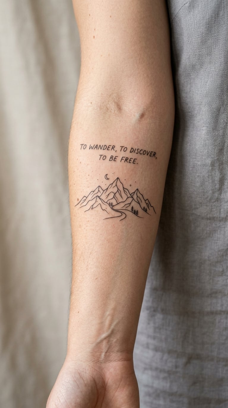
A minimal mountain range: three or four peaks in fine black line, no texture, no trees, no hatching. A short line of verse about distance, solitude, or travel sits beneath it, and that is the whole design.
Mountains in poetry are usually about the space between the person and the horizon, so this pairs naturally with lines about leaving and returning. The parallel lines in the text and in the ridgeline do more work than any added symbol would.
Placement: inner arm, forearm, or the calf. Size: 3-4 in (7.5-10 cm) wide. Style: minimalist fine line, no colour. Pain: low, one of the fastest designs on this list. Make it yours: add the coordinates of a peak that actually matters to you, set very small beneath the ridgeline where the lines already meet.
19. Antique Atlas-Style Poetry Map
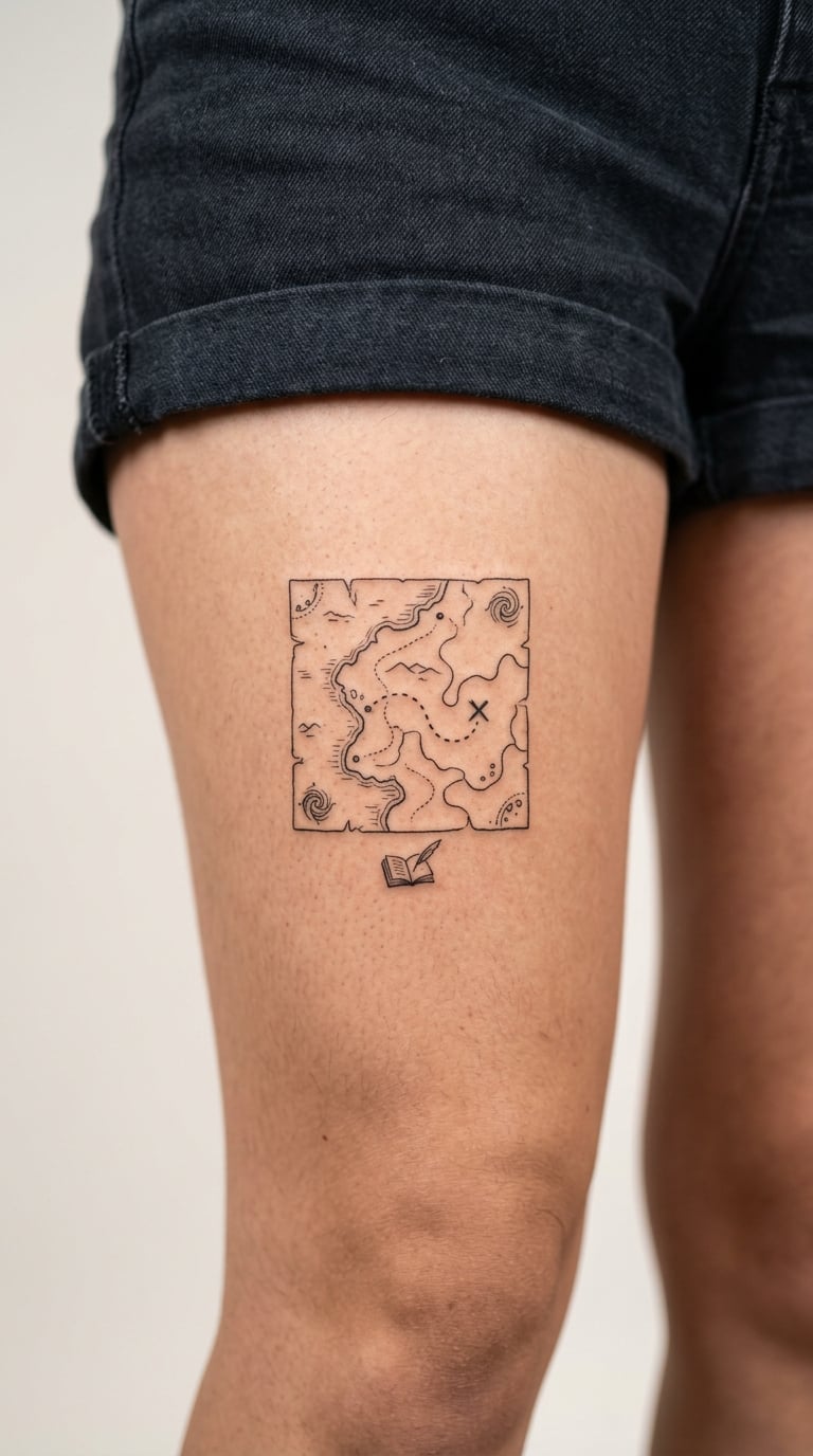
A small antique-atlas map drawn in fine line: coastlines, a compass rose, one marked location, a dotted route. It is cartographic rather than decorative, and it looks better slightly imperfect than perfectly ruled.
Maps work when the coordinates are genuinely private. A house, a coastline, the town a poem was written in, the place a person is buried, and the literary reference in small type underneath. If the coordinates are meaningless to anyone else, the piece stays yours.
Placement: upper thigh, forearm, or the back of the upper arm. Size: 3-4 in (7.5-10 cm) across. Style: fine-line cartographic illustration, black. Pain: medium over a long session, since cartographic work is all small marks. Fine hatching and dotted routes soften noticeably, so ask the artist to keep line weight even. Make it yours: add one private coordinate that no one looking at the tattoo can read.
20. Red Ink Emphasis on a Key Word
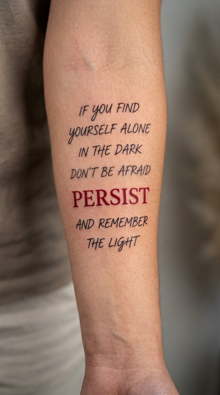
Several lines of black fine-line verse with one central word in deep red, and nothing else in colour anywhere in the design. The hierarchy does the work: the eye goes straight to the word you chose, then reads outward for the rest of the line.
Red is the most attention-hungry ink in a text tattoo, so it works best on one word and one word only. If more than one word is red, the design stops pointing anywhere in particular.
Placement: forearm, upper arm, or the chest. Size: 2.5-3.5 in (6-9 cm) across. Style: black script with a single red accent word. Pain: medium, and the red pass adds a second go over the same skin. Colour ink in a small area is the first thing to mute, so expect the red to read as deep maroon within a few years. Make it yours: switch the accent to navy, deep green, or plum if red feels too loud against your skin tone.
21. Typewriter Fade-In Verse
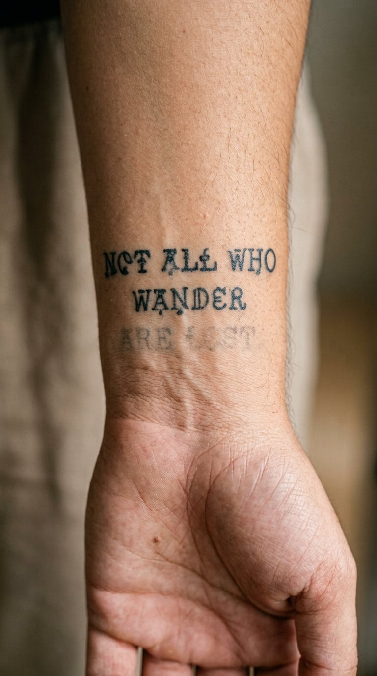
A short passage set like typewriter text, with uneven ink density and believable letter spacing. A few characters fade partway into the skin, as though the ribbon ran dry mid-sentence. It is a designed imperfection, not a mistake.
Typewriter faces are the easiest to get wrong, because the spacing has to be right before the effect means anything. Bring the passage typed out and confirm the line breaks in advance, then let the artist add the fading.
Placement: inner wrist, forearm, or the chest. Size: 1.5-2 in (4-5 cm) wide. Style: typewriter font, black. Pain: low to medium, although small consistent type on the wrist is fiddly and takes longer than the size suggests. Small text on the inner wrist is the first place to blur as the years pass, so keep the block to four or five lines. Make it yours: use a passage you typed yourself, a line from a letter rather than a published poem, and let the fading fall where the letter actually breaks.
22. Abstract Ink Bloom Inspired by a Favorite Poem
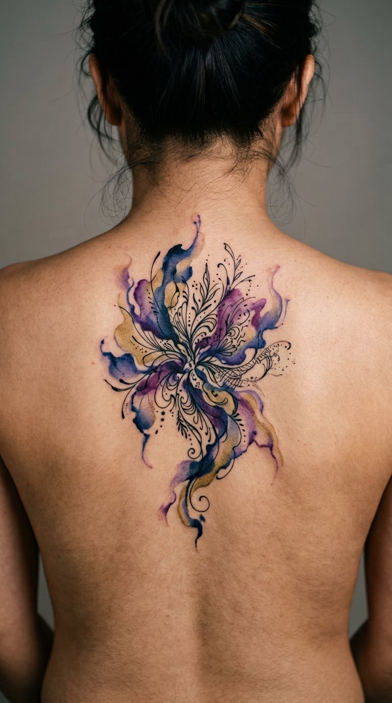
An abstract ink bloom: pigment pushed into water and left to move, in a limited palette with a black ink edge holding part of it together. No text, no recognisable commercial artwork, and no single fixed composition, because every bloom comes out differently.
Link it to a poem by choosing the palette and the movement rather than the letters. Indigo and violet for something nocturnal, muted gold for something about warmth or late light. You are the only person who needs the connection to exist.
Placement: upper back, shoulder, or the outer thigh. Size: 4-6 in (10-15 cm) across. Style: watercolour with black ink. Pain: medium and often a two-session piece, since washes need to be built up in layers and healed between them. Watercolour tattoos do soften into their own version of themselves, which is worth accepting before you book. Make it yours: bring three colours that mean something specific and let the artist use only those, even if they are not the ones you imagined.
How to Choose the Right Design
Start with the number of words, not the style. A single word and a twelve-word passage are completely different jobs, and the font, the size, and the body part all follow from that count. Decide how much text you actually want on your body permanently, then look at a body-part chart of realistic sizes before you fall in love with a layout.
Then test readability. Have the artist draw your line at the size you are considering, hold it at arm’s length, and look at it. If you cannot read it without squinting in a photograph, it will be unreadable in person and worse in ten years.
Here is a practical framework for narrowing the field.
- Style by poem mood. Serif and script work for reflective verse, typewriter faces for anything that reads like a letter, blackwork and bold faces for Whitman and Henley, watercolour for atmosphere, botanical and cartographic line work for verse with an image in it.
- Size by text count. One word: 1-1.5 in across. One line: 2-3 in tall. Four to eight lines: 5-6 in in a single column. Anything longer belongs on a flat surface such as the chest, back, or thigh, not wrapped around a limb.
- Placement by visibility. Wrist, forearm, and collarbone read from across a room. The upper back and ribs are private unless someone is behind you. If you do not want strangers reading your words daily, choose the private placements.
- Line breaks before placement. A poem tattooed as a single sentence loses its shape. Break the lines where the poet broke them, and never let a line break land mid-phrase just because the skin curves.
- Colour last. Black holds better than any other ink in text, and colour in lettering fades unevenly. Add colour only as an accent on one element, never as the whole line.
- Check the copyright reality. Public-domain poets such as Dickinson, Keats, Whitman, and Poe raise no practical concern. For living poets whose work is actively policed, especially Rupi Kaur and Atticus, it is worth reading their stated terms or choosing a line from a collection you own, since a small literary tattoo is a legally murky area and artists will generally tell you honestly what they are comfortable with.
- Find a lettering specialist. Ask for a portfolio of long-form text work specifically. Generalist illustrators produce beautiful drawings and poor sentences, and you will see it immediately in their line spacing.
What Style Works Best for Poetry Tattoos?
The best style is whichever one keeps your line readable at the size your body part allows. Fine-line script suits a short reflective line, bold blackwork serif lettering suits Whitman or Henley, a typewriter face suits anything that reads like correspondence, calligraphy suits one word, black-and-grey illustration carries a poem without quoting it, and watercolour suits lines about mood, distance, and atmosphere.
Skin tone matters more than people expect. Pale skin shows thin lines cleanly for longer, while deeper skin tones can make the lightest fine-line work lose contrast within a few years, which is a good reason to go heavier on line weight or add solid black elements. Test both options on a paper rendering at actual size, and ask your artist which they would pick for your skin and for that spot.
One more honest note on detail: the more visual detail a poetry design carries, the more attention it demands and the more you notice every part that softens. The simplest versions of these 22 poetry tattoo ideas age the best, and the ones people are still happy with fifteen years in are usually the ones nobody called elaborate.
Cost and Session Time
Most US shops charge by the hour, and a small micro text piece sits at the low end of a typical rate while a full back piece sits far above it. A single word or one short line is usually a short appointment, often under an hour. A four to eight line column and any design over three inches tend to run two to four hours, which is where the shop minimum starts to matter more than the hourly rate.
Watercolour pieces are the awkward ones. They need layers, and layers need healing time, so an abstract bloom or a pressed flower often takes two sessions of two to three hours each, with weeks between them. Same with heavy blackwork fills and anything on a bony spot that the artist knows will need a break.
What moves the total, in rough order: artist hourly rate and how in-demand they are, how much of the body is flat versus curved, how much fine detail the design needs, travel to and from the shop, and the shop minimum. Nobody prices solely by design, so the same layout in two cities can differ by a lot.
Get your quote before the session, ask whether the design fits in one sitting, and if it does not, book it as two appointments from the start rather than gambling on finishing in one.
Aftercare Basics
Start with your artist’s aftercare instructions, because they know what they did. Everything below is general and sits underneath their advice rather than replacing it.
- Wash gently. Clean the fresh tattoo with lukewarm water and unscented soap, then rinse away any plasma or ink that has loosened. Pat it dry with clean paper towel or a soft cloth, and do not scrub it.
- Keep it covered when you need to. A breathable covering helps for the first few hours and any time your tattoo is likely to rub against clothing, bedding, or a bag strap. Too much airtight covering traps heat and moisture and is worse than none.
- Moisturise thinly. A fragrance-free, plain moisturiser applied a few times a day helps the skin stay supple while it heals. A thick layer is not better; it can sit on the tattoo and hold heat.
- Keep sun and friction off it. Direct sun is the fastest way to fade lettering, and a fresh text tattoo especially. Once fully healed, if the words live on a forearm, think of sunscreen on that arm as part of keeping them readable.
- Do not pick. Flakes and scabs are part of healing. Picking fine line work is the most common cause of permanently thinned letters.
- Know when to call someone. Contact your artist first for anything expected during healing, including uneven pigment, a line that looks blurry, or a colour patch that needs reworking. Contact a qualified healthcare clinician for spreading redness, warmth, swelling, pus, fever, or pain that is getting worse rather than settling.
Frequently Asked Questions
What font is easiest to read in a poetry tattoo?
A clean monoline script or a simple serif with open counters is the easiest to read once healed. Avoid thin hairlines, heavy ornament and very condensed faces, because those details blur first on skin. Ask the artist for a rendering at your final size and hold it at arm’s length before committing. If it reads in a photograph, it will read in person.
Are small poetry tattoos likely to blur or fade?
Some softening is normal on any text tattoo, and the less line weight you use the faster it happens. Wrist and hand lettering ages the most because of sun, movement and hand washing, while chest and upper back lettering usually holds up better. A thicker line weight, monthly sun protection and a moisturiser once healed all slow it down. Expect a touch-up on lighter fine line after healing.
Can I tattoo a complete poem or only a line?
Both happen. A full poem needs a flat surface, real time and a lettering specialist, and even then long pieces are usually planned as a single selected passage rather than a whole sequence. Most people settle on one to four lines, which is far more readable and far more likely to still feel right in twenty years. Pick the line that would survive your changing mood.
Should I choose a literal quotation or an abstract poetry design?
A quotation carries the poem with it, which matters if you want anyone else to recognise the source. An abstract design carries the feeling, and nobody can tell whether you got the words right or whether the poem means what you think it means. Plenty of people do both, pairing one small line with a larger image. The choice comes down to whether you want the words read by strangers.
Where is the best placement for a long verse tattoo?
A flat surface, because a long passage needs room and needs to read straight. The chest, upper back, outer arm, and thigh all work, and a vertical column suits the inner forearm. Curved spots such as the ribs, wrist, and ankle distort line spacing, which is why most lettering artists will talk you out of a long passage there. Decide how much of it you want read by other people before you choose.
For a first tattoo, start with idea 1, 2, or 10. A single opening line, one word, or a three-line haiku is a small piece with an obvious beginning and end, it heals quickly, and it teaches you how your skin takes ink without committing you to a forearm panel.
If you already have text tattoos and want something that holds a whole poem, ideas 3, 6, and 22 give you the room. A sonnet column, a Rumi line across the upper back, or an abstract bloom takes planning, time, and more money, and it is the kind of piece that gets better the more time you have to choose the wording.
Whichever one you land on, bring the exact text typed out, the poet’s name, and the publication you want credited. That single piece of preparation is the difference between a tattoo you still want to read in a decade and one you have to squint at.