
What Not to Put on a New Tattoo: A Lasting Design Guide (2026)
What not to put on a new tattoo is simpler than most people expect: artwork you did not commission, borrowed trends, lettering too small to read, shading that closes up, and designs picked to impress someone else. Screen every idea on size, placement and meaning before you book, and most of the regret stories I hear never happen.
This guide is for the person sitting on a folder of saved references, the couple trying to agree on a date, and the collector who already owns four pieces and wants the fifth one to hold up. It is also for anyone who has spent an evening on a phone wondering whether an idea is worth a permanent spot on the body.
The advice has not really changed in 2026, which is a compliment to the people who have been tattooing for decades. What has changed is how fast images arrive, and how easy it is to commit to something you saw at midnight.
What Not to Put on a New Tattoo: Quick Guide
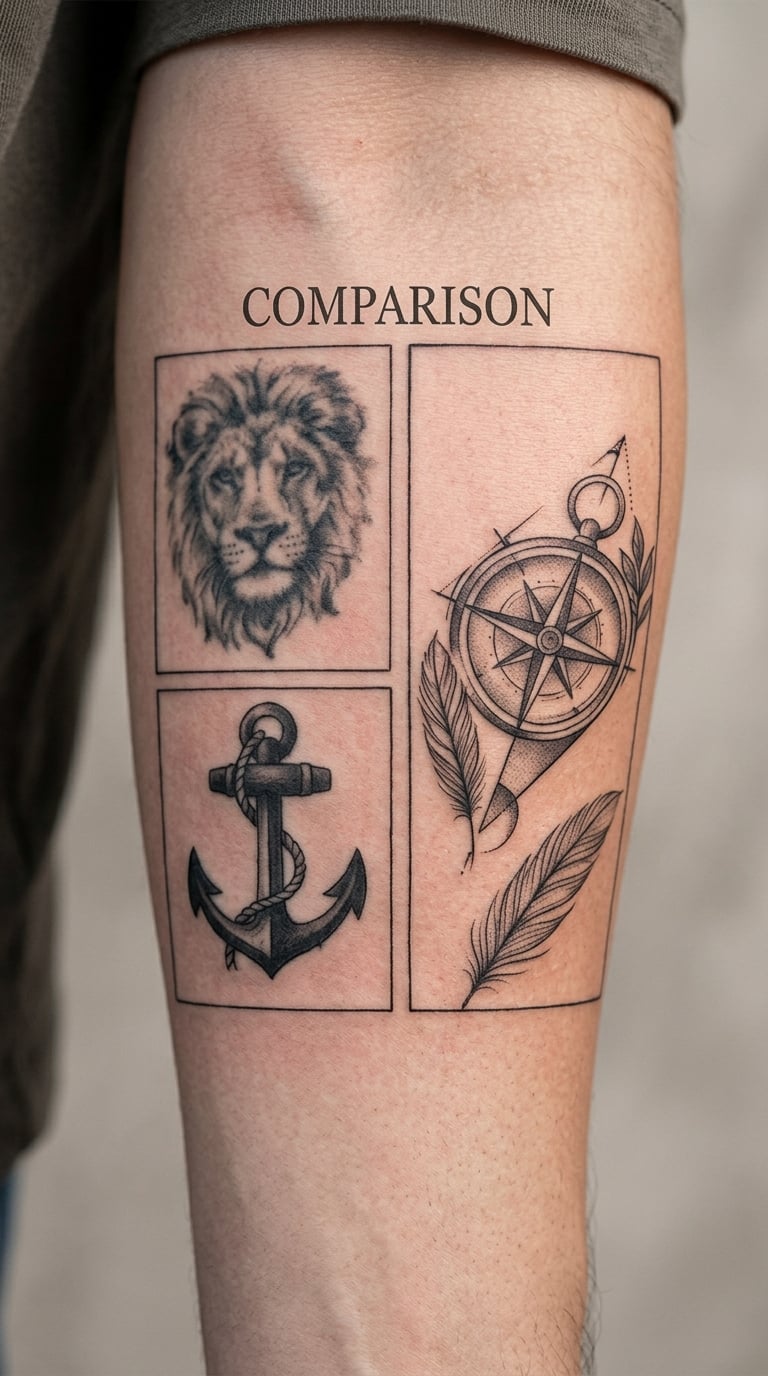
The table below covers the choices that come up most often in consultations. Each one is fixable before the session, which is the whole point of looking at it now.
| Common concern | Why it undermines a tattoo | Better decision |
|---|---|---|
| Artwork you did not commission | The artist cannot vouch for the line quality, and the piece belongs to someone else | Bring your own references and ask for a custom composition |
| A design picked from a trend post | It photographs well on a model and reads poorly in daily life | Keep it only if you would choose it without the reference in front of you |
| Lettering under half an inch tall | Thin strokes soften and fill in as the skin regenerates | Scale the words up, or move them to a flatter, larger area |
| Hairline shading and single-line detail | Fine lines close up with fading and light scarring | Ask the artist for the minimum workable line weight on your skin |
| A full-colour photo replica in one session | Colour blending needs more time than a single sitting gives | Split it into sessions, or cut the palette down to two or three |
| A design chosen to impress someone else | The motive fades fast, and the ink does not | Pick what you would be happy wearing alone |
| Tiny faces, hands or eyes | Features blur first, and they are the part people look at | Simplify to a silhouette or enlarge one defining detail |
| Something you only ever saw on a phone | You have never seen it at true size, or on your body | Test it at final size, in black, on paper, first |
Before you book, run this checklist:
- Print the design at its final size and hold it at arm’s length.
- Ask the artist what line weight they can actually run on that spot.
- Spell out every word, and have someone else check it.
- Confirm the placement moves well when you smile, frown or reach.
- Check the design still makes sense without colour.
- Decide honestly whether the meaning is yours or borrowed.
- Ask how many sessions it will take before you agree to one.
- Get the artist’s aftercare instructions for this specific piece.
What Not to Put on a New Tattoo: Designs and Details to Avoid
Most problem designs fall into a handful of categories, and the categories matter more than the individual image. Once you can name what a design is doing wrong, you can fix it before it becomes a cover-up conversation years from now.
Why Some Small Details Are What Not to Put on a New Tattoo
Fine detail fails for a plain reason: the skin under it is not a smooth page. It regenerates unevenly, stretches when you move, and catches light differently every season, so a line that looks crisp in a drawing becomes a soft grey smudge in a few years.
Things that blur first are hairline shading, tiny lettering, single-needle dot patterns, soft colour gradients, and small faces. A mouth that is two millimetres across has three features and no room for error. Ask the artist what they would change to make the detail survive, and let them tell you if the idea needs to be bigger.
Some skin makes this worse. Ankles, wrists, inner arms and the outer elbow are thin and constantly in motion, so fine work there fades and distorts faster than the same work on a forearm or the upper arm. If you want a reference point for how different styles hold up over decades, our guide to what tattoo styles age the best breaks down the ones that still look good after ten years.
Why Not to Put a Trendy Tattoo Idea on Skin Without Reflection
Trends are useful as a starting point and terrible as a reason. The problem is not that a style is popular; it is that popularity is a reason to want something that you would never have searched for otherwise.
Try four questions. Do you have a personal connection to it, or just an aesthetic one? Will it still balance visually once the reference everyone shared is old? Does it suit your proportions rather than the model’s? And can you picture it on your own body in ten years, unprompted?
Two yes answers out of four is usually enough. Zero means you are choosing someone else’s excitement, and that feeling fades faster than the tattoo.
Why the Meaning of a Tattoo Matters
Names, dates, quotations, memorial wording and culturally specific symbols carry more weight than decorative images, and that weight lasts after the excitement of the session has gone.
Words are where I see the most expensive mistakes: a date transposed, a quote paraphrased by whoever the client found online, a symbol that means something quite different in its original context. Research it properly, and if the symbol comes from a tradition that is not yours, ask why you want it rather than whether it looks good. Our breakdown of what a black band tattoo means is a good example of how much context a single motif can carry.
Animal motifs get the same scrutiny. Plenty of people book a lion without ever asking why, and a lion means something different depending on the tradition it comes from and the life of the person wearing it. Read what a lion tattoo means before you pick one, so the symbolism is yours and not borrowed from a trend post.
For a memorial piece, write the exact wording down and have a second person read it back to you. It takes a minute and it cannot be undone.
Which Tattoo Placements Make Details Hard to See
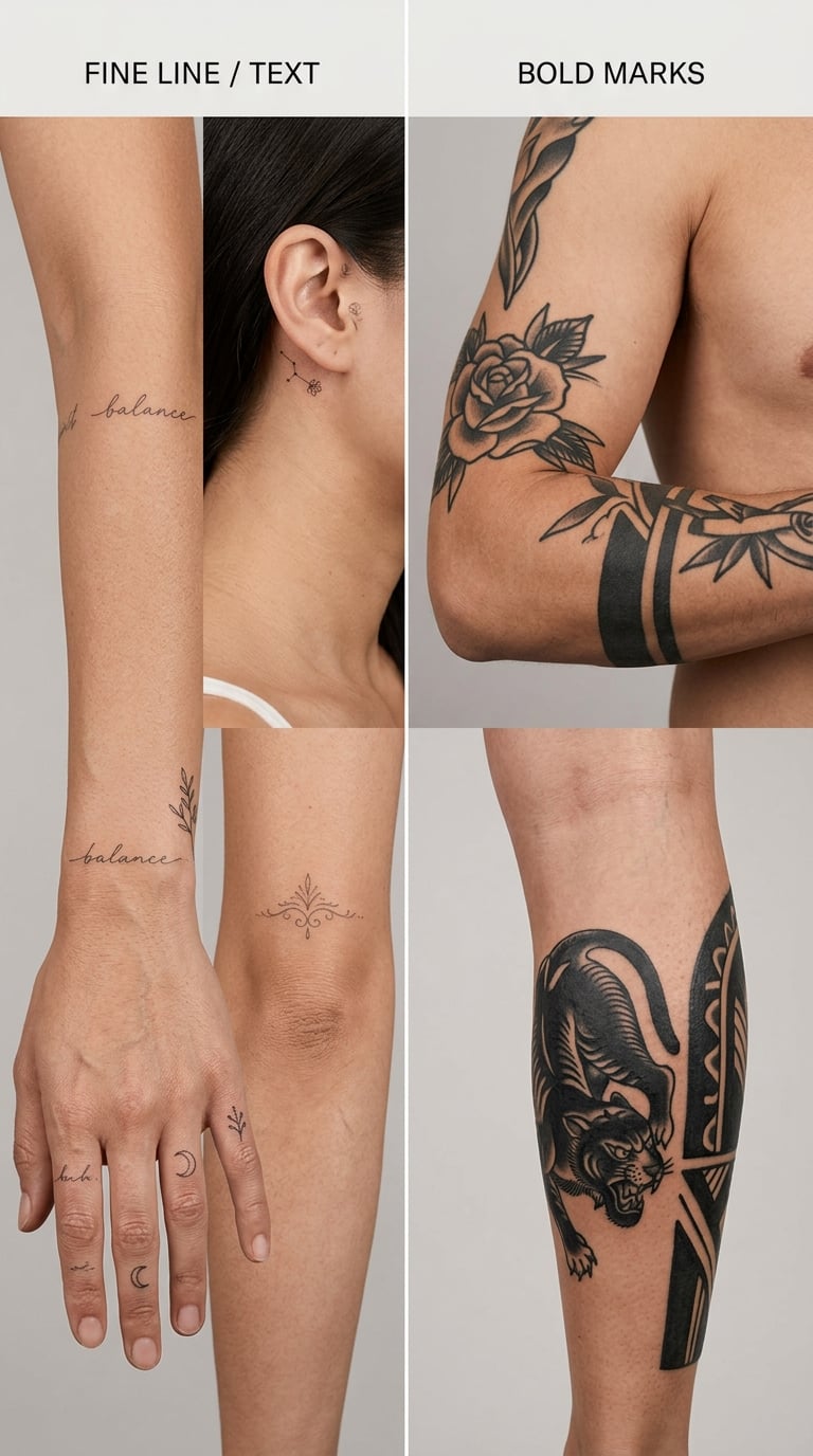
Placement decides how much detail survives, and it is decided by skin type, bone, movement and exposure rather than by taste. Here is how the common spots compare.
| Placement | How it wears over time | Better suited to |
|---|---|---|
| Outer forearm | Flat, visible, moderate sun exposure | Fine line, script, small illustrative pieces |
| Upper arm and outer bicep | Broad, relatively flat, easy to cover | Larger work with softer detail |
| Calf and thigh | Curved, stable, plenty of room | Bold motifs, repeating patterns, colour |
| Chest and sternum | Moves with breathing, high visibility | Medium detail, symmetrical pieces |
| Ribs and side torso | Curves sharply, stretches when you twist | Simpler shapes, bolder line work |
| Inner upper arm | Soft, folds when the arm bends | Medium pieces, avoid tiny text |
| Wrist and inner forearm | Constant movement, watch straps rub here | Small bold motifs, single words at larger size |
| Fingers and hands | Wash, movement and frequent contact wear it fast | Very simple, thick-line marks only |
| Elbow and knee | Hard to keep still, high contact | Small bold symbols |
| Behind the ear and neck | Thin skin, constant sun and sweat | Simple single-subject designs |
| Spine and lower back | Changes shape as you move, hard to see yourself | Symmetrical and abstract designs |
| Foot and ankle | Shoes, socks and floors cause daily friction | Small designs with strong outlines |
How to Check Tattoo Scale Before Getting Inked
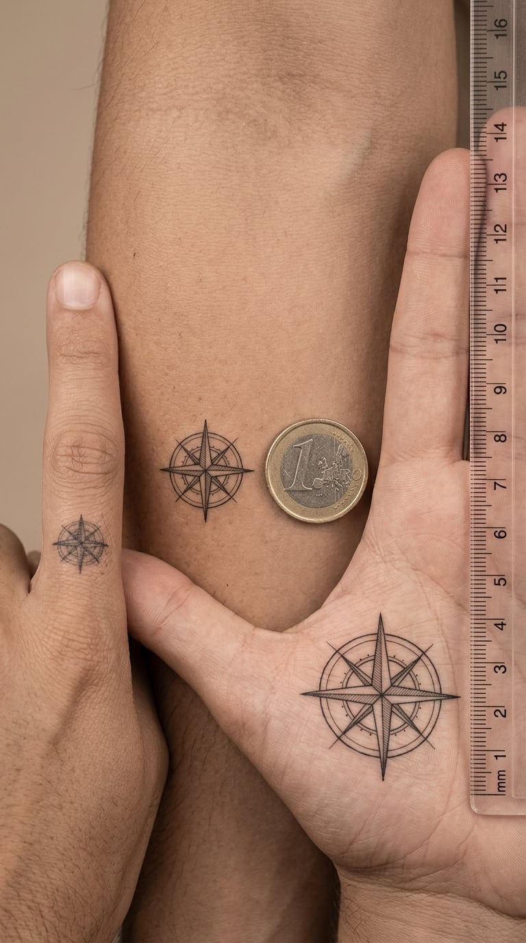
Scale is the test almost nobody runs at home. Print the design at the size you actually want on skin, then walk away a few steps and look at it again. If you cannot tell what it is, the artist will not be able to make it clear.
Hold a ruler or a coin next to it for reference. A line that measures less than a millimetre in the drawing is a line that will not hold. Then ask the artist how the stencil will sit on curved skin, because a design that is centred on paper wraps off-centre on a forearm or a rib.
Small is not automatically wrong. Small and simple holds up well. Small and detailed is the combination that ages badly.
How to Discuss a Design With Your Tattoo Artist
A good consultation is short and specific. Bring your references, and work through these points before the stencil goes on.
- References: show two or three images, not thirty. More references usually means less clarity.
- Originality: ask what the artist would change to make this piece their own work.
- Text: spell out every word, letter by letter, and check capitalisation.
- Line weight: ask what the minimum workable line is on that part of your body.
- Colour: confirm which colours need a second session to blend properly.
- Placement: move the arm, bend the elbow, sit down and stand up with the stencil on.
- Session scope: get a realistic number of sittings, not an optimistic one.
- Touch-ups: ask when to come back and what a free touch-up covers.
- Simplification: agree now that the design can be simplified to hold, and not argued about later.
That last point is the one worth writing down. Agreeing in advance that the artist can simplify an element if it will not hold at the final size saves an awkward conversation on the day.
Pain Levels by Tattoo Placement
Placement affects how a session feels, mostly because of bone proximity and skin thickness. Treat the ratings below as a rough ranking, not a promise. Individual experience varies a great deal, and a long session wears on people more than the spot itself does.
| Placement | Reported discomfort | What changes the session |
|---|---|---|
| Upper arm, outer bicep | Relatively low | Large muscle area, easy to sit through |
| Outer forearm | Relatively low | Flat and well supported |
| Calf and thigh | Relatively low | Thick skin over muscle |
| Chest and upper arm | Moderate | Comfortable position matters more than the spot |
| Wrist and inner forearm | Moderate | Tendon close to the surface, constant movement |
| Inner upper arm | Moderate | Sensitive skin, folds when bent |
| Behind the ear and neck | Moderate | Thin skin, you cannot see it yourself |
| Spine and lower back | Moderate | Prone position, long sessions get uncomfortable |
| Elbow inner and knee | Higher | Bone almost under the surface, hard to hold still |
| Ribs and side torso | Higher | Sharp bone edge, breath-holding needed |
| Sternum and collarbone | Higher | Bone directly under skin, flinching is common |
| Fingers and feet | Higher | Many small bones and joints, constant movement |
Short sessions break up the hard parts far better than one long sitting. If a placement rates high, ask about splitting it.
Tattoo Cost by Size and Design Complexity
Tattoo pricing in the US usually combines an hourly rate with a shop minimum, so size and complexity move the total more than the specific image does. The ranges below are ordinary US ranges, not quotes.
| Size and type | Typical time | Typical US range |
|---|---|---|
| Tiny, single small mark | Under 1 hour | Shop minimum to about 150 USD |
| Small, simple design | 1 to 2 hours | About 120 to 300 USD |
| Medium custom piece | 3 to 5 hours | About 350 to 900 USD |
| Large custom piece, one sitting | 5 to 8 hours | About 700 to 2000 USD |
| Full colour or photorealistic, multiple sessions | Several sessions | About 1200 USD upward |
Hourly rate, shop minimum, detail count, colour count, placement difficulty, revision work and the number of sessions all feed the final number. A cheap quote for a large piece usually means a rushed piece, and rushing is how the details that will not hold get committed to skin.
Ask what the session price includes and what a touch-up costs. Getting a straight answer on those two things before the work starts is worth more than a small discount.
Tattoo Healing Timeline by Week
The table shows what a fresh tattoo generally looks like as it settles. Your artist’s aftercare instructions take priority over anything here, because they know the technique they used.
| Stage | What you see | What to keep away from it |
|---|---|---|
| First few hours | Red, raised, warm to the touch, ink and plasma on the surface | Clothing friction, long showers, sun, dirty hands |
| Days 1 to 3 | Warm, slightly swollen, may weep clear fluid | Water, dirt, fragrance, tight collars, wristwatches |
| Days 4 to 7 | Itching, flaking, skin lifts and looks dry and dull | Picking, scratching, hot baths, gym sweat, makeup |
| Week 2 | Flakes mostly gone, colour settling back in, still tender | Pools, hot tubs, lakes, heavy rubbing |
| Weeks 3 to 4 | Surface healed, colour close to final, no tenderness | Direct sun without protection, picking at stray flakes |
| Long term | Settled tattoo, normal skin texture | Unprotected sun exposure, which fades pigment over years |
Mild oozing, dull colour and itching in the first week are normal parts of healing. Anything spreading, hot and increasingly painful, or producing thick coloured discharge is a different situation, and worth a call to a medical professional rather than a second opinion from a forum.
Mistakes to Avoid
The errors that cost clients the most are rarely about a specific image. They are about process.
- Rushing the decision. A few weeks of hesitation has never ruined a good idea. A booked appointment has.
- Choosing a trend or copied design. Popularity is not meaning, and borrowed artwork creates a different kind of problem.
- Using illegible text. If it does not read at arm’s length on paper, it will not read on skin.
- Skipping the size test. Small on a screen is very different from small on a forearm.
- Hiding an uncertain idea. Artists can smell a design nobody believes in, and they cannot fix what nobody will admit.
- Ignoring movement. A design that distorts when you smile, reach or bend was never tested properly.
- Treating the cheapest quote as the best one. Speed costs detail, and detail is what holds up in ten years.
- Booking large work in one session. Fatigue harms line quality more than almost anything else in the chair.
Frequently Asked Questions
Can a temporary tattoo help me decide what not to put on a new tattoo?
Yes, within limits. A temporary sticker or stencil shows you the placement and the rough scale, which is the part people most often get wrong. It does not show how fine detail reads over time, how the design behaves when you move, or how the artist would build the line work. Use it to test placement, then confirm size and detail with your artist.
Are very small tattoos a bad choice for a first tattoo?
No, not if the design is simple. Small, bold marks on the wrist, ankle or behind the ear hold up well and are a common first piece. The trouble starts with small and detailed, where fine text, dot patterns and colour gradients blur within a few years. Ask the artist what line weight they can run on that spot before you commit.
How can I tell whether a trendy tattoo idea will age well?
Ask whether you would still choose it without seeing the original reference. Check that it works in plain black, without colour or shading doing the work. Look at it on a body with proportions different from the model’s. And imagine it in ten years, unprompted, on someone you have never met.
Which tattoo designs become illegible most quickly?
Script and fine print lettering fades first, followed by hairline shading, single-needle dot work, small colour gradients and miniature faces. Hands, fingers, feet and the outer elbow wear fastest because of washing, friction and movement. Bold outlines and simple shapes keep their shape far longer on the same placements.
Should I wait before getting a first tattoo?
Wait if the design is still changing week to week, if anyone else is pressuring you into it, or if you are still deciding between two very different directions. Waiting is sensible when the meaning is unresolved, because a meaning you cannot explain to yourself is hard to live with later. If you already know why, the delay buys little.
Conclusion
Start with two references, not twenty. Print both at the size you want on skin, hold them at arm’s length, and check that they still read. Then verify every word and symbol yourself, compare the placements against how you actually move, and choose the one that still means something when the reference is old.
That is the whole method. Everything else is detail work the artist handles once the decision is right.