
25 Chicano Lettering Tattoo Ideas: Bold Script Designs 2026
These 25 chicano lettering tattoo ideas cover the styles people actually ask artists for: heavy Old English family names, narrow gothic scripts, blackwork wordmarks and a few phrases with a single red accent. Each idea below tells you how the design looks, what people usually get it for, and where it sits best on the body.
Chicano lettering comes out of Mexican-American lowrider and street lettering culture, where names, neighborhoods and family words carry more weight than decoration. What makes one of these designs work on skin is contrast and spacing, not detail. If you want the wider picture of the imagery that usually sits alongside this type, start with our 72 bold Chicano tattoo ideas.
25 Chicano Lettering Tattoo Ideas: Quick Guide
Every entry here is a lettering design rather than an image-based piece. Pain ratings assume the placement named in the row, so a forearm wordmark and a rib piece with the same phrase will not feel the same.
| Idea | Style | Best placement | Size | Pain |
|---|---|---|---|---|
| 1. Old English family name | Blackwork blackletter | Outer forearm | 6-9 in (15-23 cm) | Medium |
| 2. Dinero | Gothic script | Inner forearm, vertical | 4-6 in (10-15 cm) | Medium |
| 3. Vaya Con Dios | Old English blackletter | Outer upper arm | 7-10 in (18-25 cm) | Medium |
| 4. La Vida | Bold blackletter | Upper chest | 7-10 in (18-25 cm) | High |
| 5. Two-name couple piece | Blackletter with divider | Inner forearm | 5-8 in (13-20 cm) | Medium |
| 6. Amor | Narrow gothic | Wrist or ribs | 2-3 in (5-8 cm) | Medium |
| 7. Respeto | Traditional blackwork | Outer forearm | 5-7 in (13-18 cm) | Medium |
| 8. Siempre vertical | Stacked blackletter | Inner forearm or spine | 8-12 in (20-30 cm) | Medium |
| 9. Mi Familia | Chicano script | Upper arm | 6-8 in (15-20 cm) | Medium |
| 10. No Boundaries | Gothic blackwork | Chest or back | 9-12 in (23-30 cm) | High |
| 11. Date numerals | Fine-line blackletter | Inner wrist | 2-3 in (5-8 cm) | Medium |
| 12. Orgullo | Neo-traditional blackletter | Outer upper arm | 6-9 in (15-23 cm) | Medium |
| 13. Raíz | Hand-lettered | Shoulder | 3-4 in (8-10 cm) | Medium |
| 14. Lucha | Solid blackwork | Outer calf | 6-8 in (15-20 cm) | Medium |
| 15. Initial and surname monogram | Blackletter monogram | Forearm | 4-6 in (10-15 cm) | Medium |
| 16. Cultura | Traditional script with red fill | Upper back | 10-14 in (25-35 cm) | Medium |
| 17. Barrio | Fine-line gothic | Side of forearm | 2-3 in (5-8 cm) | Medium |
| 18. Fe with ornament | Blackletter with cross ornament | Upper chest | 2-3 in (5-8 cm) | High |
| 19. Mama | Bold blackletter | Inner upper arm | 3-4 in (8-10 cm) | Medium |
| 20. Spanish full name | Blackletter capitals and lowercase | Back or thigh | 10-16 in (25-40 cm) | Medium |
| 21. Eternidad | Gothic with watercolor wash | Forearm | 5-7 in (13-18 cm) | Medium |
| 22. Calle vertical | Narrow vertical blackletter | Inner arm | 6-9 in (15-23 cm) | Medium |
| 23. Perdón | Blackletter with red shadow | Upper arm | 5-8 in (13-20 cm) | Medium |
| 24. Libre | Minimal blackletter | Wrist | 2-3 in (5-8 cm) | Medium |
| 25. Herencia | Ornate blackletter | Upper back | 12-16 in (30-40 cm) | Medium |
1. Old English Family Name in Blackwork
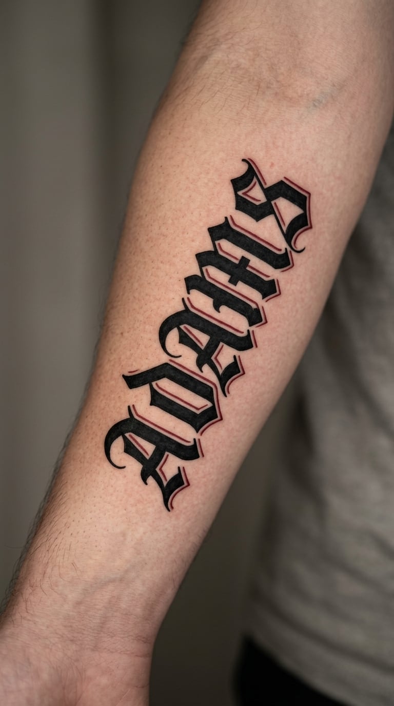
This is the version most people mean when they search chicano lettering tattoo ideas: a surname in heavy blackletter, each letter built from thick strokes with sharp angular serifs and hard white gaps cut into the counters. One small red shadow on a single letter keeps it from looking flat without turning it into colour work.
A family name is usually chosen for the people who raised you or the name that got carried this far. The weight of the letterforms matches that.
Placement: outer forearm, biceps or across the upper back. Size: 6-9 in (15-23 cm) for most surnames. Style: blackwork blackletter. Pain: medium on the forearm, and the bold fill softens and spreads slightly over the years while the letter shapes stay readable. Make it yours: red shadow the first letter only, or add the year the name came to your family.
2. “Dinero” in Gothic Script
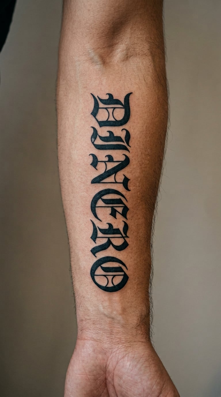
Dinero set in narrow gothic has tall condensed letters, crisp hairline terminals and clean internal spacing, laid out so the word runs down the arm rather than across it. Solid black fill with no shading keeps every gap between the letters open enough to read at a glance.
Money and the drive to earn it are the usual associations, though plenty of people just like how the word looks. Treat it as your own.
Placement: inner forearm running vertically, lower leg or calf. Size: 4-6 in (10-15 cm). Style: gothic script. Pain: medium, more an ache than a sharp edge on the inner forearm. Watch the narrow strokes near the wrist, where skin movement and daily wear thin fine black lines faster. Make it yours: put a small figure next to it, or have the word sit inside a thin oval border.
3. “Vaya Con Dios” in Old English
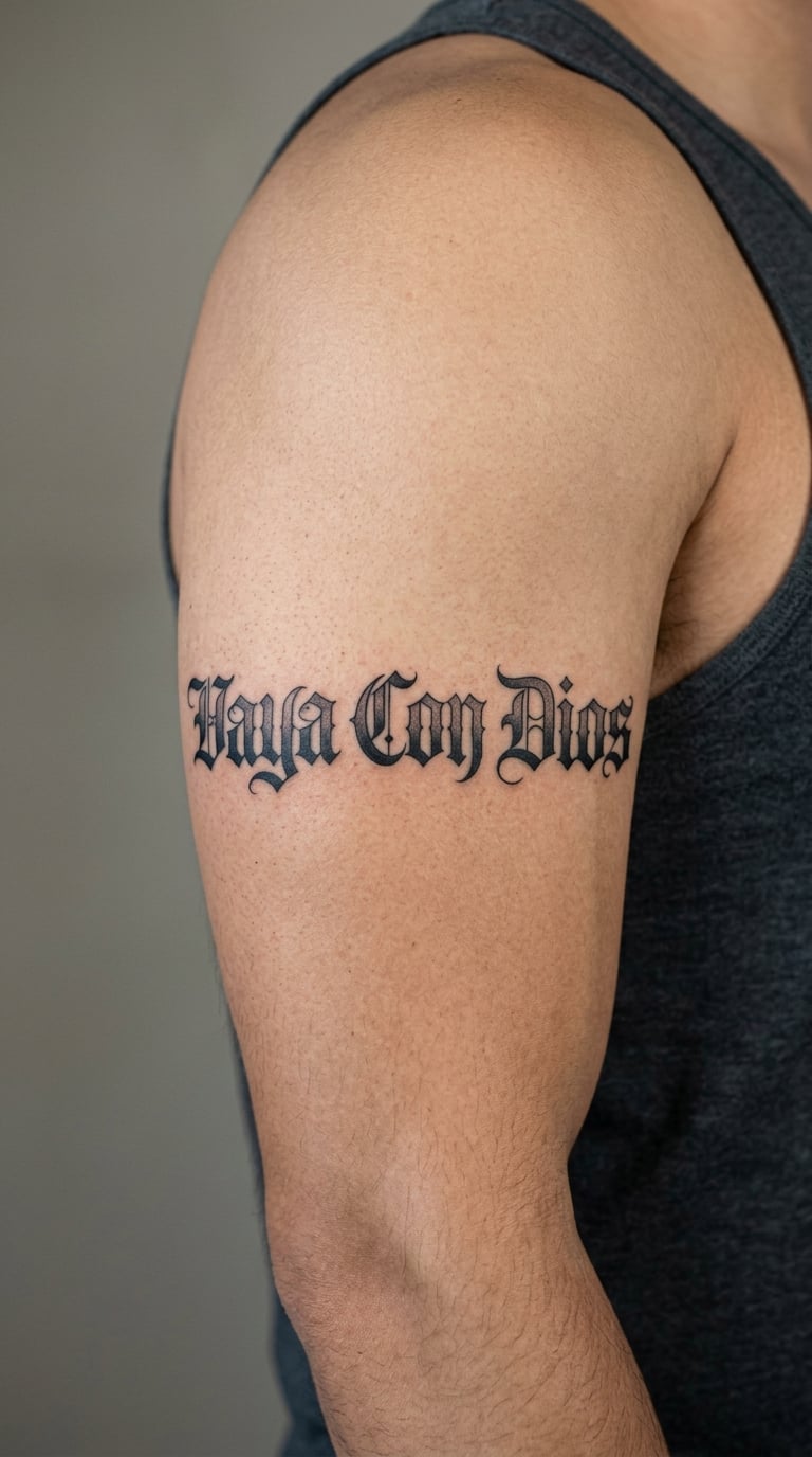
Three words need breathing room, so this version spreads Vaya Con Dios across the outer upper arm in flowing blackletter with a long ornamental capital V and grey wash shading tucked under the arches. The ornament stays at one end instead of repeating on every letter.
It reads as a farewell, a blessing, or a religious phrase depending on who you ask. People often carry it after a hard goodbye or a loss.
Placement: outer upper arm, chest or across the shoulder blade. Size: 7-10 in (18-25 cm). Style: Old English blackletter with grey shading. Pain: medium on the arm; higher on the chest where skin is thinner and the ribs sit close under. Make it yours: keep a single grey wash behind the middle word so the first and last stay the loudest.
4. “La Vida” in Bold Blackletter
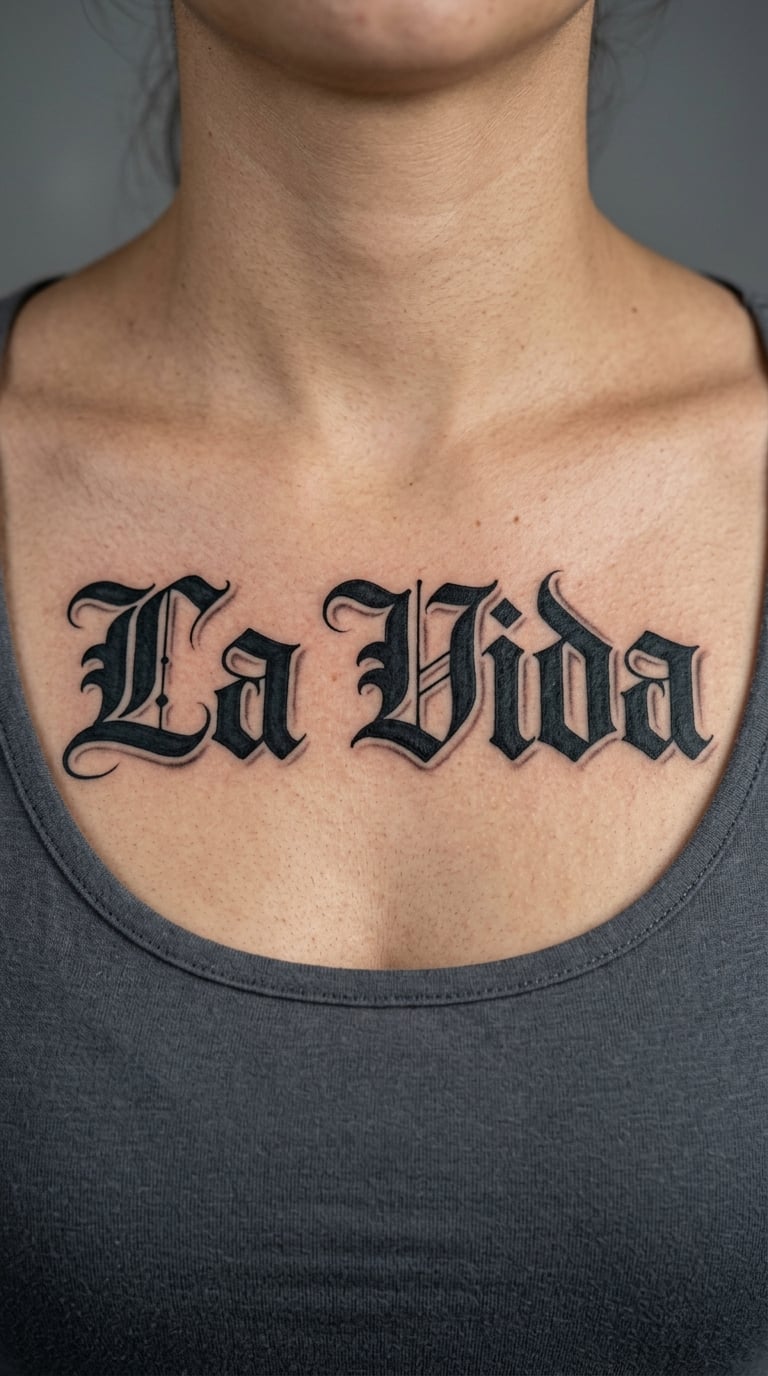
This is the widest-stroke design in the list: broad nib-like blackletter forms with almost no hairline detail, so each letter stays solid and readable from several feet back. A soft grey shadow sits behind the capitals rather than inside them.
La Vida gets picked up as the life, the good life, or simply as a word that sounds right said out loud. There is no fixed meaning to claim.
Placement: upper chest, upper back or forearm. Size: 7-10 in (18-25 cm). Style: bold blackletter. Pain: high on the chest, medium on the back. Bold fill ages better than anything delicate here, so this one keeps its shape for years. Make it yours: put it in an arch over the sternum instead of a straight line, which also frees up width.
5. Two-Name Blackletter Couple Tattoo
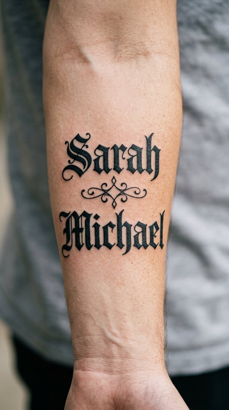
Two names, one line each, joined by a small diamond or leaf shape, all in matching blackletter so the pair reads as one design rather than two tattoos that happen to be close together. Both names get the same stroke weight.
Couples pick matching lettering for the look of it. Matching the height and weight is what makes two different name lengths sit comfortably together.
Placement: inner forearm, both wrists or the back of the hand. Size: 5-8 in (13-20 cm). Style: blackletter with a divider. Pain: medium; hands and wrists get hotter faster because there is little fat there. Make it yours: add a date underneath in the same lettering, small enough that it reads as a second line rather than a separate piece.
6. “Amor” in Chicano Gothic
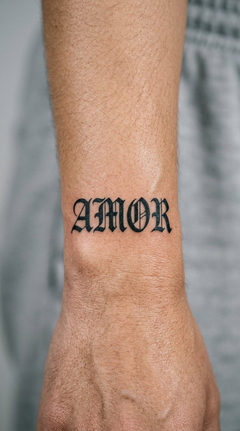
Four letters, one clean idea: narrow gothic capitals with pointed serifs, tight tracking and enough open space inside each letter that it survives being small. This is the version that works when you want a wordmark, not a statement piece.
Amor is usually chosen for love, a partner, or a memory of someone. Plenty of people wear it as plain decoration too.
Placement: wrist, ribs or behind the ear. Size: 2-3 in (5-8 cm). Style: narrow gothic. Pain: medium on the wrist, noticeably higher along the ribs. Wrist pieces rub against sleeves and watch straps, so solid fill matters more here than anywhere else. Make it yours: place it beside an existing small piece so the negative space around the letters stays open.
7. “Respeto” in Traditional Blackwork
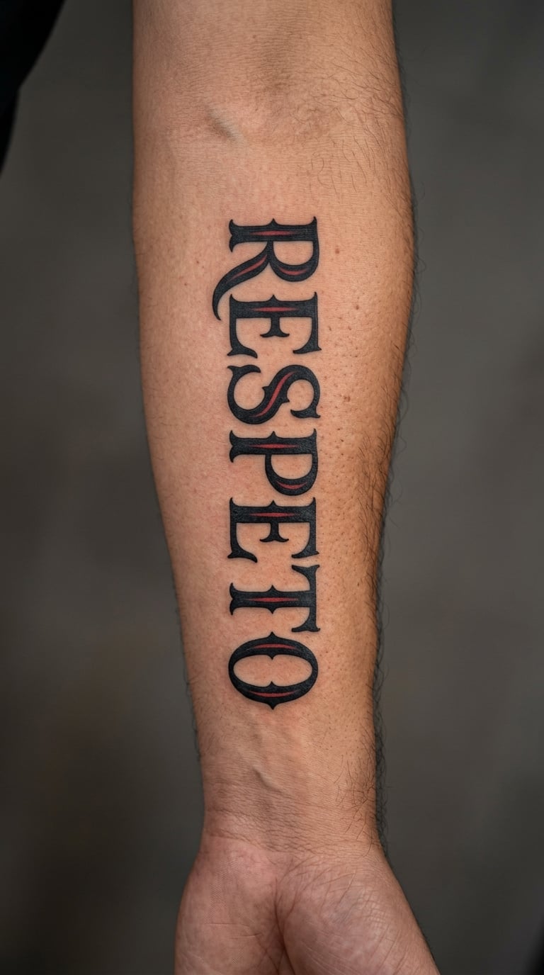
Thick downstrokes, tight letter spacing and one small ornamental detail on the capital R. Most of the work is solid black, with a single restrained red inner highlight so the piece has one point of interest instead of several.
Respeto is drawn toward words about respect, family and how you were raised. Plenty of people also use it for a person they wanted to honour.
Placement: outer forearm or calf. Size: 5-7 in (13-18 cm). Style: traditional blackwork. Pain: medium. Blackwork holds up well because the fill is deep, though very heavy areas on the inner arm can lighten over time. Make it yours: add the date you earned the respect, tucked under the word in small lowercase.
8. Vertical “Siempre” Lettering
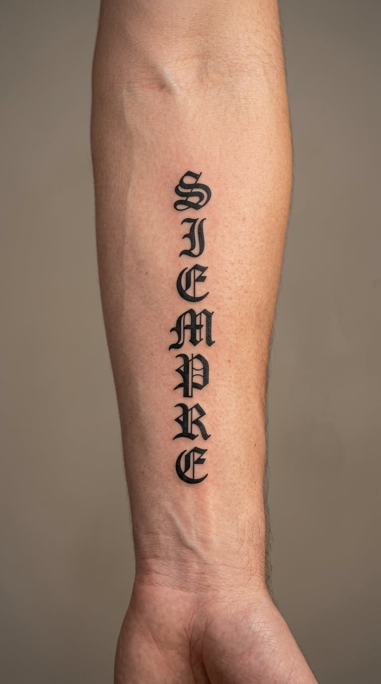
Siempre runs top to bottom in compact Old English, each letter fitted into the space above it so the word reads as one tall column. The letters stay upright rather than slanting along the arm, which keeps the shapes predictable.
Siempre means always, and it shows up for constancy, a promise or a person who stayed. Interpretation is personal.
Placement: inner forearm, outer upper arm or along the spine. Size: 8-12 in (20-30 cm). Style: stacked blackletter. Pain: medium on the arm; a spine piece runs higher because the vertebrae bump under the skin. Make it yours: add small caps at the top, or break the column with a thin ornament between two letters.
9. “Mi Familia” in Chicano Script
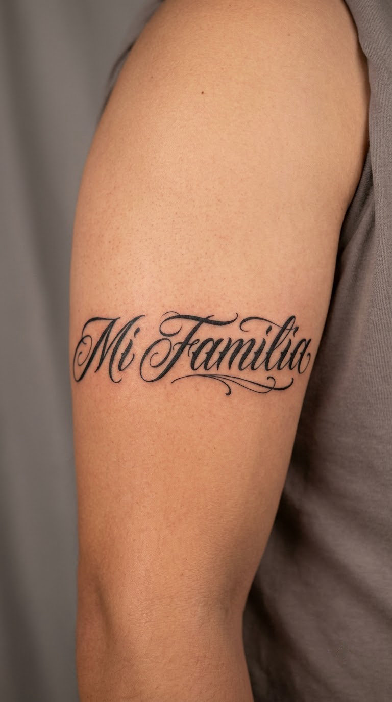
Two words with balanced flourishes on the capitals and very little else. The letters lean slightly forward and the descenders are kept short so the whole phrase fits on one curve of the arm without crowding.
Family wording is personal by nature. People use this for parents, grandparents, kids, or the household they came from.
Placement: upper arm, chest or across the back. Size: 6-8 in (15-20 cm). Style: flowing blackletter script. Pain: medium, more on the chest and ribs. Keep the flourishes restrained and this holds its shape for years. Make it yours: put one small initial inside the capital M, or add a thin outline to tie the words into a piece you already have.
10. “No Boundaries” in Gothic Blackwork
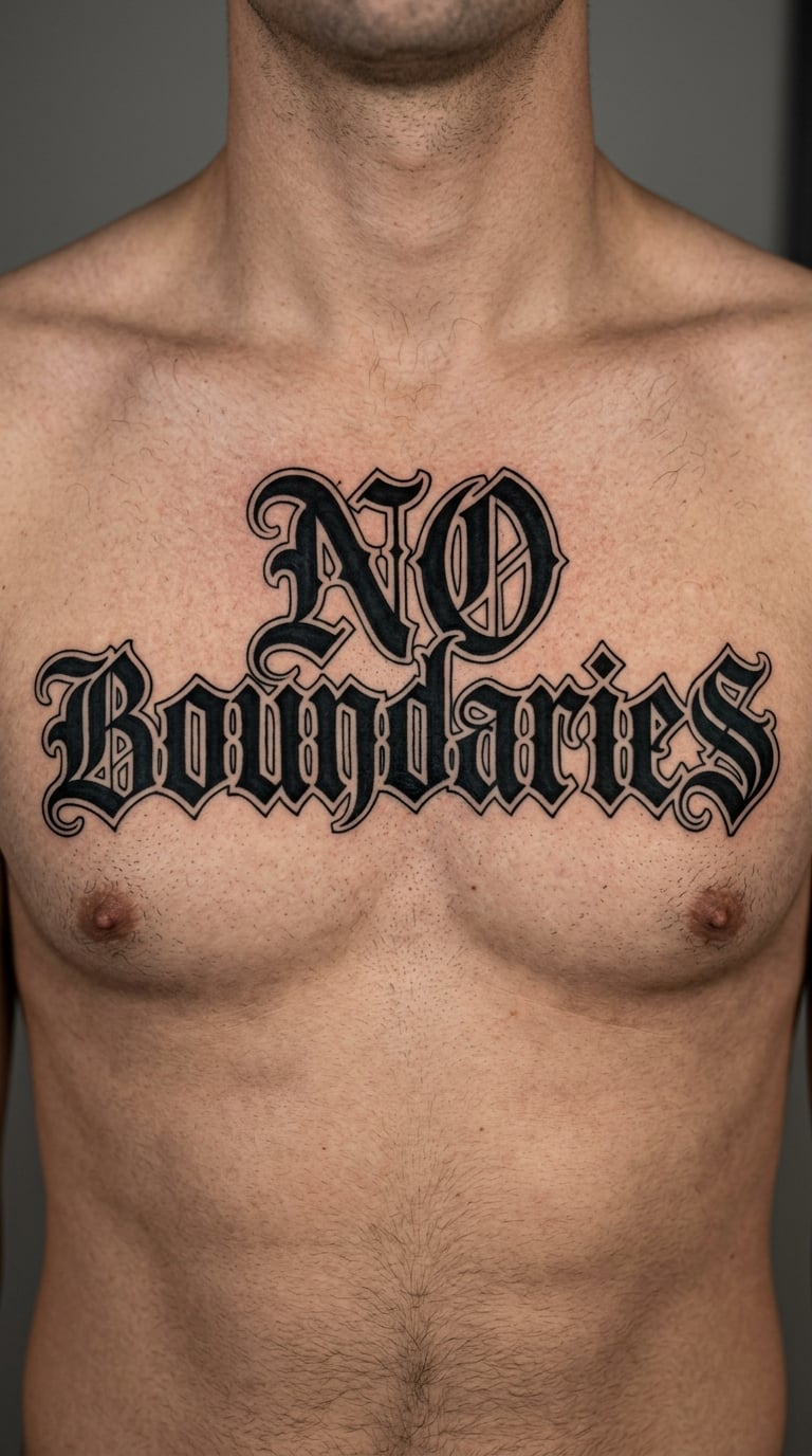
Two English words in gothic blackwork, drawn with thick strokes and wide open interiors so the counter of every letter stays visible. Nothing is shaded here, which keeps the design heavy without making it look crowded.
The phrase connects to independence, self-definition and boundaries you set yourself. It reads more assertive than most of the Spanish words on this list.
Placement: chest, upper back or across the shoulders. Size: 9-12 in (23-30 cm). Style: gothic blackwork. Pain: high across the chest, medium on the upper back. Thick strokes survive skin stretch better than thin ones, so this ages well even where it moves a lot. Make it yours: have the artist draw the letters as one block with no gaps, or add a thin broken line under the phrase.
11. Date in Fine-Line Blackletter
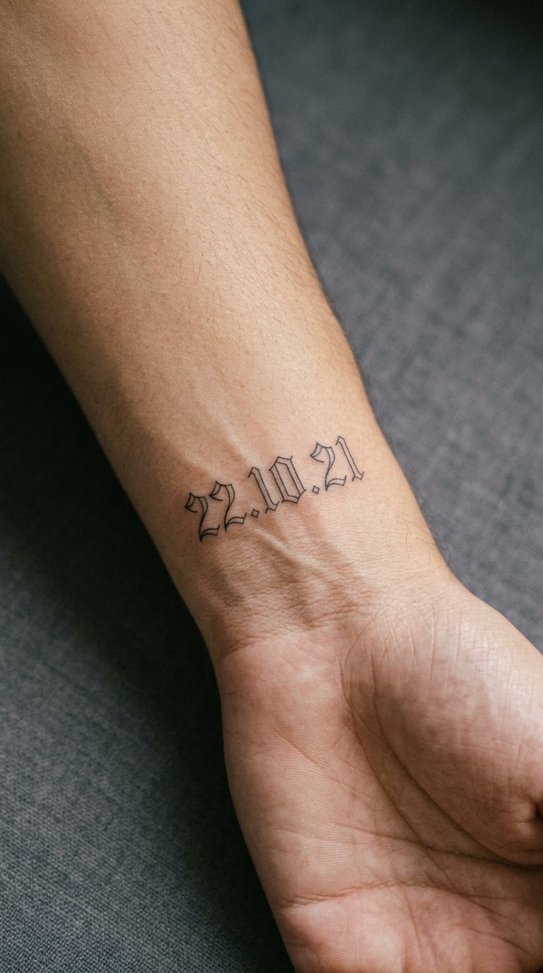
A date set in fine-line blackletter numerals: narrow strokes, minimal fill, spaced far enough apart that each digit is still a separate shape. It is the smallest and most delicate design on this list, and the one that changes the most over time.
Dates are usually a birth, a wedding, a loss, or a moment nobody else was present for.
Placement: inner wrist, forearm or behind the ear. Size: 2-3 in (5-8 cm). Style: fine-line blackletter. Pain: medium; wrists and fingers carry more nerve endings than the upper arm. Honest ageing note: fine strokes on hands and fingers blur within a few years, so choose a spot you can accept changing. Make it yours: outline the numerals lightly instead of filling them, which slows the spread.
12. “Orgullo” in Neo-Traditional Lettering
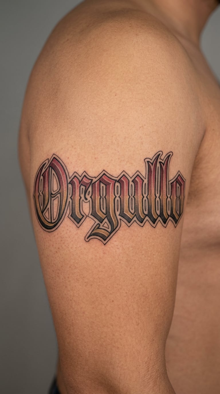
Dimensional blackletter letters with muted red and a soft gold shadow, shaded inside the arches so each letter reads as a carved block. Colour stays limited to the shadows, and the letter faces stay solid black.
Orgullo means pride, and it turns up for pride in heritage, in a family, or in something you built yourself.
Placement: outer upper arm, back or thigh. Size: 6-9 in (15-23 cm). Style: neo-traditional blackletter with colour shadow. Pain: medium, and colour passes add time in the chair. Colour in shadow areas fades first, so expect a touch-up on the red in a few years. Make it yours: swap the gold for a single accent colour that already appears in the rest of your tattoos.
13. “Raíz” in Hand-Lettered Style
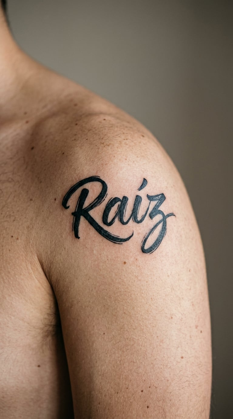
Raíz drawn by hand, with slight variation between letters, softened terminals and visible brush texture in the thick strokes. Nothing here is mechanically even, which is exactly the point.
Raíz means root, and it is chosen most often for heritage or where someone comes from. That meaning is the wearer’s, not the style’s.
Placement: shoulder, upper arm or sternum. Size: 3-4 in (8-10 cm). Style: hand-lettered calligraphy. Pain: medium on the shoulder; the collarbone area stings more. The accent mark over the i needs to be drawn larger than usual to stay visible once healed. Make it yours: ask the artist to exaggerate the accent so the word still reads correctly from across the room.
14. “Lucha” in Chicano Blackwork
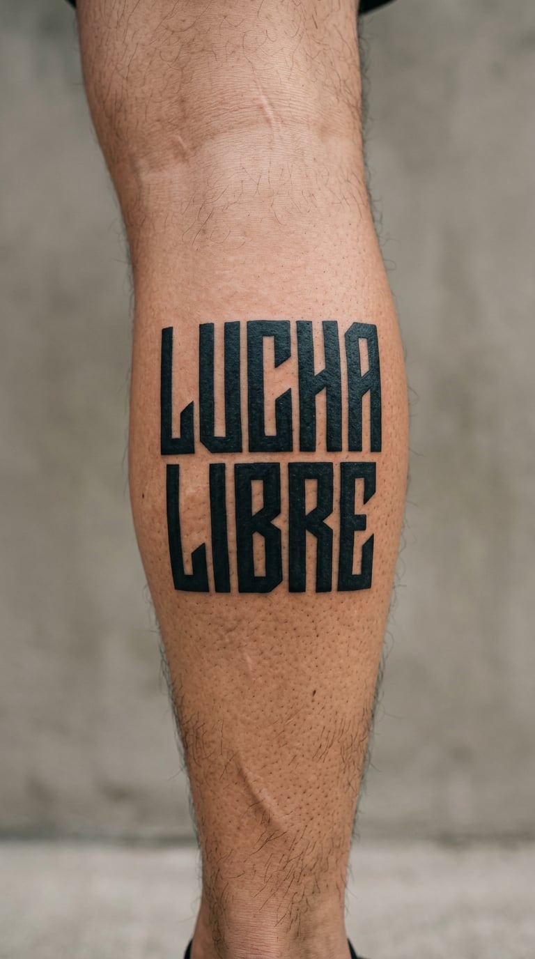
Five letters in solid black blackwork with sharp rectangular shapes and no shading at all. The simplicity is the design: heavy fill, tight spacing, clean negative space.
Lucha means struggle or fight, and it is used for perseverance, for someone the wearer is fighting for, or for a long hard stretch that already ended.
Placement: outer calf, forearm or bicep. Size: 6-8 in (15-20 cm). Style: chicano blackwork. Pain: medium on the calf, and the calf muscle shifts under the skin as you walk, so the artist works around it. Solid black with no shading is one of the most durable lettering approaches. Make it yours: place it vertically down the calf, or pair it with a small figure from the same flash sheet.
15. Initial and Surname Monogram
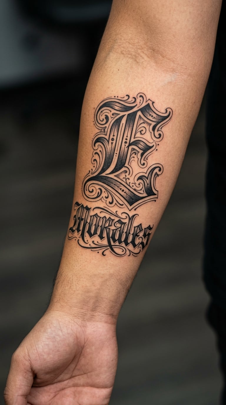
A large ornamental capital takes up roughly a third of the design, with the surname set smaller beneath it in plain gothic. The initial carries the detail, and the surname keeps to simple forms so both parts stay legible.
It works as a personal identifier without giving up your whole name to everyone who reads it.
Placement: forearm, upper chest or calf. Size: 4-6 in (10-15 cm). Style: blackletter monogram. Pain: medium. Surname detail is where this design quietly fails, so the artist should simplify the small half rather than shrink the whole piece. Make it yours: put the initial inside a diamond, or shadow only the capital and leave the surname flat.
16. “Cultura” in Traditional Script
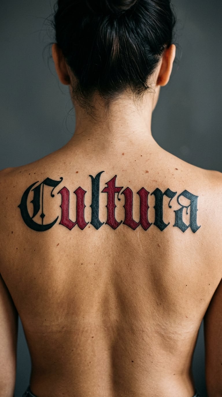
Broad blackletter curves with deep red fill sitting inside two or three letters rather than across all of them. The colour appears in the counters, not over the black, so the letterforms still read as black at a distance.
Cultura is picked up for cultural identity, heritage or belonging to a place. As with every word here, the interpretation belongs to the person wearing it.
Placement: upper back, shoulder blade or thigh. Size: 10-14 in (25-35 cm). Style: traditional script with red fill. Pain: medium on the back, where the surface is broad and even. Red fill needs a heavier pass than line work, so expect a longer session. Make it yours: fill only the capital C and leave the rest black for a quieter version.
17. “Barrio” in Fine-Line Gothic
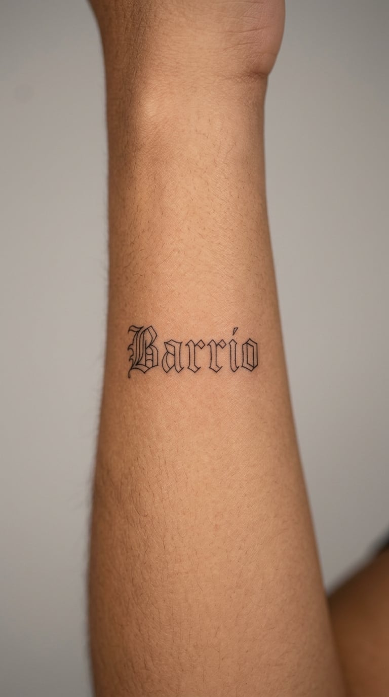
A more delicate Barrio, drawn with narrow gothic forms and clean single-needle linework. Letters are spaced wider than in a bold piece so each one still separates at a small scale, which is what makes fine-line lettering readable.
Barrio means neighborhood, and it is usually about a specific place and the people in it rather than a general idea of community.
Placement: side of the forearm, inner arm or wrist. Size: 2-3 in (5-8 cm). Style: fine-line gothic. Pain: medium, and forearm edges are sharper than the flat centre. The thin strokes will soften within a few years, so go slightly bolder than the reference if you want it to last. Make it yours: add the neighborhood name in tiny letters underneath, or outline the word with one thin border.
18. “Fe” with Small Ornamental Cross
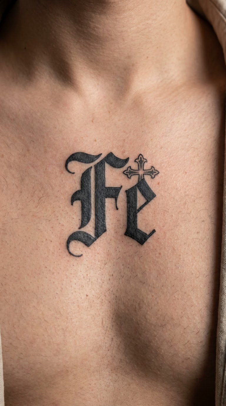
Two letters in blackletter with a small cross-like shape worked into the design, close enough to the letterforms that it reads as part of the ornament rather than a separate religious piece dropped beside it. Everything is black.
Fe means faith. The ornament is a design element the artist fits to the letters, not a claim about the wearer.
Placement: upper chest, forearm or nape of the neck. Size: 2-3 in (5-8 cm). Style: blackletter with ornament. Pain: high on the chest, medium on the forearm. The sternum area is bony and unforgiving, so many people move this one to an upper arm. Make it yours: keep the ornament in black, or let the artist run it into the F as a flourishing stem.
19. “Mama” in Chicano Blackletter
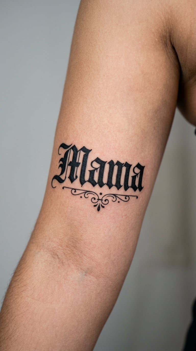
A short, warm wordmark in thick blackletter with heavy fill, a small ornamental underline and nothing else. Four short letters are the easiest shapes in this whole list to keep legible, which is why this one works so well at medium size.
Mama is family, and it shows up for a mother, a grandmother, or the person who raised you.
Placement: inner upper arm, forearm or chest. Size: 3-4 in (8-10 cm). Style: bold blackletter. Pain: medium. The inner upper arm bruises visibly for a few days, so plan around that if the appointment is before something social. Make it yours: add a small date below it, or mirror the underline with one above.
20. Spanish Full-Name Lettering
A longer design built from alternating blackletter capitals and smaller lowercase forms, with first names slightly larger than surnames. Accents are drawn oversized so they survive healing instead of fading into the letter above.
This is the one to book a real consultation for. Spell the name out loud and in writing, double the accents, and confirm the artist has drawn your exact version before they transfer it.
Placement: upper back, thigh or across the shoulders. Size: 10-16 in (25-40 cm). Style: blackletter capitals and lowercase. Pain: medium on the back and thigh, both of which are broad and flat. Long designs are usually split across sessions. Make it yours: have the surnames drop a half-step smaller than the given names so the hierarchy is clear at a glance.
21. “Eternidad” in Watercolor Gothic
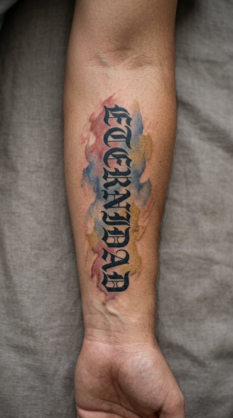
Black gothic lettering with a restrained watercolor wash behind it in muted red, blue and ochre. The colour stays behind the letters and stops well short of their edges, so the type keeps its hard outline against something soft.
Eternidad means eternity, and it is a common memorial word as well as a general statement about permanence.
Placement: forearm, upper arm or calf. Size: 5-7 in (13-18 cm). Style: gothic with a colour wash. Pain: medium, and colour blending stretches the session. Watercolour is the first thing to fade and blotch, so expect a refresh in a few years. Make it yours: use one colour from the wash inside the letter faces and drop the rest.
22. “Calle” in Narrow Vertical Blackletter
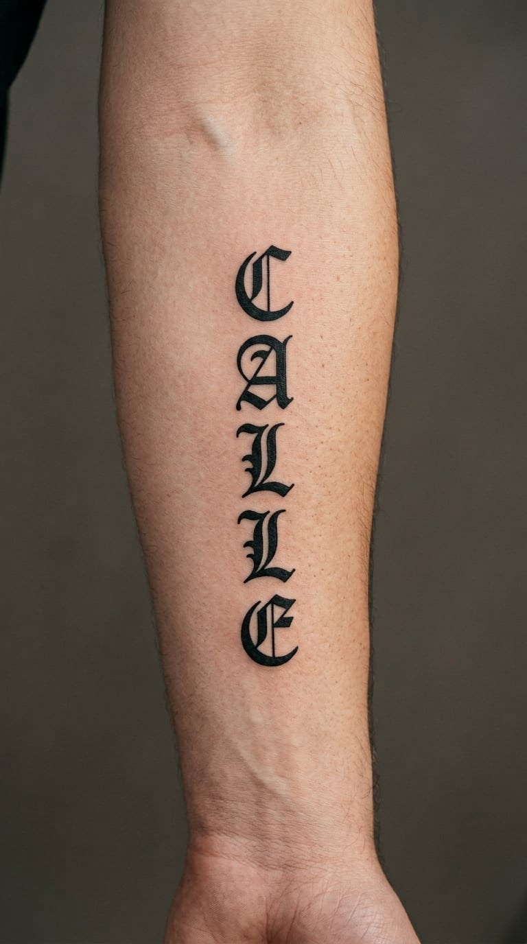
Calle stacked vertically with strong central strokes and evenly spaced letters, each one narrowed until the whole word reads as a single column. The edges stay crisp because nothing is thinner than the arm of the letter.
Calle means street, and it points at a specific street name as often as anything else.
Placement: inner arm, forearm or side of the calf. Size: 6-9 in (15-23 cm). Style: narrow vertical blackletter. Pain: medium. Protect the thin edges once healed and skip micro-sizing, which is how these designs turn into grey smudges within two years. Make it yours: put the street name in tiny lowercase under the main word, or set the whole thing inside a thin ruled frame.
23. “Perdón” in Red-and-Black Script
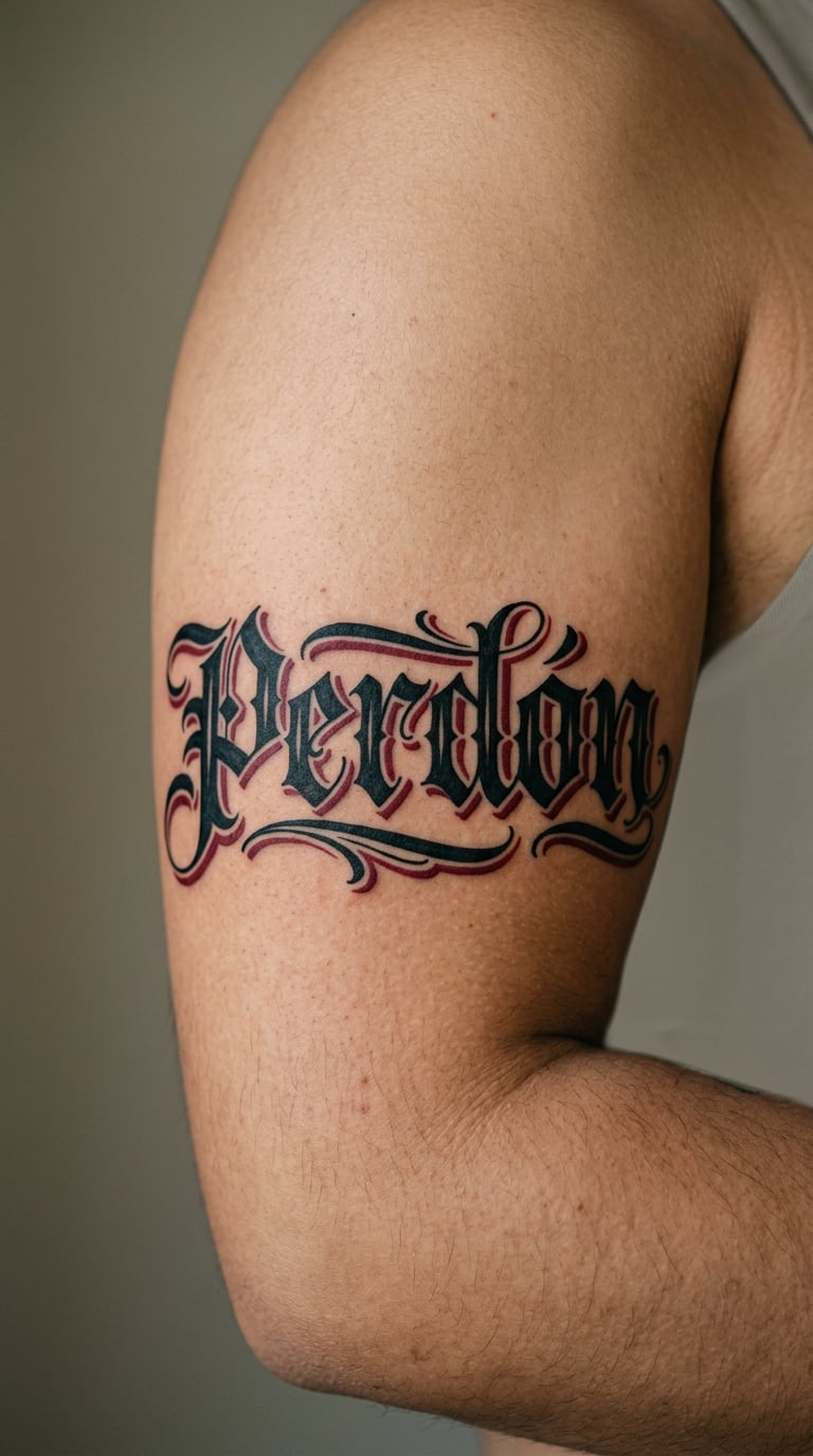
Blackletter letterforms with deep red shadowing offset to one side rather than outlined evenly around each letter, which gives the design a slight depth without grey work. The red sits behind the black, never over it.
Perdón means forgiveness, and it is chosen after a family falling out, a personal reckoning, or a long-held grudge let go.
Placement: upper arm, chest or forearm. Size: 5-8 in (13-20 cm). Style: blackletter with a red shadow. Pain: medium on the arm, high on the chest. Medium sizes hold the offset shadow best, since at large scale the red starts competing with the letters. Make it yours: red only the descender of one letter instead of the whole shadow line.
24. “Libre” in Minimal Chicano Lettering
Five letters in minimal Chicano lettering with a few thick blackletter strokes and a lot of open space between them. Nothing is filled in, nothing is shaded, and there are no flourishes. That restraint is the whole idea.
Libre means free, and it works well as a first lettering tattoo because a simple design is easier to heal cleanly and easier to add to later.
Placement: wrist, inner forearm or ankle. Size: 2-3 in (5-8 cm). Style: minimal blackletter. Pain: medium, and wrist skin is thin enough that you will feel every pass. Minimal designs also have nowhere to hide a shaky line, so pick an artist with steady lettering work. Make it yours: add a matching second word later in the same weight, using the first piece as the style reference.
25. “Herencia” in Ornate Blackletter
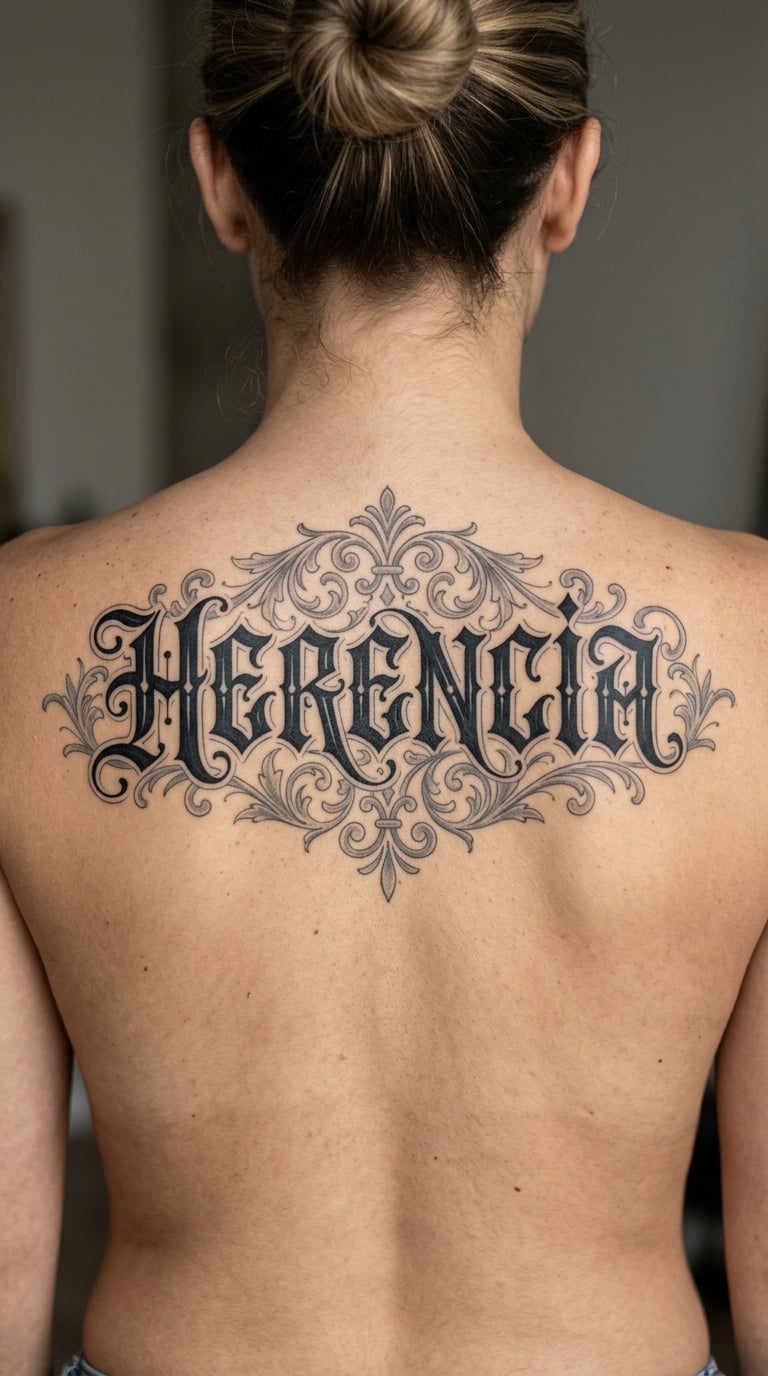
The most involved design here: ornate blackletter capitals with grey ornamental flourishes curling off the H and finishing under the last letter. Every flourish has a reason for its position, because anything added without a plan shows up as clutter once healed.
Herencia means heritage or inheritance, and it usually goes with a longer phrase, a family name, or a date on the same piece.
Placement: upper back or across the shoulders. Size: 12-16 in (30-40 cm). Style: ornate blackletter with grey flourishes. Pain: medium on the back, and this is a two-session piece more often than not. Grey flourishes have the thinnest lines in the design, so they are the first part to need touch-ups. Make it yours: work in the family name before the flourishes get added, so the drawing starts from the words rather than the ornament.
How to Choose the Right Design
Style, size and placement decide whether a lettering piece reads well at year five. Get those three aligned before you start picking fonts.
Match the style to the number of words
One word in heavy blackletter can carry detail. Four words need open interiors and thick strokes. If you have more than two words, the design has to be at least 9 in (23 cm) across or the letters start merging on the skin. Some tattoo artists will tell you the same thing at the consultation, and it saves a redo.
Choose a placement your arm or torso can actually fit
The inner forearm takes a vertical column well. The upper chest takes a wide horizontal phrase, but expect the session to be harder and the area to bruise more. The back is the flattest surface for a long name. Wrist and hand pieces need the boldest strokes you can find, because that skin takes the most daily wear.
Decide between blackwork and colour before the drawing
Blackwork ages more predictably than any coloured option. Watercolour washes and colour fills both fade and blotch first, usually within a few years, so if you want a design that still looks the same later, stay in black and grey. One accent colour is a reasonable middle ground.
Test the layout before it goes on skin
For any phrase over two words, ask the artist to draw a sample at the real size on paper or a temporary sticker, then hold it against the placement. Letter spacing that looks fine on a screen collapses on a curved surface. This is the cheapest fix in the whole process.
Ask about the lettering, not the font
Letterers draw the word by hand rather than typing it into a font, so a font name is a starting reference, not an order. Artists say this often, and they are right. Bring a reference image and describe the weight you want instead of asking for a specific typeface. More of our Old English lettering tattoo ideas and arm tattoo lettering ideas are worth a look before the consultation.
Cost and Session Time
Custom lettering prices in the US scale by size, word count and how much drawing is involved. There is no fixed menu for this work, so treat the ranges below as a shape rather than a quote, and get your number from the artist directly.
A small single-word piece, like Amor or Libre, usually sits at the lower end and takes well under two hours. A mid-size design such as a family name or a two-word phrase lands in the middle and commonly runs one to three hours.
Long designs like a full Spanish name or Herencia across the back need the most time, and most artists split them across two or three appointments. Shop minimums apply, and hourly rates vary a lot by city and by how specialised the lettering artist is.
Two things move a quote up. Drawing genuinely custom work takes longer than tracing a font, and colour passes add time. So do pieces that have to fit an awkward curve. If a quote comes back very low, ask to see healed work from the same artist, not fresh photos.
Aftercare Basics
Start with your artist’s aftercare instructions, since they know how deep they went into the skin. The basics below cover what most lettering artists agree on.
- Follow your artist’s aftercare instructions first, including any ointment or wash they specified.
- Wash the area gently with clean water and mild soap, then pat it dry rather than rubbing.
- Keep the tattoo covered and out of direct sun while it heals, especially if you added colour.
- Do not pick at flakes or scabs, no matter how much they pull. Let them come off on their own.
- Skip swimming, hot tubs and saunas until the tattoo is fully healed.
- Watch for anything unusual and contact your artist or a doctor if something does not settle down.
Frequently Asked Questions
What are the different styles of Chicano lettering?
The main families are Old English blackletter with heavy angular strokes, narrow gothic with pointed serifs, flowing chicano script built from handwritten letterforms, and traditional blackwork with restrained ornament. Most real pieces mix two of them. The style you pick should match how many words you are getting tattooed.
Are Chicano tattoos fine line?
Mostly not. Chicano lettering is traditionally bold black and grey, with heavy fills and strong outlines rather than thin single-needle work. Fine-line gothic does exist inside the style, but it is the exception, and those fine strokes blur faster than bold fill over the first few years.
How many words fit on a forearm?
One to three words is a comfortable range on a forearm. Two words in blackletter at 6 to 9 inches (15 to 23 cm) reads cleanly. Past three words you usually need the upper back, the chest or the thigh, because the letters start merging together once the design shrinks.
Will fine-line lettering fade on my hand or fingers?
It will. Fine strokes on hands and fingers blur and soften within a few years, partly from daily wear and partly from sun. If those areas are where you want the piece, ask the artist to draw slightly bolder and to leave more space between letters than the reference shows.
What is the best font for Chicano lettering?
Blackletter, usually an Old English or gothic variant, is the strongest starting point because the heavy strokes stay readable after healing. Artists hand-draw the lettering instead of using a font file, so bring a reference image and describe the weight you want rather than naming a typeface.
Can a custom word be adapted into a sleeve?
Yes, and lettering is a common anchor for a chicano or blackwork sleeve. Bring the finished lettering piece to the consultation, or plan the word first as a fixed point and build the surrounding imagery around it. Match the stroke weight of the surrounding work to the lettering so the sleeve reads as one piece.
Conclusion: Choose Your First Chicano Lettering Tattoo
If this is your first tattoo, start with Libre in minimal lettering or Amor in narrow gothic. Both are short, bold and forgiving, and they heal cleanly without needing a second session.
If you already have Chicano or blackwork work and want something with more presence, go with a family name in Old English or Herencia in ornate blackletter. Confirm the wording, the accents and the scale with your artist before booking, and get the drawing laid out at real size before any ink goes on.